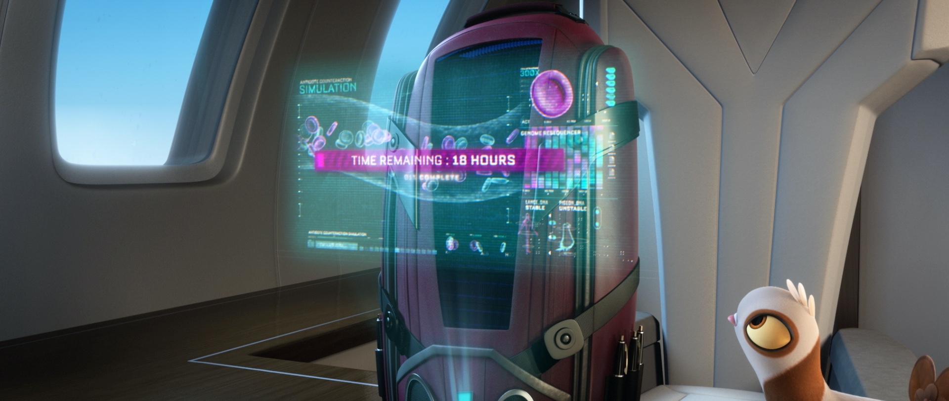
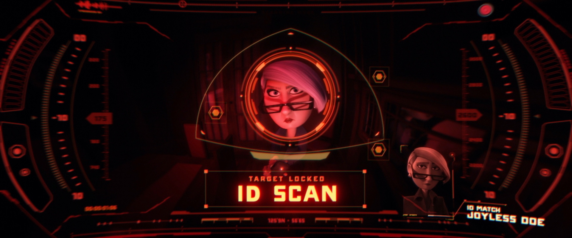
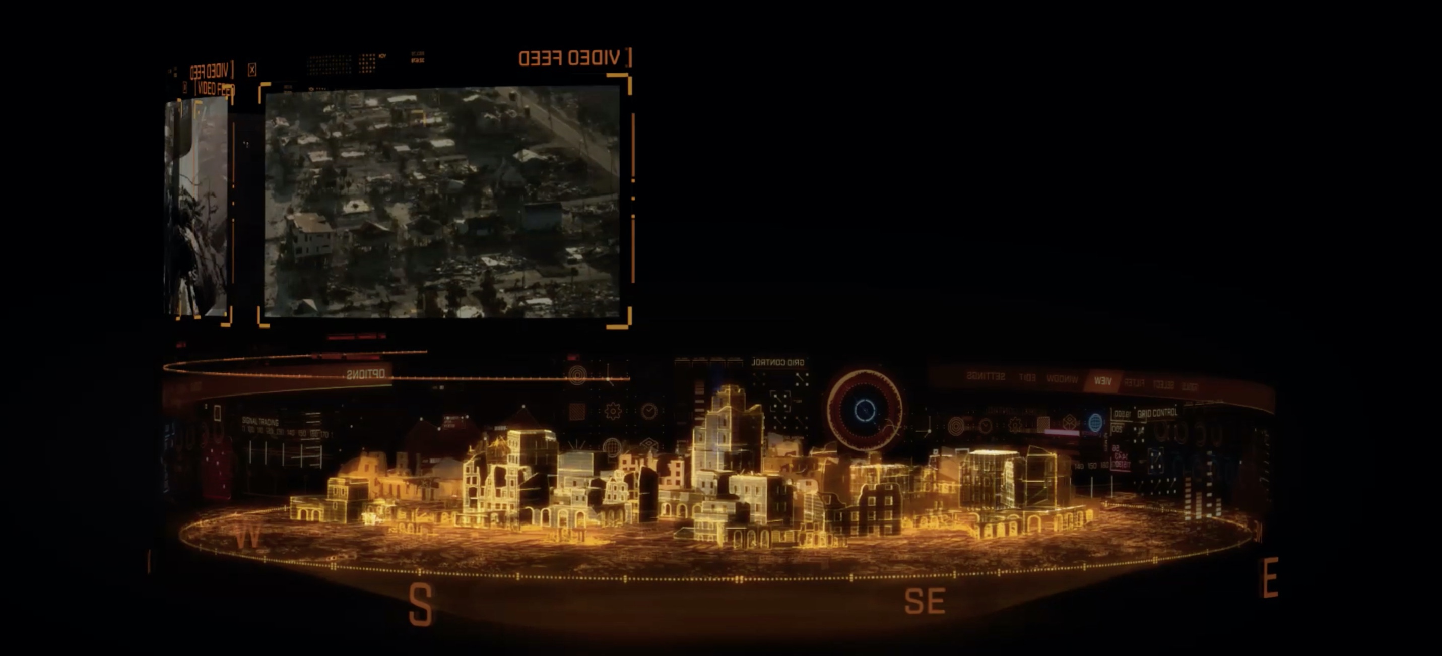
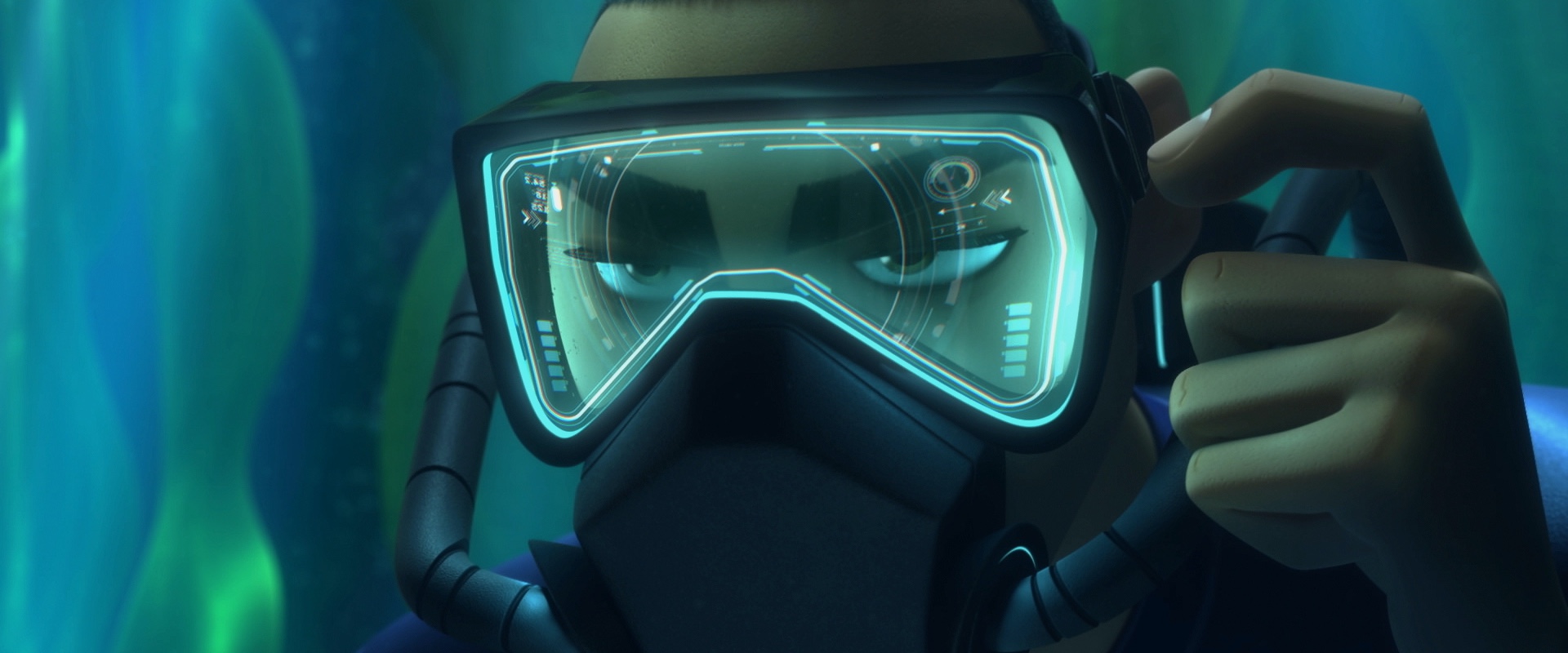
 Screen graphics for "Spies in Disguise", courtesy of John Koltai.
Catching waves – interview with John Koltai
Continuing the series of interviews with designers and artists that bring user interfaces and graphics to the big screens, it’s my pleasure to welcome back John Koltai. The first time we talked was six years ago, as he fielded questions about his work on “Iron Man 2”, “Iron Man 3”, “Robocop” and “The Avengers”. In this second installment John talks about his quest to improve his work-life balance, the meticulous attention to detail that goes into bringing these stories to our screens, the continuing prevalence of holographic elements in live action and animated features, and on finding the right color palettes for his characters. Between these and more, he dives deep into his work on “Spider-Man: Far From Home”, “Thor: Ragnarok” and the recently released “Spies in Disguise”.
Kirill: Since this is not the first time we’re talking, let’s dive right into it. What have you been up to professionally since the last time we talked?
John: Well, the biggest FUI project that I’ve done since we spoke has been “Spies In Disguise” from Blue Sky Studios.
That was pretty significant in that when I take an FUI project, I’m usually hired by a boutique design house that’s hired by the production company. But in this case, Blue Sky reached out to me directly and hired me to essentially be the design company for all of the FUI work.
A lot of times I work on very specific things, like one particular set of gadgets or holograms. There may be a ton of these types of elements in a film and it gets spread across multiple designers and animators. With “Spies in Disguise” I designed and animated every FUI element, so that was quite an undertaking and something I’m really proud of.
Outside of that you, I contributed some designs and animations to the latest Spider-man film, as well as “Thor Ragnarok”.
I do like to break things up and not always do UI design. So I’ve also worked in-house at Showtime branding their original show “Billions”, as well as doing a bunch of Showtime sports promos and designs. Another studio I love working with is Versus NYC, and I did a bunch of short fun explainer animations with them for the NFL on CBS. I also have some very talented friends that run a production company called Human Being and I partnered up with them on a number of their Governors Ball Music Festival recap videos, as well as some videos from the band Turkuaz.
Screen graphics for “Spies in Disguise“, courtesy of John Koltai.
Kirill: Does it leave you time to relax between productions?
John: I try to give myself some time between gigs. The last time we spoke, I was very much in a mindset of grinding and taking on everything. I had a tough time saying “No” to work, so I got a little bit burnt out.
I would say I’ve worked pretty hard on dialing in more of a proper work-life balance now. Right around the time of our last interview I learned how to surf, and that has become a huge part of my life. I feel that it balances the time in front of the box really well.
Kirill: Moving closer to these three features you’ve worked on recently, how does it feel to see months or even a couple of years of work condensed into a 90-120 minute final product? When you talk about what you do with people who are not in your field, how do you convey the complexity and the time scale of it?
John: Well in general I don’t think people outside of the industry really quite understand how much meticulous detail goes into making a movie. And that’s across the board, costume design, cinematography, lighting, script – all of it. I try to always display the work I’ve done on my website, whether it’s styleframes or a process reel, and I think that helps convey the complexity of what I do. And usually it’s the other creatives that understand just how long the time scale of these things are.
Screen graphics for “Spies in Disguise“, courtesy of John Koltai.
Kirill: Was there anything surprising or unexpected for you when you joined “Spies In Disguise”, seen that it is not a live action but rather an animated feature?
John: There’s definitely a ton of overlap in the process, which is good because I came from strictly a live-action background. I would say the number one thing that I didn’t realize with working on an animated feature was that the length of the project is so much longer.
And I think one big reason behind that is because they have the luxury of rewriting a script, reworking scenes, throwing scenes away, changing the narrative throughout the whole process – since they don’t have to worry about a reshoot with someone like Robert Downey Jr who’s getting however many millions of dollars on his productions. There’s a lot less budget connected to the talent, so you can perfect the story in a way that doesn’t happen with live action features.
The other cool thing about working on an animated feature – at least at Blue Sky – is that they have everyone see the rough cuts and be involved with the process along the way. Everyone is able to voice their opinion. I’ve never worked on a film where I had a direct line to the directors and the producers in that way. That was unexpected and quite amazing.
Screen graphics for “Spies in Disguise“, courtesy of John Koltai.
Kirill: Did you feel that you had a bit more freedom to explore the interaction of the characters with technology because it is a world that is more freeform compared to live-action?
John: They had specific ideas on how certain things would work and feel. The fact that it was an animated feature allowed us to do things that you might not do in a live-action world.
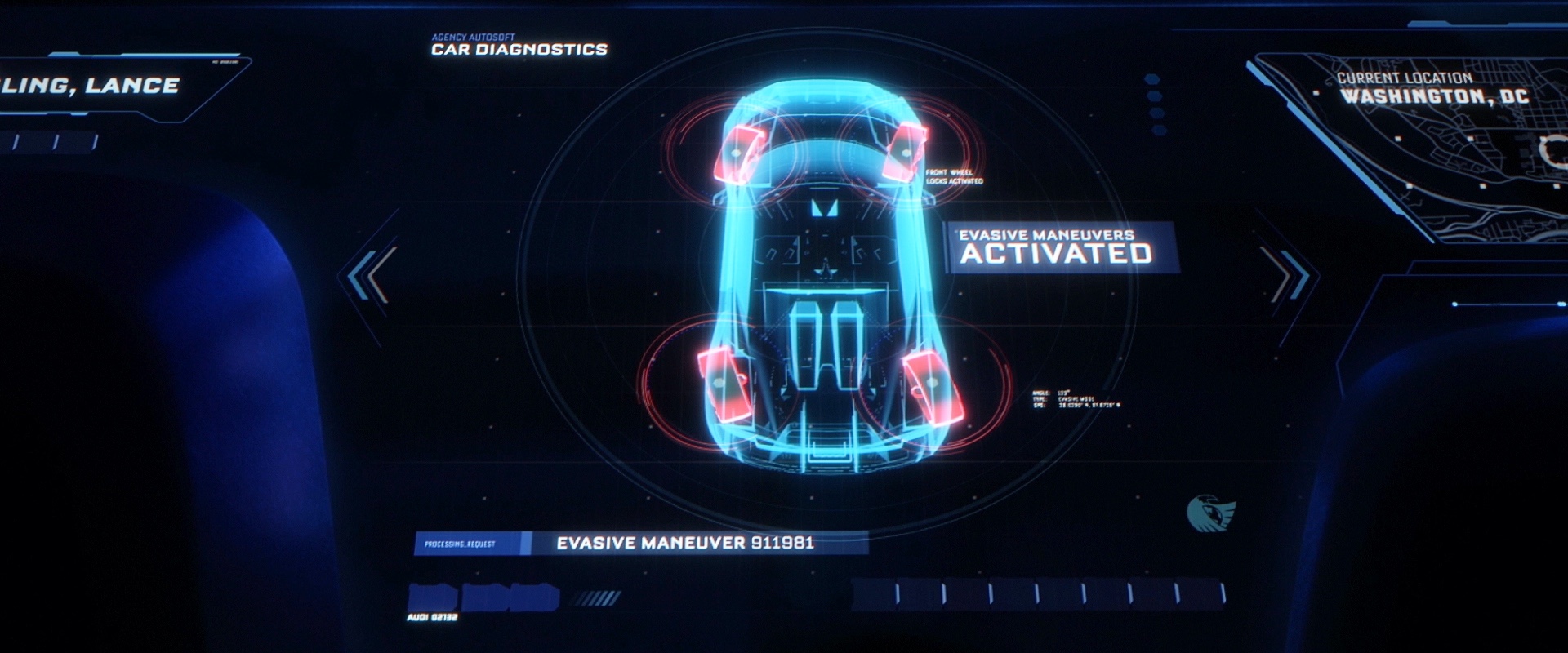
We had more freedom with the choreography of the actors’ movements. There were scenes where Lance interacts with the touchscreen displays in his super-spy car. In a live-action movie, typically the actor will be touching a piece of glass with no real rhyme or reason, and then you have to design the interface around whatever that actor’s motion was the day they shot. But Blue Sky was quite good about letting me create the visual language, define where certain buttons would be, and then it would go into the animation phase and character interactions. It was nice to put a little bit more logic back into some of the interactions, as opposed to designing around random gestures.

Screen graphics for “Spies in Disguise“, courtesy of John Koltai.
Kirill: It’s surprising to hear that an animated movie has more realistic interactions compared to a live-action movie.
John: I wouldn’t say the interactions themselves are more realistic but it certainly allows me as the UI designer to create a more logical structure to the interface.
Kirill: Do you get to play more with colors across all of these different characters?
John: Well if you look at the designs of “Thor Ragnarok”, I would say we really went crazy with the color palettes on those interfaces.
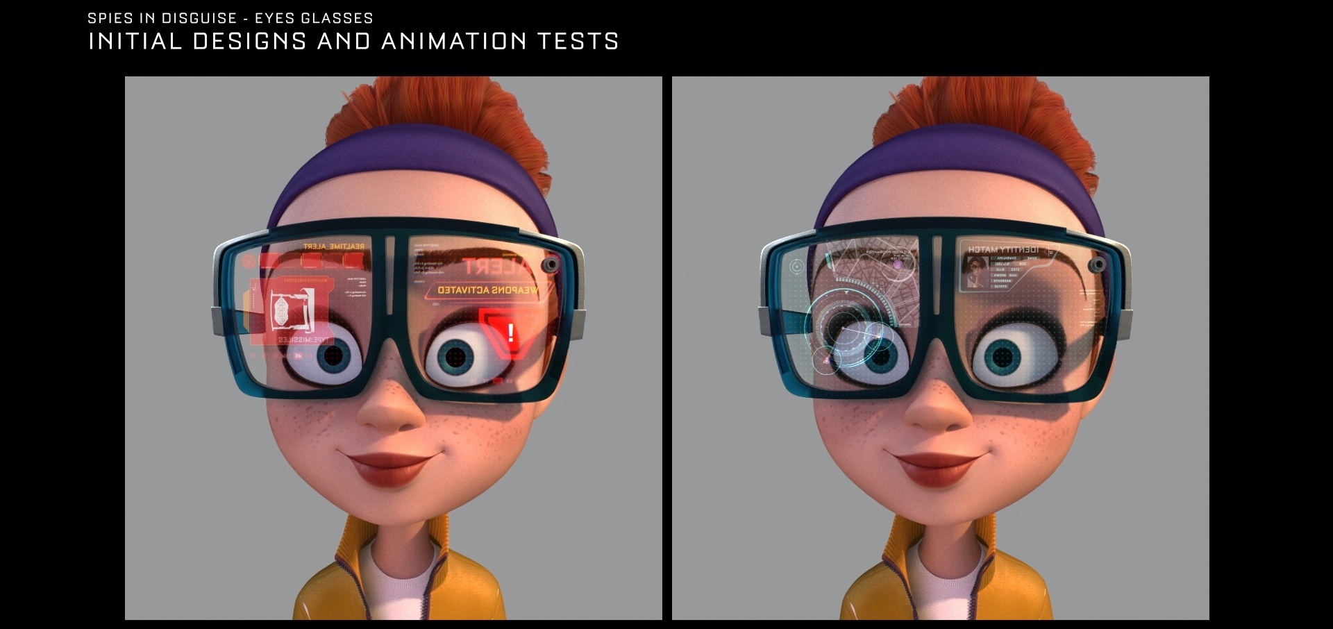
The color palettes in “Spies in Disguise” were definitely specific to certain characters or technology. Each character was designed with identification colors in mind. The UIs that Lance uses were always blue. Killian’s were very red, black and menacing. We took a lighter, more playful color scheme approach with Eyes’ glasses. Those used more cyans and pinks. The idea was to come up with color palettes that represented the vibe of the characters.
Kirill: Who is involved in these discussions?
John: Mainly the directors and the production designer. Those three came up with a lot of the initial concepts. After a briefing I would shoot ideas off of them. It was quite an open, back-and-forth dialogue that allowed a lot of creative freedom on my part. They really encouraged that process.
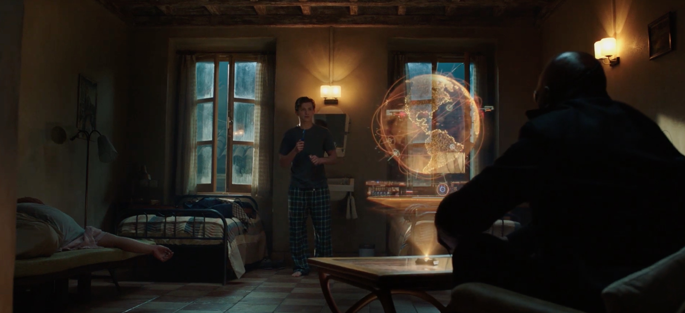
Screen graphics for “Spider-Man: Far From Home“, courtesy of John Koltai.
Kirill: If I look at your work in these three movies, perhaps the common thread is these holographic elements detached from surfaces. Is that a coincidence, or a larger trend in the last few years?
John: That is definitely a huge trend in the Superhero, SciFi and Spy genres. It’s ramped up and become more common now, but it’s been around for years. I can’t tell you how many times I’ve heard “Minority Report” or Iron-Man’s holograms used as references.
Kirill: From a more personal perspective, does it get repetitive to explore the same field, or is the field deep enough to continue finding something new in it?
John: When this stuff first started happening in movies, there was very much a mindset that every hologram had to be blue and the same 3 or 4 typefaces were used.
Lately more directors have realized that we can play with future tech more and the audience will follow. One of the cool things about the Thor film was that the design of the movie and the shape language within it – like the costumes and the crafts featured in the film – were based around the old Jack Kirby illustrations from the original Marvel comics. That coupled with the story being on an alien planet, and it allows you to veer away from some of those traditional typefaces and colors. It allows you to make a shape language that almost felt alien and we had more freedom in terms of lines, angles and colors.
But other times you have a bit of a go-to tool box, a trusty recipe like you might find in your favorite cookbook. The challenge for me is to create something that feels identifiable, that the audience is going feel comfortable with and recognize, but also put a new spin on it. Similar to the way a cook might create something new out of a traditional recipe.
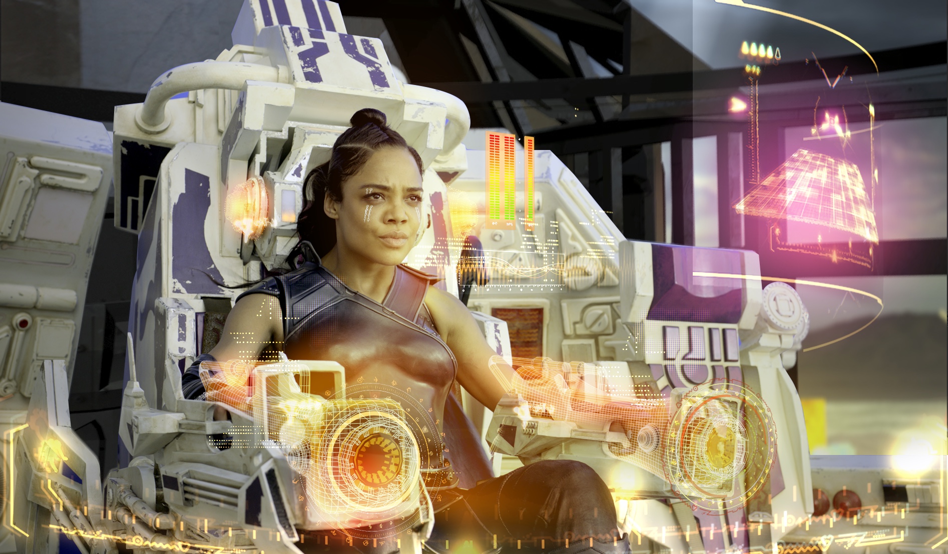
Screen graphics for “Thor: Ragnarok“, courtesy of John Koltai.
Kirill: How was your process on “Thor Ragnarok”? How much of the craft designs did you have access to so that you could design the interfaces and the holograms that matched them?
John: They sent us original plates from the film when they shot it. Those gave us a sense of what the interiors looked like and the basic shape language of the spacecraft. They also sent us the 3D models of the craft, and that helped a lot. We’d pull that into Cinema4D and get a feel of the full craft.
We also were able to get on the phone with the VFX director, and have a few discussions. Similarly to the colors in ‘Spies’ they wanted each spacecraft to reflect a certain feeling or characteristic of the individual who was driving them.
The Commodore which was the Grandmaster’s leisure ship didn’t have any weapons. It wasn’t built for any sort of combat, so it was like a flying party bus. Instead of designing a navigation system that included traditional heads-up displays for battles, we created a navigation system that was more social-based.
In contrast to that, there was a ship called the Torana which was a fast fighter jet. It had a stripped-down, purpose-built HUD. They wanted that to convey an aggressive stance. The UI needed to feel like something a bounty hunter would be using. There was another ship called the Statesmen, that was like a big cruise ship or a big old Cadillac that your grandparents might drive. That was more used for long voyages through deep space, so it needed to have a sensibility that felt more like a cruise ship would. Nautical, almost.
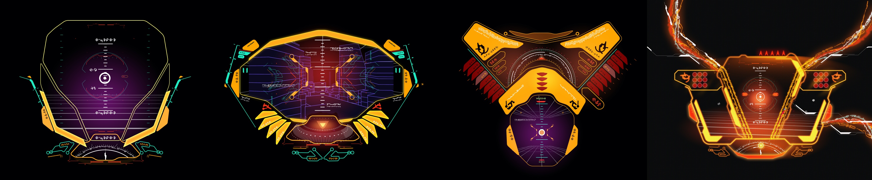
Screen graphics for “Thor: Ragnarok“, courtesy of John Koltai. From left to right, graphics for Commodore, Lambo, Torana and Warsong.
Kirill: There was this big reveal in the middle of Spiderman where Jake Gyllenhaal’s character is revealed to be not quite who he appeared to be before. Is it sometimes a bit disappointing to know these plot details and not be able to enjoy the movie when you see it in the theater?
John: For sure. It’s almost to a point where I can’t tell whether a movie is actually good or not [laughs] because I’ve seen so much of it. I’ve seen the movies I’ve worked on in so many different shapes, stages and forms that it really does take away from the movie going experience.
But it’s a small price to pay for working in this field. I feel really lucky to be a part of the movie making process, and I am proud to be doing this type of work.

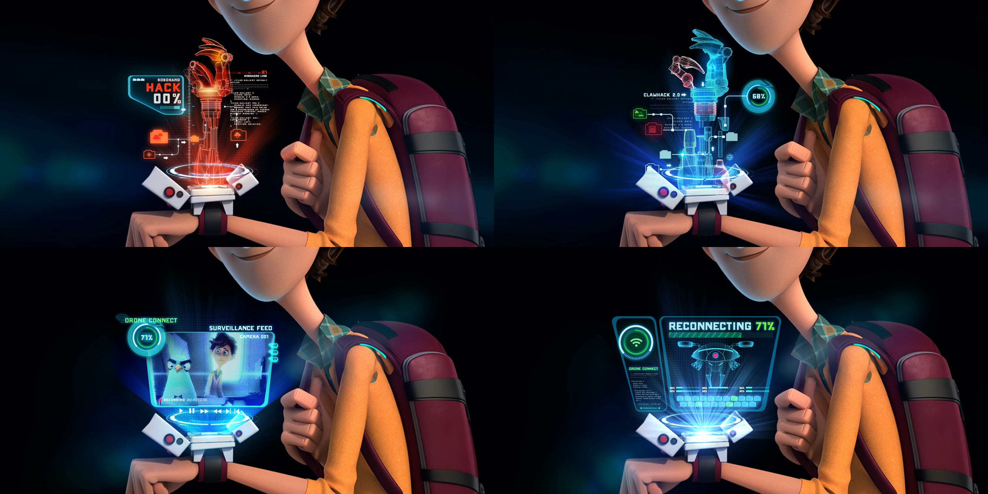
Screen graphics for “Spider-Man: Far From Home“, courtesy of John Koltai.
Kirill: What was your overall involvement with “Spider-Man: Far From Home”?
John: I was actually only on it for a short period of time. There was a break in the production of “Spies In Disguise” and I had about two weeks where I wasn’t working on anything, so it lined up perfectly for me to go back to Perception and work on the Spider-man stuff.
The first week there, I handled animation of pre-approved design elements. I animated Mysterio’s helmet HUD, as well some screens in the final Elemental fight sequence.
My second week was spent doing concept designs for the Nick Fury holograms. As he tracks down Peter in Italy, he uses a portable hologram projector to illustrate the scale of the impending danger of the Elementals. That required a little bit more creativity and mindfulness. The concept design for that was tactical, but also had a spy gear type of style to it. I used a lot of point cloud and LIDAR scan visuals in designing those.
In the end it was a quick one, but I was lucky to be able to get in there and do what I did while I had that break from ‘Spies’. I started my career at Perception too, so I always enjoy going back and working with the crew there.
Screen graphics for “Spider-Man: Far From Home“, courtesy of John Koltai.
Kirill: When you look at these three movies, and perhaps your earlier FUI work in film, is there any made-up technology from there that you would love to have in your daily life?
John: I’m an avid surfer, so it would be cool if there was a pair of glasses I could wear in the water, and see when a nice set wave would be coming through. I’d know exactly where to sit to catch that wave before everybody else [laughs]. Off the top of my head thats the thing I would totally love to have if the technology existed.
Kirill: When you look at your older productions, something that you worked on 6-8 years ago, what stays with you? Do you remember the bad parts, something like rushed schedules or last minute changes? Do you have a rosy filter that makes everything look better than it was?
John: Well I’m definitely my own worst critic. Although my goal is always to be 100% satisfied with the work I’ve done, there always seems to be a shot or element I’m not completely happy with. I think the perfectionist in me is never fully satisfied. Which can be both healthy and destructive, but I try my best to make it a positive trait in my creative process.
Also, when I see certain shots I do think of things like last minute changes, a creative battle that was won or lost, or late nights that might have been put in. There’s also quite a few movies that I include my own personal “easter eggs”. Things like my name, initials, or names of friends, or important dates. On “Captain America: Winter Solider” we were able to work in a few photos of us!

Screen graphics for “Spies in Disguise“, courtesy of John Koltai.
Kirill: Do you have a definition of what success is for you? Do you look at critical or audience reviews, at the box office numbers, or at something else entirely?
John: Of course you want the projects that you work on to be well-received, and for critics and for the audiences to like them. But at the end of the day if I do something that I’m personally happy with, that’s more important to me than anything else.
In the bigger scheme of things, in terms of success, when I was younger, I strove to be the best UI designer in the industry. I wanted to give the talks at the design conferences and to win the awards. All that is nice and those are meaningful things to strive for, but there’s so much more to life than that.
If that other stuff happens, that’s great. But don’t kill yourself working away your youth or working on projects you don’t find personally significant or fulfilling. And Don’t deny yourself all the other aspects of life to achieve “success”.
I feel like I’ve done a much better job of figuring out how to make this career be a thing that I’m happy about without it necessarily consuming my entire life. Things like my friendships, my family, traveling – all that goes into what it means to be successful.
Screen graphics for “Spies in Disguise“, courtesy of John Koltai.
Screen graphics for “Spies in Disguise“, courtesy of John Koltai.
Kirill: What’s next for you?
John: Well I’ve been taking some time off after “Spies In Disguise” and I’ve been surfing up and down the coast of California for the last few weeks. I wasn’t exactly sure what my next freelance project would be but the other day I was offered (and accepted) the role of Freelance Art Director on the Netflix show “Patriot Act with Hasan Minhaj”.
I’ve always been passionate about politics, and I’m a big fan of Hasan Minhaj, so needless to say I’m ecstatic about the job. I’m super excited and thankful to be able to contribute to a show that’s so educational and informative in such an important time in American politics.
For people who don’t know the show, it’s pretty much just Hasan surrounded by these giant screens. Think TED Talks meets Michael Bay. It’s a cool opportunity to help inform the show and complement Hasan’s commentary for each episode.
Kirill: Certainly from the episodes that I’ve watched on Youtube, his show is quite different from John Oliver, Stephen Colbert or Trevor Noah. Their political commentary sections have a bit of supporting graphics, but those are more of an afterthought. What I loved about “Patriot Act” is how visually immersive and rich those graphics are, and how central of a role they play in the environment that surrounds him.
John: Exactly! You said it better than me [laughs]. A lot of these shows have a talking head with a box over the talents shoulder. But this one is a fully immersive, and at times an interactive environment. It’s a great opportunity to be a part of something that hasn’t been done before.

Screen graphics for “Spies in Disguise“, courtesy of John Koltai.
And here I’d like to thank John Koltai for another opportunity to talk about the art and craft of screen graphics, and for sharing the supporting materials for the interview. You can find more of John’s work at his portfolio. John’s latest work can be seen in “Spies in Disguise” which is available on a variety of digital platforms, as well as in the traditional physical formats. And if you’re interested to read additional interviews about the wonderful world of screen graphics and user interfaces for film and TV, click here for more.
