Responsive mobile design on Android: from view pager to action bar tabs
The basic principles of responsive mobile design are guiding our work on enhancing and refining support in Android Market / Google Play Store for a variety of device sizes and configurations. The “deep dive” series that ran on this blog in November 2011 was based on this work, providing a detailed description of the underlying concepts and technical implementation as presented at AnDevCon II conference (slides can be found here). The new tabbed look for “My Apps” in Google Play Store 3.5 has a new pattern that we’ve started exploring – click for the full size version.
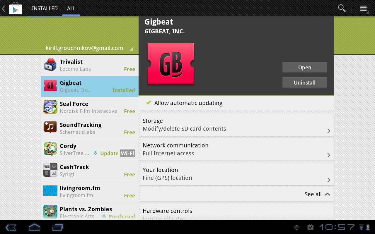
On small devices where we use a single-column layout, we use the ViewPager class for consistent appearance and behavior. However, when the device is big enough to display the master-details view in two columns, swiping sideways between the tabs is awkward. If the pager strip extends across both columns, it is very sparse and takes extra vertical space. If the pager strip is only on the first column, the transition in the right column (to the new selection) is not well defined. In addition, having the pager strip not span the entire width of the device, and having it not aligned below the action bar is a little weird.
Instead, we display the tabs in the action bar itself (check ActionBar.Tab and ActionBar.TabListener). Since we switch to the two-column layout when we have at least 800dp in width – with the -w800dp resource qualifier – we’re not going to run out of horizontal space to display the tab titles. This way we save the extra vertical space for the main content, and do not require wide swipes to switch between the tabs.
This redesign of “My Apps” page joins the recent redesign of item details pages, as we continue refining and polishing the application across the entire gamut of supported devices. Stay tuned for more in the coming months.
