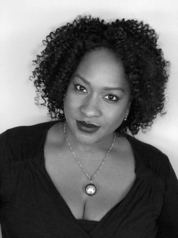
Continuing the ongoing series of interviews with creative artists working on various aspects of movie and TV productions, it is my pleasure to welcome Etzel Ecleston. In this interview she talks about the art and craft of makeup, and her work on “Archive 81”.
 Kirill: Please tell us about yourself.
Etzel: My name is Etzel Ecleston, and I was one of the Department Heads on “Archive 81”. It was brought to my attention that a Key Makeup Artist’ position was available due to the initial Makeup Department Head moving on to another project. I was referred to the project by fellow colleagues as they knew this is the type of makeup genre that I truly enjoy. It has action, suspense and it has special effects as well.
While filming the last couple of episodes, an opportunity came up where I was promoted to Makeup Department Head.
Kirill: And stepping back a little bit towards the beginning of your career, what brought you into the field of makeup, and more specifically into doing makeup for visual storytelling?
Etzel: I started out at the MAC cosmetics counter as a makeup artist, and there I fell in love with being able to change someone’s emotions if they were feeling down prior to doing their makeup. That was a good practice to speak to people and to have a multitude of people in one’s makeup chair.
After 2-3 years I found that as I was binge watching movies, and I was sitting all the way through the end credits to see who did the makeup. A lot of people like myself watch Marvel movies and stay for the post-credit scenes, but I was also doing that to see the makeup department credits. I wanted to be a part of the entertainment industry, and I became involved in independent films. I joined the makeup union, which opened the doors to meet amazing people within the entertainment industry, and to get referred for amazing projects that I have been blessed to be working on.
Kirill: As you joined the industry and saw the behind-the-scene making of the movie magic, has it reduced in any way your enjoyment as a viewer?
Etzel: I like being able to see how things are broken down. I love contributing to these stories, and I love being able to see how a story comes together. There is no disappointment or loss of enjoyment in seeing how that magic is made. I love being a part of this collaborative effort.
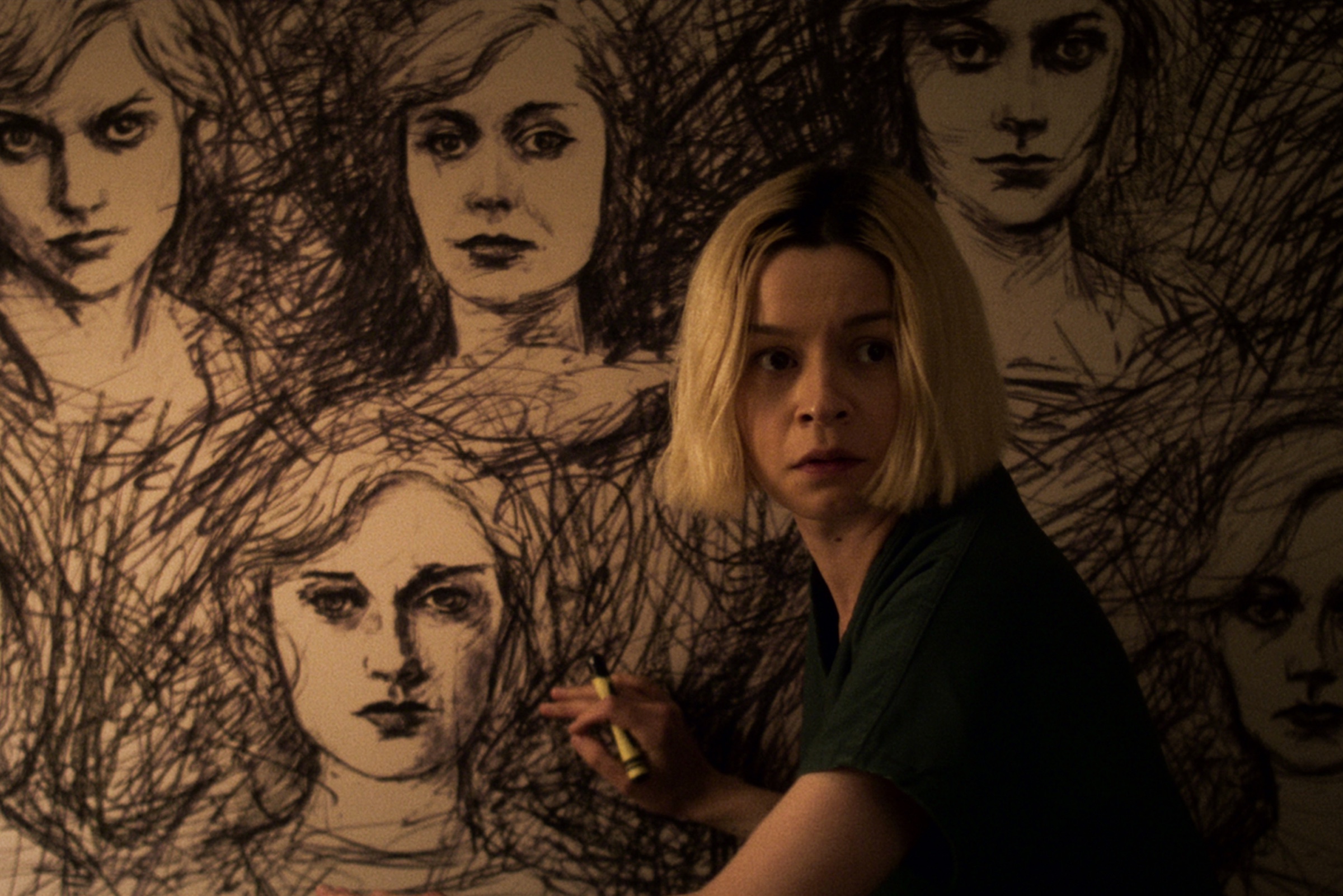
Julia Chan as Anabelle Cho in episode 108 of “Archive 81”. Courtesy Netflix.
Kirill: Our home screens keep on getting bigger and higher resolution. Do you find that you need to do more, or maybe do things a bit differently as both digital cameras and our screens are getting that much more detailed?
Etzel: It definitely depends on what the character calls for. Certain executive producers and directors don’t like seeing a lot of makeup on the actors for specific scenes of the characters being portrayed. As a makeup department head, you have to remember what the director is asking for, and sometimes have to compromise remembering the cameras have much higher resolutions.
On “Archive 81” we have Melody Pendras placed in 1994, and her makeup was designed with the idea that she is a graduate student who doesn’t have a lot of money, but who still wants to look presentable. Then, that drives the choice of specific products on her face that would also look historically correct. Generally, it’s about what the character is calling for.
Kirill: Do you find that natural look is something that people assume is easier to do compared with more elaborate period makeup?
Etzel: Sometimes it is perceived that way by people who are not in the entertainment industry or are not makeup artists. In my opinion, it is not quite so. We have higher resolutions, such as 4K, and sometimes you do have to do a little bit more work for the person to look completely “natural” and the products that you use have a big influence on that.
Continue reading »
Earlier in the Compose Desktop / Skia explorations:
Today, it’s time to take a look at how to leverage Skia to draw texts on paths:
Android’s Canvas class comes with a few API variants of drawing texts on paths, and those APIs are available to use in your Compose code running on Android via Compose’s Canvas.nativeCanvas. At the present moment, there is no such API available in Compose Desktop, and this article introduces just such the functionality for you to play with.
If you’re not interested in the particular details, you can head straight to the full implementation. Otherwise, let’s dive in.
First, the overall approach is going to be:
- Get the text metrics (details on the width and horizontal position of each glyph within the text)
- Get the path metrics for mapping each glyph to its position along the path
- Get the position of each glyph on the path
- Get the tangent of the path at that position to determine the glyph’s rotation
- Create a combined translation + rotation matrix for each glyph
- Create a combined text blob that contains position and rotation of all the glyphs
- [Optional] Draw the shadow for that text blob
- Draw that text blob
Now, let’s take a look at each step. We start with getting the text metrics. Note that at the present moment, there is no public bridge API that can convert Compose’s TextStyle into Skia’s Typeface or Font, so in the meanwhile we use the default typeface.
val skiaFont = Font(Typeface.makeDefault())
skiaFont.size = textSize.toPx()

// Get string glyphs, and compute the width and position of each glyph in the string
val glyphs = skiaFont.getStringGlyphs(text)
val glyphWidths = skiaFont.getWidths(glyphs)
val glyphPositions = skiaFont.getPositions(glyphs, Point(x = offset.x, y = offset.y))
Here, we’re using Skia’s Font APIs to get detailed metrics about each glyph – how wide it needs to be, and where it needs to be positioned (horizontally and vertically) if drawn along a straight line accounting for the specified offset.
Next, we’re getting the path metrics:
val pathMeasure = PathMeasure(path.asSkiaPath())
Next, we determine the start position of our text along the path based on the path pixel length, the text pixel length (based on the position and the width of the last glyph) and the requested text alignment. Note that here we do not support RTL or mixed direction texts.
val pathMeasure = PathMeasure(path.asSkiaPath())
// How long (in pixels) is our path
val pathPixelLength = pathMeasure.length
// How long (in pixels) is our text
val textPixelLength = glyphPositions[glyphs.size - 1].x + glyphWidths[glyphs.size - 1]
// Where do we start to draw the first glyph along the path based on the requested
// text alignment
val textStartOffset = when (textAlign) {
    TextAlign.Left, TextAlign.Start -> glyphPositions[0].x
    TextAlign.Right, TextAlign.End -> pathPixelLength - textPixelLength + glyphPositions[0].x
    else -> (pathPixelLength - textPixelLength) / 2.0f + glyphPositions[0].x
}
Now it’s time to start looking at each glyph to determine its position along the path, as well as how much it needs to be rotated to “follow” the curvature of the path at that particular position. Also, we need to decide what to do with the glyphs that do not fit into the path’s span. While it might be tempting to extrapolate the path beyond its starting and ending point, in this implementation we take a “safer” route and do not display glyphs that cannot fit.
First, we start with a couple of lists to keep track of visible glyphs and their matching transformation matrices, and start iterating over glyphs:
val visibleGlyphs = arrayListOf()
val visibleGlyphTransforms = arrayListOf()

// Go over each glyph in the string
for (index in glyphs.indices) {
    ...
}
Each glyph needs to be positioned along the path and rotated to match the curvature of the path at that position. Depending on the “nature” of the path, we are going to have more or less space between neighboring glyphs. For example, if you draw text along the outside of a tight curve, there’s going to be more space between the glyphs. On the other hand, if you draw the same text along the inside of the same curve, the glyphs are going to get crowded or might even start overlapping. There’s not much we can really do about that without morphing each glyph, which goes well beyond the scope of this article.
The simplest thing we can do here is to take the mid-horizontal point of the specific glyph, determine its position along the path and use that to cut off those glyphs that do not fit into the path’s span:
val glyphStartOffset = glyphPositions[index]
val glyphWidth = glyphWidths[index]
// We're going to be rotating each glyph around its mid-horizontal point
val glyphMidPointOffset = textStartOffset + glyphStartOffset.x + glyphWidth / 2.0f
// There's no good solution for drawing glyphs that overflow at one of the ends of
// the path (if the path is not long enough to position all the glyphs). Here we drop
// (clip) the leading and the trailing glyphs
if ((glyphMidPointOffset >= 0.0f) && (glyphMidPointOffset < pathPixelLength)) {
   ...
}
Now that we know that our glyph fits in the path, we ask the path measure to give us two things:
- The (x, y) point that matched the glyph’s mid-horizontal point along the path.
- The tangent of the path at that point.
// Where are we on our path?
val glyphMidPointOnPath = pathMeasure.getPosition(glyphMidPointOffset)!!
// And where is our path tangent pointing? (Needed for rotating the glyph)
val glyphMidPointTangent = pathMeasure.getTangent(glyphMidPointOffset)!!
With these two pieces, we can now compute the translation components of our matrix for this glyph:
var translationX = glyphMidPointOnPath.x
var translationY = glyphMidPointOnPath.y

// Horizontal offset based on the tangent
translationX -= glyphMidPointTangent.x * glyphWidth / 2.0f
translationY -= glyphMidPointTangent.y * glyphWidth / 2.0f

// Vertically offset based on the normal vector
// [-glyphMidPointTangent.y, glyphMidPointTangent.x]
val glyphY = glyphPositions[index].y
translationX -= glyphY * glyphMidPointTangent.y
translationY += glyphY * glyphMidPointTangent.x
And add the glyph itself, as well as its full rotation + translation matrix to our lists:
// Compute the combined rotation-scale transformation matrix to be applied on
// the current glyph
visibleGlyphTransforms.add(
    RSXform(
        scos = glyphMidPointTangent.x,
        ssin = glyphMidPointTangent.y,
        tx = translationX,
        ty = translationY
    )
)
visibleGlyphs.add(glyphs[index])
Now we’re ready to use the TextBlobBuilder API to create a single text run with the information on all the glyphs that fit along the path and their matrices:
// Create a single text run with all visible glyphs and their transformation matrices
val textBlobBuilder = TextBlobBuilder()
textBlobBuilder.appendRunRSXform(
    font = skiaFont,
    glyphs = visibleGlyphs.toShortArray(),
    xform = visibleGlyphTransforms.toArray(emptyArray())
)
val textBlob = textBlobBuilder.build()!!
Now we’re ready to draw the optional shadow
if (shadow != null) {
    nativeCanvas.drawTextBlob(
        blob = textBlob,
        x = shadow.offset.x,
        y = shadow.offset.y,
        paint = org.jetbrains.skia.Paint().also { skiaPaint ->
            skiaPaint.color4f = Color4f(
                r = shadow.color.red,
                g = shadow.color.green,
                b = shadow.color.blue,
                a = shadow.color.alpha
            )
            skiaPaint.maskFilter =
                MaskFilter.makeBlur(FilterBlurMode.OUTER, shadow.blurRadius)
        }
    )
}
And finally draw the text itself:
nativeCanvas.drawTextBlob(
    blob = textBlob,
    x = 0.0f, y = 0.0f,
    paint = paint.asFrameworkPaint()
)
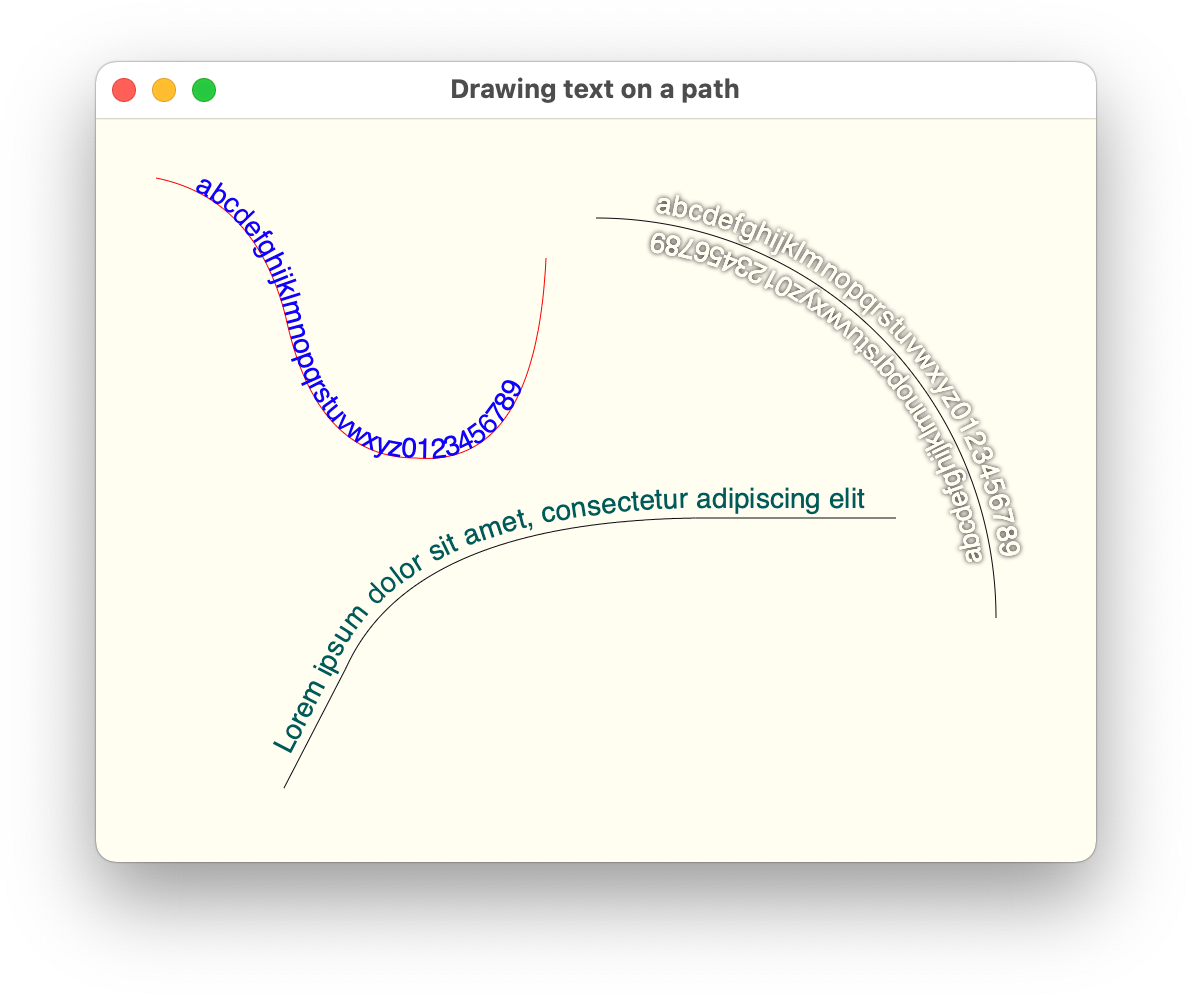
Let’s take another look at how our texts look like:
Here we have a few sample paths (each path is drawn for the sake of completeness) and texts that are drawn along their contours with and without drop shadows.
Now we can use this in a bigger example that loads daily visits data to a specific Wikipedia page (either remotely with Retrofit and Moshi, or from a local JSON file), and then displays that data as a seasonal spiral based on the visuals from this article:
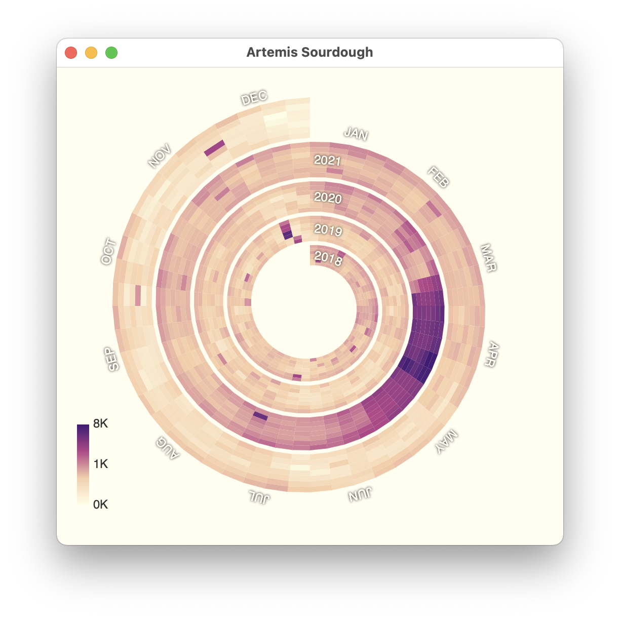
The full code for this chart can be found over here.
This is it for this installment. Stay tuned for more explorations of Skia in Compose Desktop as the year progresses.
I’ve been marinating in the world of Swing for about 17 years now, and one thing that I will say for certain is that trying to achieve native fidelity (not even the feel, but just the look of components) is a herculean task that requires constant work.
Swing engineers tried to do that at some point by delegating all the rendering to native APIs. That worked to some extent. But not the animations – since these controls were not native ones. And over the years the gap between the visuals of Swing controls under that cobbled-together house of cards and the real native controls keeps on growing larger and larger, as Microsoft keeps on tweaking and changing what native look and feel is.
The same goes for macOS – every release changes things for individual controls, as well as the overall structure of the window and the content in it. Even if somehow you managed to get aligned with the absolute latest macOS visuals (including light/dark and accent automatically respecting the user setting), if you don’t do a window layout that matches the platform guidelines, you’re still off.
And again, every year, every major platform changes things. So whoever it is that provides the UI kit that aims for native fidelity, needs to make a hard decision. Do they follow the latest native look and keep on switching to the latest native APIs (effectively abandoning the older versions of those platforms), or do they create a monstrosity of backwards compatibility, that eventually requires so much testing and hand-holding, that it collapses under its own weight?
And of course, the moment that person / organization stop maintaining that library is the moment it simply stops working on new versions of those major desktop OSes. That’s a hard guarantee.
If anything, the beautiful thing about the web expansion in the last 6-8 years is that it has shown that the end users simply do not care about native fidelity en masse. Sure, there is a small, dedicated, vocal cohort of die-hard aficionados that are willing to die on that hill, but the 99.9999% of users do not care. They want to get their thing done, and move on.
Continuing the ongoing series of interviews with creative artists working on various aspects of movie and TV productions, it is my pleasure to welcome Martim Vian. In this interview he talks about the art and craft of cinematography, the transition of the industry from film to digital, his love of storytelling, and the impact of the ongoing pandemic on his industry. Around these topics and more, Martim dives deep into his work on “Voir”, a series of visual essays celebrating cinema.
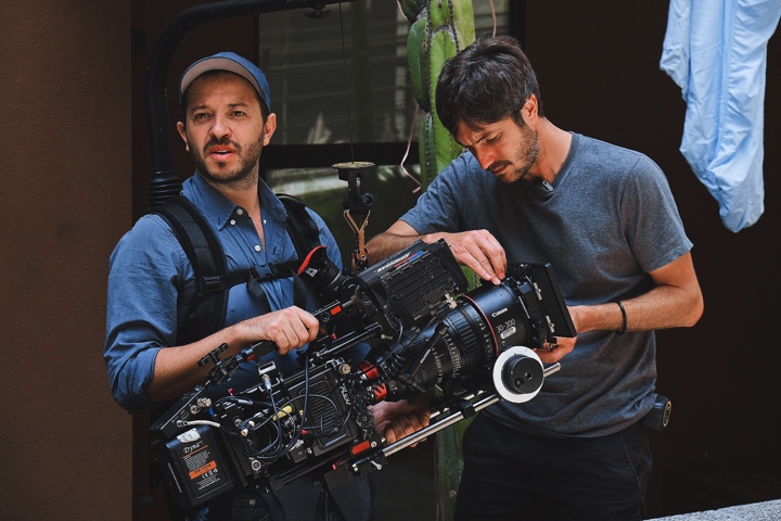
Martim Vian (left) on set.
Kirill: Please tell us about yourself and why you wanted to be a part of this field.
Martim: I grew up in Lisbon, Portugal and I have wanted to make movies since I was a kid. I used to say that I wanted to be an animator for Walt Disney because those movies moved me and I wanted to be a part of that process.
As I grew up, that evolved. The movies I was watching started to change, and we started getting these little behind-the-scenes featurettes of big Hollywood productions on cable TV in Portugal. I would record them on VHS and rewind back to whenever the lights or the cameras were in shot because I was fascinated by how it was all done and why they looked so different from the things I could do at home with my Hi8 camera. My interest was shifting into the technical side of filmmaking before I even knew that there was a job called the cinematographer.
As I got older, this dream of being a filmmaker started becoming a little more real, and I enrolled in the National Film School in Portugal. One of the disciplines you could pick was cinematography, so I did. What I loved about it was the marriage between the artistic side of it – the ideas, the storytelling – and the craft – having to be in command of the tools to do it. And that blend really fits the way my brain works. So, that’s how I got into the field of cinematography.
Kirill: Now that you’re in the industry and you know how it works on the inside, does it diminish your enjoyment when you watch a story in a movie theater as that audience member?
Martim: A good movie or a good TV episode will always transport you into the story and the characters. The cinematography is something that I’m obviously particularly interested in when I watch something, but there are movies that I finish and realize I didn’t pay any attention to how it was made – and that’s a good sign. It means the movie transported me to where it needed to.
At the same time, a lot of what brought me into movies and that interest in the technical side makes me particularly interested in this side of filmmaking. So it’s a mix.
There are moments, especially with streaming, where I might rewind something because I want to understand how they did it. That’s where your job kicks in and you become aware of something that’s being done. This happens in a way that I don’t think would if I was a regular viewer, but a good project will always supersede that. And those are the movies that I really enjoy watching, because first and foremost I’m a film lover.
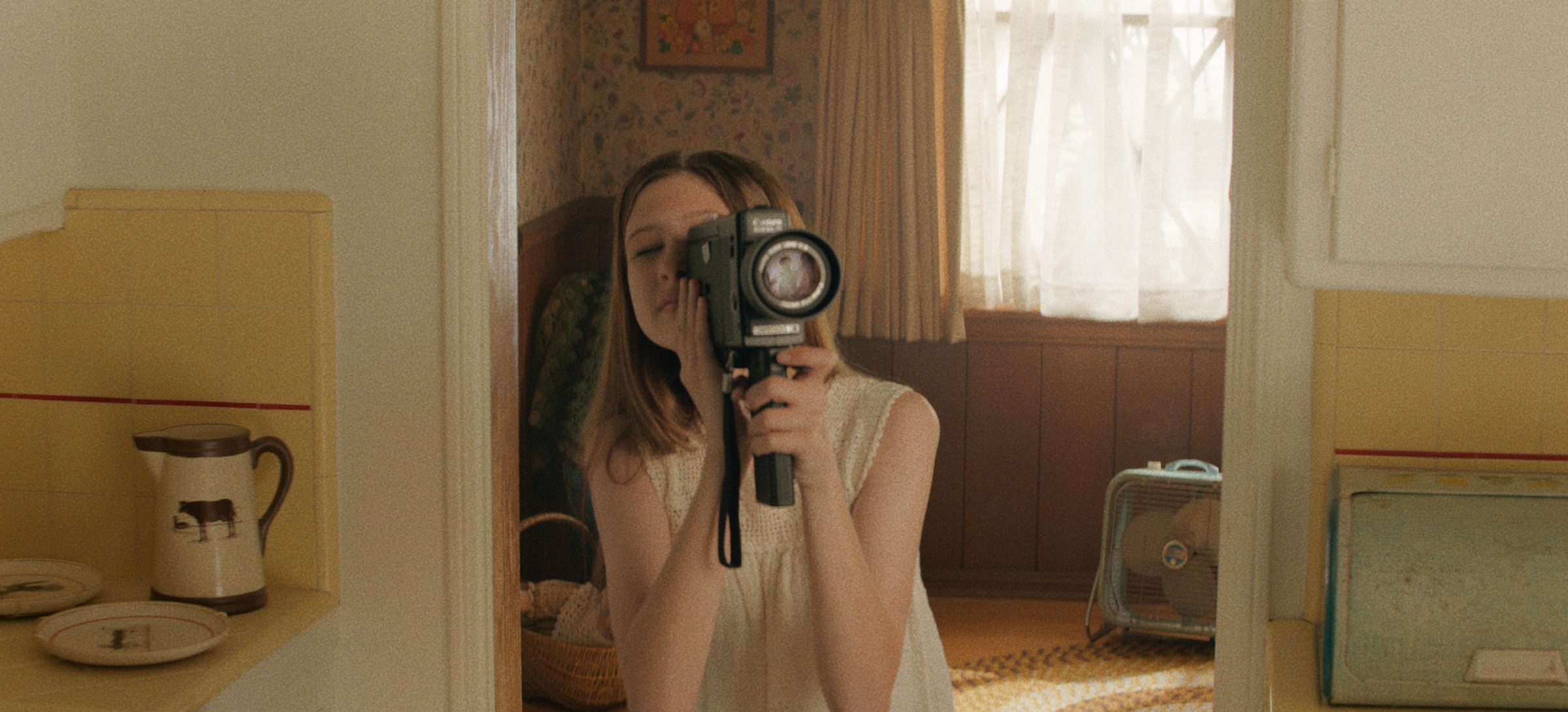
Cinematography of “Voir” by Martim Vian. Courtesy of Netflix.
Kirill: Where do you fall on this spectrum between film and digital as the medium? Would you consider yourself a fully digital citizen of your industry?
Martim: I shoot mostly in digital these days. And most of my professional career as a cinematographer has been digital. I was lucky to work on film in my years in Portugal, both as a student as well as a camera assistant – which I did for five years. So I was lucky to have that experience with film before moving into the digital world.
Digital is in many ways easier to use, and it’s more economical as well. And honestly, most projects simply aren’t able to afford film these days. I love both formats. They both have a place in filmmaking. I don’t think the format has to determine the quality of a movie or series in any way.
I also think they’re just tools. The important thing is to tell a story, to create characters, to move the audience. There was a debate of film versus digital a few years ago, but now I see them as two tools. You pick between two sets of lenses, you pick between different ways you can light a scene, the same way you can pick between film and digital. They’re tools in the box.
And cinematographers, directors, and producers are there to decide where to allocate their resources, where to invest their time and budget, all to better serve the story.
Kirill: Going back to what you said that you love being at this intersection of art and technology, do you place more importance on one of them, or is it a balance between the two?
Martim: It is a balance, but in the end, the technical side needs to be there to serve the artistic side. I have a technical brain, so I enjoy that side a lot, but anything you do at the technical level should serve a purpose for the story. You don’t want your choices to ever feel gratuitous. As far as how they compare to each other, it varies. It varies from moment to moment, from project to project, and from DP to DP.
On one hand the technical side is more quantitative. It’s easier to talk about, to address, to learn, to teach, because it’s math and physics. It’s these things that you can describe to other people. I want a light at this height, at this distance, with this quality – they’re physical characteristics. But the other side of filmmaking is much harder to define and to communicate. It’s also the one that creates a reaction in people.
It’s a balancing act, and the balance itself shifts depending on where you are. Even within the same project there might be a scene where you want to create a space for the actors to perform and not be bogged down by the technical side of filmmaking, so you might design that scene in a way that is technically less complex. You might put all the lights outside the set, for example, so that they can move around freely in that space. And then in the same movie you might have a fight sequence, and those are usually done by shooting little bits of action that only work from a specific angle, and then come together in the edit to make it feel like this thing is happening in sequence when it really isn’t. So, with a scene like that you have to be technical. I find that it depends on the movie, or the scene or the people you’re working with, and what you are trying to achieve. One requires the other. You always need both. It’s just a matter of which one you lean on at that particular moment.
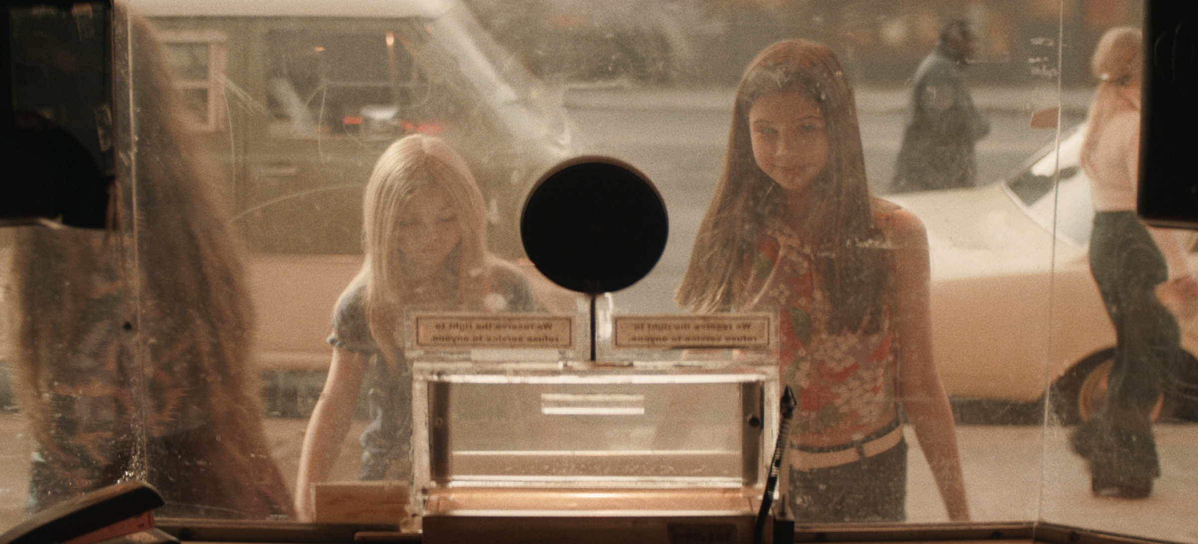
Cinematography of “Voir” by Martim Vian. Courtesy of Netflix.
Continue reading »
