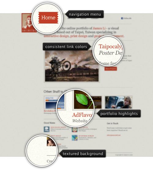
Today’s post highlights the design of Infinitum, the online portfolio of James Li – who designed and developed AdFlavor.net featured in the very first post of the “Design, uninterrupted” series. Infinitum uses a simple color scheme which can be found on a number of other portfolio sites – dark gray foreground on off-white background with consistent use of dark orange for headers and links. The main page features few of the portfolio highlights, leaving enough white space around the elements to prevent overcrowding of the content. The navigation menu and section headers use a custom font which can benefit from better pixel grid alignment to prevent blurriness around vertical stems. The footer section is a slightly odd duck here – while it does not have any background differentiation from the rest of the page, it breaks the main column grid and uses different separators around it.

Today’s post highlights the design of TheHouseMedia.com. A dark and slightly textured background is offset with a vibrant color palette of header and footer that extends the main logo into the site design. Note how the navigation menu grows from the header illustration and is further accented by the separator lines that blend with the illustration as well. The navigation menu, section headers and the main copyright text use a custom font and manual kerning; due to the current limitations of browser font engines the site uses images instead of plain text. Beveled separators blend well into the dark background, and the main content is grid aligned across the sections – except the second column of “what we can do” that aims to create a tighter text section. To bring the final polishing touch, the design adds background highlights around the logo, below the portfolio slider and around the contact form.

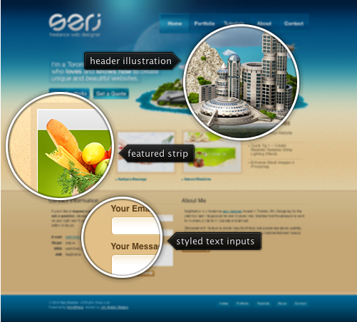
Today’s post highlights the design of serj.ca, the personal portfolio site of Serj Kozlov. The strong saturated blues of the header and footer are offset by an exquisitely intricate header illustration, translucent overlays of the navigation controls and smooth slightly textured gradient transition to the main content area. Leaving plenty of white space around the text sections, the design has a strong grid layout that aligns the portfolio thumbnails with the contact / info sections below them. The footer section uses the same color palette as the header, completing the two-color palette used on site, including the separators and the links.
The latest 5.0dev drop of the Flamingo library (code-named Imogene) provides full right-to-left (RTL) support for the ribbon component and all its parts. Here are some screenshots of the ribbon running under iw-IL locale using the Office Blue 2007 skin from Substance core and Substance Flamingo plugin.
The first screenshot shows the full RTL ribbon in action – click to see fullsize view:

You can associate rich tooltips with buttons in ribbon bands. The tooltips are shown below the main ribbon area, right aligned with the original button:

Command buttons placed in the ribbon can have associated simple popup menu:

The popup menu can also host a command button panel, with each button having its own rich tooltip:

The screenshots above show an embedded ribbon gallery (in the middle ribbon band). A ribbon gallery can be expanded to show all the available gallery choices:

The ribbon usually hosts command controls – such as command buttons or ribbon galleries, which themselves contain command buttons. However, you can also put any core Swing component into the ribbon:

Note that you can associate an optional icon and an optional caption text with the wrapped core component.
The application menu button is shown in the top-right corner. Internally it is a command button as well, and you can associate a rich tooltip with it:

Clicking on the application menu button shows a three-panel application menu:

You can associate a custom secondary menu group with the specific primary menu entry:

The secondary menu group can have multiple menu sections:

You can have more than two levels in the application menu by associating a custom popup callback with the relevant secondary menu entries:

Contextual task groups can be shown and hidden based on the current selection in the application. The contextual task group headers are shown in the application title bar:

You can place frequently use controls in the ribbon taskbar. Command buttons in the taskbar can have rich tooltips. These tooltips are shown directly below the button and are right-aligned:

Command buttons in the ribbon taskbar can have associated popup menus:

You can also associate a rich tooltip with the ribbon band expand button:

This is the next major step towards full RTL support in all Flamingo components. The breadcrumb bar remains the only Flamingo component without the RTL support. It will be added after the planned internal refactoring of the breadcrumb bar to use command buttons.
To test the new functionality in your applications, you will need the following:
Note that the last two are required if you’re running your application under one of Substance skins – such as Office Blue 2007 used in all the screenshots in this entry.


