Who am I? I am Sugar. I am what you would call a fallen woman. But I assure you I did not fall. I was pushed…
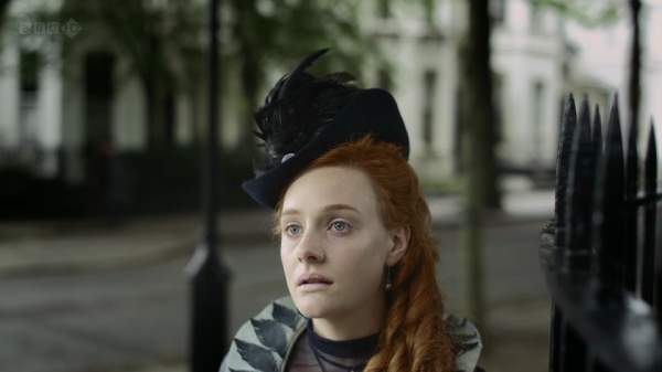
This is the tagline of “The Crimson Petal and the White”, a mini-series that unfolds the story of a young prostitute named Sugar living in London in 1875. Played by Romola Garai, the young girl chances upon a married heir to the family perfume business and uses her passion for literature to ensnare his mind away from the unstable situation at home. Pushing the limits of broadcasting censorship, “Crimson Petal” offers an unfettered look at the lives of rich and poor – alternating between unsettling and riveting, revolting and fascinating, voyeuristic and enchanting.
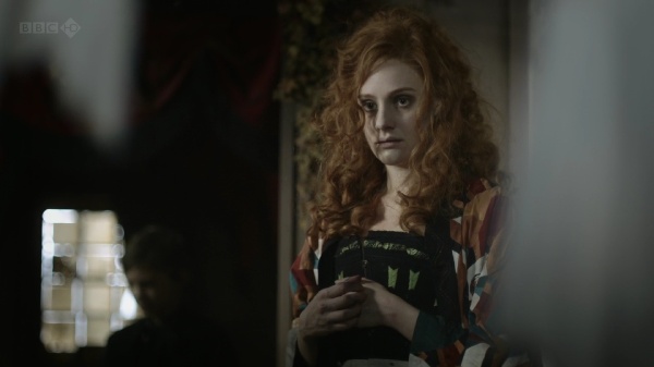
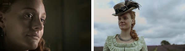
Sugar’s fiery golden tresses highlight the sensuous setting of the local brothel, with deep reds, greens and golden browns welcoming the customers onto the premises.
The first encounter between Sugar and William Rackham places the viewer at a nearby table, with dancing candlelight flames and blurred reflections framing her face. As she deftly weaves the conversation and plays to his vanity, the camera never goes below her neck, highlighting his noetic enchantment with Sugar.
This is the beginning of a scene where Rackham talks to the brothel’s mistress, offering a full patronage arrangement for Sugar. While the conversation is very detached, deep reds and yellows highlight the very intimate nature of the transaction. Note the richness of the dress, chandelier and the tapestry – all in the area that welcomes the customers.
As Sugar herself is listening to the conversation, the camera places the viewer half peeking from behind a curtain. The cool colors of the environment – turning her fiery hair into sand brown – highlight her emotional detachment from the impending transaction. She has been planning this move all along, deftly planting the idea seed in his mind. All that is left to do is to complete the deal.
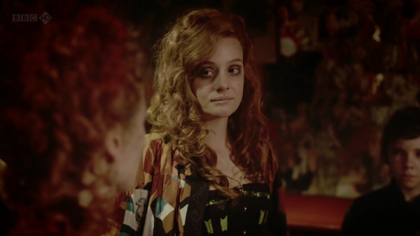
And here she is, a few moments later, entering the scene and “adopting” the rich sensual palette that washes her hair and face in deep ember. This color transition from warm to cool and back to warm is one of the best color sequences in “Crimson Petal” and is certainly worth rewinding a couple of times.
With Rackham back at his house, Sugar bids farewell to the mistress. A short conversation reveals many intimate details, including how the mistress (which is also her mother) pushed her to sell her body. The dialog is brief and very cold, and is washed in desaturated browns, cool blues and soft yellows – with not a single hint of a warm color anywhere in the frame.
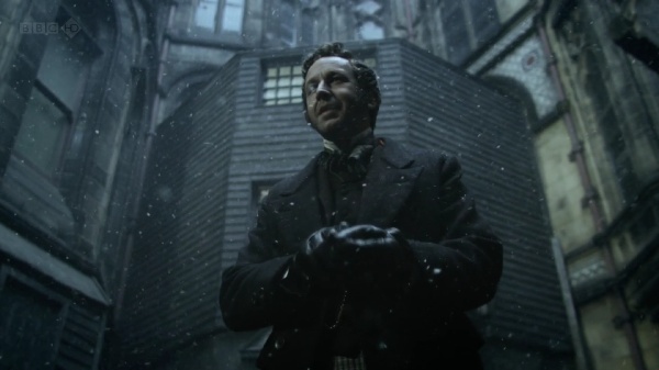
As the story begins to unfold in the winter, the outside scenes in the Victorian slums are dominated by grays tinged with sea green.
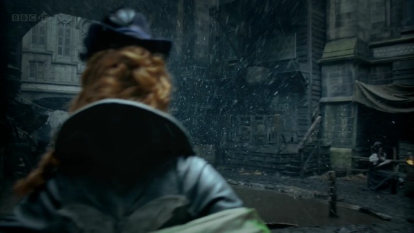
Even these few short moments that the main characters spend outside are enough to show the destitution and despair that engulfs the poor parts of the capital. The stark contrast to the lush interiors of the Rackham residency is just another reminder of why Sugar is so desperate to claw her way out of this misery.
As Sugar’s plan begins to materialize, the plot gives additional meaning to the name of the series (and the book it is based upon). Michel Faber that wrote the original book explains the many meanings of the name:
It comes from a Tennyson poem that begins “Now sleeps the crimson petal, now the white”. But the poem has no particular relevance to my story. I like the complexity of associations suggested by crimson and white—Sugar is a “scarlet woman” but she is mistaken for an angel by Agnes Rackham, and is also desperate to move into a new life that’s respectable and innocent. Agnes is, by birth and inclination, pure white, but is troubled by the phenomenon of blood. William uses and destroys petals of both colours in his profession of perfume manufacture.
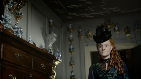
This is just one of many scenes that happen in the Agnes’s bedroom. Bedridden with frail body and mind, she spends most of her time surrounded by the sea-green floral patterns of the wallpaper, oppressed by the frequent visitors of the family doctor.
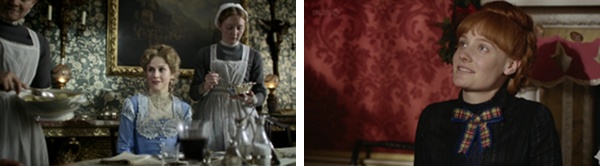
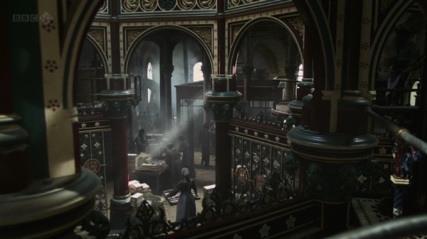
Elsewhere in the house, the wallpapers and tapestry are much lighter and warmer, with bright patterns dominating the dining room and mahogany red wrapping the main family room.
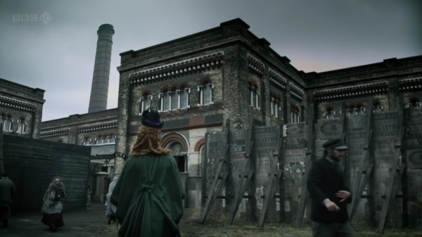
This is one of my favorite shots. This is the outside of Rackham’s factory that packages various perfumery products for domestic and international shipping. As inconspicuous and slightly decrepit as it is on the outside, it only serves to enhance the visual impact of the interior design, with its immaculate color palette, ornamental embellishments and intricate woodwork:
Luke Dunkley did the editing for this wonderful mini-series, and you can imagine how delighted i was when he graciously agreed to answer a few questions I had about his work on “Crimson Petal”
Kirill: Tell us a little bit about yourself and your busy schedule.
Luke: I’m a freelancer of TV drama and have been for 15 years. Budgets have steadily been reducing in real terms so schedules become ever more squeezed. So I find myself in the cutting room from pretty early to late in the evening.
Kirill: As the editor, how important is it to spend your time on the set reviewing the daily shoots?
Luke: I spend very little time on set. In fact I feel like a spare part when I’m there as there’s nothing for me to do except be positive about the dailies I’ve been given. There is the odd occasion where it’s necessary to visit the set for a specific problem but they’re rare. However, reviewing the dailies is terribly important; I need to be able to watch them and give constructive feedback to the director on set. Feedback can range from coverage (the lack of it and whether it will cut together as a story and whether we need any pickups) to an actors performance up to the look of the show.
Kirill: Given how much time you spend with the director during the post production stage, is there a special bond of trust that is developed?
Luke: Definitely. It’s essential. The more you work with a director the easier it is to interpret their vision. You build a trust that works both ways; so if I say something isn’t working, even if the director loves it, then they will listen. They won’t always change it but they will listen. Plus, if you’re with one person for 12/16 weeks you have to have fun.
Kirill: You’re mostly doing TV productions for BBC these days. Knowing the hard limits on each episode length, how far is the editor’s cut from the final product that the viewers see on the screen?
Luke: By editor’s cut you mean the 1st assembly I think. That is always 10 to 20 percent longer than the final product. It’s usually in scripted order and it has what I call fat in it. As an editor you know from that assembly where you want to make trims, add music, move scenes and generally start shaping it. Depending on the director you could do that before they see it in scripted form or, if they trust you, you can start shaping it before the end of the shoot. Mostly I’m somewhere in the middle.
Kirill: On a related note, how different are editor’s days between the movie and TV productions?
Luke: None really. They’re all long.
Kirill: How much of the eerie atmosphere of “fallen” London streets and the opulence of the upper class surroundings was done during the post production? Is it mostly the right selection of camera equipment or dynamic software processing?
Luke: Obviously the design was a huge factor, which meant that Lol Crawley (director of photography / DOP) could shoot it in a particular fashion. What we did in post was a combination of sound, light and image manipulation. Very early I started playing with the idea of drones. I sent Marc Munden (director) a cd of about 90 drones that he loved (not all of them). We added them to scenes for atmosphere and tension. Lol (DOP) and Grant Montgomery (designer) did such a fantastic job that when it came to grading the series they had a great deal of scope. And finally image manipulation; there are about 50 shots per episode that we changed from their original format. This might have been as simple as adding a zoom, but occasionally I would stretch an image (a bit like a circus mirror) to hopefully add unease. You can’t stretch it too much though or it looks silly.
Kirill: What part do the advances in professional editing software play in merging all editing responsibilities in the hands of a single editor? What are your current tools of trade?
Luke: I’m currently using Avid media composer and have done for years. I like to think that the tool doesn’t make that much difference it just makes you quicker (I can cut as quickly as I think). Obviously nowadays you are expected to add temp music, vfx and sfx and this is made easier in the non-linear world.
Kirill: “Crimson Petal” has a lot of close-ups with dynamic focus and lighting effects. Is this something that you’re doing during editing, dynamically altering the frame selection and applying various continuous effects?
Luke: Not really. Lol used 1970s Prime Canon lenses that had a very shallow depth of field and a slight softness to them. I thought it looked great but you should ask him about that.
Kirill: Some of the productions you’ve worked on (including this one) are adaptations of much lengthier books that have the luxury of conveying characters inner thoughts. How far can you as the editor take an adapted script and use the visual tools at your disposal to bring the viewer closer to the original complexity?
Luke: It’s very hard, especially if there’s an inner voice. you can get round that with voiceover/narration, but that is very much down to the screenplay/script.
Kirill: Some people spend inordinate amount of time ferreting the smallest physical discontinuities, even if they don’t matter for engaging the viewers in the emotional story lines. Is this something that bothers you?
Luke: Not at all. If someone is overly concerned with continuity then we have failed them because they’re not engrossed in the story. There’s a very obvious continuity jump in Crimson where Mark Gatiss’ character knocks over a teapot and the proceeding shot it’s upright. We kept it in because on numerous viewings it was never noticed, people were watching the actors not the props. The best take for performance is always the priority.
Kirill: Can you recommend a few of the productions (movies or TV) that have particularly impressed you?
Luke: There a whole host coming out at the moment that are very good, I think British drama is in rude health. I’m particularly enjoying the Shadow Line at the moment.
Kirill: What’s next for Luke Dunkley? What are you working on these days?
Luke: Currently I’m working on the first three episodes of a new BBC3 series called The Fades. A graphic comedy horror – should be on screen in September.
And here i’d like to thank Luke for his work on this production, and once again for taking the time to do the interview. As for the readers – i hope you enjoy the series as much as i did.
In my last entry i talked why i see “Tron: Legacy” as the best 3D movie experience that i’ve seen so far, and it’s my great pleasure to have Bradley G Munkowitz aka GMUNK join me for a conversation about the work he and his team did on the movie, extending it to the visual effects in general and a glimpse into the not so distant future of movie-going experience.
Kirill: I was reading about the background of the movie itself, and i’ve read that it started in 2007 when there was this big writers’ strike and it started with Digital Domain pitching Tron:Legacy to Disney. Were you part of that phase, or were you brought later?
Gmunk: I was freelancing for Digital Domain, so i’m not a staff employee there. So they hired me as an independent contractor to build a team that was involved after the VFX tests and pre-viz. They hired us to be the concept and the execution.
Kirill: So pre-viz is like a proof of concept?
Gmunk: What you’re talking about, the VFX tests, that is the look development. It’s “we want to make Tron and we want it to look like this, all dark, in a stormy world when everything is glass”. Then they take that look and they pre-viz the whole movie where it’s all done in 3D, but it’s not rendered. It’s a crude structure so that you can see and edit it, almost like the next step from storyboarding. What the shots are, where the camera is, where it’s moving.
Kirill: But it’s beyond the still shots and color schemes, right?
Gmunk: It’s in junction with. And so my team was brought in to do the look development and execution of key holographic UI sequences.
Kirill: So that was somewhere in mid-2009?
Gmunk: It was the end of 2009, yes.
Kirill: And it took you about a year until the final completion, with the movie released in December 2010.
Gmunk: Yes, it was about a year. The team scaled from me all the way up to five people who were brought in at different times [see the links at the end].
Kirill: It was about 800 people working on the digital art of the movie. So five people doesn’t sound a lot.
Gmunk: That’s true. Digital Domain has its own visual FX pipeline with giant teams doing giant strides. And we were this outside unit that just parked in a corner of Digital Domain facility and just did our own thing. So we were kind of a special team.
Kirill: But you guys did the vast majority of the real work on the VFX part
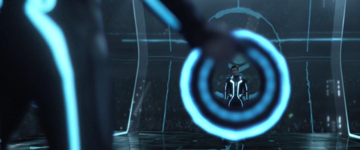
Gmunk: The VFX part of the select scenes in the movie. We were not doing the VFX for light racers, for example. We were doing small niche graphical interfaces, data visualizations. We did the opening titles, the fireworks and a few other scenes. It’s all on my site.
Kirill: You mention on your site that you worked in close collaboration with the movie director. Can you describe the process?
Gmunk: I knew Joe [Joseph Kosinski] personally since we worked together on the Hummer commercial two years prior, so he felt comfortable just coming over and sitting down with us. You get him for 45 minutes to concept out what it is that we’re doing, what the task is, sketching it on a sketchpad. And then we’ll take it for two or three weeks and show him our solution, he’ll critique it and we’ll start refining it. We had five really key reviews which would trickle into the VFX shots and then to the desk of the VFX supervisor who wants to have proper depth of field, for example. This is integration stuff that gets critiqued more and is in front of everybody’s eyes on the daily basis. For the core conceptual look development stuff we had three or four review cycles with Joe and then it would go into the VFX pipeline.
Kirill: So you were doing all of the scenes in parallel?
Gmunk: There was a ton of overlap for sure. We were just a team of five, and it takes a lot of time to get that super grunt work done. There were big tasks, like for example the solar sailor sequence which took us three months, while we did the opening sequence in about a month and a half. Fireworks were quick – there are a lot of these quick design bits where we would do interfaces for the bikes or the throneship – those were couple of weeks.
Kirill: You also mentioned in one of your summaries that originally you were contracted for about five minutes that later expanded to ten. Was it more scenes, or more content in each scene?
Gmunk: It’s definitely a good thing to get more opportunities to jam. It was definitely different scenes. We were killing ourselves doing the solar sailor, and they would come in asking to do the opening titles and we were “OK, let’s add that to our list”. Or we would be heavy into the throneship rectifier extraction where they were decoding the disk, and they’d ask us to do the fireworks. So it would be a completely different thing, and we’d have to develop and concept it. We looked at it as a good thing, because we were super-inspired and we just wanted to jam.
Kirill: Well, the end result is amazing. Did you have something that you worked on and then the entire scene was cut?
Gmunk: Not on this one. I’ve had that happen before. They would advise us on a lot of stuff. A lot of eyes looked at our graphics and had comments after the core development, and a lot of stuff was dumbed down a lot, but never killed.
Kirill: What do you mean by dumbed down? Removing extra fluff?
Gmunk: “Removing extra fluff” is a good description. It’s like taking out the greeble. It looks awesome – the more complex, deep and insane it looks, the better, but sometimes it sacrifices the quick read on what it is supposed to represent with its conceptual cues. And so, we definitely had to take out a lot of greeble so the point of the graphics was understood quickly.
Kirill: In all the portfolio entries and blog posting by you and your team mates you spend a lot of time describing the underlying geometric primitives and algorithms behind the implementation, but not a single mention of the 3D aspect. Who did the 3D part?
Gmunk: We did all of 3D. We would put a lot of compositing into the Digital Domain pipeline because we weren’t the end people for these shots. We did the elements and then work with the compositor that would comp our elements into the shot under mostly mine and Jake [Sargeant]‘s art direction. That was one of the things that we didn’t do a lot – comping.
Kirill: So that would involve mixing it with live acting?
Gmunk: Exactly. Mixing it into the shot with actors within, casting lights on the actors. That was the big thing, because the holographic elements that cast the light.
Kirill: Do you have special screen hardware to check how 3D looked?
Gmunk: Not on our screens. There was a testing stereoscopic 3D television called “The Hyundai”. We would go in there and check.
Kirill: So you would go there and check if it looks good?
Gmunk: We developed so much stuff. Digital Domain has a very special VFX pipeline, there’s nothing else like it. And we found a way to get these stereoscopic 3D cameras into our 3D applications, like Cinema4D. We used a lot of openFrameworks applications that had to take in these stereoscopic cameras. Digital Domain had a technical director Jon Gerber who helped us accomplish that, to write the scripts to get the cameras to go into Cinema4D and openFrameworks. And then out of our 3D apps we would render stereorenders and then check those on The Hyundai.
Kirill: There’s a lot of complaints that movies shot in 3D don’t look very good in a fixed-eye projection system – if you buy a BluRay disc for your home TV or go to a regular screening. Did it take care of itself because the 3D aspect in Tron:Legacy is so muted?
Gmunk: I think the use of 3D in Tron is the best out there. It was so tame and tasteful. We never had an interface to make that was supposed to knock you upside your head. Our stuff was always medium and wide shots of whatever holograms they’re using.
Kirill: That was also my impression. Even in the solar sailor scene where the guys extract the virus from Quorra’s DNA and there’s a lot of camera panning, it was all very subtle. Was it an explicit directive from the movie director, not to go overboard with 3D?
Gmunk: That’s very much Joseph’s style. Kosinski’s style is always very tasteful, beautiful and elegant. I think the best example was during the light jet fight. It was always done in a really tasteful way, even an exaggerated shot of a ship coming directly to camera and then diving back down when it runs out of gas. It doesn’t come super close, but just close enough so you see. That kind of stuff is awesome, it’s perfectly controlled – and that was all over the movie. In the light jet scene there were a couple of times where the jet flies by camera but it wasn’t right by camera, it was kind of off to the side. We got to see in dailies every day the work of the VFX supervisor, Eric Barba – he’s the man. Watching him critique a 3D image in stereo, pinpointing all the problems, citing interocular distances and the convergence points, picking apart the 3D image – it was amazing. That was my favorite part – watching Kosinski and Barba work together and critique images. It was being in a super advanced design school.
Kirill: Sounds fascinating. Do you think that the industry is still making baby steps, exploring the right ways to shoot, edit and composite 3D movies?
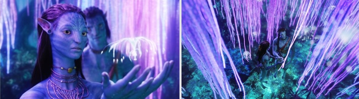
Gmunk: There’s a lot of movies that do 3D after the fact, and that’s awful. I think that “Transformers 3” is going to be a really good test of where it is right now. That is a 3D explosion movie, that’s an upper cut, that’s a smack you across the face grand effects movie, and if they can nail that stereo so that it is super frenetic, but in a tasteful way that doesn’t crush your brain, that’s a big step forward. My favorite 3D implementation is still “Avatar”. I thought the camera work in that movie was so beautiful, so well done. Every single shot, the camera feels completely hand-held.
Kirill: All of the movies that you mentioned – Transformers, Avatar, Iron Man and of course Tron: Legacy – are confined to the “escapist” genres of sci-fi, horror, animation and adventure. Do you think over the next few years, or perhaps a couple of decades it will transition to “Oscar-type” productions?
Gmunk: I think film makers are such purists, that for the sake of respecting the medium it will take them longer. Oscar-nominated movies will take perhaps ten to fifteen years before it happens. It should be in five, but people are going to stay true to the art form a little longer. Until going to the movies is completely immersive. In fifteen years a movie theatre is going to be an interactive 3D fully-realized hologram in front of you. You’ll be on those flying mountains, you’ll be able to touch the wing of the Ikran.
Kirill: Will this translate to the TV experience in my living room?
Gmunk: I think the theaters will be fully immersive crazy kick-ass ones, and the living room will be a scaled down version, with perhaps hard-core super gamer types who drop eighty grand on their system to get the full experience.
Kirill: I think it was “The Lawnmower Man” which had this immersive gaming experience. That never happened, right? And that was 20 years ago.
Gmunk: May be i’m getting ahead of myself. But things are getting pretty cool. I think in five years your phone will be able to project something out of it that makes something you can use.
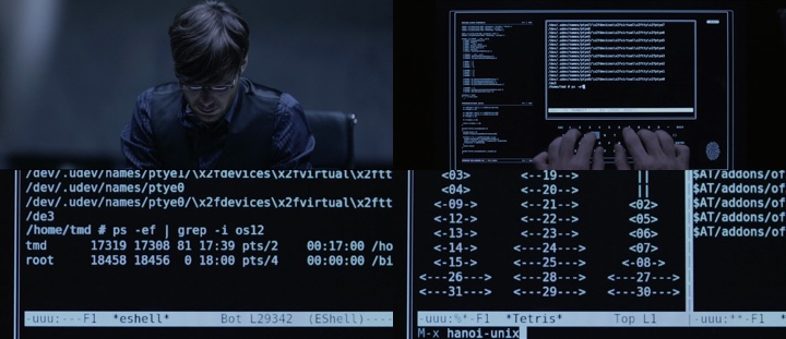
Kirill: This brings me to the topic of futuristic UIs. I’ve been reading Josh Nimoy’s blog that talked about bringing realism into the hackery scenes, showing emacs and proper Unix commands. Do you ever get told to forget about how realistic it will look to the geeks and instead to concentrate on wowing the audience?
Gmunk: What Josh did was awesome. I was talking about purists, and he’s a purist. He’s an artist and you always have to plant these Easter eggs in everything you do. You have to stay true to your roots and plant those little reminders. This is what Josh did, he went old school and did a retro thing that nobody but geeks would appreciate – and that’s what’s important for him.
Kirill: Now that the movie is out on BluRay, do you get emails from those hardcore guys that dissect every single still from the movie?
Gmunk: He probably does, and that’s cool – you’re touching people. The average movie goer is perhaps looking at the surface level, with nothing to really grab them and touch their inner passion. But geeks and people who live for this – they are just more educated fans that appreciate this aspect, and that’s who we care about.
Kirill: Do you need to get an approval from the director – to plant those Easter eggs?
Gmunk: I don’t think the director knew [laughs], but i think that he would appreciate it as much as Josh did. We’re all purists, we’re all indie at heart. When i graduated from college, i preached that i would never do client work in my life. I was completely anti corporate America, a vegan (still am), super against the carnivores, super environmental. So i made a pledge to do what’s right and that quickly faded when i moved to Los Angeles.
Kirill: Somehow you need to pay your bills…
Gmunk: Right. So you always want to throw in the whatever indie respect that you can give. I try to do that a lot with commercials too.
Kirill: Talking about the futuristic UIs. Whenever it gets mentioned, people always seem to be talking about “Minority Report”. It seems that only that movie managed to capture people’s imagination on what the interaction with computers will look like in the future. Do you think that the way we interact with computers every day at work and at home will change?
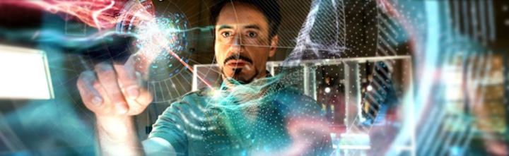
Gmunk: First of all, the reason why it was the most accurate representation of the UI is simple – it was developed at MIT. They had computer scientists and UI specialists that research this for a living design this interface. Mostly in movies it’s just greeble – just make it look awesome and don’t think about making this a real-life thing. Kind of like “Iron Man 2” – the implementation was gorgeous, and that may be a real-life hologram some day – but did they really thing about usability and would that mirror what would happen soon? The thing about “Iron Man 2” and more so about “Minority Report” is that it’s all gestural. It’s all about controlling things with your hands, interacting with your hands, taking everything off the mouse and the keyboard – which we’re already seeing starting with iPads and iPods and the gaming consoles. That’s the way it’s going, and basically every UI you’ve seen in the last ten years in a movie has been touch-based, with gestural controls. I can’t remember the last UI i saw in a movie that had a mouse.
Kirill: We mentioned “Iron Man 2” a few times. I was reading this article which says that Robert Downey Jr. would improvise his movements on the set, and then the VFX artists would need to build the entire holographic UI around his movements. How was your interaction with Jeff Bridges in the elevator and solar sailor scenes?
Gmunk: We were just given the footage. We weren’t involved in the shoot of those sequences at all. Unfortunately, in the elevator shot his hand is completely out of focus. They shot everything at f/1.4 and everything has a crazy shallow depth of field – and so the graphic had to be out of focus, which was kind of a bummer. The solar sailor had also a shallow depth of field, so that was something that we had to work with to get our renders right.
Kirill: So you got the shots of him staring into empty space and moving his fingers around, and then you built your scenery around that? Is this more interesting than creating your interaction model and asking the actor to somehow work with it?
Gmunk: It’s way better to do it when actors are gesturing in the air and then design around that. It’s easier and also fun and super-inspiring, as long as the performance is good. He didn’t have a lot of definitive motions, with soft gestural commands and not a lot of emphasis, so we made the interface itself react to that and be less complicated. We made it match his gestures.
Kirill: I was thinking about the sci-fi movies that i’ve seen in the last decade or so, and it seems the best of them take place in darker environments – such as Matrix and Tron, of course. Your portfolio would also indicate that you’re moving in this direction. Is it because you can explore the futuristic environments better in an inverted contrast?
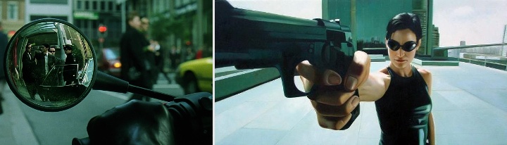
Gmunk: I just love dark, the vibe and the evil dark aesthetic. I love the original “Matrix”, it is by far the best sci-fi movie ever made. It had this nasty, really dark vibe to it that was so beautiful. And the plot lines and the language were so deep, intelligent, sophisticated, well thought out and written.
Kirill: Were you disappointed by the sequels, from visual as well as content point of view?
Gmunk: The third one was almost unwatchable. The visuals in the third one were cool, but it was really bad script. Everything every actor said was just a sentence, plus they got away from the charm of the first one where you see all the karate. And by the third one you have seen all the tricks and you didn’t care anymore, it was almost a video game. But the first one was amazing, and it still holds up today.
Kirill: Getting back to Tron and its dark environment. Did you feel restricted by the color space that was at your disposal, with soft blue for the good guys and yellow-oranges for the bad guys?
Gmunk: We got to love the glowing light blue a lot. But that’s just how it was. It would’ve been cool to see some pinks explored – no way it would go through of course. Some really nice cool pink.
Kirill: Did it somehow affect the exploration of different geometrical building blocks?
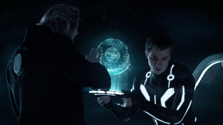
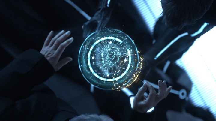
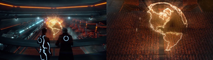
Gmunk: Not really, because we knew it would never go through. I would throw some yellows, and i think a pink slipped through once in a while – and we were told to change it. But some of the graphics got expanded colors. The board room, for example, got a full spectrum. We also designed the holographic animated rectifier globe in the scene where Clu addresses his army, and there were a lot of reds, oranges and browns there.
Kirill: How did it feel to see your work in the theaters, and all the geeks – including me – swooning over the effects?
Gmunk: It felt really good to see it on the screen with the audio, because we didn’t get hear any of the sound design. So hearing it was really quite a treat, because we didn’t have any creative input whatsoever into that. It was really interesting to hear the bits they added to the stuff that we were doing. You’re animating it and you think about how it will sound and you have ideas, and then they come back with something completely different. It was really fun. So the sounds the scoreboard made, the sounds of the hologram on the solar sailor when you click on it, the sounds of the DNA when it forms, the rings breaking apart in the rectifier extraction. And then hearing the sound track too was a part of it – a lot of the shots that we’ve seen, you’ve already seen on the big screen during the development on the theater screen in Digital Domain. But to hear it, that was a treat, the thing that i remember the most.
Kirill: So what can top your work on Tron: Legacy?
Gmunk: I think that if we’re doing another Tron, i don’t know what kind of charm it would have. But just knowing what we know now, learning from the process of generating these graphics, we can really push the envelope a lot further because we would hit the ground running. We would be full speed in the first week because we’ve been there and we know exactly what’s coming and we could pull off a lot more kick-ass.
One could only hope that James Cameron is already on the phone, tapping the man to lead the VFX team for the Avatar sequels. I’d like to thank Gmunk for this fascinating peek inside the VFX industry and for the incredible work he and his “black-ops team” did on the movie. Here are the links to their portfolios:
икони
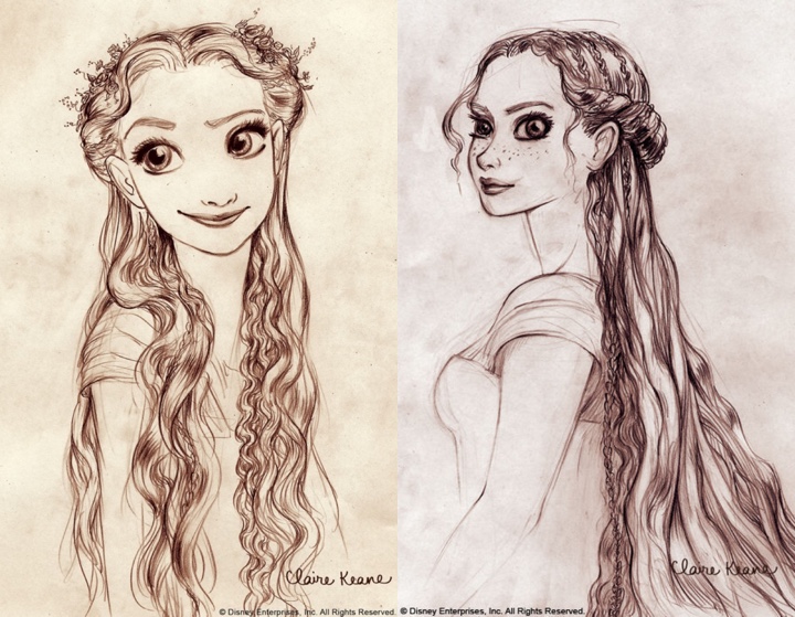
If you’re new here, let me introduce myself – I’m a giant fan of “Tangled”. It doesn’t happen a lot, but when it does, it sweeps you off your feet. A visual journey so wonderful that you catch yourself watching it over and over again, discovering yet another subtle layer of colors, textures, strokes and shapes. A splendid feast for your eyes that passes by in a blink of an eye without you noticing how the time has passed. In short, a movie that sets the bar so high that you never expect another movie in the same genre to be quite on the same level.
So you can only imagine my excitement when Claire Keane has graciously agreed to answer a few questions i had about her work on “Tangled” and the animation industry in general. Going under the rather dry title of “conceptual artist”, Claire’s work spans the entire movie, from the leading characters to Rapunzel’s surroundings – not to mention the intricate details of her magic hair.
Kirill: Tell us about yourself.
 Claire: I grew up in southern California until the age of 16 when my family decided to move to France for a year. After one year our family loved Paris so much we stayed many years thereafter. After graduating from the American School of Paris I went to Parsons School of Design in Paris for one year thinking I would like to go into fashion design but soon enrolled in the Ecole Superieure D’arts Graphiques realizing that illustrating and drawing was really my passion. In my fifth year at ESAG, I chose to write and illustrate a fairytale book for my thesis project. It wasn’t until then that I realized how much I loved the development phase of a project. When “Tangled” came to the point where they needed to bring people on to develop Rapunzel’s world I was ready to go with my thesis project in hand as my portfolio.
Kirill: How long have you been working on Rapunzel? Has it been an all-consuming adventure or a more structured “work” project?
Claire: I worked on Tangled (Rapunzel) for 6 years with a small break to do some work on Enchanted. Working on Tangled was an all-consuming adventure – I like it best that way.
Kirill: Where do you find your inspiration?
Claire: I usually find inspiration in other artists. A few that I tend to come back to a lot are: Matisse, Rembrandt, Klimt, Marie Laurencin, Ronald Searle.
Kirill: What is your preferred drawing medium and why?
Claire: I love pen and ink for the simplicity of being able to do it anywhere but since I’ve started using photoshop so much I have become completely addicted to the undo button… and I find it very hard getting back into using *real* medium again.
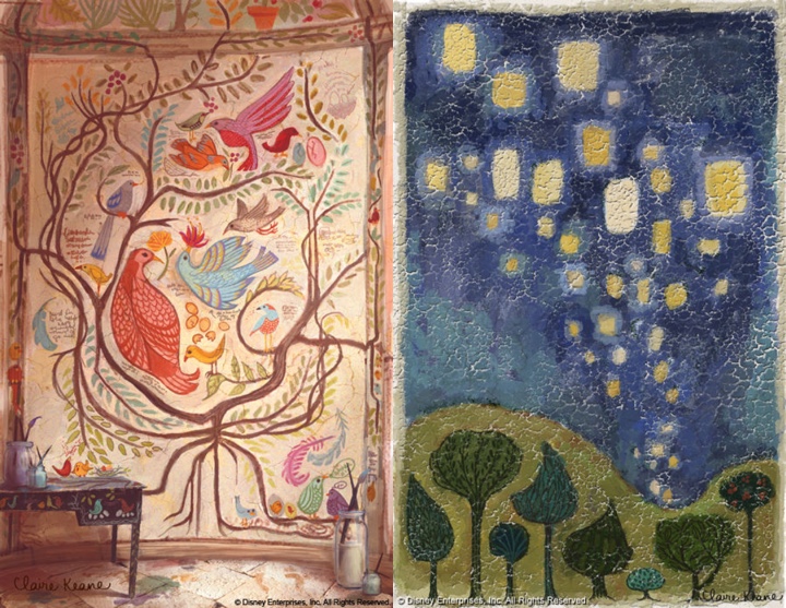
Kirill: How do you recreate the world as seen through the eyes of a girl that has spent all her life locked away in a tower? How much of yourself have you channeled into the fabulous wall paintings?
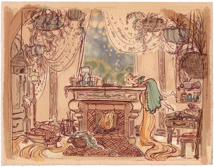
Claire: For Rapunzel I drew my inspiration from my own life. Early on I realized that the paintings on Rapunzel’s walls were going to be a representation of Rapunzel’s personality and her subconscious thoughts and desires. To be able to accomplish that I felt I really needed to know who she was. I ended up carrying a sketch diary with me on my free time to document what I was doing when I wasn’t doing anything in particular so that I could have a sense of what Rapunzel could be filling her days doing in her tower. So if I was putting my clothes away I would get out my sketchbook and draw Rapunzel hanging up her clothes in her room, and then I’d see that I was drawing while I was supposed to be doing chores which led me to an idea that Rapunzel would be constantly creating: if she had mending to do it would turn into a full-on craft project. Needless to say not much housework got done those few weeks of “research”!
Kirill: Your character and scene sketches are wonderfully expressive and exude a lot of vibrant warmth and energy. What does it feel to hand them to be transformed into precise mathematical models and how much (if any) of the original feel is lost in the process?
Claire: I’m honored if any of my sketches get handed off to be modeled! It is so rare to have your inspiration be taken all the way through to the finished product. As for the mural paintings, they weren’t really finished until they were mapped onto the CG model and lit. Once we saw them like that it all felt so much more real. It added another layer of believability to the character- as if Rapunzel had really spent all those years in her tower painting them.
Kirill: What do you think about the transition of the industry in general, and full-feature animation movies in particular, to the 3D world?
Claire: I feel really lucky to be apart of this time in animation. It feels like it is full of ripe ideas just ready to present themselves to the public. There are so many amazing things that are possible to do and very little of it has yet made it into a full-length feature film. I think we will start to see hybrids of 2D and CG animation and completely new styles and ways of animating that we have yet to conceive of coming out of the industry soon.
Kirill: “Tangled” has an amazing level of detail everywhere – tree leaves, grass blades, wall stones, pavement blocks, dresses and, of course, the magical hair. That leaves the characters’ faces as the only flat element lacking any level of realism. Is this related to the “uncanny valley” that has plagued movies such as “The Polar Express”, “Beowulf” and, to a much lessed degree, the Clu character in “Tron: Legacy”?
Claire: Yes, there was discussion about how naturalistic they wanted to make the characters. They ended up with a more stylized version for the sake of animation.
Kirill: Can you recommend a few of your all-time movie favorites? Have they influenced or shaped your artistic style?
 Claire
: Cinderella for the colors, composition, and story which are so magical. But I think the movie that has most inspired my visual development work on “Tangled” in particular was Sofia Coppola’s “Lost in Translation”. I loved how she spent time with the main character without having to get to a plot point right away. Everything I was doing in my sketch diary that I spoke of earlier was really inspired by watching Scarlett Johansen’s character just sit in her hotel room- you really start to feel like you could hear her inner thoughts even though nothing was really happening externally and no dialogue was being said. I’ve found I really love exploring a character’s private moments that may not necessarily be scripted in the movie but they make me believe in the character I am spending time working on. And I have seen that it helps me a lot when thinking about anything I would need to design for him/her: be it the character’s bedroom, costumes or even their paintings on the walls.
Kirill: What’s next for Claire Keane? Anything exciting you can share with us?
Claire: I am hoping someday to find the time to work on my own personal project. As for right now though, I’m having a lot of fun working with some wonderful people: Chris Buck (director of Tarzan and Surf’s Up) and Mike Giaimo (art director of Pocahontas) on a really fun and whimsical film. Mike has such a bold personal style and I am so excited to help get that style onto the screen.
And here again i would like to thank Claire Keane, not only for taking her time to answer my questions, but also for bringing us such a wonderful cinematographic experience. If it takes another six years for your next movie, my daughter and I will be waiting.
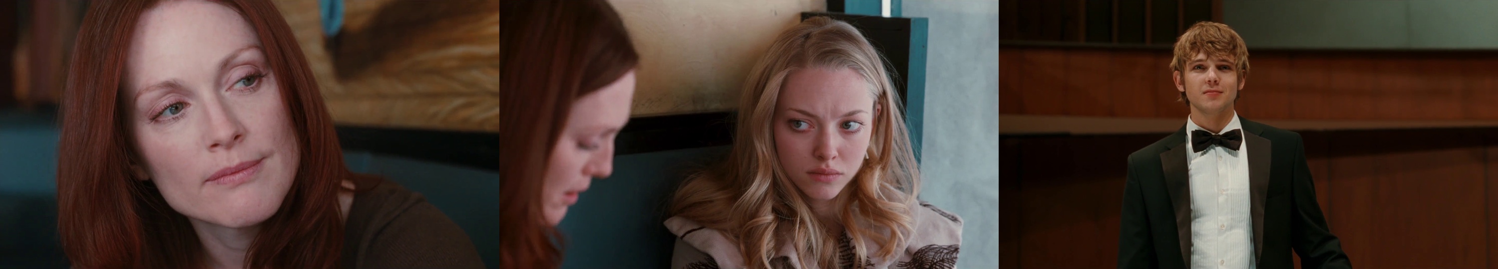
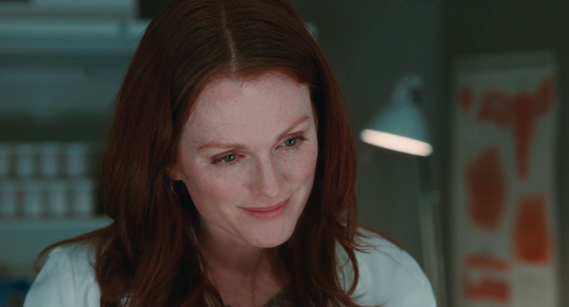
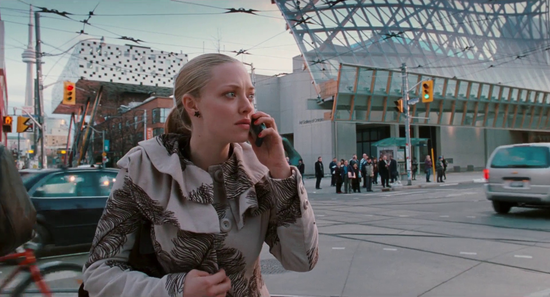
I happened to stumble upon “Chloe” almost by accident this week, and it was love at first sight. An erotic thriller drama starring Julianne Moore, Amanda Seyfried and Liam Neeson, it’s an exquisite visual treat that I couldn’t leave unattended. The opening sequence sets the intimate atmosphere with soft lights, smoked glass and the camera slowly panning across Amanda’s character gazing at herself in the mirror (seen above).
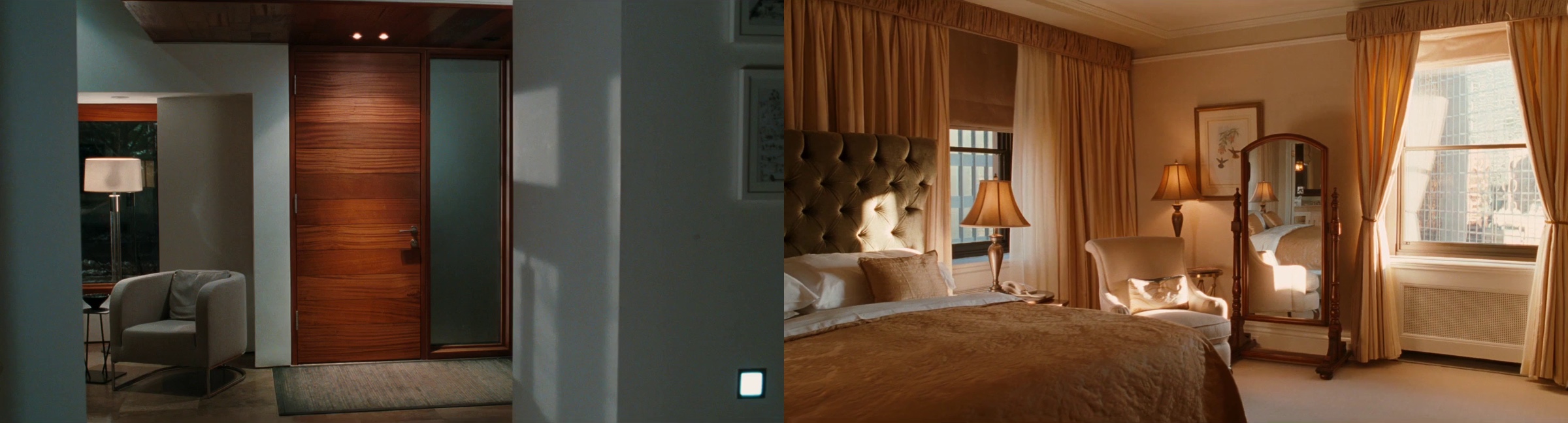
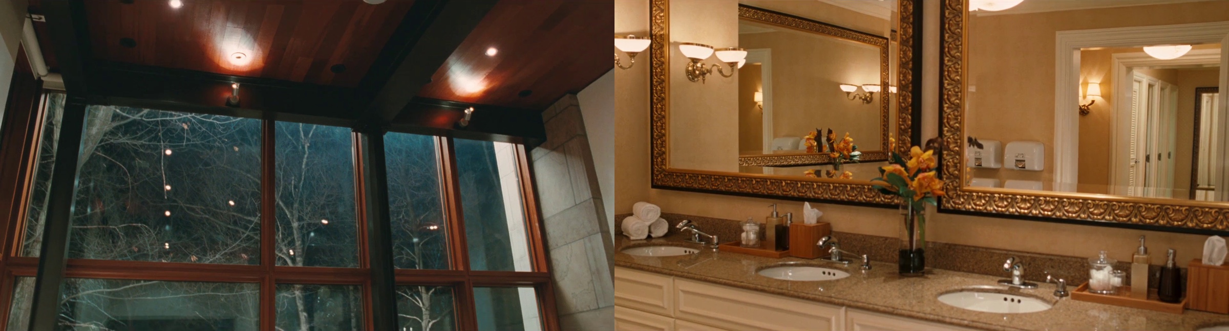
Glass, windows and mirrors are interwoven throughout the various scenes, from the first encounter between Amanda and Julianne in the bathroom to the Ravine House designed by Drew Mandel. As you follow the movie, note how this positions the viewer behind the characters as hidden observers, supporting the progressively increasing intimacy of the plot.
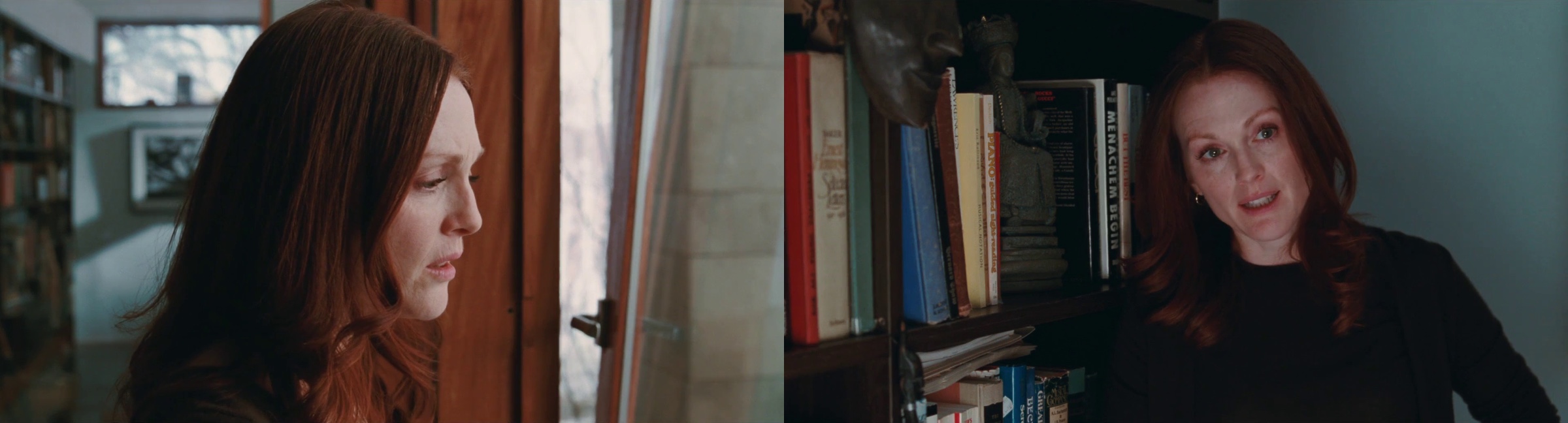
Background elements key off of the skin, hair and eye color of the two leading female characters and vary based on the scene mood. Here is the very first scene featuring Julianne – in the cold and sterile doctor’s office, with the steely green walls, cabinets and lamps keying off of her eyes, and the blurred chart complementing her hair and freckles:
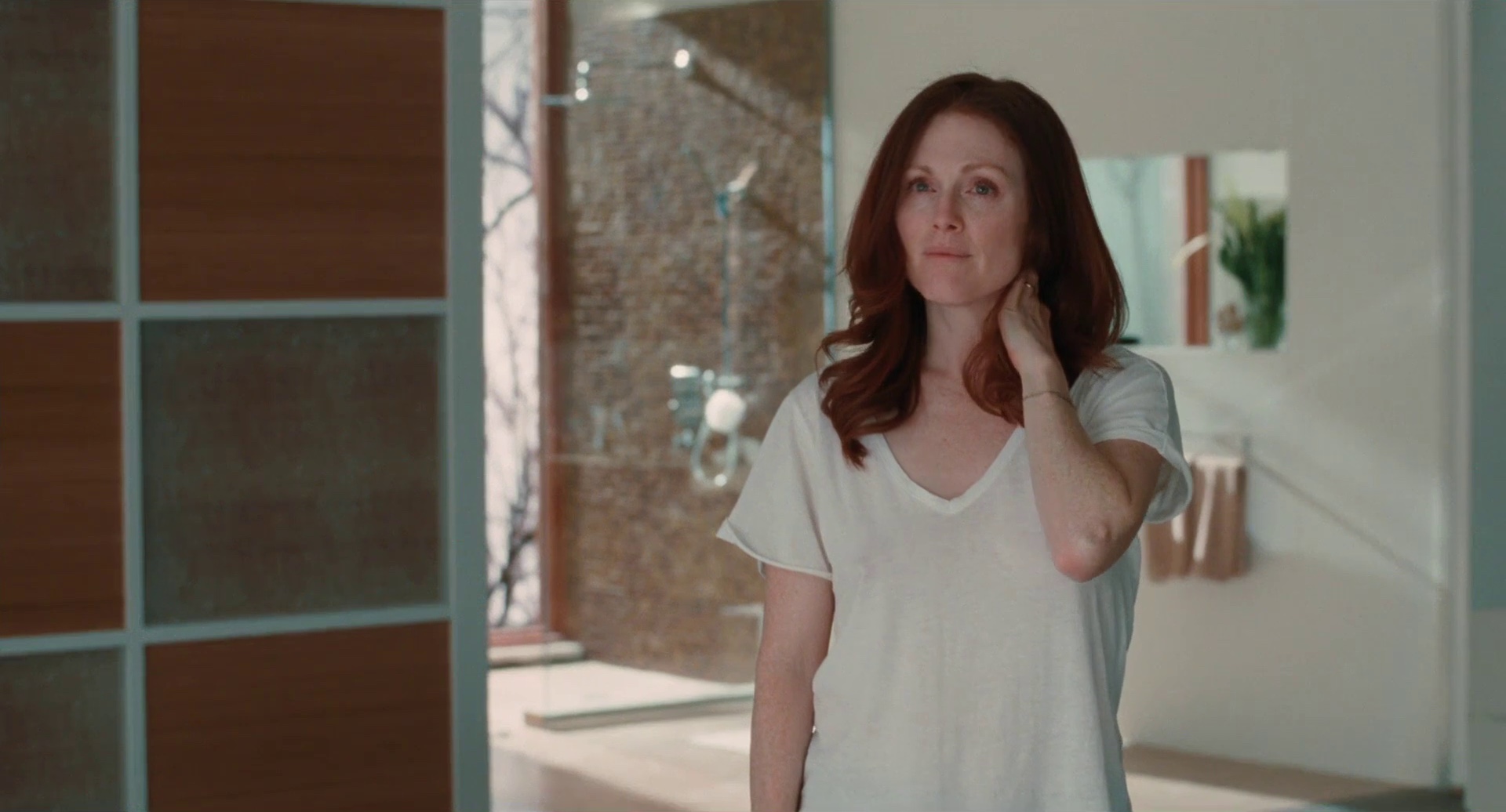
Soft browns dominate the large open spaces in the house, perfectly framing the strong hair color and providing just a tinge of green and blue:
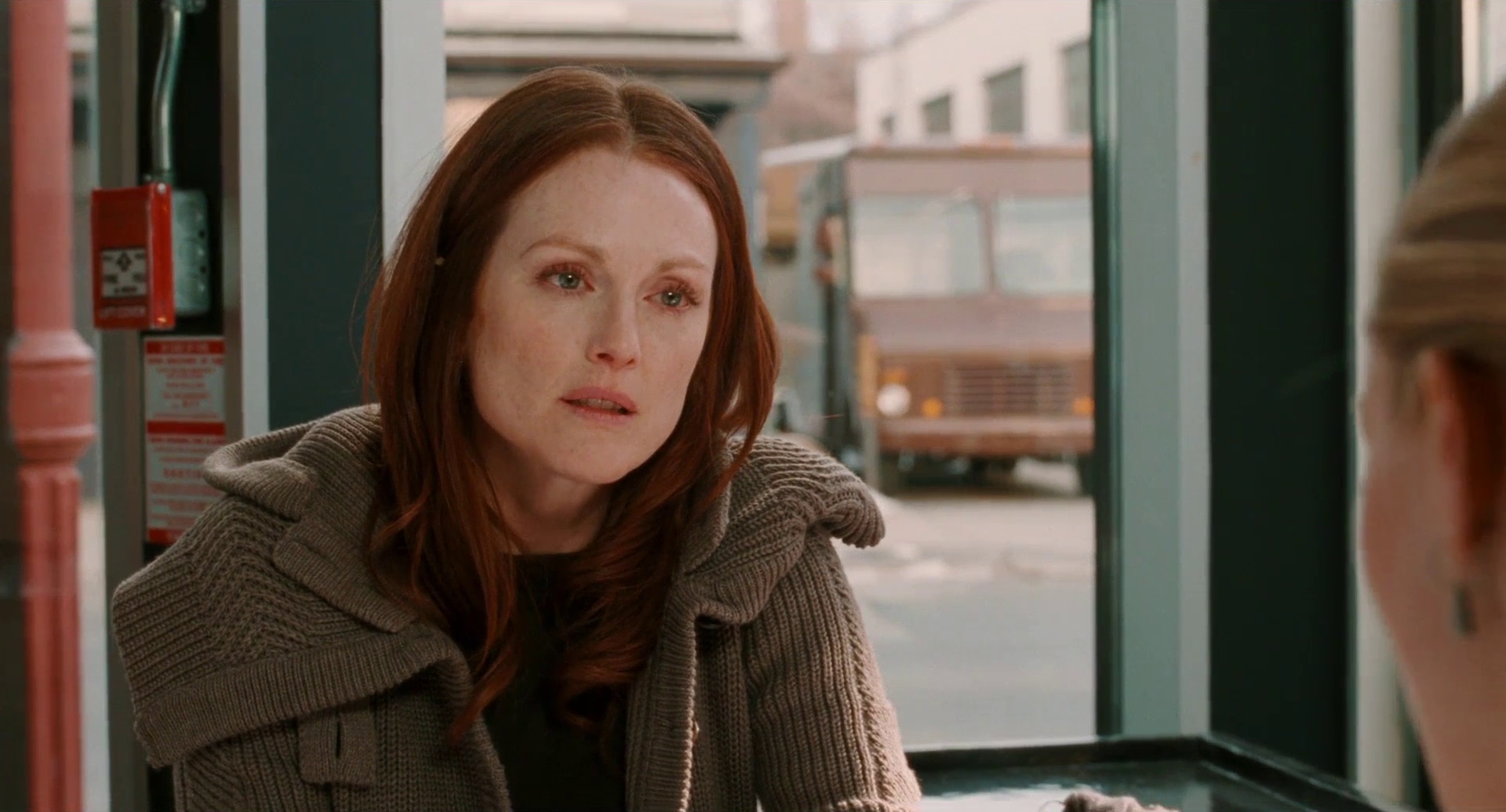
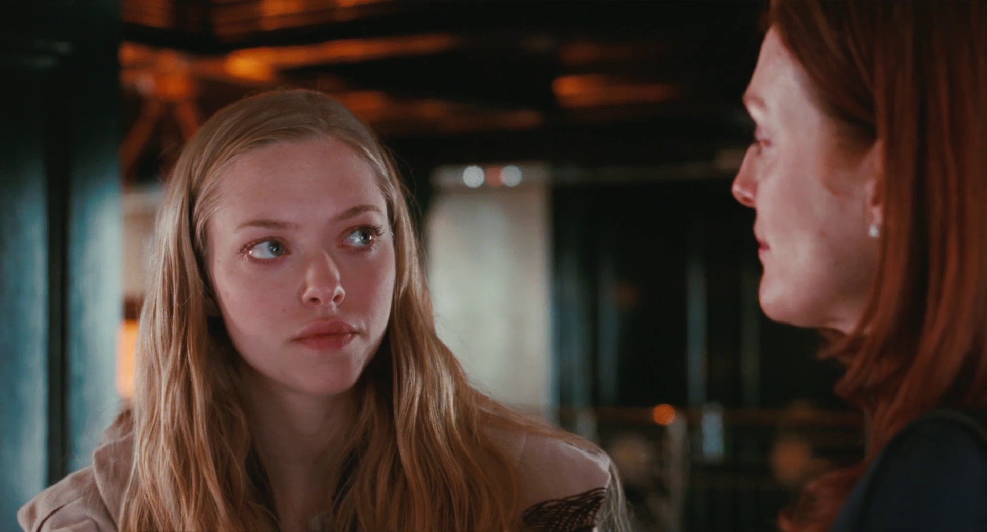
As Julianne’s suspicions grow, the costume colors become progressively more subdued, staying within a very narrow range or green-tinted beige and dark emerald. Here is the second encounter between her and Amanda – note the saturated red fire alarm box that highlights the inner tension of her character and the brown delivery truck behind the window:
The costume designer Debra Hansen provides a little insight into the morphing colors and textures:
There are shapes, colors and structures that are mirrored in the choice of clothing for the characters. On Chloe in particular you’ll find colors and patterns that are connected to the outside environment. For example the coat she wears in the greenhouse and the coat with the embroidered leaves both reflect her exterior surroundings. You’ll notice too, though it’s very subtle, that outfits for Catherine and Chloe begin to echo one another
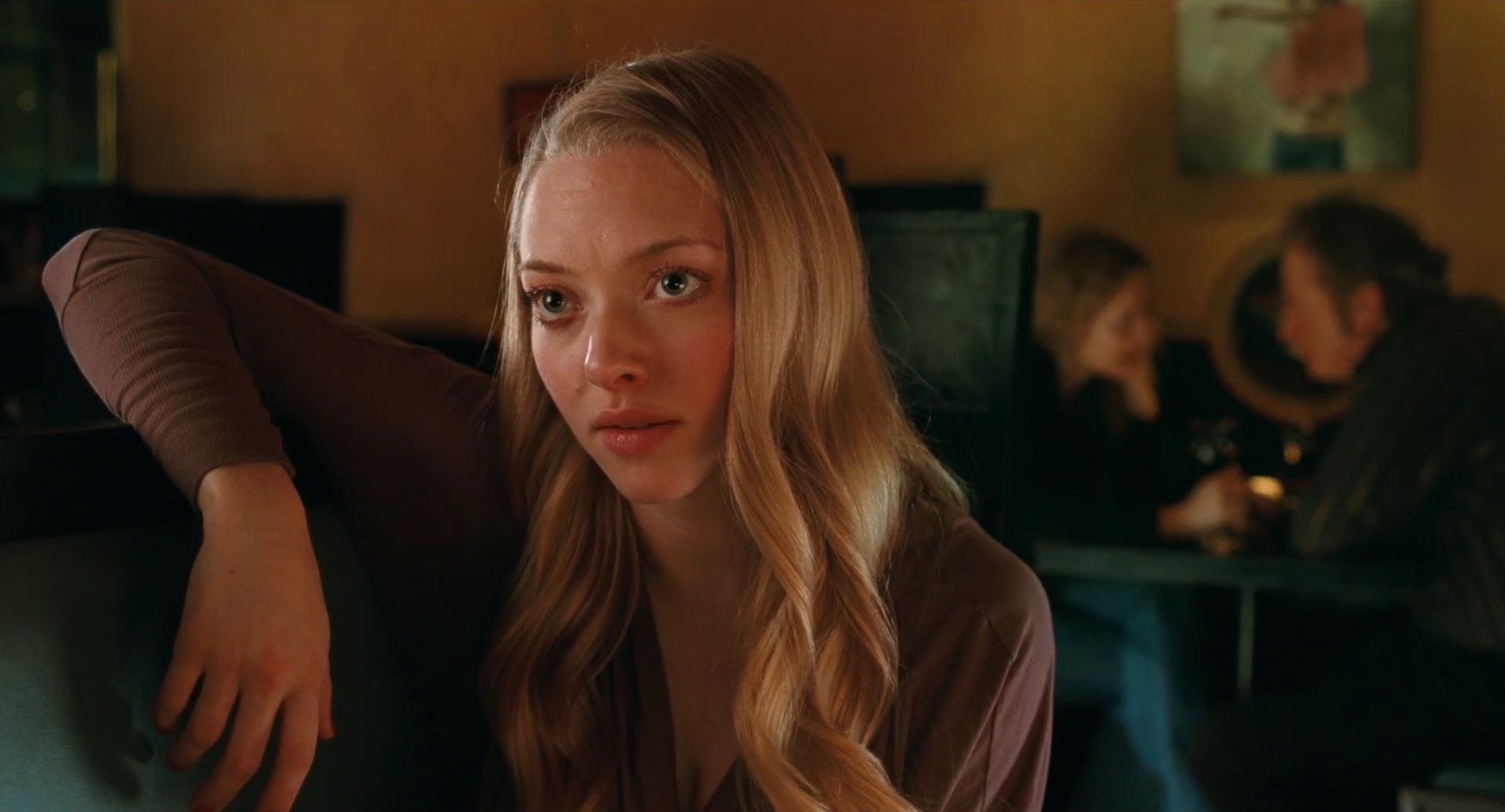
As the two female characters become more involved, the movie spends a lot of time following their encounters. One of my favorite conversations is initially bathed in a large swath of neon blue washing in from the outside, highlighting the cool and somewhat distant mood of the encounter:
As the dialog becomes more intimate, the camera sweeps to the left, stopping slightly above Julianne’s right shoulder. Rich warm golden browns replace the cool blues, and the green leather becomes deeper and more saturated. Here, even though clearly Amanda commands the scene, i cannot stop looking at the background setting and how it frames the main character. From the wall paint color to the painting to the clothes and hair of the couple holding hands – simply perfect:
And here’s another example of the perfect blend of background elements – with steely greens and muted oranges playing off of the hair, skin, eyes and clothes of the foreground characters:
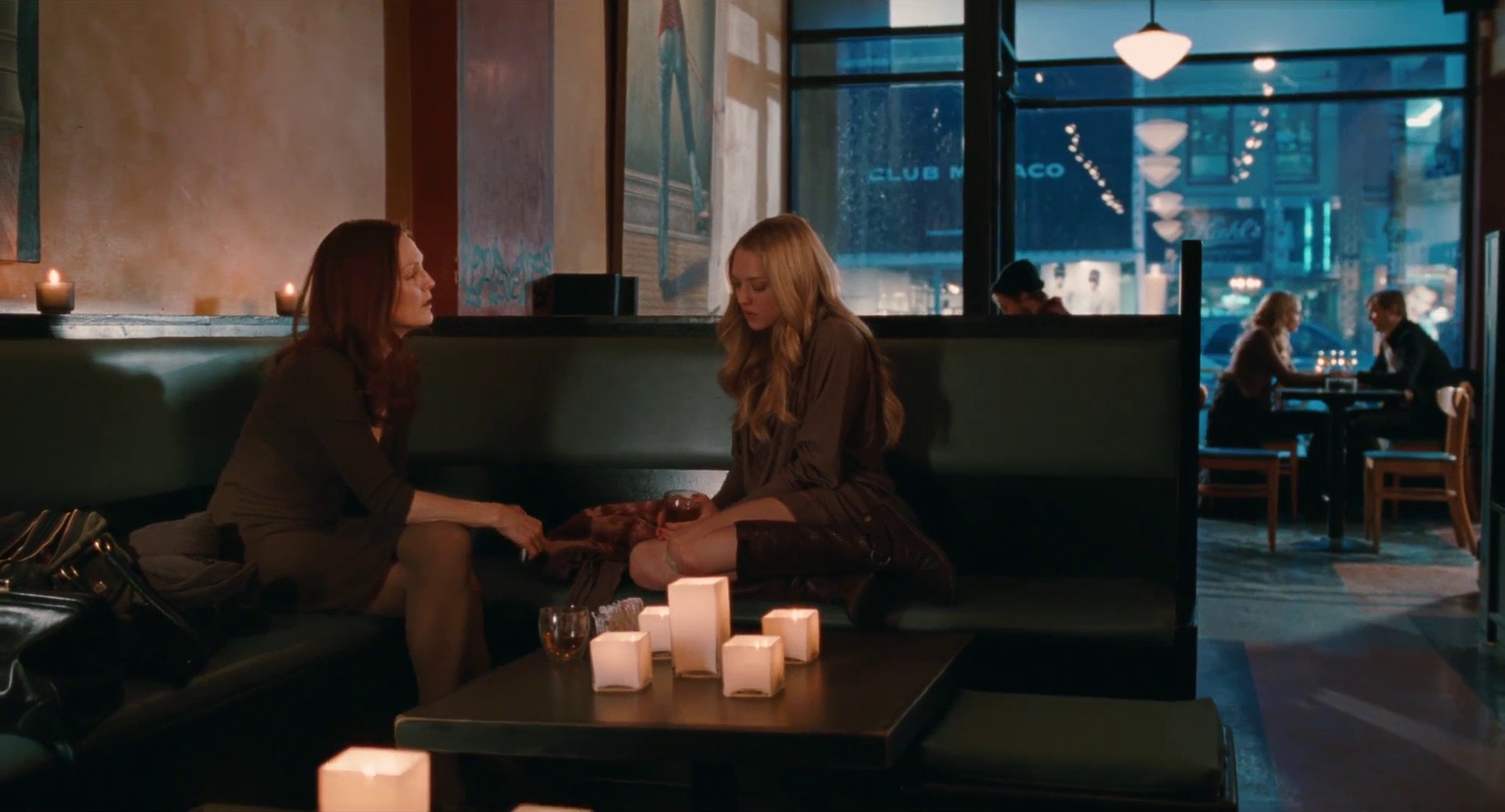
Cuing the audio track from the next scene is one of the most common ways to transition the viewer into the next scene. As the camera stays to exit the current setting, the audio switches to background noise or the few opening sentences of the next scene, followed by the mostly abrupt visual transition into the middle of the new setting. “Chloe” chooses a different strategy. With its slower visual pace, the transition has an intermediate stage where the camera lingers on the new surrounding environment, guiding the user into the new setting. Cafe Diplomatico is one of the main locations, and here it is in one of these intermediate transitions:
Soft browns spill into this scenery, from the pavement to the brick walls of the adjacent building. The attention to details is amazing considering the fact that these are public locations not fully controlled by the production crew. Here is one of my outside favorites, with the much cooler grays and turquoises that accentuate the ulterior motive behind Amanda’s manipulations:
The interior design of various locations follows the mood and tension levels between the characters – from the slate grays of the house to golden browns of the hotel room:
Phillip Barker is a man of many talents. Between writing and directing his own short films, he also works as the production designer for major movie productions. He’s graciously agreed to answer a few questions i had about “Chloe” in particular and on movie art and design in general.
Kirill: Tell us a little bit about yourself and how you got to work on “Chloe”
Phillip: I am a visual artist who has always been interested in film. I currently combine two careers, one as a production designer for feature films, and one as a visual artist who makes his own ‘art ‘ films and installations. Atom Egoyan saw an installation I had made in a gallery and expressed interest in working with me. We have been working together on most of his films since then. Our first collaboration was ‘Salome’, an opera he directed for the Canadian Opera Company where I designed all the multimedia projections, and the first film I designed for him was “The Sweet Hereafter”.
Kirill: Most of the scenes in the movie take place indoors. Have you used existing locations with slight interior tweaks, or was most of it built from scratch?
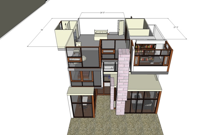
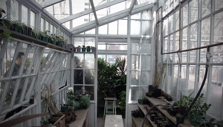
Phillip: I designed and built the third floor of Julianne Moore’s characters modern glass house. It had to seamlessly flow with the actual location. The set included the master bedroom, bathroom, David’s study, 2 staircases and a view to an 80′ long photo mural outside the windows. We also built the hotel bedroom and a few other sets. Sometimes we added to existing locations, for example we built a smaller greenhouse within the large greenhouse of Allen Gardens, Toronto.
Kirill: How much of the set design was influenced by eye color, hair color and skin tone of the main characters?
Phillip: We found neutral colours, and greens to look the best with Julianne’s and Amanda’s hair and skin tone.
Kirill: When Ann Rutherford told the producer David O. Selznick that he can save a lot of money by having the “Gone with the wind” actresses wear flannel petticoats under their hoop skirts, he replied that maybe the audience wouldn’t see them, but the actresses would know they weren’t silk. How important is it to create a complete set even if some parts of it are never seen by the audience?
Phillip: Sometimes I make things interesting for myself, the set dressers and the actors by accessorizing the sets beyond what is seen. For instance, in a main location we would sometimes fill drawers and cupboards with objects that would help define the background of the character. Pertinent books will be used on the shelves… these sort of things often become featured, and can provide the freedom to invent new scenes and to shoot spontaneously.
Kirill: You’re operating within the confines of the script, director’s artistic vision and, sometimes, specific external locations. Do you see this as a factor that limits your creative freedom, or rather a welcome challenge?
Phillip: I enjoy the challenge of working within boundaries. Because I write and direct my own films, often I get involved in the scripting process. I may suggest different locations that may tell the story better, or an action that could replace dialogue. Most people in film recognize the advantage of allowing ideas to flow in a collaborative way. Sharing ideas in the planning of the film is what I enjoy most about film making.
Through discussion I try to find visual language that becomes a coda for the film. Images of texture, colour, light and wardrobe are gathered specifically to the film. These images are put together in a book which is reproduced and distributed to the crew and cast. This “look book” becomes useful for specific references to style, period, but also just to inspire and remind ourselves during the shoot what we set out to do.
Kirill: Open space and cool glass surfaces surrounding the “Chloe” characters at home, soft rich colors and textures bathing the two actresses having an intimate conversation at a coffee shop – what is the importance of the scene setting and background elements in supporting the main story line?
Phillip: In “Chloe” glass became an obvious material to use whenever we could. Catherine lives in a house of glass and all that represents, the erotic voyeuristic nature of glass and windows, the way glass changes with extremes of cold and heat (like the story and the setting), and the way glass reacts when we touch it. It’s like an invisible skin.
Kirill: Computer-generated environments traditionally seen in sci-fi movies are becoming a more mainstream production tool. With the ever increasing sophistication and progressively more powerful capabilities of modeling and rendering software, do you see the filed of physical production design endangered by this trend in the next couple of decades?
Phillip: I enjoy the use of CGI in extending and enhancing real sets. If the film needs to be naturalistic, care must be taken not to overdo CGI and to build into computer generated scenes small flaws that you may experience when shooting something real. I often oversee the CGI work to make sure it fits.
Kirill: And on a perhaps related note, what are your thoughts on the growing presence of 3D productions in feature films?
Phillip: Film has a very short history and the way we read and interpret film is constantly changing. Technological breakthroughs and advances in film production very quickly become accepted, as the audience learn and adapts to new ways of looking. Interestingly, the older technologies remind us of the past and therefore possess a power of nostalgia. Technology becomes our history, it’s how we define ourselves and helps tell our personal story. Our storytelling, and our fascination with light is timeless.
And here I would like to thank Phillip for his outstanding work on the movie and encourage my visitors to watch it and keep an eye not only on the plot, but on the visual surroundings.