“Midnight in Paris” is the latest production written and directed by Woody Allen. A young couple, portrayed by Owen Wilson and Rachel McAdams, travels to Paris on the eve of their wedding. As Owen’s character falls in love with the city, the movie takes an unexpected turn, exploring a nostalgic – and at times over-idealized – fantasy that a life different from ours would be much better. The opening sequence of the movie, with the camera lingering lazily on stunning Parisian vistas, sets the visual tone for the entire movie, with fantastic performances from a star-studded cast.
Anne Seibel is responsible for the flawlessly executed production design of the movie. Over the last couple of decades she has worked on numerous productions, from “Marie Antoinette” to “Munich”, from “Swordfish” to “The Happening”. I am quite delighted that Anne has agreed to answer a few questions I had about her work on the movie and her craft in general.
 Kirill: Can you tell us a little bit about yourself and your background?
Anne: I studied in an architecture school, and I always liked doing art props for dance shows and family productions. My family was not in the movie business, but rather in science and medicine, and I went to study architecture. One day a friend of my parents offered to take me to a movie set, and I was very curious to see what happens during the shoot. There I realized there was an entire team of people doing what I was doing at home – making the sets – and it attracted me. I realized that with my background in architecture I can be part of such a team.
After finishing the school I had a chance encounter with someone working in the movie business, and when he asked me what I wanted to do, I told him that I wanted to do sets for movies. He offered me a job to draw a few sets for the fund-raising presentation. After working there and meeting a few people I have decided to call ten best designers in France to get an assistant position.
And then one day, I met a big designer named Serge Douy at the bar and he told me that he has a small job to mirror an english crew coming to Paris to film a movie, and he needs someone who speaks english. I asked which movie was that, and he said that it’s a James Bond movie – and I screamed inside my head.
Kirill: And that was “A View to a Kill” in 1985?
Anne: Exactly. That was my opportunity to start working on english-speaking american productions. I made friends with set decorator Jille Azis whom I was mirroring, and I went with her to her next movie, “The Living Daylights” which was shot in Morocco with a french speaking crew. From there I continued working first as an assistant art director, and later as an art director, on additional productions that came to France. I also did french movies as additional education with great designers, most of whom are now gone. And as time went, I learned my skill from great production designers that I worked with.
Kirill: What are your impressions working on american movies shot in Europe?
Anne: Sometimes I am hired as an art director to recreate the Paris parts of the movie outside France itself, in Budapest or Prague, for example. This happened on “G.I. Joe” with Ed Verreaux and “Munich” with Rick Carter. On other movies, such as “Rush Hour” or other scenes in “Munich” I work in France. Even “Marie Antoinette” is an american movie, even though it is about french history. I worked with K.K. Barrett as a supervising art director, and it goes very deep into the local history and culture, which might be difficult for an American to understand in detail – same as it would be difficult for me to research and recreate New York or London, more difficult because it’s not in my blood.
We were doing “Munich” with the production designer Rick Carter in Paris, and for financial reasons some parts were shot later in Budapest. At first I thought that I would not be doing those parts, but he called me and asked me to join him in Budapest to continue the work, and it was fantastic.
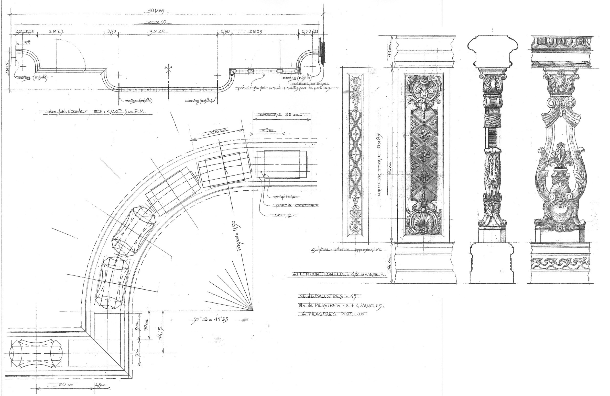
Marie Antoinette, detailed bedroom plan. Click to see fullsize image.
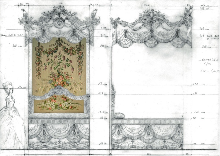
Marie Antoinette, detailed bedroom drawing.
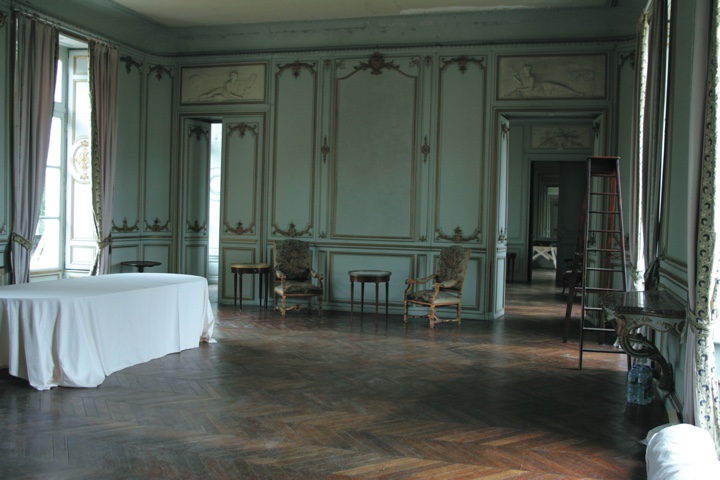
Marie Antoinette, bedroom location before decoration.
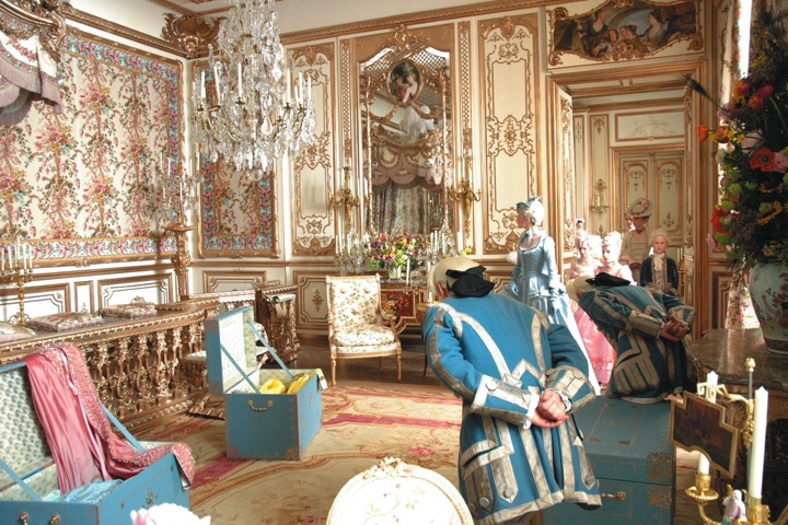
Marie Antoinette, bedroom location after decoration.
Marie Antoinette, final stills.
Kirill: I was just recently watching “Marie Antoinette” again, and it is so unbelievably rich in color, texture and incredibly lush set decorations. How did it go on your side?
Anne: It’s one of my best memories. It was such a nice and warm vibe working with Sofia Coppola. I did a lot of research, and had a real thrill doing all the construction. It was such a pleasure to go into the smallest details reproducing Versailles, to see how it was done – a really good way of learning history, better than at school. It was fantastic to go to Versailles, to meet the people who maintain the gardens and to talk with historians. I met this completely mad woman who is collecting everything about Marie Antoinette, and it was really incredible to see some of the pieces. It’s a really interesting part of our job to do the research, to put yourself in a different period.
We also spent a lot of time on small details. For example, we made extensive camera tests to find the right color of the gold. We didn’t want it to be too pink or too green, and you might not have noticed it, but it does not feel cold. We looked very carefully at colors and fabrics, and how they reproduced on the screen.
Kirill: This brings me to your latest movie, “Midnight In Paris”. It also has a very stylish look from the very first opening sequence. As the production designer of this movie, what was the initial exploration stage between you, the cinematographer and the director?
Anne: Woody Allen movies are different. The very first thing they told me during the interview – no construction, as Woody does not spend more the 10 million dollars per movie. With such a small budget for art department it was a challenge to do this movie in France. As soon as casting was over and I started working on it, I spent a lot of time researching the period. It was about two months before the shooting started, watching films, reading books and other materials.
I had very little discussion with Woody Allen. I saw him for an hour in New York, and about half an hour in Cannes after I’ve already looked at different locations that I could transform and adjust for the different periods of the movie. The contemporary period was the simplest, even when we tried to achieve a certain look with the cinematographer Darius Khondji. When I first met Darius, I gave him all my research to get on the same level. We worked closely, particularly on the colors and light of the period – brown, maroon and beige – and brighter colors for contemporary, to give a sense of passing from one period to another. And we had these great conversations about colors that I wanted to use, and how it fit into the look that he was targetting. We also talked a lot about the lighting and the practicals that we equiped in a certain way to affect the mood. I had another DoP (director of photography) calling me and asking how we managed to achieve this unity of lighting – and it’s because we worked together from the beginning on colors, texture of the shade, vibration of the bulbs and dim of the lights.
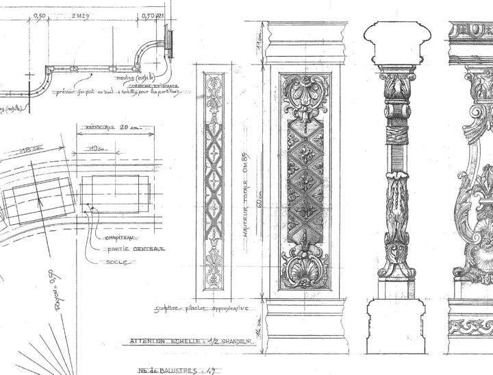
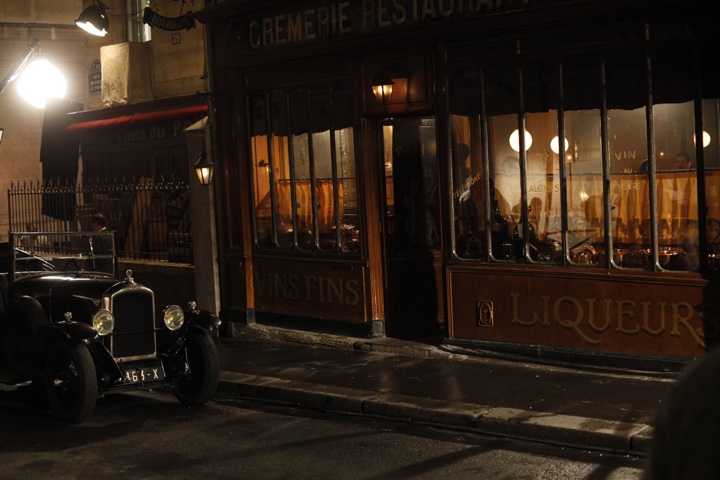
We had a task to find a modern location which we could use for 1920s within the budget restrictions, to find a solution that makes the viewer believe that it is a location from that period. “Moulin Rouge” was a particular challenge for me, my art director and my construction manager. The original building from the beginning of 20th century does not exist anymore, and there are very few concert halls or theaters that could be used to reproduce the original structure. We found one concert hall that hosts rock concerts, with a balcony running around it, and I took Darius there to show him the space that I will transform with false wooden floor, built ballustrades, drapes and period lights. I chose this place and studied a few visual elements that would attract the audience’s eye – light bulbs, peelers, table, railings – particular pieces that I found in the period references from my initial research. We managed to achieve the look we wanted with the mood and lighting by Darius, and if you look at the references, it’s the same feel.
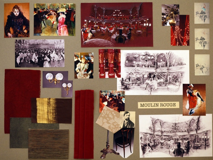
Mood board for the “Moulin Rouge” set by Anne Seibel.
When I went there with Woody, it was completely empty, and I thought that if he doesn’t like it, we don’t know what we’re going to do, because we only had one place. We used drawings and mood boards, and I sold the idea of shooting at that place, and everyone was waiting as Woody and I were standing alone in the middle of it, and he said “that could work”. Everyone was relieved, and that’s where we did it, a combination of finding little tricks and keeping within the budget.
Kirill: You mentioned that you wanted a distinct look for each period, but the first transition was almost unnoticeable. Owen Wilson gets into the car, goes into the nightclub, and it took me some time to realize what is happening. Was that intentional as you slowly introduced different costumes, lighting and colors?
Anne: As the car goes up the road, we started removing modern items, as the car itself, and the people and their costumes are telling that it’s different. It’s not telling it straight away as it can be people going to a dressing party, but as they’re stepping outside, they come into a place which has the real look of 1920s, the costumes, the furniture, the mood, and that slow transition was intentional to make people realize what is going on. We want to make a bit of mystery surrounding the midnight, and I like the way we did it.
Kirill: How much time overall did you spend on the movie?
Anne: The filming was seven weeks, the official preparation was also seven weeks, and I personally researched for two months before that. We shot it during the summer, as Woody calls them “Woody Allen summer projects”.
Kirill: What happened during the preparation?
Anne: When Woody came five weeks before the shooting began, I had visuals and mood boards to illustrate my vision. Most of the time it worked, and we only spent a lot of time on the Pigalle set. Woody wanted to go to that district which is very modern with a lot of neon lights, traffic and sex shops. We looked around a lot of little streets, and we ended up in Pigalle narrowing the space. If you go out of the frame, it’s all modern, but within the frame it was our magic – change the facade, change the lighting, change the coffee shop furniture, the posters, the cars in front – just the magic of dressing.
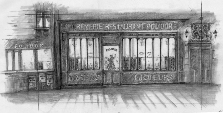
A sketch of a 1920’s restaurant exterior.
The decorated exterior of “Polidor” restaurant by Anne Seibel.
There was also a place that I found, and I really liked it, and it was completely unusual and not even part of the script. Some of the Zelda Fitzgerald’s cocktail parties were supposed to be in an apartment, and this place I found was a museum for fair pieces, with old merry-go-rounds and game machines, was so incredible, with such a strange dark ambience, that I had to take Woody there. When Woody went there, he was like a child and he changed the script to have the party inside this place. It was the look of the place that made him change the location.
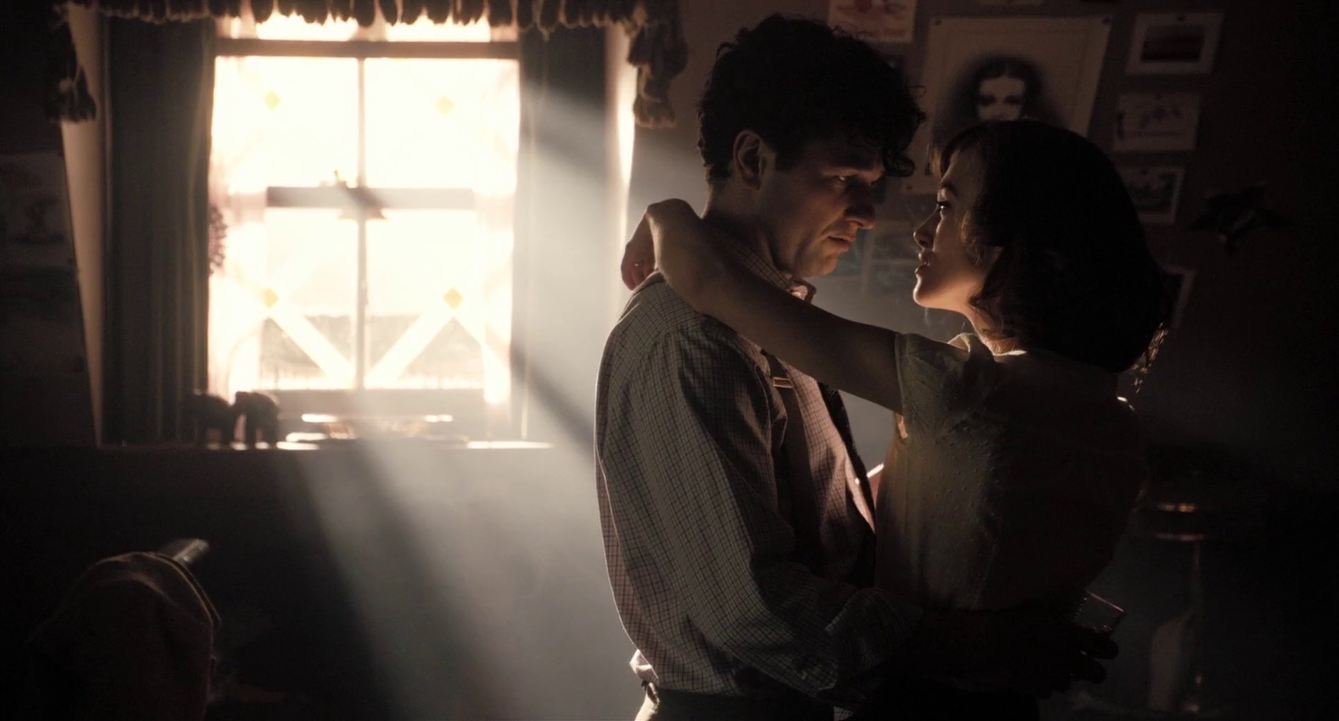
Kirill: Did you spend a lot of time decorating the hotel room where Owen Wilson and Rachel McAdams stay in the modern period?
Anne: We shot it on location in “Bristol” hotel. We changed things according to the script – the lights, the curtains – just dressing it with props and flowers. We didn’t do anything major, but there are always some adjustments to do, especially with lighting because it’s very complicated to film in a small area. We did a lot of research on different hotels, and this was our favorite.
Kirill: Did you enjoy working within the tight limitations of the budget?
Anne: It’s a challenge, but at the same time the budget is never enough, even on big movies. You just never have enough money. I enjoyed this challenge, and I liked that the producer Raphaël Benoliel brought this movie here [Paris], and he made us feel as one big family on the set. It was a pleasure working with everybody, communicating, working for Woody Allen, making his movie the best we could.
Kirill: Do you have a favorite scene?
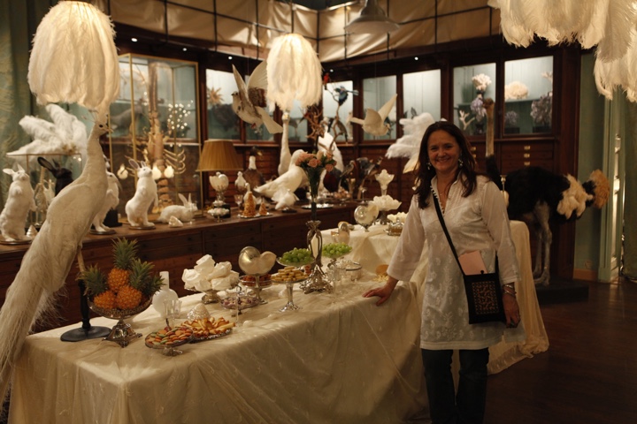
Anne: I really enjoyed “Moulin Rouge”, mostly because of the set, and all the scenes with Gertrude Stein [Kathy Bates]. I also liked the surrealistic wedding at the taxidermist “Deyrolle”, where we created special lamps with feathers, working around the wild animals. We managed to create a different look for different scenes, instead of going for a traditional look of apartments or restaurants, and I’m very pleased with this movie.
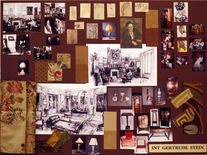
Mood board for the Gertrude Stein set by Anne Seibel.
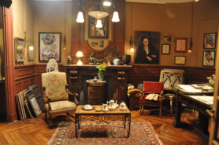
Final decorated set for Gertrude Stein location by Anne Seibel.
Kirill: You worked on different types of productions, periods and looks. Do you have a favorite one?
Anne: Contemporary movies set in usual locations interest me less. Woody’s next movie, “Nero Fiddled” is set in Rome, and although it’s a contemporary movie, I tried to find unusual locations to serve the script, giving various different look at the same time. I’d love to be able to work on a fantasy movie, where you can completely let go of your imagination and go crazy, like on Tim Burton productions.
Kirill: Can you recommend a few of your favorite productions?
Anne: It is hard to choose a few. “Midnight In Paris”, of course, is my first recommendation. The film I will watch again and again with a true pleasure. “E.T.: The Extra-Terrestrial”. I am a fan of Tim Burton and Terry Gillian. Recently I enjoy very much the Polanski film “The Ghost writer” and I liked “Avatar”, for the look of it, and because I’m a great fan of Rick Carter. I really loved what he has created in the Avatar world.
Kirill: Do you start analyzing the production aspect of movies when you go to the cinema?
Anne: Sometimes. I look at it, because it’s my job, and I like movies in general. When I saw “Midnight in Paris” for the first time in Cannes, I was drawn into it even though I worked on it. Woody did a really beautiful film with what we created for him. When you work on a movie, you don’t realize what will happen and what the director is going to do with it. It was very clever in the way he put things together, and I was totally drawn into it and I believed in it myself, even knowing how we set up the scenes.
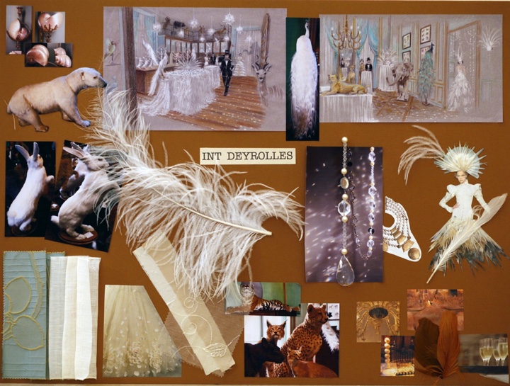
Mood board for the “Deyrolles” surrealistic wedding by Anne Seibel.
Anne Seibel on the constructed set of “Deyrolles”.
And here I’d like to thank Anne Seibel for the interview and the supporting materials, and Rebecca Fayyad of Sheldon Prosnit Agency for putting me in touch with Anne.
In this interview the cinematographer Jonathan Freeman ASC talks about what drew him into the craft, the slow transition from film to digital and the art of lighting. In between he walks me through the creative process behind his recent movie “The Edge Of Love“, from choosing the locations and defining the visual language, to capturing low-light scenes, post-production color matching and integrating visual effects.
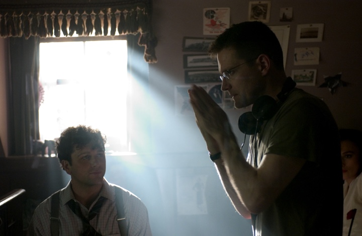
Jonathan Freeman on the set of “The Edge Of Love” with Matthew Rhys and Keira Knightley.
Kirill: Tell us about your background and why you decided to pursue a career in cinematography.
Jonathan: I was born in Canada. After studying in Concordia University in Montreal I began my career doing low-budget Quebecois dramas, even though I spoke very little French at the time. Then I moved to larger projects as I built my reputation, eventually leading to larger American projects. Around twelve years ago I moved to New York as I was receiving more offers from American productions. For the most part I shoot drama, whether it’s for features or for television, and also some commercial work.
Kirill: Were you always interested in making movies?
Jonathan: Going back many years, I was always drawn to movies. It was the first “Star Wars” film that pulled me in as a kid and, like a lot of people in my generation I was blown away by the spectacular special effects. The opening sequence, with the ship flying overhead, felt so real; and then the camera tilting down to show a planet that looked very much like Earth – as a ten-year old I wondered “how did they shoot that?”
As much as I was captured by the story, I was even more intrigued by the magic that was in front of me and I wanted to understand how that magic was created. And from that simple process of being inspired I went to see the movie again and again and then again. My mother was a painter and she taught me a lot about light and color, and my analysis on why it seemed so real was the magical element in how the camera was used to photograph the models. In addition, the way the models were lit seemed to be very realistic comparing to the space photographs of the period.
Throughout high school I was interested in great directors and cinematographers. Bertolucci and Storaro were particularly influential. My generation was fortunate enough to be at the advent of VHS home movies available for rent – as an essential tool to study movies at home. Sometimes when I was overwhelmed by certain movies during the first viewing I would go back and watch the specific sequences to see if I could figure out how they achieved their beautiful work.
Kirill: You mentioned the word “magic” when you described your first impression with “Star Wars”. Were you disappointed as you started dissecting the actual techniques, unravelling the illusion and masterful deceit?
Jonathan: It was actually the opposite. I marveled that someone was able to create this illusion. I particularly was impressed with the work of the team led by John Dykstra ASC who supervised the special photographic effects on the original movie. It was good to see that there was this group of people who were able to achieve this, and it was inspirational in a way that I wanted to do what they were doing.
Kirill: Looking back at those years in high school where you would rent these precious VHS tapes and rewind the specific sequences to study and analyze them, how would you compare it to the abundant access to an ever-expanding selection of high quality digital media in the present day? Does that affect the genesis of the next generation of cinematographers and movie creators on one hand, and the movie fans on the other?
Jonathan: I think more access means more information, and it’s always a selective choice. If I was born ten or fifteen years earlier, I would have been more restricted because the only way I could have reviewed movies back then was with 16mm prints or repertoire cinemas. Overanalyzing things doesn’t necessarily help either, but the ability to have access is a good thing.
There’s a bigger question when it comes to the current and the next generations, certainly for cinematographers, as the digital medium overtakes film. It’s much like the way the digital still camera has lost the magic of still photography. First of all people don’t even look through a view finder anymore, and even if they do look at the camera monitor, they’re already half-editing the shot before the moment it could be created. There is a great deal one can learn from trial and error. When you look at the work Robert Frank did with a still camera on the subway, he would often have it on the shoulder strap not even looking through the view finder, taking a shot of what he thought was interesting. He was able to capture these images confidently because he imagined what his camera was seeing without looking through it. That requires a lot of trial and error. He may not have known for certain whether he got an interesting image. Only later when he would look at the negatives and proof did he discover what would become very iconic images.
I think that kind of magic is being eliminated. The experience of not knowing for certain whether you have captured the moment is surely different from shooting in a digital production – there’s a bit of a loss in that respect. Does it mean that the work of the next generation is not going to be as good, or even better? I don’t know. There might be a gain in other areas. But I certainly love film.
Kirill: Is it a loss in the sense that instead of relying on your artistic instincts you’re guided by the immediacy of the visual feedback, not only for you, but for the rest of the production crew on the set?
Jonathan: I have to admit to sounding a bit like a dinosaur. There’s a certain value to understanding the photographic latitude that the film required you to learn. It would involve thinking about the stock, the lenses, the filters, setting the correct exposure value to cover what you’re looking at. The kind of experience that you eventually gain through shooting film is valuable in how you understand and appreciate the technical restrictions of the medium. Of course similar things happen when you shoot video, analyzing the exposure outside the windows and compensating, but for me it comes back to the magic of it.
It’s not something that derails the potential quality of cinematographer’s work, but I do think that emerging cinematographers would benefit from shooting film. Even still film is a good learning tool, as well as shooting in black-and-white. When you shoot in black-and-white, you get a much more appreciative idea of contrast, and the lack of color separation forces the photographer to find ways to create separation.
Kirill: So through restricting yourself to a different physical medium you’re becoming a better artist?
Jonathan: I wouldn’t qualify it as better, but definitely more versatile. I don’t consider myself a very technical cinematographer, and there are a lot of things I wouldn’t be able to tell you about a film camera and certainly about a digital camera and their basic components. I do understand the principles of exposure value, and as a cinematographer it’s critical for you to understand, not just for the immediate moment when you’re recording on film or digital, but for the final projected and broadcast result.
Kirill: What was your choice for “The Edge Of Love”, film or digital?
Jonathan: It was actually a mix. It was probably 40% film and 60% digital Panavision Genesis HD camera. This was by choice and not necessarily aesthetically. I was working with the brilliant director John Maybury, and it was actually our second collaboration in a period of less than a year. We worked together on an HBO series “Rome” which we shot on film, and at one point I was shooting digital stills to give him an idea of what the result might look like. We were talking about monitors which are either too bright or don’t represent what I’m exposing, and I realized that it would be helpful for both of us to see an image that is much closer to the end result. This way I could go even darker in the scene because he was OK going that dark, because he felt more confident that he was seeing an accurate image. Before I would be more conservative regarding exposure, and as a cinematographer you rather expose the negative as close to your intended result. I thought that HD was a good attempt at resolving this.
However, as we were shooting a portion of the film in Wales, it didn’t seem that Genesis was a system comfortable under different weather conditions. Never knowing what you would get in Wales, and for efficiency reasons (not being tethered to HD) I just felt it would be OK to shoot that portion on film. As it was meant to be stylistically separated in anyway, I shot the Wales part in film, a kind of a dreary Tarkovsky landscape – in contrast to a more vibrant night London.
And so we shot our first three weeks on film in Wales and then came back to London and switched over to HD. I think it worked out pretty well.
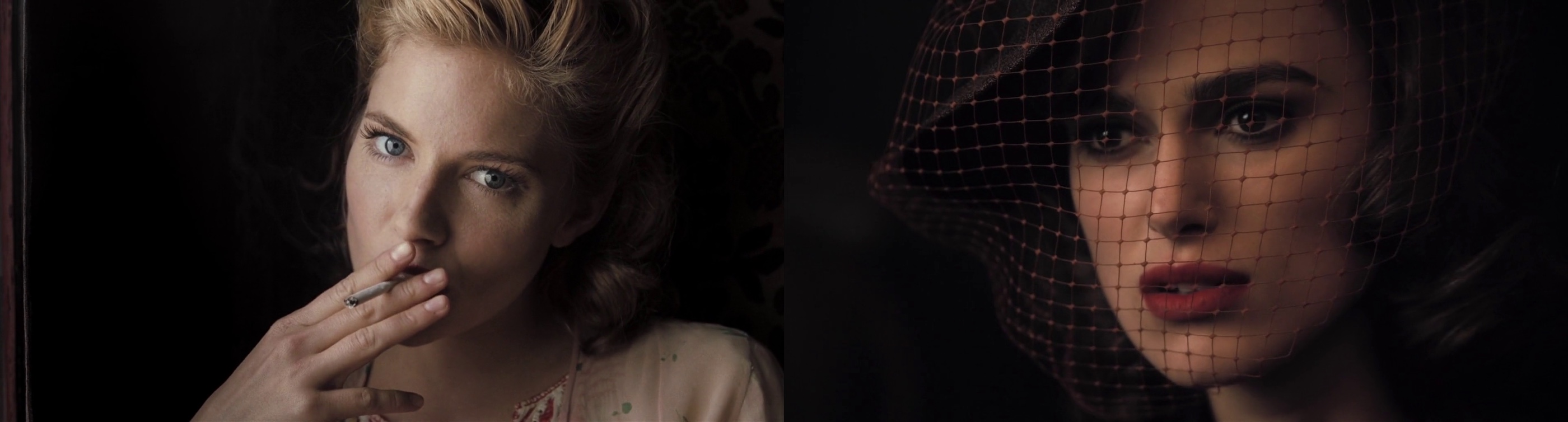
Left – close up of Sienna Miller – 35mm film. Right – close up of Keira Knightley – HD digital.
Kirill: Are you more limited by the bulkier HD cameras that often run thick tether cables back to the recording booth?
Jonathan: It was back in 2007. The current technology comes with its own version of recordable sources, so that you can record without being tethered to a cable, apart from some recommended dependent systems. Regardless, even on film we’re used to an attached video cable that provides video playback, and at the time it was the choice that we felt to be more efficient. Today, in the same exact scenario, I would probably assume to shoot in one format or the other.
Kirill: Given that your most recent work on the “Boardwalk empire” is on film, do you see yourself continuing this in the next five to ten years?
Jonathan: It’s becoming progressively less of a choice, being driven by production considerations as well. In some cases the production will be willing to consider doing film as long as there’s a financial give back on our end in some way. Shooting straight film is very costly, and the cost of DI [digital intermediate] stage has come down to a point where posting your film in anything other than digital intermediate is not even affordable. Digital has improved rapidly year to year, and it’s possible that in five years a system will come out and it is really superior to film.
When it comes to low light levels it’s hard to argue against HD even with the highest quality film. It’s at least comparable, if not more successful – depending on what you’re talking about. It’s certainly comparable in grain and resolution, and it’s harder to narrow down in regards to color range as different systems respond differently into the low end. But when it comes to highlights, HD is overall universally challenged and film is still superior, but that will change.
I said ten years ago that film will be dead. Maybe not in ten years [laughs], and hopefully there will still be opportunities to shoot it because it’s a beautiful format. But being conscientious of the environment, video is much better for the planet.
Kirill: Transitioning to your role in the overall production process, what does a cinematographer do?
Jonathan: The director usually hires the production designer first, and that was the case on “The Edge of Love”. John has worked with Alan MacDonald for many years; a cinematographer’s dream to work with. Alan worked on principal ideas before I came on board, and after I joined we started adding to and reshaping the script into what John was visualizing. They are both very collaborative, and together we developed various ideas for the scenes, going through the script.
It was over a period of weeks, where we would gather notes and sit down scene by scene, discussing different locations and how we would approach things. John would tell me how he visualized opening the movie, and we’d work together to figure out the shot elements. Alan would have ideas on specific imagery that he researched and found, and we’d apply those to certain scenes.
Kirill: Did you drive to locations across Great Britain, shooting stills and bringing them back to discussions?
Jonathan: Exactly. In some cases we studied generic photographs of locations, and at other times we would discuss very specific angles that one of us thought to be a strong support for the story. Sometimes the locations didn’t look exactly as I wanted them to be, so I photoshopped the pictures to give a stronger impression to John, or I would take his thoughts and apply that look.
Kirill: And the goal was to have a prototype of the intended visual style?
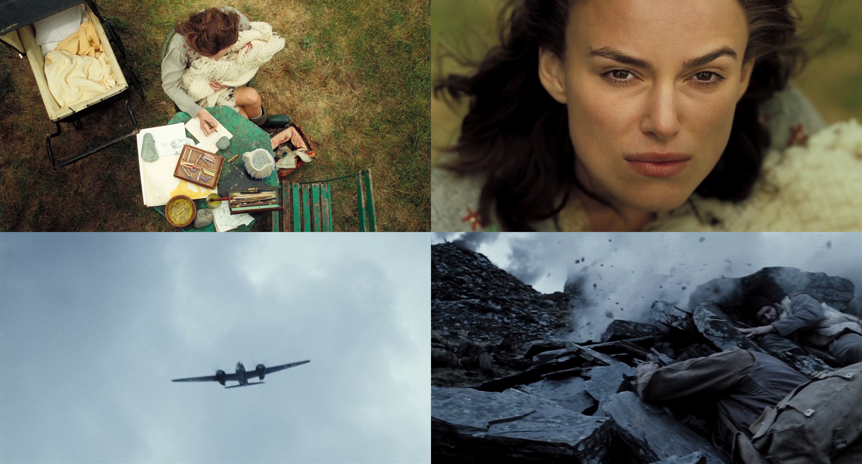
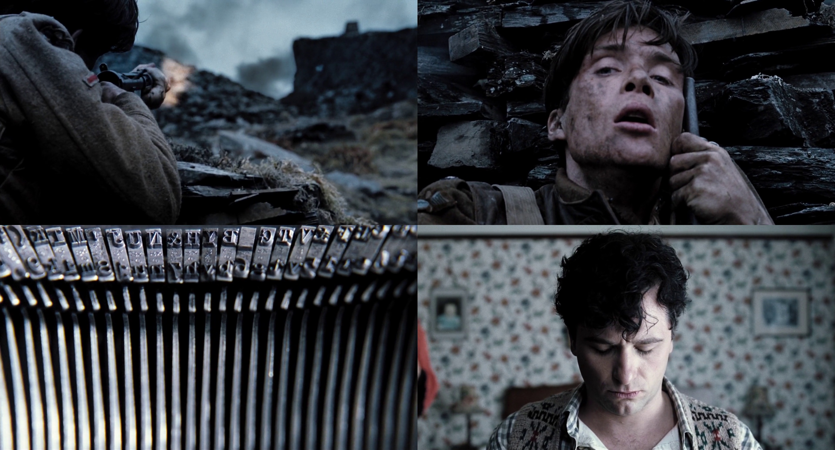
Jonathan: I’ll give you a few examples. Many years ago John had found this beautiful location in Wales, and he wanted to use it for the sequence of Cillian Murphy‘s character at war (that took place in Greece). Even if it doesn’t make logical sense as it doesn’t look like any specific location in Greece, the black slate quarry surrounding the hillside is very dramatic, and after going there, we tried to figure out the sequence. The script as it was originally written was very true to the story, but not very dramatic. Cillian’s character was originally tasked with digging up land mines, but as he was not blown up or exposed to direct violence, we needed to give him a little more heroic angle.
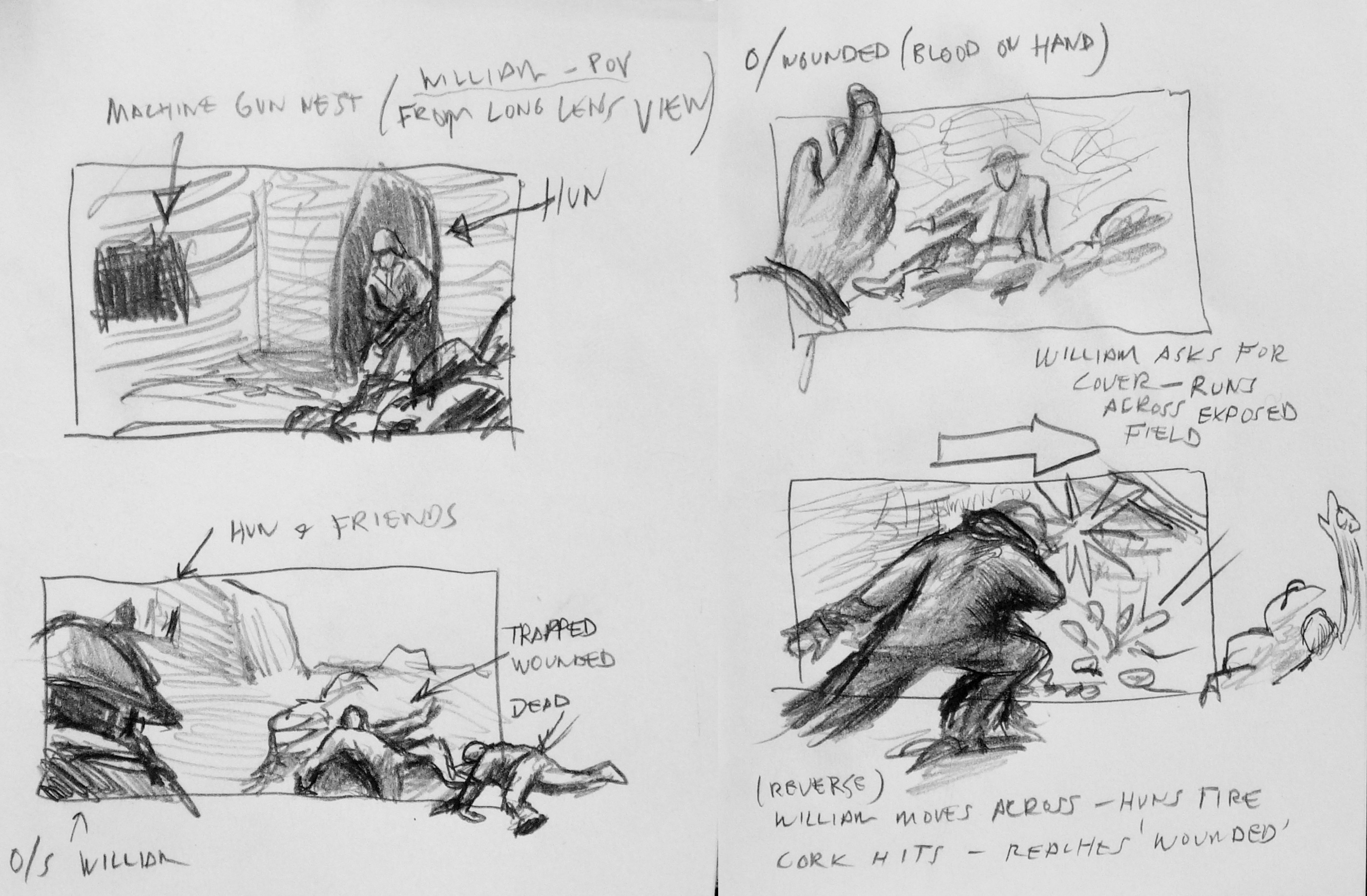
Hand drawn original boards by Jonathan Freeman.
So we had to reconceive the sequence – with very little money – to tell the story not only of his character, but also the potential psychological and traumatic experience at war. In addition to the field surgery scene, we needed another one of battle, and we only had seven hours to shoot it. It was done in a way that was as simplistic as we could do it, with great help from the brilliant “Double Negative“; the digital effects company behind “Children Of Men” among countless other projects. They delivered some of the missing elements in the scenes that we pre-planned and shot.
This specific sequence begins with Keira Knightley‘s character writing a letter, and then, when she hears a plane, we cut to the plane above and transition to the battle scene. Originally I suggested that the plane is going away and we tilt down with its movement, but in the end we flipped it to an advancing plane and tilting from there, as the visual effects company thought it would be easier for them to do. And all the elements including the CGI planes were cut together to create a sequence which I boarded as a reference, and in the end it came pretty close to what we’ve planned.
Another concept of a sequence was with Cillian and Keira huddled together outside the bombed night club, just before he was shipped to war. Alan had this image of a firefighter during the blitz, as a silhouette hosing down the fire.
Kirill: This was a nice transition from a glamorous dance hall interior to the grim reality of a wartime London.
Jonathan: This was John creating an experience of the time, where you live on the edge, risking your life on the daily basis – and a lot of characters are right on that edge. You risk a lot, but you feel that you live the best that you can under the circumstances.
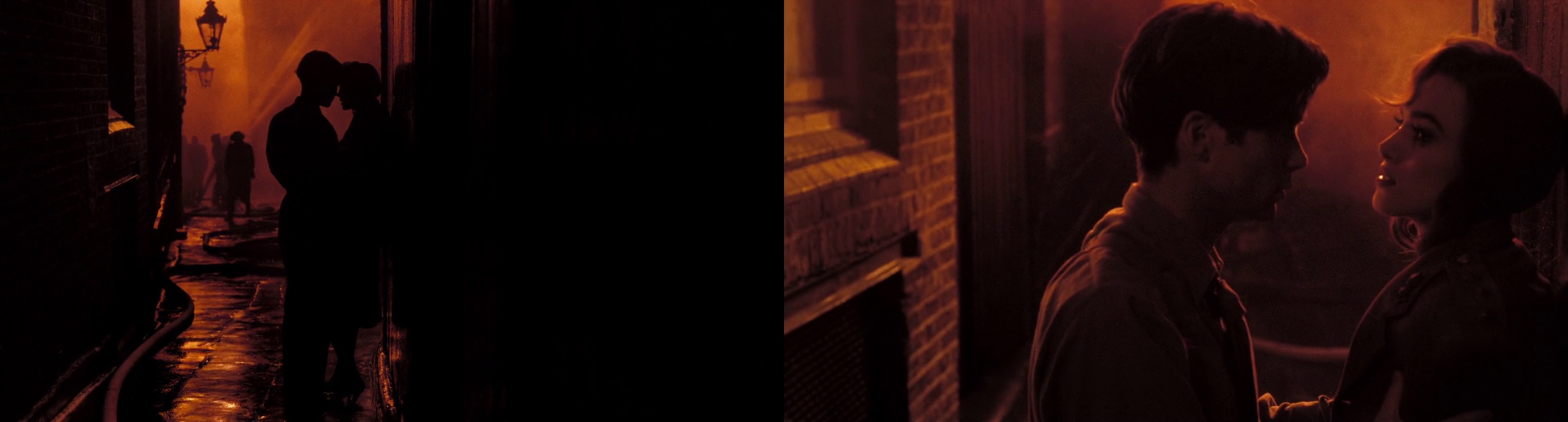
And the sequence that we could afford, without a big spectacular CGI fire scene, was based on this photograph. We looked around London to find a place where we could recreate this practically, without it becoming a huge thing. I don’t remember the exact location, but it was close to the theater district, sort of a narrow alleyway, where we were able to frame their silhouettes against what ended up being a cluster of lights on a tower, with a lot of smoke and some guys hosing a building offscreen. This is sort of a typical illusion that ends up feeling more expressionistic – which is what we wanted to achieve in much of the London portion.
A lot of John’s movies and approaches are expressionistic and suggestive. That image didn’t have real fire, but you know it’s fire because of the color and the logic behind it. You never see the collapse of the interior of the night club, but you get a sense of it when the chandelier is down and everything goes black, and it’s just search lights panning over the victims while our heroes escape. And this is John’s visual way of interpreting simply something more spectacular, in a somehow more gratifying way.
Kirill: You talked about your collaboration with “Double Negative”. How does it work during the post-production as their digital output is merged back to the live action sequences?
Jonathan: The color correction was done at Framestore. Brian Krijgsman is a true artist, and he was very integral in delivering another layer of the look through his expertise and patience. He would show us things that he could do with the system, and it’s unfortunate they’re no longer doing DI [digital intermediate], as their system was the best DI experience I’ve ever had.
Digital intermediate is essentially color grading or color timing which happens at the final stages before you do the film print. It used to be done chemically, but now it’s a much simpler process. You also have other things which you couldn’t do in standard film timing, like power windows where you can darken or lighten part of the frame, more versatile range of color and exposure adjustment.
Kirill: Did you participate in the post-production stage?
Jonathan: The visual effects company was certainly involved during the integration of their sequences. But overall it was again myself, John [Maybury, director] and Alan [MacDonald, production designer]. Although it doesn’t always happen, I wanted Alan to be there as well. It was important for me to see him getting value on the images that we collaborated on. If he felt that the initial exposure missed out on a certain set detail, I’d be very happy with him going in, taking that detail and bringing up the exposure. John also was able to highlight other aspects of the frame whether it was costume or an actor’s face.
The staccato of bullets morphs into the staccato of typewriter, aiding the visual transition from war back to peace.
Kirill: How much time did you spend during the post-production phase?
Jonathan: Once the shooting was complete, the editing took a few weeks. It was fairly quick edit, and we did the color timing within six-eight weeks or so, and we spent two weeks at Framestore which has been an excellent experience for us.
Kirill: What was the daily routine of looking at the output of that specific day?
Jonathan: We did what most people do – watch DVD dailies. It was a standard analysis, and it was more critical in Wales as we were shooting film. It became less critical when you’re shooting HD as the dailies that you get are essentially the same as you see on the set – which was another advantage of HD, as you’re able to see the immediate output collectively.
Kirill: The London scenes were done in very low light, immersing the viewer in the environment that required the citizens to close all the windows and use as little light as possible. Was it more challenging to shoot London scenes from the lighting perspective?
Jonathan: In some ways that was my biggest challenge. I remember John joking about how was I going to figure this out. Technically speaking, we took some liberties in terms of what we got away with, but basically the exteriors of London at that time were pitch black during the night because of the mandatory blackout during the blitz. At night you can’t use any artificial light as your source. It’s essentially what they classically describe as moon light, and I personally loathe this idea. Moon light tends to look very artifical on film when it’s recreated, and you can’t shoot in the real moon light. There’s very few examples in cinema which I’d describe as great moon light.
There’s a choice, and I felt that a more subtle ambient sky light in a cloudy overnight cast – as opposed to a harder single-source direct moon light – will cause your eyes to eventually adjust and see something. And on top of that we’d have the search lights illuminating the clouds, so theoretically between that ambience and the natural ambience of the moon light filtered through the clouds you’d have your light source.
We could justify the artificial tungsten lights for the interior scenes, and the blocked windows provided a nice contrast between warmer interior and cooler exterior as the light did not enter from the outside. I had my biggest challenge in the scenes which were not supposed to have any light sources at all.
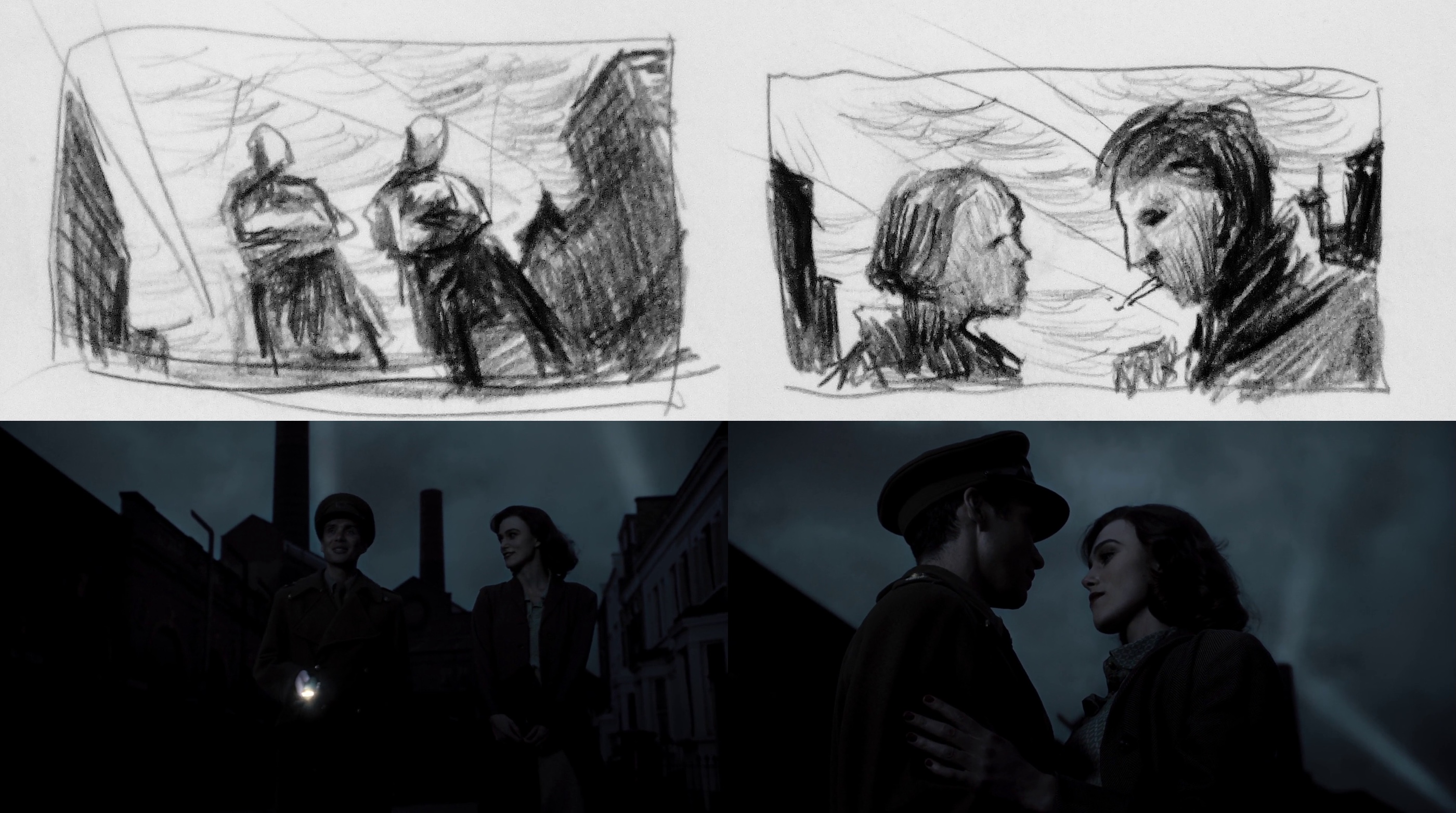
Top row – hand drawn original boards by Jonathan Freeman, bottom row – final stills.
The sequence where Cillian is walking Keira home, and there’s a street in Chelsea with this beautiful factory, and we asked ourselves how do we show the scale of the street without it looking false. You can get a big light way down the street, and that becomes your moonlight – but I felt that it was very artificial. And the alternative that I came up with was no less artifical, but more aesthetically interesting. We shot the sequence in one shot at magic hour, with the intention to take most of the street and the figures, bringing the exposure down so they’re almost silhouette walking against the sky that we eventually replaced with visual effects.
Part of the framing was to keep the characters silhouetted against the sky, because otherwise they would be buried against the dark architecture.
Kirill: And there you lowered the camera to show more sky and less cityscape
Jonathan: Exactly. This would silhouette them more distinctly, and would provide the opportunity to show the search lights that happened at London at the time. I drew some boards for this, and did some photoshop explorations.
Kirill: There were two shots, one at the bar, and another where Cillian and Keira were making love for the first time, and it appeared that you shot them through some kind of a glass structure that resulted in a series of complex overlapping reflections. Can you share your secret?
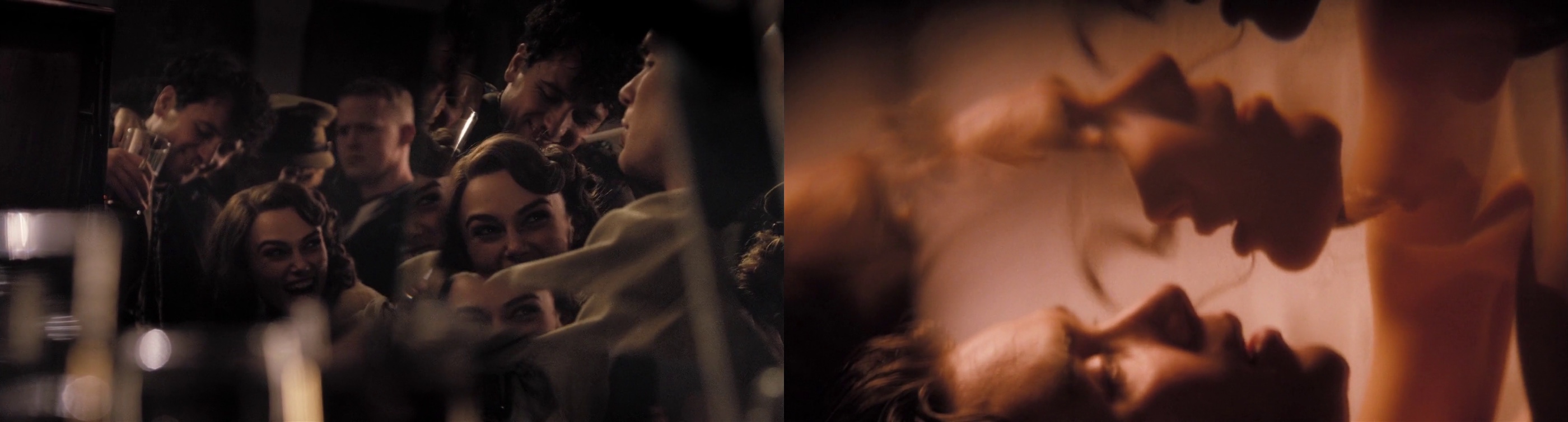
Jonathan: That’s the pure genius of John Maybury. We shattered a large mirror and selected a portion of the mirror break that seems to be the most photographically interesting, with fragments large enough so you can capture almost the full image.
There are two things that happen. Since the fragments are not flush to each other, they capture slightly different degrees of angles of the same image. We’ve asked the actors to start pretending to make love, and as that’s happening we shot them in profile through the mirror and panned while using a series of zooms to give the camera some movement. Then we created a dissolve effect which we did through a series of shots. Because of this, we had this magical moment in two or three shots, as they separate from kissing, there’s a silhouette that happens where their faces seem to merge together to become one. John knew we would get something interesting but this was one of those magical moments you can’t plan for. It was very lucky actually.
Kirill: Would you describe this as going with the flow, as it’s hard to plan for?
Jonathan: You can plan for it but it’s, again, the magical element. We did a lot of very precise planning, but things like that are organic and it’s fantastic when it does happen. You know you’re going to get something interesting, and John knew confidently that he’ll get something that he could use. Following his lead I knew that as well; but we didn’t know what we would get in moment. On camera it works photographically in a way which is very abstract and beautiful.
John is a brilliant artist and a great person to work for and work with. He inspires you in a lot of ways, and encourages you to contribute, which is the best collaboration you could possibly ask for.
Kirill: There were a couple of scenes with very strongly defined pyramid of light penetrating the windows. Was it your intent to have this in scenes where Cillian’s character is not present, highlighting the more feisty side of the other three characters?
Jonathan: I like the analogy of pyramid of light. We definitely wanted to frame Cillian out of the shot, but I’m not sure if this type of light was the right call. You certainly don’t get a lot of sunlight in London, but that scene needed a contrast to highlight the potential jealousy from both Cillian and Sienna [Miller]. We needed something less gloomy to elevate an image of Dylan Thomas played by Matthew Rhys, as he and Keira are sort of enveloped by the light, digging the knife even further into Cillian’s character.
Kirill: As it wasn’t direct sunlight, how did you achieve these visuals?
Jonathan: It was a very simple standard technique used by a lot of cinematographers. We used a 10K tungsten Fresnel light which can be used for sunlight effects, placed outside the set. I wanted this shaft of light to be even narrower, but we didn’t have enough space in the studio. So I bounced the light into a mirror, and then it would be directed into the window. Since the reflection of the light has to travel twice the distance to the window, it effectively moved the light further back from the window. Otherwise if you put the light too close to the set, its quality becomes too wide and unnatural. The placement itself and the backlit quality makes it more impressionistic, but still has a natural quality to it.
Kirill: You said in the very beginning that you were immediately drawn to analyzing and understanding lighting as an integral part of the cinematographer’s craft.
Jonathan: I can’t imagine being a cinematographer not constantly thinking about the light. Obviously the composition and framing are incredibly important too, not only to be aware of, but to be an active participant as well. But to be fair there are a lot of directors that know where exactly they want the camera to be. Some others may not have an idea where they want the camera, preferring to work with the actors. When that happens occasionally, I then try to find different alternatives to cover the scene – so it can spark a discussion. But most of the time it’s somewhere in the middle as a collaborative process, building together a shot design based on the director’s ideas and my suggestions. And even if there are few directors that have specific ideas for the look of some scenes, the cinematographer’s principle essence is the light, or lack thereof. It begins and ends with light for me.

Capturing the magic hour. Top left – test mockup during construction (waistcoat and gun added in Photoshop). Top right – shot from the set, capturing the scale of the house against a fragile character. Bottom row – final stills.
Kirill: You mentioned that digital cameras are not good at capturing highlights or a wide contrast range. Does this contribute to some cinematographers’ opposition to this technology?
Jonathan: I think it would be wrong to say that we’re opposed to it. Five years ago there were a lot of cinematographers swore that film was it. The technology is still not there yet. It still needs to be further developed, it needs to surpass film in terms of full dynamic range and capacity, and once it does that, I think that everyone will understand that a new medium has effectively replaced the old one. But a lot of us are not comfortable with the idea that if a technology gets locked in too soon to be acceptable, then we’ve lost something. If a technology gets to replace another technology, it has to be because it’s better in all respects.
Kirill: That is not necessarily what happened when the music recording industry has transitioned from vinyl to CD. Even though the hardcore audiophiles still swear by the dynamic range and warmth of sound captured by vinyl, the general public does not seem to care as much.
Jonathan: That would be true for cinematography and photography in general. I think there’s another stage where in twenty years digital will be so far advanced in terms of dynamic range capturing that we’ll be requested to make it worse, if you will. There will be functions like today’s hipster apps that will give you a look of the specific film stock that we’re shooting with now, like Kodak 35mm 5219.
Kirill: And even now the visual effects artists are required to recreate the physical imperfections such as lens distortion or film grain, as their output is integrated into the live action.
Jonathan: Going back to magic, the first thing about visual effects is that they have to appear real. There are certain ways in which you can aid that, and taking away the perfection of a computer generated image is one of them. You can do this through lens distortion, light flaring, and film grain – which is still hard to simulate. I’m sure that somebody will come up with a program that will be able to satisfactorily simulate grain of different film stock.
The only way it’s going to happen is if dinosaurs like me, and more influential dinosaurs will keep saying that what we have now is not good enough. If we all say that it’s OK, there’s no reason for the companies that develop these technologies to move forward and to advance and improve their products. So the motivation must come from us to keep their feet to the fire and make sure that this transition into the new medium is done in a way that succesfully surpasses film.
It’s unlikely that twenty or thirty years from now we will look back at the films we shot and people would say “wow, that looks terrible, how would you even think that looked great”? It’s much like the black-and-white films that have their own essence and their own beauty that represent a certain time period of cinematic history. And the new technology that replaces film can have its own marker, but it needs to be at a place where we’re not struggling to achieve things that we can already do on film.
I’d like to thank Jonathan Freeman for kindly agreeing to this interview, and I hope you enjoyed it as much as I did. Special thanks to Kimberly Weston at ASC and Andrew Stadler for their help.
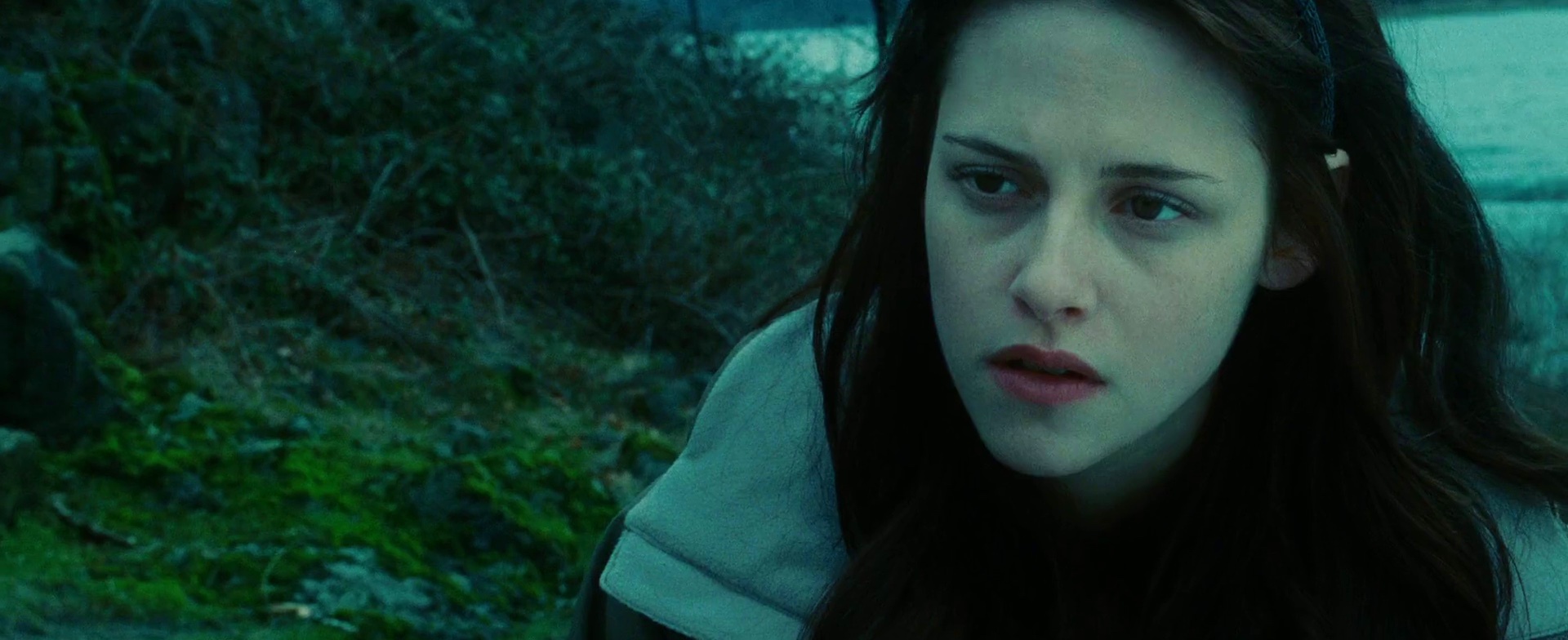
The first installment in the “Twilight” saga is a well orchestrated and beautifully executed visual journey by the director Catherine Hardwicke. I have to admit that it was actually quite hard to narrow down the selection of stills for this entry; the color coordination and narration is very consistent throughout the entire movie, never lapsing or cutting corners, and never creating an unpleasant combination or arrangement.
Desaturated turquoise is by far the most dominant color in the movie, and it’s quite fascinating to see how it is supported by different color combinations in different scenes. Here, the support is provided by golden ochre and teal blues.
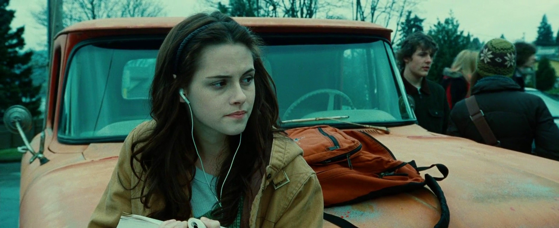
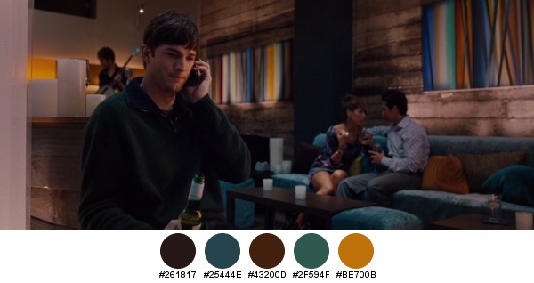
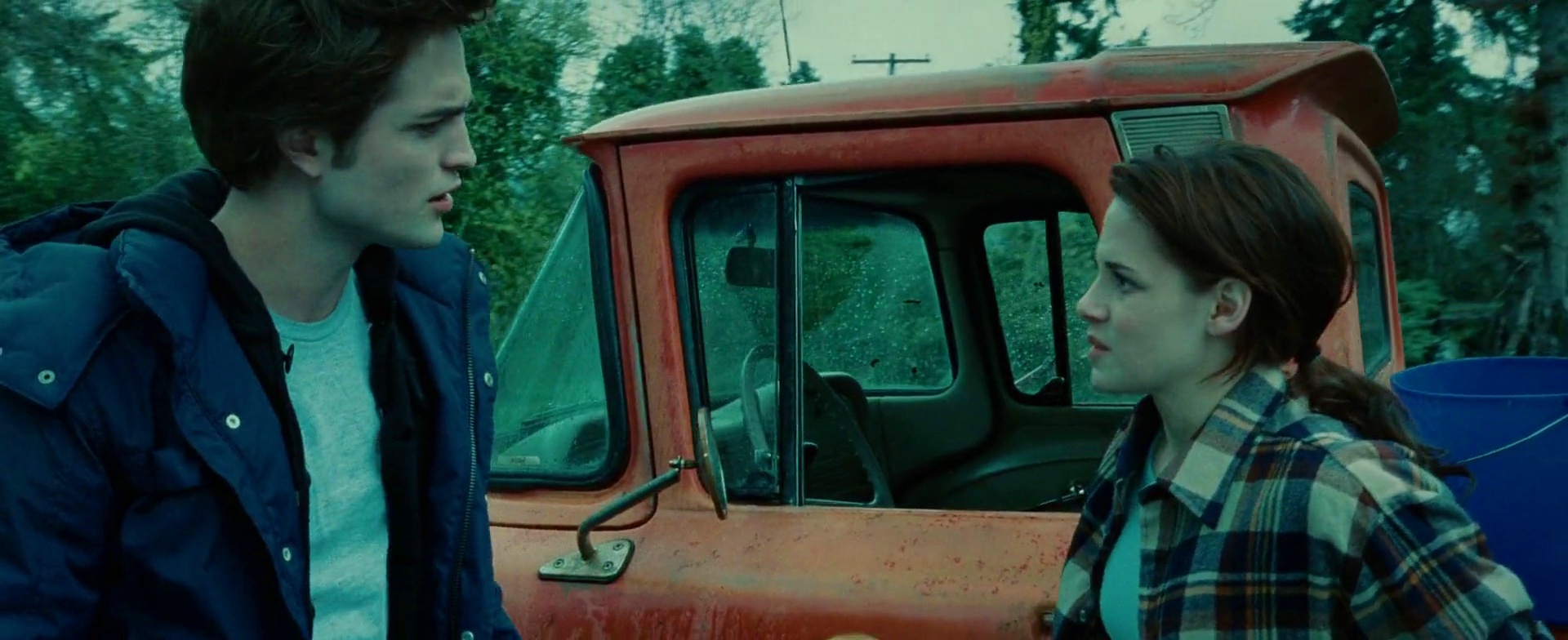
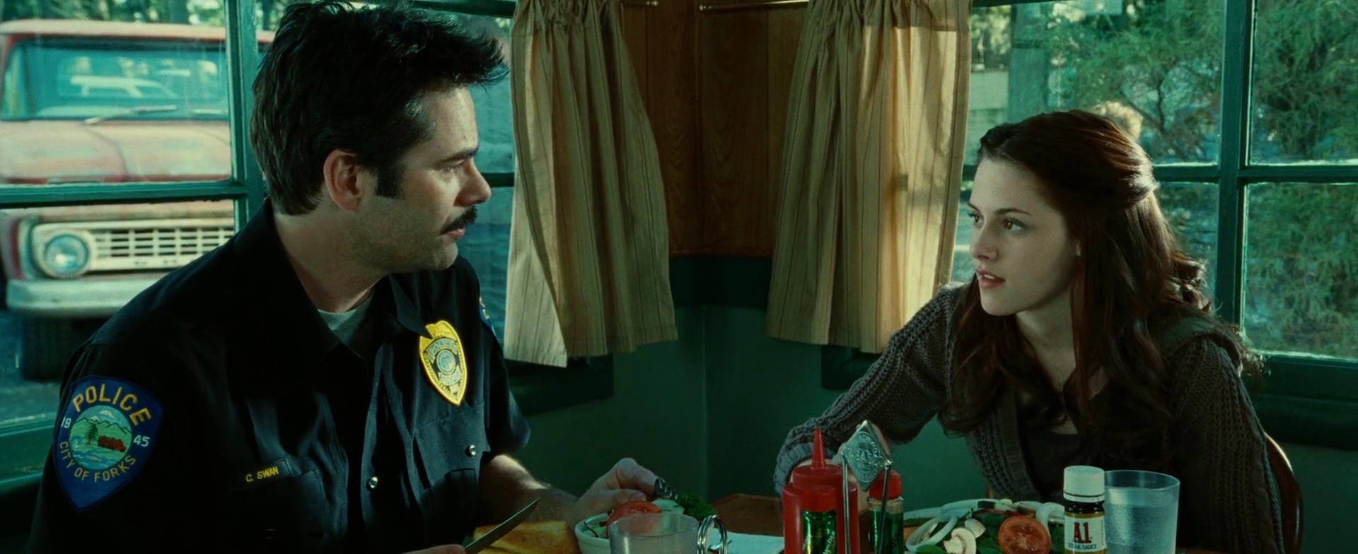
The orange truck is my favorite supporting element, appearing in quite a few scenes. Its color is washed enough to be able to take over large parts of the screen estate without diverting too much attention away from Kristen Stewart’s character, Bella. This is not the only scene that uses parts of all three primary colors, while at the same time maintaining a balanced look. Here, it is achieved by confining the green to small elements in two corners.
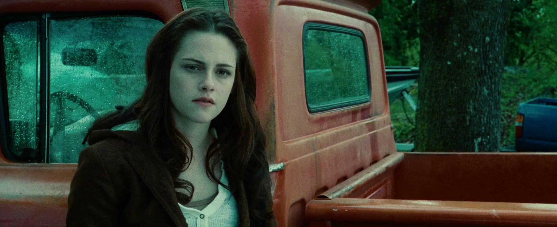
And here the same truck, and the same colors, switching the roles of green and blue. The tail corner of the truck is a nice counter weight to the large swath of turquoise that frames the chestnut brown frame of Bella (hair and coat).
This is a nice exploration of the transition from sand yellow to sea green. The colors look slightly oversaturated, but not too overwhelming given an almost complete lack of reds and browns.
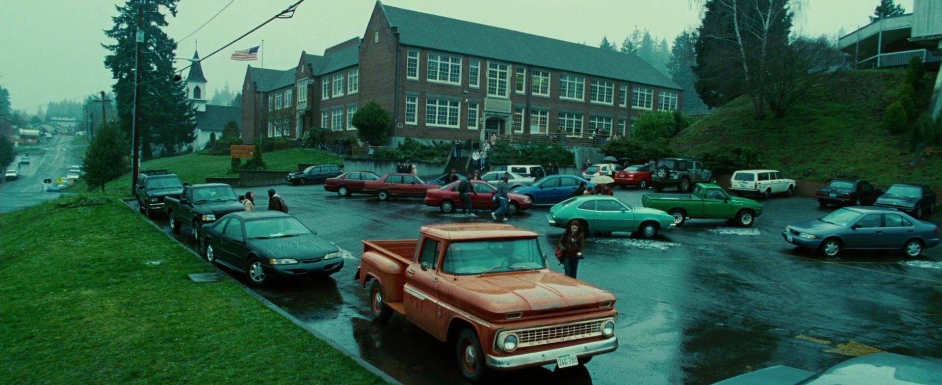
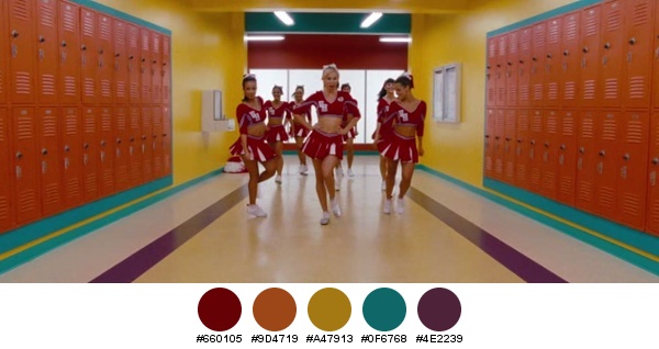
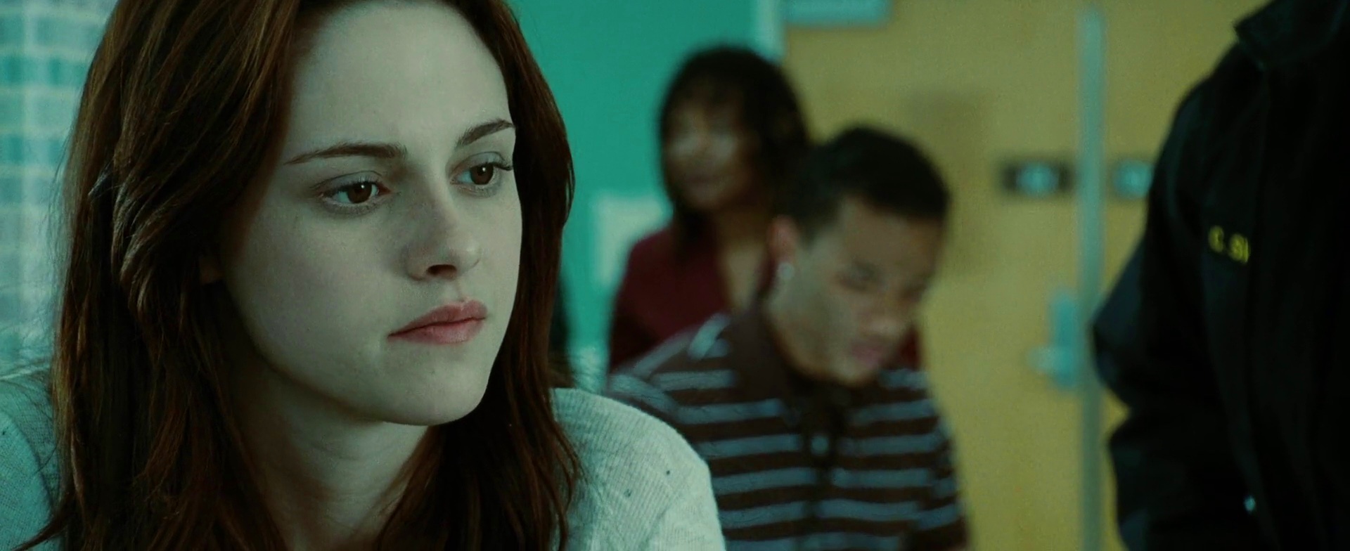
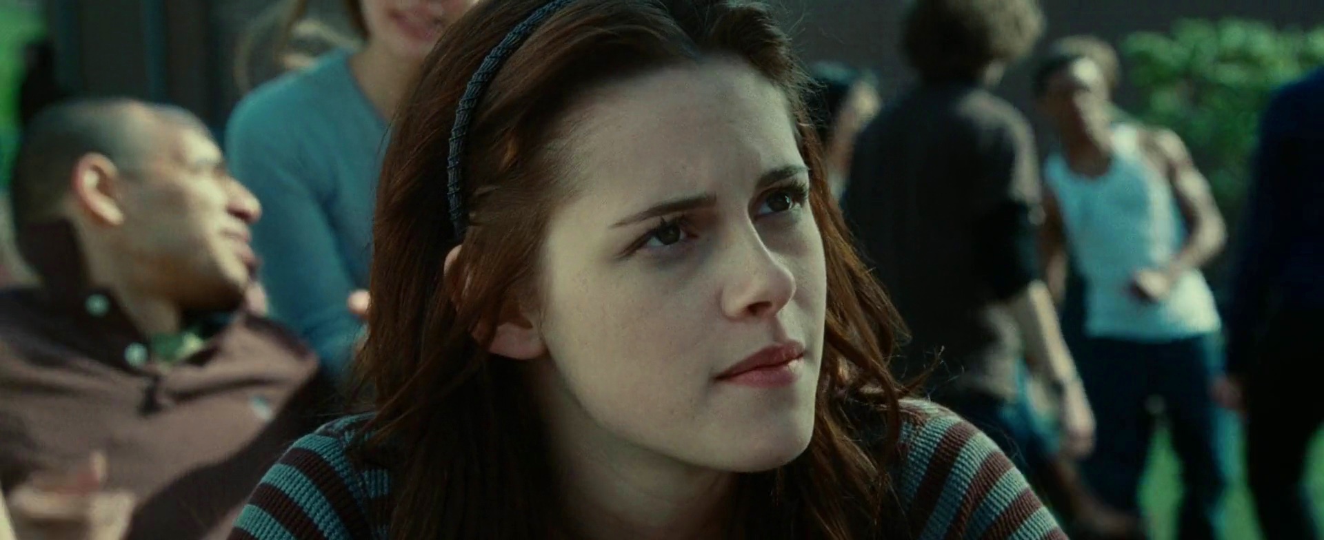
This is my favorite scene. It would be presumptuous to show the parking lot of a high school where all the cars look the same. Instead, the vehicles are carefully positioned around the main axis of interest. Note how the four red-burgundy cars are placed within a larger triangular shape created by the school building and Bella’s truck; this effectively confines that color spectrum to a well defined shape, all the while maintaining the viewer’s attention on her figure. The light blue car directly behind her almost blends into the pavement, while the green truck behind it seems a natural continuation of the green slope to its right. There are a few white cars, but you can hardly see them as they are obscured by other vehicles. The dark gray asphalt lot is clearly delineated by half a dozen dark gray sedans, completing the visual setup for the next event.
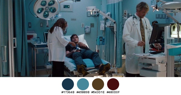
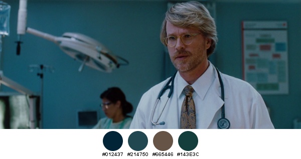
Chestnut brown and light blue are the main colors in this scene, completed by the dark red on the most distant supporting character.
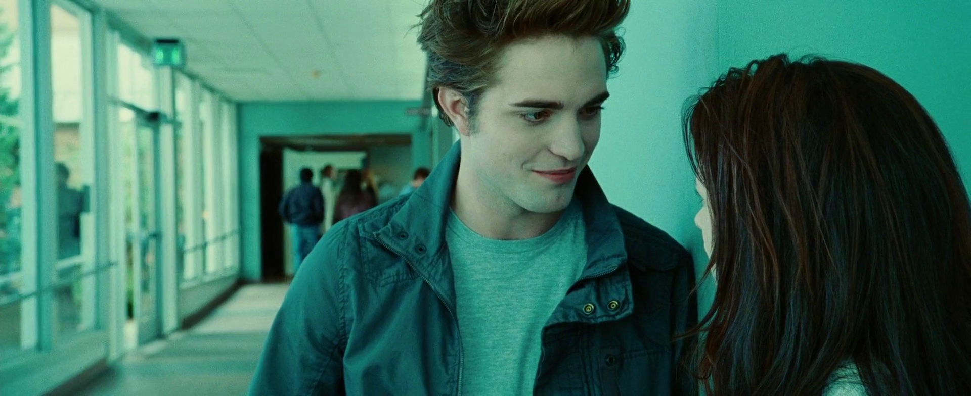
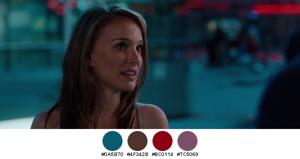
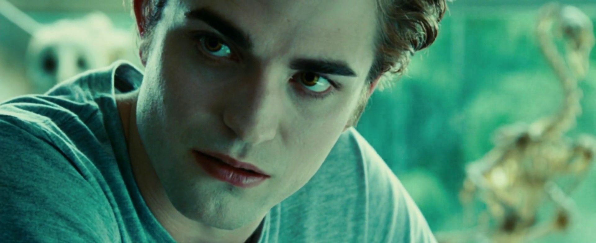
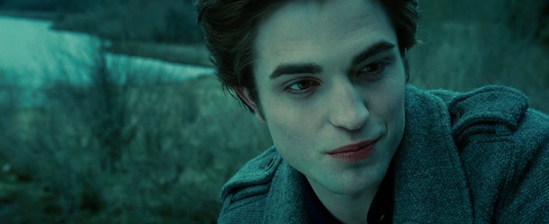
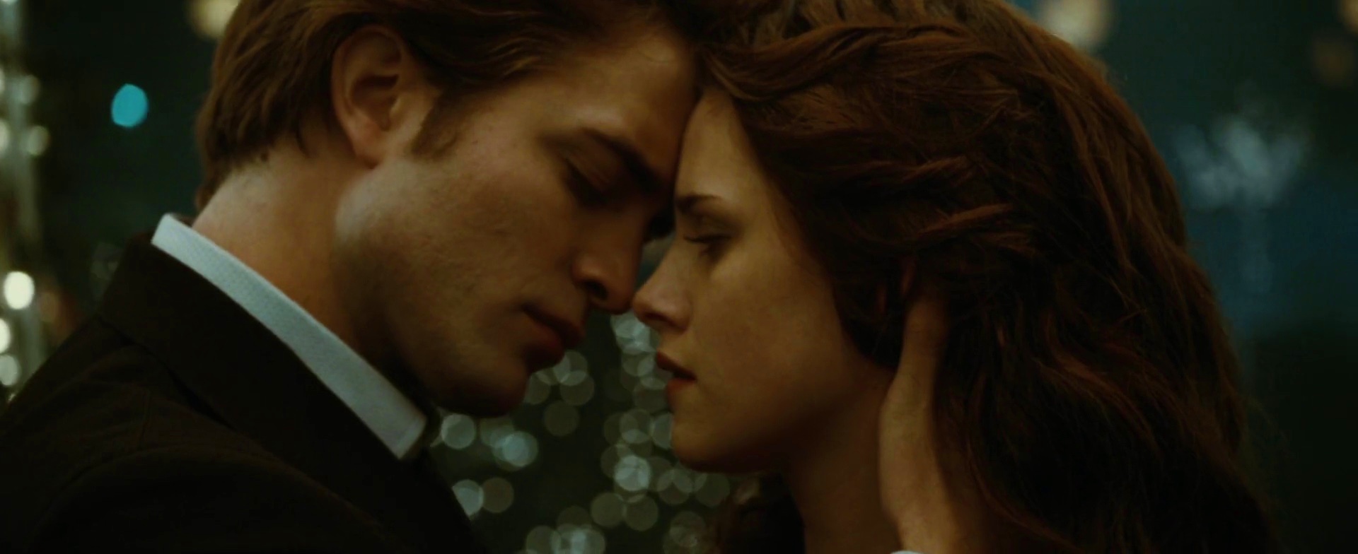
Even though this scene is completely dominated by the blue hue, you can still see traces of the other two primary colors. Streaks of brown in both characters’ hair are slightly broken apart by the red on Edward’s lips, and the green is hinted along the outer glass wall.
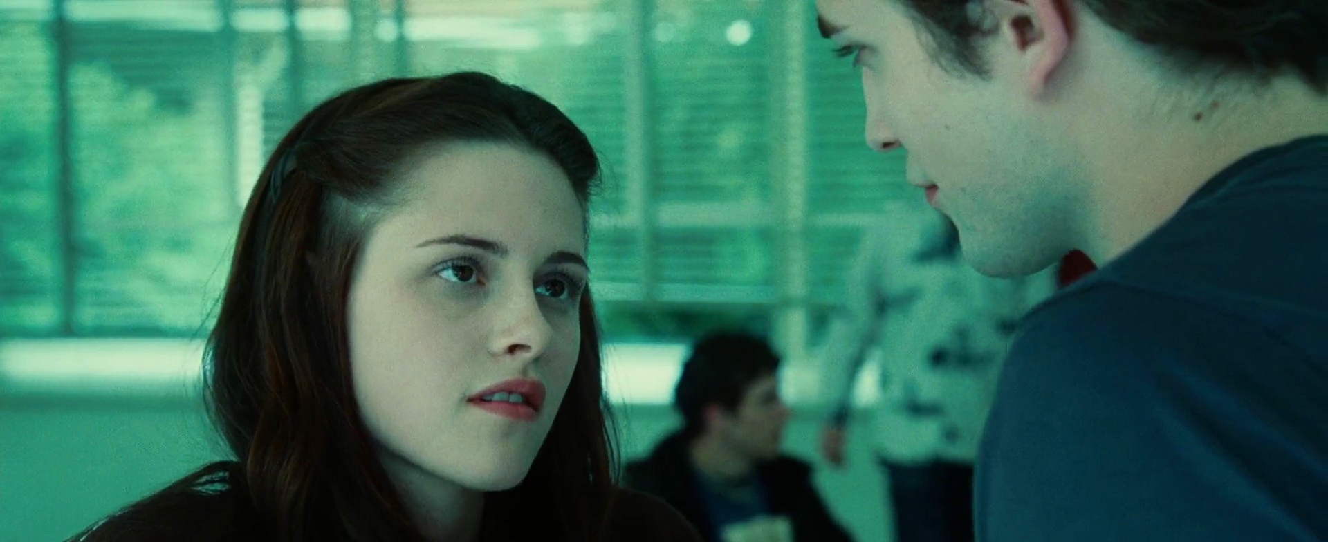
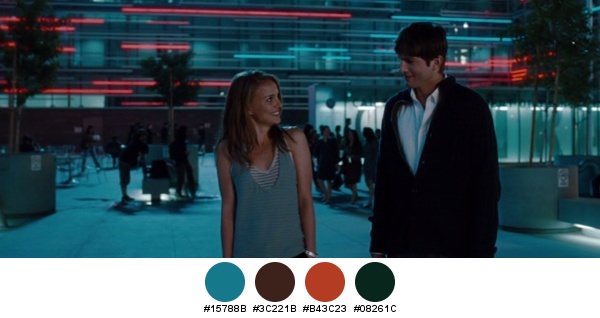
A rare occurrence of sea green overtaking the turquoise. This switch is supported by the partially opened blinds on the glass wall that let in the greens of the outside vegetation.
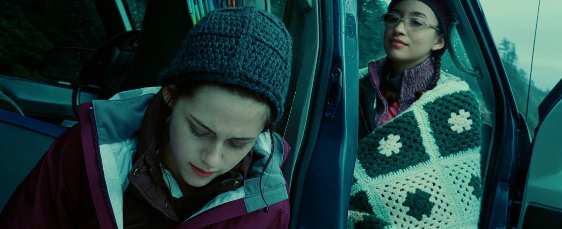
And an even rarer occurrence of color purple. My favorite part is the blanket wrapped around Christian Serratos’ character, Angela. The dark teal is taken from the fog-hugged trees, while the light teal is taken from the overcast skies.
In an interesting twist, Bella is wearing a shirt almost identical to the one worn by the unfortunate driver that we’ve seen earlier (in the hospital scene). Note how the two colors are mirrored in the light blue headband in her hair, as well as the shirts worn by the two guys behind her right shoulder.
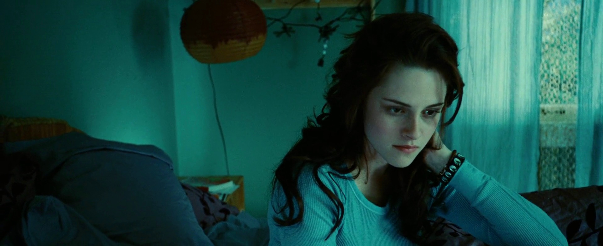
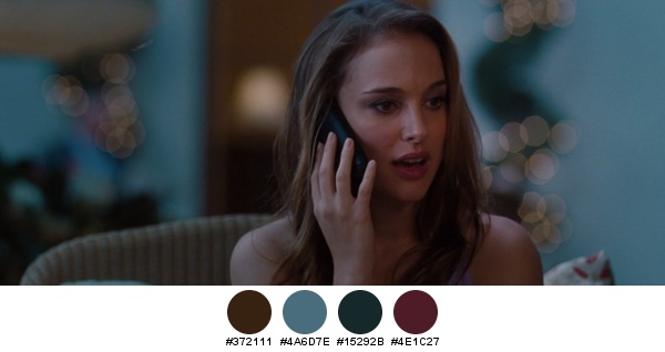
Traces of purple on Bella’s bed sheets and ochre-brown furniture are a nice complement to her hair and bracelet.
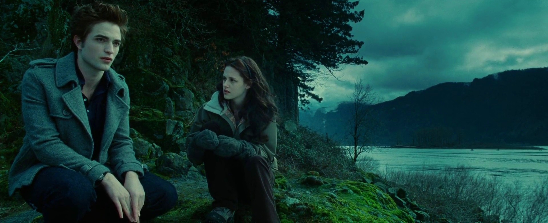
In one of the more beautiful outdoor scenes, bright moss greens fight for attention amidst slate grey and cloudy blues.
Alternating shots of the characters in the same scene add pale purple from the lips bitten by the cold weather.
The orange truck is once again a main background element, this time with a great addition of orange stripes running through Bella’s patterned shirt. This is also a rare occurrence of an almost equal doses of all three primary colors, with blue taking the lower corners and green spanning the top half.
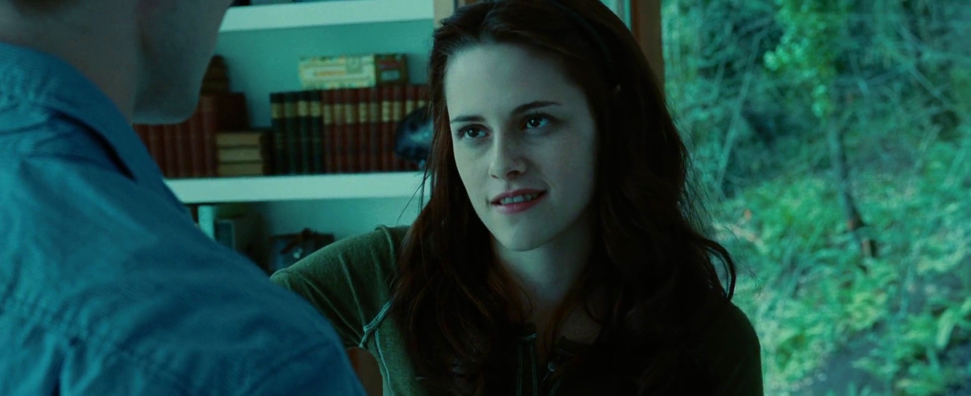
Cool greens of the outside forest are a nice visual counterweight to neatly arranged blocks of color formed by the books behind Bella. Also note how this green sneaks into the shirt she’s wearing.
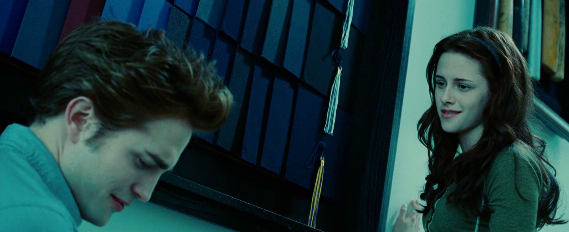
Yet another guest appearance by the color purple, this time in the masterfully arranged wall of graduation caps. Note the visual connection between the tassel of lowermost cap and the yellow elements behind Bella’s head.
One of the more vibrant scenes, with bright splashes of orange along the bottom edge, the bright yellow badge catching the sun and a somewhat garish blue shoulder patch.
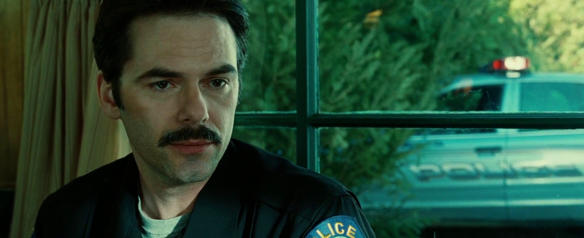
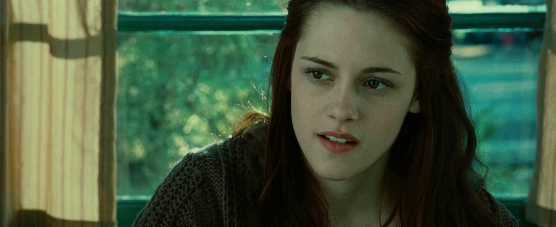
Same scene, following the dialog. Note the nice framing of the characters, and an extra splash of orange from the emergency light on top of the police car.
Strong emotional attachment between Bella and her mother, played by Sarah Clarke, is highlighted not only by the same color palette, but also by dying her hair with the same chestnut streaks.
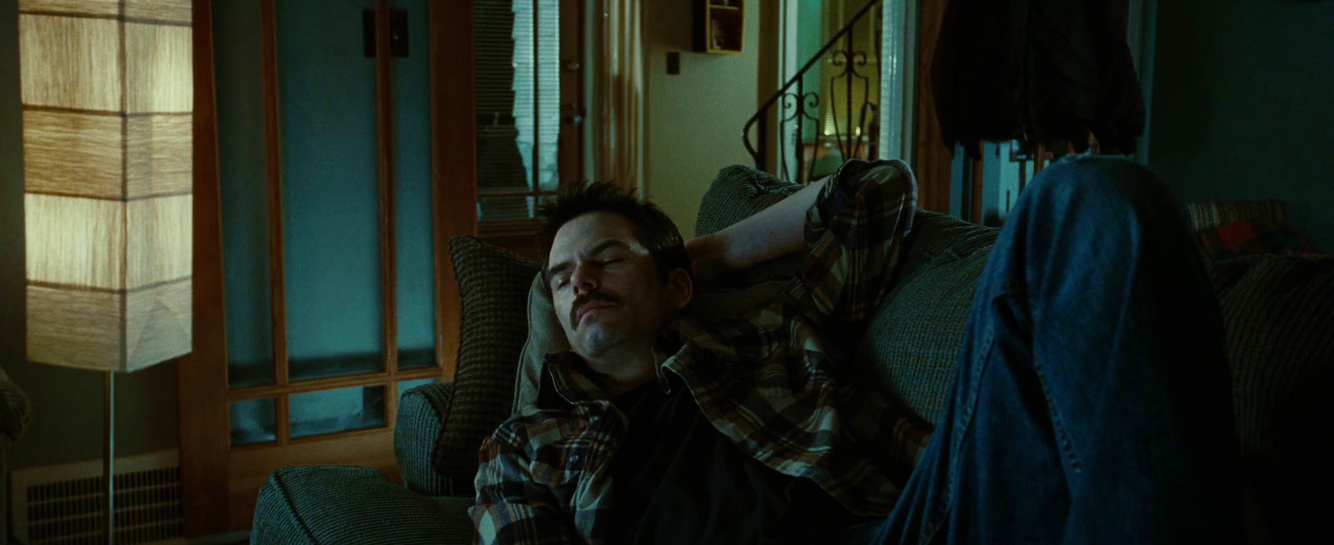
Bella’s father played by Billy Burke is seen here sleeping on his sofa. Note how his checkered shirt seems to draw from both the warm browns of the wooden panels and the deep greenish grays of the upholstery.
The emotional warmth of the last scene removes almost all traces of cold blues, leaving only earthen colors – golden yellow of the skin, soft brown of the hair and earthen green of the background.
Cinematography: Elliot Davis
Film Editing: Nancy Richardson
Art Direction: Christopher Brown and Ian Phillips
Set Decoration: Gene Serdena
Costume Design: Wendy Chuck
Director: Catherine Hardwicke