Continuing the ongoing series of interviews with creative artists working on various aspects of movie and TV productions, it is my pleasure to welcome Richard Hoover. In this interview he talks about the changes technology has brought to the world of art department in recent years, the meaning of success and the business side of the industry, and collaborating with directors and cinematographers on finding the right visuals for the story. Around these topics and more, Richard goes back to his work on “Twin Peaks” and “Girl Interrupted”, and dives deep into building the worlds of the upcoming family drama “Second Act” – out in theaters this December.
Kirill: Please tell us about yourself and what brought you to the world of storytelling.
Richard: I found the theater first and, of course, was an actor. In school I began designing stage sets and making plays. I think storytelling is a desire that grew and is being realized – as opposed to being in my mind at the beginning. Over recent years I’ve grown in the desire to learn the basics of storytelling, visually and verbally. I want now to know not only structure and construct, but also of what value story may have for others, for the audience, and how does it reflect a truth.
That interest had grown out of making scenery on stage. I still like building and making things. These days it is actually more critical that I use more of verbal muscle through writing.
Kirill: From your perspective, how has the world of storytelling evolved in the last 30-35 years since you started?
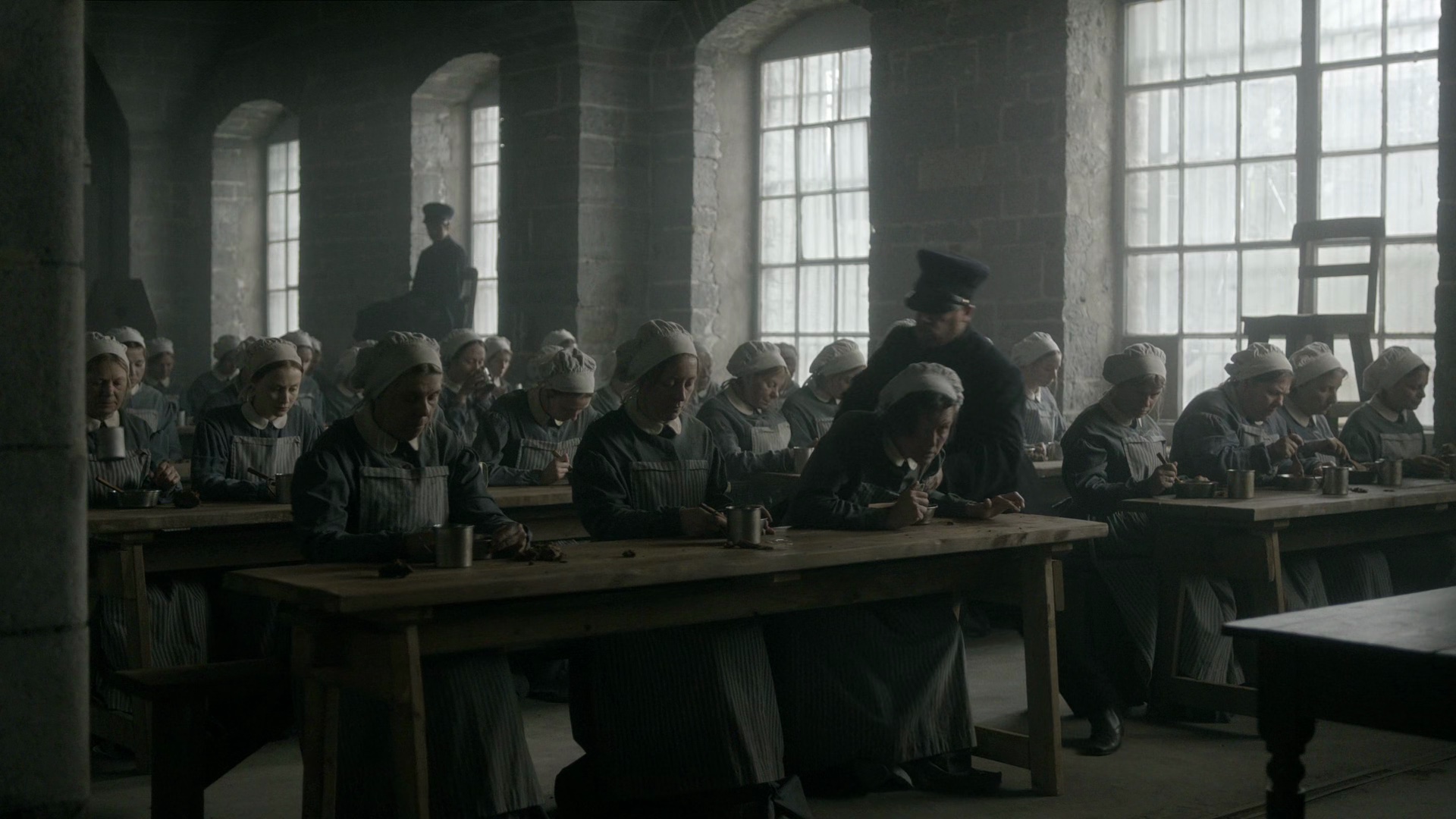
Richard: I think there have been advances but still story is still rooted in the basic human soul. We have an inherent need to tell stories, the desire to tell and to connect. In terms of story in film language there have been leaping advances in pacing and scope that are fascinating. “Twin Peaks”, for example, used a slowed down pace, wide angle shots, and a humorous witnessing that was very radical for TV at that time.
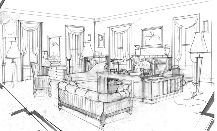
Sketch art for “Girl Interrupted”, courtesy of Richard Hoover.
Concerning the growth in digital infrastructure that has been happening in the last 20-25 years, there are now chances to do things in a virtual way not previously available. We used to build physical models, and now we do it digitally (as well as physically). We can look at it from all sides, explore it and figure out if we want to adjust things. That has become a major advance in what I have to do as a designer of a production. The digital world to me is both wonderful and painful in that it has also speeded us up and invaded quiet times.
We have less time now in film productions, and the economical pressure is more intense. So story is traded in often too speeded up a way. Communication has sped up, and sometimes in that speed-up things get lost. You sit in the same office with somebody, and you keep on emailing each other. I need to go stand in the room, and talk and show. That being said, if you’re working in a remote place, digital links are an advantage. You can send images, and that’s been amazing.
I remember my first cell phone which was this giant banana [laughs], and before that it was quarters in the pocket and payphones if you could find them.
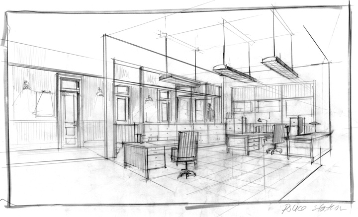
Sketch art for “Girl Interrupted”, courtesy of Richard Hoover.
It is amazing, but it still takes time and economical investment to get the technical people in place to help the designer illustrate and render. The key thing is interactive presentation to the director and the producers, so that there’s a sense of a commitment to tone and approach. During those presentations it’s critical to have digital tools and physical tools to really look at how things are going to want to be – as a hope, as a desire. That’s what I always try to do. If I have an illustrator, that’s a wonderful thing. If I have time to do it, I’ll do it in pencil or in Photoshop. It doesn’t happen in a moment though. It takes hours.
Kirill: What about how much the modern cameras can capture as far as the resolution goes? Do you find that your sets need to be more detailed?
Richard: High definition digital cameras have pushed change in design a lot. So much more can be seen now, and details might become much more of an issue than in normal film camera work.
I do find it very interesting to see how little lighting is needed these days. Sometimes I watch a film on my computer, and it’s all dark, but that’s fine. But it’s amazing to see what can be done with just a candle in the room.
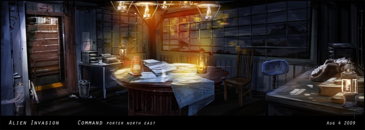
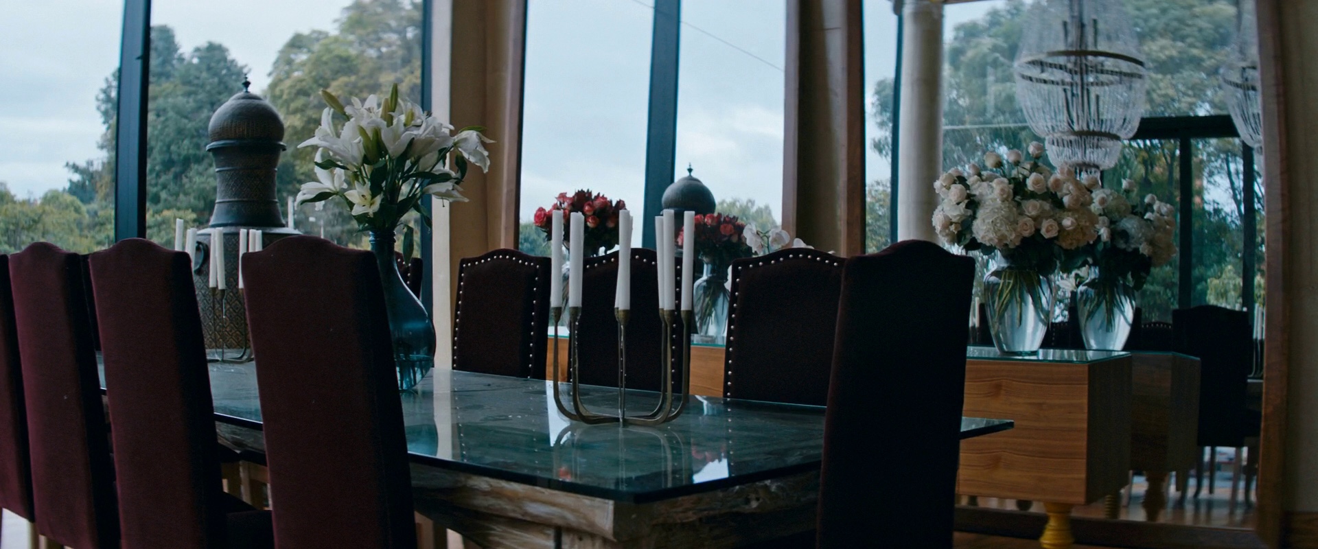
Concept art for “Falling Skies”, courtesy of Richard Hoover.
Continue reading »
Continuing the ongoing series of interviews with creative artists working on various aspects of movie and TV productions, it is my honor to welcome Inbal Weinberg. In this interview she talks about her dream of becoming a production designer, finding the right projects to work on, the invisible craft of production design, doing research in the age of the Internet, and what keeps her going. Around these topics and more, Inbal goes back to her work on “Blue Valentine”, “Beasts of No Nation” and “The Place Beyond the Pines”, dives into building the worlds of the critically acclaimed “Three Billboards Outside Ebbing, Missouri”, and reflects on the much-anticipated upcoming remake of “Suspiria”.
Inbal Weinberg on the set of Billboard Road.
Kirill: Please tell us about yourself and the path that took you to where you are today.
Inbal: Probably contrary to a lot of other people in our field, I’ve always wanted to be a production designer. While in high school in Israel I was studying drawing and painting, but realized I didn’t want to be a full-blown artist. That’s the time I really got into movies. It was the beginning of the indie film wave in the US, Hal Hartley was my favorite filmmaker and I loved Ken Loach and Mike Leigh in the UK. There were a lot of other active filmmakers I liked around mid-90s, when I was in high school. That indie film “revolution” affected me a lot.
I can’t say what it was, but the credit ‘production designer’ just caught my eye. Even though I knew absolutely nothing about it, I sort of invented what it was in my mind and decided that’s what I wanted to do. I remember very distinctly that when I was in the Army, I told people I was going to be a production designer – without really knowing what it was.
I tried to find out more about it. At the time it was just the beginning of the Internet, and there wasn’t that much information available to you offline either, especially if you lived in Israel. I remember going to the Tel Aviv university’s library and trying to find books about production design – which didn’t exist.
I decided I wanted to go to film school in the US. I wanted to leave Israel and live in New York. There weren’t undergrad production design programs anywhere at that time, and even today there are very few. So I decided to apply to NYU just knowing that it was one of the best film schools in the country.
Production design of “The Place Beyond the Pines” by Inbal Weinberg.
I went to talk to the Chair of Film School before I even got in and asked him what he thought about me wanting to be a production designer. He encouraged me to attend, saying that filmmaking basics are always important. And at the same time, because not a lot of craft people go to film school, I would probably have ample opportunities to design student films.
He was totally right about that. I went to film school at NYU and had the ability to work on a lot of student films. The school was also pretty receptive to me asking to tailor my own studies to my concentration. I think they didn’t have a lot of people that were asking to do that. I took the required film classes, but I also took classes in the theater department learning to draft scenery, in the Cinema Studies department learning about history of production design. I sort of put it all together.
The indie film world is the world that I wanted to be in, and I started doing a lot of small films. I went through many positions in the art department, slowly going up the ladder. At some point I felt it was time to try designing my own films. I started with really small ones, and kept going from there.
Kirill: Was there anything particularly surprising or unexpected for you when you joined your first production?
Inbal: Reflecting back on it, I probably self-importantly thought that I knew everything, but really I knew nothing. It was a humbling experience, where I learned how little I actually know. Come to think of it, to this very day on every project I realize how little I know. That hasn’t changed much [laughs].
I’m always surprised by how much I learn on every project. Production design is this huge field where you can become an expert on so many different things. Depending on the project, you learn about the history of very specific subjects, or you learn a craft that is really specific for your film. People-managing is also a big part of the job, and that’s something that most of the time you learn through experience.
Production design of “Blue Valentine” by Inbal Weinberg.
Continue reading »
Continuing the ongoing series of interviews with creative artists working on various aspects of movie and TV productions, it is my pleasure to welcome Arv Greywal. In this interview he talks about his life-long love of movies, the various roles he enjoyed in the art department in the last two decades, the changes the technology brings to building the physical and augmented worlds we see on screen, and what keeps him going after all these years. Around these topics and more, Arv dives deep into his last two episodic productions – “Genius: Picasso” and “Alias Grace”.
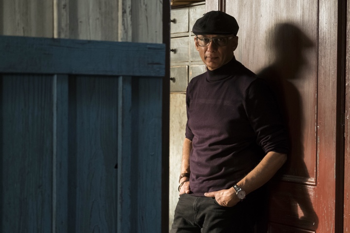
Budapest, Hungary – Arv Greywal on the set of National Geographic’s Genius: Picasso (National Geographic/Dusan Martincek).
Kirill: Please tell us about yourself and your path so far.
Arv: I’m Arv Greywal and I’m a production designer working in feature films and more recently in television on limited series. I grew up in Mumbai. My father was an architect, and my entire family had a huge interest in arts during my formative years. I was about nine when my dad took us to my first movie. It was “Lawrence of Arabia”, and it’s still my favorite movie. I watch it at least once a year, if not more. They played it in an IMAX theater in Toronto recently, and I went to watch it again. Still in awe of its beauty, its technical accomplishments and its power to tell an impactful and resonant story.
I remember that as I was watching it, I was enthralled by the story, but I also wanted to know about how it was made. My dad got me a small book on that movie, mainly about the actors, but some back story as well. At that time, the seed for my love of movies was sown. I didn’t know how, but I could really see myself being involved in some way with making movies.
My family immigrated to Canada, to Toronto and after I finished high school, I began my studies in Architecture at university. Toronto wasn’t the film hub it is today and the idea of life in film seemed distant. Yet, most of my free time during university was spent watching and learning about film, reading books and interviews by and with film makers. My favourite section of the library was where all the bound copies of old Cahiers du Cinema were kept.
I finished my degree in architecture and spent the next 4-5 years in that field. Then when the recession hit in the mid-90s, architecture firms were laying off staff by the hundreds. Around that time, I was about to get married, and my wife (also an architect) and I decided to spend all our money on a 3-month trip, our honeymoon; then come back and start brand new careers.
I started sending out resumes to film production companies and designers in early 1995, and after a lot of doors being shut in my face and luckily some meetings, I finally got a job as an art department assistant on a small indie movie. It was perfect. It was the best experience that I could have had. The production designer was impressed with my work, and my ability allowed her to move some people in the art department around to other departments that were understaffed. She and I became the entire art department. We had one carpenter and one art director building things, a set designer promoted to assistant set decorator and I ended doing all the drafting, designing sets, making templates for backdrops, helping with the painting of sets, prop building, set decorating, helping with special effects, etc. It was the best job that I’d had until that point.
I never went back to architecture. I worked on more movies, studios films, doing set design for a few years and then moving onto art direction. It’s an amazing job. I used to go in early every morning to check on people’s drawings and prepare for what we would want to accomplish that day or that week. We stay late after the day was done, for a drink or two and discuss the work. We worked hard and we were working on some of the biggest shows that were coming to Toronto at the time. One morning, I remember moving from table to table, collaborating and creating with my team, working with the paint and construction crew, bouncing back and forth from set and amidst all the frenzy, thinking to myself that this was the best job ever. We had fun.
Production design of “Alias Grace” by Arv Greywal.
A couple of movies after I did Zack Snyder’s “Dawn of the Dead”, I got a call from one of the producers, asking me if I would be interested in designing a George Romero movie “Land of the Dead”. I said that I wasn’t really interested. I knew that moving into production design would get me to a more political and a less hands-on level. Luckily, I was wrong about that; since then, I’ve been able to keep my hands dirty, so to speak, negotiating the larger scope that production design requires, but also holding on to the details and doing the nitty-gritty work that just moves things ahead. Nevertheless, I declined initially, but he was persistent, and asked me to give it a try and I agreed.
I did a few sketches of my ideas for that movie. Romero and the producers were visiting Toronto looking at some locations, and my interview with them was supposed to be on that Friday. I got a call from my producer friend on Friday morning saying that they were out of time and couldn’t meet with me. A few hours later, I got another call, and he said that they had a bit of time to talk at the end of the day before they went back to LA. It seemed that even though one of the producers was championing me, the other producers were not sure about it, since I didn’t have any production design experience.
I went in and met with George, only as a fan. I wasn’t expecting anything out of it. I showed my sketches and talked about my ideas, and it was a very pleasant and creative meeting, but I wasn’t expecting anything to come of it. On the drive home, I got a call back. They asked me for a couple of names in LA that could vouch for me as somebody who could do this job. It was a real thrill, but the only reason I agreed to it, was George Romero. I had watched every one of his movies before that and was excited to be collaborating with someone who had single-handedly created an entire genre. That was my first job as a production designer.
It’s a different animal. I’ve been doing art direction for a while, and you work hand-in-hand with the production designer for most of the day. It was a good training, and it didn’t seem totally foreign to me. But I understood the difference.
Kirill: Looking back to the last 25 years or so that you’ve been in this field, what major changes have you seen in the art department as the technology continues evolving?
Arv: The art department itself has changed significantly. We used to hand-draft things. We used to build elaborate models. A hand-drafted set was quite carefully considered. There were a lot of sketches and rough models made. Art department was more hands-on to give the director an idea of size and shape, laying out taped plans on the studio floors before the actual construction would start.
When computers came into the art department, it was fantastic. We would build our models, and we could have a small eyepiece connected to a camera that would walk through. We’d create a Quicktime video of a full set, with as much detail as we could put into it. And now everything is done in 3D. It’s ubiquitous. All set drawings are done in 3D. Then everything is converted into a model for a walkthrough. It doesn’t take much time to layer on the materials to see how they would affect the set. Now I’m excited about 3d printers and we’re incorporating those as a part of the art department toolbox.
I am finding though, that we are making a lot more changes to the sets. You can pull things, raise or lower or move them around. For me it’s better because I can be more involved and get a better feel of the set as we’re designing it.
And the second aspect of it is taking that virtual 3D model and handing it off to the VFX department. They use it as a barebones model for what they need to do. I did a show called “Waco” in which we built the majority of the building. We gave the 3D model to the CG department that did the wide helicopter shots for layering the textures on top of what we’ve built, completing the full building. Even with the ubiquitous incursion of CGI, we still like to build as much as possible.
Another aspect is with previz, where the directors can previsualize how a scene is going to look on any particular lens. It helps resolve a lot of problems that previously would take much more effort.
I art directed “K-19: The Widowmaker” in 2002. We wanted to test with Harrison Ford with a beard. So instead of him spending a couple of hours in a chair with hair and make-up people, they came to us with a photograph of a goatee they liked. We we able to easily put it on a few frames to show them what it could look like on his face.
It has come a long, long, long way since then, but the basic fundamentals are still the same. The evolving technology allows you various venues to be more creative, work within shorter timelines and explore even further the fundamentals of the job.
Production design of “Alias Grace” by Arv Greywal.
Continue reading »
Continuing the ongoing series of interviews with creative artists working on various aspects of movie and TV productions, it is my pleasure to welcome Diana Trujillo. In this interview she talks about the art and craft of production design, finding stories that resonate, building lasting relationships in the industry, and creating worlds that feel authentic for the camera and the viewers. Around these topics and more, Diana looks back on her work on the first season of critically acclaimed “Narcos”, and dives deep into the spellbinding “Elizabeth Harvest”, a story of a brilliant scientist, his all-consuming obsession and a single-minded, tragic pursuit of the long-lost past.
 Kirill: Please tell us about yourself and your path so far.
Diana: I was born in Colombia and my original field of study was architecture. In the middle of doing that degree, I went to New York for about a year, intending to study photography. I had a certain conflict between two dimensional and three dimensional art design, and before ending my career in architecture, I really wanted to see what was behind photography.
When I was there, I lived with some Colombian friends that were studying film in NYU. During my photography studies at the new school, I started to play with them to do kind of art direction. I started learning what art direction was and it made me consider that maybe this is something that I could be really good at. I’ve always been in love with cinema and I’m fond of art, but what I did not know was that you could choose that as a way of life.
I went back to Colombia and I finished my degree in architecture, but I always kept on coming back to that time in New York. As those friends of mine graduated, they went back to Colombia and created a production company. Andi Baiz was going to do his first feature called “Satanas”, and Rodrigo Guerrero the film producer called me asking me to be Andi’s visual consultant. I didn’t really study anything yet about the lenses or Set design, per se, but I knew about depth of field, layers and principles of architecture, photography and the basics of set decoration.
On the set of “Undertow”. Photography by H. Alvarez. Courtesy of Diana Trujillo.
I pictured everything in my mind, but I hadn’t put everything together. That collaboration was a turning point for me, and I never went back to architecture.
I was basically making all the aesthetic decisions with him. He had his production designer, art director, costume designer and makeup designer, and I remember this experience because nobody knew who I was. I was next to him and he asked my opinion on costumes, decorations and everything else. After that I decided that I really wanted to go into art direction.
My grandmother had a really big house with many different rooms and pieces of furniture and objects of many eclectic styles. I always liked that space, and I used to ask her to let me use the furniture. I started bringing these crazy collection pieces and showing them to my directors. After doing a couple of movies as a set decorator, they started asking me to be the art director. It all happened very fast. I used to draw the plans and to sketch the perspective of how a space for a frame will look. I had it in me, but I didn’t know about it until I started doing it.
Still from “Elizabeth Harvest”. Production design by Diana Trujillo.
Kirill: If I can bring you back to your first productions, was there anything particularly surprising or unexpected for you?
Diana: What really caught my attention was that moment when the director says “Action”, and everybody has to stay silent and not move at all. It’s like the time freezes for a while. You have to really listen to what they’re saying. When I watched it, it looked like a ritual. It was the perfect place to be in, because you’re creating something in that moment.
You’re creating through the director of photography, through his camera. You can feel it around you, there is the silence, and then you see it. You’re looking at this tiny monitor,and you are looking at the work of 80 people. I remember saying that this is something that I really enjoy doing. Definitely it’s magical to be there, to be creating as a team.
Continue reading »
