The “Design Secrets for Engineers” blog post over at Pulse engineering blog opens up with the following:
If you are a designer like me, you must be asked on a regular basis to “make it look pretty.” The request can stroke your designer ego, making you feel like a design rockstar with super powers to make this world a more beautiful place. This is especially true at startups, where you are one of the few, maybe the only designer there. However, it can also be really annoying–almost degrading at times. Thoughts like “why the hell can’t engineers do this on their own? It’s all common sense” always go through my head. If only engineers knew how to do visual design, designers would have more time to focus on cooler, more exciting problems like future product concepts.
This is a snarky, and quite abrasive statement. It diminishes the value of a good UI designer. It implies that if only engineers were to sit down and memorize the eight steps outlined in the article (one of which is “Use Keynote” of all things), they’d be magically imbued with the ability to take any rough wireframe and not only wire it to the data, but also come up with a pixel-perfect polished elegance for every single element. You know, something that usually takes equal parts of talent, years of formal training and even more years of hard work. No wonder that the very first comment from the self-titled engineer was no less snarky:
If only designers would do the parts of their job that isn’t cool, then engineers would have more time to focus on cooler, more exciting problems like building the actual product.
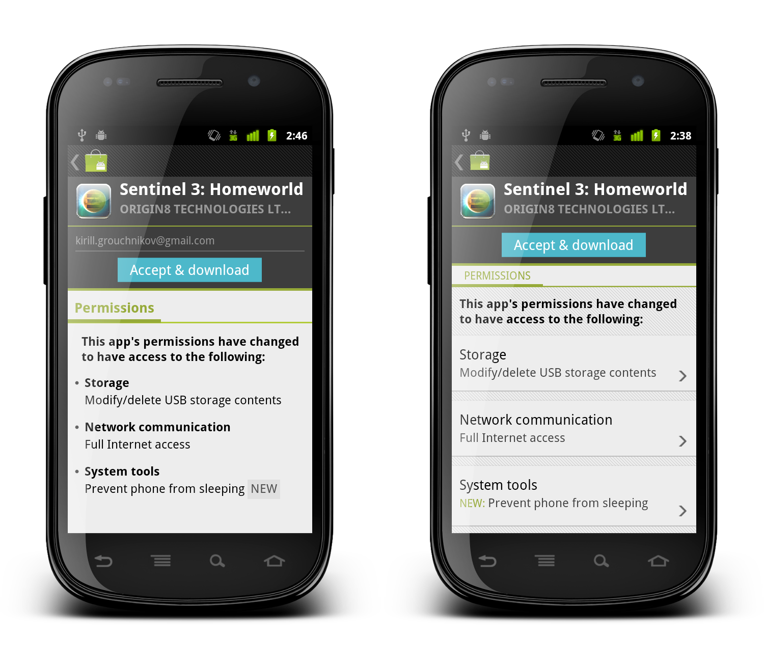
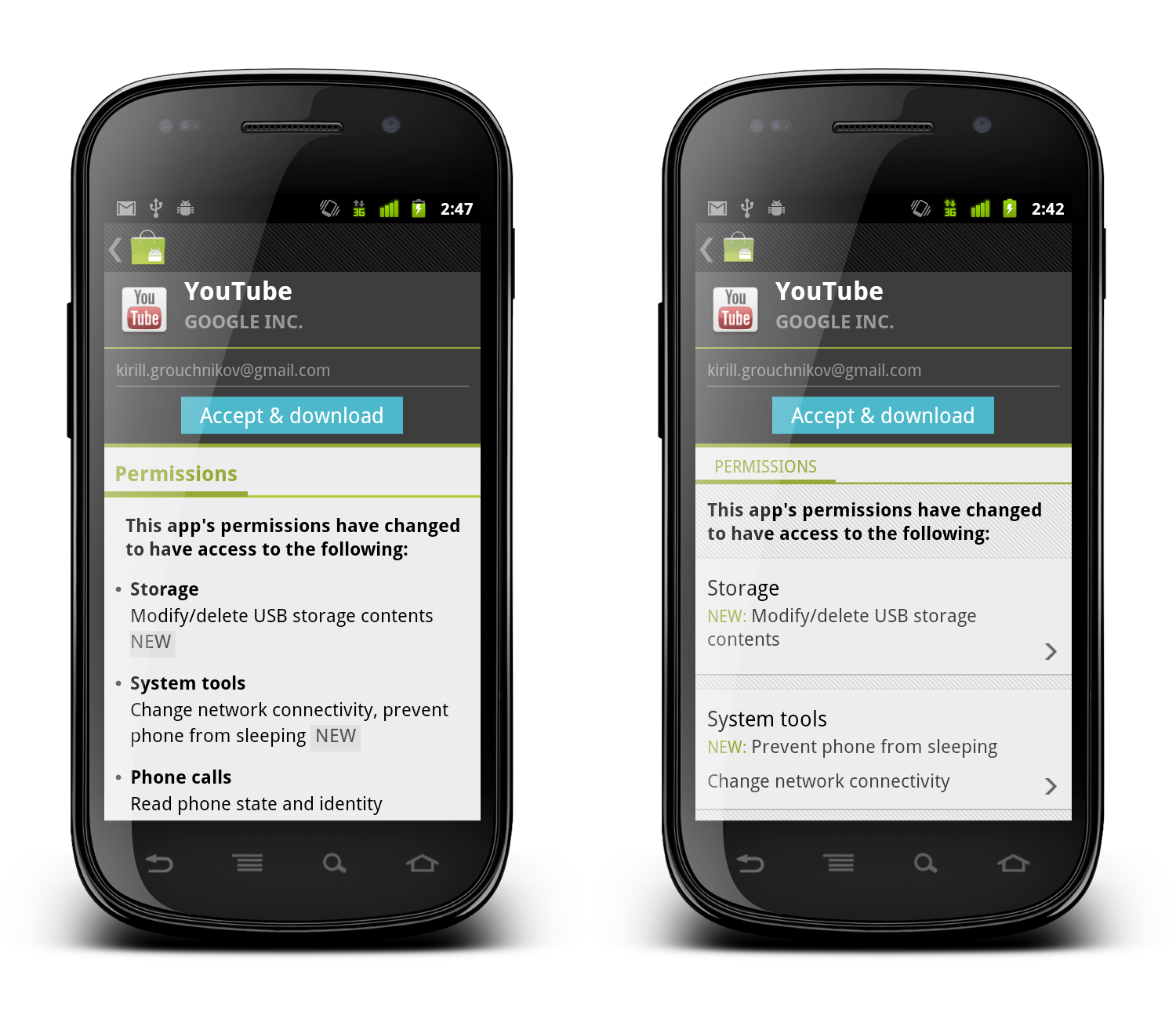
And here i want to illustrate the difference between engineer-driven and design-driven UI, using one of my favorite elements in the new Android Market client. When a developer publishes an update to his app or game and requires new dangerous permissions, the user will be asked to manually approve the permissions before the update is downloaded and installed on the device.
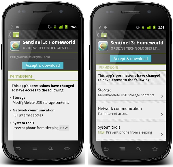
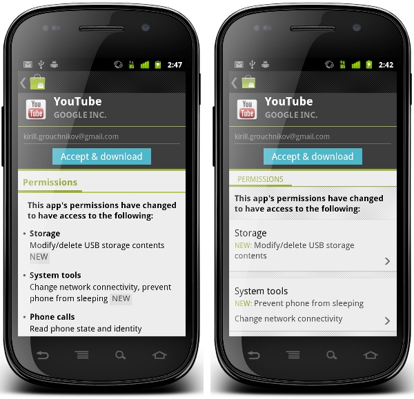
When the user opened the details page of such an app in the old versions of the Market client (pre-3.0), we would display all the permissions required by the new application version. There was no easy way to tell what are the new permissions, unless you went to the system UI, wrote down the permissions required by the currently installed version and compared them to the new list. This has been bothering me for a long time, and we ended up implementing a rather rudimentary way to mark new permissions requested by the published update:
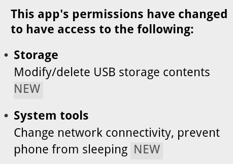
When we concatenate all permissions under the specific category, we check to see whether the specific permission is new. If it is, we add the word “NEW” and style it with different shades of gray (using ForegroundColorSpan and BackgroundColorSpan respectively). If you (as the user) are interested to see what exactly is the update requesting, this allows you to quickly skim through the list and find the answer. Functional, and designed by engineers.
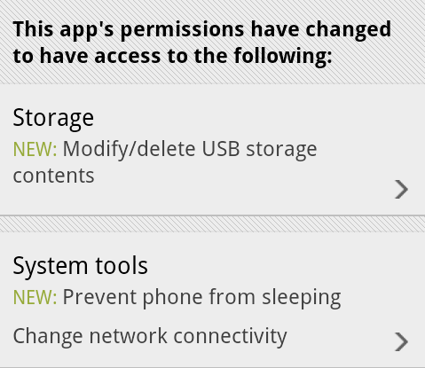
And this is how it looks after it underwent UX and UI treatment by our designers:
Let’s look at the differences:
- Each permission category is separated with the same visual styling as we have on the details page (translucent separator on top and pinstripe footer on bottom). This creates consistency across the entire Market application.
- Each permission category is clickable – denoted by the arrow icon that is used elsewhere to indicate additional content that will be displayed in a separate screen or dialog. Clicking on a section will display a dialog with more detailed information on permissions in that section.
- The category title is no longer bold – but rather uses a slightly bigger font. In the original version the category titles were screaming for attention, where in fact it is the individual permissions that are important for users interested in seeing what level of access the specific application is requesting.
- New permissions in each section are placed in a separate row. If there are multiple new permissions, the word “NEW” will appear only once. This allows for quicker scanning as all new permissions are grouped together, and removes extra noise created by all-caps strings.
- Placing the word “NEW” in the beginning addresses the issue seen in the previous screenshot – where the leading space before the first appearance of the word “NEW” was effectively cut by the linebreak algorithm. This removes the “illusion” of this label being a badge.
- Using the same green color as the rest of supporting elements on the details and purchase pages of applications allows removing the background fill – also removing an awkward visual balance of the gray rectangle that surrounded the word “NEW” in the original implementation.
When you get such a design, you may or may not notice the intertwined subtleties of such a change. It takes some time and practice to detect each specific choice that went into this redesign and understand what it is trying to solve. But that does not mean that after seeing a few of those you (as an engineer) will be able to do the same. Much as with programming, it takes years of constant practice at designing, taking apart, redesigning, brain storming, understanding usability aspects and limitations of device context, absorbing constructive (and sometimes brutal) criticism from your peers and superiors until you get to a point where it just “comes” to you.
When an engineer comes to you and asks you to make it look pretty, it means that the engineer actually understands that a working and functioning implementation is in a bad UX and UI shape – much like a good designer would understand and work within the platform and device limitations. Not all engineers appreciate the difference, and both sides should thrive on an opportunity to collaborate and educate each other on their respective crafts. Starting from the view point of “don’t bother me because i’m working on the next shiny thing” is not only counter-productive, but also engenders a bad environment where both sides passive-agressively blame the other side for shipping bad products.
As a point of reference, here are both implementations side by side. Click to see high-res versions.
Set in the austere and secluded world of an all-girl boarding school in 1934 Britain, “Cracks” follows the story of Miss G, a charismatic and glamorous teacher played by Eva Green and her class of six girls that struggle to cope with the arrival of an enigmatic Spanish blueblood.

Thriving on the attention she gets from her girls, Miss G projects an aura of a well-versed woman that pauses but for a brief moment to teach them the ways of the outer world.

Occasionally interacting with the girls, she spends the first few scenes as if her mind is travelling far away, sketching the next big adventure.

The first unexpected twist comes with the arrival of the new girl that, strangely at first, commands all the attention of Miss G. Stealing a piece of confectionery, she savors a small bit and saves the rest for later.

Dressed in a different elegant chic costume in every scene, we get a glimpse at Miss G’s past as a rare interaction with another grown up character (school’s director) reveals that she is a former student of this very school.

The progressively wilder changes in mood are highlighted by a larger variety of costumes, make up and hair styles.

Going from the bright summer textures to the heavy patterned dress further burdened by dated jewelry and loosely set hair contributes to the somewhat puzzling (at this stage) disarray of Eva Green’s character.
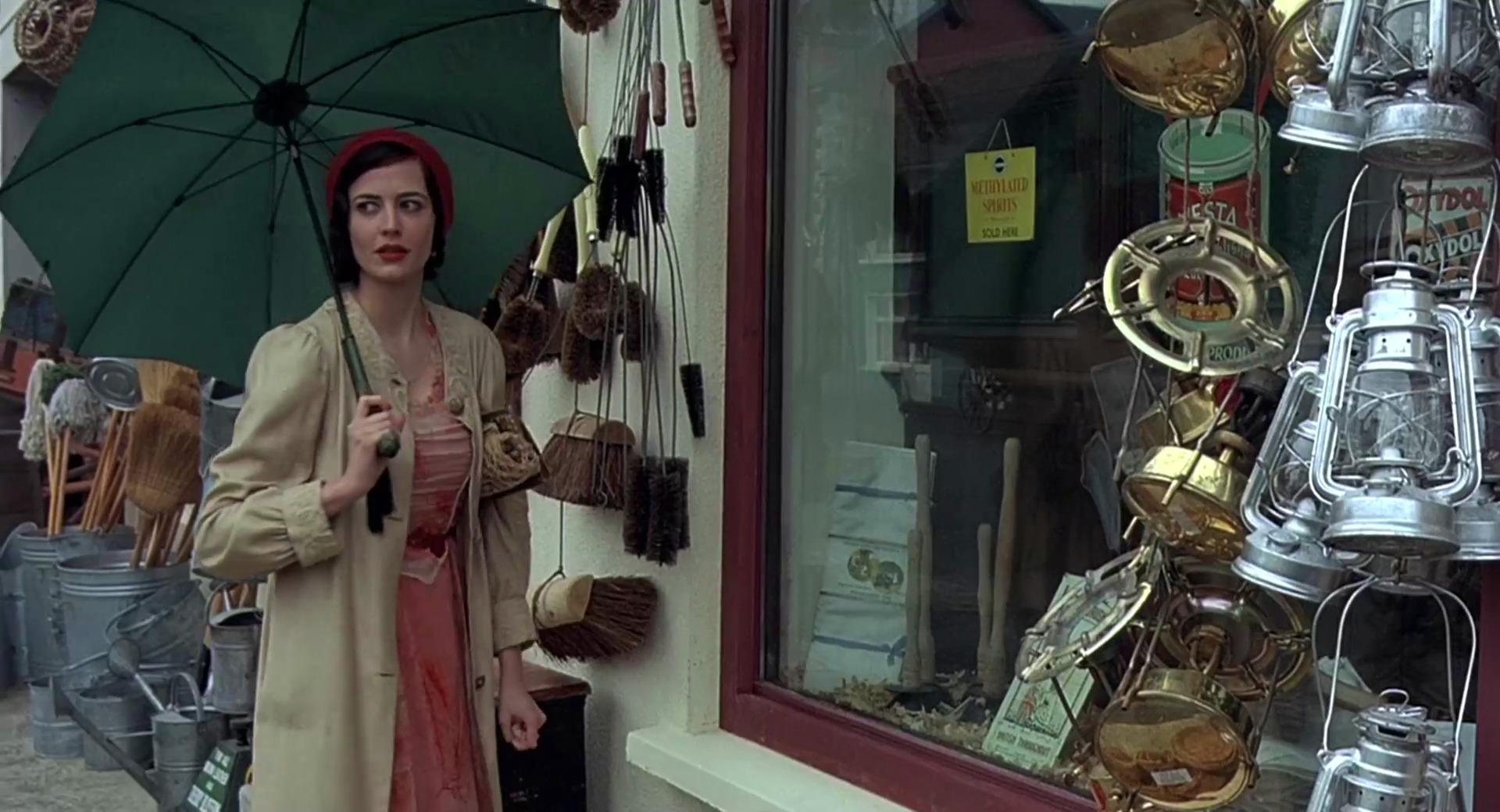
In a sharp contrast to the preceding scene that her room strewn with artifacts from her alleged travels, she is drawn to the rather drab display of a provincial variety shop.

And this first excursion from the school grounds has Miss G falling apart as she stumbles clumsily along the street and is frightened by the interaction with two men in a confectionery shop.

Back to smiling for the last time, Eva Green wears a beautiful dress, complete with a loose sash, a matching necklace and playfully coiffed hair. Her behavior in the scene is irrational at best as she tries to distance Fiamma away from the other girls who are finally opening up to the newcomer.

As the cracks go deeper, she spends progressively less time on her appearance. The carefully applied makeup is gone, revealing a pair of weary disillusioned eyes. The strokes of carefully chosen colors are long lost in the drab gray costume, and strands of untended hair break loose from under the head scarf.

The light beige coat fails to compliment the last attempt to pull herself together, as the story turns towards a tragic end.
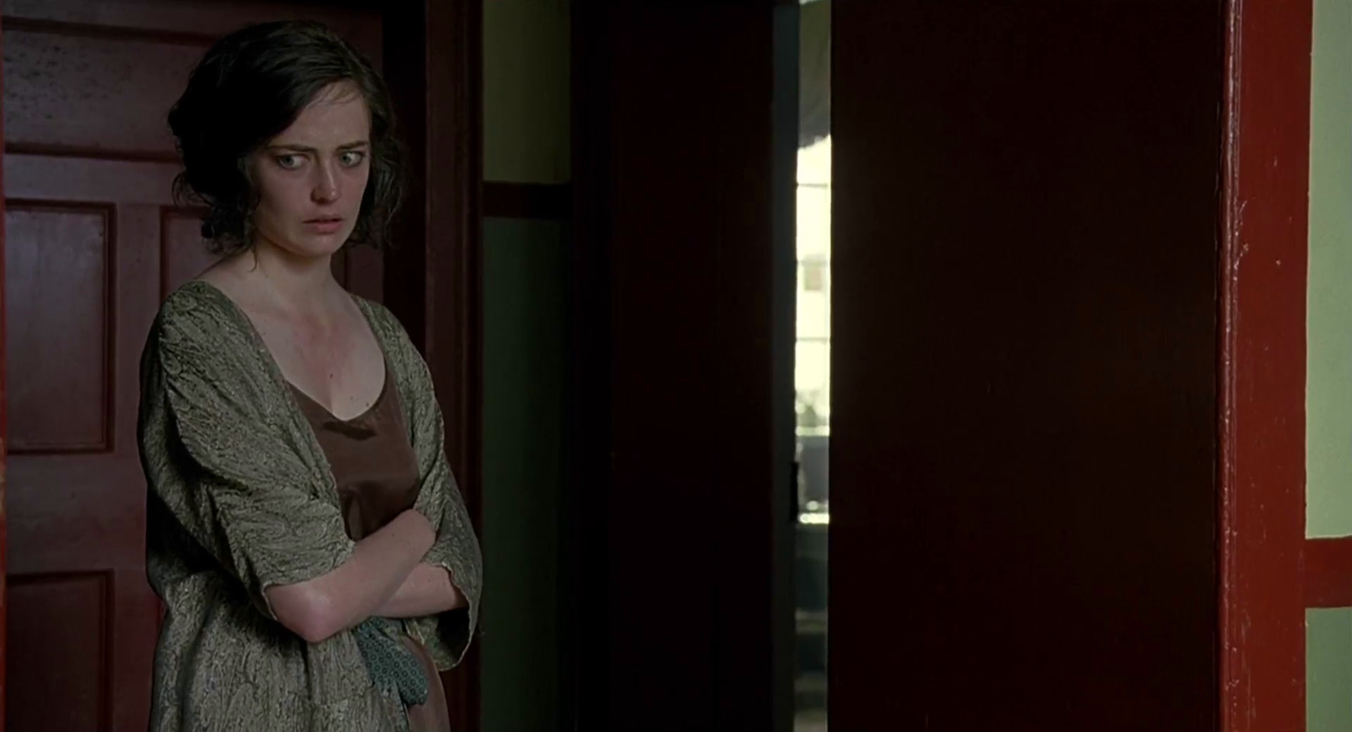
Trying to cling to the only place of relative comfort she knows, she wears a night gown that borrows the colors from the walls and doors in the hallway, silently clawing her way to blend into the surrounding surfaces.

In the final shots, all the glamour, mystery and panache is long gone, along with the elegance of her costumes and hair styling.
Production design: Ben Scott
Art direction: Bill Crutcher
Set decoration: Jenny Oman
Costume design: Alison Byrne
Editing: Valerio Bonelli
Cinematography: John Mathieson
Director: Jordan Scott
Even though Microsoft has spent significant effort to branch into mobile, web and console markets, the company’s main revenue stream remains in the desktop space. Gearing up towards the next major Windows release, Steven Sinofsky (president of Windows division) has started extensive blogging about Windows 8. In yesterday’s entry he addresses a lot of criticism of the transition of Windows Explorer to use the ribbon component, the future of Aero and Metro, as well as the high-level approach that the Windows team takes towards the consistency of Windows desktop experience. The entire entry is well worth the read, but the following quotes are particularly interesting:
The unique element of Windows has always been the “open market” approach to interface. We embraced how people used and adapted the Windows APIs to bring unique experiences to market. Within any context there really isn’t a single “desktop” experience. Certainly some have been critical in the past that “Aero” did not achieve a uniformity or consistency, even within Windows.
We’ve long embraced apps that have palettes or toolbars, full screen / windowed / MDI, built-in controls or custom controls. The mechanisms to implement this variety are part of the desktop heritage. Some wish for more uniformity or policing. As a member of the team that built our early Windows tools, I know we tried. Even in the most homogeneous platform, developers will strive to differentiate and build their user experiences for specific purposes and experiences will diverge from commonality. Commonality was an answer to complexity in another era–today we are surrounded by digital experiences of all different types and we readily adapt (just as people adapted to a wide variety of print formats or video formats as these technologies improved from their first generations). The answer today is whether the design works in the context for which it was intended.
While this is not particularly surprising, it further confirms the focus on providing support for diverse experiences that allow differentiation, with particular focus on adapting to the context.
In his seminal article published in May 2010 Ethan Marcotte coined the term “responsive web design“, paving a way for a unified approach to designing web sites that adapt to the current media context:
Rather than tailoring disconnected designs to each of an ever-increasing number of web devices, we can treat them as facets of the same experience. We can design for an optimal viewing experience, but embed standards-based technologies into our designs to make them not only more flexible, but more adaptive to the media that renders them. In short, we need to practice responsive web design.
Ethan’s research into crafting browsing experiences that scale from large desktop environments down to tablets, netbooks and small mobile phones has culminated in the “Responsive web design” book published in June 2011. The original article and the book have prompted forward-thinking web designers to reevaluate their work flows. Trent Walton summarizes his experience working on responsive projects:
Web designers will have to look beyond the layout in front of them to envision how its elements will reflow & lockup at various widths while maintaining form & hierarchy. Media queries can be used to do more than patch broken layouts: with proper planning, we can begin to choreograph content proportional to screen size, serving the best possible experience at any width. […]
In my mind, it’s best to build something that works on any possible width or device instead of something that works on all current widths and devices.
This underlines a major shift into approaching the web design. Instead of creating a number of rigid grids heavily optimized to a number of predefined screen sizes, Trent emphasizes the importance of fluid rearrangement of content that maintains the overall structure but adapts the presentation to a wide range of media contexts. Instead of forcing the user into the “best presentation” mode, the content reflows based on the current user preference, from full-size desktop browsing to smaller netbook screens to even smaller handheld devices. Mark Boulton drives this point even more:
How should we do it on the web? Remember the goal is connectedness and this feeling of belonging. We do that by defining the constraint from your content. The constraint could be derived from an advertising unit, or from a thumbnail image from tons of legacy content. Whatever it is, start there. Don’t start from an imaginary page. […]
Embrace the fluidity of the web. Design layouts and systems that can cope to whatever environment they may find themselves in. But the only way we can do any of this is to shed ways of thinking that have been shackles around our necks. They’re holding us back.
The ever-evolving landscape of mobile devices keeps on producing an almost continuous spectrum of screen sizes, resolutions and ratios with increasingly more powerful computing and networking capabilities. Highlighting the long gone days of content dumbed down for small screens, Jeremy Keith notes:
More and more people are using mobile devices as a primary means of accessing the web. The number is already huge and it’s increasing every day. I don’t think they’re all using their devices just to look up the opening times of restaurants. They are looking for the same breadth and richness of experience that they’ve come to expect from the web on other devices.
Hence the frustration with mobile-optimised sites that remove content that’s available on the desktop-optimised version.
Rather than creating one site for an imaginary desktop user and another for an imaginary mobile user, we need to think about publishing content that people want while adapting the display of that content according to the abilities of the person’s device.
Designing native mobile experiences is undergoing a similar transformation, especially for the Android platform. A continuous stream of new devices coming to the market, especially in the 7″-10″ range presents a challenge to developers that create applications with hierarchical information content. On one hand, the single-window presentation mode seemingly removes the need to explicitly rearrange content on the fly – as opposed to the context of a multi-window desktop environment. On the other hand, even in this mode you need to properly handle device orientation change, especially on devices with “unusual” screen ratios that necessitate content reflow. And of course, if you go beyond the single device, you would want to support a variety of screen sizes, from 4″ phones to the 7″-10″ tablet range.
The same arguments put forth in favor of content-driven design that adapts to the wide range of media context are relevant for the native mobile design. Some applications will naturally “expand” to fill a larger screen; these would be mainly canvas-driven applications such as map viewers, image editors or video streamers. But applications presenting hierarchical (and mainly text-based) content require the application designers and developers to think in terms of a fluid content presentation. A single-column presentation optimized for smaller phone screens may look sparse and unbalanced viewed on a larger tablet screen, especially in landscape mode. Navigating information hierarchy that lends itself to master-details relations may require separate screens on smaller devices, but may be presented in a split mode on larger ones.
Android resource system has provided support for multiple screens and densities, allowing the developers to optimize user experience for different screen configurations. To that end, the screen configurations have been mapped along two separate buckets:
- The physical size of the screen – small, normal, large, xlarge. Each bucket is a continuous range, with some overlap between the buckets.
- The density, or how many pixels appear within a constant physical area of the display – ldpi, mdpi, hdpi, xhdpi. Each bucket is a continuous range as well, with some overlap between the buckets.
Combining multiple configuration qualifiers has allowed Android developers to provide layouts optimized for the specific screen configurations, in much the same way as CSS3 media queries enable the ever more powerful responsive web design. If you take a closer look at the range of qualifiers supported in CSS 3 and at the examples of responsive web design, you will see that the main difference is in defining the “boundaries” between the different configurations. Instead of a set of predefined screen size buckets, the main CSS3 qualifiers are width, height, device-width and device-height with optional min and max prefixes. The values themselves are numeric in units of either CSS pixels (corresponding to Android dip, or device-independent pixels) or ems (corresponding to Android sp, or scale-independent pixels that respect the user’s font size preference).
As we’re seeing a wider variety of screen sizes and shapes for Android devices, we’ve also seen that the developers need a more refined system for adjusting the content presentation. Introducing the new resource selectors, Android framework guru Dianne Hackborn writes:
Based on developers’ experience so far, we’re not convinced that this limited set of screen-size buckets gives developers everything they need in adapting to the increasing variety of Android-device shapes and sizes. The primary problem is that the borders between the buckets may not always correspond to either devices available to consumers or to the particular needs of apps.
Android 3.2 adds support for three new resource selectors:
- width dp: the current width available for application layout in “dp” units; changes when the screen switches orientation between landscape and portrait.
- height dp: the current height available for application layout in “dp” units; also changes when the screen switches orientation.
- smallest width dp: the smallest width available for application layout in “dp” units; this is the smallest width dp that you will ever encounter in any rotation of the display.
Unlike the existing size buckets, these selectors start from the content and not from the context. Instead of mapping your content presentation into the buckets of physical screen sizes or densities, you start by defining the main building blocks that represent your content and mapping those to different presentation strategies. Each strategy will arrange the content blocks based on their importance and require certain minimum width for a balanced arrangement. Then, you can use the new resource selectors to provide implementation for each presentation strategy.
As with the CSS3 queries, you have finer control over the bucket boundaries and the content presentation within each bucket. Depending on the overall information hierarchy depth and density for your specific domain you will decide when the content presentation transitions between the different strategies. So for example, if you’re writing an email reader, you can use the width dp selector to switch between single-pane and double-pane mode at, say, 600dp. Devices at the bottom “edge” of the large bucket will display a single-pane mode in portrait and double-pane mode in landscape.
This is both simple and powerful. Instead of thinking about all possible combinations of physical sizes and densities, you go back to the device-independent units. The content of your application domain drives the decision on how much device-independent real estate you need for each presentation mode, and the framework switches between the different modes depending on the physical characteristics of the device and current orientation. Each new territory needs best practices. Stay tuned for more.