The original for the quote is behind a paywall, and it’s about four loosely related sections. One of them is borrowing from this story and expanding on the larger ecosystem of the recent crop of “intermediaries”:
In the old economy of price signals, you tried to build a product that people would want, and the way you knew it worked is that people would pay you more than it cost. You were adding value to the world, and you could tell because you made money. In the new economy of user growth, you don’t have to worry about making a product that people want because you can just pay them to use it, so you might end up with companies losing money to give people things that they don’t want and driving out the things they do want.
I think we’ll look back at the late 2010s / early 2020s as some kind of a weird aberration in the global market as untold billions of dollars were burnt trying to upend industries, with no solid business plan other than the vague promise of innovation, customer centeredness and dreams of striking it rich. Well, the last part obviously is working for the very very few who are still managing to squeeze incredible amounts of money from a) investors, b) creators of the thing and c) consumers of the thing. While at the same time destroying the very market they have set out to “rescue”.
One last thing I wanted to do with hero images for interviews. Now on larger (desktop / laptop sized) screens the interview title blurb is displayed on top of a translucent scrim along the bottom edge of the hero image. Maybe now I’m done for 2019…
As the follow-up to yesterday’s post about using edge-to-edge, full-width images in the interviews posted on this site, here’s the technical background on how this can be enabled in WordPress. First, add this snippet to your stylesheet:
.post .fullbleed {
  width: 100vw;
  position: relative;
  margin-left: -50vw;
  height: auto;
  left: 50%;
}
What do we have here? We start with the vw unit which in CSS stands for viewport units. This snippet says that an element marked as fullbleed should be positioned relatively to its normal position, with the combination of position, left and margin-left positioning it to start at the left edge of the viewport and span the entire viewport width. The height attribute forces the layout engine to preserve the original aspect ratio of your image.
If you have a breakpoint for smaller screen sizes, add the following snippet as well (tweaking the max-width media selector based on your breakpoint):
@media (max-width: 480px) {
  .post .fullbleed {
    max-width: 100vw;
  }
}
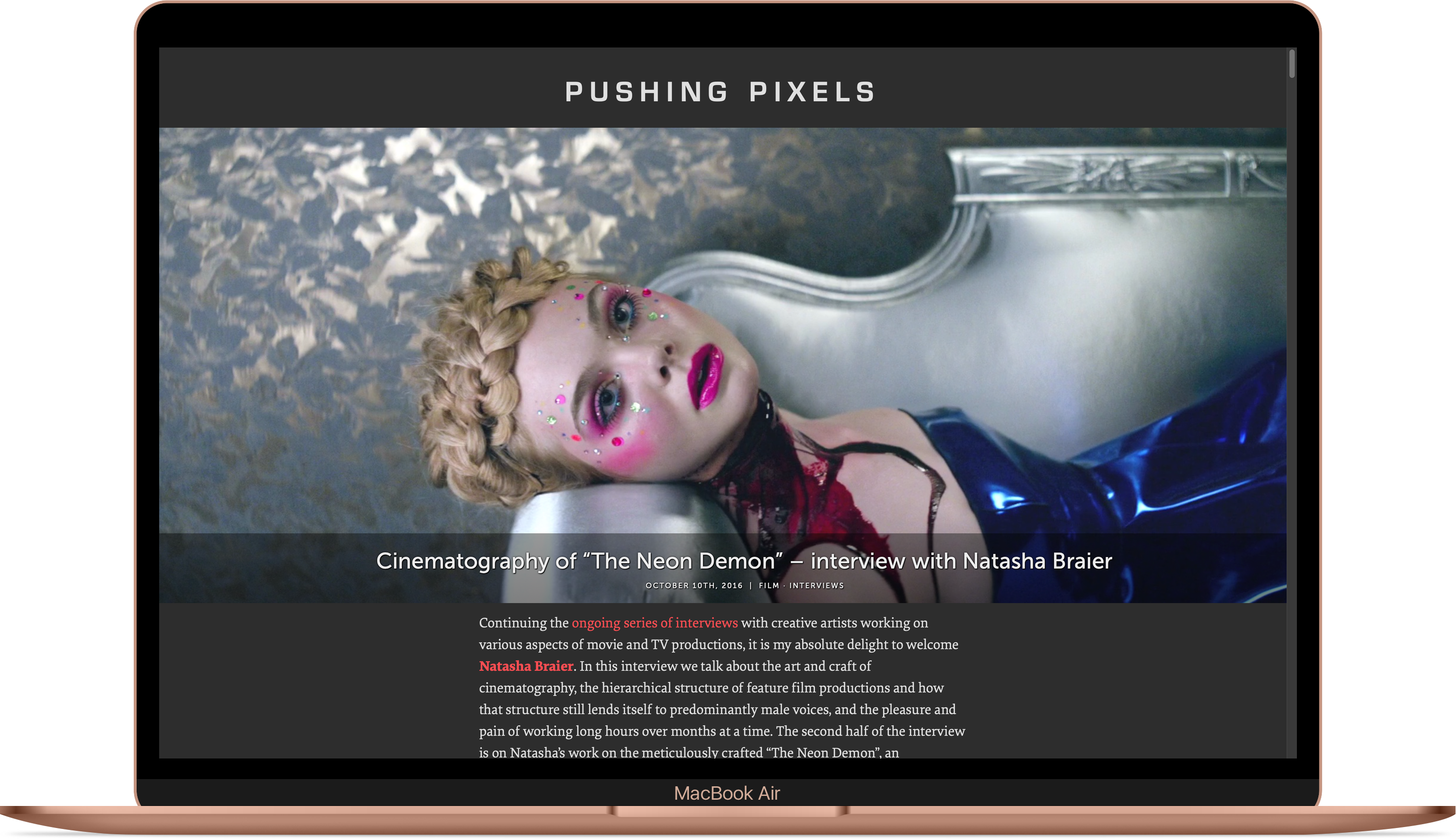
To make sure that an element marked as fullbleed continues spanning the entire viewport on smaller screens. From this point, any image marked with <img class="fullbleed"> will be shown in edge-to-edge, full-width mode. You can view such images in this interview.
The same technique can be applied to images that you want to appear wider than your main content column, but not necessarily full-width on larger screens. For example, here is the snippet for images that span 80% of the viewport width:
.post .halfbleed {
  width: 80vw;
  position: relative;
  margin-left: -40vw;
  height: auto;
  left: 50%;
}
Note that width and margin-left are updated to stay in “sync” (one as the double of the other), but left stays the same. On smaller screens, you can tweak such elements to span the full width of the viewport instead – overriding width and margin-left:
@media (max-width: 480px) {
  .post .halfbleed {
    max-width: 100vw;
    width: 100vw;
    margin-left: -50vw;
  }
}
From this point, any image marked with <img class="halfbleed"> will be shown in 80% viewport width on larger screens, and in edge-to-edge, full-width mode on smaller devices. You can view such images in this post.
Finally, how do you display a full-width hero image at the very top of your post, before the title block? We start with a couple of custom fields. You can find the “Custom fields” block right under the main editor area when you add or edit your WordPress post. Here I’m going to use image_before_title_url and image_before_title_caption as the names for these two custom fields, but of course you’re free to use your own names, as long as they are used consistently.
First, you need to configure your theme to emit the hero image block if it has the information for it. This is a one-time operation. Open the wp-content/themes/your-theme-name/index.php file and locate this line: <h1><a href="<?php the_permalink() ?>"><?php the_title(); ?></a></h1> (which might look a little bit different depending on your theme). Add the following section right before this line:
<?php $hero_url = get_post_meta( get_the_ID(),
      'image_before_title_url', true );
  if (is_single() and ($hero_url != '')) {
    echo '<img class="fullbleed" src="' . $hero_url . '"?>';
  }
?>

<?php $hero_caption = get_post_meta( get_the_ID(),
      'image_before_title_caption', true );
  if (is_single() and ($hero_caption != '')) {
    echo '<span class="caption">' . $hero_caption . '</span>';
  }
?>
Next, upload your hero image to the media section. After it’s done uploading, do not choose to insert it into the post. Instead, copy the full URL of that uploaded image. Now go to the “Custom fields” block and add a new field named image_before_title_url with that copied URL as the value. Optionally, if you want to display a caption under that hero image, add another field named image_before_title_caption with the caption as the value.
What do we have here? The first snippet checks the presence of the image_before_title_url custom field associated with the current post. If that field is present, it also checks whether we’re emitting a single post. I personally found that displaying the hero image before the post title block makes browsing your main page a bit more disorienting. If both conditions hold, it emits the <img class="fullbleed"> element with the source pointing to that custom field value. The second snippet checks the presence of the image_before_title_caption custom field, and emits the corresponding span.
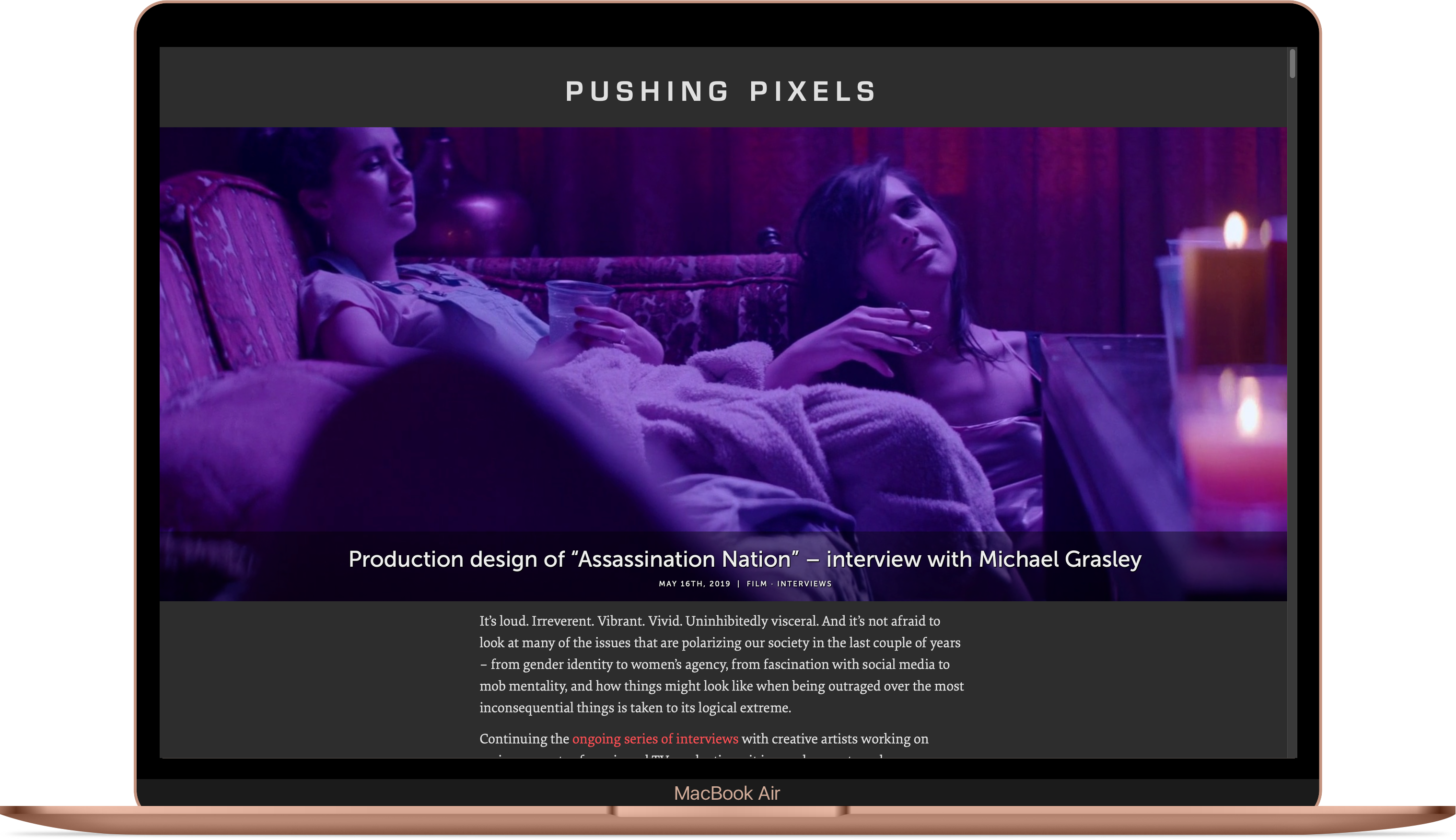
You can see how a full-width hero image before the title block looks like in this interview.
As I wrote late last year, software is never quite done. And so goes yet another year tweaking the presentation layer on this very site. Back in 2014 I’ve switched to using 2x / retina images on modern screens, going back to the archives and resourcing all the images in the interviews that have been published until then. From that point on, all the interviews published here showed higher-resolution images when appropriate. And yet, that wasn’t enough.
The film medium is by its very nature a visual one. Stills from film productions, be they movies or TV shows, demand the same full-width treatment as the production itself. I’ve spent most of my summer going back to older interviews and resourcing all the images (yet again) to even higher resolution. Now those stills are displayed in full-width, edge-to-edge format no matter what device you’re viewing them on. In addition, I’ve started to switch all the interviews to use the leading hero image that is displayed before the title block. Here is how it looks like on smaller, phone-sized screens:
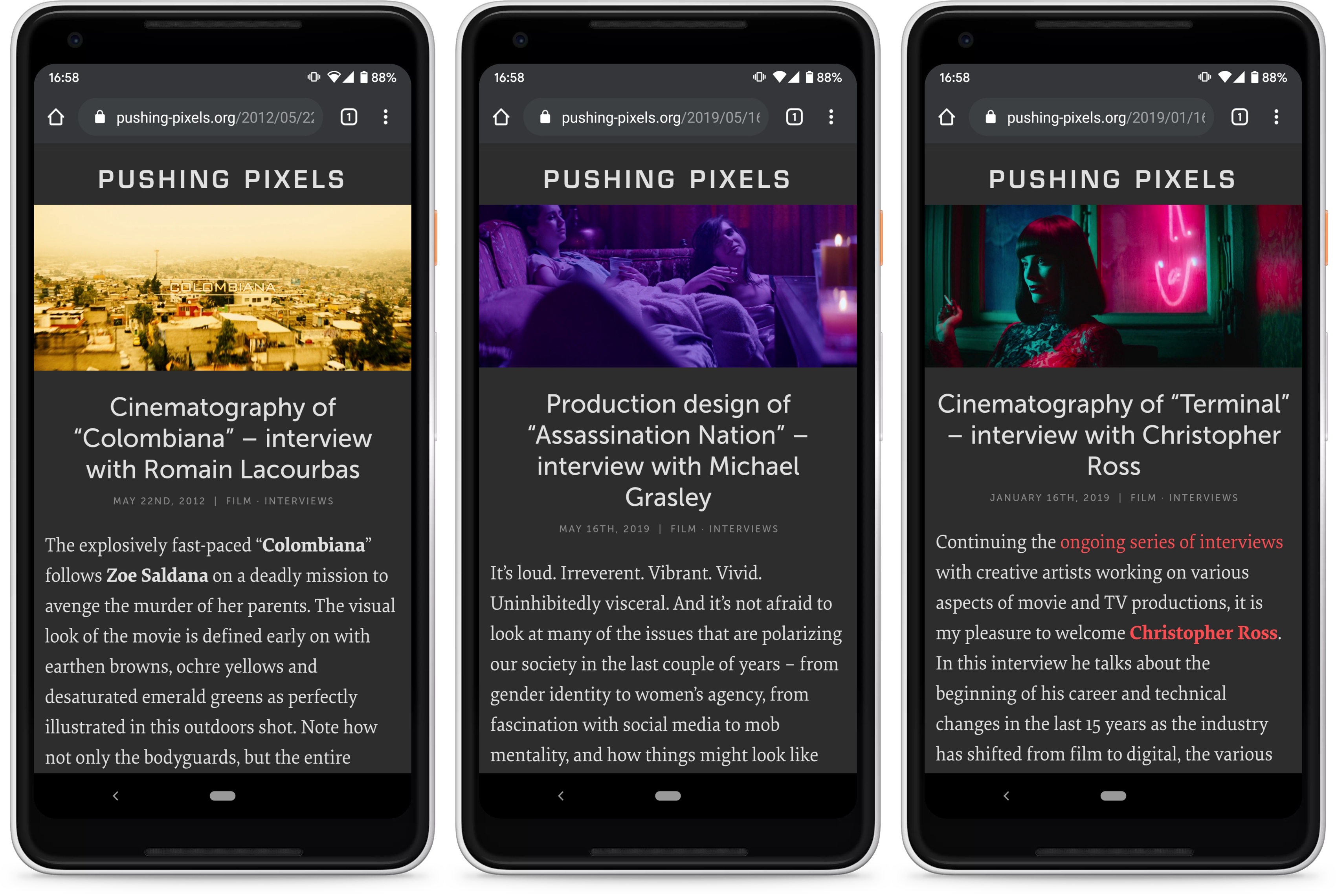
And this is how it looks like on larger, laptop / desktop sized screens:

This is probably it for the 2019 edition of tending this little web garden of mine. What will the year 2020 bring?
Stay tuned for a more technical overview of how this can be achieved in WordPress.
