Meet the Green Goblin, part 2
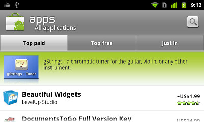
Last Friday we announced a significant update to the Android Market client. A whole slew of features went into this update (and many more are to come), and this week the pixel geek in me will be talking about the new visual design of the application. After talking about custom layouts and overlapping non-rectangular components, it’s time to talk about organizing visual information on landscape orientation. It is rather unfortunate that the vast majority of application designers and developers do not spend time optimizing the user experience for wide screens and just port the “default” portrait layout. Let’s take a look at the old home screen of the Market client:
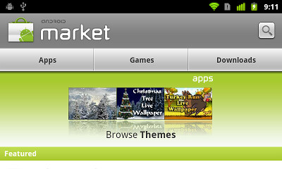
I’ll spare my actual thoughts on this screen, but it looks like ass. From top down:
- Way too much vertical space for the header. The icon is unnecessarily large, the font looks a little dated and the search button just hangs in mid-air.
- The Apps / Games / Downloads look like tabs, but are not actually tabs. Tapping one of these moves to a different screen that shows the relevant content.
- The three-pane promo widget takes almost half the screen height and is a usability disaster. Not only the user cannot swipe to the previous / next triplet. The worst thing is that tapping on the specific thumbnail does not take you to the details of the app. Instead, it takes you to the category of the app, and then you need to “hunt down” the matching row.
- With all this vertical space taken, the actual list of featured apps is not even visible – besides the header, that is.
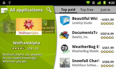
And here how the landing page of the new Market client looks like in landscape mode:
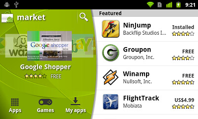
Here, we’re putting the user in control. The screen has now two sections – the carousel + extra controls and the list of featured apps:
- The main title bar (with the search button) does not extend the full screen width and leaves enough vertical space to show full four rows of featured apps.
- The carousel allows swiping to both sides so that you can go to the previous app even after auto-advance animation kicks in and advances the carousel.
- We have enough vertical space below the carousel to show the title, price and rating of the fronted app – leaving enough white space to separate the carousel from the navigation buttons below.
- The navigation buttons now look like actual buttons. They support traversal with D-pad / trackball and show correct highlight outlines on focus and press.
- The list of featured apps spans the full screen height and shows full four rows on the “common” hardware configuration (Nexus-type screen size / density). I personally thing that making each row more narrow is a usability improvement as the price / rating is closer to the app title / developer name.
Next, let’s look at the top-level category listing in the old client:
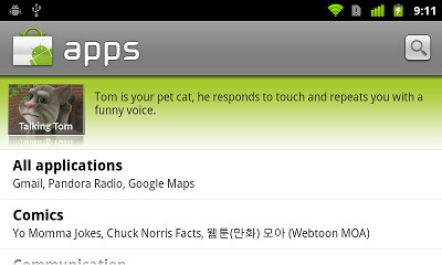
This one is a tad more usable, with two full rows of categories visible. Of course, the fat title bar is still there, and the promo switcher takes the whole screen width and has a whole bunch of unbalanced white space around it. In addition, there’s a whole lot of white space to the right of each category row. Let’s see how this screen looks in the new client:
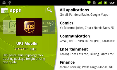
Preserving the overall layout of the home screen, the promoted apps are now displayed in a carousel. The user is no longer at the mercy of promo switcher – swiping is fully supported, and if auto-advance animation is too fast, you can always swipe back (and we actually increase the auto-advance interval once the user starts interacting with the carousel). We also have enough vertical space to show not only the promo description, but also the title, rating and price for the fronted app. And since the category list spans the full screen height, we can fit full five rows, and a much taller scroll window.
Next up – the app listing of the specific category. Here is the old client in all its glory:
Tabs are actually tabs for a change, but all the rest is still ass. Let’s see how this screen looks in the new client:
As on the previous screen, the promoted apps are in an interactive carousel. The tabs are now much lighter and don’t command too much visual attention. Personally i also like that the tab texts are closer and don’t have too much space between them. And we have enough vertical space to show full four list rows, with a much taller scroll window.
Finally, let’s see the app details page in the old client:
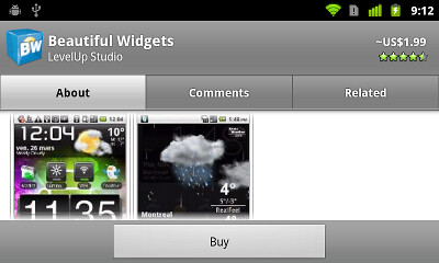
What can i say? Fat title, fat tabs and fat button bar take so much vertical space that the actual content has less than half the screen height to view and scroll. This screen is by far the worst usability offender as far as the content perusal goes. Let’s see how this screen looks in the new client:
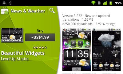
Preserving the same top-level organization, the top-level information on the app is displayed to the left – along with the action buttons to install, buy, update or uninstall the app. The rest of the information is displayed to the right, providing the full screen height for comfortable skimming and scrolling. There’s definitely room for improving the visual arrangement and balance of the app info in the left side – remember that we’re not done yet :)
Android devices come in all shapes and sizes, and we strongly encourage the application developers and designers to invest extra effort in addressing usability aspects of landscape orientation. This does not mean that you should fill every single white area with yet another control. But you shouldn’t be blindly forcing the portrait-optimized layout either. And of course, don’t forget the “small” details such as different screen sizes, resolutions or localization. Here is just a small example from the new Market client:
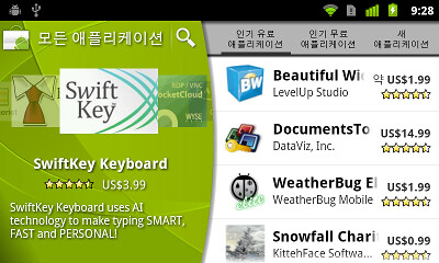
This is running under Korean which has rather long translations for “top paid”, “top free” and “just in”. At runtime, we dynamically find the largest font size that can fit at most two lines of text in the specific tab button. All buttons have exactly the same width and the layout enforces the middle button to be aligned with the horizontal center of the tab strip. Finally, the tab strip itself has custom left padding that pushes it “away” from the curved arc, while the light gray background extends all the way below the arc. You know, pushing pixels :)
That’s it for today’s installment. Tomorrow i’m going to talk about custom drawing and the green swooshes on the new title bars and carousels.


