It certainly feels like this little web garden of mine is not quite done yet. Just a few short months ago I wrote about converting interviews to use immersive, full-bleed images. This is how it looked like back then:

Ever since I’ve been tweaking the custom layout of the intro section that combines the hero image, the title block and the name of this site (that leads to the main landing page):

Now this combined section starts right at the top, and layers all the textual elements along the horizontal edges of the hero image. It brings together all of these elements in a single, unified, cohesive space. And it also gives extra vertical space to the interview introduction to be visible above the fold. This particular journey started in May 2019, and it might just be getting close to its conclusion. Onwards to the next chapter!
Software is never quite done. Even if you have all the features put in, and all the known bugs fixed, if you stand still, the world will slowly pass you by and leave you behind.
A modern app is, more or less, expected to be everywhere. People expect seamless sync between all their devices, intelligent offline, presence of all the screens in their life, and constant adaptation of how the app behaves to the ever-evolving world of technology that we live in.
The same goes for web sites. Space Jam is a rather wonderful memento of the early web frozen in time. But it’s a curiosity, a rare peek into the world of yesteryear.
Content is king they say. Whoever they are, they don’t tell you that the presentation of content matters. As I was switching my site to be fully HTTPS earlier in the year, I was reminiscing on all the non-content maintenance work that I keep on doing on a semi-regular basis with my site to keep up with the latest and greatest. To keep up with what is “expected” of modern web sites. To get a feel of the burden the technology evolution is placing on hundreds of thousands (millions, tens of millions?) of web developers that find their carefully constructed houses of cards gather cobwebs.
- In 2012 I’ve switched to using web fonts, and I kept on tweaking those ever since – for body, headings and navigational elements.
- In 2013 I’ve switched to fully responsive design, scaling the overall layout to behave well on a variety of screen sizes.
- In 2014 I’ve switched to use 2x / retina images on relevant hardware, which required going back to the archives and resourcing all the images in the interviews that have been published until then.
- In 2015 I’ve switched to a single-column layout, rearranging the content to flow better across a variety of screens.
- In 2018 I’ve switched to HTTPS, even though the only user-facing input box is the search tucked at the very end of the page.
Is the latest 3 year gap an indication that things are slowing down? Maybe. But probably not. I’m still tending this little web garden of mine. The latest chapter, so far, has been adding support for dark mode:
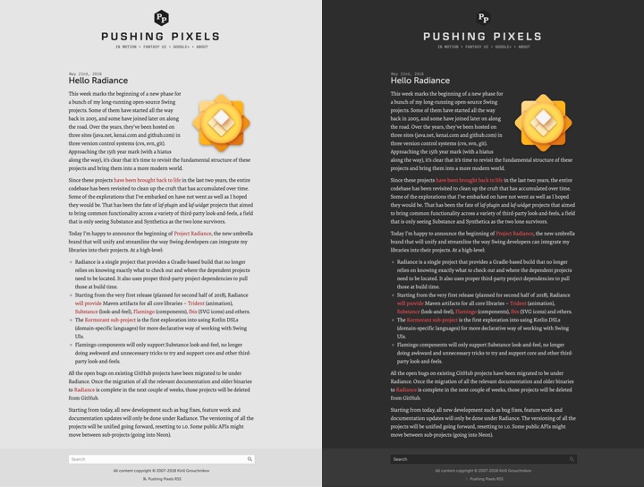
On the left is the regular version of Pushing Pixels. On the right is how it looks like running under Safari Technology Preview on the latest macOS 10.14.1 (Mojave), with the work under way to add the matching CSS selector support to Firefox and Chrome.
I hope this little web garden of mine will be there in 10 years. In 20 years. Hopefully in 40 years. There’s a lot of tending ahead.
Note: since this post was written, Safari for macOS 10.14.4+ and Firefox 67+ have added official support for dark mode. Chrome has added support for dark mode starting in 73 on Mac and starting in 74 on Windows.
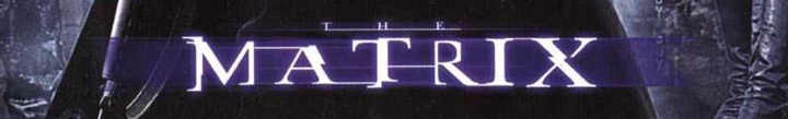
Back in the olden days of 1999 it was pretty much the only movie that I watched in the theaters. In pre-digital days it took a few months for a movie to complete its theatrical rollout across the globe, and once it got into theaters, it stayed for much longer than it does these days. Such was the story of “The Matrix” for me. It stayed in local theaters for at least six months, and I was a single guy with not much to do in the evening after work. So every week, at least twice a week, I would go to watch it again. And again. And again. It’s quite unlikely, in fact, that there’s ever going to be a movie that I’ll watch more times than I’ve watched “The Matrix”.
Back in those olden days, people didn’t wake up to write a new Javascript library. People woke up to write a Matrix rain screensaver. Those would be the mirrored half-width kanas, as well as Latin characters and arabic numerals.
A few years later, “Matrix: Reloaded” came out, taking the binary rain into the third dimension as the glyphs were sliding down multiple virtual sheets of glass. And I finally decided to dip my toes into the world of making my own Matrix rain screensaver, complete with many of the visual effects that were seen in that movie. There’s a bunch of old code that I’ve uploaded as an historical artifact right here. Fair warning – this was 13 years ago, and as many do when they first start out, I reimplemented a bunch of stuff that was already there in the JDK. If you dive into the code, you’ll see a home grown implementation of a linked list, as well as a rather gnarly monstrosity that exposed something that resembled a canvas / graphics API. Don’t judge me. Anyhoo, on to the topic of this post.
One of the things I’ve wanted to do in that screensaver was to take a string as input and render it in the style of Matrix titles:
In here, every glyph undergoes one or more transformations (cropping, displacement, segment duplication). In addition, there are connectors that link glyphs together. It is these connectors that I’m going to talk about. Or, more precisely, how can you come up with the “best” way to connect the glyphs of any input string, and what makes a particular connector chain the “best” chain for that string?

This image captures the “essence” of quantifying the quality of a connector. In the title sequence of the original movie, as well as the sequels, the connectors are only placed at three vertical positions – top, middle and bottom. That is the starting point of this diagram. In addition, there are the following factors at the level of an individual glyph:
- On the scale from 1 to 5, how far the connector would have to go “into” the glyph to connect to the closest pixel? So, the bottom part of A gets 5’s on both sides, and the top part gets 2’s on both sides. The middle part of J gets 0 on the left (as the connector would have to “travel” across the entire glyph) and 4 on the right (as the connector would need to go past the rightmost point of the top serif).
- Defining a “natural” connection point to be (in the diagram above green marks such a point while red signifies that the point is not natural):
- Anything on top and bottom – this is an escape valve that would make sure that any input string has at least one connector chain
- Serifs in the middle – such as the right side of G
- Crossbars in the middle, extending to both sides of the glyph – such as A, B or R.
Then, a valid connector chain would be defined as:
- No two consecutive connectors can be placed at the same vertical position. In the example of the original title, the connector chain is top-bottom-middle-bottom-top.
- A connector must have positive (non-zero) value on both sides. For example, you can’t connect A and J in the middle because the left side of J places value 0 on the middle position.
- A connector must have at least one natural connection point. For example, N and O can’t be connected in the middle, while N and P can (as P’s left side defines the middle position as a natural connection point)
Finally, the overall “quality” of the entire connector chain is computed as:
- The sum of connection point values along both sides of each connector
- Weighed by the chi-square value of the connector vertical positions along the entire chain
- Weighed by the mean probability of the connector vertical positions along the entire chain
The last two factors aim to “favor” chains that look “random”. For example, there is not much randomness in a top-bottom-top-bottom-top-bottom chain. You want to have a bit of variety and “noise” in a chain so that it doesn’t look explicitly constructed, so to speak. As can be seen in the diagram above, the middle vertical position is not a natural connection point for a lot of glyphs, and both of these factors aim to bring a well-distributed usage of all vertical position into the mix.
It is true that the basic underlying rules of defining how a glyph connector chain is constructed are based on the visuals of the Matrix movie titles. You might think of this as the basic rules of physics that apply to the particular universe. However, the evaluation of a specific constructed chain is a softer framework, so to speak. There is nothing explicit in these rules that would force the quality score of the particular connector chain that you see in the final graphics for these particular six letters to be the highest of all valid chains.
When I first ran the finished implementation, it was one of those rare moments of pure, unadulterated geek joy:

These are all possible valid connector chains for the word “MATRIX”, ordered by the quality score that is based on values of individual connector points, as well as statistical variation that accounts for predictability and randomization within a specific sequence. Yes, the top score goes to the sequence that was used in the movie title!
Let’s look at “RELOADED” next:
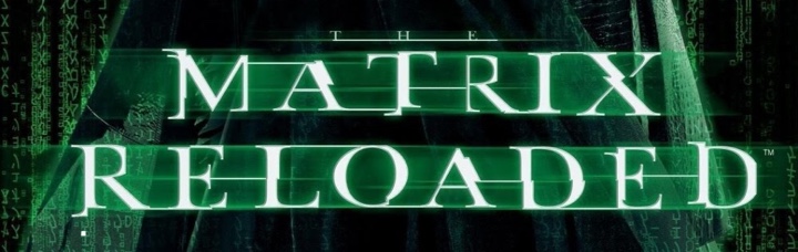
And these are the top 39 valid connector chains for that word:

While my algorithm found the perfect match for “MATRIX” connector chain, the connector chain that was used in the movie for “RELOADED” is scored at place #37. You can see where it falls flat – in the top connector between L and O. The score value for top connector on the right side of L is 1 out of 5, and while the score value for top connector on the left side of O is 5 out of 5, that drastically lowers the overall score. In addition, the last four connectors are bottom-middle-bottom-middle which lowers the median probability factor applied to the entire quality score of this chain.
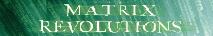
The connector chain selected by the third movie for the word “REVOLUTIONS” is not considered a valid one based on the rules that I chose after “Reloaded” was out. Specifically, the middle connector between U and T is not valid, as there is neither a serif not a crossbar in these two glyphs. And the same applies to the middle connector between I and O.

Finally, the “ANIMATRIX” title deviates slightly in the “MATRIX” part, using middle connector placement between M and A. How did my algorithm fair on scoring this chain?

This was a close one. The connector chain used in the movie title scores at the second place, with the only difference being in the very first connector (top instead of middle).
It’s hard to quantify artistic choices, and I don’t presume to claim that the top-scored connector chain for “RELOADED” based on the rules of my algorithm is clearly superior to what ended up in the actual movie titles. Would it be worth to tweak the scoring system? I don’t think so. There are a couple of noticeable “weak” connectors in the connector chain in the movie title, and relaxing the scoring rules would only introduce more randomness into the process without necessarily bumping up that chain up the ranks.
Perhaps the artistic choice of choosing a long top L to O connector was based on introducing a bit of variance and randomness into the mix. Or perhaps I should check to see who was in charge of the title graphics and ask them :)