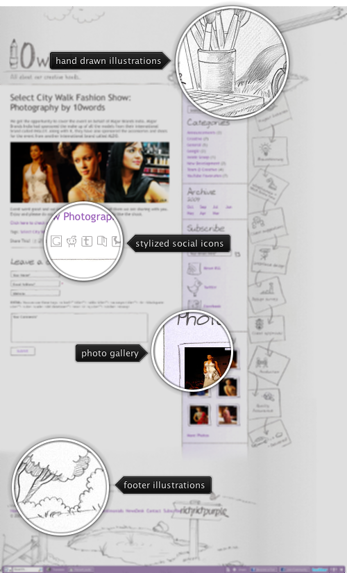
Today’s post highlights the design of 10Words, the blog of RichPurple digital agency. Using desaturated purple for links and sidebar fading gradient, the design uses soft hand-drawn illustrations placed on noise texture background to frame the main content. The illustrations along the sidebar are an overkill and create too much visual noise, especially given that most of the entries do not have a lot of content. The social icons found in sidebar and below each blog post further reinforce the decoration style set by the pencil-themed rendering of the main site logo.

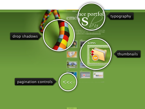
Today’s post highlights the design of EmotionsLive.com. A warm, unique and memorable illustration highlighted by soft drop shadows is the main design element. A simple navigation menu along the top edge borrows some of the saturated colors from the stockings to separate between the three menu elements. The playful tone set by the main illustration continues in the header typography, with handwritten ligatures and a tree sprout projecting from the letter “o”. Custom framed portfolio thumbnails blend beautifully with the autumn green background which uses horizontal gradient to breath some life into the surrounding white space. Combined together, the design elements create an elegant and lasting impression.

Today’s post highlights the design of JosephPayton.com. Set in various shades of steel blue, the site features an intricate header that combines multiple illustration techniques for a unique and memorable appearance. The background layer starts with a soft geometric pattern, which is overlayed with a few watercolor strokes and a pencil vignette drawing. A three-tone color palette used for the stylized portrait of the designer creates a friendly and humane feel, further inforced by the custom typography used for the header bullet points. The next header layer combines the navigation menu section (set in a slightly darker shade of the brick red color from the portrait) and the social icons bar. Both use simple rollover highlights and rounded tab appearance for better balance. While these two sections use drop shadows to raise them above the illustrations, an even harder drop shadow separates the entire header from the main content. This separation is completed by overlaying and extending the fingers into the main section.
A two-column layout in the main section highlights snippets of recent blog entries and the latest tweets. The attention to details shows in every element of the snippets – consistent usage of custom fonts for the titles, title rollover effect, watercolor strokes behind the moleskin notebook, the dark mahogany color of the notebook cover that continues the color continuum of brick reds in the header section and slightly raised “callout” bubbles with the comment count. A simple footer section set in deep steel blue completes the usage of custom illustrations on top of watercolor strokes.
When you visit the main page, move the mouse over the header portrait illustration for an attractive fading transition that invites you to visit the designer’s portfolio.

Today’s post highlights the design of Forrykt.com by Johannes Gorset. A minimalistic one-page design uses the monochrome black and white palette, with a welcome addition of a fine pinstripe pattern across the large black horizontal section. An elaborate illustration of a temple is accentuated by a bloom halo that follows the direction gradient of the pinstripe pattern. The drop shadow effect around the hanging stippled ribbons adds a slight touch of three-dimensionality to the design.
The main content column uses a lot of white space and simple typography to format the snippets of last two featured articles. To keep all the content above the fold, a one-sentence summary set in italic is displayed directly below the article title. A simple footer features an embedded list of last tweets and a few general navigation / social links.