As part of the “In Motion” series, I did a few interviews about screen graphics and the way they are portrayed in futuristic sci-fi movies, and one of the “usual” questions I ask the person is where they see the human-computer interaction going in the next few decades.
And then, as I was talking with Scott Chambliss, the production designer of “Star Trek”, about how he approached designing the computer environment of the Enterprise Bridge, especially given that it’s happening in a rather distant future (250 years from now, give or take), I realized that I’m not really being fair.
Asking such a question immediately puts the other person on the defense. Look at where we were 25 years ago, and look at where we are now. The pace of technological evolution is incredible, and there’s an amazing amount of research going into all these different directions, some proving to be niche experimentation, and some reaching and changing lives of hundreds of millions of people. Asking somebody (who is not an extrovert futurist) to predict what will happen in the next 25 years is unfair. There’s just no way to be able to do that, and there’s an extra layer of being indexed forever and having people point fingers at your old self and how completely wrong you were at the time you made that prediction.
So here’s my resolution. I’m not going to ask this question any more. No more “Where do you see human-computer interaction going in the next 25 years”. Instead, I’m going to ask about where they would like it to go. What is bothering them now, and how that can be eliminated? How this can make our lives better? How this can be enriched without isolating us even more from our fellow human beings?
My own personal take on this is that interacting with computers is too damn hard. Even given that I write software for a living. Computers are just too unforgiving. Too unforgiving when they are given “improperly” formatted input. And way too unforgiving when they are given properly formatted input which leads to an unintentionally destructive output. The way I’d like to see that change is to have it be more “human” on both sides. Understand both the imperfections of the way human beings form their thoughts and intent, and the potential consequences of that intent.
What about you? Where would you take the field of HCI in the next 25 years?
Continuing the ongoing series of interviews with creative artists working on various aspects of movie and TV productions, today I’m honored to welcome Seamus McGarvey. In this interview Seamus talks about his collaboration with the director Joe Wright and the production designer Sarah Greenwood that has brought us “The Soloist”, “Atonement” and the recently released “Anna Karenina”, the shifting digital world of modern cinematography and his roots in the world of physical film, his work on the sci-fi blockbusters “The Avengers” and the upcoming “Godzilla”, and the shifts he sees in the ever-prevalent use of computer-generated effects and, finally, his thoughts on 3D production from both professional perspective as a cinematographer and a personal perspective as a movie goer.
Seamus McGarvey
Photography by
Kimberley French
Kirill: Please tell us about yourself and how you started in the field.
Seamus: I’m Seamus McGarvey the cinematographer. I started as a stills photographer. It was interested in solitary photography, going off on walks and returning to the dark room at our house in a fairly small town in Northern Ireland. That sort of sparked my interest in cinematography because it gradually allured me from landscape shots towards developing photo sequences that told stories. I started getting really interested in photo sequences. The art teacher at school saw some flicker of talent, and he encouraged me to start shooting with a Super 8 camera. That really kickstarted me when I started making films on Super 8, and that led to being accepted into the Polytechnic of Central London where I studied cinematography for three years. It was called “Film and TV arts”.
When I graduated, I began to assist, work as a loader and as a focus puller, and at the same time I was also shooting short films and low-budget films for friends mostly. It was one of those that got noticed by Michael Winterbottom, and I ended up shooting his first feature, “Butterfly Kiss”. That was a little cult success, particularly in America. I was quite young at that point, having shot my first feature when I was 24. That was a lucky break, as they say. Then one thing led to another, starting to get feature films. “Butterfly Kiss” was my first feature film, and after that I did a series of low-budget films in Britain. And then I got a lucky break to shoot “High Fidelity” for Stephen Frears, and that changed everything for me. It was the first US-based film that I shot, and things took off after that. I started getting bigger features.
Kirill: As you build your portfolio, do you get approached directly by the producers or the directors to work on a particular production, or is it more of a competitive interviewing where a number of potential cinematographers are interviewed at the same time?
Seamus: Generally speaking, many of the projects that I’ve worked on have been with friends. Usually I’m the only cinematographer that is considered, as for example with Joe Wright who gives me the first call, or with Sam Taylor-Johnson with whom I’m about to start on “Fifty Shades of Grey”. I’ve worked with her for sixteen years. On bigger films, like for instance “The Avengers” or “Godzilla”, they are considering several cinematographers. It is a competition where you go in for interviews, because that’s how it usually works on bigger ones.
I like mixing it up. After “The Avengers” I was offered a lot of very big films, but it’s actually very nice to do smaller stuff as well. I still keep my hands doing short films and documentaries. It’s good to exercise your eyes in different directions, use different skills, work at different budget levels.
Kirill: Can you plan those smaller projects ahead of time, as you’re finishing your part on one bigger film and not getting started yet on the next one?
Seamus: I’ve just premiered a documentary called “Harry Dean Stanton: Partly Fiction” that I shot and helped produce. It was released in LA this week, but that was an ongoing project, kind of a passion project that lasted over two and a half years. We were shooting it ad hoc whenever we could on a Canon 5D Mark II, sort of capturing it as best we could. The low-budget documentaries cannot happen over a long period. And I just did a commercial in Paris for Chanel. I don’t often do them, but it seems to be a regular thing over the last six or seven years that I’ve done these Chanel commercials with Joe Wright. They are great, high-end commercials.
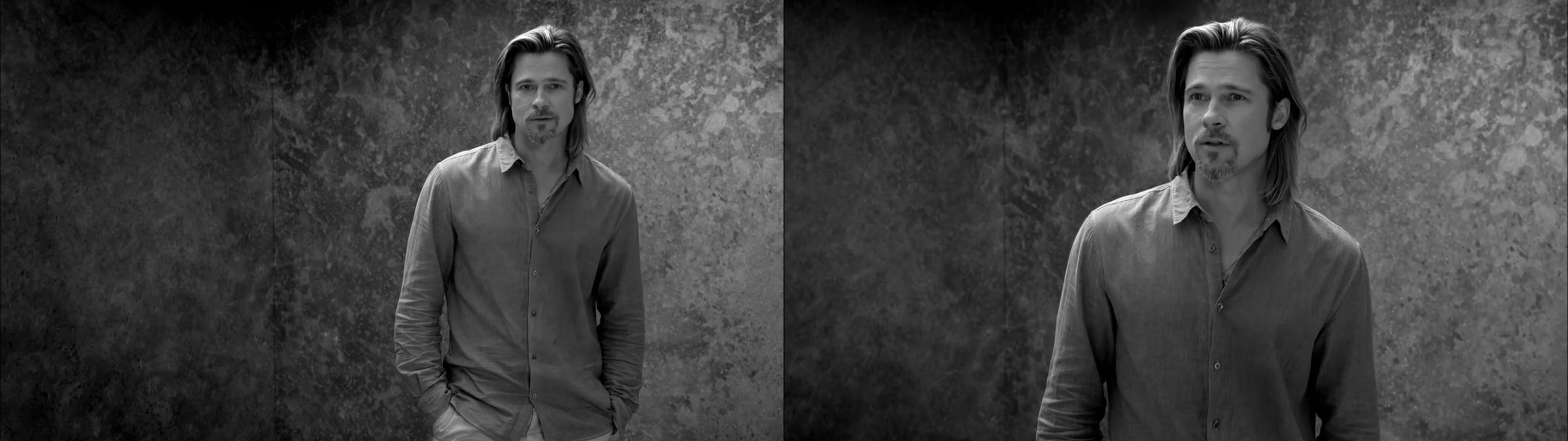
From “There You Are” commercial for Chanel.
But I also like to take time off. I have two kids who live in Scotland with their mom; we’re divorced. After I finished “Godzilla” in July, I took time off and took the kids to my house in Italy. I like to balance it between holiday time and commercials whenever I can. Occasionally, with my little 5D camera it allows me to do passion projects, like the Harry Dean film or this one-day project I just did with Bella Freud which was a charity job. I think that camera has opened up things for me to do, like music videos for my musician friends.
Continue reading »
After hitting his stride as the production designer on the TV show “Alias”, Scott Chambliss has risen to the top ranks of major movie productions. In the last few years Scott has worked on “Mission: Impossible III”, “Salt” and”Cowboys & Aliens”. He has also continued his collaboration with the director J.J. Abrams on the reboot of the Star Trek franchise. In this interview Scott talks about the traditional collaborative triumvirate of director, cinematographer and production designer and how that balance is shifting in the world of increasingly VFX-driven sci-fi productions, how advances in digital technology and global connectivity affect the current state of the visual arts, the approach he has taken to bring back the rich world of the original Star Trek universe to the modern audiences, his take on where human-computer interaction should go, and his thoughts on 3D productions.
 Kirill: Please tell us a little bit about yourself.
Scott: I’m a motion picture production designer, and I’ve also designed episodic television. I began in fine arts and theater design in school, and spent the beginning of my career in New York working on Broadway and regional theatre productions while keeping up on my own artwork, which included showing work gallery shows.
Kirill: Was “Alias” your first big-scale production?
Scott: Not at all. As a matter of fact, “Alias” came along at what I thought was the end of my career. A pause for a professional history recap: I’d done a number of assistant art direction jobs on large scale studio features shot in New York and then designed my own first small feature there, which led me to Los Angeles to try my luck as a full-time production designer. The projects I landed in LA over the next eight years were small features and episodic tv pilots plus a few mid-scale studio comedy features. While I met and continued to work with a handful of wonderful directors, producers, and other creative collaborators, none of those projects ever built real momentum for my career. They were all virtually invisible to the public as there was not an attention grabber or a box office hit in the bunch. By the time the “Alias” pilot rolled around I had resigned myself to the fact that I was probably in the last days of my efforts to be a production designer and was seriously exploring what else I might do for a living. I was still a young guy with a future to create, so maybe it was time to begin Act Two.
What I imagined to be my last gig in the biz, taking over the tv episodic “Felicity” in its third season, (when it was no longer even being tracked by the Nielson ratings because its viewership was so miniscule), unexpectedly turned into my game-changer. This job brought me into the same room with J.J. Abrams at a somewhat formative moment in his career, and we hit it off creatively and personally. Toward the end of that season of “Felicity”, JJ liked my work and how I did it, and he asked me if I’d do the new pilot “Alias” he’d just written and was going to direct. That pilot was the beginning of a creative relationship that I’d always hoped to have: mutually inspiring, always supportive, adventuresome to the point of riskiness, fueled by respect for the talents of each other. It’s more than ten years later, and I remain devoted to our working process together and grateful for any opportunity I have to work with J.J.
Kirill: People usually talk about the director, the cinematographer and the production designer as the trio in charge of defining the universe, the visual look and the atmosphere of the specific movie. Are you looking to be on the same brain wave length with your collaborators, or for more of a clash of different ideas?
Scott: The clash part of a job…or in life, for that matter… is not inspiring to me. I think there can be any number of different points of view on the piece of material that you’re collaborating on, and they’re each a necessary part of the collaborative discussion. However being rigid with a point of view is a rather limiting stance. There are many ways to tell a story, and the task of exploring approaches that aren’t your own is an interesting process. When there’s a mutual respect among the storytelling collaborators on a film, very nuanced tales evolve which are richer than a story any one of us would come up with on our own. The kind of team I am most at home with understands and supports this point of view. I know that’s not the way every film making collective in town works, and I’m well aware that some directors prefer a confrontational dynamic in their work environment. Having worked in a few of those situations myself, I’ve found that such an atmosphere to be anti-creative.
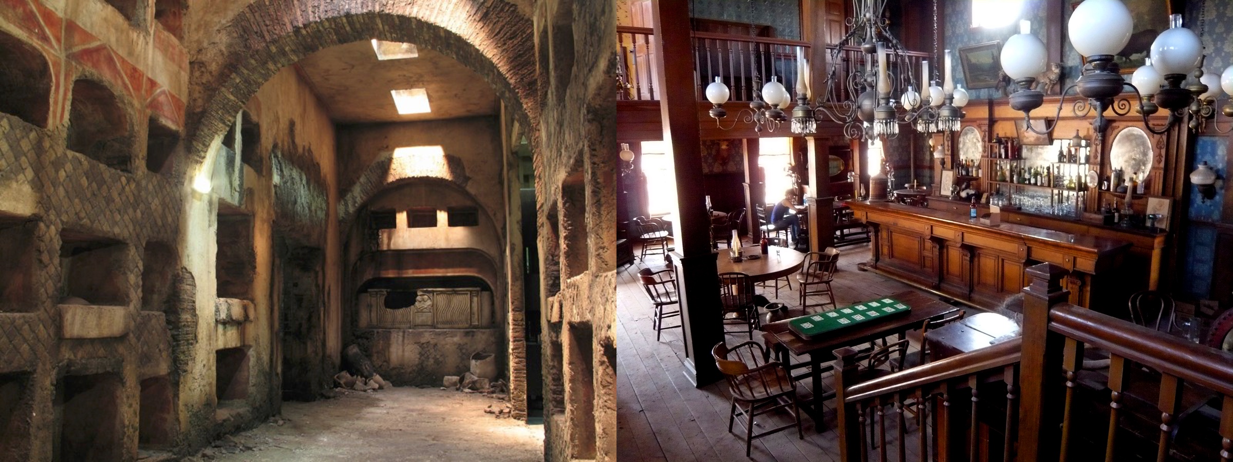
Left – on the set of “Mission: Impossible III”, photography: Scott Chambliss, courtesy Paramount Pictures. Right – on the set of “Cowboys & Aliens”, photography: Zade Rosenthal, courtesy Universal Pictures.
Continue reading »
Continuing the ongoing series of interviews with creative artists working on various aspects of movie and TV productions, today I’m pleased to welcome Leslie Morales. In this interview Leslie talks about the art and craft of set decoration, why Oscars are awarded to the team of production designer and set decorator, the differences between working on TV series and movie productions, and her work on the recently released movie “Stoker“.
Kirill: Please tell us about yourself and how you started in the industry.
Leslie: My name is Leslie Morales and I’m a set decorator. I started as a starving artist / painter. I had a painting studio in Santa Monica and like most artists, I was looking for odd jobs to pay the rent. I started scenic painting and then costuming, and very quickly ended up decorating a film, probably within a year or so. Years before that I had considered being an actress, and decorating to me fit that profile – reading a script and creating a character. This is how I saw set decorating – between acting and painting.
I never studied – or even considered – set decoration in that it would be my career. I learned from directors, production designers & the directors of photography which I thought at the time was all fascinating, guess it was sort of a self taught process. On my first job I had no idea what a decorator did, and I’m glad that I learned that way. It was intense & crazy & fun.
Kirill: When you are considered for a job, is there any kind of process where people look at formal education? Or perhaps after a few productions it matters much less and they look at your body of work?
Leslie: For me the educational background doesn’t seem to matter. It’s far more what you’ve actually done on film. If someone’s interviewing me for a show, they know my eye and my style, they know the directors & production designers I worked with, and that’s where it’s coming from. For most decorators that I’m aware of, it has much more to do with the work that you’ve done than any specific education that you have, though I think a fine art background is very helpful. I’m not sure that there’s much educational curriculum geared to film art. You look at film schools and their focus is on writing, directing, photography and acting – all very important but you don’t see many courses on production design or decoration.
Kirill: What’s your role in the overall structure of the art department? I’m looking at the list of nominees for the Oscar awards for production design, and it’s always the team of the production designer and the set decorator. What makes this relationship so special?
Leslie: We’re considered the visual heads of the art department. The way I see it, the designer – along with the director – will create the overall visual design of the film. For example, “Stoker” had a very specific color palette, with a distinct symbolism defined by the director Chan-wook Park. So Thérèse DePrez (production designer) and I, or any designer and set decorator, start the dialog on how you take that conceptual discussion to screen. The designer is always the creative head of the art department, and the decorator would be, I guess, the next creative head. Ideally it is a very collaborative effort. We’re constantly having discussions, building our canvas on screen, talking to the director & the director of photography clarifying the mood and the texture of each set.
The art department has many people from art directors, set designers, painters, construction & props. And in my department I am supported by my lead person, my buyer & set dressers. We, the production designer & the set decorator are the two people who are responsible for getting the look on film.
Continue reading »
