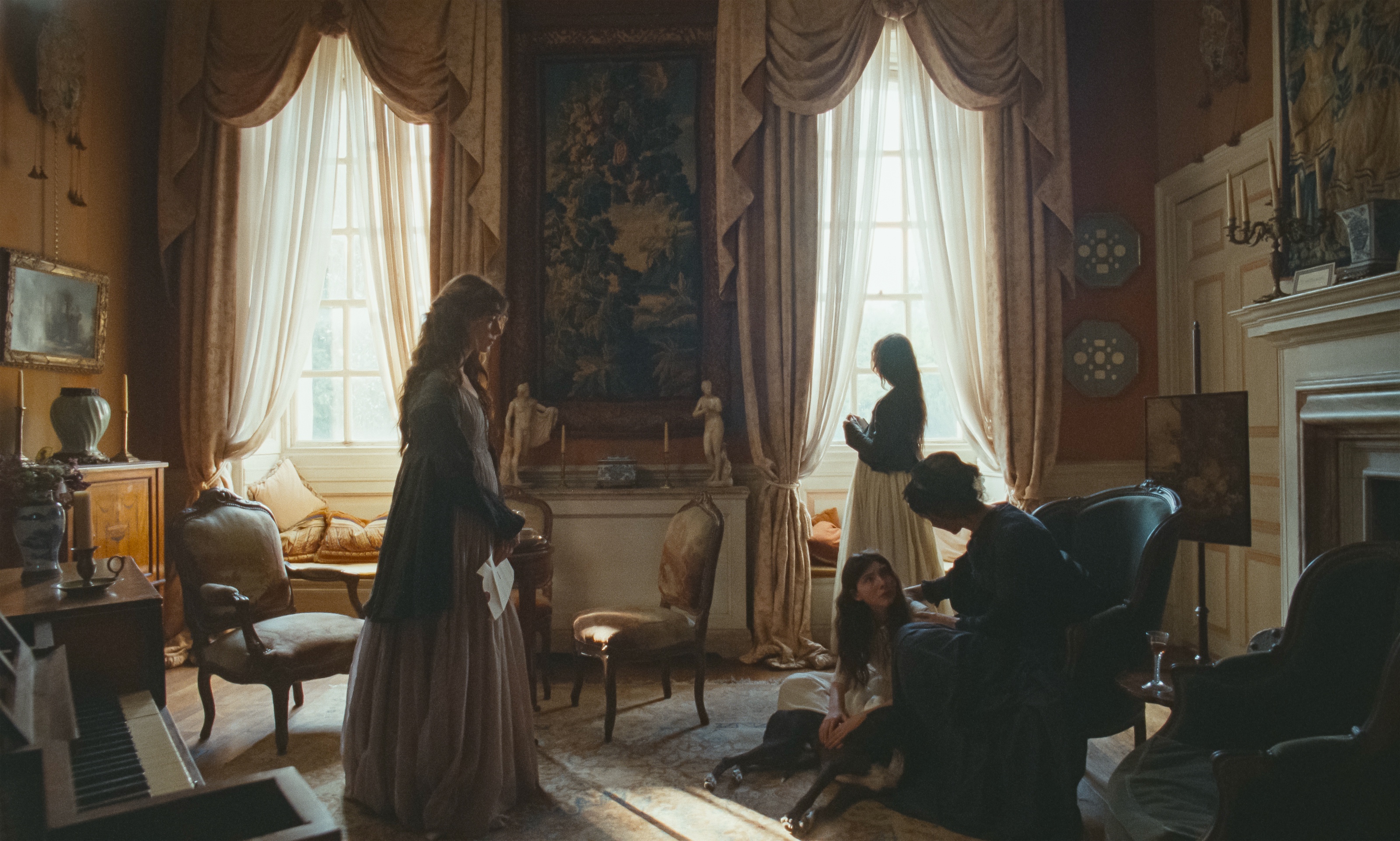
 Production design of "Sense and Sensibility" by Francesca Di Mottola, courtesy of Focus Features.
Production design of “Sense and Sensibility” – interview with Francesca Di Mottola
Continuing the ongoing series of interviews with creative artists working on various aspects of movie and episodic productions, it is my delight to welcome Francesca Di Mottola. In this interview, she talks about the art and craft of production design, experiencing stories on the big screen, her thoughts on generative AI, and key ingredients to longevity in the industry. Between all these and more, Francesca takes a deep dove into her work on the recently released “Sense and Sensibility”.
 Kirill: Please tell us about yourself and the path that took you to where you are today.
Francesca: I have always been interested in the arts since I was a little girl. I remember that I had a passion for storytelling via my drawings and the way I would play since my early age. I often have this image of me in a room alone, drawing the bird’s eye view of myself in that space. I also remember being interested in drawing to a specific scale and with a specific point of view and I was often creating miniature worlds. But there wasn’t a straight path that led me to storytelling or production design.
I went to art school in my high school back in Italy. Then at one point I thought I had to go into a profession that meant more. I was about 18 years old at the time, and I was a bit confused about what it meant to be an artist or to be a designer. And so, I signed up to study agriculture. I felt that it was important to grow things and to be connected to land. I didn’t even know how that would become a profession for me. I was in Rome at the time, and I signed up to this university course in Florence, so I had to move. After a few months I had a complete awakening that this was not the right way of life for me.
After that I moved to London to do a foundation in art and design, which turned out to be a year where, as far as my studying is related, wasn’t the most inspiring. But living in London exposed me to so many different cultures, so much art and so much theatre and cinema from all over the world. Back in Italy you either didn’t necessarily have access to that as much, or you had to work much harder to find access to certain movies or fringe theatre plays. That became my foundation here in London. I went to all different kinds of theatrical performances and cinema shows daily.
One day in particular stands out vividly in my mind. I was at the very top level of the Royal Opera House in London. Unfortunately, I don’t remember what opera it was. Perhaps it was “The Magic Flute”, but it might just be my association since it’s one of my favourites. And it hit me that that’s what I wanted to do – create beautiful imagery within a theatrical box. And so, I went on to study theatre design, which I did in London at Central Saint Martins.
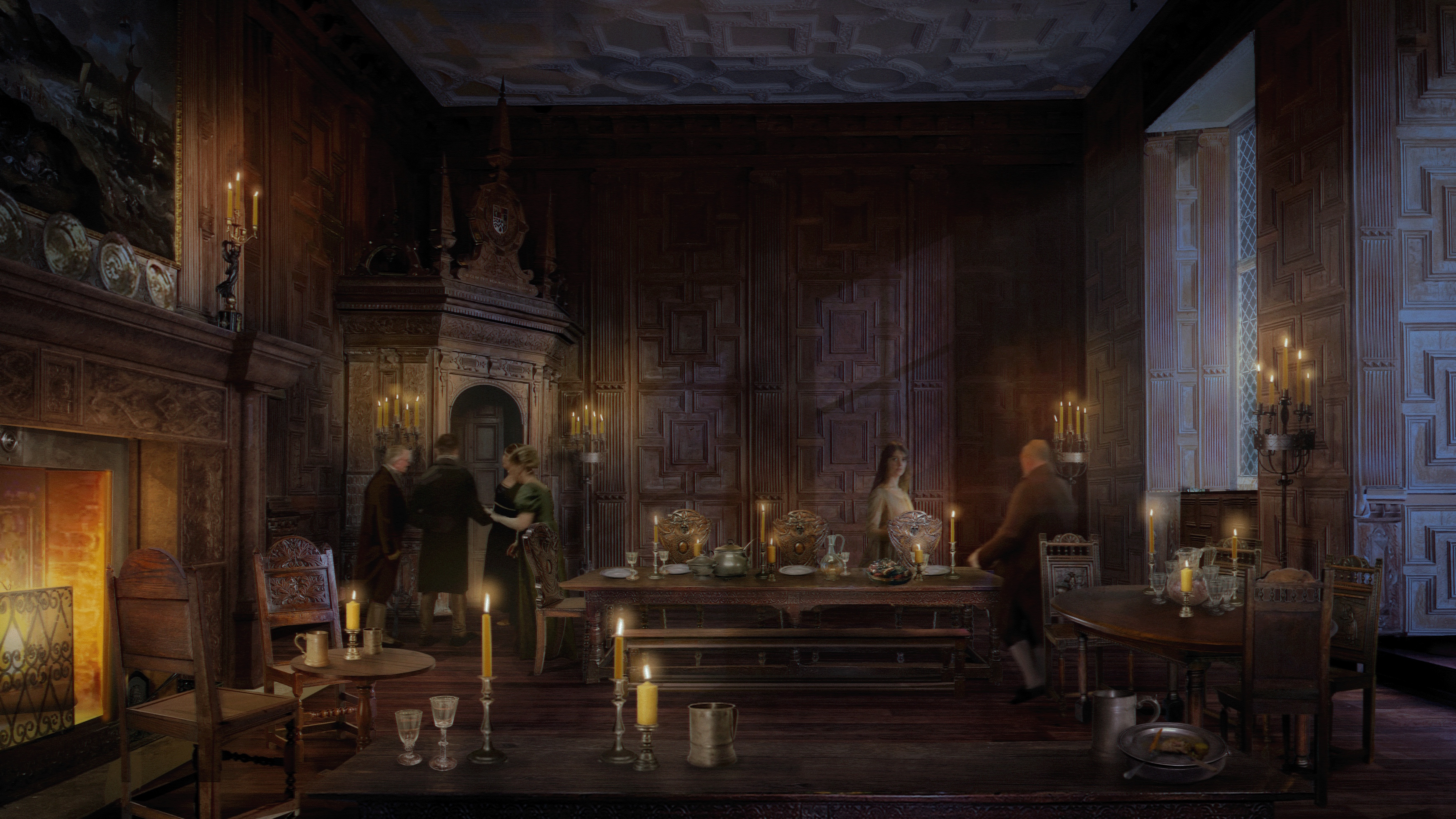
Concept art for “Sense and Sensibility”, courtesy of Francesca Di Mottola.
Film came a little bit more as a coincidence. My theatre design course was based in the basement of the London College of Printing (London College of Communication now), which also happened to house the film course. The students from the directing course would come down to our studios and ask us who was available and interested in designing their short film shooting over the weekend. I found myself with two other students collaborating with those directors almost every weekend. We formed our little group where we would work together as a team. One of us would be designing and the others would be assisting and doing set decoration. We took it in turns, and we did that throughout our college years. Film became a different language that I was learning side by side with doing my theatre design courses.
I’m half Brazilian, and as luck would have it, a friend of mine who knew Walter Salles (a Brazilian filmmaker) put me in touch with him because he was going to be directing a movie in Rome. That was around late 1999, and through him I got an internship with the most amazing Italian production designer Dante Ferretti. That’s how I started working in the art department. Unfortunately, that film never happened. It was a beautiful movie about the painter Filippo Lippi, and it was going to be starring Benicio del Toro. Long story short, he ended up breaking his wrist, and he was off for a few months, and the project eventually got called off. I went on to work with the same team on “Cold Mountain” in Romania, and that was that. I worked in different positions in the art department for a few years but quite quickly I found myself designing. Luca Guadagnino’s “I Am Love” was the first movie I designed back in 2008 in Milan.
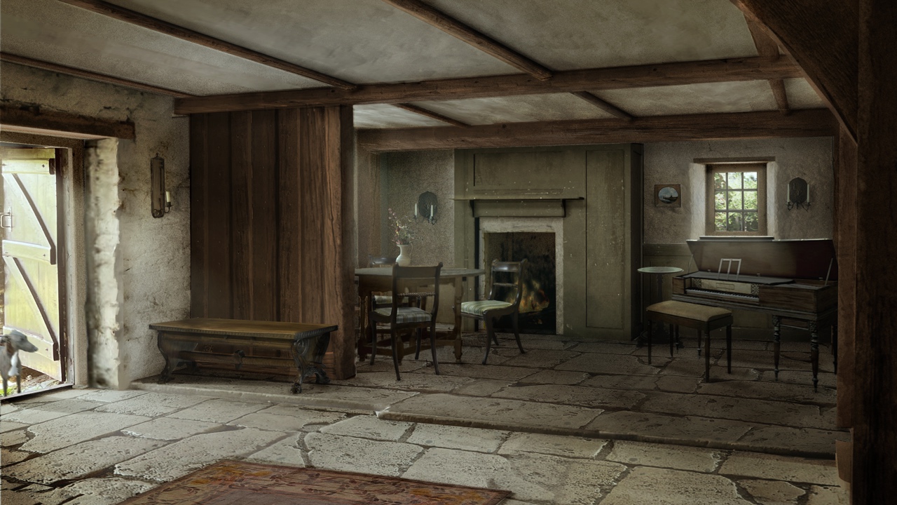
Concept art for “Sense and Sensibility”, courtesy of Francesca Di Mottola.
Kirill: As you look at this first chapter in your professional life in the art department, how many changes have you seen in it and what stays the same?
Francesca: It’s a complicated question because projects come in all different shapes and sizes. When I was just starting out, I worked on these huge projects first as an intern and then as a junior draftsperson. We drew by hand and that’s how I learned. Twenty years later, we have almost completely abandoned hand drawing. I was trained that way, and I like to draw by hand. Especially on period productions. When I was designing all the sets for “The Great” (we had some major builds spread over 4 sound stages) I was lucky enough to have 2 assistant Art Directors that droughted both digitally and by hand. That was specifically helpful for sets that had a lot of mouldings and decorative details as shading done by hand feels so much more pleasing to look at.
I haven’t yet designed a huge budget movie, so I can’t compare the size of the art department to what they used to be. I do feel that even with the advent of AI and all the amazing software and tools we have access to today, we still need a substantial art department especially when we’re building huge worlds from scratch. But that loss of hand drawing is a shame and a clear change.
Kirill: What are the common misconceptions or misunderstandings about the role of the production designer?
Francesca: Apart from the actors and what they wear, almost everything you see in a film is part of production design. It goes far beyond the sets themselves: set decoration, props, graphics, greenery and floristry, food, action vehicles and even the choice of animals. It’s everything we create, source, adapt, manipulate or transform within the world of the film.
Perhaps the biggest misunderstanding isn’t so much about what we do, but the sheer scale of what we have to oversee and control. Although it’s difficult to use the word ‘control’, because production design is an incredibly collaborative process. We work closely with the set decorator, prop master, graphic designer and so many other departments, and you must learn to trust people and let go of some of that control. But ultimately, the visual world of the film sits with the production designer, and we’re responsible for how all those elements come together.
When I hand over a set to a director, for example, if something doesn’t feel right or doesn’t make sense, they will come to me. That responsibility extends to everything within the frame. I think it’s very difficult to appreciate the sheer breadth of the role unless that’s your profession.
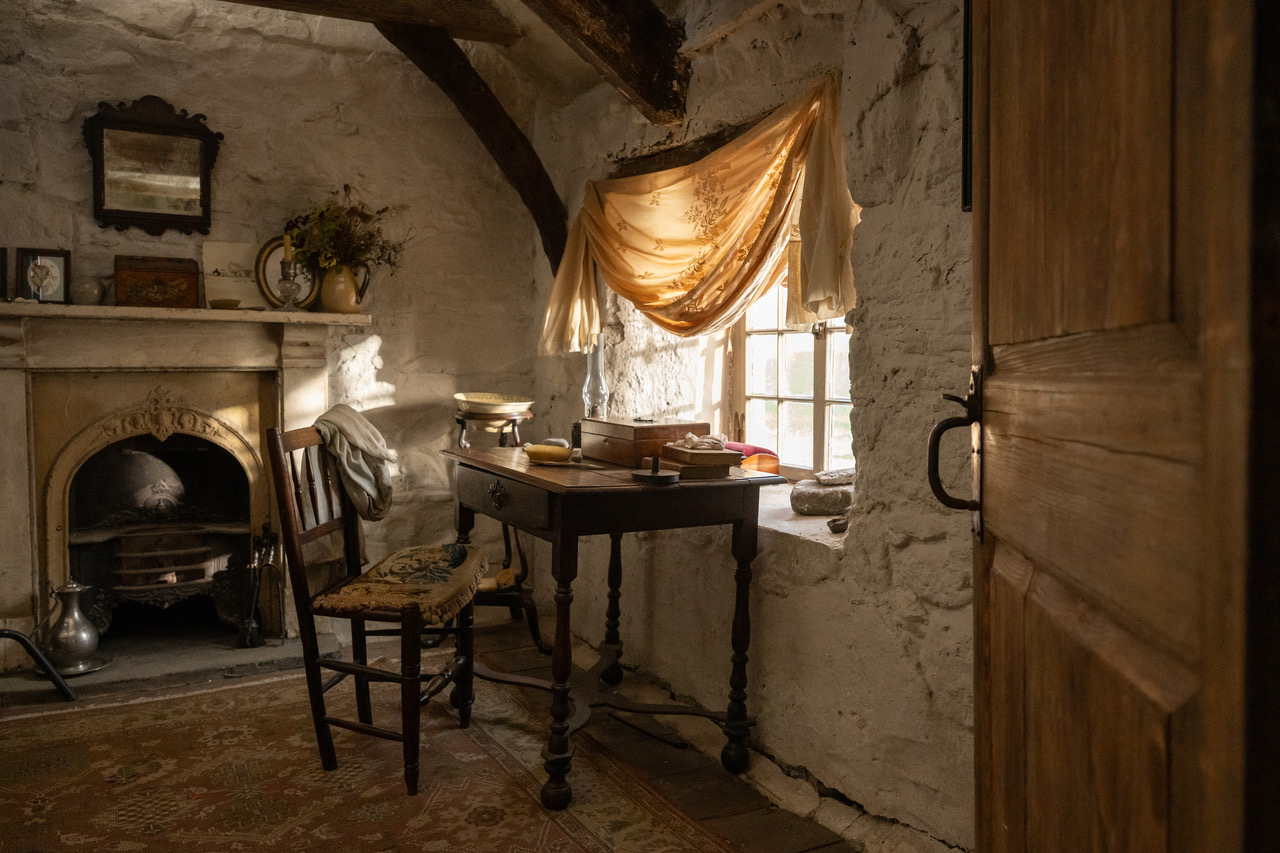
Production design of “Sense and Sensibility” by Francesca Di Mottola, courtesy of Focus Features.
I’ve just returned from Greece, where every two years we have a gathering of the Production Designers Collective. I’ve spent the last four days listening, talking about our profession, sharing experiences and discussing many of the things we’re touching on now. It’s been a wonderful opportunity to exchange ideas with colleagues from around the world. I think it can be quite a lot to take in for people who aren’t part of our industry.
There’s also a common misconception about movies that are shot predominantly on location that the production designer had an easy time. Location scouting and choosing your locations is such an intense part of our job. And very rarely have I walked into a location, and it was ready and good to go. There’s always so much to do. If we talk about “Sense and Sensibility”, we had an immense amount of work in all our locations – which I of course hope is invisible.
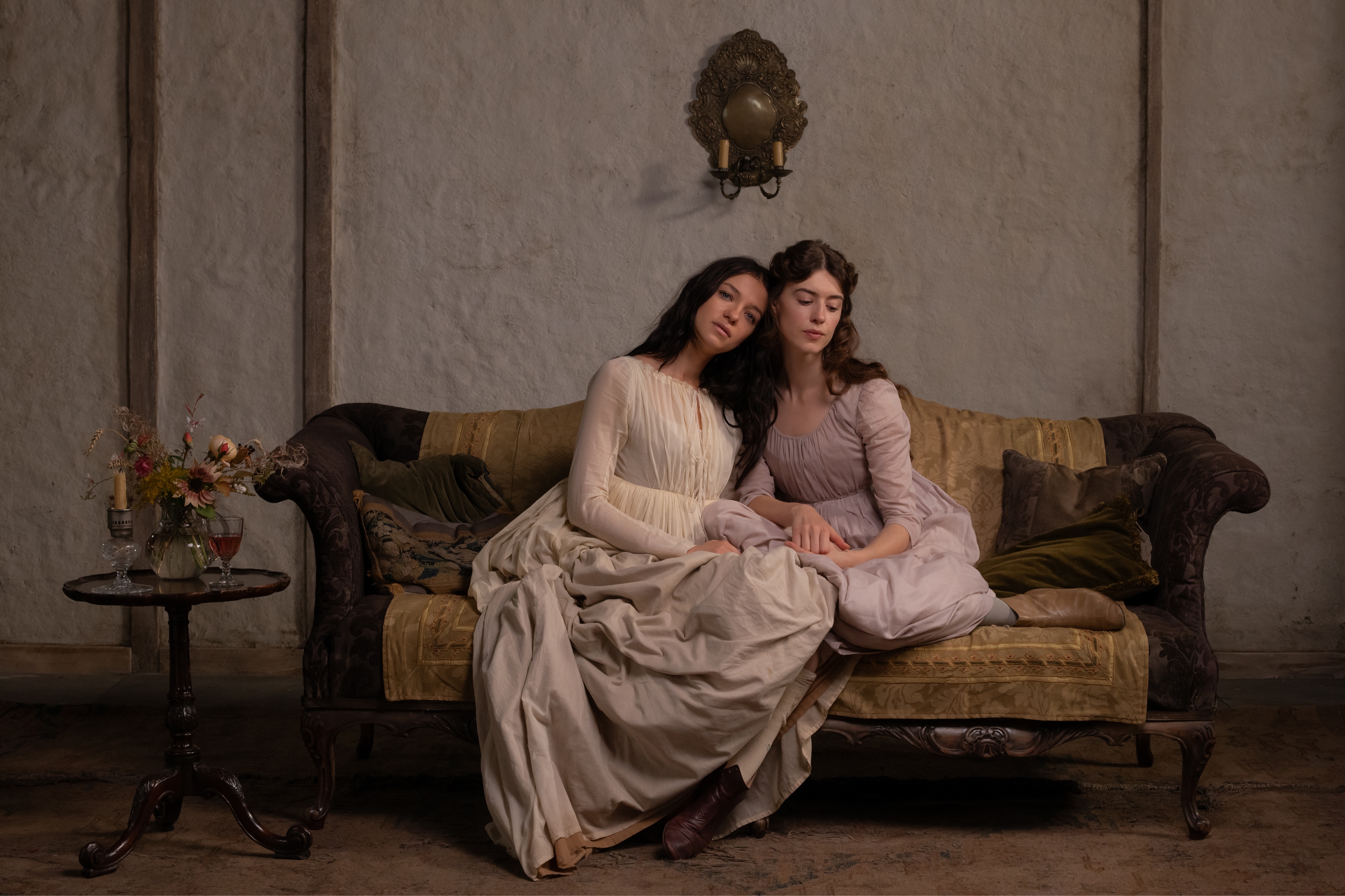
Production design of “Sense and Sensibility” by Francesca Di Mottola, courtesy of Focus Features.
Kirill: Getting to this film, how did it start for you? How did it find its way to you, or maybe how you found its way to it?
Francesca: Georgia Oakley, the director, had seen some of my previous period work and was interested in meeting me. Although “The Great” couldn’t have been more aesthetically different from the world we eventually created for “Sense and Sensibility”, I think she saw something in that work that sparked her curiosity.
When we first spoke, we connected quite quickly. I was very honest with her that I didn’t come to the project as a great Jane Austen fan. My roots are Brazilian and Italian, so I was also curious about how she felt about the material from a cultural perspective. We had a very open and honest conversation. In fact, it was quite funny because I think I was asking her more questions than she was asking me! [laughs]
I was working on another project at the time, and Georgia was kind enough to make time to meet me over a weekend. Otherwise, I might never have had that first meeting. I was curious to understand what drew her to the novel, what she wanted to explore and, most importantly, how she imagined approaching it. There’s always a lot of work involved in presenting yourself to a director and trying to understand whether you share the same sensibilities.
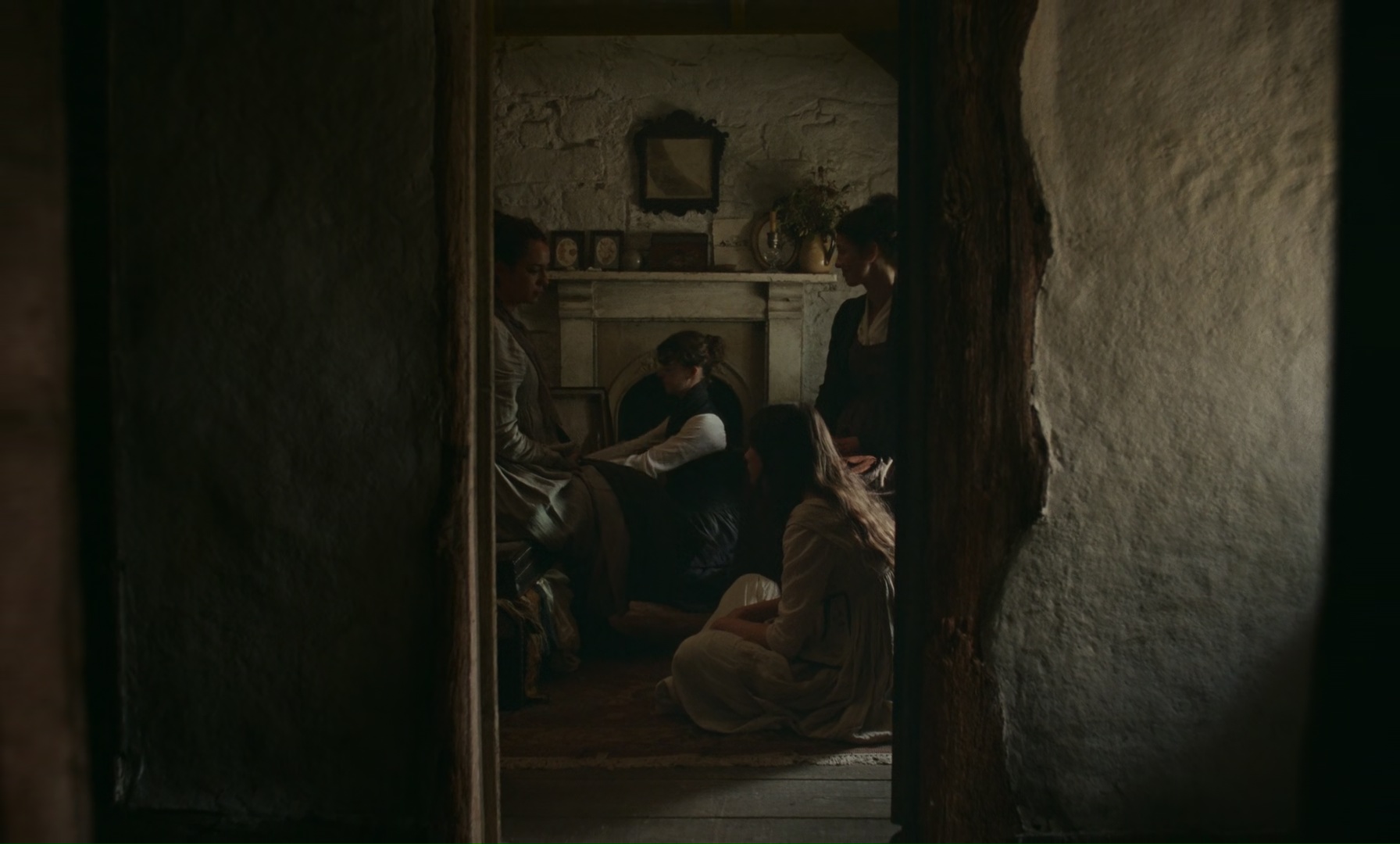
Production design of “Sense and Sensibility” by Francesca Di Mottola, courtesy of Focus Features.
After that first conversation, I went away and started putting together a presentation of how I imagined the world of “Sense and Sensibility”. Georgia spoke so beautifully about her sensitivity towards the material and I felt very inspired. What really drew me in was her idea of approaching it as a coming-of-age story. She made the story feel incredibly accessible and relatable to me, and I think that’s something we managed to achieve with the film.
People have asked me whether I felt a particular responsibility towards the material, especially given the 1995 adaptation, which is so loved by audiences. But to be honest, that never really worried me. There are so many adaptations of great novels, and they can be incredibly different from one another. If anything, I found that quite exciting.
I love Ang Lee’s 1995 film, and I watched it again before we started. I think it’s very much a film of its time, but still an absolute joy to watch, with wonderful performances and a beautiful sensibility. But I didn’t feel we had to live up to it. I saw our film as an opportunity to find our own way into the novel and create something that felt true to Georgia’s vision.
I didn’t go back to the book to find the differences between the script and the book. I took the script as if it was an original story. In that way, I was free to imagine the world of these characters as I would for any other story that we wanted to tell visually. I put together a visual presentation that included some beautiful paintings, and it very much spoke to the mood that I felt could be interesting for the various locations. I presented it in story order, as I mostly do when I’m imagining a movie and its spaces, and the arc of the story. I think that Georgia really connected to the imagery that I selected.
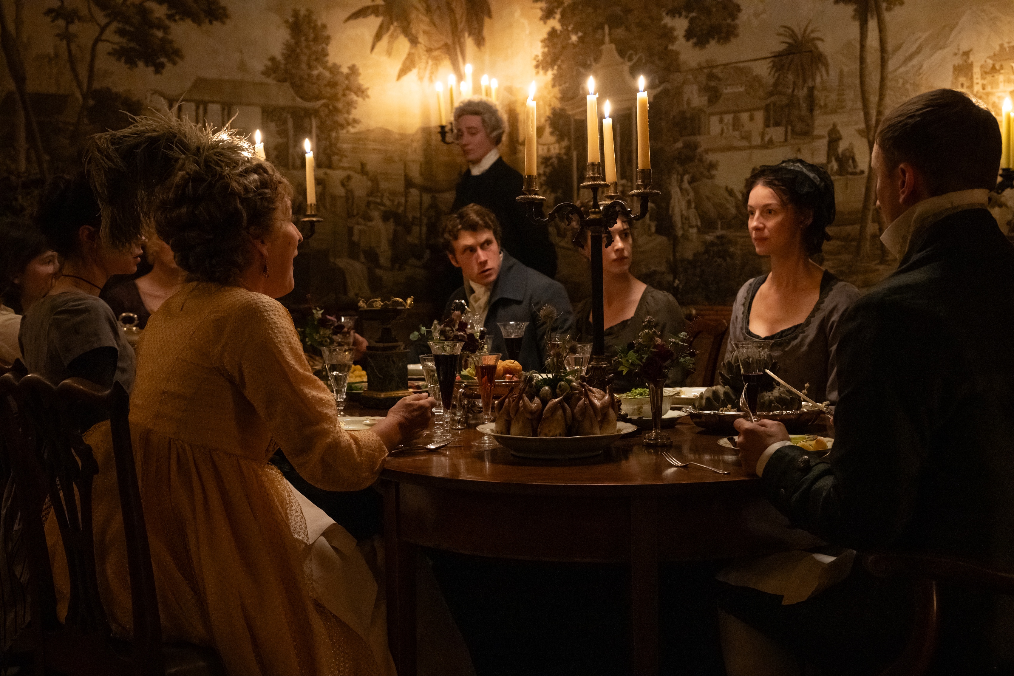
Production design of “Sense and Sensibility” by Francesca Di Mottola, courtesy of Focus Features.
Kirill: I feel as a bit of an outsider looking into British culture, and perhaps your Brazilian and Italian roots make you a bit of an outsider as well. Does it feel that the British public is a bit obsessed with the Georgian and Victorian eras? Does that affect the expectations from productions set in that time?
Francesca: Maybe it’s more the older generations that are obsessed with the Regency period and the Georgian period. I don’t think that’s the case with a younger generation; and yes, although I have been living and working in the UK for many years now, I am still absolutely an outsider. Sometimes I think that being an outsider can be a good thing and I wonder if I was less worried about failing certain expectations and that freed me creatively?
My previous experience working with a similar period was on “The Great”, which is, as the series itself puts it, ‘occasionally’ a true story. Although we were aesthetically grounded in the eighteenth century, we took considerable liberties with historical accuracy. Our version of the Winter Palace, for example, was a world away from the actual building. It was created through a combination of set builds and locations across Greater London and Italy. The architecture of our built sets was an amalgamation of different styles drawn from palaces around the world, all of which had inspired me and informed the visual language of the design.
The one thing I felt really needed to be original about “Sense and Sensibility” was the choice of locations. Georgia felt just as strongly that we didn’t want to keep seeing the same houses and locations that appear so often in period films and English dramas. That became our starting point, but it was also what kept me up on many, many nights [laughs], trying to find places that felt fresh and that hadn’t been seen before.
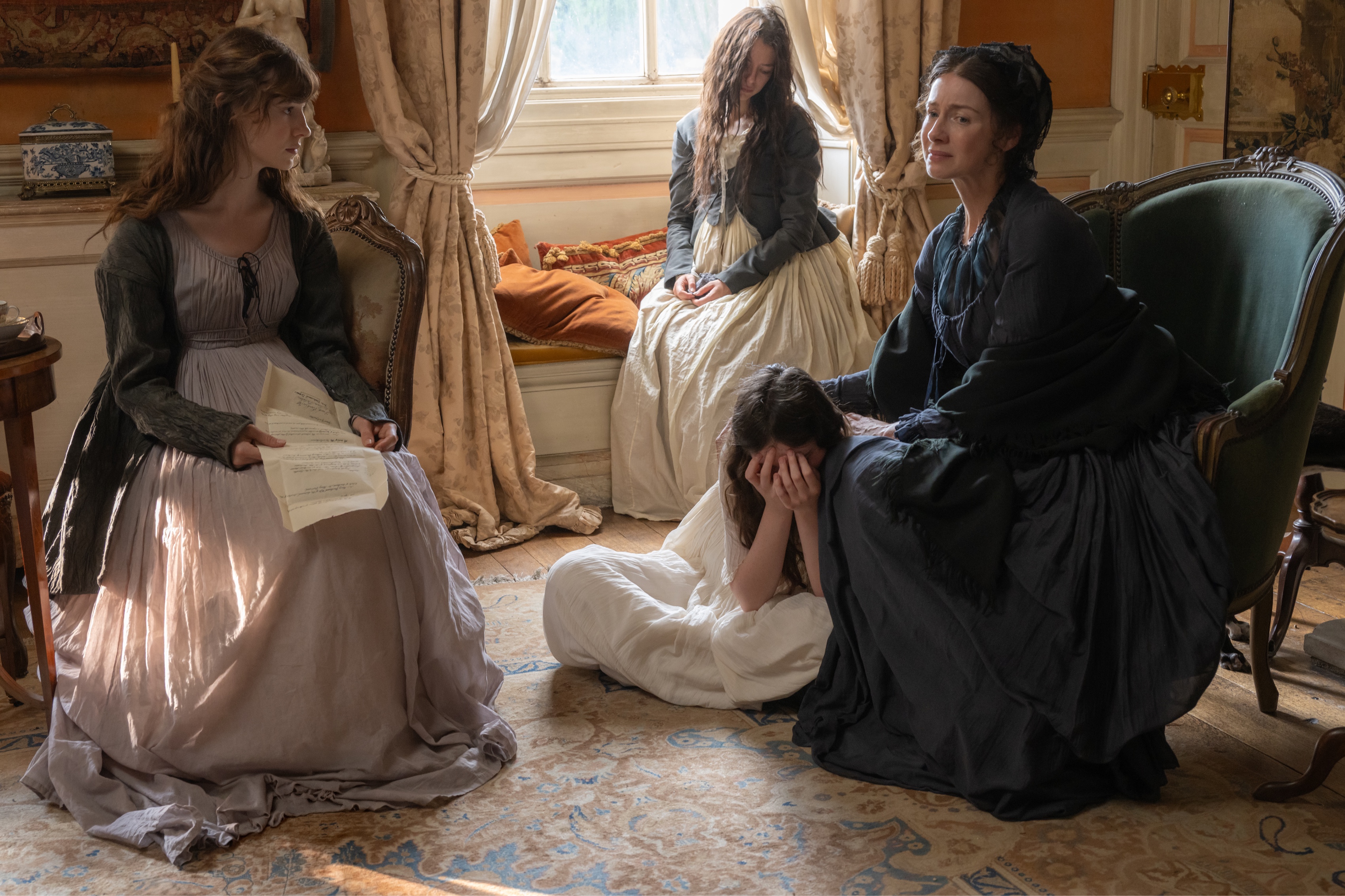
Production design of “Sense and Sensibility” by Francesca Di Mottola, courtesy of Focus Features.
There are probably all sorts of practical and logistical reasons why certain locations come up again and again in period productions, but we really wanted to challenge that a little and see if we could discover places that would give our film its own character and we felt these needed to be locations that hadn’t become familiar through other films.
There was a sense of discovery that needed to happen about locations and the landscape, and that kept me excited about this project. We wanted to shoot most of the movie away from London. Of course, there is a whole part of the book and the script where the characters travelled to London. But when it wasn’t necessary, we didn’t want to be in London. We could have been in Bath and cheated it for London. But unfortunately, there were practicalities associated with the budget where we had to come back to London and so the second half of our shoot was mainly based in London or close by.
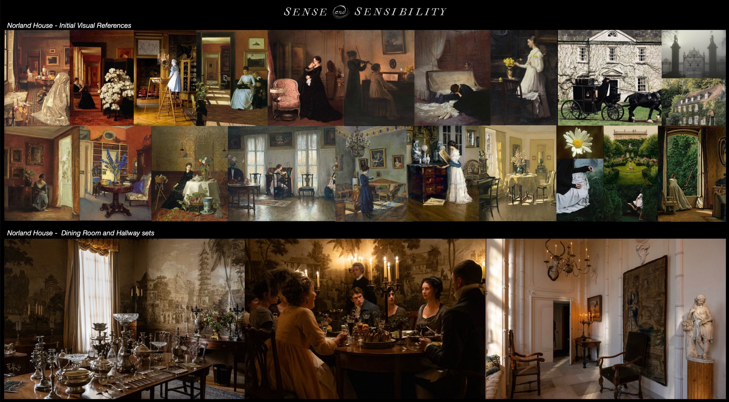
Visual references and sets for the Norland House on “Sense and Sensibility”, courtesy of Francesca Di Mottola.
We were lucky that one of our location managers stumbled across one of our principal locations very early in the process: Kingston Russell House, which we filmed as Norland Park, the Dashwood family home. It was a house that had never been seen in a film production before. An even more fortunate coincidence was that our director knew the owners – a young couple who had recently taken over the house from their parents and moved in. They were incredibly open to the idea of filming there and very flexible. In fact, they moved out for over two months and generously handed their home over to us.
That was a great starting point. The house ticked almost every box. The only drawback was that it didn’t have all the rooms required by the script for Norland. The film opens shortly after the family has lost their father and husband, and the sisters’ dresses are being dyed black for the mourning period. At the time, young girls in particular wouldn’t necessarily have had black dresses, so we needed a courtyard where this could happen. Unfortunately, the house didn’t have one. There was also a scene in the script where Marianne runs to find Elinor in their late father’s study, but the house had neither a library nor a study. So we had some decisions to make: did we look elsewhere for these spaces, or could we find a way to create them within the house?
When people watch the movie, they have no idea that the study where we first see Elinor doesn’t exist, and it was a completely new build within an existing room. Aesthetically the house had the exact feel as how we had imagined. It has a great facade, beautiful stucco decorations and peeling paint throughout. Some of these details are almost invisible to the eye, but they create a lot of texture. In some of the rooms, other than re-hanging paintings, we almost didn’t touch the walls, and we built some of the other rooms from scratch – like the study and Marianne’s bedroom.
The house was originally built in Jacobean times, and over the centuries it had lost several of its wings, although the current owners didn’t really know why. The current facade was from Georgian times, and it replaced an older one. The house had clearly undergone so many transformations over the years. In its present configuration, it no longer had a central staircase. I became a little obsessed with understanding its architectural history and trying to work out where the original main staircase might have been, particularly as the two staircases in use today were both located in the more modern side extensions, which had been added in the 1930s.
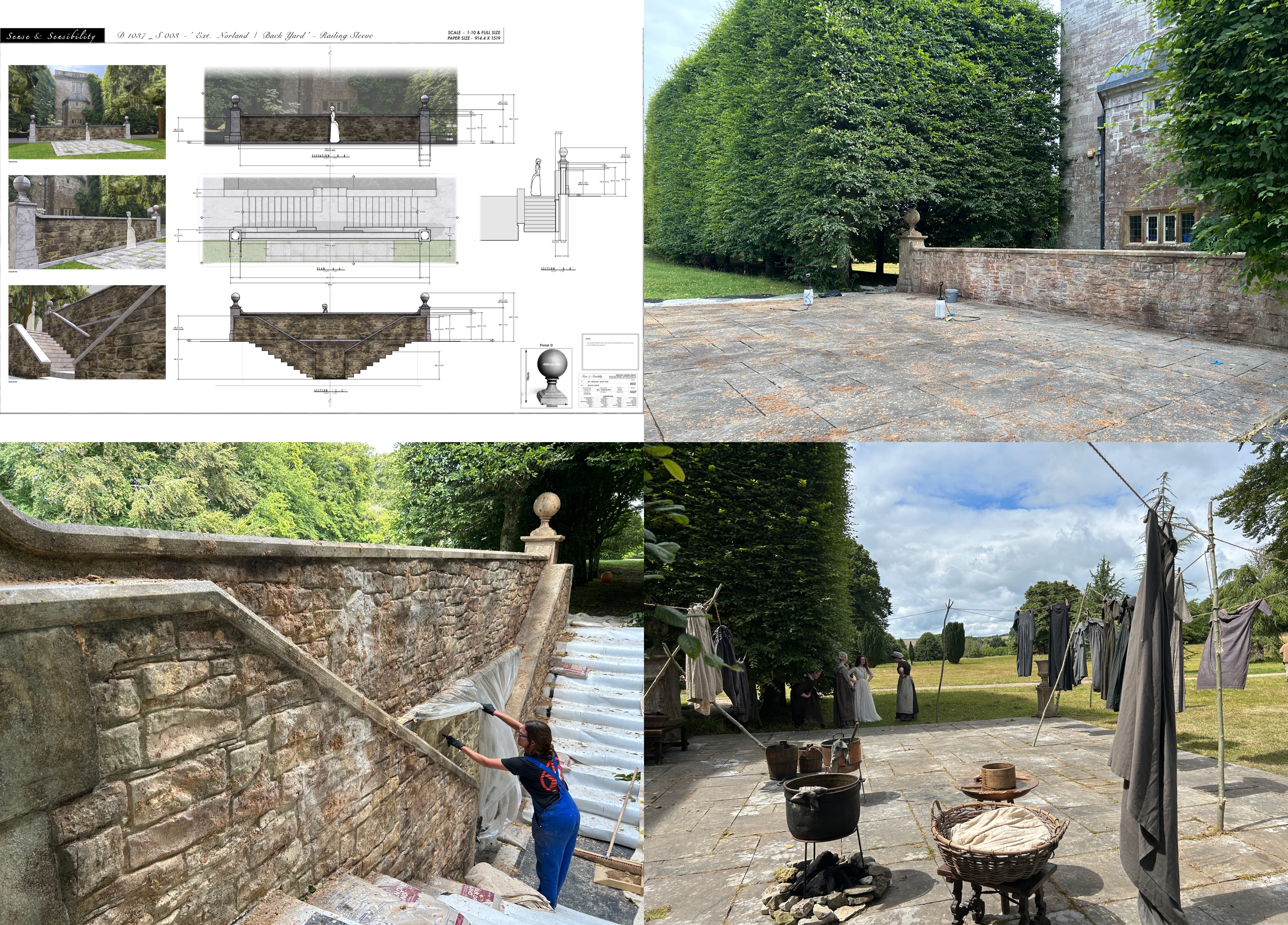
Construction diagrams and building on location for the Norland House on “Sense and Sensibility”, courtesy of Francesca Di Mottola.
It felt great to make the decisions early on about the spaces that we didn’t have – that we were somehow going to create within the house. We wanted the actors to spend as much time together as a family at their family home location. Particularly because, in the story, this was the home they were eventually going to have to leave, we wanted them to feel completely connected to it. We didn’t want to split the filming of the Norland scenes across multiple locations and wanted to spend as much time as possible at Kingston Russell House.
Nevertheless, we had to make some compromises to make this approach work. The existing dining room, which is covered in beautiful original 18th century chinoiserie paper, wasn’t big enough for one of our main dining scenes and the director of photography had to plan shots in a very careful way to make sure we could use the room.
Essentially, there were three rooms on the ground floor that we could use: the dining room, the music room and the entrance hall, which we also used as a parlour and a games room. There was also a beautiful gallery running along the entire back of the house, where we filmed the scene of Elinor drawing Edward. Upstairs, there was one room that we could transform into a nursery.
We created the father’s study on the ground floor, in a room that had been modernised in the 1980s. We had to clad all the walls in timber boiserie and panelling and build the bookshelves from scratch. This allowed Marianne to run from the courtyard, where the sisters’ dresses were being dyed, around the side of the building, through the back of the garden and into the study.
The original script had her running from the courtyard into the kitchen, then through the servants’ quarters and into the wing where the study would have been. But the existing kitchen was very modern, and we couldn’t afford to build a new one. Nor did we have the space to create the servants’ quarters. So Diana, the screenwriter, and Georgia looked at how we could simplify the action and adapt it to the spaces we had available.
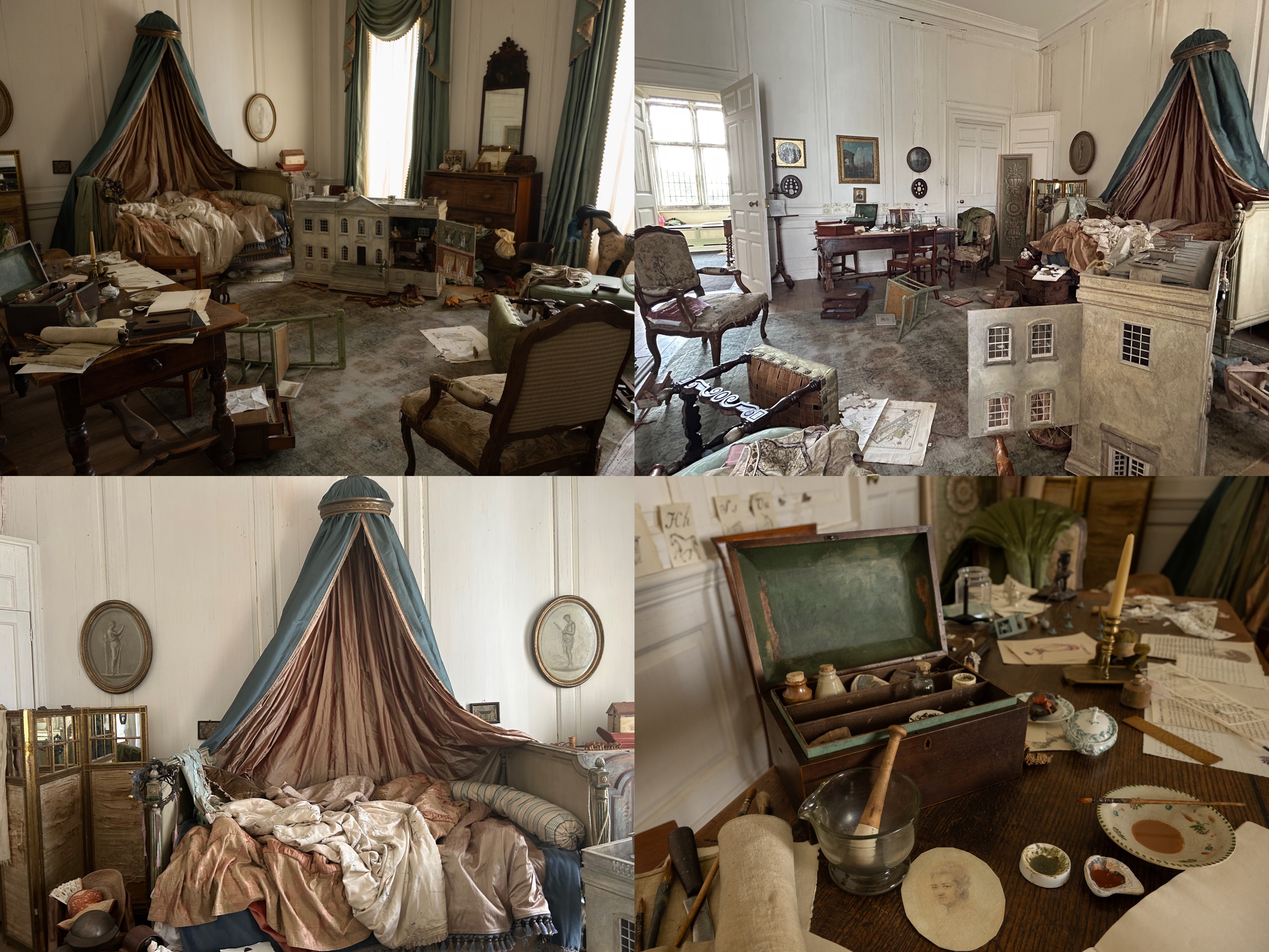
On the set of the nursery room of the Norland House on “Sense and Sensibility”, courtesy of Francesca Di Mottola.
Once we had built the study, I suggested that we should also use it as Marianne’s bedroom. There was another bedroom in the house that we had initially considered, but it had a beautiful, rather precious William Morris wallpaper that wasn’t right for our period. The owners were understandably very attached to it and were adamant that we couldn’t remove or replace it. So we decided against using that room and instead transformed the study.
We had less than a week to do it. We had to panel over the bookshelves, introduce a fireplace in one corner, which SFX had to make practical, repaint everything and then dress the room. We had less than a day to decorate it!
By creating some of the missing spaces within the house, we were able to give the actors and the camera almost complete freedom to move through it. We had to make a few compromises, of course, but we gained so much more by keeping everything together and being able to work within that location.
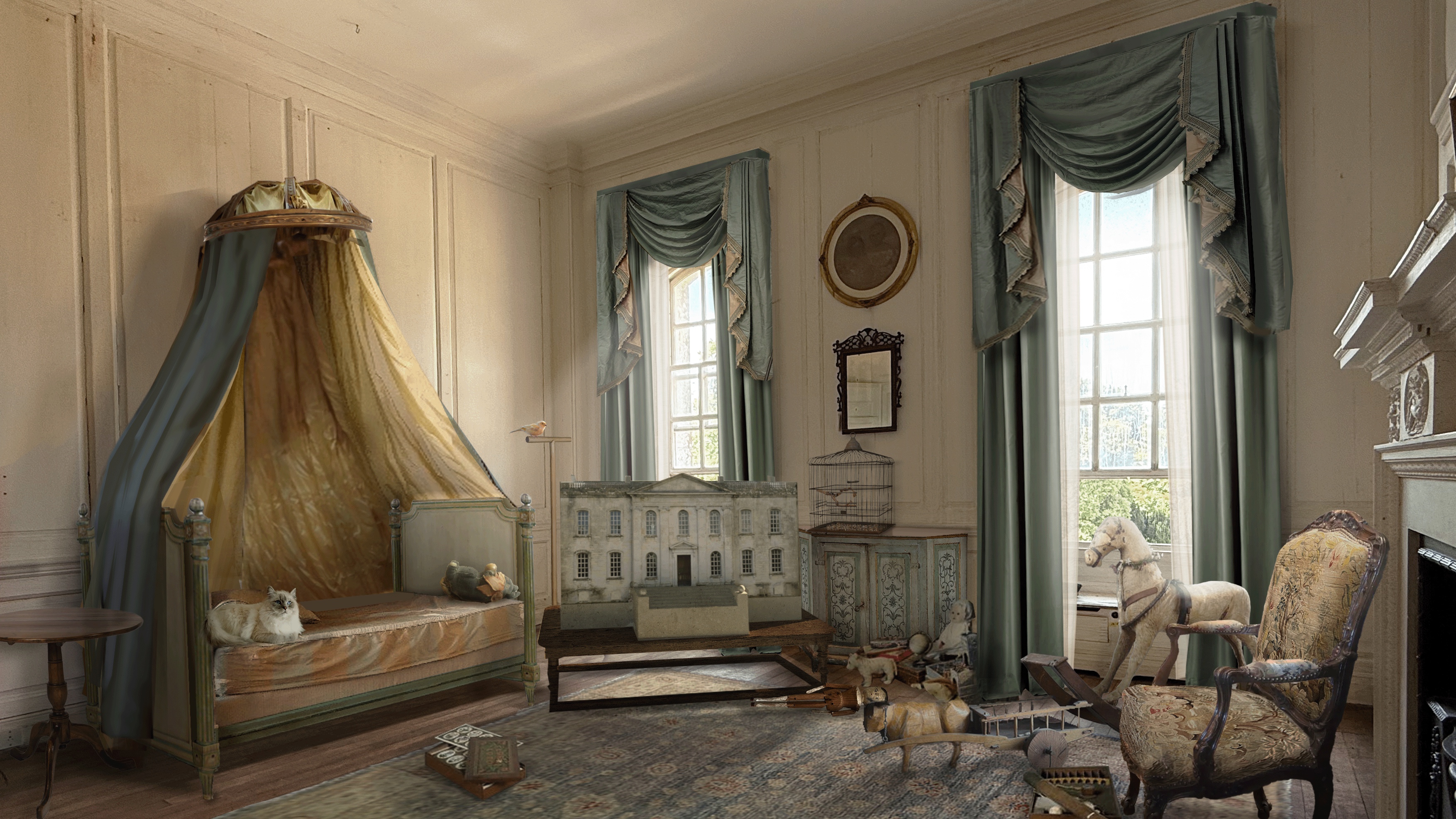
Concept art for “Sense and Sensibility”, courtesy of Francesca Di Mottola.
Kirill: Were there any particular colors that you wanted to stay away from?
Francesca: We wanted to stay away from bright reds. We also didn’t want any strident colours, as well as pastel colours often associated with the Regency period. We found ourselves organically drawn to the more earthy colours. Mossy greens and terracotta seemed to come back a lot, and that started to appear early in the pictures that I presented and in early choices of fabrics that I remember putting up in the art department. We had a big open working space with no separation between the art department and set decoration, and we had all the set dec references on one of the walls. The colours were mossy greens and terracotta, and sometimes a soft mustard yellow would creep in.
The director also wanted to stay away from blue. I understand she used a lot of that colour in her previous movie, which is coincidentally called “Blue Jean”. I think that she was creatively done with blue [laughs], and I didn’t feel that it fitted this world. Maybe we have some darker or softer blues creep in now and then. Over time Georgia eased away from not wanting to use blue at all. It wasn’t necessarily a major discussion on colours, but more of a natural choice of the earthy tones, which then found their way to costume design. Marianne’s bedroom was green edging on blue/ dark teal.
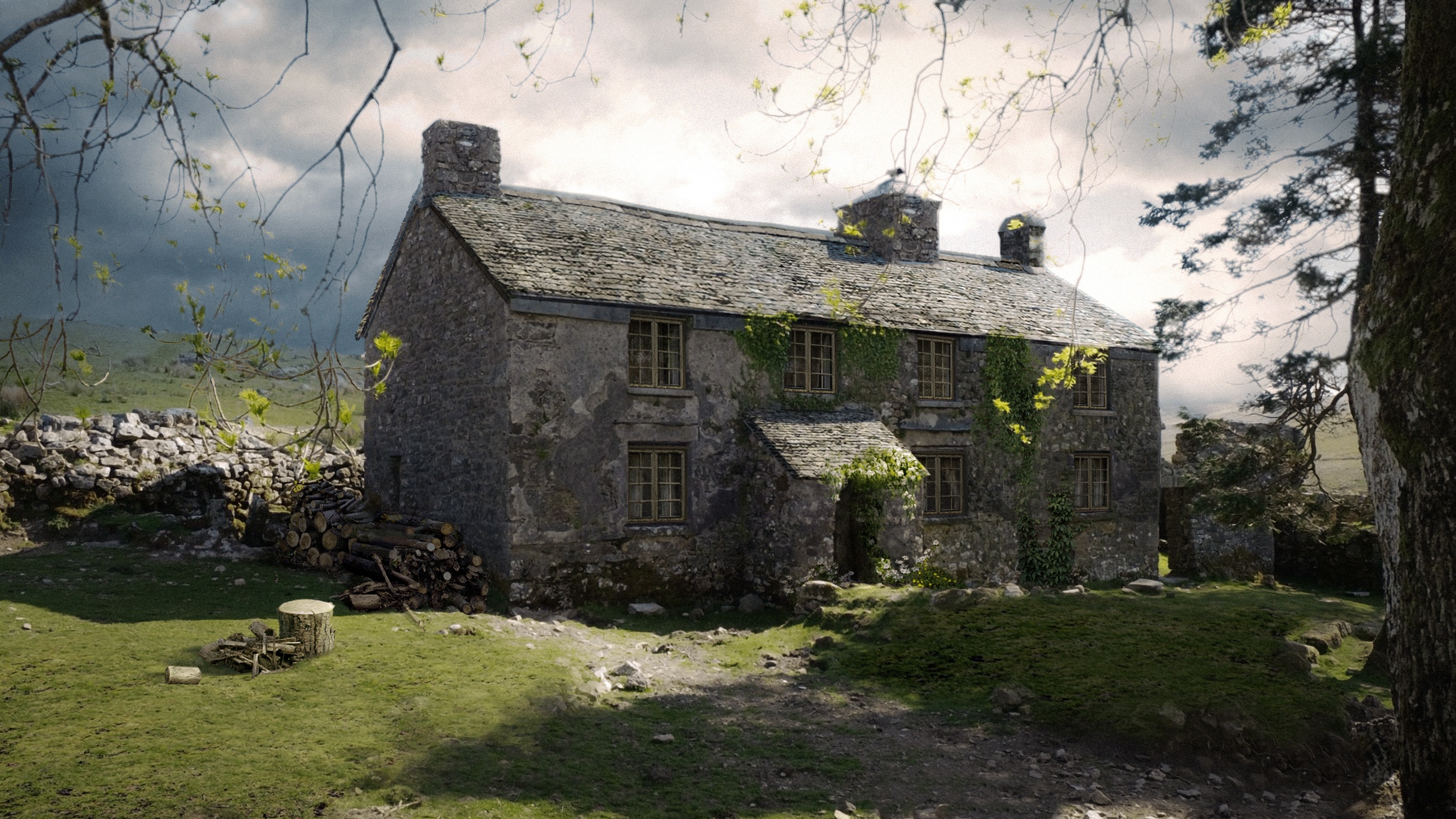
Concept art for “Sense and Sensibility”, courtesy of Francesca Di Mottola.
Kirill: What’s the story of the Barton cottage? Where is it and how much work went into making it look like it needed to look?
Francesca: Barton cottage is on location in Devon, in Dartmoor moorlands. The search for that location was a much longer one. We saw hundreds of cottages. Initially, we wanted it to be on the coast, as the Dashwood family would move close to the beach or somewhere where they had a view of the seaside. But we couldn’t find anything that felt right, that was big enough, that hadn’t been re-modernized. The one cottage that we did fall in love with was booked throughout the summer for holidays, and that didn’t work with our shooting schedule.
Then, our location scouts and our location managers started showing us pictures of cottages in the moors. When we started seeing that landscape, we felt really drawn to that ambience. We started at Bodmin Moor which is closer to London. We fell in love with one location there, but it was too small and almost impossible to access. Then, as we started to drive through Dartmoor, you saw the landscapes, and the wild horses, and the livestock, and it made perfect sense. It felt like we were entering into our story’s period. It was so remote from anything else.
We first fell in love with the landscape. Then, when we came across this little cottage, Ditsworthy Warren House, its scale felt like a perfect starting point for us. Inside, it was really just a shell. The floors were partly in good condition, with beautiful stone flooring on the ground floor, but the ceiling was in a terrible state and there was black mold growing on the walls. Before we could even commit to using it as our location, we needed to commission a full structural engineering report and bring in a specialist team to deal with the mold. Only once all of that had been done could our Health and Safety team sign off the building as safe for us to work in and film.
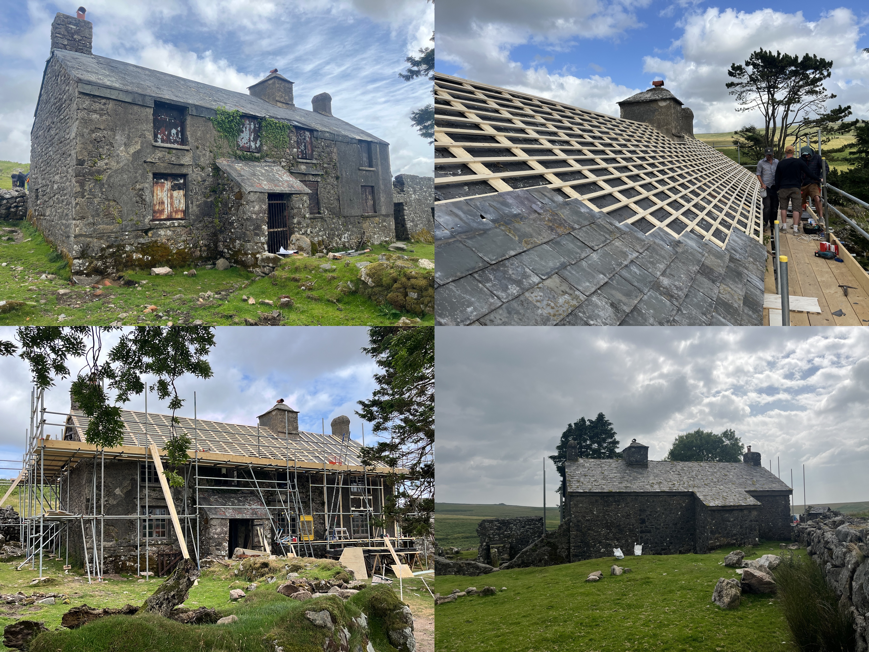
Before and after for the Barton Cottage location of “Sense and Sensibility”, courtesy of Francesca Di Mottola.
Then came the design phase. We had discussions with my team and the construction manager about how we could go about transforming the whole interior. We couldn’t touch the walls because it’s still a grade two protected building. The original house was built in the 16th century as a farmhouse. And then through time, the military took it over. The stonework at one point was covered with cement render. It had so many transformations in time, but because it is such an old building, it is protected. It wasn’t a case that we could just go in and repaint all the walls. We treated it as a shell within which we could create our space.
We panelled part of the walls with timber panelling so we could bring in color. The floor plan is a rectangle. On one side on the ground floor there’s an existing big fireplace with a beautiful old beam – which we didn’t touch. On the opposite side, there was an opening for a fireplace. That inspired me to separate the areas. On the side of the big existing fireplace, we created the area which was going to be the sitting room. And then on the other side, we created a dining room. I painted the panelled wall around the fireplace in this area in a mossy green colour, and we dressed that area with a dining table and a piano forte, which the Dashwood find there when they arrive at the cottage.
We also brought in old oak beams from an old barn. I built a separation wall so we could define the areas, because the cottage is so small. And there was an adjacent room which we turned into a kitchen, and we built some panelling there also, so that we could bring in a soft yellow colour.
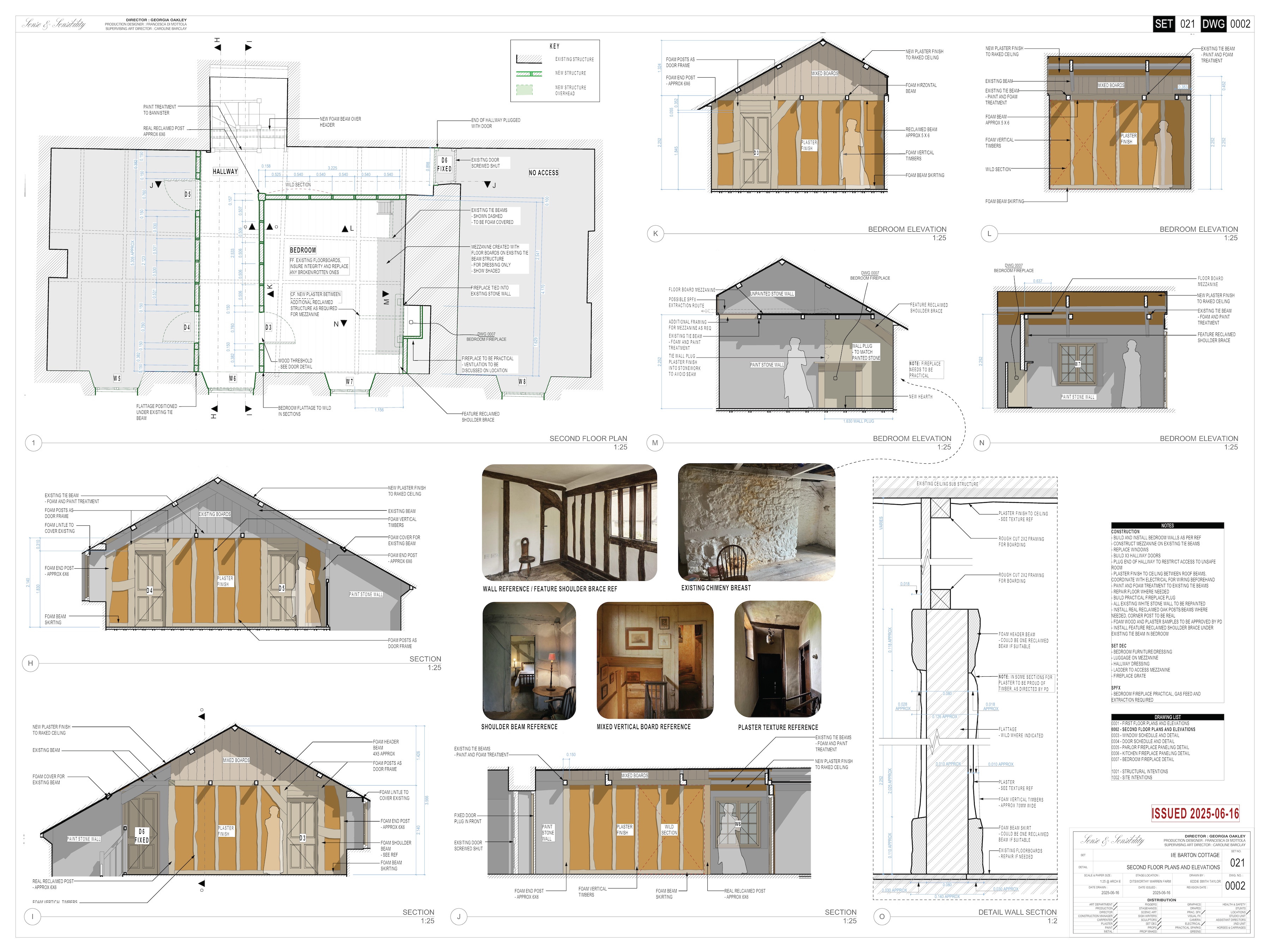
Construction diagrams for the Barton Cottage on “Sense and Sensibility”, courtesy of Francesca Di Mottola.
For the ceiling, quite a few of the existing beams were metal beams supporting the first floor. As we needed to hide them, we ended up cladding the entire ceiling. We used plaster sheets which brought the ceiling down even further, and it was already quite low. But somehow, that change made the space feel even cosier. We found some beautiful old beams at a yard sale, and my team scanned every single one of them. Using those scans, we started designing the full 3D model.
I think that’s one of the really positive things this technology has brought to the art department: when you have very little time at the actual location, you can plan everything in advance, build the elements in the construction workshops and then bring them to the location for final assembly.
We used the scans to work out exactly which beams would cover the different sections of the existing metal structure. We also had to supplement the original beams with some Styrofoam ones. I had an amazing team of painters who managed to give those Styrofoam beams just the right finish, so that they sat naturally alongside the real ones.
The upstairs floor was quite interesting. It was essentially one big open space, but the farmer who rents the cottage and the surrounding land had created some separation by hanging fabrics. It’s not really a lived-in space; the family occasionally sleeps there, rather than camping in tents outside. But we had to divide the upstairs space into bedrooms.
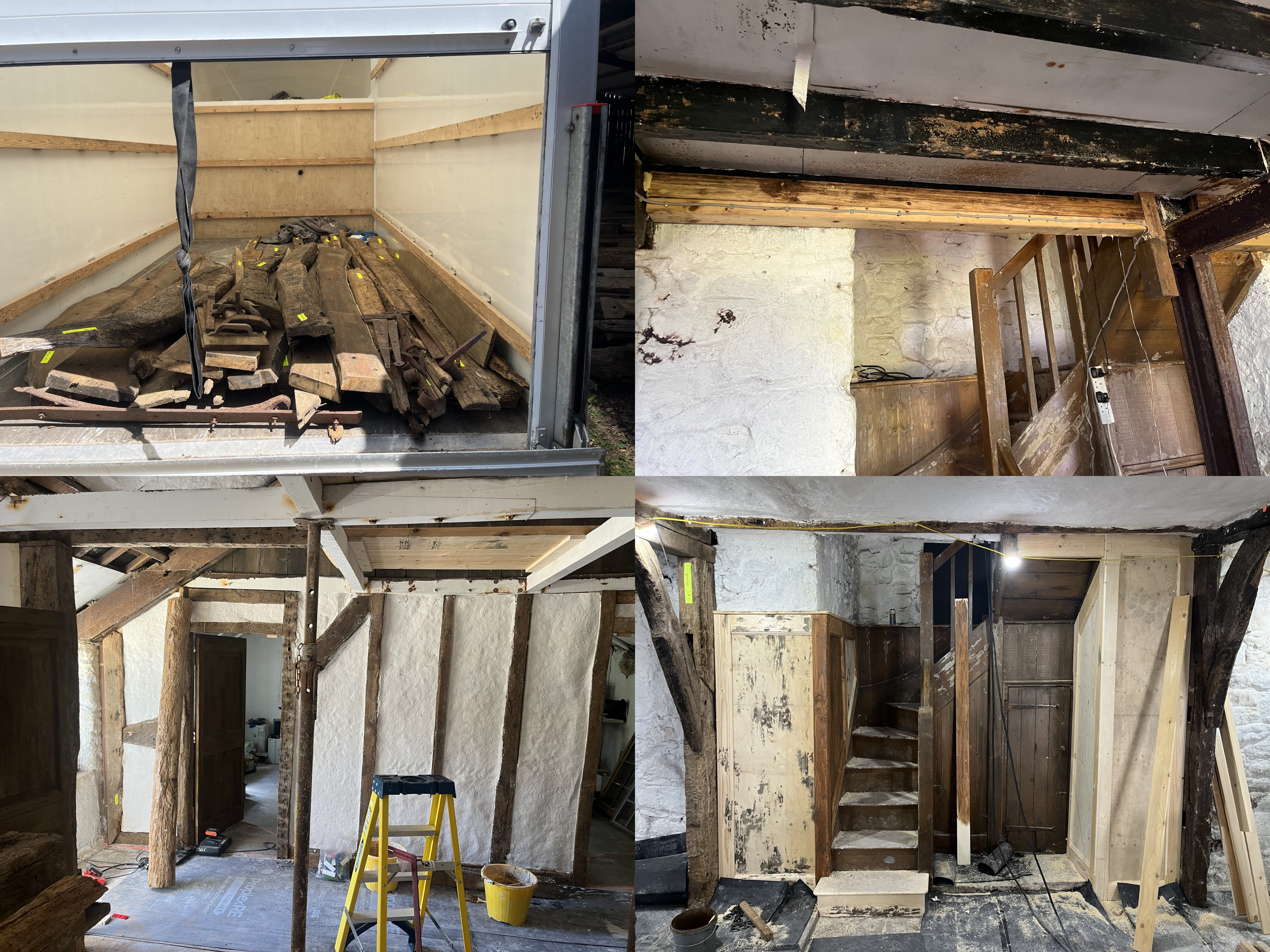
Set building on location of the Barton Cottage on “Sense and Sensibility”, courtesy of Francesca Di Mottola.
To do so we built frames using some of the old beams, and for the walls we used these rather interesting textured plaster sheets that our construction manager introduced us to. Normally, in film set construction, a typical method for creating an interior wall is to build a timber stud frame, clad it with sheet material (often MDF, plywood or plasterboard, depending on the finish required), and then apply a textured coating to achieve the desired surface. But we simply didn’t have the time to do that on location, particularly as it was such a humid environment and the plaster would have taken too long to dry. These plaster sheets were an amazing discovery. They gave us a lovely textured surface to work with, which we could then paint directly onto.
It was important to me that every beam that we introduced had an irregular shape. I wanted our cottage to feel those beautiful old English cottages where everything is at an angle and crooked- all the imperfections add so much character.
We started prepping our first location in Dorset, and I was driving from there to Devon to spend time with the team to make sure that those irregularities were there. We did a lot of planning, and we had our 3D digital model, and loads of sketches and drawings as we always do. But then once you are building on location you may come across a more irregular beam, you can add and tweak things on the day to make it much more interesting.
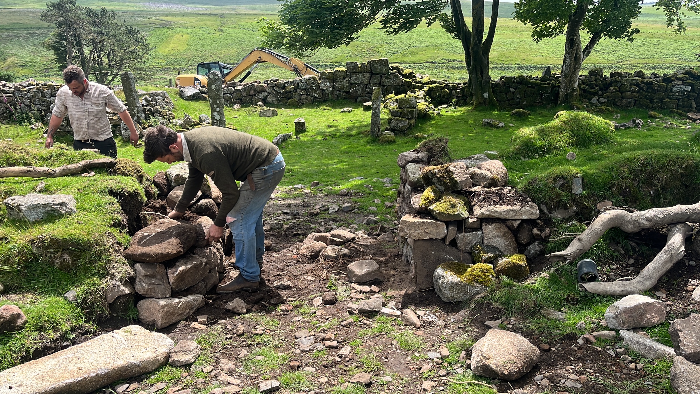
Set building on location of the Barton Cottage on “Sense and Sensibility”, courtesy of Francesca Di Mottola.
Kirill: One more place that I loved in this film was the big ball in London. What was that location like, and how much were you able to do there?
Francesca: That location, which is West Wycombe Park, is possibly one of the locations that you see the most in period films shot in England. That was the last location we filmed in, and that’s when we bent our rules of finding locations that have never been seen. We couldn’t find any location that had the right feel and the right tonal palette for us – and that one felt like it was the one.
When Georgia learned that it had been in probably every period movie that she’d seen from “Napoleon” to all the TV series, we desperately tried to find another location, but all the interesting ones weren’t close to London.
So we had to bend all our rules for that ball. However, we did convince the owners to let us use a floor that is normally only family space that they don’t allow shooting in. They have a big snooker table in there, and that might also be the reason no production had wanted to take on the cost of moving and replacing it after the shoot. We decided that in our case it was necessary to stretch the budget. Moving the billiard table was a big deal with a special team of professionals that had to come in.
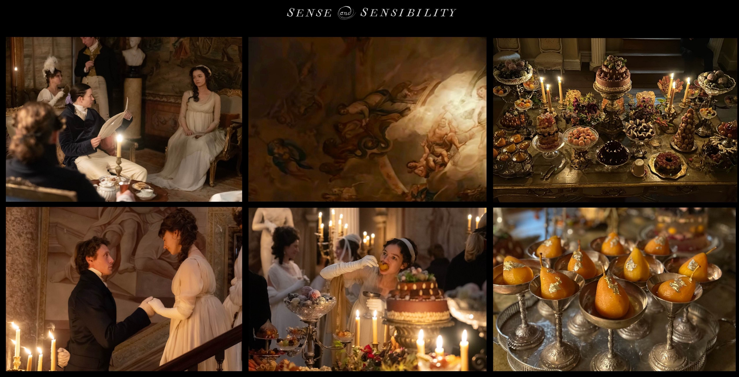
Visual references and set photos of the London ball scene on “Sense and Sensibility”, courtesy of Francesca Di Mottola.
The way the scene was described in the script meant that we needed it to take place across two separate floors, connected by a grand staircase. And then, as the story of my life goes, I had to clad the walls! The location had beautiful mural paintings, tapestries and ceiling frescoes throughout the house, but the top floor was quite bare. So I decided to reproduce some of the frescoes that were at the very top of the staircase, an area we were never actually going to film. Our lead graphic designer had them photographed, and we then sent the images to an amazing scenic painter, who recreated them for us.
We didn’t want to simply photograph and print the original images. We wanted to achieve something with a more painterly quality. So our scenic painter recreated them on a smaller scale, making a few changes to elements that didn’t quite work for us. We then photographed his paintings and printed the images onto canvas. The canvas was finally stretched over frames built by our construction team, which were made to fit perfectly against the existing walls.
I think we managed to use the location in a way in which it hasn’t been used before. The grand staircase allowed the cinematographer to do that beautiful shot where the camera turns and follows the sisters descending in a dramatic moment of the film. I’m so glad that we found a location where we had the geography that matched what the screenwriter had envisioned and imagined for the scene.
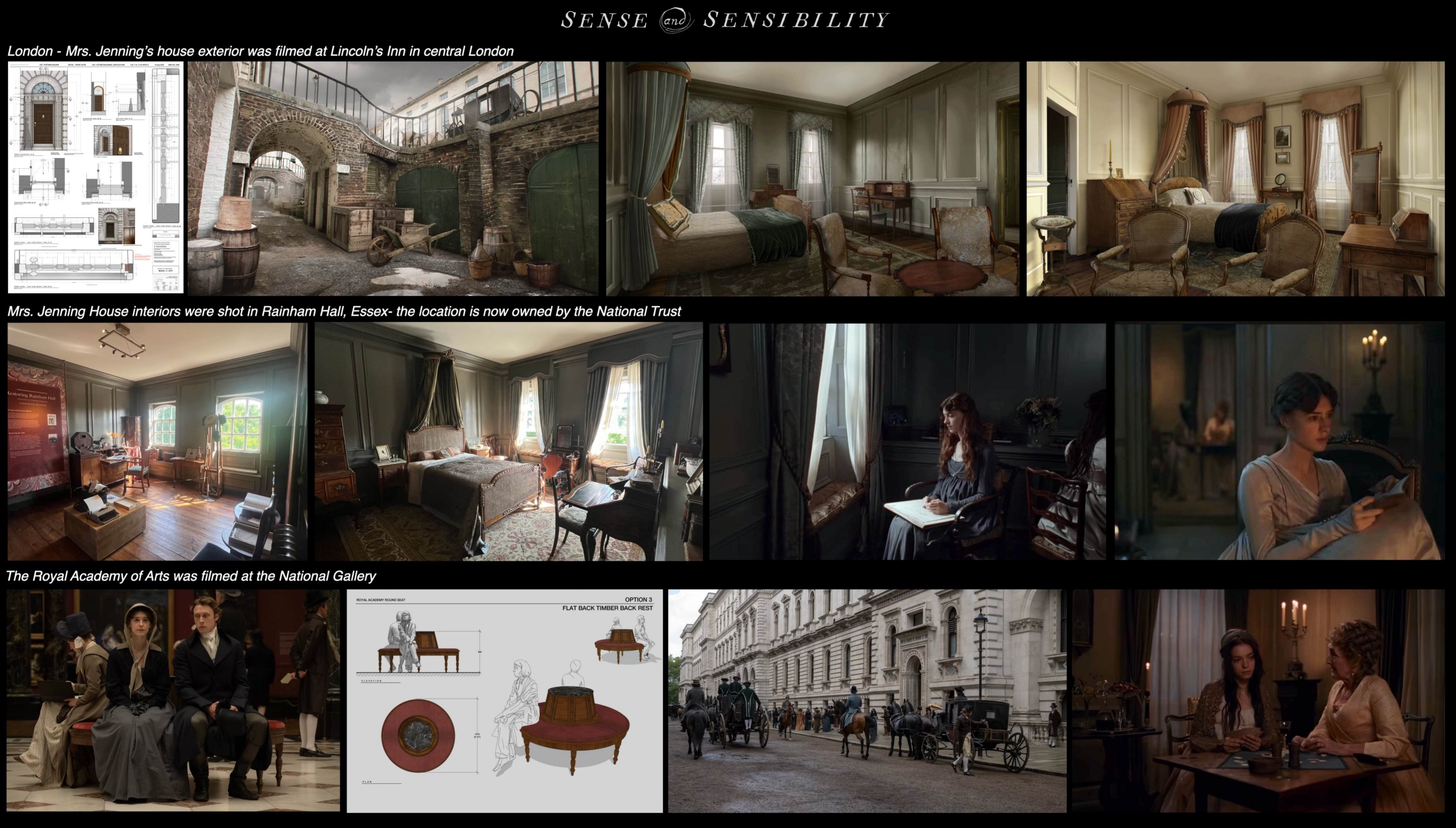
Visual references and set photos of the London house of Mrs Jenning on “Sense and Sensibility”, courtesy of Francesca Di Mottola.
Kirill: Do you want people to see it on the biggest screen possible now that it’s been in the movie theatres? What do you feel is the magic of the movie going experience?
Francesca: It’s the first movie where I texted my friends and my family and I asked them to please go and see it at the cinemas. I’ve done TV for a long time. I’ve done art house movies that haven’t been in the movie theatres for long. This one has had a proper theatrical release and despite not being a blockbuster it was in cinemas for over a month, so I wanted to put it out there because I really care about it.
This movie is such a great experience on the big screen. We have beautiful landscapes, painterly cinematography and a great score. I also suggest which movie theatres to go to for the best image and sound system. Watching it on your home screen or on an iPad will never be the same experience. There’s nothing like being in the movie theatre, and I will go and make time in my schedule for any movie when possible.
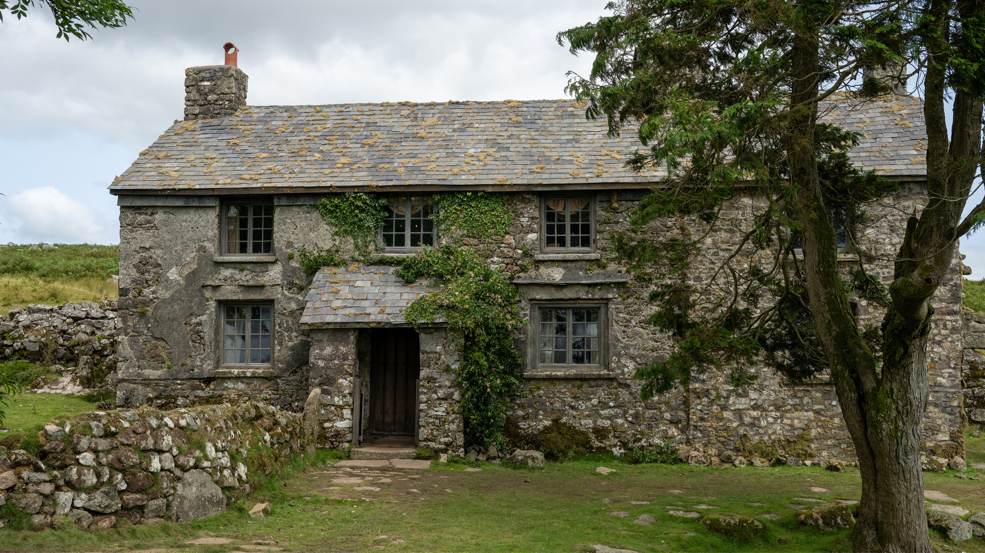
Production design of “Sense and Sensibility” by Francesca Di Mottola, courtesy of Focus Features.
Kirill: How do you feel today about generative AI?
Francesca: I think it can be a very useful tool, particularly when it comes to communicating ideas with our colleagues. I recently found myself on set having to demonstrate how we could change the colour of a particular piece of furniture that was quite important to the scene. The cinematographer was concerned that its existing colour wouldn’t work photographically. So we took a picture of the piece, and within seconds our set decorator was able to generate images showing the same object in different colours and patterns. We eventually decided that we didn’t need to repaint it, which saved us quite a bit of hassle. Of course, we could have created the same images in Photoshop, but the fact that we could do it within seconds, using our phones right there on set, made such a difference.
I see the pros, and I want to see how to use it conscientiously and in an intelligent way where I know it will never replace any of my art department. I can’t predict if it will take away jobs from people that I love working with. I would never want it to come to that. As of now, I see it as a tool that I’m enjoying discovering its potential.
The scope of what we can do in movies might change quite considerably because so much can now be achieved with AI. When it comes to set extensions and visual effects, I’m often not entirely happy with the digitally created environments, even when I’ve tried to stay closely involved and communicate with the teams working in post-production. So perhaps if AI becomes more widely used in that part of the process, there could be real advantages.
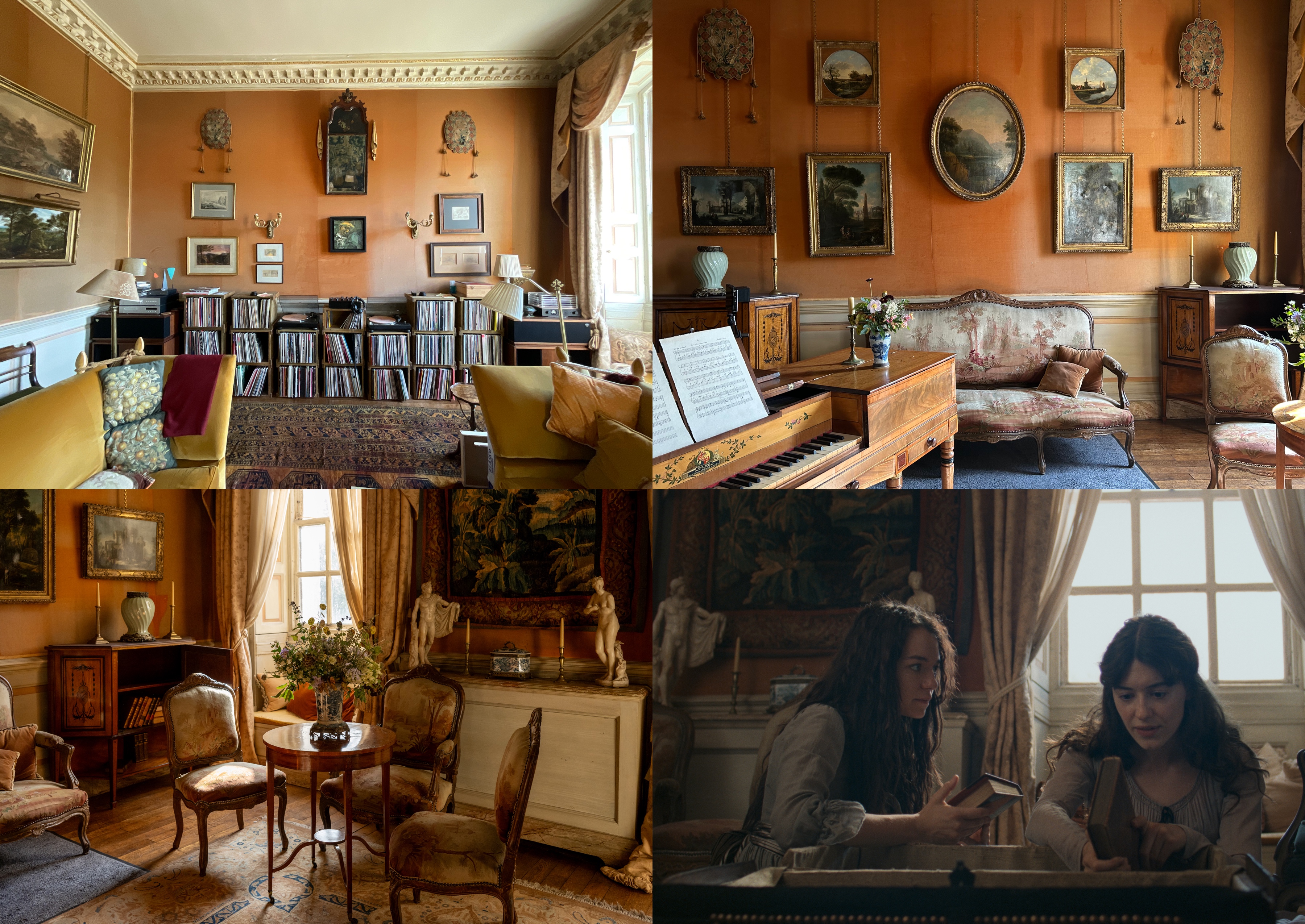
The existing living room (top left) and its transformation into music / drawing room for the Norland House on “Sense and Sensibility”, courtesy of Francesca Di Mottola.
There are also so many techniques that we simply don’t use anymore, unless we deliberately choose them for their particular visual quality. I absolutely adore “Poor Things”, for example, which used entire backdrops manually painted by scenic artists. But that was an artistic choice, and it’s precisely what makes the film so beautiful and distinctive.
I don’t think I would want to go and see a film in which all the actors had been replaced by AI-generated characters. I find it difficult to believe that people who genuinely love cinema would want to watch stories created entirely by robots. Ultimately, we are fascinated by human experiences. We love watching stories that explore, in one way or another, what it means to be human. And I think the flaws and imperfections that come with human beings creating art are precisely what we will always want to see on screen.
Everything is evolving so rapidly, and I’ve been making an effort to become more familiar with these new tools. I want to become better at using them so that I can achieve better results. Ultimately, AI is a tool, and I think that, if you learn how to use it properly, it can become another very valuable part of your professional practice.
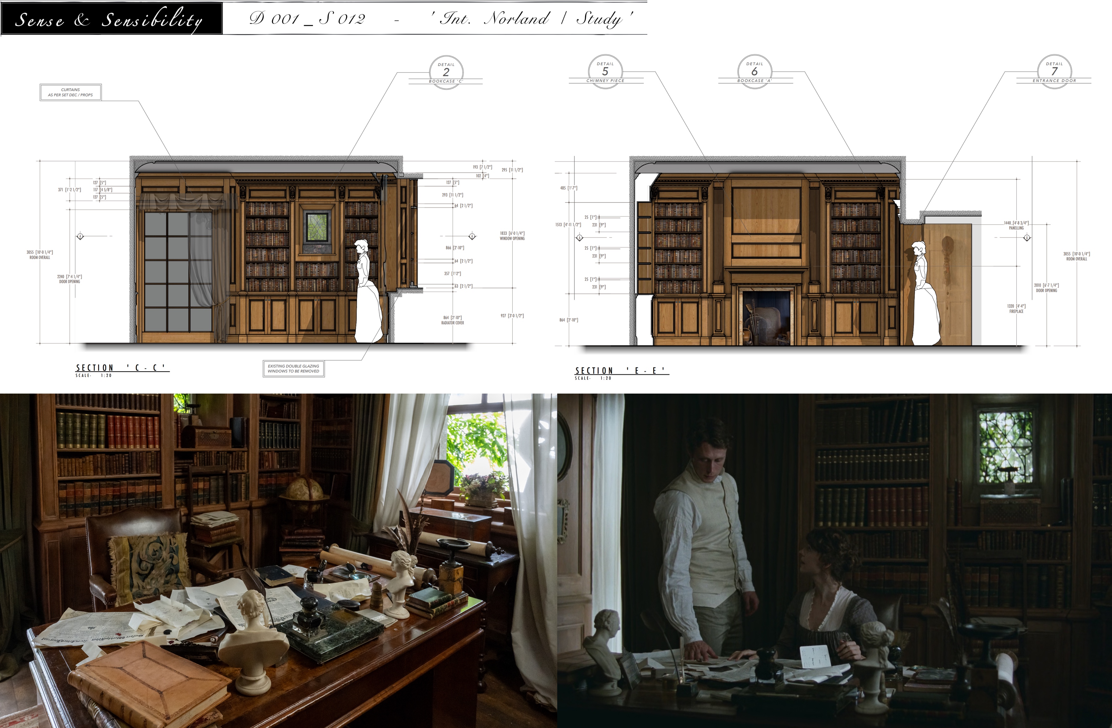
Set build of Mr Dashwood’s study (including construction drawing) for the Norland House on “Sense and Sensibility”, courtesy of Francesca Di Mottola.
Kirill: What are the key ingredients to longevity in your field?
Francesca: I’m working hard on understanding that. I don’t have an answer yet. It’s so life-encompassing. I feel that the younger generation is much better at maintaining a healthy work / life balance. I instead am always in the creative process. I enjoy it, and it’s very hard to step away from it. I’m living the movie. I am always researching.
I’ve tried to pay more attention to that balance whilst working on my last movie, where weekends were weekends. I tried to force myself to put the phone away. It’s important for the brain to step away, and I’m invested in getting better at it. It’s very important to learn how to separate one’s life from work, there’s where longevity lies in my opinion.
Kirill: You come from Brazilian and Italian roots, and now you live in England. Which cuisine out of these three is better?
Francesca: My favourite food is Brazilian food, which might sound weird coming from someone who’s half Italian. The flavour in Brazilian food is an agglomeration of tastes, like the nation itself that is made of people from so many different cultures. You find such fascinating variety in the food when you travel around the country.
One of my favourite dishes would be a good plate of rice and black beans. Feijoada, which is black beans slow cooked with different kinds of meats; it has so much flavour. I don’t have it often because it’s strong.
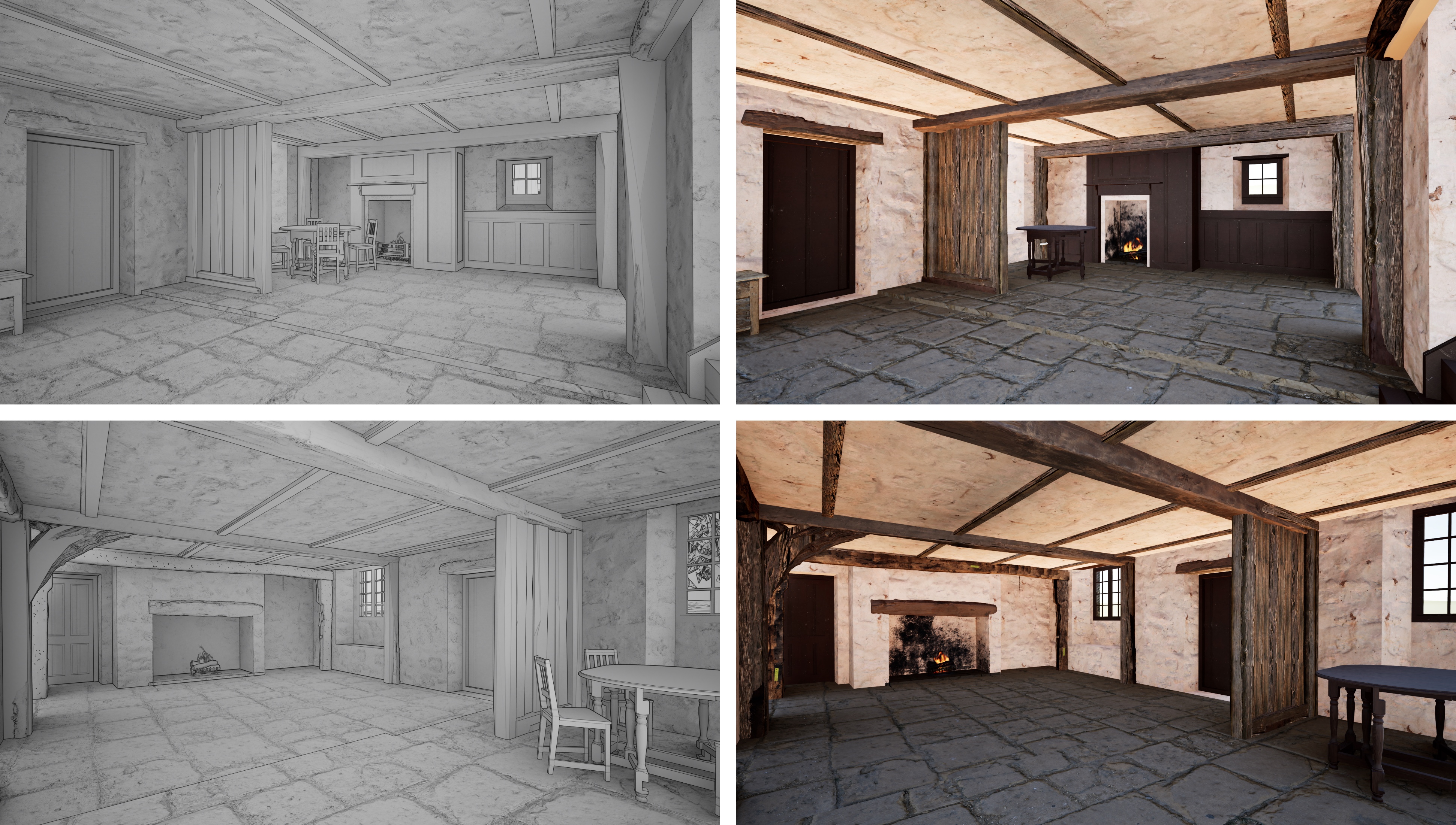
Initial renderings for the spaces of the Barton Cottage on “Sense and Sensibility”, courtesy of Francesca Di Mottola.
Kirill: Any particular favourite dishes you had in the countryside while you were working on “Sense and Sensibility”?
Francesca: We stayed on the coast, and we had great fresh battered fish and chips. When it’s good, it’s really good. When we were in Dorset shooting at the Norland Park location, there were some great restaurants nearby. We also went to a few places in Somerset because I needed good food. After a while of being in the countryside, I wanted to travel for art, and we went to the countryside location of Hauser & Wirth in Bruton. I wanted to keep my mind active and see contemporary art, and they also had two great restaurants in that location.
London has so much variety that you still don’t have in Rome. When I’m in Italy, I miss having access to good Thai or Indian food. And Brazil has some of the best Japanese restaurants outside of Japan, because they have the biggest Japanese immigration in Sao Paulo. Japanese food has been amazing in Brazil since forever, and it only recently became a trend in Europe.
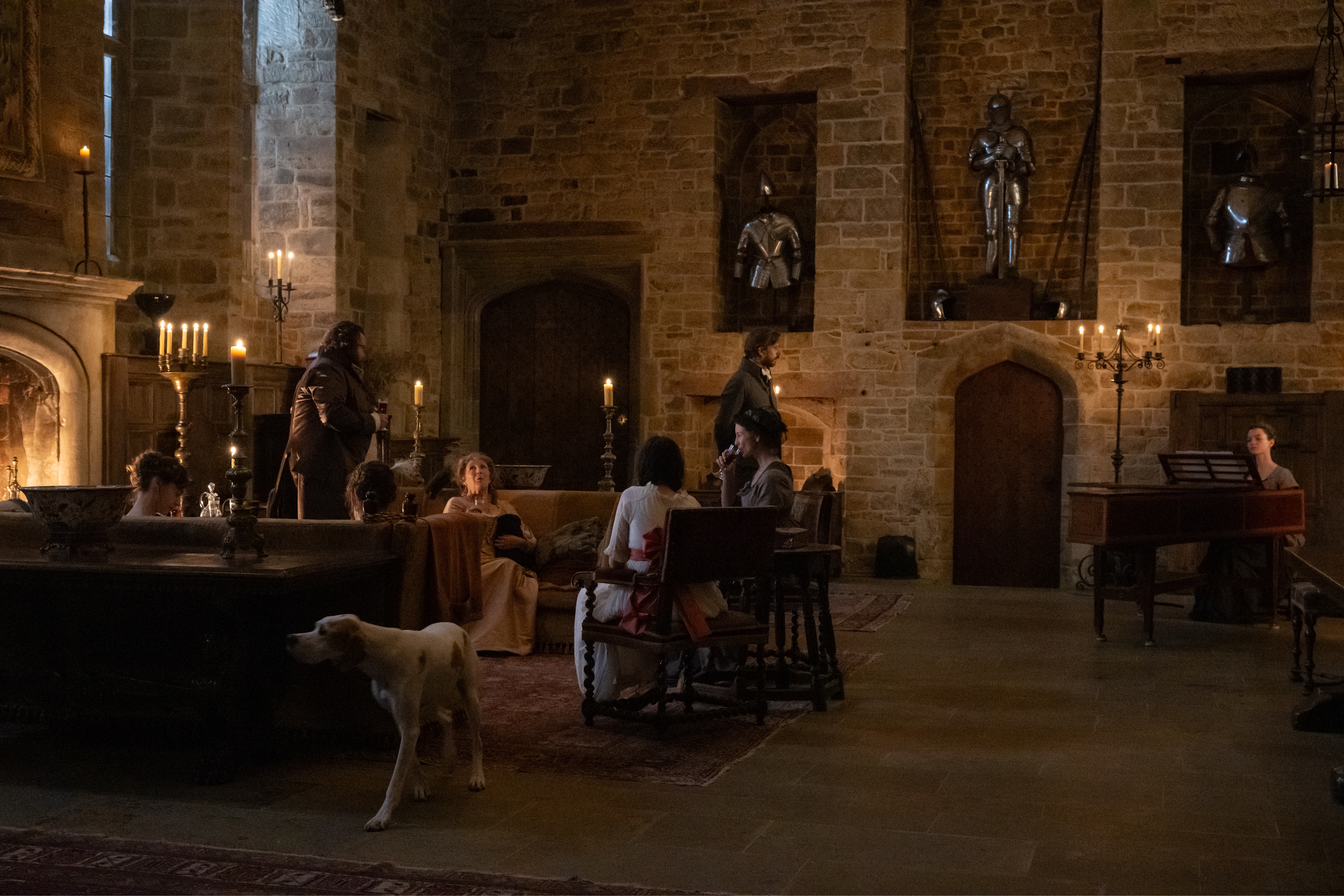
Production design of “Sense and Sensibility” by Francesca Di Mottola, courtesy of Focus Features.
Kirill: Going back to what you mentioned earlier for my last question, how was the PDC gathering in Greece for you?
Francesca: I just came back from it and it was yet again an amazing and very enriching experience. It’s such an unbelievable initiative, from starting the Collective itself, and how Inbal manages to put together this gathering whilst being an incredible designer, I have no idea. She’s become a close friend. We met three times this year – Sundance, Berlinale and this gathering. I still can’t work out how Kalina and her do it. I’m in awe and very grateful to them for this.
It’s been a life changing experience to meet like-minded people, to become friends, to exchange experiences and ideas and visuals, to eat together and to party. We spent four full days together as a big group, and now I can count so many production designers as my friends. It’s completely changed the way I approach certain worries. Our jobs can be very overwhelming, and it used to feel quite lonely and isolating as people outside the industry don’t necessarily understand the level of stress we sometimes go through. Now it’s so different and we really have a support system. I’ve got close friends who are costume designers, and they tell me that it could never work between them [laughs].
They’ll probably need an “Inbal” costume designer to start it for them. I will never forget her first email to me. She was in Italy, crewing up for “Suspiria” for Luca Guadagnino whom I’d worked with before. She said that she was setting up the collective with the main idea to help each other when crewing up in other countries and asked if I could help with her own ramp up on that production. I remember that I was in the middle of my own prep and it was very hectic, but I stopped everything and put together a list of recommendations for her as my priority. Every time I get a call, I will make sure I find time to talk to a designer who needs crew suggestions or sometimes it be someone who is on a difficult job and may need to vent. I’m always only one step away, because I know how difficult it can be.
And here I want to thank Francesca Di Mottola for sharing her time with me to talk about the art and craft of production design, and for sharing the supporting materials. I also want to thank Marilyn Lintel for making this interview happen. “Sense and Sensibility” is streaming on Apple TV, Amazon Prime and YouTube. Finally, if you want to know more about how films and TV shows are made, click here for additional in-depth interviews in this series.
