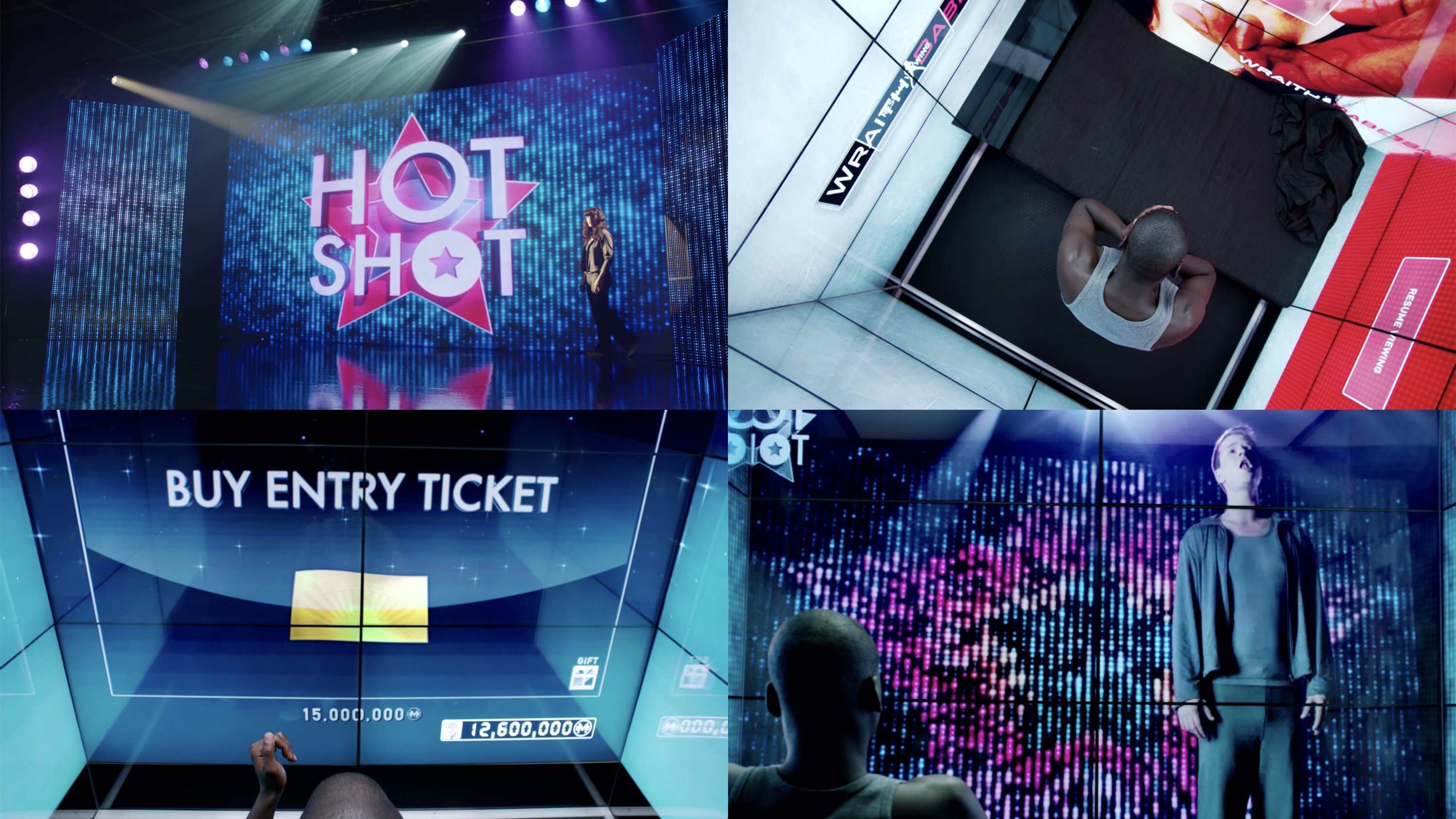
 Screen graphics for "Rachel, Jack and Ashley Too" episode of "Black Mirror". Courtesy of Clayton McDermott.
The screens of “Black Mirror” – interview with Clayton McDermott
Continuing the series of interviews with designers and artists that bring user interfaces and graphics to the big screens, it’s my pleasure to welcome Clayton McDermott. A multi-faceted portfolio highlights Clayton’s work in art direction, motion graphics, illustration and animation. He’s been with “Black Mirror” since the very first season when he worked on “Fifteen Million Merits” and “The Entire History of You”, as well as the now-iconic title sequence of the show. His work can also be seen in the later episodes such as “Men Against Fire”, “Hated in the Nation”, “Rachel, Jack and Ashley Too” and the most recent interactive installment of “Bandersnatch”.
Kirill: Please tell us about yourself and the path that took you to where you are today
Clayton: I never really knew what I wanted to do growing up, I was interested in a lot of things and I still am. I watched a lot of animation, I played a lot of computer games, I was amazed by film and animatronics, I drew, I painted and generally just enjoyed anything art and design related. I think more than anything though I was fascinated by how stuff worked.
I had a decent enough computer at the time and although the internet was still relatively young I began exploring some of the things that interested me digitally. I started messing around with programmes like Photoshop, Director, Adobe Flash, even HTML and began to realise I could use them to make my own content. It was around that time that I realised motion graphics was a thing and how a program called After Effects was being used to make some of the stuff I had seen on TV as well as things like DVD menus etc. All the while I was looking into these things I was learning and teaching myself new skills, I enjoy it all as a creative process. I began to realise that maybe if I just did something I enjoyed as a career hopefully it wouldn’t really feel like I was working. That’s where my career began.
Screen graphics for “Men Against Fire” episode of “Black Mirror”. Courtesy of Clayton McDermott.
Kirill: Looking back at your first couple of productions, what was the most unexpected part of working on client projects?
Clayton: I don’t think anything really prepares you for your first job and although I’m not sure it was completely unexpected I think early on in my career I learnt not to be too precious or protective about that initial idea. Things often evolve or change over the course of a project and more often than not you will need to revisit or adapt ideas as things progress. Sometimes a client brief will change so much you need to pretty much start again. There are often a lot of moving parts, it is what it is.
Kirill: Do you worry about how your work will age / be seen in 20-30 years?
I think it’s hard not to think about, especially when you have grown up and are working in a time that has seen such rapid advances in technology. Whether or not it worries me, I’m not so sure. I’d like to believe that everything has its place in time and I can live with that. I suppose most of the projects I have been involved with also serve as a form of entertainment and I’m still entertained by things that now might otherwise seem dated.
Kirill: Between ideas in your head and deep knowledge of tools to translate those ideas to the screen, what’s more important in your opinion?
Clayton: I suppose without the idea the tools are useless. When pitching ideas there are often parts where you are unsure of how you will achieve them. I guess that’s also what keeps me interested in the process – the idea of learning something new or going about solving that problem. It’s usually a good or unusual idea that forces me to learn more or develop that knowledge of those tools further.
Kirill: Looking back at when you started, do you think it’s easier to get in this field today compared to back then (better software, more affordable hardware, …)
Clayton: I remember when I started I just had to fiddle with the software to figure out what it could do and how it worked. Nowadays the internet is full of tutorials or information about how to create imagery using a wide variety of programs. Software has also just become much more accessible, I can’t remember the last time I saw or used a CD to install anything. I’m not sure laptops even come with drives anymore. With the advances in cloud-based software and subscription it’s easy just to rent software even if it’s just to try it. Obviously the internet has also been able to provide way more information than I could ever get my hands on when I started. Hardware nowadays pretty much comes right off the shelf as well, I remember a time when I had to order a computer to be built before I could use it. So I definitely think you have more exposure to the field than I ever had, not to mention an increase in available roles due to the development of film, tv and interactive content.
Screen graphics for “Men Against Fire” episode of “Black Mirror”. Courtesy of Clayton McDermott.
Kirill: When you are asked what you do for a living, how difficult is it to convey the complexity of what you do?
Clayton: I’d be lying if I said I talk a lot about what I do for a living, generally it’s easier to just say I’m a graphic designer and people often just get that. But you are right, there is a complexity to the process that I think often people don’t question, largely because they are just used to seeing the end result. I think it’s just making people aware that it is very much that – a process – that like I said before sometimes has a lot of moving parts all of which need to be looked at, discussed and then brought together as a whole.
Kirill: In general, do you start sketching on a piece of paper, or do you go straight to digital tools for your explorations?
Clayton: It depends really, I usually have a piece of paper or notebook around. Sometimes I’ll just go straight to digital. It’s still nice to have that interaction with paper though, especially when you know the process will be digital. Generally I’m just making notes in my notebook throughout the process. It’s quicker sketching little ideas and assessing them beforehand without committing too much time to them on the computer.
Kirill: What brought you to work on “Black Mirror”?
Clayton: I had previously worked with a friend that went on to be a part of Painting Practice, the company that was doing the production design for the show. If I remember correctly, I was initially brought in to work on some screen content for ’15 Million Merits’. From there I was asked to look at the ‘grain’/’in-eye interface’ for ‘The Entire History of You’ and lastly the ‘Black Mirror’ title sequence itself.
Screen graphics for “Bandersnatch” episode of “Black Mirror”. Courtesy of Clayton McDermott.
Kirill: Looking back at it, was it clear from the start how far the show could go in terms of finding its devoted viewer base?
Clayton: I remember watching shows like ‘The Outer Limits’, ‘Tales From The Crypt’, and ‘Twilight Zone’ reruns as a kid and loved them. When the idea for Black Mirror came about it felt like it was that kind of thing for our generation. There were only 3 episodes back then but even at that time you could see it had potential to go further and I’m glad it did. I just remember those initial episodes left me feeling a little uneasy at the time, the ideas stayed with me for a bit. For good or bad they had invoked a feeling and surely other people were going to have a similar experience. Until it’s out there though, you never really know.
Kirill: What was the most challenging / interesting episode that you’ve worked on in “Black Mirror” so far?
Clayton: I think the ones that I have worked on have all been interesting or challenging in their own way. I guess if I had to pick one then ‘Bandersnatch’ probably sticks out because I was brought in very early to the process and at the time we were all still so unsure of how it was all going to work. Netflix were still developing the tools to provide this kind of interactive content to their platform and the script was still developing as things were being worked out.
I have always been interested in games from a young age also and a few weeks before getting the call to work on the episode, as a personal project, I had started looking into old text adventure games. It was a strange coincidence, but I felt in tune with the episode from the start. I also got to design a bunch of retro games, which has always interested me.
Motion graphics for “Fifteen Million Merits” episode of “Black Mirror”. Courtesy of Clayton McDermott.
Clayton: Kirill: How did you approach designing the screens in “Fifteen Million Merits” that pervaded the characters’ spaces and almost boxed them in?
I came in later to ’15 Million Merits’ so a lot of the design work had been discussed and the set designs were already there. I think the idea was to make the content feel so overwhelming, bright and large in scale that it made elements like their individual pods feel so much more claustrophobic and cramped. The continuous use of bright, vibrant colours enforced a sort of false facade that sat within an otherwise depressing, grey, dystopian environment, if removed.
Kirill: What kinds of discussions went into creating the in-eye interface of “The Entire History of You”? How do you balance making something that looks great for the viewer and something that makes sense for such a personal consumption?
Clayton: I think the brief was pretty open at the time. I just remember thinking that I didn’t want it to look like the Apple ‘cover flow’ interface which was being done a lot around then or anything grid like. I just felt like it could be something a bit different. I wanted to try something ocular / round looking. I considered it a lot in the short time I had, trying to work out how everything could work in conjunction with a simple hand held control and how ultimately data could be stored and recorded.
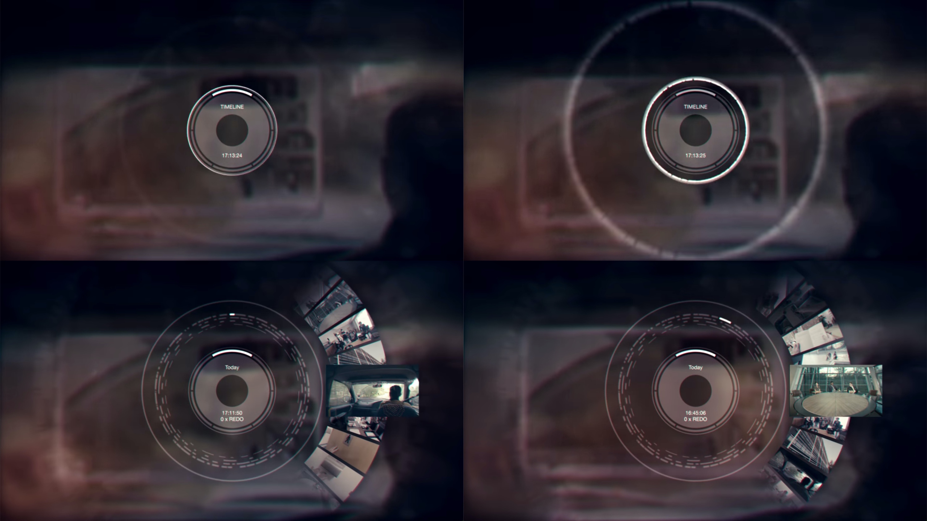
Screen graphics for “The Entire History of You” episode of “Black Mirror”. Courtesy of Clayton McDermott.
After some exploration I came up with the idea of using sets of concentric circles which could be broken up into sections of data. These separated ring sections of data could then be used to represent anything from years, months, days, hours, minutes, menu settings etc. Using the circular shape and concentric circles/rings allowed me to represent certain visual aspects. Firstly, it was reflective of the human eye where the recording of the visual memories took place. Second, it echoed the shape of an analogue clock and denoted the concept time. And thirdly, visually it looked like the cross section of a tree with the rings forming much like those of the growth rings of a tree. This again helped reinforce the idea of not only capturing information but also the preservation of time.
I think that balance comes from always trying to think beyond the shot required or what looks good and into how the interface works as a whole, where the menus are, how you navigate etc. In my opinion it always makes for a more believable design.
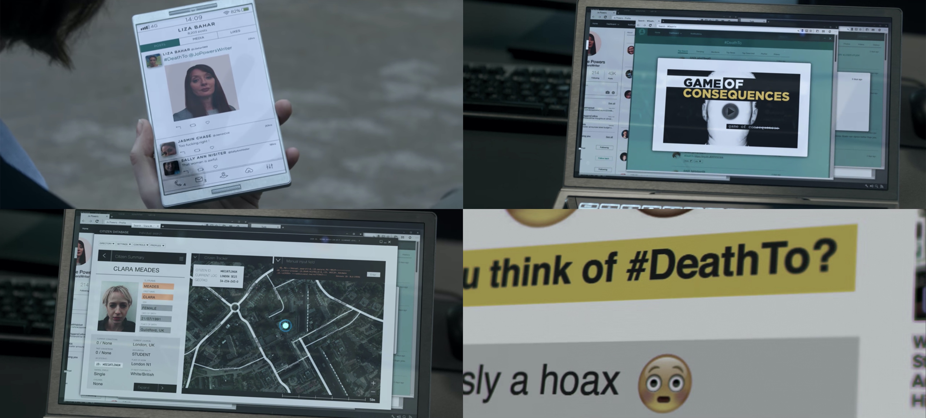
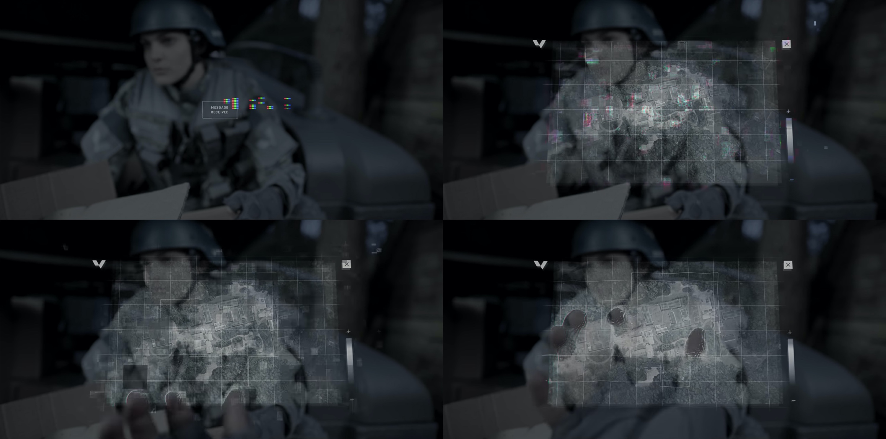
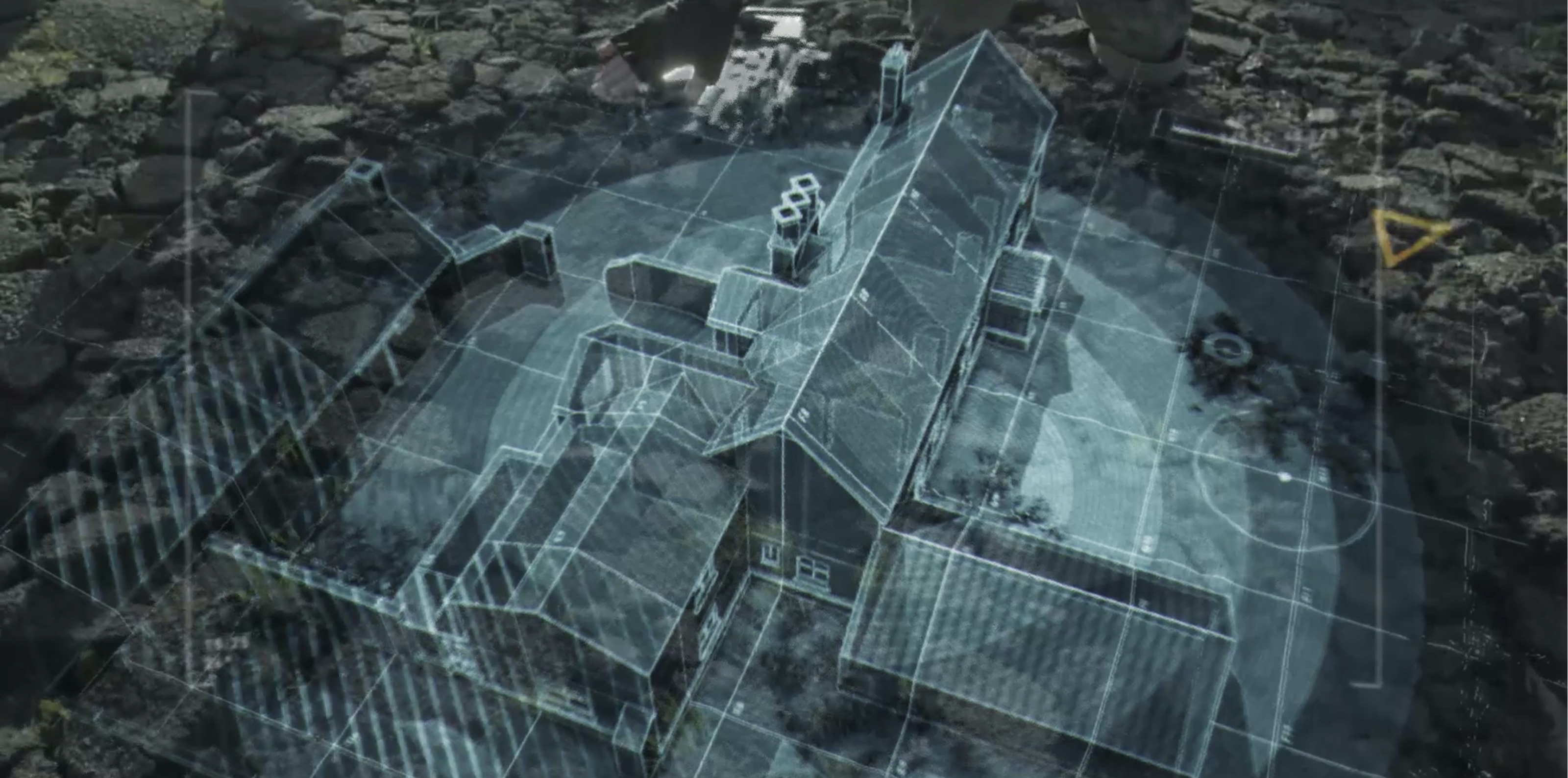
Screen graphics for “Hated in the Nation” episode of “Black Mirror”. Courtesy of Clayton McDermott.
Kirill: Was the simplicity of graphics in “Hated in the Nation” intentional? Is it easier to design something that looks simple / everyday?
Clayton: The parts that did in that episode largely centre around social media and online content that we are all familiar with whether you choose to use it or not. I think if it had looked any other way, it would have been harder for people to relate to, it just would have been less tangible. The simplicity of the screen content was juxtaposed against the slightly advanced hardware/devices that were designed to have these transparent screens.
In regards to whether it’s easier to design, I guess you get to start with a pretty decent tried and tested reference. The problem however is that with some of that reference, ‘social media’ elements for example, people are so used to seeing and interacting with it on a daily basis that you need to make it feel as lived in as possible otherwise there is the risk of it all feeling a bit too contrived. Windows need to feel like they can be closed, web browsers / apps need to feel like they can be navigated and content needs to feel authentic. All of that can sometimes take a bit of time to get right whilst still trying to make it feel different enough.
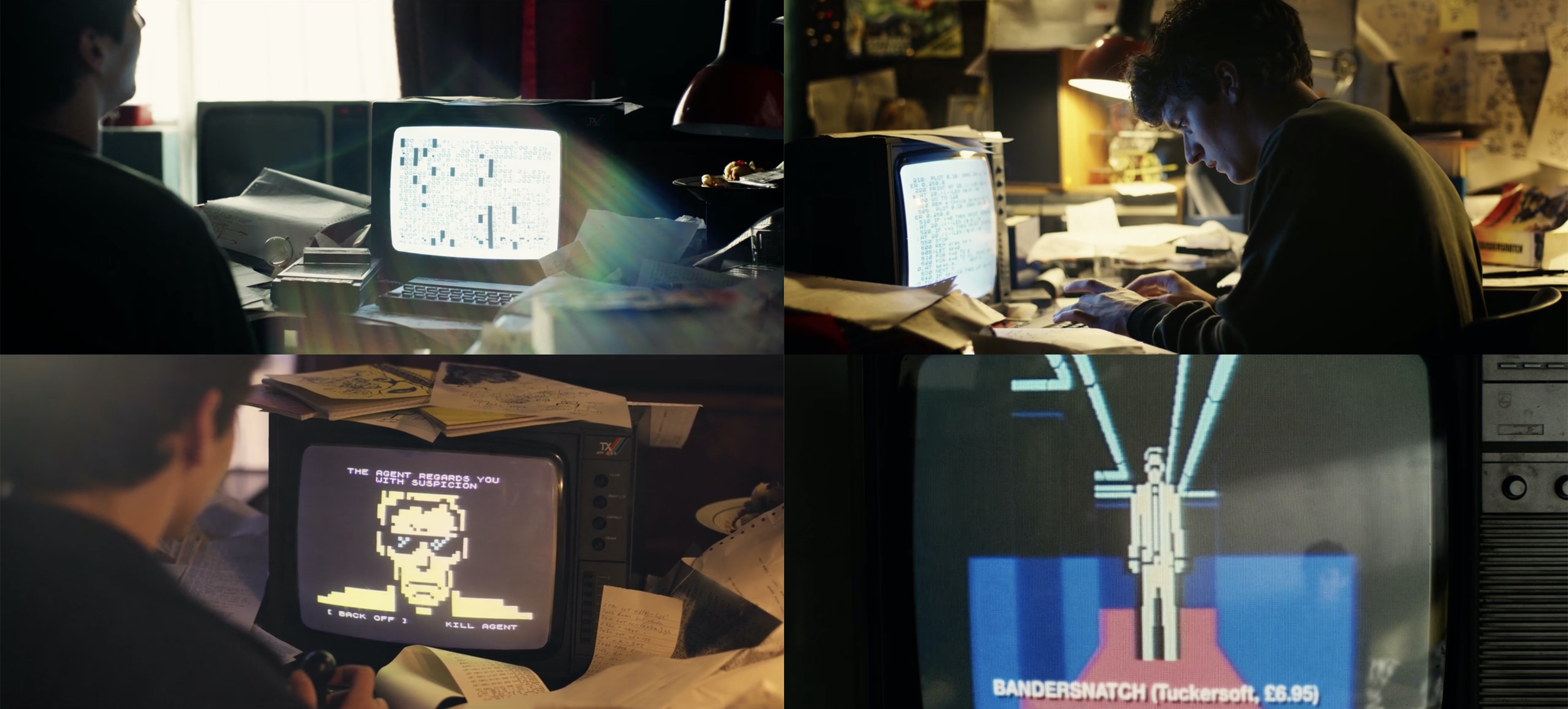
Kirill: What can you tell us about going “back in time” for the retro graphics in “Bandersnatch”? What inspired you for that episode?
Clayton: The script was always written and centred around the ZX Spectrum and graphics from that 80’s time period, so graphically that was the starting point. One of the first computers I owned was an Amstrad, not long after they had acquired ‘Sinclair Research’. I’d wait for ages for the cassette tape to load up games, more often that not only for it to fail, but I had memories of the type of hardware portrayed in the episode.
Specifically games like Manic Miner, Jet Set Willy, Jetpack and The Hobbit were all good points of reference. From these I went on to produce a few games for the episode whilst always trying to stay true to the feeling of spectrum gaming using its colour palette and limitations. Ultimately, however respectful you are trying to be to that hardware and software you have to use some artistic licence to get what is required for the shot etc.
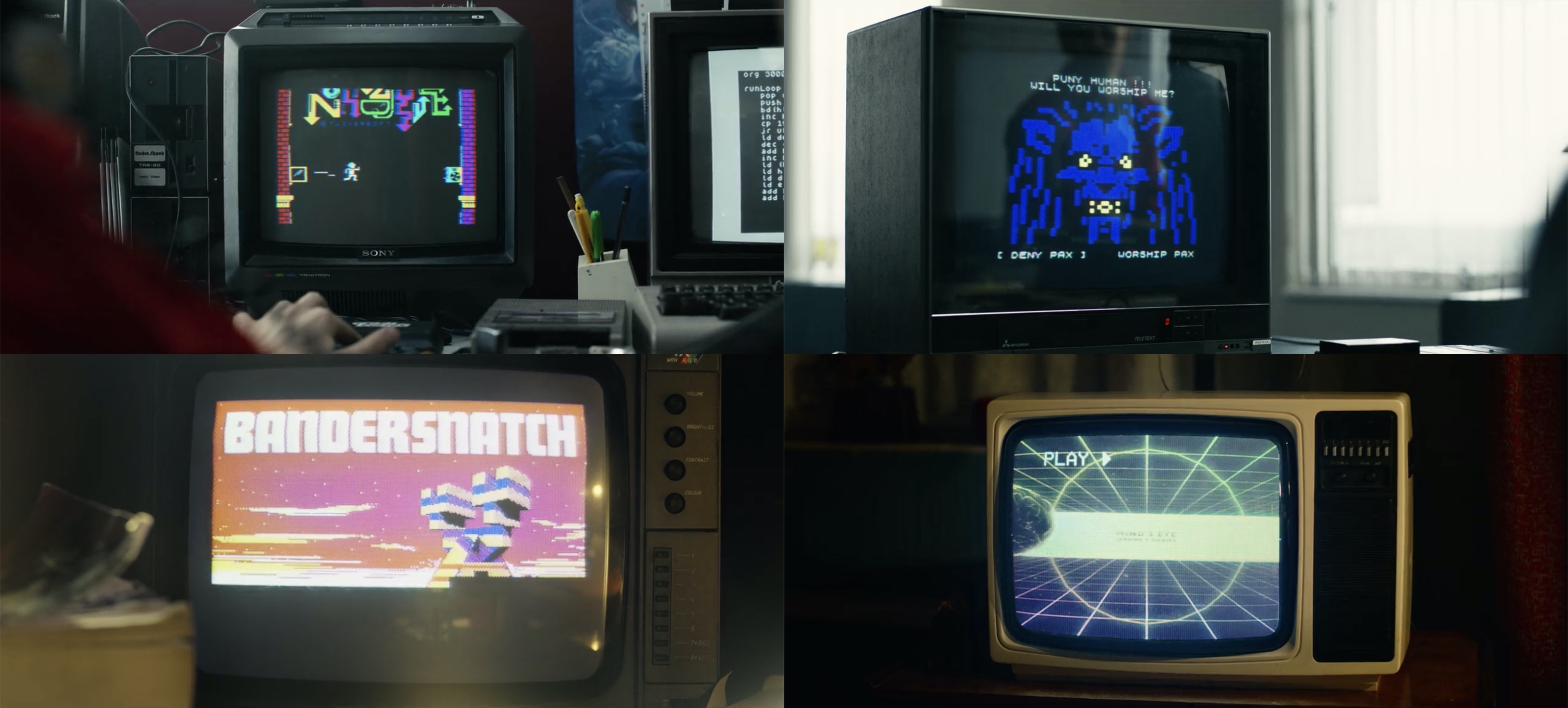
Screen graphics for “Bandersnatch” episode of “Black Mirror”. Courtesy of Clayton McDermott.
I remember one issue I ran into early on was the way in which a user interacts with the ZX Spectrum and rubbery keyboard buttons. For the correct command lines to appear on screen certain letters and symbols need to be pressed in conjunction with one another to get the correct commands to appear. The time between pressing those buttons also varies so eventually rather than try to recreate those inconsistencies I ended up running an emulator and typed everything out by hand whilst recording sections. These recordings were then mixed with elements created in After Effects in the hope it made the whole thing feel more realistic and authentic.
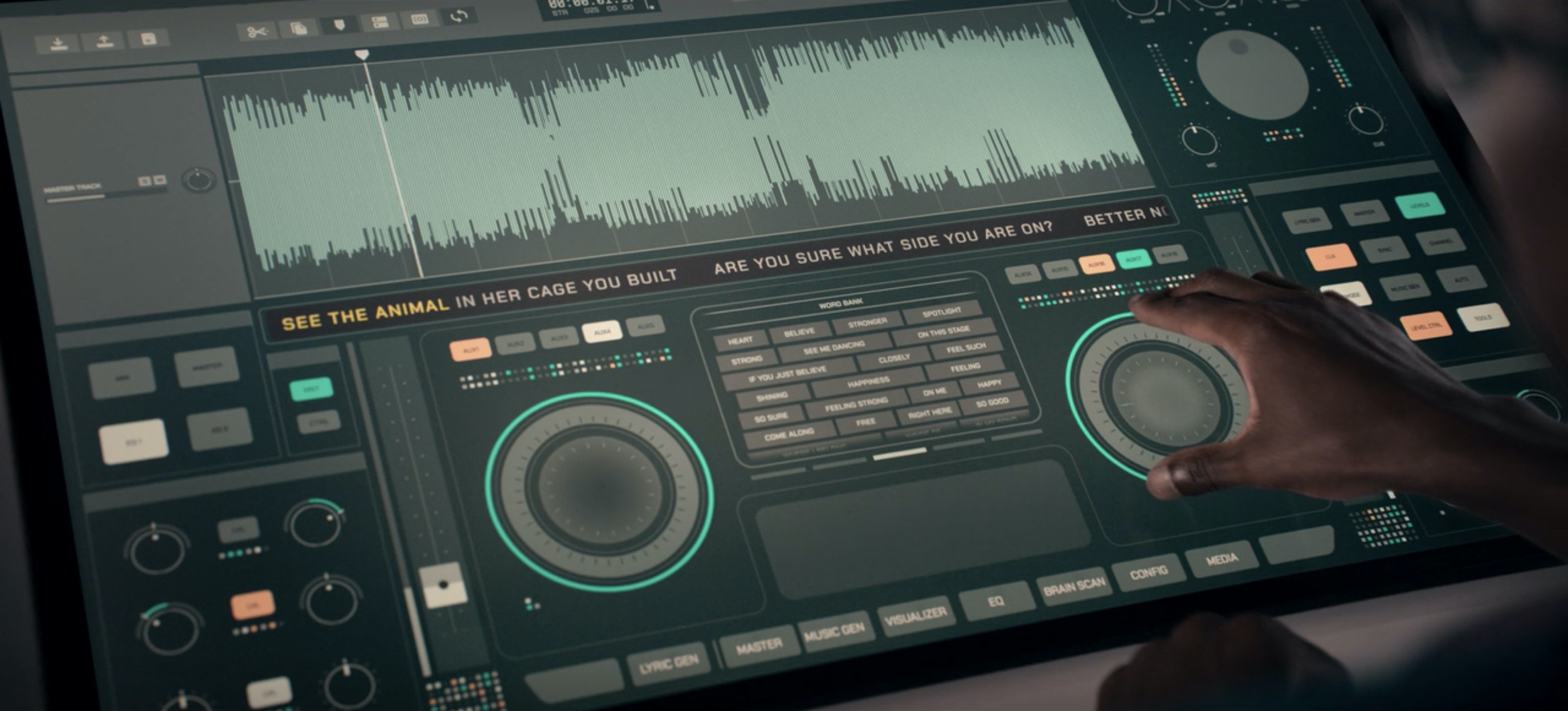
Kirill: How did you choose the color palette for the more detailed and intricate medical interfaces in “Rachel, Jack and Ashley Too”?
Clayton: Whenever I design an interface, particularly like those in the episode, I find it generally a good idea to have a background colour for the software and then a few accent colours to deal with selection, highlighting, toggling etc. Otherwise the whole thing becomes too overwhelming or confusing. I don’t remember there being any specific significance between the colours chosen, only that they complemented each other and brought attention to certain areas.
Kirill: Overall, how much time did you spend on average on “Black Mirror” episodes?
Clayton: It’s hard to say – they vary depending on what is required. Plus, there is usually time between sections where elements are being signed off or shot on set. Generally though the design process runs over a few months.
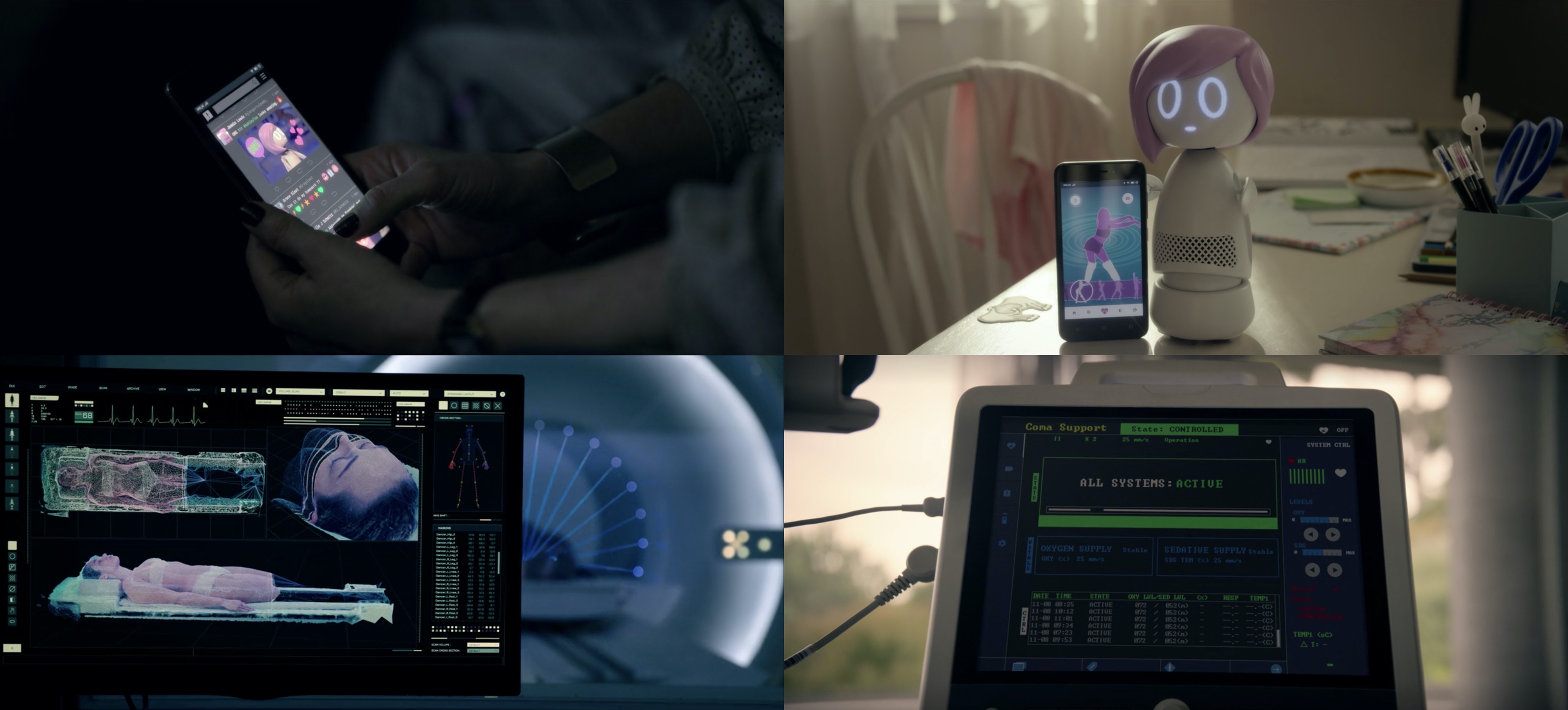
Screen graphics for “Rachel, Jack and Ashley Too” episode of “Black Mirror”. Courtesy of Clayton McDermott.
Kirill: Do you get to enjoy seeing the final episode when you probably already know the major plotline from the graphics you were working on?
Clayton: It always takes me a while to revisit them after they have been released because, like you say, I’ve not only read the script numerous times but I’ve also seen rough cuts of the edits to help with the required graphics etc. Usually I try to avoid seeing the edit after my bits are done and it goes on to the last section of the process. Once some time has passed I’ll usually look back over them and can enjoy seeing how everything has come together.
Kirill: Is it an exciting time to be a designer?
Clayton: I think so, things always need to be designed, new technology continues to evolve and film and TV are relying on that process now more than ever. Advances in other areas like interaction also continue to expand and create new roles.
There is always something new popping up and it’s interesting to see what people go on to do with it.
Kirill: What do you do between your client projects? Where do you find ideas and what do you draw your inspiration from?
Clayton: With the release of things like Unity and Arduino a while back, I started to look more into the programming side of things. Like I said, I’ve probably had an interest in it since I started looking at HTML a long, long time ago. I enjoy the process of coding, there is always a problem to solve and whether the output is hardware or digital it’s another nice way to explore and create things. I also use it more and more in my commercial process now and think that understanding of what lies beneath software allowed me to understand more about how things like interfaces and interactive content work when designing them. As well as prototyping game ideas I also enjoy seeing what can be achieved with generative art and how that can be used to make new art works. I think I just enjoy both the rigidity and the randomness the coding environment can bring. Again I think it’s just that fascination with trying to understand how the things I enjoy work.
Kirill: What do you think about how deeply technology has integrated itself into our daily lives?
Clayton: I think it is safe to say without technology not only would I be out of a job but I also wouldn’t have been able to teach myself half the stuff I know. On a personal level, I also wouldn’t have been able to leave my home and country and continue my career, not to mention still be able to continuously stay in touch with friends and family in an instant.
I’ve always felt I’ve tried to use it to the best of my advantage or for my own personal enjoyment but I suppose there is always that question of what happens if these deeply integrated technologies were to ever be removed in some way. The truth for the most part though is it just makes life easier, more manageable maybe. We have evolved and that’s not necessarily a bad thing. I suppose it’s the way in which we choose to interact with it that will ultimately matter.
Graphics for the title sequence of “Black Mirror”. Courtesy of Clayton McDermott.
And here I’d like to thank Clayton McDermott for this wonderful opportunity to talk about the art and craft of screen graphics, and for sharing the supporting materials for the interview. All the seasons of “Black Mirror” are available for streaming on Netflix. And if you’re interested to read additional interviews about the wonderful world of screen graphics and user interfaces for film and TV, click here for more.
