Android tips and tricks: reflections
Continuing the series on the more interesting UI pieces of the new Android Market client, today i want to talk about image reflections.

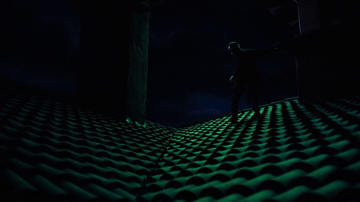
Here, the Market landing page shows two square cells with image reflections in the bottom half of each cell. If you’re coming from desktop client development, your first thought would be to take the original promo image, create a larger version of it with reflection and then set the resulting image on the ImageView displayed in the cell. There are enough code samples floating on the web that show how to write a method that gets an image and returns another image, twice as tall, with the original one on top and reflection on the bottom. There are two problems with this approach, one small and one big. Let’s start with the small one.
If you look closely at the reflection part in the screenshot above, you will see that the “amount” of gray does not change linearly as you go from the top edge of the reflection towards the full opacity near the bottom edge. It starts very slow and then accelerates to full alpha once it’s about two-thirds in. There’s nothing fancy about such an acceleration, and it can be quite faithfully approximated by a simple spline. The problem is that there are no core Shaders that do hardware-accelerated spline-based gradients. There’s a number of ways to work around this:
- Use a multi-step LinearGradient, carefully choosing the positions to minimize visual artifacts. You may still end up with awkward alpha transitions in the final visuals around the “segment breaks”.
- Paint the overlay programmatically. First, given the spline equation, compute the alpha for each vertical position. Now, you can draw a bunch of horizontal lines, changing the alpha on every row. Alternatively, you can create a one-pixel wide Bitmap, wrap it in a Canvas, paint the pixels based on the spline-computed alphas, create a BitmapDrawable with the resulting Bitmap, sets its bounds to stretch the bottom half of the reflected image and call the draw() method on it.
- Finally, you can work with your designers to create a nine-patch asset that emulates the alpha overlay. There are certain advantages to this approach. The designer can tweak the reflection appearance in his tool of choice without any extra work on your side to come up with the correct math approximation of the target visuals. The main drawback is that nine-patches (or n-patches) only support linear gradients.
The second problem with creating a twice-as-tall reflection image is much bigger – memory pressure. Android runs on a wide gamut of hardware profiles, but one thing is constant – you don’t have as much memory as you do on desktop clients. Images are a particularly memory-hungry species, and given how many images the Market client displays on the landing page, we simply cannot afford consuming any more memory than absolutely necessary. Let’s see what we’re doing:
- The entire cell is a custom class that extends RelativeLayout. Let’s call it GridSquare. Extending the RelativeLayout gives you a nice option to get access to the ViewGroup.MarginLayoutParams as the layout parameters of child views. This way you can respect the layout margins set in the XML layout definition. This also gives you an extra flexibility for more precise control over the layout.
- GridSquare overrides the onMeasure and onLayout to compute the bounds of promo image. The end goal here is to have the promo image fit the entire cell width while maintaining the original ratio. To this end, the onMeasure gets the intrinsic width and height of the ImageView, computes the scaling ratio based on the intrinsic width of the image and the available width (computed from the width measure spec passed to onMeasure) and computes the matching height. The measure() method is then called on the ImageView child with the full width and the matching height (using MeasureSpec.makeMeasureSpec with MeasureSpec.EXACTLY). The onLayout() method fetches the measured height of the ImageView and passes it directly as the bottom position to the layout() call.
- Reflection is done in two passes – full opacity reflection and overlay.
- Full opacity reflection is done at runtime with Canvas APIs without creating any extra images or drawables. First, the GridSquare constructor calls setWillNotDraw(false) to let the rendering pipeline know that it has a custom onDraw logic. The overriden onDraw() method calls ImageView.getDrawable() on the view that holds the promo image, save()s the Canvas, translate()s it vertically by twice the height of the image view, computes the scale factor of the image (same logic as in onMeasure above), scale()s the Canvas based on the computed scale factor (positive X, negative Y), calls Drawable.draw() on the promo image drawable passing our Canvas and, finally, restore()s the Canvas so that we don’t end up affecting other draw operations on the Canvas object once our method is done. In addition, we paint a one-pixel black horizontal line along the bottom edge of the original image (our designers found that it adds a nice touch to the visuals).
- The fading overlay is done with a nine-patch asset that is set as a background attribute of a special child view of the entire cell. We’ve decided to go with the third approach outlined above, where the nine-patch has a large non-stretchable vertical section that emulates the non-linear fading, and a full-opacity stretch that is “used” when the fading is complete. As child views are drawn after the parent, this overlay is painted on top of the full-opacity reflection created on the fly in the cell’s onDraw() method.

Stay tuned for more.