Today’s post highlights the design of Urustar.net. A nice illustration style that features circus-related elements; i especially like the city landscape with giant robot and striped tents in the footer, transitioning to the simple information section at the very bottom. The design has an interesting way to embed multiple navigation menus in between the sections, varying the position and size of the icons to break the usual monotonous look of such elements. Also note the precise geometry and lighting of the various separators and borders, as well as consistent usage of a single beige hue with varying brightness levels throughout the entire page.

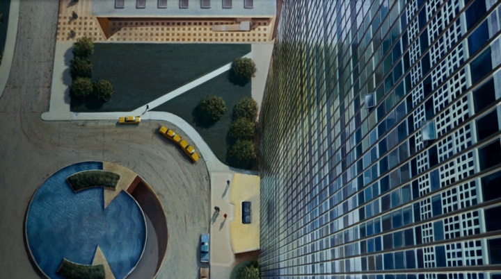
Today’s post highlights the design of HelloSquare.co.za. I like the simple three-column grid and a muted color palette of beige, light blue and dark slate gray. Noise-based textures bring a welcome relief to otherwise unoccupied stretches of white space, with varying line styles used for element borders (dotted patterns on section headers, double lines on the footer icons and “postal stamp” wavy outlines of the portfolio thumbnails). Note the overlapping elements along the transition lines of the content area from the header and into the footer – bringing further element of interest into the visual flow.
With the great layout and typography of the embedded tweet, i wonder whether the main description section can use a more distinct and flavorful web font – instead of relying on the overused Arial. It also feels that centering the multi-line content of the “expertise” cells is quite distracting and significantly decreases legibility. On a more positive note, see the consistent usage of the color palette when you move the mouse over the footer icons – with the main light blue color used for the rollover effects on the otherwise greatly styled monochrome social icons.
Erika Hall of Mule Design on the value of design:
You are making UX design decisions as soon as you specify anything you expect another human to interact with, as soon as you specify anything that has implications for how a human might interact with it. Of course, you are are also making system design decisions, but we assume you are comfortable with that sort of thing.
So don’t pretend like you aren’t making design decisions already. And don’t make them by omission. You cannot NOT design something. The floor of Silicon Valley is littered with the crumbling husks of great ideas—useful products and services that died in the shell before they hatched out of their impenetrable engineering-specified interfaces. (It’s why Sunnyvale roads have the same consistency as the floor of a Western bar.)