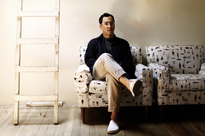
Screen graphics of “Her” – interview with Geoff McFetridge
One of the most influential movies in my recent memory, “Her” explores the intersection of love, relationships and technology in a world where voice-based interactions and artificial intelligence have evolved to the point where they are virtually indistinguishable from those of humans. Credited as a graphical futurist designer, Geoff McFetridge designed the outer manifestation and the inner workings of that technology, balancing the dichotomy of how pervasive yet inconspicuous it appears to be.
We start the interview by talking about the role of design in our everyday lives, whether there’s such a thing as good and bad design, timelessness and fashion cycles in the world of design. Then Geoff dives deeper into the world of “Her”, from the directive to build a nice near-time future to crafting a narrative that reveals the quiet horror lurking beneath the utopian veneer of the characters’ lives, and working on the almost invisible interfaces of the technology that binds it all together. At it gets closer to the end, we discuss connections between the world that “Her” imagined in 2013 and the screen-filled obsession of our daily lives in 2018.
Kirill: Please tell us about yourself and your path in the world of design so far.
Geoff: I grew up in Calgary, Alberta Canada. I came to design through doing skateboard and snowboard graphics. Then I went to the Alberta College of Art and Design, and the program was very much rooted in what was, at the time, archaic techniques of design. That was around 1990 which was the beginning of desktop publishing, and computers arrived while I was studying there.
My work was street-culture related. I was doing skateboards and flyers, and working for people in California while I was in college. I figured that I wanted more out of design, and I applied to CalArts in California to their grad program. It was a deliberate turn for me, as I wanted to start from zero and really learn design. That was where I got my thinking. That program helped me develop my critical approach to design. It was within me, but I didn’t really know. It was a way of building a narrative into the work, but also being critical of your own work. Even before there were any client expectations, it was about meeting my own personal demands.
I’ve been in Los Angeles ever since. I’ve started my studio nearly right after I graduated in 1995. The plan was to have art shows, do animation and do design. These three things have been my pursuit since in different mediums.
My film work started in titles. I work with directors, and the only time I do that work is when I know the director and we have a working relationship, or I get called in to work on a project directly with the director.
Kirill: It feels like the past decade has placed a lot of emphasis on various parts of design in our lives. Instead of rushing to solve a problem, you have to understand it well enough so that your solution feels natural – which obviously takes a lot of work. Do you see that there’s more appreciation to the field of design in the last few years?
Geoff: Things have changed so dramatically. We live in a more visual culture. No longer is it shocking to be able to make a magazine on your desktop computer. You see both filmmakers and viewers that are so literate of design and culture in a way that I think is untapped. I always operate to design for people who are as literate or more literate in this world than I am. It might be doing a user interface or doing a logo for a fictitious company. People know the difference between a fake logo and a real logo when they see it.
When you see something like “Cyborg Incorporated” on a side of a bus in “Terminator”, it looks fake and people know that. Does that work for you? Does that help build that escape of being in a fantasy world? Or is it a flaw? That’s always been true. People are autonomous makers – in film, website design or other fields. That sophistication was there before, but it was untapped. But now people are also participants, producing so many things of their own.
Kirill: Is there a counter-edge to it? Anybody can be a producer, but also anybody can be a critic. There are so many social platforms and forums where people can easily critique design work without necessarily investing time to understand the limitations, constraints and thinking that surrounded that work.
Geoff: Absolutely. I’m not saying that design has gotten any better. There is more design. There is more of everything. But it’s not like we’ve entered the golden age where there is more beautiful stuff.
I always wonder what it would be like to live through the time of Art Deco. Would you be tired of all of it? Oh look, here comes the next toaster with lines on it. If I was alive back then as a fan of Art Deco, would I think that Adolf Loos is awesome, or would I be tired of it?
Nowadays there is a lot of critique. You can post something, and people link to it and link to other things. There’s a lot of connecting going on, and it is a type of a treadmill that doesn’t necessarily lead somewhere.
What’s the difference between an online forum and a critique in school? When you’re in grad school and you sit down for a critique, it’s powerful. That power is structured. There’s a culture of critique at the school you’re in. There’s someone leading it, and it looks very different from this commentary.

Kirill: I like this question you’re asking about living through a certain design era and thinking if you’d love it or be over it quickly. Is that one of the reasons for seeing trends in design come and go? There’s a new shiny thing, everybody jumps on that bandwagon, and then a few years later everybody is so over it and it looks so dated. People are exploring, and perhaps there’s no such thing as timeless design.
Geoff: I’m curious about this idea. If you have good design on one side and bad design on the other, what’s the difference? And the answer to that question right now, in 2017, is very interesting. I really don’t know. What is the context to decide what is good design and what is bad design? How does the design speaks to the context that it is in? How is it being read? How legible it is? Is it to be universal or to be super-specific? Is is beautiful? Inventive? Expressive?
Would bad design be the opposite? Is it not inventive? Is it derivative? Mundane? Clumsy? But the reality is that mundane and clumsy is sort of beautiful [laughs]. It’s a strange time. Maybe it’s my personality, but for me everything has a purpose. If I get called by a client to do something specific, I’m not thinking how to make it good. I want to answer their specific question. I’m listening very closely, and I’m thinking that I need to learn their world and their distinct needs. Is there a room to apply what I do to their project?
I believe that my thinking is the universal response. I don’t think that anybody needs anything. The most important thing is to create something where there was nothing, to fill a space that was otherwise void with something that is a piece of me. I walk by things all day, and they have no effect. But I see something inventive, and I feel the hand or the mind or the eye of the individual in it. That has value to me, but I don’t know if that is good design.
Kirill: It reminds me of unsolicited redesigns of big properties like Craigslist, Facebook, LinkedIn and so on. Most of those appear to exist in vacuum, ignoring the realities that those properties face. Not to single out any particular one, but I think Craigslist owners know exactly what they’re doing and why they are staying with such a simple and utilitarian look. I love your idea that good design should have a purpose.
Geoff: Actually, my website for a while looked like Craigslist. My belief is that web design is not about design, but rather about programming. Craigslist is beautiful because it’s so close to the function, with nothing in its way. To speak about Craigslist is to speak about the space in between good and bad design. I like when I’m closer to the thing, and you get there when it speaks to you. It doesn’t exist in a vacuum, like you are saying. It exists within the language of your viewer.
I feel super-literate in design. I love brands, I love pictures, I love logos, I love typefaces. When I look at things, the intentions of the person that made them are visible to me. Those intentions are very often what I respond to. We are all super-literate in that. We are all responding to the intentions.
When you cringe when Dropbox has a cute little monster that dances across the screen, it is not inspired. Not to pick on Dropbox, but when you see that, you see that the designer behind it does not care. But people do care. People are articulate and literate, and they see those things. Not everyone cares to the same degree, but they do understand.
I don’t believe in good or bad design. But a logo without any inspiration or specificity to the world that exists in is not good. If you make a logo for a store, and that logo seems to ignore the specificity of the context of the street that store is on, that speaks volumes. And I think that design of our time is often ignoring the streets that it is on. It is ignoring the people that see it.
Gentrification in America is a serious issue, and the neighborhood where my studio is at is like that. The negative feeling of gentrification is about understanding what the local neighborhood is like. When you open up a fancy candleshop on a street where the local people can’t afford it, it ignores the context. It is the equivalent of being uninspired.
When you are a designer working in a studio or for an agency, you want to avoid that visual gentrification vibe. You try to stay connected. You want to create something appropriate and inspired, something that fits. When you’re moving from client to client for work, you’re basically moving from neighborhood to neighborhood very quickly.
Kirill: Getting closer to “Her”, how did it start for you? What explorations and discussions did you have about that world before starting to design for it?
Geoff: I worked with Spike Jonze on all of his movies, so it was not a new relationship. It started with smaller things, and then grew into bigger ones. I did a lot of things for “Where the Wild Things Are”, but this was the first time where my work would be a real character in the film.
I met with Spike, Hoyte Van Hoytema the cinematographer, and K.K. Barrett the production designer right before they started shooting. We talked about the world and what things would look like. They needed the box, so we talked about the packaging of the device. And then you have the vending machine for the device and it needs a logo. And nobody knew what the device would look like yet.
I started with tangible things, like coming up with the box. The idea was that it’s near future. There are no flying cars, and it’s a nice future. That was the basic direction. Everything I made in my studio needed to respond to that. It couldn’t be too futuristic, or too familiar, or too far-fetched.
It was so intimidating. There are people whose entire lives are dedicated to the pursuit of user interface, and I didn’t have any background in that world. I had to design interfaces for phones, non-linear editing tool, a mail program. I had to create a believable world within the film. I didn’t want it to just be plausible, like that bad logo that I mentioned. It wouldn’t take away from the film, but it also wouldn’t add to it.
My idea was about what I could add to project my belief that design is transparent. I wanted people to see my intentions within what I did, so that it would speak to the narratives of the characters and the film. This belief was almost exaggerated within the film’s experience, because there was so much. You’re getting a peak into a sliver of a whole world.
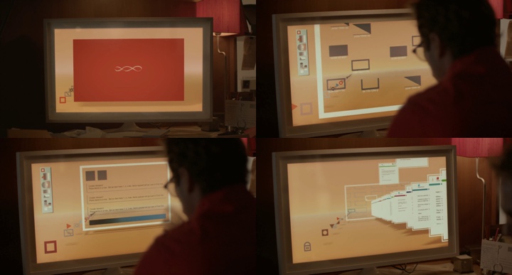
I couldn’t use Photoshop to begin with, so I started making models. I painted wooden models and photographed real things like boxes. I would stack things up and draw on clear acetate, making dioramas [laughs]. I would take my ideas and bring them to life. For the interfaces, it would be paintings that would function. They would be rooted in decorative abstractions that we don’t quite understand, just out of reach. And that failed [laughs]. It was too off.
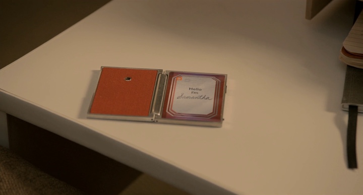
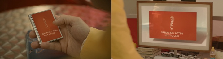
A lot of the functional aspects went to be very traditional – windows, icons and other elements. I started with the logo for the OS. That came out of making paper sculptures. One of them was a triple helix, and from it I created many iterations which ended up resolving in the original triple form. It represents the continuousness and the bottomlessness of AI. There’s you, there’s AI and there’s the universe. It’s three things happening, and a higher consciousness mixing in with your mundane consciousness.
It was a difficult project. Once I had this one thing designed, I thought that it started to look like something. I’m someone who makes things. I want to paint things, draw things, make things. And when I started with the AI project, I was feeling that I wasn’t making anything until I made that helix.
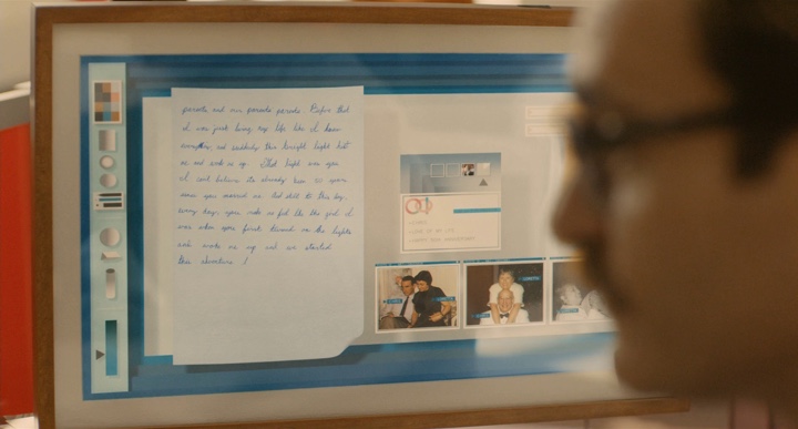
From there I created the strategy of a tactile world. It’s a picture in a frame. When you view a picture in the center of a frame, for me it was a Rothko turned on its side. It is often three window shapes, glowing and blending, and you don’t know where one ends and the other starts. But they have the feeling of beauty and epicness. I wanted to aim for that – Rothko on the side and Rothko in a frame.
When you look at a Rothko, you don’t think of a frame, and I don’t even know if they come in frames. But let’s say you put it in a frame. You wouldn’t even think of the frame itself. That is the window, the controls, the functionality of the OS. And the middle is the AI. You can reach out and touch the frame. You can pull the functionality out of the frame. But you don’t see it. I had the logo, and the idea of a Rothko in the middle and the frame on the sides.
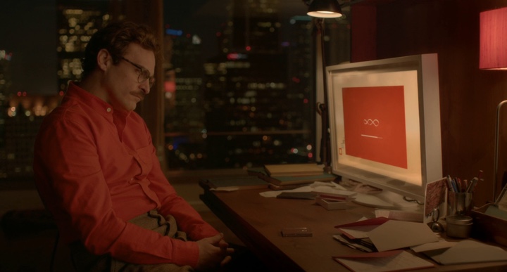
Kirill: I loved how powerful the technology shown in the movie is, not only back in 2013 but also today in 2017. And yet the interfaces do not call any attention to themselves. The initial setup is unremarkable in its visual form. The elevator interface is almost invisible. There are no 3D holograms like JARVIS in Iron Man that is very in-your-face intelligent assistant. I loved that the technology in “Her” is hidden and the design is invisible.
Geoff: I feel that the best design will encourage you to get out of it. You see people in the street, with their phones in front of them and their heads bend down. They are basically fully isolated. And the things that you are describing are there because that future is nice. Is it nice to have a hovering entity covered in type and numerals floating in the elevator? Probably that’s not nice. So “Her” has nice things that are unobtrusive. They are familiar but feel futuristic.
The OS in “Her” has unseen powers. It’s like a sleeper in a car culture. It looks like a normal car, but underneath it has a giant engine of a dragster. That is the belief in the world that Spike created – the technology is tremendously powerful, but what you see is nice and familiar enough for the viewer that they don’t question what it is.
When I was saying that what I started with was too arty, it was distracting as technology. It became more about color and form to make things feel warm. We thought about all the things we didn’t want it to be. There was no interface out there I thought would apply to this film.
Kirill: The interfaces seemed quite tailored not only to each character, but also to the specific context they were in. Theodore has his work screen and his home screen, and Amy has her home / work screen that looks nothing like his setups. It felt like the power of that technology is not only in what it is capable of, but also in how it adapts its visuals to the context.
Geoff: Absolutely. When you see the interfaces, they are connected to that environment. Amy is holding a cup of coffee, and it’s very easy to move in and out of work. She doesn’t go into a high-tech cave to edit her work. You feel like she would edit in a very fluid way on a small device in her living room, as a comfortable and seamless activity.
You see it in the wardrobe and the casting that Spike went with. These people have nice lives. They are not harried or stressed out. Everybody seems happy and healthy. Of course there are these dark personal things that are happening, but nobody seems overworked. So none of the interfaces or the interiors should feel like that. It should all be projecting a nice future.
And then obviously, the use of AI would take so much time off of your screen time. It would be so personalized that it would remove all the junk activity out of your daily routine. It would be a very tailored world.
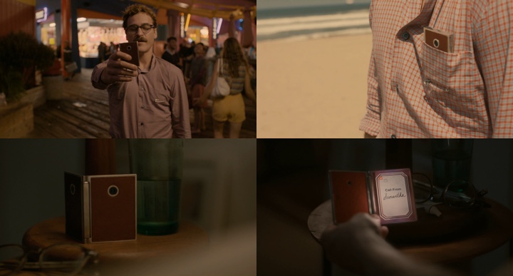
Kirill: You mentioned that we are all glued to our screens now, but that also seems to be happening in the movie as well, at least from a few glimpses at what is happening around Theodore when he’s outside. Everyone seems to be interacting with their own versions of Samantha all the time. That technology might not be visible, but its dark side is that it is fully consuming the attention of that person. Theodore starts down that path, and then Amy starts down that path, and at the end they look completely lost without that voice in their ears. That AI insinuated itself into their lives without being too manifest about it.
Geoff: I’m thinking that he’s not on his phone. He’s talking to Scarlett Johansson. It’s a person. So my view of it is that it’s real. That was my view on it when I was working on the film. He’s getting away from being on the Internet. He’s talking to his AI, even though obviously he’s going deeper in a more insidious way and disappearing into this mediated world.
People are indeed on their phones in the background. It’s all voice controlled, and it has to be for the film to function. It’s also believable that you would be talking to your device to make things happen. It took a huge weight off of interface design for me.
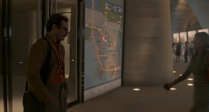
Kirill: You mentioned that this was the first time that your film work was that visible. I’m looking at the transit map you did, which was there for a few seconds in the background, as almost a decoration behind Theodore as he’s walking outside. He doesn’t look at it or interact with it in any way. How does it feel to put a lot of thinking into something and then see it become so invisible in the final cut?
Geoff: I definitely have a number of takes on this. Working on film and animation has taught me the lesson of the value of frames. You might spend a lot of time on something, and you can’t even measure it in seconds. But it registers.
As I’m working on things and putting time into making different variations, I’m aware that it’s going to be a tiny percentage of the frame – in pixels and in time. But it’s my chance to put something into the frame that helps everything. By it being the right thing, it’s going to help that scene. It’s going to help the narrative and how the actors perceive the entire thing. Even though you know that it’s this little thing, you also know what it is like when it’s not the right thing that throws the whole scene off.
I do very few projects, and my studio is just me and my assistant. Spike is super-inspiring to work with, and it’s a unique experience. I don’t do any other projects like what I do with him. Film is not my industry, and I approach it differently. For me, it’s very much the experience of doing it. I’m not going to do set design or art direction for film. So that does help to take the sting out when your thing gets cut.
That subway map is exactly the example where I knew that it was going to be in the background. It was very important for me because it’s Los Angeles. I made it from memory. I drew Los Angeles and I made my dream map for the subway. You could go to the airport, you could go surfing, you could go dirt-biking, you could go up into the Angeles Forest. It’s all the places that I loved that any Angelino would agree with. And it wasn’t a joke. I wanted to hide my personal intention and my personal love for Los Angeles. I wanted to believe in the positive future, and by projecting it in the film to put something out in the cosmos. I wanted to make that map real, based on my belief in what Los Angeles could be. With everything that comes out of my studio I try to not be cynical.
Kirill: I think that as long as the world in the specific story is consistent internally, as a viewer I am ready to accept it. So if you do your job right, I should not notice any particular part of that world as its own thing to be analyzed and critiqued.
Geoff: For sure. Design for film is so much about not getting it wrong. As long as you don’t notice it, you can go by. You don’t need to build a whole building. Just make the front look really real. You’re watching a high-budget blockbuster and you just know that they are holding a piece of foam core. And design is the same way – do no harm.
That’s the power of film. You can only register the feel of it. “Her” is like a horror movie, but it doesn’t work if it looks like a horror movie. It has to look utopian for the true horror of it to seep in.
Kirill: Without over-analyzing it too much, “Her” predicted some parts of the visual trends five years later in 2018 – with hand-drawn illustrations and warm color palettes specifically. For this particular project and for other projects in general, do you worry about how it is going to be seen in 10-20 years and how it is going to age down the line?
Geoff: That’s what is so great about it. All you want is an opportunity to be right or wrong about something, and to be critiqued. I love to make work that is visible. This is my first time with Spike’s movies where I made something that is really in the film.
I remember sitting in my studio and thinking “Oh, the movie is out” and then I had the feeling that people are going to be criticizing it. That must be the feeling of a real filmmaker when you make something that goes out so broadly. It was terrifying but also great. And nobody did [laughs]. I got very little response to it. It took years until there was any sort of response. I was surprised when it just came out.
But I’m definitely interested about how it ages and how people respond. I’ve since talked with people at Google, Apple and that world about it. I hear that the design of “Her” resonated in Silicon Valley. It is something that people are aware of. But it didn’t happen right at the time.
I would love the idea of it being criticized in the future, and become something of the time – in a good way. When I was working on it, I didn’t know much of that world. People ask me if I read particular books, and I could have done my homework. But I chose the route of creating it from the void, with the hope of being a new voice in a really specific world. It wasn’t possible to get up to speed to what was going on in contemporary world of AI and interface design.

Kirill: I think the longevity of “Her”, at least so far, lies in its prediction of where our general interaction with technology is heading, and how it is affecting our daily lives. If you look at technology in your life, do you see it as a positive force, a negative force, as a force you need to take in moderation?
Geoff: It’s a negative and a positive force that needs to be taken in moderation [laughs]. People take about the time of Timothy Leary and the acid test. It was different then. I don’t know if it was more strong or less strong, but I feel like we’re getting a really strong acid.
Before we were aware of the power of the constant always-on device culture. There’s a chance that we are getting a really heavy dose that we will look back on and think “Oh my God, how did we survive those times?”
For me personally, I find myself dialing way back on my screen time, and that applies to my kids as well. As humans, we do need time to adjust. We are in an adjustment period. Designers and technologists need to step up and do good work moving forward. Not all device makers and designers are good at their job. If business people and corporations are left to decide on how this future is, they are not best suited to do it.
As technology moves and becomes more decentralized, as we become more fluent and as things evolve, ideally we get a more tailored nuanced version of technology. I hope we will look back at these times and see the craziness of this Wild West. I hope that we will get something that is much more humane, at a more reasonable dose. I hope that we would not just adapt to this dystopic present.
Kirill: I look at my kids and myself, and sometimes it’s so hard to detach from those screens. Just another minute, just another pineapple to earn in this game, just another Instagram or Facebook post to like. It’s like a drug sometimes and not in a good way. It’s so addicting and so empty at the same time.
Geoff: I’ve had Instagram since it started, and it was a massive change in my studio. People now know what I do, and I can tell people what I do every day. I never had that before. I never had a website that worked, and I never shared this personal stuff. I don’t announce my shows. But on Instagram I can do it. It’s visual and easy.
But at the same time, I post something and then I don’t look at it. I only look at Instagram once a day, or I don’t look at it even longer. I check it for messages and activity when people reach out to me, but I basically don’t check in on my friends the way I used to. So the situation is that I have a huge positive from it, but it doesn’t feel good when I spend time on it.
I could see how it started affecting my relationships with people. If I can check in on them on Instagram, why do I need to see them? And it can affect staying in touch with people in other ways. All the repercussions are there. And it becomes really interesting for people who are not going to get the same career benefits from Instagram the way I do. What will happen? Will they fade off? Will they back away?
Kirill: With all these screens in our lives, there’s certainly a great good in it. It’s so much easier to find information, share things and connect. But if you don’t do it in moderation, you lose yourself to things that don’t push your brain in the right direction.
Geoff: Absolutely. They move you away. It does push you towards some other state. You get lost in it. You get that rush, like you say. It is like a drug, but then what are you doing? I don’t do drugs.
As much as we talk about our usage of devices, it’s always about time that we spend on them. But there needs to be some other quantifiable way of talking about it. I spent this much time in the vegetative zone today [laughs]. It’s not even about time. Let’s be real. What’s really going on with this total detachment from the real world? That will be something interesting to talk about.

And here I’d like to thank Geoff McFetridge for taking the time out of his busy schedule to talk with me about his work on “Her”. You can find more of Geoff’s work on his Tumblr and Instagram pages, as well as in his art shop. And if you’re interested to read additional interviews about the wonderful world of screen graphics and user interfaces for film and TV, click here for more.
