The art and craft of screen graphics – interview with Toby Grime
Continuing the ongoing series of interviews on fantasy user interfaces, it’s my pleasure to welcome Toby Grime. In this interview he talks about the experimenting with writing musical composition interfaces inspired by analogue synthesizers, the evolution of software tools at his disposal in the last twenty years, the overabundance of screen graphics in contemporary movies, balancing the realism of our everyday interactions with technology with demands for novelty and screen time scarcity, and the prime directive of supporting the main story line.
As we discuss these and more, Toby dives deeper into the details of his screen graphics work for feature films, from the surgically stark black-on-white lines of the virtual control room in “The Matrix Reloaded”, to lo-fi 8-bit video game aesthetic of screens in “The Lego Batman”, to his most recent work on the holographic table interfaces in “Alien: Covenant”. At the end, we come back to the world of technology in our daily lives, taking a look at the screens all around us and talking about teaching the kids to understand the concept of consumption and producing.
Screen graphics of “Alien: Covenant” (2017)
Kirill: Please tell us about yourself and what brought you into this field.
Toby: My name is Toby Grime and I’m an art director and designer at Animal Logic which is a film animation studio in Sydney, Australia.
Screen graphics, amongst other undertakings is one component of what I do at Animal Logic. I also get stuck into short form directing, visual effects and feature development there. Outside of work I love tinkering with experimental sound design, keeping my interests broad.
My interest in interface design possibly started subconsciously whilst engaging with analogue synthesizers in early ’90s. I shared a sound studio with a close friend Brendan Palmer which was kitted out with Korg modular synthesizers, Roland drum machines and many other fun pieces of hardware for creating electronic music. They are littered with dials, sliders, switches and graphic markings. Each synthesizer has its own uniquely designed interface and hardware ergonomics used to interface with the machine.

Photo by Nick Wishart
Some of the interfaces were better engineered than others. Some were more fun to use. Some just looked cool but were an ergonomic nightmare and so forth. I believe that’s what triggered my interest in interfaces and how humans work with machines. It’s the idea of interfacing with machines that was of interest to me.
I was interested in that through my years at art school where I got my bachelor’s degree in photography and sound, but it wasn’t until eight years later that I started to work in UI and UX. That was the start of the ‘.com’ web boom when websites became more popular and the world was going online. I didn’t have a formal design education, but I wanted to explore this field more, so I launched myself into very early set top box TV UI design and online web design and UX.
At the same time, around 1999, I started creating experimental musical composition interfaces. I drew on my experiences with hardware analog synthesizers, and started creating my own musical software. I didn’t like the commercial software I was using, and wanted to create my own. I used Macromedia Director to create visually based sound art applications that would be used with the interface projected as I use it. I liked making very minimalist, stripped down UI that was graphically based and used that as an interface to change sounds. It was the opposite to the complexity I was finding using commercial software.
That was the pathway of how I got into the field of UI, and it’s been a component of my career working in VFX and film since.
The actual sound remixer that I did for my master’s university project was pivotal. It had a clean minimalist design. I’d thought hard how different visual language would create different outcomes in the way the sounds were mixed. The interface is the gateway between humans and machines to produce an outcome – that’s the heart of UI whether it’s real or imagined in the world of movie making where we bend the rules!

’70s & ’80s analogue audio hardware from Toby’s studio
Kirill: If you look back twenty years ago, and at the software and hardware at your disposal, are things easier now? Or perhaps you still find yourself fighting with your tools to express a certain thing and accomplish a certain task?
Toby: The tools have progressed immensely over the last twenty years. There is more sophistication in software to let you (mostly!) achieve whatever outcome one designs. Even though you can achieve a higher level of sophistication these days, the same rules of time and budget reign king when working on any film project. Technology and tastes change, time and money doesn’t.
I was thinking back to 2003 whilst working with the production designer, Grant Freckelton when I worked on my first film UI for a sequence called ‘Virtual Control Room’ in “The Matrix Reloaded”, and we didn’t have tools like Houdini or Nuke etc.. After designing elements in Illustrator, we did it all as 2D animation in AfterEffects using camera data from the tracking department to align the graphics in 3D space. I believe it was just the early days of people using camera data in After Effects. It was very minimal, just black graphics in a white virtual endless white room – at least we didn’t have to worry about look up tables and colour spaces!
There’s so much 3D integrated into UI design now. Since that first Matrix piece, UI has jumped leaps and bounds in sophistication and detail.
If you look back at the ’70s and ’80s, most UI was very basic, and that in itself has immense charm. When you have limited resources, you have to be on point with the user interface in the context of your storytelling.
I enjoy watching the original “Blade Runner” and “Alien”, and also who could forget “2001: A Space Odyssey”? All the UI graphics were minimalistic and very specific to the story points, and that’s something that is lost in some of today’s UIs I feel. I see lots of complex, beautifully detailed UI that somehow doesn’t feel it supports the story point – ha ha I maybe am guilty of that sometimes too! Us UI designers sometimes love to just over design, cause sometimes it’s fun.
There is more than enough of an expanded and incredible toolset at designers’ disposal today to pretty much do whatever UI that one dreams of. This was not the case 20 years ago.
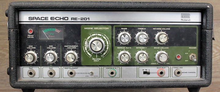
’70s & ’80s analogue audio hardware from Toby’s studio
At the end of the day, the UI has to support the script, the story and the emotion of what is happening in that sequence. In a way, I feel a good UI is when you’re not paying attention to it in the context of the film. It’s a graphical extension of the set. It’s a part of the production design. It’s a part of the performance of the actors themselves. It’s part of their hand motion, the eye darts, the facial expressions. I see UI as an extension of all of that. If it breaks those connections, it will take you as an audience out of the shot. You don’t want to be the UI designer who lets the audience break their suspension of belief in the middle of a film.
There are examples of contemporary UIs that are minimalistic and streamlined, of course. I liked the way “Blade Runner 2049” handled some of the UI with a slight nod to the ’80s visual language from the first film. This is why I like to look back at the charm of the old films. I love the UIs from the ’70s and the ’80s. It’s simple and it’s always on point for the message and the storytelling.
Kirill: I find it interesting to think about those older productions, like the original “Blade Runner” or “Alien”. Those were done back in the film days, where doing things in post-production was perhaps more difficult than it is now, and screen hardware for on-set use was not as cheap and ubiquitous as it is nowadays. So they had to be more thoughtful about the interfaces, perhaps.
Toby: Exactly what you said. They pretty much had to capture everything on set in camera. Of course some shots would be cut away with second unit etc, but anything with actors interacting with UI would have required loads of preplanning. Obviously there’s a pre-production phase where they had to have everything approved by the director, rehearsed, worked out, signed off, timed out etc. That was a very different process from what we do now. You had to have it all nailed down. No fixing it up later. Imagine being the designer making a spelling error back then?
Back in the time of, say, “Blade Runner” (1982) computer graphics were not only limited but an expensive visual effect cost, and the hardware to play TV screen UI back on set was limited as well (as well as being bulky CRT screens). I can imagine some of these UI graphics had to be cued and rolled on tape, and you had to rehearse them with the actors and the camera performance. It would have been really hard to achieve that live on set. I imagine it was more of a theatrical performance, puppeteering the graphics with limited technology. Would have been similar to trying to eat noodles with your toes.
Now we keep on fiddling and making changes right until the very last minute, and directors have more flexibility with contemporary technology… and us designers can’t stop tinkering and cramming more detail in! I admire what people achieved back in the day when it was all in camera. Of course, lots of UI is still done in pre and shot in camera, but the whole added dimension of CRT TV screens and low tech CGI would have required a whole different mind set.

Musical composition interfaces done in Macromedia Director in 1999/2000 by Toby Grime
Kirill: Does it feel to you that more productions use screen graphics these days than it was 15-20 years ago, and that there are more people working in the field now? Is that connected to having so many screens in our daily lives?
Toby: It does seem that way. There’s certainly plenty more sci-fi and and films/TV that warrant the use of screen graphics as part of their standard story telling toolkit nowadays. I guess as viewers, we always like a UI that explores the way things might be soon. There is also a lot more UI in our everyday lives, from phones to tablets to TVs. So we’re going to see more of it in current films and TV shows. Myself as an audience member I prefer UI to have a purpose and not overtake the storytelling. Quite often in films UI sequences are generally in the set up of certain sequences or earlier on in the film’s story arc.
It’s easier to create UI graphics these days. You might not need as large a team that you might have needed 10-15 years ago. One designer who is fluent in Cinema4D, Houdini, After Effects, Nuke etc can create quite a lot of content on their own.
Having said that, I see a lot of UI looking the same. There seems to be an accepted language to UI at times, an accepted colour palette. But I always like things that buck the trend and break out of what the audience might expect, hopefully without alienating or distracting too much.
There’s that craze of transparent screens with UI which has been going for decades. It’s funny as you can imagine using your computer at home with a transparent screen. That would be so wrong and illogical, but in film world it’s what happens often so you have clear reads of actors’ faces and fewer objects blocking the openings of a shot. I’ve been there!
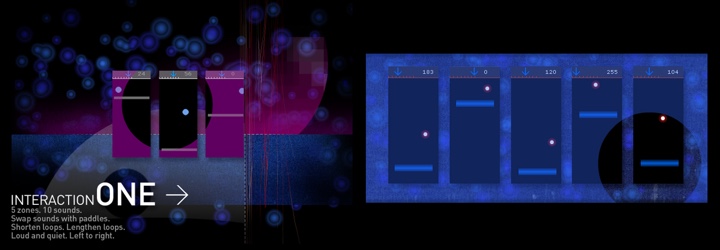
Musical composition interfaces done in Macromedia Director in 1999/2000 by Toby Grime
Kirill: It would be a bit weird to watch a contemporary movie set in present or near future without any screens in it. I think it would feel very outdated for the modern audiences.
Toby: Yes, we as audiences expect to see UI screens in stories set in the present or near future. As you say, it might be odd if they were absent – but maybe that’s clever? There would be many ways to suggest a sense of ‘modern’ or ‘future’ simply through production design, wardrobe etc.
Whenever I get involved in a UI project with futuristic premise, we always debate what the future is going to look like. Are we really going to have floating holograms that we’re interacting with? It looks great in a film as a design exercise, but my mind’s eye imagines that in the future we’ll be pulling technology away from our environment. There’ll be less of the apparent, literal in-your-face technology. I imagine future technology to be very intelligent (did I say AI?!) and streamlined, so you see less of it. Instead of throwing up masses of big data up at the user, the computer would have done the grunt work.
From the context of the audience today, we still need to show an advancement of what UI and technology is now – should the show be future based, so that they understand what that is as a storytelling device. In my mind’s eye, I’d love to see a futuristic film where there’s almost no UI. Things are so advanced that any sense of technology is downplayed in a way.
Kirill: “Her” was a great example of that. The only UI there is the initial setup, and then it’s just the phone in his pocket and her voice in his ear.
Toby: Exactly, great example. That was a fantastic take on it by director Spike Jonze – and I think it was also a very realistic one. It wasn’t based on some whiz-bang technology. It’s all based on the relationship with the AI – by showing the depth of that relationship, you don’t need show the technology itself. It’s a beautiful film.
It’s all about the emotions of the computer and the human connection. It’s a great film and a really good example of a future UI, as opposed to sci-fi blockbusters with control rooms full of crazy UI screens where you don’t know where to look. You can imagine the control deck of a spaceship in 300 years – you wouldn’t have an overload of information coming at you. You’d have something more streamlined. Maybe just a stop and go button!

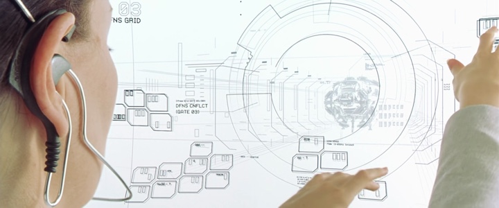
Screen graphics of “The Matrix Reloaded” (2003)
Kirill: You mentioned that a lot of film UI looks similar these days, and it’s mostly dark background with blue / teal / green text and diagrams. This brings me back to the control room UI that you did for “The Matrix Reloaded” which was set in a stark white room and the interface itself done in black instead. It was also so much different from the rest of the movie, where the surviving humans escape the machines and live underground in a world where everything is falling apart piece by piece. What was the process of coming up with that look?
Toby: The initial brief came from the amazing Wachowskis who directed the trilogy. Their idea was to have a white UI room with graphics floating in it. Working with the super versatile production designer Grant Freckelton at Animal Logic who had set a bit of a look, we pushed the design with myself busy in Illustrator creating content, design feel and animations in After Effects. The actors are dressed in white clothes, and they sit in white chairs, and the design had to work in that environment. Black on white, you can’t beat that for contrast and legibility!
Pretty much every UI you see these days has bright colourful elements on a dark background or in a dark space. The Reloaded graphics weren’t about dozens of colours or crazed complexity. It came down to bold black graphics in a white room – and it felt futuristic in very clinical way. It felt the right way to go – a less is more approach and it contrasted well to the grit and dirt of the Zion.
Kirill: What kind of a setup did you have back then to work on these graphics and collaborate with the rest of the production?
Toby: It was back in 2002. We had shots that were coming in keyed and tracked. It was one of the first projects that I worked on with AfterEffects that had camera data. That way you could use the 3D information from the set and use it to lock graphics in 3D space, all on your desktop computer. We used Maya to bring that data into AfterEffects and give it movement, and then rendered out passes back to compositing. That was before Nuke, and we might have been using Shake or Fusion back then. It was the early days of digital compositing, visual effects had a mystery and science to it then.
I think that the “The Matrix Reloaded” UI sequence still has a fairly fresh look. It’s very hard for UI to keep its freshness (just cast your mind back to your favourite 90s films!), but I believe that sequence has retained a sense of design clarity. It’s a good lesson that less is more.
Screen graphics of “The Matrix Reloaded” (2003)
Kirill: Why are we not seeing more explorations like that? I’m not talking about making an exact copy, but there’s just too much stuff that looks almost identical from one production to another.
Toby: There are films that have minimalistic and almost monochromatic UI color schemes in their design. I wouldn’t say that if somebody did a black interface in a white room, it would be a copy. It’s a fairly generic futuristic concept, almost 70s in a way. Maybe directors strive for more color and detail. Maybe they feel if there’s no colour, it feels cheap? I’m trying to think about other white-room UI sequences – and I can’t think of anything else… I am sure there are some. Anyone?
Kirill: An interesting part of that was also that it wasn’t a physical environment they were in. So they’re sitting somewhere in a grungy room, and we get a look at the virtual environment they are in, where they are focusing on the task at hand and not getting distracted by anything else that is around them. The whole environment around them is an interface.
Toby: You’re in the UI. It’s almost like they are in VR land… the sequence was always dubbed the Virtual Control room. Ironically, I think if I operated UI in that room, I’d get really sore arms and hands trying to touch objects in space which is not grounded to a keyboard or desk!
I’m thinking about the physicality and the ergonomics of working in that space. It almost doesn’t make sense. You’re holding your arms up and operating these pixels that move around. The pixels that you touch would need to have force feedback so that when you touch it, you get some resistance.

Screen graphic flats of “The Matrix Reloaded” (2003)
Kirill: What was your next screen graphics production after that?
Toby: After “The Matrix Reloaded” I did “Stealth” which was directed by Rob Cohen who also created the first “The Fast and the Furious”. Stealth was shot at Fox Studios in Sydney – in fact just 20 metres away from our office, and it was a big tech military A.I. plane film starring Jamie Foxx and Jessica Biel.
I was involved art directing the screen graphics team tasked with making all the in-camera / on-set screen graphics. We produced all the cockpit screens in camera on set, as well as the screens for the control room. It was a totally different experience to Reloaded. We created UI graphics for the on set playback crew who live triggered our UI animations to script and actors performances. We were running down the set with the hard drives and doing a little bit of rehearsing with some of the actors. We talked them through the different scenes, showing what would come up when they deliver their line which really helped their expectations of how to react and where to look etc.

Screen graphics of “Stealth” (2005)
It was quite fun. It’s very different to post-production process of creating UI. You’re dealing with the playback crew who are responsible for cutting up your graphics and timing that to the actors’ performance on set. You need to have the UI on point with the story for the director – actors need to know what is going to come up. If they are moving their fingers, or do something with the mouse or the keyboard, the graphics have to make sense. And when the camera starts rolling a heap of money is spent every second… so if the graphics aren’t working or on point… watch out… !
Pre-production in camera UI is a different work ethic to doing it in post. You only get one shot (usually). It’s filmed and it’s done. And that’s great. Once it’s done, you can relax. If there needs to be a screen replacement done later in post, its usually considered very carefully as it’s a costly exercise and usually an additional cost that production don’t wish to take on.
Screen graphics of “Halo” TV commercial
Kirill: There’s so much UI around us in the last decade or so. When you talk about your work with people outside your field, do you think some are surprised to hear that user interfaces they see in film and TV need to be explicitly designed and not just taken, so to speak, from a bunch of existing generic pieces floating around on our daily screens?
Toby: Many people who see film UI refer to it as ‘Oh, you make that techno screen data and junk flashing on the screen that doesn’t make sense!’… Pretty much every project that I have worked on had its own design aesthetic that you’re working towards with the production designer or the director. It has to have a certain look, first and foremost. You pretty much need to design fresh for each project.
The bottom line for me in any form of filmed entertainment is the thought and design needs to go above and beyond what is in our daily lives, you need to present a vision that excites people.
However – there are preset libraries I have seen available to UI designers who just need to chuck any old generic graphic in, but that’s just cheating and creates a cheap aesthetic, much in the way an advertising agency may use generic library music for a commercial cheaply. I can understand productions doing that due to budget and time and aesthetic restrictions, but it’s not something one would see on a film… maybe it’s time to get the AI-UI design bots coded…
One huge aspect of why all UI isn’t just generic is… SCRIPT! You have to make it work for the storytelling. One thing I always try to align any design work I do is it must MEAN something with regards to story point. Everything should work to elevate the story to a higher level.
I said before that I like UIs that don’t distract you when you’re watching a film. What I meant is that it needs to make sense for that shot or sequence. Don’t confuse the audience. That is why a lot of the time we do put in something which could be seen as a bit obvious for the storytelling, and I think it’s OK sometimes. You can do the fun design stuff, but you can’t let it cloud the storytelling.
Kirill: Do you think that at a certain point it starts sacrificing the believability of the interface? You make it so obvious with those gigantic flashing red “Access Denied” banners where no “sane” real-life UI would do that on our everyday screens.
Toby: I feel audiences could feel ‘short changed’ when watching a UI sequence in a film as they witness all this lovely high detail UI, only for it to come to a bold full stop with ACCESS DENIED in red flashing up over the UI on queue with the story point. At the end of the day, most UI story points in film and TV are just investigative moments in story, a confirmation of a premise and so forth, then the story moves on. More often than not the UI moment is a trigger for the next beat or step in the story sequence.
I think there’s a bit more of that in TV because of the pace of it. They need to use the obvious, but clear visual storytelling devices. In film it is possibly a bit more restrained and art-directed, because there’s more time to work on it.
Obviously, our world today is full of UI. When I see a film or a TV show set in today’s world, I prefer to see UI as I would see it in the real world. When you set your story in today’s world but use futuristic UI, that breaks the audience out of the believability of what they’re watching. It pushes it too far, because you start questioning it. People might have access to different UI in different organizations, but there’s a boundary to today’s technology.
We’re always bound by what’s available and real today. Any UI that is created for a story that is set in today’s world needs to heed those boundaries. That’s just the way it is. You need to keep the audiences believing in it when they watch it.
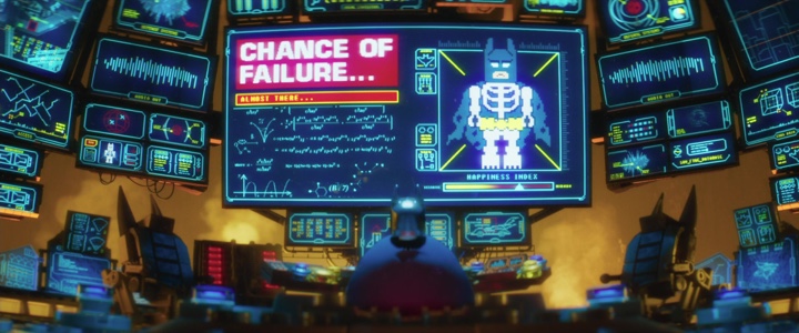
Screen graphics of “The Lego Batman” (2017)
Kirill: You’ve worked on three Lego animated movies so far. How different is it to work on designing screens where you don’t need to be constrained by the physicality of the environment?
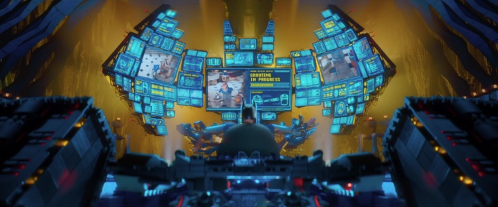
Toby: Those films are entirely out of CGI Lego bricks. Currently we have made three of those at Animal Logic, and I had a bit of fun with the Batman one where I did the Batcave UI. As it’s a fully animated film, there’s a bit more flexibility.
In every Batman film through history there’s always the Batcave filled with… screens! It’s Bruce Wayne’s man shed, his secret nerd out cave. For me it was a chance to have a bit of fun with it. I worked with the Lego Batman Movie production designer Grant Freckelton, and the whole idea of the movie was to make fun of Batman itself. To be irreverent, to poke fun at the history of Batman and so forth. So the actual Batcave screen was a complete overload of information, often much of it useless and super silly.
It was making fun of UI, and making fun of the Batman. It was a very different stylistic approach compared to, say, “Alien: Covenant” or “The Matrix Reloaded“.
Everything was designed to look like a lo-fi 8-bit video game. That was the aesthetic throughout the Batcave. Also the idea was that the Batcave computer wasn’t very powerful, like an early Commodore 64 8 bit PC was driving the entire Batcave UI. He didn’t quite have the latest tech, and it didn’t work very well.

Screen graphics of “The Lego Batman” (2017)
Kirill: Was your design approach any different because it was an animated movie?
Toby: It was different because it usually starts when you work with actors and shot plates, but here it’s fully animated. The initial reference I get is the storyboard which is really different to working off shot plates with live action. Same, but very different. It also evolves in a much more flexible manner as the edit and sequence is constantly evolving even after storyboards and through the layout process in animation.
The graphics are there to support for the story, and that’s the same on every film that I’ve worked on. I start with the script and make sure that the graphics make sense for the story points that are expressed in those shots.
Kirill: Do you think that some people have certain prejudices against animated movies as an art form?
Toby: A lot of people still regard animated films as big cartoons for kids and not ‘real’ films. Films often get aligned as an art form due to the ‘artistry’ or the craft of the camera, the acting, the costume design and so forth. Animated films often get overlooked in their artistry as they may be perceived merely as ‘cartoons’ no matter how inventive or creative they are. That seems odd as there is SO much artistry that goes into every animated film. It’s hard to ever discount it as an art form.
Look at any Hayao Miyazaki films, or early Disney like “Fantasia ” etc. It’s pure art. Look at contemporaries like “Fantastic Mr Fox” etc – it’s pure art in motion. On another level, the first “Lego Movie” was never considered for an Oscar, as it was potentially perceived as ‘a toy commercial for kids’, so it had this other layer to fight through for recognition as an art form. It was such an incredibly genius bit of film making on so many levels for kids and adults in its ideas and premise that really made it a true piece of artistic film making. I think if the emotions touch an audience through the medium of film making, it succeeded as an art form no matter what stylistic route the film maker went.
To a degree maybe that is how they are pitched to the younger audience, but plenty of adults thoroughly enjoy animated features. I thoroughly enjoy animated films of all varieties and styles. The Lego Batman film was pitched at children, and there’s a lot of humour which is aimed at adults. And I think adults who have known the Batman properties over the decades enjoyed that film immensely.
If you look at a lot of Hayao Miyazaki films like “Spirited Away” or “My Neighbour Totoro”, those are films that are enjoyed by adults all around the world. I imagine that half the audience of the animated films are adults.
The level of emotion that is engineered into animated films can be truly intense. A recent example for me was the character Bing Bong in “Inside Out”. When he fades away for the greater good and sacrifices himself, it’s overwhelmingly emotional. It’s extremely artful, high powered storytelling. Sure live action contains emotions that are powerful when done well, but I remember watching that Bing Bong moment in “Inside Out” and thinking it was artistry on another level.

Screen graphics of “The Lego Batman” (2017)
Kirill: When you spend weeks and months working on a project, and then you see it in the movie theatre for the first time as the final cut, does it sometimes feel that your work goes by too fast? You said a couple of times that a good UI should not be drawing too much attention to itself, but does it feel that your work sometimes becomes invisible?
Toby: Yes! Sometimes it feels like the shots go fast in the context of a final mix and cut, but usually that’s due to the fact that you are so familiar with every detail of that shot or sequence. You’ve been living with them for weeks, so they’re like flat mates you know too well.
Only you know how long it takes to make that thing that ended up on the screen. It’s always a great feeling to see your work on the big screen. You’re always aware of the edits and the pacing when you’re watching it. When the final mix is done, and the grade and the sound design is there, it may feel a bit quicker.
I think I mentioned this note before about the ‘invisibility of UI work’. I like it when you don’t pay super close attention to it in the context of the final cut. It just needs to feel convincing and to make sense from the story perspective. It mustn’t snap the audience out of the suspension of belief.
But you have to remember that on something like “Alien: Covenant”, I see the holograms and the UI that we designed as an extension of the art department and set. It has to work with the set. It has to work with the actors and their performance. It’s a part of the physical set.
UI design is intricate and labor-intensive. You’re designing every little pixel that appears in that screen. Sometimes those pixels are blurred away in depth of field in composite, and you didn’t know that there would be so much lens blur [sighs and laughs]. You have to be true to the technical constraints of that shot.
It is labor-intensive, but UI is always fun to design. It might be a minor concern from the director’s perspective, but from the designer’s perspective it feels a really big task – purely because of the amount of work that goes into creating the detail.

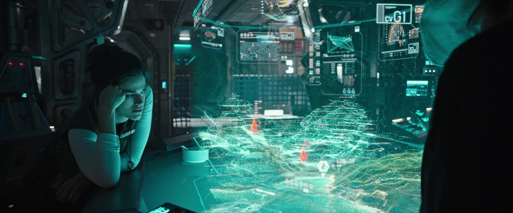
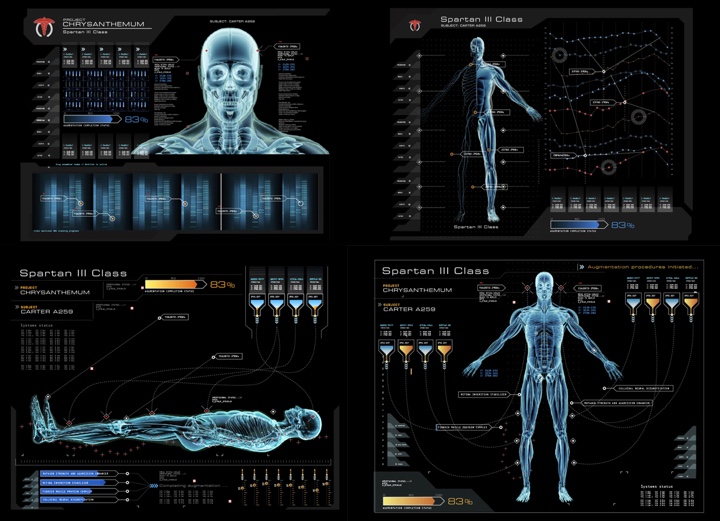
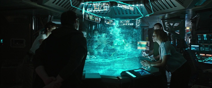
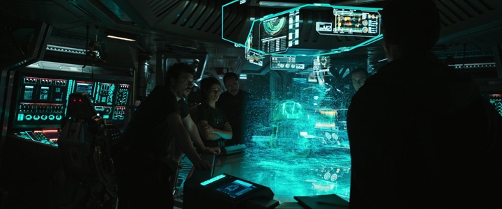
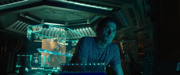
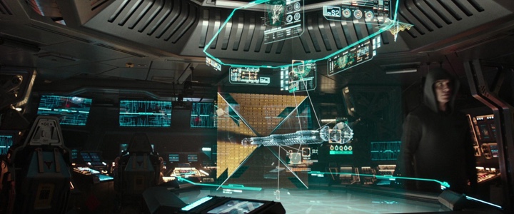
Screen graphics of “Alien: Covenant” (2017)
Kirill: Moving on to talk about “Alien: Covenant”, how did it start for you and how much time did you spend working on it?
Toby: On that movie we worked on the holotable hologram sequence graphics and a few other sequences. We embarked on a couple of weeks of upfront design work with our in-house VFX supervisor Paul Butterworth and designer Anna Fraser whom you have interviewed previously. We were basically bashing out conceptual style frames to cover all the major plot points that the holotables appear in. Prema Weir also helped create loads of great UI animation work. The top line comment from the director was to treat the holotable UI like a fish tank of pixels which led the general mindset of design.
We worked over shot plates, essentially filling in the blank paper with options to present to the director, Scott. It was locked down fairly quickly overall as he knew what he liked and what is the right way forward, and it was great having a visionary at the helm. As far as production timeline, we had FX doing development and testing to create what we presented in look frames and went into detailed UI design, animation and lighting. It was around four months of work overall.
Screen graphics of “Alien: Covenant” (2017)
Kirill: Was there any continuation of the design language from the first “Prometheus” movie?
Toby: Fuel VFX, from where Paul Butterwoth was a founder, did the original holotable work on “Prometheus” (and the amazing Orrery sequences), and some of the look was carried over. Paul and his team did that at Fuel, but the actual UI and graphics in “Alien: Covenant” were a bit different. The nature of the holotable was a common thread across the two films, just very different execution.
The Prometheus was a vastly different spaceship to the Covenant. The former was a more luxuriously designed exploration ship for the owner, Wayland, whilst the Covenant was a colonist ship with a military attachment. We were talking about it, and it was almost like Linux vs Mac OS. These two spaceships have their own operating systems that are designed differently, for different purposes. That’s the approach that we had. And we did think about what they had in the original to not break it for the audience. A lot of people are passionate about these properties, and they know every little detail of every single film.
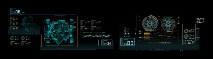
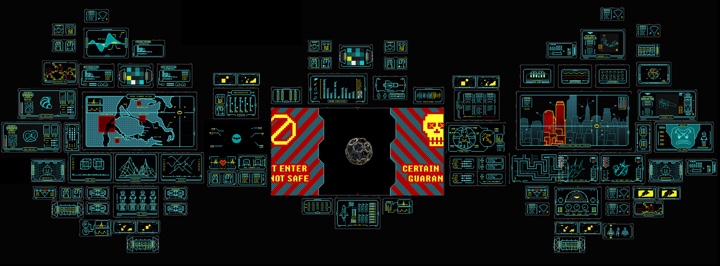
Screen graphic flats of “Alien: Covenant” (2017)
Kirill: The plot is set far enough into the future that perhaps you don’t need to feel constrained by the technology of today. Did that give you a bit more freedom to explore the capabilities of that holotable?
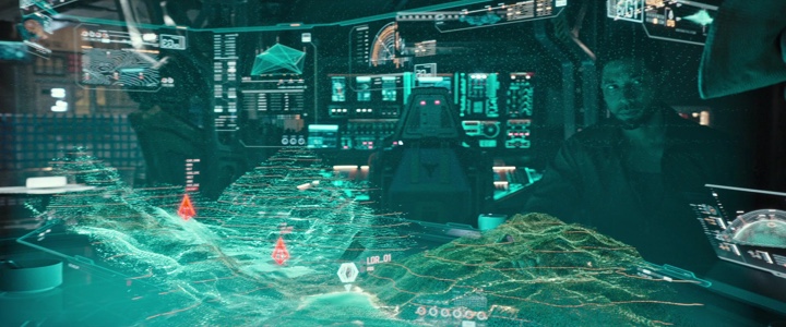
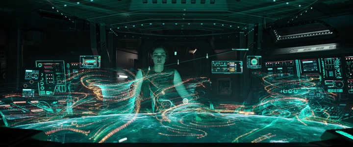
Toby: Yes it did. Soon as you are making dimensional 3D VFX UI away from a flat LCD screen, you are immediately in the world of future fantasy UI. The nature of a table that beams up a fully dimensional holographic environment is still relatively sci-fi, though current tech headsets like the Microsoft Hololens are moving in that direction.
The idea was to keep inline with the flow of the films currently and to make it grounded sci-fi in approach – grounded as in not pure fantasy if that makes sense. The brief from Ridley Scott was to treat it like a holographic fish tank of pixels you stand around, gaze into and interact with. It had boundaries like a fish-tank, and within it you could create visual dimensional data. We created glitchy three-dimensional terrains, distorted messages, weather storm maps and so forth and UI graphics above it that informed what was going on on the terrain, for example which were the more hard ‘real’ graphics to the piece.
Screen graphics of “Alien: Covenant” (2017)
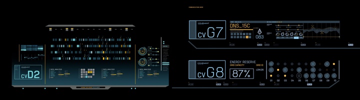
Kirill: What about the screens around it in the main ship and the lander screens?
Toby: All the in-camera screens were done by another VFX animation crew led by Martin Crouch whom I worked previously with on a 2005 film called “Stealth” which I was creating in-camera screen based UI. We had to do screen replacements for some of in-camera UI for very specific story points which meant some in camera screens required updating as the edit evolved. They’ve done as much in camera as possible, but quite often in post production you have to go and pop in a new screen. Again, that is possible now, but not something that would have been attempted 30 years ago due to cost and tech.
Kirill: There are only so many different shades of blue, teal and green that you can use to differentiate yourself from other productions. How does it feel to operate within a rather narrow range of the color spectrum that is probably coming down from the art department?
Toby: Ha! Good point. There’s still 1,000 shades of blue, teal and green left to explore! This is an interesting point. We talk about colours endlessly, and it goes back to my earlier point that a lot of film interfaces look the same. You’re doing a blue hologram or a blue UI with a little warm tone. Yeah, that’s the future. That’s the language. And you do fall into that trap. Happened to be what worked best this time.
We were working off of some of the existing on-set color palettes. We did explore some other palettes to not make it look like the ship on-screen graphics, but ended up moving it more towards the in-camera UI palette.
There are indeed only so many teals, aquas and blues. That’s what I loved about “The Matrix Reloaded” – all black and white. That certainly cuts down any passionate colour loaded arguments in the design room.
Screen graphics of “Alien: Covenant” (2017)
Kirill: I did like the orange highlights on the screens around the holotable, and that color was also used for the terrain markers on the holotable. Orange is usually reserved for system warnings, but here it was used as an accent color. It’s an important thing, but not necessarily an indication of something that is bad.
Toby: Yes, it’s more of an accent or highlight. The final look I think worked quite fell, felt fresh and bright. Colour is so important, it links audiences on an emotional level too. There was a lot of detail in the terrain sequences. We used Houdini to create the glitching 3D terrains and broken messages and the like, and then we did the UI graphics above it. We had to be clear that we’re looking at a landscape and tracking the crew that are down on the land. That story point had to be clear without too much distraction.
There’s another point about screen graphics, which is the actors’ eye-lines. It must be incredibly hard for an actor to go on to a set with this empty table that will at some point have a graphic 30 centimeters above it, moving around dimensionally. They have to act to a graphic that is not there in a 3D space.
Screen graphic flats of “Alien: Covenant” (2017)
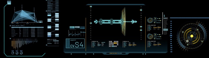
Kirill: The screens around the holotable use a rather restrained visual language, with sparse diagrams and what feels almost like vector graphics. And then the holotable feels so different and so much more powerful. Sometimes it’s a particle cloud, and sometimes it’s a swirling 3D terrain curved model. As a centrepiece of that set, it felt more advanced compared to everything around it.
Toby: Yes. The holotable was always going to be the centrepiece of the set. It’s the place the crew gather to gain visual information in a communal manner. Bit like the campfire we tell stories around, the holotable was the central visual data communication device for the crew as a group. The Covenant is a military ship with a grounded, military aspect to it. That’s what the on-screen graphics were styled to sit within contextually. They are not as fancy as those on the Prometheus, because that ship was funded and built with a one trillion dollar budget as mentioned in that film with amazing tech and a different OS to it, hence the totally different looking OS and screen UI. It was more colourful and the design language was quite different.
The simplicity of the on-screen graphics is grounded in the military aesthetic of the Covenant. The on-set screens have to have a more practical aspect to their look. But the holotable is the centerpiece of the ship’s tech. That’s the approach that we discussed, hence its greater dimensional complexity within the fish tank of the table.
Screen graphics of “Alien: Covenant” (2017)
Kirill: Coming back to the physicality of synthesizer interfaces that drew you into this field, there was a lot of that aboard the Covenant. It’s not all-touchscreen. There’s a lot of physicality, with knobs and dials and levers, to how you interact with the ship.
Toby: Yes exactly. The art department did an amazing job housing all these detailed physical levers and dials all over the Covenant ship controls. Gives it a real grounded reality to how humans interact with machines. That’s part of the way, I think how Ridley Scott wanted to show the difference in the Covenant ship to the Prometheus. We did a set visit to the Covenant flight deck set that was built on the Fox Studios lot in Sydney. It was amazing to actually be on the flight deck of the Covenant. It felt like that thing could actually take off and fly [laughs]… and on a more serious note, it helps the UI team plan for integrating UI into the shots. Really helps having that physical experience of being on the set so you get a sense of scale, tactility, the whole feel of the set.
Screen graphics of “Alien: Covenant” (2017)
Kirill: What about the in-helmet graphics in Tennessee’s spacesuit?
Toby: That was the part of the mysterious message that he receives when preparing the damaged sail. It’s all distorted, almost like the communication is a broken VHS tape. It was part of the same design – the glitching talking face (Dr Shaw) on the holotable that occurs after he is brought back into the ship. Imagine an old VHS tape that has been broken up into pixels in a 3D almost voxel like space.
Kirill: For graphics like these that are either seen on a curved surface or in a 3D space, how do you start thinking about them? Do you doodle on a piece of paper? Do you experiment with some software? How does the beginning of it look like for you?
Toby: It’s a bit of everything. I was working with our VFX supervisor Paul Butterworth and designer Anna Fraser. Basically we start with discussions, research, script reads to fully know the story points and loose sketches, and then move into Photoshop and FX development. It comes down to nailing a few look-frames and style-frames which express that story point of the glitched message, the terrain etc. Then we work in Houdini and VFX to recreate that look and give it motion.
It’s really important to have those look-frames locked down. Once you sign it off with the director and they are happy with how it looks like, you start the process with your VFX team to narrow the look and nail that frame. Sometimes it takes a long time, and sometimes it’s quite quick. It’s always a process of exploration, happy mistakes and discovery, really.
Screen graphic flats of “Alien: Covenant” (2017)
Kirill: You work on a production, then you see the final version of it in the movie theater, and then some time passes. As you look back at your earlier work, what stays with you?
Toby: What stays with me is if it was fun, how successful it was in aiding the story telling process of the director and if it pushed the ways humans and machine interact. Above all, it should aid the entertainment value of the film. Also, like I mentioned earlier, as long as it is a part of the design language of the film, then I feel it’s being successful. It shouldn’t try to grab too much attention as a design piece if that makes sense.
That’s how I see all design work in film. Even though you’ve been working on it for months and months, and you know it intimately – every pixel, you have to forget all that when you watch the film. You have to let the director take over and deliver the story.

Screen graphics of “The Lego Batman” (2017)
Kirill: As you mentioned, the work you did on “The Matrix Reloaded” has stood the test of time so far. In general, do you worry about how your work will be perceived by the next generation when they watch your work in a few decades?
Toby: I do wonder what people in 30 years time watching “Lego Batman” or “Alien: Covenant” in 20-years time would think! Heck, if they actually watch these films in 30 years time, that’s a great thing! But you have to look at it in the same context that I would look at the UI in the “Blade Runner” from the ’80s. I look at it trying to understand what they could achieve at the time, and I am still in awe at what they did.
Maybe people will look at this stuff in 20 or even 30 years time and will think that it’s really complex and over-done [laughs]. Or they might think that it looks cool. We just don’t know how UIs will be designed in the future. All we can rely on now is our future fantasy UI mind set and use that, and trust it. We look forward to the future by looking back. If people who look back at what we do today with the same charm that we look at the things from the ’70s or ’80s, that’s a good thing. It feels that there’s been a big jump over the last 30 years in the UI language.
We’ve almost plateau’d in audience’s expectations of what UI is meant to look like in certain contexts. It’s an expected look, and if you break out of it, people don’t understand what it is. It would be great to work on a UI that pushes those ideas further. I’m not quite sure of what that is.
You mentioned “Her”, and that’s a great way to show technology. You strip it down to the bare essentials. And I like how “Black Mirror” is tackling the ideas of technology and human existence. It’s a clever show.
Screen graphics of “The Lego Batman” (2017)
Kirill: It feels that perhaps it might be risky for a creator to stray too far away from the well-trodden path of traditional sci-fi.
Toby: Yes to a degree. If you really push the ideas visually, I imagine you could throw the audience somewhat unless the premise of the extreme experimental bare was a core idea.
Kirill: If you look at technology in your daily life, is there anything that excites you? There’s so much raw power at our fingertips, but sometimes it feels like I have to fight against so many obstacles to “explain” what it is that I want to express.
Toby: There’s is a mad rush to try and get the next ‘big thing’ going right now. AR, VR, Hololens etc… it’s all on. Feels rather overwhelming, but exciting. I mean we have to keep pushing the ideas, keep exploring. To me the power of technology is creating simplicity. Whenever I interact with technology, I hope that it’s making my life simpler – not more complex. I’d love technology to be simpler. We’re bombarded with so much tech. The thing I love doing the most is going to the beach or camping, and not having any phone or net connection [laughs]. That’s my preferred state – off the grid. It feels quite alarmingly free. When you really go off the grid, as in no internet or phone reception, no electricity, no immediate access to emergency help… there’s this amazing freedom and calmness that presents you. Feels great.
Technology is driven by corporations with vested interest to build a presence and get a dollar out of you. I’m always aware of the idea behind what is this company A or B trying to do with their technology. What do they want from me as a consumer or as a user of this technology? What do I have to gain? Are they adding something to my life, or do they just drain dollars from my wallet? Are they controlling my information connection to the world? Those are questions that we need to ask when we take on technology.
Screen graphic flats of “The Lego Batman” (2017)
Kirill: It’s hard to draw these lines, and things are not always black and white. I look at how my kids interact with their screens, and it’s not clear what is the right approach here because the society in which they will be adults is probably going to be different from the society that is right now.
Toby: A great point. The world our children grow up in will be so different to what we experience right now and what we experienced at their age – and we’re not talking big leaps of time here… technology is in rapid change. I have two school aged children, and even within their generation – I’m seeing a dramatic change and rate of change in the impact of technology. It’s something that we need to be monitoring.
Technology can take hold of them quite easily at that young age, and you need to be aware of the way they consume content. One thing that I’ve always been clear about with my children is the difference between being a consumer and a producer.
You can sit there and watch Youtube, but they need to understand the concept of consumption and producing. One of them loves drawing and wants to make animations, and I suggested that they start posting their stuff on Instagram or Tumblr, build a network of an audience, learn off them, broaden your reach. I’m trying to get them to learn the idea of putting things back into the world and creating a presence based on what you create and not what you consume.
To me that’s a very important distinction. It’s the idea of how to use technology to your advantage and not be a slave to it. It’s a hard thing to teach to young children.
There’s no point in trying to block them away from technology. They’ll go to high school and they’ll have to have laptops. They’ll have to work with it. But they have to be educated in the best way to maximise what it can do for them as a producer and not as a consumer. What I see is that 90% of the population is just the consumers of tech, kind of brainwashed and not using technology to make things, to start things, to reach out.
And then you have the whole concept of UI design to make it easy for kids. We can get them hooked from an early age, like a drug.
Screen graphics of “Alien: Covenant” (2017)
Kirill: I personally would love to be a kid right now, in 2017. It feels so much more interesting than what I had back in the ’80s.
Toby: Ha! But didn’t you get a buzz from jamming away on the Commodore 64? It’s probably as much of a technical high as a kid playing with a Sony VR headset today. The bar is just set differently, not higher or lower, just differently. Same high, different tech. I agree, kids are really spoilt for choice these days.
I compare one of my 12 year old kids to what I had access to. He has a 27 inch iMac with Adobe CC suite, the internet, a scanner, a Wacom, Ableton music software, access to my hardware synthesisers, DSLRs, movie cameras… at same age of 12 I didn’t have a computer at home. I used to hang out at a book shop to play on the computers on display like the Vic 20 and Commodore 64… I also played on the PCs at the computer club at school but couldn’t really get into the whole early code mind set. In some ways, maybe kids are overloaded? One thing that I see is how quick they can learn things today. He jumps onto Youtube, watches some tutorials on editing and away they go with some basic concepts to get them off and running to start editing their own footage. That’s an amazing change in education, the whole self exploration and research. So today there is an overload of choice. The hard part is focus and stamina. The tools to learn are certainly available.
When I was a young child in the ’80s, you didn’t sit there endlessly chatting online in chat forums with your friends. You would hang outside, or go bike riding, or go outside and talk to them. You’d go watch “The Empire Strikes Back” and be in awe after waiting months for it to come out. Now kids binge watch seasons of shows in one weekend then search out their next binge.
Kirill: It feels like technology is moving much faster in the last decade than it used to, and I wonder how their world would look like when they’re my age.
Toby: I totally agree. That’s the big shift that I’ve noticed in the last 10 years as my younger child was exposed to deeper, more sophisticated technology than the older one. It’s been quite short a difference with that age gap in how they approach technology, but I see it even in that small 4 year gap. 4 years, it’s not much.
You can say that technology is bad for kids, but it’s here to stay. We can’t change that. There’s definitely a negative side effect to some kids and their attachment to portable technology. That’s a real issue. But you can’t blame the child. You have to look at the parent [laughs], because that’s who introduced technology into the house. The child doesn’t go up the road and buy a mobile phone or a laptop.

Musical composition interfaces done in Macromedia Director in 1999/2000 by Toby Grime
Kirill: They see us glued to our screens, and they may feel entitled to a screen of their own. And when you say that they can’t have it, how do you explain that you get to have one?
Toby: It’s called parental discipline! Yes, it’s hard. You have to lead by example, but if you yourself stare into screens, it’s an issue. Parents can quickly look like the ‘bad guy’ when they have double standards in the use of technology. Comes down to the education of consumption and producing, and how to use technology. It’s important to educate children.
I was reading this article about a high schooler that put his art on Tumblr and had a publisher reaching out and asking to illustrate a book for $2,000. That’s a great way to see technology working for that child as a business tool. It’s good to wrap your head around it at a young age. There are so many examples of children using Kickstarter to launch concepts, ideas, ventures, self made games and so forth. It’s a powerful thing if used properly. Kids playing FPS games 24/7 probably isn’t the best use of time and tech.
Kirill: It reminds me of the conversation Neo had with Councillor Harmann on “The Matrix Reloaded” about the symbiotic relationship between humans and technology. And today, at least in the developed countries, it’s hard to imagine how to extricate ourselves from our dependence on technology.
Toby: Exactly. We are addicted already. Imagine a situation in which suddenly there is no electricity in the whole of the developed world. BOOM. We’re stuffed. Technology will all break. We’re already completely reliant on technology from the most mundane insignificant aspect of our lives to the most crucial life dependent aspects. Everything would just come to a grinding halt if we cut our tech supply that satisfied our addiction. Technology is a part of our life, and there’s nothing we can do to stop it. Have you tried turning off your net connection for a month?
Obviously, technology throws a heap of positives our way to improve quality of life and enjoyment. So we happily support it with our consumption and the dollars we pile back into it. Advancements in technology have done amazing things for health and education, countless of other facets of life – but technology has also done a lot of harm the planet. Combustion engine?
Technology is already controlling us. We have started something that we can not stop. That’s how I see it. Starts to sound like we are already in the one of those dystopian films we make filled with futuristic UI. Maybe in the future, we become so advanced that we circle back to a very basic self sustaining way of life on the land.
That would be just fine.

Screen graphics of “The Matrix Reloaded” (2003)
And here I’d like to thank Toby Grime for taking the time out of his busy schedule to talk with me about the wonderful world of screen graphics / fantasy user interfaces for feature film, and for sharing the supporting images. I’d also like to thank Tessa Crozier of Animal Logic for helping to make this interview happen. If you’re interested to read additional interviews about the wonderful world of screen graphics and user interfaces for film and TV, click here for more.
