Looking beyond the edge – interview with Khairul “Keko” Ahmed
Continuing the ongoing series of interviews on fantasy user interfaces, it gives me great pleasure to welcome Khairul “Keko” Ahmed whose work spanned, so far, the worlds of video games, feature film and automotive interfaces. In this interview we talk about what goes into creating video game cinematic sequences, how it compares to working on hero and background screens in the feature world, designing with purpose and supporting the main story, creating design systems that span dozens of screens, and the challenges of car dashboard interfaces, from longer development times to making them informative and immersive. Khairul’s work in feature film was part of “Captain America: Civil War” and “Avengers: Age of Ultron”, and as we got through the topics, we dive deeper into his work on “Batman v Superman: Dawn of Justice”.
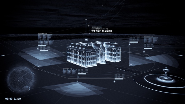
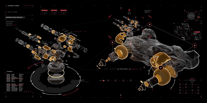
LexOS screen graphics on “Batman v Superman: Dawn of Justice”. Courtesy of Khairul Ahmed.
Kirill: Please tell us about yourself and your path so far.
Khairul (Keko): I am a designer, art director and photographer, gravitationally driven by the need to explore the unknown. I guess that’s what drove me to where I am today!
Believe it or not I was actually on the path of the sciences which I failed completely. Till this day I reflect on that as the best thing that could have happened to me, as this ignited my passion for the things I love doing now.
Within this moment I discovered “Data Flow”, a graphic design book on visualizing informational data, and fascinated by its contents I was lead onto studying traditional Graphic Design at the University of the Arts London. It’s known for its exceptional Graphic Design degree course, and I felt I was at the heart of pursuing my dreams.
 On the path of discovering my passion, it was actually the periodic table sequence from the film Iron Man 2 which hit the mark completely. In a full state of visual brainfreeze I was ultimately taken away by the whole FUI experience. This was the first time I fully felt immersed by the use of visual graphics on that level. I think for me this became the pinnacle of understanding FUI, as my obsession for the graphics itself and the need to know the process led me down the rabbit hole.
I kid you not – I spent uncountable hours revising the footage, tracing elements trying to imitate the designs and even looking up the artists involved to find some way to reach out to them. Pretty psycho right? Though I’d like to think I was simply super passionate! Funny enough, this hunger led me onto emailing Prologue, the studio behind it all.
Simon Clowes one of the Creative Directors at Prologue at the time was kind enough to reply to my fanboy email which resulted in a dream come true moment! a phone call that changed everything. Completely speechless I was asked if I’d be interested in joining the team as a design intern.
Within my first week of being at Prologue I broke all the rules of being an intern. I was on a mission by the end of the day, to learn everything I dreamt of knowing when revising those Iron Man 2 sequence and to ask all the questions I could possibly ask! Frankly, I wasn’t discreet about it either.
Straight off the bat I introduced myself to the creatives involved with the Iron Man 2 sequence, literally telling them I loved what they do. This sudden exchange allowed me to connect to the artists beyond the level of just looking at their work. I must say it was a great pleasure and privilege to have been able to connect to such amazing creatives such as Simon Clowes, Alasdair Wilson, Ilya Abulhanov, Taka Sato, Paul Mitchell, Manija Emran and Danny Yount. Having spoken to them directly, not only was I able to get a deeper insight into their thoughts, processes and ideas, I was actually being taught by some of the best in the industry.
Besides learning from the best in the industry of FUI, it was actually a car ride with Simon Clowes which rooted me as a core designer today! He asked me right then and there “what do you love doing and what would you want?” Till this day I am so grateful for that question, as what happened after made me pursue the next stages of my life very differently.
It’s moments like this that I feel are so important in life, as it takes you a step back and makes you think about how far you’ve come and where you see yourself going, as you can remind yourself of your goals.
So Mr Simon Clowes if you’re reading this – Thank you!
Prologue pretty much grounded my career! I adopted and developed my aesthetic into a distinctive style that combines my love of title designs / typography and cinematography. Using all the knowledge I had gained, I graduated from University of the Arts London with an Honours in Graphic and Media Design. Shortly after joined the design team at Spov via the recommendation of Alasdair Wilson.
I was immediately immersed into the world of creating high level, advanced screen graphics for featured games such as the Call of Duty series. Designing at such an advanced level with a sharp eye for intricate detail, I am proud to say I’ve crashed a few Ae files in my time. Within this time frame I was inspired by the works of GMUNK, Yugen Blake, Ash Thorp and Jayse Hansen. Seeing their exceptional level of work displayed in the film realm reminded me of my passion for working within films. This was a turning point at which I decided it was time I focused on working on a feature film.
With my goal in sight, I literally was on a mission and nothing could stop me. Without any hesitation (crazy to say) I booked a flight out to New York in the search of reaching my goals.
Honestly, I can’t thank the guys at Perception enough for taking that interview. I met with the infamous John Lepore and Danny Gonzalez, who both instantaneously inspired me about the work I wanted to do and was dreaming of once again!
To give a little background, Perception was doing everything I wanted in terms of FUI for films, whilst also applying their knowledge into creating real world UI. This was a very unique and new direction for me, as I was yet to experience that realm. Landing an opportunity with Perception was literally a life changing experience as this was my breaking point.
Having the talents of John Lepore, Russ Gautier and Doug Appleton mentoring me really changed my perspective in the UI world. They basically taught me one of the most important factors behind Ui design which was “ask yourself why each elements needs to be in frame”. As you know this is very important as a lot of UI tends to get dismissed as beautiful background blur. Perception really focused on giving elements importances to their roles. Story first!
Honestly I could tell you endless amounts of stories about how John Lepore would come behind my screen and fire a million questions with regards to the roles and my choices of UI elements. Moments like that have shaped me into clarifying my design choices, plus adding hierarchy in accordance to the level of importance to the narrative. Johnny was teaching me the rules of graphic design once again, re-rooting me back to my backbone. I feel we all need that from time to time to understand why we are making things in the first place.
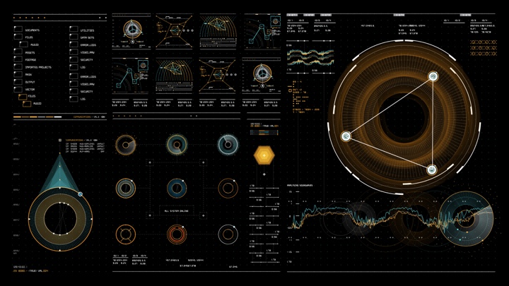
Screen graphics on “Call of Duty”. Courtesy of Khairul Ahmed.
Kirill: Back at Spov when you worked on video games, did you do in-game graphics or the cinematic sequences between stages?
Khairul (Keko): It was a mixture of both, depending on the particular project. For instance, on the Call of Duty series nine times out of ten it would mostly likely be cinematic sequences. They are all carefully scripted with a narrative possibly following a chain of events, needing some level of graphic UI to suggest what lies ahead.
Thus my role would be designing elements for mission briefings, highlighting key objectives, schematics of buildings etc. At times I also took part in the early stages of enhancing the multiplayer experience for the Call of Duty series. This role required me to challenge the realm of current gaming experiences and push the boundaries of elements such as simple HUDs, weapon loadouts, maps and so forth.
It would even go down to creating a style guide that could be implemented into the game itself. This was actually the case for Batman: Arkham Knight. The original piece that is on my site is actually part of a pitch, which then allowed Spov to continue their work on the actual game. What we submitted was in fact a teaser suggesting Bruce Wayne booting up the batcave. Rocksteady Studios fell in love with the visual language and aesthetics so much that they felt each element was tailored to the look and feel of Batman. Thus they went full steam ahead to implementing the same stylistic approach in the game.
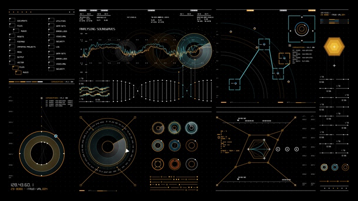
Screen graphics on “Batman Arkham Knight”. Courtesy of Khairul Ahmed.
Kirill: What is the most important aspect of those game cinematics? Does it have to be very precise in terms of how it conveys the information to the person playing the game about what is expected of them in the next stage?
Khairul: It’s always the narrative. Besides that, what is the point of doing all of this? As a person on the other end that also enjoys playing these games, I’ll be honest. If the cinematic sequences aren’t engaging or telling a story, I just simply skip them. Knowing this, I feel it’s my role to make sure that whatever I am presenting is absorbed by the audience in the correct manner which we envisioned.
In order to do so, each element is always carefully considered and tailored to the narrative. We approach that by dissecting the brief into sections that clarify key story points. This enables us to evaluate our choices of design elements as well as border out any room for error.
One of the tricky balances that we often face is trying to avoid making pretty elements just for the sake of striking visual awe. I feel that justifying our choices always brings us back to the pinnacle of the purpose. That helps us to create a feedback loop that guides our viewers on the other end to not only engage with the content shown, but also progress further within the game.
Screen graphics on “Batman Arkham Knight”. Courtesy of Khairul Ahmed.
Kirill: How would you compare it to the work you’ve been doing on hero screens in feature film? There you have very little time, and you need to convey a very specific point or two for the story as well.
Khairul: The time constraints do make the job a little more challenging, but in terms of the process they aren’t far off from each other. There isn’t much time to glamorize the story points, so you have to try and tell the story using the least amount of time possible.
In a nutshell you’d probably have to tell the story within seconds of glancing at any particular screen. It’s very straightforward and quite bold in terms of the use of graphical elements.
Without being too, most of the time it’s pretty idiot proof. The graphics are tailored to read as quickly as possible. For instance, on “Batman v Superman” we had a scene where Batman had just carpet-bombed Stryker’s island, and is flying away right after. So the UI elements had to cover three major points – the island, the iconic batwing marker indicating Batman’s location and, lastly, the overview UI elements which compiled the map and suggested the overview of the whole city. All of this had to be communicated within seconds of seeing the footage. To accomplish this I had to ensure nothing was set dressing, and that each element had to be read as quickly as possible. Legibility is king! Literally.
Kirill: Would you say that on movies you have even less time (compared to the game cinematics) to convey those points?
Khairul: You definitely don’t have as much time, that’s for sure. As mentioned above, you have to be more literal so that the narrative is absorbed in the correct manner within a glance.
The difference between movies and game cinematics is that on games you have time to create beautifully crafted animations. Those animations give graphical elements a certain characteristic and stylistic feel. You simply don’t have that time within movies. You’d be lucky to add such subtle details and hope that it is seen.
I think that because of the demand for prominent graphics, sometimes there is less room for creative solutions. At the end of the day it all comes down to the narrative. This is why we get the bold warning signs and in-your-face graphics. For example, let’s say there’s a breach in the left wing. There would be some sort of a read out that would simply state “Left Wing Breached”, and any other elements would be supporting graphics that are suggesting the same storyline point. It’s fast and effective, which is understandable given the time constraints.
Screen graphics on “Batman Arkham Knight”. Courtesy of Khairul Ahmed.
Kirill: What was the most surprising thing for you when you started to work on your first feature film production?
Khairul: It was the level of work that goes into each shot. I had a surface understanding of the process itself, but had no clue about the amount of people and degree of attention to detail which would be required to see a shot through. It’s actually amazing!
The thought process itself is purely genius. Nothing is there without purpose. All elements are carefully orchestrated for specific needs. That’s something I learnt and revised a lot whilst at Perception. Knowing that nothing was random took me by surprise.
Looking back at when I was an intern at Prologue, I didn’t really notice this, as my knowledge of the film industry was still at a novice level. I was pretty much caught up on the visuals vs substance side of things.
Eventually I slowly started to pick up on the small details that made a masterpiece into what it is. Once I realized that everything was carefully constructed with the sole purpose to address different levels of information, I was able to readjust my design ethics to make sure I was designing with purpose. It’s all about adding just the right amount without diluting the story. At the end of the day, if it becomes a beautiful piece that doesn’t do anything, for me personally you have failed to connect with the audience.
Screen graphics on “Avengers: Age of Ultron”. Courtesy of Khairul Ahmed.
Kirill: There’s so many screens in our lives, and so much software that we interact with every day. When you talk with people about what you do for a living, do you think they are surprised at this particular part of it – that everything has to be explicitly designed?
Khairul: 100%. I think they know how much work goes into the visual effects side of thing, but I don’t think they realize the level of work that goes into designing the screens or any FUI. Thus to be frankly honest with you, I don’t really tell people what I do. Till this day some of my closest friends still don’t know that some of what they are seeing on the big screen has been designed by me!
It’s not that they won’t be able to grasp it or anything like that at all. It’s just that there is a big misconception about the body of work that goes behind it, and if I was to go into it, some may possibly fall asleep. I’ve come across people who thought it was just a copy and paste kind of job. We know that everything is designed through so many iterations, and the battles around what is and is not shown are beyond believable at times.
If I get a chance to talk about it and the person listening is actually engaging, I would pretty much always start with the process, in order to give them a sense of how we come up with these ideas. I also think the process is the key, and without it you can’t have anything. It holds all our successes and failures, and failures are more important if they help us reach our goals. I really love this part, as it gives them an insight into the mind of a designer. It also makes me feel cool, like as if I’m Sherlock Holmes or something.
So to get into it, I would talk about how we sketch ideas, look at moodboards, discuss ideas, and how that all develops into creating style frames. From that we eventually start to build a style, which is one of the biggest key design points. Once you have a style locked in, it becomes the voice of your aesthetics and gives each design choice a purpose.
For example, look at what Jayse Hansen and the amazing creatives at Cantina Creative did on Iron Man. They didn’t just come up with amazing, mind blowing graphics. They initialized and set up the entire style for Tony Stark. Anything that has to do with Stark Industries is now stylized in a very unique way that separates him from any other character in the Marvel Universe. That is a big deal!
I use this example to show the degree of how much thought goes into what is actually shown. I feel that such a detailed context gives the person I’m talking to a visual reference point which encapsulates our reasoning behind creating specific elements. It also gives them an insight into why we established certain stylistic looks and feels.
Then, I would share the thinking that goes into choosing typefaces. For example, you may use something square or boxy for Captain America and Tony Stark, but go for something totally opposite – soft and round – for Spider-man. It’s always different according to the context of what you’d like to portray. Even to the point of which colours are used. This always blows people’s minds.
Screen graphics on “Avengers: Age of Ultron”. Courtesy of Khairul Ahmed.
Kirill: And on the other side of that work, there’s not really a lot of time that those hero screens get to be in the frame. How does it feel to see all those long weeks and months compressed into such a short presence in the final cut?
Khairul: It’s a tricky thing, though at the end of the day I still know the level of work that went into that specific piece and how that reflects on the process. It can be there for ten seconds or only five, but I still see that it is my work on the big screen! Being able to share that feeling with my friends and family is pretty cool. On top of that I feel I’ve reached my dreams of working on feature films.
I think that having an understanding of the level of production that goes into creating such films helps me view the end product in a different way, a way which doesn’t dishearten me.
In the FUI world we all know there’s a ton of set dressing on most sets, so all that intricate level of design work can be lost. With that in mind, I feel that I can make my design work better, and understand where I should be focusing my energy when I’m designing such elements. It’s all about knowing the context and the narrative of the shot. If you already know what will be in the background and foreground, you shouldn’t spend too much time creating elements that can get dismissed. Rather, spend your time focusing on the hero elements.
So I guess what I’m saying is you can’t get too attached to the notion of not having enough screen time. There is still a beauty in doing the work, whether everyone knows the full details or not.
On the bonus side I’m grateful for people like yourself and HUDs + GUIs for taking interest in the work we do. It’s a great feeling to be able to share our work and have the audience know about the creative process behind it all.
Kirill: When you did the cinematic sequences in games, those are meant to be consumed directly, so to speak, by the player. But in movies there’s a sort of intermediary between the viewer and those screens. It’s the camera that captures those screens, and the decisions that are made by the director and the cinematographer on how to position those screens in the overall frame. Does that somehow figure into the process of designing those graphics on your side?
Khairul: We always have to understand the context of the shot. The narrative and the framing of the shot itself can completely change our outlook and approach to designing these elements.
For instance, if the characters within the shot are blocking a certain part of the featured screens, we have to take that into context immediately to avoid designing any major hero elements within that area. It’s a tricky process at times, but it is so key to knowing how the screens are being interacted with. The last thing we want to do is to spend time creating elements which won’t even be seen.
A great example of how a shot can heavily influence our design process would be the 5 panel UI screen that I designed on Batman v Superman.
We were given the task to design a long screen that would go along the back of the Batcave, suggesting the idea that Batman’s setup was state of the art – super techy and really advanced. It was pretty much a set decoration, but even then all the elements had to be considered as the shot had many moving parts in terms of the characters moving in and out of frame. Any hero schematics had to be positioned so that they could be read from a distance whilst avoiding being blocked at any given moment.
So all the way the camera sees screens within films does affect the design process a bit. For games, on the other hand, the process isn’t really affected as much since the UI is there full frame.
LexOS screen graphics on “Batman v Superman: Dawn of Justice”. Courtesy of Khairul Ahmed.
Kirill: I don’t think there was a particular production that sharply marked the transition, but it seems that 10 or 15 years ago screen graphics on a particular movie were done by one person, and these days screen graphics involve so many people and sometimes even more than one studio on the same production. I’m not sure if the process is more complicated nowadays. Perhaps it’s more about the sophistication of it?
Khairul: I agree with you. It seems like over the past few years there has been a big shift in the level of demand and labour intensity behind creating these screen graphics. Jobs that used to be done by either one or two designers, with the extra help if needed, now require a full team. It’s evolved so vastly, mainly because of the fact that the film industry has also progressed within this timeframe. Also let’s not forget the level of demand that follows behind it.
The demand has become a lot higher for screen graphics, leading to a higher degree of sophistication being applied. Productions are bigger, and everything involved becomes bigger as well.
I personally think this is due to the audience expectations. Viewers are more keen than ever on visual stimulants, whether they actually contribute anything to the film. This is why we see the constant push for new graphics, and also the demand for elements which look and feel a certain way. It becomes a trend. I’m sure you have picked up on the FUI trends in the last few years. The whole sci-fi graphics scene is being skinned in a very particular way in order to feel future-tech. You see loads of blue hues and tons of layering.
I feel we ended up having a saturated market where elements start to look very similar to one another, and the complexity of the screens also leads to having more people to carry out these jobs. I don’t think it’s about the sophistication per se, but rather just a push to creating visual awesomeness. I have a strong view against this, but only because I come from the background of graphic design which followed the rules of designing with purpose. I was looking up to designers such as Dieter Rams whose philosophy revolves around true design that is honest. Everything should have a purpose, and I found myself questioning my designs to make sure my choices have reasons behind them. In the long run we should be avoiding the trap of creating elements for no apparent reason.
I feel that as the industry has become bigger, the chances of elements being dismissed or made with no purpose has grown significantly. Possibly, this didn’t happen as much when there were fewer designers on one job. It’s like that saying that too many cooks in the kitchen leads to too many opinions and more distractions.
Look at the graphics made on Alien. The iconography was so bold and practical. It gave you the whole sci-fi genre feel within one glance. You could clearly tell that the degree of thought and consideration behind each element was of the highest level. The whole aesthetic was carefully considered, with a very high degree of attention to detail. Even though the elements were not as intricate or as advanced compared to what we have now, they held up to their time as being subtle and iconic, plus true to its story.
Now the film industry is changing, and you’re expecting more. You get the future tech UI which all kind of looks the same. There needs to be more of a balance.
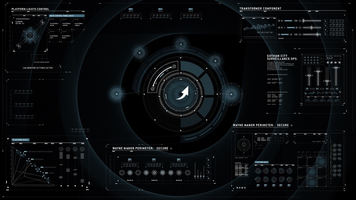
Batcave screen graphics on “Batman v Superman: Dawn of Justice”. Courtesy of Khairul Ahmed.
Kirill: Going back to your mention of the first Iron Man. What I find interesting about it is that it came shortly after the first iPhone was introduced, which ushered in the presence of touch screens in our daily lives. Do you think it’s harder these days to keep the movie audiences engaged, because we can do so much with our everyday screens? If you do something “regular” in a movie, that is not very compelling.
Khairul: I think it’s a balance, and most of the time we tend to try and push the boundaries, though you always have to have some level of shared experience linked to the viewer in order to sell the idea.
For instance I could simply show a shot of someone brushing their teeth in front of a normal mirror. But if I take this mirror and start applying UI elements along its surface, immediately that is absorbed as being future tech. But how can this become engaging for the audience? It is by using the suggested technology that makes it feel like it could probably exist in the world we live in today. I think that’s the magic, as audiences are well aware of what exists. It’s our role to play with the notion of the what ifs.
The coolest thing about Iron Man was that he had all those gadgets that you couldn’t have, but at the same time you felt like they were existing products, with some level of Tony Stark customization added to them. His phone looked very similar to an iPhone model, but say 5-10 years ahead in the future. The use of suggestive technology that isn’t too far beyond our realm makes us as the audience feel excited and intrigued, as we slowly start to feel these gadgets are attainable. We imagine how it would feel if you we were able to have such technology.
Kirill: There is so much data that is captured by all the sensors in our phones and tablets, and yet the trend in the recent years is to distill all that complexity to something sparse and easy to grasp. And then in sci-fi productions you have screens that tend to go to the other extreme – display mountains of data to, admittedly, very technically-leaning characters. Do you think that’s one way to elevate the technology in movies above what we have in our lives at the present?
Khairul: It’s a tricky one. It’s definitely one way of doing so as one of the main trends is layering masses of data to create depth. It’s the whole Z-space dimension which has been introduced many years ago, creating this staple idea of advanced technology.
Look at “Avatar” and how that film pushed the boundaries. What they created was carefully considered and implemented in a way that made you feel like all the graphical elements belonged to the film. They had an amazing take on basic hologram concepts. By creating different levels of intricacy not only did they create striking visuals. They also suggested the advancement in technology. It’s all a matter of doing it tastefully.
Again another example of this would be “Prometheus” where you see the use of staggered layering of graphics suggesting the complexity of an interface / device. It’s always interesting, because the way the FUI is treated always gives a sense of the advancement of the tech being used.
Coming back to your question, sometimes I think it depends on the directors themselves. For instance Joseph Kosinski’s approach on Oblivion was to only add elements in if it enabled a reason to the story. It was perfectly demonstrated by emphasizing shooting in camera, while also building as much of the final image into the sets as possible. Joseph felt that it was important that the actors be able to touch and interact with as much as possible. Vida’s table is a great example of his logic being applied.
What was special about Vika’s table was the choice of UI elements being used. There were no 3D holograms or even basic z-space extrusions, all of which you’d expect to see in a sci-fi film, especially when trying to portray future tech. But that’s not the only thing that made it outstanding and aesthetically astonishing. It was actually down to the use of grids, simply taking it all the way back to pure graphic design. Giving the screen a very rigid structure and housing it with the additional use of intricate high fidelity elements immediately converts the feeling this is not your average table.
It’s all down to how you’d like to portray the technology advancements. There isn’t just one simple recipe to follow, but rather many ways you can reach the same point.
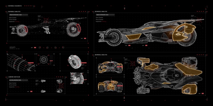
Batcave screen graphics on “Batman v Superman: Dawn of Justice”. Courtesy of Khairul Ahmed.
Kirill: Film is such a visual genre. If you can find the right interface to express the capabilities of that particular device, it’s a much more vivid way to do so, compared to, let’s say, the characters simply talking about it.
Khairul: I definitely agree with you. In many cases I have come across briefs that ask for certain elements to be designed in a very specific manner in order to tell a key story point. Most of the time we are asked either to create something that is 10-15 years into the future or a supercomputer which you have never seen before.
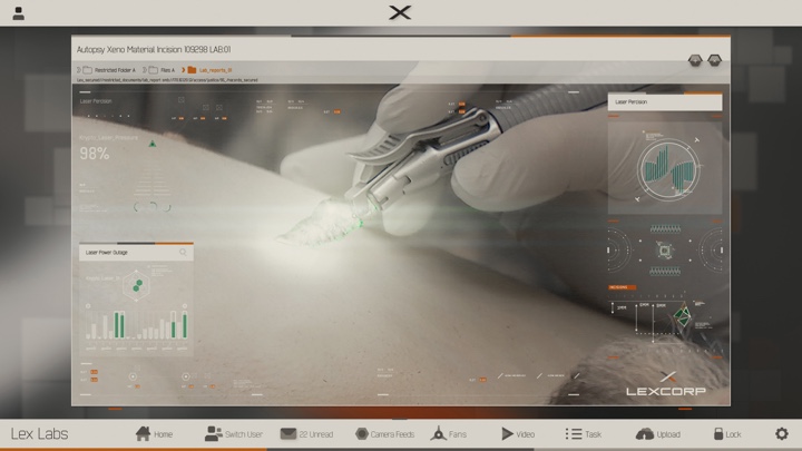
Obviously that makes perfect sense. When designing the screens for Bruce Wayne on Arkham Knight, I wanted to make sure all the elements had a very high level of intricate detail, and any use of geometric shapes felt very intense. This was done to make his personal computer feel state-of-the-art, while at the same time conveying the feeling that it’s a one-off customization which would only be used by Bruce Wayne.
That information was carried across within the bootup sequence of his mainframe, and I created a very sinister spartan interface which required two levels of security access – keypad and biometric scan. I used a super detailed mesh within the background and tailored UI elements, and I feel I was able to achieve the targeted look and feel of the device.
It’s very important as a designer in the film industry to make sure that we always apply the correct visual language to communicate the right narrative.
Kirill: If I look at the movies that you’ve worked on so far from the Marvel and DC universes, you have Tony Stark and Bruce Wayne and Lex Luthor that have billions of dollars at their disposal, but they still can’t be too far ahead with their technology. Maybe they are a couple of years ahead, but not much more. So you are creating interfaces that are half a step ahead of what we have in our pockets today.
Khairul: That’s true. It’s a bit like the hypothetical of them being able to invest in a company that makes a new phone. Would they be getting something that is custom or state of the art, even though the tech would suggest that rest of us could possibly attain this same device several years down the line.
When we work on these movies, most of the time when we’re dealing with future tech, we tend to push our ideas as far as possible into the future, and then slowly dial it back so that it doesn’t go into the realm of unrealistic. You need to bring it back into the current day and age, so that it can be grasped by the audience.
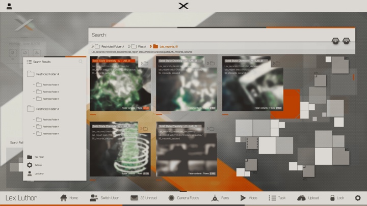
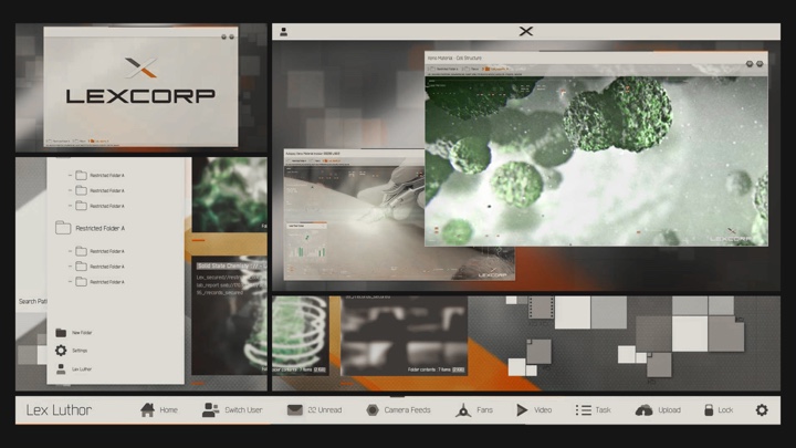
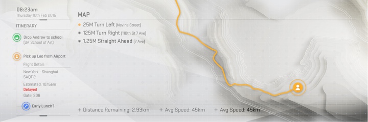
LexOS screen graphics on “Batman v Superman: Dawn of Justice”. Courtesy of Khairul Ahmed.
Kirill: How different was working on Lex Luthor’s interfaces for you? We usually see these militaristic interfaces with dark background and a rather strict palette of blues and teals. And here I was thinking back to the early 2000’s and the explosion of custom Linux skins, with Lex OS looking to be a custom tailored system that was made for just this one person. This is how he wants to see things on his machines.
Khairul: You definitely hit the nail on the head. It’s a one-off that is tailored to Lex Luthor, and that’s about it. Even though it feels specifically customized to Lex, the look and feel takes notes from current software such as Linux and Mac OS. It’s kind of a hybrid, but with a unique twist that holds it up to being exclusive to Lex Luthor.
We wanted to design something that felt familiar. But we also wanted to create an aesthetic that would be absorbed by the audience as something that could be an actual operating system.
Kirill: But it can’t be too crazy. Whatever the camera captures still needs to be parsed and understood by the audience.
Khairul: That’s correct. It still has to be grounded by what you expect from any OS. In order to make Lex OS feel advanced and custom, we started by researching how different operating systems run. We were looking specifically at the visuals, the overall feel, as well as their processes. That was how we came up with ideas on differentiating our OS to be seen as superior and more advanced. For example, the animation sequence added on top of the simple search functionality sold the idea of this not being just your average OS.
Even the choices of colours played a huge role, as they were carefully tailored to the character of Lex Luthor. They are clean and simple, reflecting on his personality of a crazy scientist. The use of white, grey and orange emphasized the corporate essence of Lex, which again identifies the OS as being branded to him specifically.
In comparison, Bruce Wayne’s character is more mysterious and dark, so for his interfaces we delved more into the darker hues of the colour spectrum give him that sinister and enigmatic feel.
And when we were designing Diana’s computer, the approach was to create something very basic to suggest that she is using something that an everyday person would use. Again, it’s that level of shared experience. Her character is just like us, so it had to look a very familiar and usable interface. It was skinned to look like a basic Windows or Mac interface.
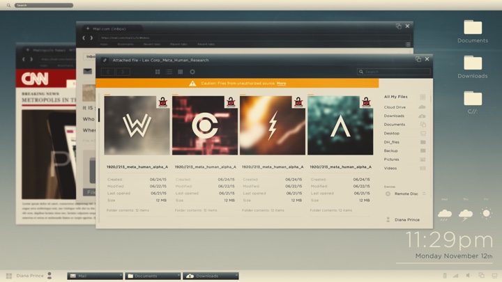
Diana’s screen graphics on “Batman v Superman: Dawn of Justice”. Courtesy of Khairul Ahmed.
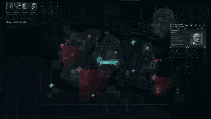
Kirill: Talking about the militaristic systems, it’s very common these days to see sets with dozens of screens in them. How important is it to create a design system that spans all of those screens and leaves an impression of a single unit, so to speak?
Khairul: It’s very important. You don’t want any single element to hold more emphasis over another, unless of course it’s a hero element or something that tells a big story point. In that case I’d create some level of separation, using accent colours, bolder typography, bounding boxes, etc.
Otherwise, when you see all these design elements together, your brain needs to read it as a pattern rather than different sections mashed together. It’s very important to make sure that everything looks like a collective. It needs to feel like it fits.
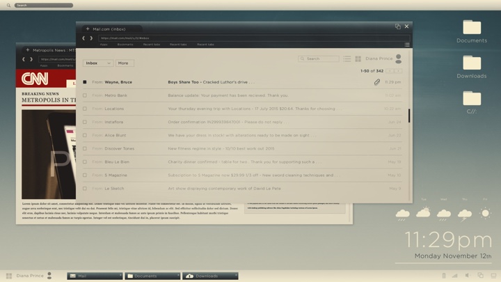
Diana’s screen graphics on “Batman v Superman: Dawn of Justice”. Courtesy of Khairul Ahmed.
Kirill: When you design such a system, how do you visualize the way it looks across all those dozens of screens? Do you print out the frames and hang them on the wall, perhaps?
Khairul: It’s a balancing act that depends on the amount of screens and the level of importance they each one holds. For the most part, during the initial stages we print out the mood boards and plaster them up on a wall to help visualize the space.
On “Batman Arkham Knight” we designed the screens, and then placed them onto Cintiqs to help visualize the layout of the Batcave. Not only this gave us the sense of the space itself, but it also played a massive role in influencing our design choices tailored to the narrative. Seeing the elements graphically on set allowed us to adjust and tweak them according to how we planned to interact with them.
When we did Batman v Superman, it was more about making the screens feeling cohesive and being under one stylistic aesthetic. In order to meet that goal, we analyzed our screens as a whole. We would pull the graphics onto several monitors, and then look at them from a distance to clarify the hero elements as well as the overall graphical aesthetics. Seeing the screens as a pattern instead of individual elements helped assure that the same language was being applied across all the screens.
When you design for the background, you know that those elements tend to get blurred most of the time. So there you take that blur into consideration during the design phase. The main reason for that is to avoid creating dense areas of patchy artwork. So, instead of designing individual elements, I would design the boards as whole panels, and then use dual monitors to pull up the screens to get a sense of the space. With that process I could easily identify what was working and what wasn’t.
And then you have the huge factor of what is happening within the shot in terms of the character interactions. That helps shape the layout choices of those graphical elements.
Kirill: Going back to what we’ve talked about earlier, what do you say when people ask what you do for a living?
Khairul: I usually come up with a very basic answer. I say that I do graphic design, and most of the time I don’t even mention film. There’s the whole NDA aspect, and as I said before, I don’t like drawing attention to what I do. Depending on their level of engagement or whether they are a fan of superhero films, I would elaborate and possibly tell them how I had the great pleasure of working on “Batman v Superman” and so forth.
At the same time, I love design in general. So I might say that I’m a designer that loves to design for films, and that I also have great passion for title designs. Lastly I tell them about my photography, which plays a huge factor in my creative side of design.
Chrysler dashboard screen graphics. Courtesy of Khairul Ahmed.
Kirill: Let’s switch gears and talk about car interfaces. It feels to me that some areas of the industry design move much faster than others. So you see really big shifts in exterior design, and the overall technical capabilities of modern cars, not to mention the drastic shift to greener technologies. But then, the whole experience of having a dashboard screen to interact with the auxiliary technology inside of the car is moving at such a glacial pace. How do you approach doing those interfaces? How far ahead can you get in those explorations?
Khairul: Even though they are moving at a slower pace, I feel that the graphical language seen in films is now being applied to cars, so we don’t feel the technology gap that heavily. Also you have to understand that we can only apply so much to the technology itself before it becomes unrealistic.
In most cases we can push ideas and it tends to only work in prototypes, mainly because it comes down to practicality. All the stuff you see in films is amazing and advanced, but also a huge distraction. When you design for car interfaces, you aim to only add elements that have a purpose. This is maybe why we feel it’s not developing at the same level.
Chrysler dashboard screen graphics. Courtesy of Khairul Ahmed.
Kirill: If you’re driving, your primary focus should be on the road ahead, and not on the screen on your dashboard. But there are manufacturers that are trying to replace all those knobs and levers with all-screen interfaces. Is that the right interaction model for a car that is not fully self-driving?
Khairul: The focus should be 100% on the road, especially if the car itself is not fully self driving. When I worked with Perception, we would discuss this all the time to make sure that our design choices and elements were crafted with a sole purpose to match the need of the user.
Whether it’s the right level of interaction for these car models is questionable. As designers we are creating such elements, and we aim to avoid creating distractions which could be life threatening. But we could still apply some level of design aesthetics, giving these cars a reason to having screens in the first place.
It’s a balance of creating elements that feel subtle enough to belong to the car itself. Once that is met, I think it’s fair to have these screens.
Chrysler dashboard screen graphics. Courtesy of Khairul Ahmed.
Kirill: I think it was in “Captain America: Winter Soldier” where they showed the interfaces inside Nick Fury’s car, and it was all these HUD-like overlays on top of the windshield. I’d love the technology to get to the level where navigation, for example, can be superimposed on top of the reality, so to speak. I don’t want to be glancing down on a tiny phone screen to see how much distance is left until the next turn. I’d love some kind of an augmented reality overlay, if it can be done in a way that still makes it very clear to navigate the traffic.
Khairul: I don’t think that stuff is there yet. There are ideas around what we would like to have, but it’s not close enough. The thing is we can push that stuff in movies, because there aren’t any limitations in terms of practicality or even health and safety. It would be amazing to have Nick Fury’s windshield interface. But it seems like we just aren’t there yet!
Chrysler dashboard screen graphics. Courtesy of Khairul Ahmed.
Kirill: In game cinematics you have the requirement of moving the story forward. In feature films you have the same requirement and the limitations of having even less time to do so. In car interfaces you are limited by the real-life technology and safety regulations. As a designer in general, do you welcome these restrictions that are placed around you?
Khairul: Personally, yes. In most cases these restrictions actually provide a backbone that you can work off of. The process of understanding the restrictions rather than seeing them as limitations, factoring in the purpose and identifying the problems all lead to creating better solutions.
Kirill: If we’re speaking about the world of real-life technology, what are the main pain points for you?
Khairul: Sometimes the things you design end up looking very different in frame as there is only a certain degree of detail that can be carried across. This puts a stop to creating intricately detailed elements, and as the result, in most cases I’d need to thicken the lines in order to fit in within the limitations of such devices. That’s something I dislike quite a bit.
But nevertheless even though some information is lost, as a designer I still see these challenges as goals to refine my designs and make decisions based on such factors. On top of that it teaches me to not be too precious with the elements when designing.
Chrysler dashboard screen graphics. Courtesy of Khairul Ahmed.
Kirill: What about the process itself? Not to single out any particular product, but some of the high-end professional tools at the level of complexity of Microsoft Office or the various Adobe offerings have so many features that navigating their interfaces becomes a very hard task to accomplish.
Khairul: For somebody new that starts with those tools, at first it may be frightening as there are so many hidden elements. But it’s something you will pick up as you go along.
I use Illustrator pretty much all the time, and I feel even after 5-6 years I’m still learning new things about it. But that’s okay because I still know it to a degree that I can get what I want from it, which is perfect. So I don’t feel like it’s a problem or restriction, and if you need to know something you could just Google it.
One thing I would say is that people will most likely tend to stick to whatever they are familiar with, or most comfortable with. But I feel that nowadays these software tools are slowly becoming more approachable for the novice user. It’s not as hard to get a grasp on certain programs as it used to be.
Kirill: What keeps you going in the field, not particularly in the world of feature film, but screen graphics in general?
Khairul: It’s the love for what I do, and I’m sure you hear that a lot. To go deeper into it, for me it’s about those challenges I have to face as a designer. I’m a problem solver, and I live for the process of trying to solve an issue. Every single time it’s always something new, so there’s this amazing feeling of exhilaration when I find my solutions.
I think it’s also down to the idea of the industry feeling a little saturated in terms of the graphics. Everything is slowly starting to either look very similar or to follow certain trends. I see this as an amazing challenge to push my designs further and create something unique and bold each time. I don’t want to follow any trends nor imitate anyone’s designs. I just want to share a new voice.
Batcave screen graphics on “Batman v Superman: Dawn of Justice”. Courtesy of Khairul Ahmed.
Kirill: That reminds me of what you said about the overall style of Iron Man. The style is consistent, but it still is evolving with every new movie in that universe.
Khairul: That’s correct. Even though the style has been initialized, you can certainly add more to it to advance the look and feel without taking away from the aesthetics. The beauty of what Cantina made was that they gave each element a functionality, thus creating a voice and style guide that can be seen on all the HUDs made for SHIELD and Stark Industries.
This is something I wanted to do when I was applying my own look and feel to the UI aesthetics on Batman V Superman. Given the task to create two very distinctive directions for the operating systems of BatOS and LexOS, my aim was to not only create UI elements, but actually create style guides that could be applied to the voices of each character. This was achieved by making very bold choices in how it used colours and created aesthetics in order to help visually differentiate the two systems.
For instance, the sinister super-tech dark approach taken on Batman’s screens reflected his character. And the light approach taken on LexOS helped to create that iconic visual difference, while at the same time suggesting that the tech used by Lex was something familiar to the viewers. LexOS was tailored to Lex Luthor personally, but we wanted to suggest that it’s something that could possibly be built for everyday use of the audience.
It’s moments such as this that make what I design a little more interesting, as it’s suggesting ideas that have that level of realness to it.
Diana’s screen graphics on “Batman v Superman: Dawn of Justice”. Courtesy of Khairul Ahmed.
And here I’d like to thank Khairul “Keko” Ahmed for taking time out of his busy schedule to talk with me about the wonderful world of screen graphics / fantasy user interfaces for feature film. If you’re interested to read additional interviews about the wonderful world of screen graphics and user interfaces for film and TV, click here for more.
