The art and craft of screen graphics – interview with John Hill
His first production was the original “Tomb Raider”. Since then, he contributed screen graphics and fantasy UIs to productions such as “The Bourne Supremacy”, “Spy Game”, “Terminator 3”, “Thunderbirds”, “Quantum of Solace”, “Prometheus” and the last season of “24”. And for his latest project, he was the creative supervisor overseeing hundreds of screens in multiple locations on the latest installment in the Bond universe, “Spectre”. It gives me great pleasure to welcome John Hill of Vincent Studio to the ongoing series of interviews on fantasy user interfaces.
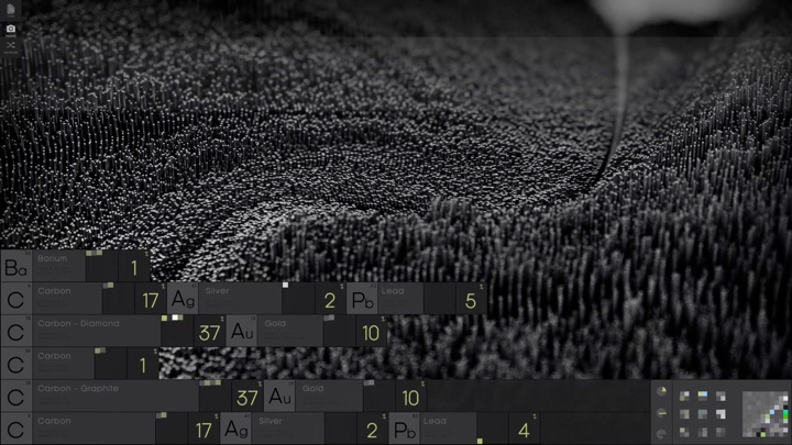
Screen graphics for Q’s workshop in “Spectre”. Courtesy of John Hill and Vincent studio.
Kirill: Please tell us about yourself and your path so far
John: I initially studied fine art and painting, focusing more towards graphic art during my foundation art course (the course tutor highlighted the long term plights of becoming a fine artist). I did a degree in Graphic Arts and then started to freelance in central London. I then worked at a small company designing club & venue visuals, where I learnt 2D animation.
 I then was asked to work at a company in Pinewood Studios designing computer graphics for film sets. My first feature was the first “Tomb Raider” film where I was asked to design the POV shots for the robot fight scenes in the opening of the film and then the title sequence, which was really exciting for me back then. I remember waiting 15 minutes for my G4 to update each frame in AE. I stayed on working full time in Pinewood for the following 2/3 years at Useful Companies working on most of the action films that came into Pinewood and Shepperton studios like “The Bourne Supremacy”, “Spy Games”, “Thunderbirds”, “Terminator 3” and others, designing UI graphics, shooting onset video and doing live playback.
I then worried about becoming too focused on UI graphics and wanted to broaden my horizons a little, so I decided to go freelance and started working at various studios around London before setting up Vincent. I continued working on films like “GeForce”, “Quantum of Solace”, “Prometheus” and “Spectre” whilst doing motion graphics and VFX projects.
Kirill: What can you tell us about Vincent studio?
John: We creatively direct, design, animate for film, gaming, commercials, broadcast and live events. We also do on-set supervision for playback and VFX post production work. We called ourselves Vincent simply because we quite liked the name and its ambiguity. I run the studio and co-direct projects with Rheea Aranha.
Kirill: What drew you into the field of designing for feature films, and how has that changed since you’ve started working professionally in it?
John: I stumbled across it to be honest… I was’t getting much out the job I was in at the time working, so a friend working on a Bond film introduced me to Useful Companies who offered me a job as their art director, so I moved. Back then UI GX and video playback for films was not particularly well respected or deemed very important in the film making process… even though we were often relied on to bridge storylines in scripts and make key story telling moments. It was still a relatively new department in film… especially UI and computer GX. Most directors and productions designers were getting their heads around using computer GX for set design and story telling as it inevitably became part of current technology and everyday life.
Kirill: Your work spans a wide diversity of projects. When you meet a new person and they ask you what you do for a living, how do you describe it?
John: This is always a bit of a weird moment for me. I never really know how to sum up what I do in a singular job role and tend to waffle on about various projects and films I’ve worked on… I usually end up saying I’m a creative director, but I’m really a visual artist looking at any form/medium to tell a story in the most clear and interesting way. I’ve found over the years I can learn most new programs or disciplines like live action shooting/directing and post production/VFX fairly quickly… although it’s not getting any easier, I must say! I’m very hands on.
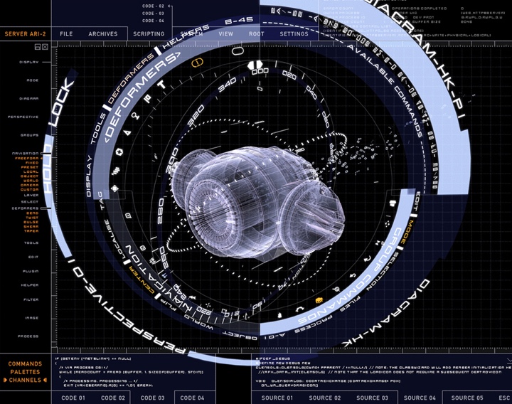
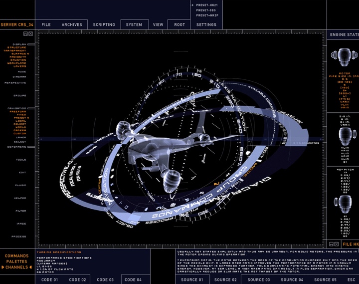
Screen graphics for “Terminator 3”. Courtesy of John Hill and Vincent studio.
Kirill: If you look back at the work you did for Terminator 3, how much has your field has changed in the last decade? Do you expect the scope and intricacy of your work to continue evolving at a similar pace in the next decade?
John: I think the world of UI GX has changed considerably in the past 15 years. It is now an intricate part of many sci-fi and current day films, providing unique storytelling moments and is a great fabric to dress and light film sets, as well as a great asset to play with in post-production.
Way more time is invested by film directors and productions to create beautiful graphics and UI VFX as they not only look great but are fantastic at telling complicated stories cost effectively. It will continue to evolve at an exponential pace, I think.
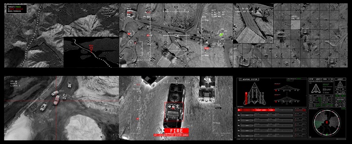
Screen graphics for “24”. Courtesy of John Hill and Vincent studio.
Kirill: As you worked on the last season of 24, were there any big differences in working on a TV show if you compare it to your feature work?
John: It’s way, way quicker production pace – we were designing graphics and playing them back simultaneously for 2 episodes at the same time… crazy pace and very intense. Your lead up time and budget is less to prepare the work and there’s a lot of on the spot fixing and script changes everyday. A logistical and creative nightmare! Although the crew were a nice bunch and what they produced in the short time frames was quite impressive to be honest. Jon Cassar the director was a lovely guy.
Kirill: What was the overall structure of your work on 24? Did you work on the entire arc of the season, and then going deeper into individual episodes?
John: Yes, I worked on the whole season, with my old friend and mentor Simon Staines. My main focus was the drone control room set graphics and the VFX shots for these in post.

Screen graphics for “24”. Courtesy of John Hill and Vincent studio.
Kirill: What are your thoughts on the word “fantasy” in Fantasy UIs?
John: We currently live in age of “The Internet of Things” which very much exists in the same universe as fictional UI design, so it has to be believable and tangible and really work as a viable OS. The design process is based on an idea of how something works and what it needs to communicate. I ask myself a set of questions before I start.
What story does this need to tell? What should it look like in the context of the set it goes in and what genre and time is the film? How will the GX help light the set? What time of day and environment? Who is the user? All this information is vital to set myself a good brief to work from. I can not simply start drawing stuff with out a framework or goal. I need real briefs and jobs to work on. I can not simply make stuff for the fun of it, it has to be for a purpose.
Kirill: Do you try to stay current on the technological advances that are happening in commercial products and research labs?
John: Yes, this is unfortunately very important as they are the tools with which you tell your story. The better they are and the wider the toolset, the better equipped you are for telling the story. I do hate having to keep up though with technology. I must admit that it’s exhausting, especially as you get older, but it’s something I can not ever ignore. I find new technologies fascinating though… new discoveries like Graphene and what it can offer the world.
Kirill: And on a related note, with so many screens around us in the last few years, does it become more difficult for you to push the envelope of human-computer interaction in your feature productions?
John: I’m not saying it’s easy by any stretch, but I haven’t found it that difficult so far. Conceptualising is the very thing that keeps me interested in my work. It’s all about what ideas drive the visuals/GX… you can always develop ideas and push the audiences’ imagination and encourage them to believe in new technologies and ways of reading new graphic languages.
I must say though, there is a lot of nonsensical UI graphics around these days with very little thought or real concept behind the content. Bit of a blue wash of eye candy. Technology always dates, not the ideas.
Screen graphics for “Prometheus”. Courtesy of John Hill and Vincent studio.
Kirill: Going back to your work on “Prometheus”, how do you approach designing interfaces in a story that happens 80 years into the future? Do they still have to be immediately understandable for the present-day audience?
John: As long as they tell the story they need to, they’re doing their job. I try and develop ideas of how things might work in the near future and how a user might interact with an OS/computer. Making something look other-worldly is easy, it’s making that new language work to tell the story in a simple way. The simpler the design and function, the more futuristic the result.
The biggest problem with having to create sci-fi GX for in-camera playback is always the technology restrictions. You would never even have a square 2D fixed panel 80 years in the future. Wouldn’t it be made from a completely new kinetic technology – or simply telepathic, with no visual content at all? I always remember that Clint Eastwood film Firefox – ‘think in Russian…’
The audience must believe and follow the ‘technology’ you create on at least a subconscious level – the audience digests so much they are not fully aware of which in turn tells them to believe what they’re seeing. It’s like that exercise the US Military Satellite reconnaissance guys do, flicking through thousands of photos of landscapes waiting to find abnormalities and something ‘not right’. They simply mark what they ‘feel’ is not right and then return to the pictures later to look into more detail and to explain the abnormality… a subconscious filter. The content we designed was quite abstract but had a functioning purpose – whether it was to represent weather or atmosphere analysis or act as the Rover door opening panel.
Apart from the set GX we designed, I also created a library of design elements that everyone working on the film could pull on for various screens and HUD shots to help with design continuity.
Screen graphics for “Terminator 3”. Courtesy of John Hill and Vincent studio.
Kirill: Are the ever-increasing demands for details and sophistication from the productions met by the companies who are making software and hardware tools that you are using?
John: I remember when the company I worked for were the pioneers in 24 frame CRT sync playback (tech which removes any horizontal monitor refresh bars going up and down on an old CRT computer monitor). Playback interactivity with the actors is improving – however, we are starting to move towards an era of having place holders in-camera to provide good interactive props for the actors and realistic lighting for the DOP – in view of being replaced in post, as this can give the director more freedom to change things and tweak the GX later. It’s becoming cheaper to do GX in post and sometimes bundled in with the VFX vendor bids these days.
Productions are quite reliant on ‘cool’ UI graphics, so sometimes it’s simply easier to do in post, if say the director wants the GX to be holographic or displayed in a way that can not be achieved with today’s tech. The main problem with trying to create in camera futuristic GX is the limitations with projection technology and the simple fact that we can only display GX on a square/curved 2D panel. That in itself will always date the technology, so doing things in post gives the director way more freedom.
The software I use to design with is improving leaps and bounds. I’m not a coder, so I’m always looking for easy software to learn that gives me results quickly – learning and problem solving in software is a real pain. You lose so much time trying to work out how to get what you want. Decisions on what to invest time in is really important. I just want a single button to press!
Screen graphics for “Tomb Raider”. Courtesy of John Hill and Vincent studio.
Kirill: How do you combine the realism of our everyday interactions with technology with demands for novelty and short screen time that you have for your interfaces in film?
John: The best realism is achieved through function… the challenge is to create new ways of illustrating that function in the short space of air time. I usually have to work within the foot print of locked edits in post, so that in itself is sometimes very restricting and you are sometimes forced to settle for a very simple message to get the story across on a first read clearly.
Working around the in-camera interactions from the actors is also tricky sometimes – if the in-camera placeholder they’re working with needs to be significantly different to the story you are later asked to tell, it’s quite challenging to tick all the boxes – lots of juggling with aesthetics with function. This is one of the negative sides of doing the GX in post. You can not change the movements/timings of the actor or the composition of the shot to suit your GX.
Kirill: Is the big red “Access Denied” warning a necessary compromise to quickly convey a story point?
John: Most directors I’ve worked with feel they need to see a familiar RED alert / Access Denied to ensure the wider audience follow the story – usually at an enigmatic moment of course… so key to the narrative. You’d be surprised how many people struggle to understand what’s going on without these simple alerts to read. It is patronising, but the film must work for the box office. I quite like a simple one line DOS on black and go against the grain. There’s nothing more clear and ‘real’ for some films.
Kirill: What’s your approach of starting in an existing franchise such as “Mission Impossible” on which you did “Ghost Protocol”? Do you look at what was done in that universe on earlier installments, or do you start fresh?
John: I always start from scratch with all productions. Most graphics and 3D content I have created for other films do not quite work for the current one. I also find it’s easier to work from scratch, as I’m not also wasting time trying to remember how I created the old projects/rigs. The “Ghost Protocol” work I designed was very fast turn around. I wanted the design to look fairly current day and very real for a CIA control center.
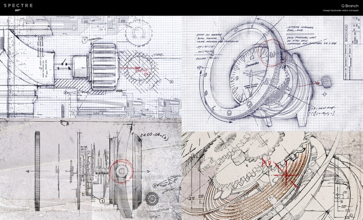
Watch concepts for Q in “Spectre”. Courtesy of John Hill and Vincent studio.
Kirill: Moving to “Spectre”, what would you say are the strongest sides of doing screen graphics as on-set playback?
John: Anything done in-camera always looks better and more believable than in post. It was Sam’s request to have everything in-camera to create very real interactive moments with the actors. I think you get the best performance out of the actor if he/she has something functional and real to interact with. Also, some DPs [director of photography] and VFX supervisors require the GX to be in camera live to get the right lighting for the set, and sometimes it’s too complicated and expensive to replace in post.
The only down sides are that you have less time to make the GX and test them for playback. They also can not be changed significantly on the day – the director is pretty much locked into what we have. A lot of preparation and presentations have to take place before shooting so the director is happy and knows exactly what he is getting. Also, the actors usually require the GX programmed up so they can practice before shoot day as well. I had regular weekly meetings with Sam so we were both on the same page.
Kirill: What kinds of discussions took place on that movie for defining the near-future technologies and the ways those capabilities are conveyed through the screens?
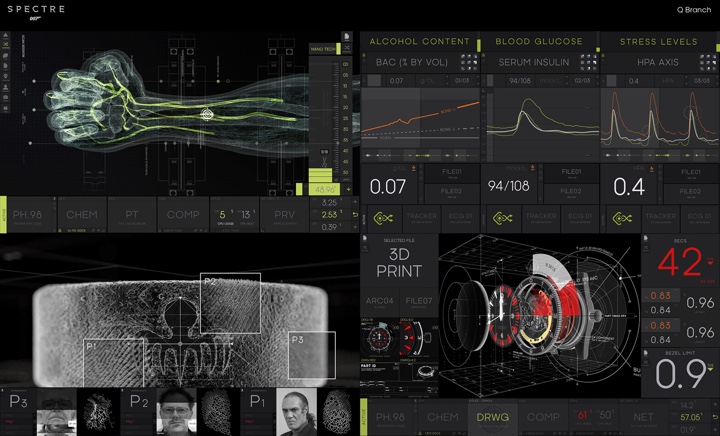
John: I presented various designs for Q Branch, CNS and Oberhauser’s lair based on current and near future technology discussions and what is currently out there. I researched into what companies like Google X are doing in California as well as military and nano-technology, so I knew what was out there today.
The graphics had to feel identifiable as next generation designs for all the three main sets. I spent many hours reading and researching before presenting ideas to Sam. Every background screen for Q’s workshop had to have a relevant idea and function. I spent time working with the props guys and art department, looking at what they were designing for the sets so the computer GX worked with the props. I designed around the functions of Q’s gadgets so to only suggest how parts of them work without giving away the story to come. This way the designs are relevant to their sets and look right in context without giving away the story.
![]()
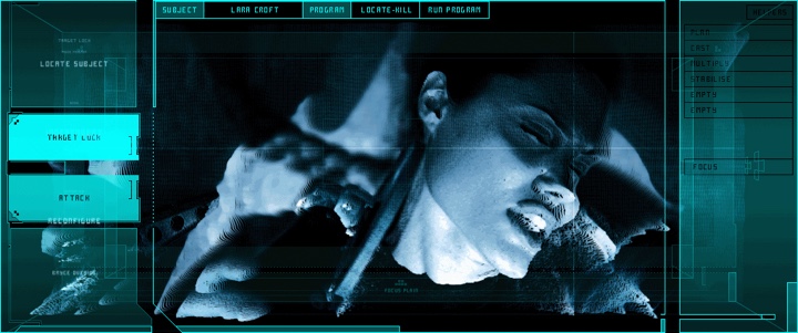
Screen graphics for tracking social media in Oberhauser’s lair in “Spectre”. Courtesy of John Hill and Vincent studio.
The research and design process for Oberhauser’s lair was quite involved. I presented ideas of how Oberhauser’s operations could realistically work as an enterprise, how he funded and controlled his operations for example. Oberhauser’s sets were minimal in design, so the GX had to compliment this, especially for the torture room where Oberhauser drills into Bond’s skull. The CNS set did not feature that much in the film unfortunately as we did a lot of work for this… content and ideas were similar to Oberhauser’s Lair (next generation global information monitoring). Once I had the ideas signed off, I could start the design process and consider the workstation layouts and where the graphics would sit onset.
The only limitations for script specific sequences is the playback programmability and interactive response available. This can sometimes restrict how much interactivity you can offer to the director and actor… a lot still has to be improvised by the actor. I usually talk through what is achievable with the director before hand.
Kirill: Is the goal to create a single design system that spans across multiple screens, or to have a wider variety of interfaces that show the more organic history and evolution of those technologies?
John: It depends on how much time you have usually (and what works for the characters and sets). If you only have a week to do a set, you have to design a single or repeatable framework that can be reshaped and rearranged to make lots of layouts, but retain an overall look. I quite like an eclectic portable mix of designs for some films. It’s quite refreshing to see a chaotic mix.
Kirill: How did you approach defining distinct visual languages for Q’s lab vs Oberhauser’s lair? How much of that distinction is driven by the need to quickly convey those differences to me as a viewer?
John: Each set of designs had to compliment and reflect the film’s characters. The design and way the GX animate has to work for the character’s personalities. For Spectre, the protagonist’s personalities were quite polarised, so their designs and OS would also be very contrasting, which helps the viewer identify with the characters and their worlds.
I started with research into next generation technology, from nanobotics and medical tech through to current technology used by today’s tech giants Google and GCHQ as the film is current day. Eventually for Q, I designed a bespoke modular operating system that would compliment his prodigious mind. It was an intelligent graphic wall paper where each modular window functioned as a self contained unit/app which could stack, rearrange, scale and fit together like Lego – simple but very intuitive and customisable – something I thought Q would develop and be unique to his character. I designed the initial ideas for how the watch would work in ‘Bomb mode’ repurposing the functional parts of the existing watch.
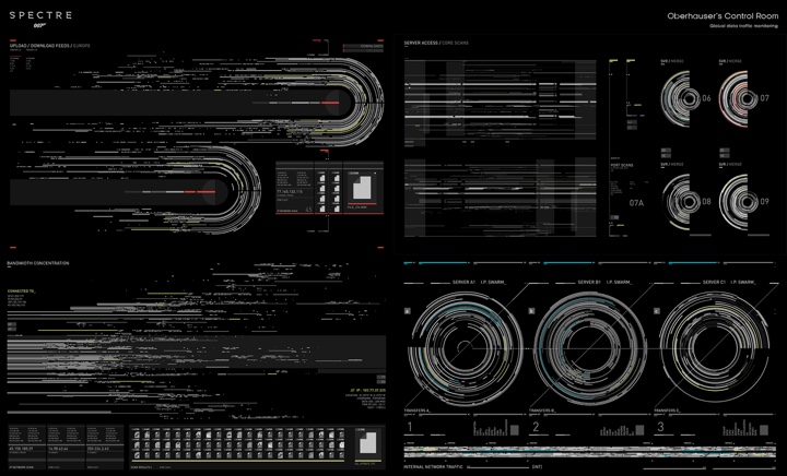
Screen graphics for tracking data traffic in Oberhauser’s lair in “Spectre”. Courtesy of John Hill and Vincent studio.
To contrast with these, I created a next generation dark world of global news and data traffic for Oberhauser’s Lair, designed to monitor vast amounts of global news and data traffic. I designed these analytical graphics in rows to compliment the long lines of workstations on set, tailoring enough variety to populate the 120+ monitors. I came up with various ideas to provide structure and credibility to his character – for example, I used terrorism events to manipulate commodities and stock prices to fund Oberhauser’s operations. These ideas in turn gave me a premise/brief to work from and expand ideas. Once these ideas were in place, i did a previs of the set with various GX designs in place to see what worked design wise. After that, each screen had to have a relevant concept and function. I never could predict exactly what would be in shot so every screen and animation had to hold up to a full screen insert.
The CNS set designs had a similar premise and function to Oberhauser’s lair, but needed to look very different in design. I chose a light palette for this and a frameless OS design. The content was very simply designed and quite clinical, not so raw as Oberhauser’s designs… more commercial looking but still next generation and something the viewer had not seen before. I kept Oberhauser’s technology very raw, representing data in its most elementary forms, but with a freeform subtle framework. I loved designing how data can be represented and moved around – digital patterns with suggested order. The more raw, the better for this set/character.
Kirill: Did you have any interface / graphics continuity from your earlier work on “Quantum of Solace”?
John: No, these were designed by MK12 who worked in the porter cabin next to ours in Pinewood (lovely guys) when I was working on the pre-vis for the opening roof sequence in Sienna.
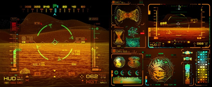
Screen graphics for Q’s workshop in “Spectre”. Courtesy of John Hill and Vincent studio.
Kirill: Do you feel constrained by the color palettes defined for your use by the larger production visuals around your work?
John: Sometimes, but usually it’s a given the UI GX should compliment the production design of the sets… not the other way around – (unless the GX literally fill the set)
Kirill: Would you say that the scope of your work expands to fill the available time? If so, what happens as you get closer to the deadline? How do you decide what gets prioritized and what gets cut?
John: Our schedule is dictated by the production shooting schedule – what’s up next. After that, hero script specific animations are prioritised. Once I have the concepts locked down and signed off by the director and the production designer, I then flesh out the designs and utilise as much time as I can to more R&D before locking on a specific tech. Sometimes I do pre-vis of the sets I’m dressing to get a feel for what works. I try and present more ideas if I think they work better than the original signed off versions. Not all directors have the time for this though.
Kirill: What are your thoughts on holographic screens and environments? Is this more of a great cinematic tool to convey the complexity of the interfaces? Putting aside the technical aspects of making such interfaces a reality, do you see real-world applications for our work and home environments?
John: I think these graphic styles are becoming very over used and over complicated. The brief it seems must read…’make the most complicated detailed graphics you can and make them luminous’. They’re all based on gesture commands, which as a concept has not moved on from “Minority Report” (which is still a seminal piece of work in my opinion).
Less is more always if we want to make things more intelligent and functional. Yes, I do think some designs would work for real-world applications, definitely. It would be great to expand and refine some of my designs to work for similar applications in life. It’s a very parallel job to be honest, just less bound to technology restrictions.
Kirill: Do you worry about how your work will be seen and judged in 20-25 years, how it will date and diverge from what whatever will actually happen in the tech landscape?
John: Not really. Looking back and improving on your story telling is very helpful, I think.
I still look at “2001”, “Star Wars” ep.IV, “Alien”, “Escape from New York” and even “The Hitchhiker’s Guide” (original TV series) as having the best UI graphics… simple, believable storytelling graphics – timeless I think. The old wireframe animations, real models and simple code graphics will always tell the story really well… so therefore it does not really age. If I manage to tell the story well, the graphics will always hold up.
Screen graphics for Overhauser’s torture room in “Spectre”. Courtesy of John Hill and Vincent studio.
Kirill: Stepping back into the world of real life software, what are your main pain points with the software and hardware we have nowadays? What can be made better in the way we communicate and interact with computers and screens around us?
John: I think realtime processing and reaction from computers is what the aim is – with all tasks.
It will always feel like you’re working with a computer if there is a ‘processing lag’. Voice recognition needs to improve as well as kinetic/gesture commands. All still feels very Speak & Spell currently. AI is constantly improving. Eventually computers will be a better version of ourselves. I love the Charlie Brooker series, “Black Mirror” – great insight, especially the “White Christmas” episode with Jon Hamm that had fantastic ideas.
Kirill: Is there anything that interests you personally in the world of augmented and virtual reality?
John: Technology is progressing so quickly – the Oculus Rift experience is really quite immersive and real. In time, the virtual experience and GX technology will be indistinguishable from the real world, which really does blow your mind as to where it will go from there. To think that pretty soon, rendering photorealistic fully-interactive CG at massive resolutions will be realtime for any device at throw-away costs. I’m interested in following how technology will mimic the remaining senses other than sight & sound to bring the virtual experiences even closer.
Kirill: Are you excited about the pace of technological evolution around us? Is it moving too fast just for the sake of constant change?
John: Interesting point. I do think it’s exciting – especially the way technology is changing our lives (hopefully for the good). I do worry about future generations becoming so immersed in virtual worlds for long periods of time. Even the way kids are taught with iPads in school, for example. Yes, technology has to be embraced but there must be a healthy balance between being ‘plugged in’ and actually being in the present – feeling and experiencing the world around us through our primal senses. We are too distracted from everything around us and that can’t be good for the brain long term. Will our brains evolve and change over the generations to compliment the very involved use of technology? Darwin I guess?
There is an ever increasing commercial drive to develop new technology, so there’s always a big incentive to encourage people to buy/try new technology – as long as it’s balanced with our actual needs and our health, it’s OK with me.
And here I’d like to thank John Hill for graciously agreeing to do the interview and answering a few questions I had about his craft. I’d also like to thank the other half of Vincent studio, Rheea Aranha, for her help in making this interview happen. You can find more of their recent work at Vincent studio site. Finally, if you want to know more about the wonderful world of screen graphics and user interfaces for film and TV, click here for additional in-depth interviews in this series.
