The craft of screen graphics and movie user interfaces – interview with John LePore
At the intersection of art and technology, the ever-increasing importance of screen graphics in film reflects the expanding arc of human-computer interaction in our everyday lives and the pervasive presence of glass screens around us. It gives me great pleasure to welcome John LePore of Perception to the ongoing series of interviews with designers and artists that bring user interfaces and graphics to the big screens.
In this first of two parts on the work that Perception has been doing in the last few years John talks about his background in motion graphics, Perception’s first foray into the world of FUI on “Iron Man 2”, the ongoing collaboration with Marvel on “Avengers” and “Captain America: The Winter Soldier”, the initial explorations around defining and refining screen graphics elements, the evolution of FUI over the years that tries to stay ahead of the evolution of technology and UI in the real world, and balancing between showing realistic interactions and the primary directive of supporting the story. He also dives deep into the automotive interfaces of “The Winter Soldier” and the pace of changes in the automotive industry in the real world, how we can improve the ways we interact with devices and information, and the work Perception is doing outside the realm of feature film productions.
 Kirill: Please tell us about yourself and your path so far.
John: I’m John LePore and I’m the creative director at Perception. I’ve been working with Perception since 2006. A lot of people would say that it’s an unusually long time period to be working at one particular studio. At least on our side of the industry people tend to hold a full-time position for around 18 months at a time or so. I’ve had a great time working here since then.
Going all the way back, I’ve studied traditional design in school. I’ve always been fascinated with and really curious about motion graphics. Back then – around 2002 – motion graphics was just about to explode in the industry. I discovered it just as it was beginning to rapidly evolve and change. As soon as I got to it, I instantly knew that it was it, that it was absolutely what I wanted to do. Before that I wondered whether I want to do print design or web design or maybe some stuff that I see on television. Learning about After Effects and motion design in general, seeing studios like MK12 which was the first one I ever came across – just blew my mind.
Since then I’ve worked at a lot of studios, and then found Perception which is, more than anything, a really fun studio to work at. The owners are really nice to work with, giving me an almost terrifying amount of responsibility which I really appreciate. As I was working here there projects shifted and changed.
Part of the initial explorations for the Stark Expo keynote sequence in Iron Man 2. Courtesy of Perception.
A huge breakthrough for us was back in 2010 with Iron Man 2. That was our first feature film that we worked on. We had a long-standing relationship with Marvel, mostly helping them with small projects. When Iron Man 2 came along, we were contacted by the Marvel team for a couple of elements. It was a great opportunity, an almost shocking thing to have our first feature film to be a really major one in a popular franchise. It was a really exciting opportunity for us.
We got into interface elements within Iron Man 2, but we didn’t do futuristic interfaces before it. We had done work with an information design angle to it. A key project in my career in that area was in 2007. The network ABC asked us to help them redesign their election graphics coverage. We had upcoming elections of 2008, and they wanted to have a whole graphics package for it that felt really great and innovative. We were figuring out different ways to visualize the data, and I loved it.
I like working with elements in motion graphics that are more graphic design based. I certainly appreciate a lot of things that go into the traditional visual effects, but my heart is always with the traditional graphic design. So a project like this election coverage gave us an opportunity to really dive deeper into things like visualizing information or focusing on legibility that you don’t traditionally get an opportunity to do with motion graphics. Motion graphics is usually about making one specific message really shiny, make it pop off the screen. And that project had more of a cerebral approach to it.
During that project I already started to thing about taking inspiration from the early work by Mark Coleran. I know there were other people working at that time, but he seemed to be the guy who was doing these futuristic interfaces.
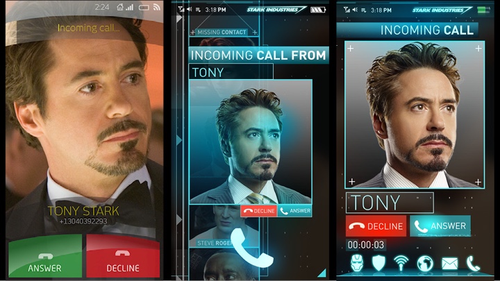
Conceptualizing the Stark Smart Phone in Iron Man 2. Courtesy of Perception.
Kirill: That’s my impression as well that he appeared to be almost the only one doing screen graphics until somewhere around 8-10 years ago.
John: There were a couple of other guys, but it seemed to be that he was the expert, the master, the Yoda of futuristic user interface. I took a lot of inspiration from him. As I and other people at the studio were working on the election project, we were thinking how awesome it would be to make these interfaces for sci-fi films. That was a pretty early goal for us.
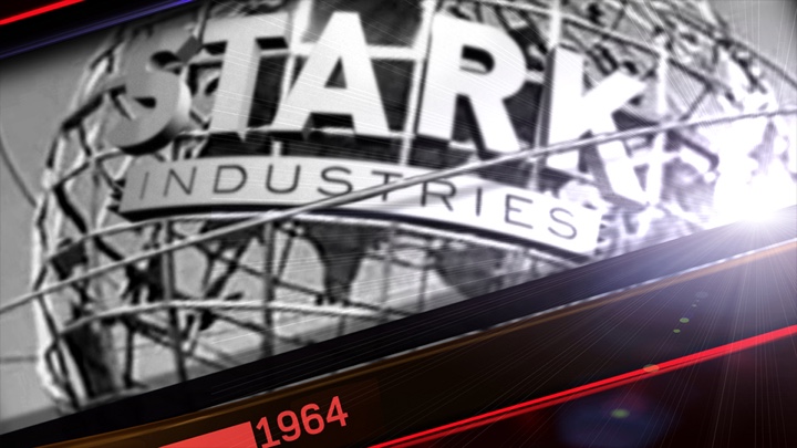
So when Iron Man 2 came along, we were tasked with a really simple challenge. In an emergency turnaround they needed on-screen graphics projected for the Stark Expo. They had a massive screen on the stage with Tony Stark standing in front of it presenting. They needed more traditional motion graphics playing in the background on this huge practical screen.
While we were reviewing design concepts for that scene with the team at Marvel, there was one concept that they didn’t ultimately approve. But when they looked at it, we literally heard someone in the background on the conference call saying that this one element reminded him of Tony’s glass phone. And on the other side of the call we were asking if he did just say glass phone with holograms on it. We were really excited at the prospect of that, and they told us not to worry and focus on the Expo screen.
Interface elements for the coffee table in Iron Man 2. Courtesy of Perception.
We did that, turning it around really quickly, and the client was happy. And we figured that while we still have their attention, we need to get them to give us this phone project for the film. So over the course of the 3-day weekend we went out to Home Depot and we had a piece of glass cut out to approximately the size of a cell phone. We shot and animated our own quick test of what we thought a glass phone interface could look like and feel like. There was no brief from the client, they had not asked us to do anything specific on it. We said that it sounds so cool that we have to do something with it.
We sent them this test after a crazy sprint to get it together. We had to get it to them while we were still in contact. We were terrified that it would be one tiny little task for the team at Marvel and that we’d never hear from them again.
They loved it but we’ve never heard any definitive feedback for months and months. It was probably a four-month period with no response from Marvel to this test. We didn’t know if we were too forward to do something like that, but in reality they were just busy filming and editing the movie. Then, as they got further along in the process, coming back to the post-production, our phone test popped back up. They called us and asked us if we could do the phone, and we said absolutely. We had the phone and the coffee table that kind of looks like a phone with some windows and a mirror, and before we knew it we had 125 shots to work on for the film. That was a really exciting opportunity for us. It was definitely our big entrance into the world of futuristic user interface design.
Interface elements for the coffee table in Iron Man 2. Courtesy of Perception.
Kirill: If I can take you back a decade or so to the time where, as you said, the field of motion graphics was about to explode, would you say that it also coincided with the tidal rise of much more sophisticated screen graphics in movies? Was it a convergence of software tools, hardware availability and the desire of directors / producers to put something more interesting and immersive on the screens?
John: Indeed it was about the rise of motion graphics in general. It was definitely the product of the software becoming something that you could really do on a desktop machine. By the time 2003 rolled around, I think that it was generally considered that you could make professional-level graphics on a desktop machine. You could that years before, but people didn’t feel it was legitimate. It still needed some crazy proprietary work stations set up – Silicon Graphics or Flame. So that was a big transition.
And as far as films? It’s an interesting thing to think about when did the futuristic user interface become a really big part. I think it might have been a few years later, but it was always around – for example, the “Help me, Obi-Wan Kenobi” hologram.
And a big part of it came with the technology advances and the Internet becoming more mainstream. You can track futuristic interfaces through “Starship Troopers”, the original “Robocop” or the heads-up display in “Predator”. But I feel like that as the technology became mainstream in everybody’s lives, when the Internet became something that everyone used, that’s when it happened. The screen writers or the script writers charged with the story started writing interfaces into the story.
What happens when you have a complex piece of information that needs to be conveyed? Think about the geographical logistics of the distance between the hero and its destination – the hero turns to a big screen that has a graphic that explains it. How do we show cycling through potential suspects? The technology became more present in our everyday lives, and it started to find its way into the stories. It didn’t become big because it was set dressing or because it just looked cool. I think it became a big thing when you started seeing characters interact with the technology, use the systems and navigate through them.
And it required to have these forward-thinking concepts that feel futuristic, but still operate and function in a way that we can relate to, in a way that we interact with our computers.
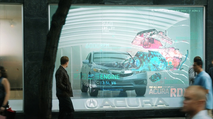
Steve Rogers walking by the Acura dealership with holographic display window in Avengers. Courtesy of Perception.
Kirill: That would also depend on the story timeframe of the specific movie. If you look at the Marvel universe, for example, with Iron Man, Avengers and the latest Captain America, it all happens in the present time with, a somewhat relatively modest leap of technology available to the characters. What’s the process in your studio as you get a brief describing the specific screens or shots?
John: It’s always important for us to understand what is the time period and who does the technology belong to. Who owns it? Where did it come from? Did it come from the military and it needs to be more utilitarian with a harsh practical feel to it? Is it something that is commercially available, being more user friendly with a touch of off-the-shelf feel? Or is it something very specialized like in the case of Iron Man where Tony Stark builds all of his interfaces?
In this case, for example, we would come to an agreement that Tony Stark doesn’t have an interface that is from the future, but he’s so much better at making his own interfaces that it feels 5 years ahead of everything else. And the government comes in with their high-tech stuff, but it’s not as high-tech as his. They’re half way in between.
It is important to establish the hierarchy of who has the coolest technology. Often the villains or the bad guys or the police would have something that is inferior or less appealing.
Kirill: Who is participating in these explorations from the studio side?
John: Each film is different. On our side we have the studio owners and myself the creative director, and the team of individual artists working on ideas. We would typically present to a small group of people at the studio for the review. That group could be made of the visual effects supervisor and producers. Sometimes it would include the production designer. Sometimes we’d be presenting directly to the director. And sometimes with Marvel we’d be presenting to the studio executives as well.
We start by talking about our inspiration and what gets us excited, and that is usually enough to start to get a sense of what they’re thinking and how they’re feeling. At this point we have to understand that we’re coming on to a project that the client has been working on for months or even years before we become involved in it. It’s important for us that we work really aggressively to get to their level of immersion within this world as quickly as we can. We do that by discussing inspirational items. Then we do a wide range of design exploration which we share with them. At that point you start hearing feedback about what they hate, like or love. But leading with a wide range is a fundamental starting point in the process. From there we usually have a good enough understanding of what this world is, and we can focus in on the particular design approach for the specific tasks. We can then build on and refine the designs.
Then, as we get into animations, there’s a lot we need to finesse and adjust in terms of being in perfect sync with the story line, with the actual events and interactions that are happening within the story.
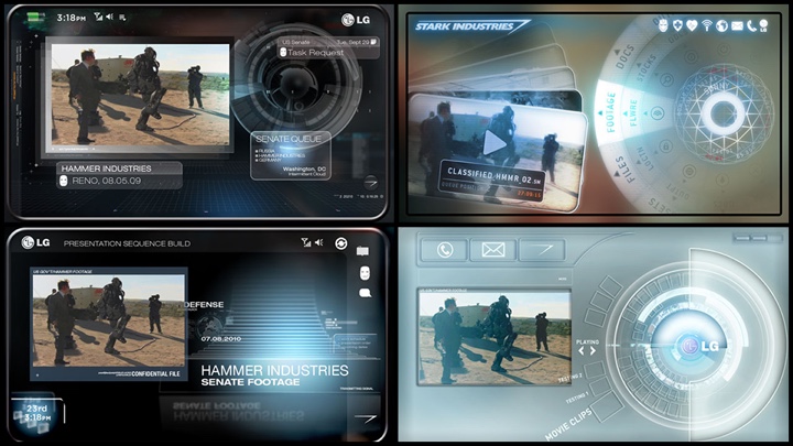
Concepts for Pepper Potts’ cellphone in Avengers. Courtesy of Perception.
Kirill: But then you don’t necessarily know how the actors are going to be interacting with these screens.
John: The actors are interacting with pieces that serve a specific purpose. We often find ourselves talking to the editor who may have ideas about the specific interactions. It never ceases to amaze me how seriously the teams that work on the films take these elements. They can often provide so much input into the story and what’s happening. There’s a lot of subtle nuances that you don’t even think about when you watch the final product. Somebody pressed a button and something took place. But there’s typically a tremendous amount of collaborative thought that goes into making those actions feel as logical and as finessed as it possibly can.
Kirill: You don’t want me as the viewer to be taken out of the story and to think about why did he press that button.
John: Absolutely. And sometimes we do work with clients that don’t put as much importance on the graphic elements. We do always advocate them to be taken very seriously because audiences today are so much more savvy then they were even just a few years ago. Today my mother knows what an interface is, and that’s something that she didn’t even understand the concept of 5 years ago. Today everyone is so familiar, and interfaces play such an important role in our daily lives that it’s really easy for the audience to call bullshit on something if it feels fake, if the interaction feels cheated or unrealistic.
And sometimes we would adjust things not necessarily to feel realistic, but to have them communicate more subtle nuances of the story line. We were working on Captain America: Winter Soldier, and in the final climax of the film we see these helicarriers that are raising to different altitudes. We were trying to convey this complex message that was changing day by day as the film was being edited. We would start getting different requests. Now the important thing for the three helicarriers is to be in sync with each other to form a triangle on the map. And a day later it’s a bit more about their altitude and reach and how high they get off the ground before they become armed and synced with their satellites.
There’s a lot of subtle nuances to the interfaces, and as we adjust them, they can help communicate some of the more complex details of the plot.
Kirill: And usually you don’t have a lot of screen time for your interfaces, as the camera doesn’t linger on all those little nuances.
John: The interfaces are never going to be as engaging or interesting as the actors themselves. They need to communicate their points clearly and quickly, and that’s where we get into the areas where you’re sort of stretching the realism of the interface to best suite its purpose. An interface in real life is designed to be as usable, efficient and user-friendly as possible. But for the film the interface is built for one thing and one thing only, and that is to tell the story. So there are certain times when we have to make specific concessions to help make that as clear, as legible, as loud, as visually dominant as possible.
Kirill: I noticed this particularly in Nick Fury’s office sequences in Captain America as he’s communicating with the system and it shows “Access Denied” message in gigantic letters taking over the entire screen.
John: We worked on a couple of Nick Fury screens. I don’t think we did the “Access Denied” ones, but it’s become part of the vocabulary of fake interfaces. We did some huge gigantic 72-point typeface in Men In Black III. And it wasn’t just on the screen. It was literally floating like a hologram off of the surface of the screen with a giant red band behind it.
Sometimes it’s difficult to try and make it feel technical and elegant and sophisticated when the most important thing is for the person in the last row of the movie theater to be able to clearly read “Access Denied” on the screen. We do have certain challenges like that.
Concepts for Quinjet displays in Avengers. Courtesy of Perception.
Kirill: How does it feel then on your side to go against the grain, if you will, of usable user interfaces?
John: That’s something that we take very seriously, and I do want to talk about some of the work we do with real user interfaces. When this sort of challenge comes up, there’s the other side to it which is telling the story. It’s up to us to walk that line.
If there’s one message coming across as clearly as possible from the visual effects supervisor or even the director when they are concerned about it, it would be the lack of concern about how much that needs to feel like a real interface. The message is the priority.
And we have to stand up for the interface and make sure that we’re addressing that concern in that we’re creating a bold loud message, but we’re also still doing everything we can to bring the gravity and the realism of a traditional interface. So that somebody like you or I who is watching it and is really fascinated with the realism of the interface doesn’t see it as offensive, insulting, childish or over-simplified.
We face those challenges pretty frequently on these projects, and we feel that a pretty important aspect of it is making sure that it still has the respect and sense of realism. And it really is our job to do that because typically at that point our clients are not going to be concerned about that.
Kirill: And to speak in defense of that interaction in Nick Fury’s office, he does stand a few dozen feet away from the screen itself, communicating with the system via a voice interface. So it would make sense to display the error message in a very visible and noticeable manner.
John: In that case that’s fine. But something like Men In Black III with Will Smith leaning his face toward the monitor, literally 14 inches away from its surface, and it’s covering up the entire screen with “Access Denied” in huge letters.
Kirill: For that particular movie it did go along with the more light-hearted comic streak of the story.
John: Absolutely, and there’s a good reason for that. I don’t mean to say that when we’re asked to do these unrealistic actions within the interfaces, it’s unwarranted. It’s all about matching the tone and telling the story of the film. But for us it’s also a personal responsibility to make sure there’s the sense of grounded realism in there as well.
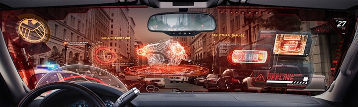
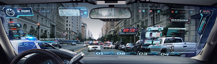
Screen graphics for Helicarrier interfaces in Captain America: The Winter Soldier. Courtesy of Perception.
Kirill: You mentioned that you didn’t work on a lot of Nick Fury interfaces, but let’s take this to a more general level of voice interactions. In the recent “Her” we only get a very short glimpse of the setup sequence and then the screens are completely gone, replaced by voice. And in real-world you have Siri, Google Now, Alexa and Cortana on modern mobile devices. Do you see these as a challenge in how to integrate these interactions and experiences into the world of film storytelling?
John: I think there’s something really spectacular about the movie “Her” in particular. It had an incredible vision of the future, and I felt that it was more realistic than most films that we see. It was even more innovative than holograms and glass screens. It was just simple elegance, and in a real world that’s the ideal – technology needs to become as transparent and natural as possible.
Movies like “Her” is challenging for us because we specialize in the visual representation of the interface. But that’s fine, because there’s almost always some sort of visual representation that is seen. Even in “Her” it was there even if it was somewhat limited.
In “Captain America” we did do an entirely voice-activated interface in Nick Fury’s car.
Kirill: Pretty much all his interaction with technology – in the elevator, in his office, in the car – was voice based.
John: Sometimes on these films we’re brought in very early on in the process to talk to the FVX supervisors, the directors, the production designers about what kinds of interesting technologies we would consider including within the film. A big part of that is thinking about technology that also lends itself to an interesting performance – and using a mouse or a keyboard is not very interesting.
To me the most advanced interface in the entire world would be when you don’t even have to talk to it. You have a chip in your brain and the way you use the interface is to just think about it. That’s very difficult to capture on camera, very difficult to convey and make it feel to be a natural and engaging performance. It would basically be Robert Downey Jr having nothing to do.
But when you create something that allows for a more interesting interaction. It can be voice. It can be gesture which is an obviously very big thing right now, and it particularly works well from Iron Man to Minority Report in creating something that feels very dynamic and interactive. Those are important thing when you’re making a film.
I sort of miss the flip phone for one specific reason. When you’re hanging up on somebody, you could slap it shut really hard. And that felt cool. That felt like a powerful action. And you lose that when you delicately press “Call end” button on your touchscreen phone. Finding ways to create something that also allows for emphatic performance is important as well, and it’s big thing that we factor in when we’re talking about these futuristic fictional interfaces.
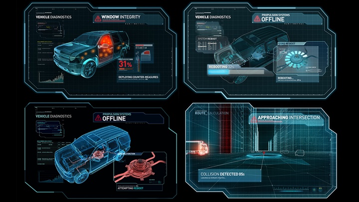
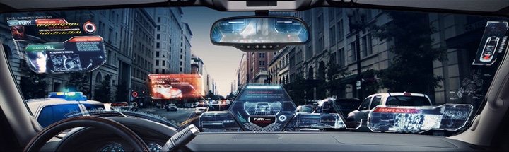
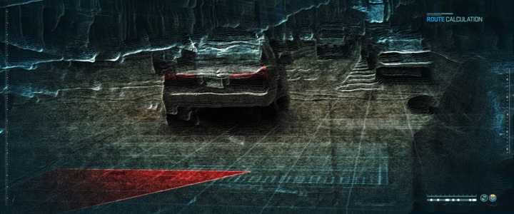
Initial design concepts for the automotive interfaces in Captain America: The Winter Soldier. Courtesy of Perception.
Kirill: If we’re talking about the automotive interfaces that you did for “Captain America”, it feels like the entire industry is in such a bad shape, almost like the 90s for the desktop software. How did you approach designing the interactions of Nick Fury’s vehicle?
John: The heads-up display went through a lot of research and development, figuring out a number of things. We figured out stylistically how advanced that technology would be – not as advanced as Iron Man as we discussed before, but perhaps it feels like Iron Man came and helped them with the interface just a little bit, but it’s still SHIELD so it’s half a notch below that.
And we also looked into what kinds of technologies are applicable in these scenarios. It goes from the car being self-driving to even hinting at the fact that his car could fly through the air. The wheels of the car would turn downwards, almost turning into the helicarrier-style propulsion.
Initial design concepts for the automotive interfaces in Captain America: The Winter Soldier. Courtesy of Perception.
Kirill: So that was this “Flight ability lost” part.
John: Exactly, and that’s the direct nod to the comic books. Every single one of the SHIELD vehicles in the books has that function to take off and fly around. Being able to hint at that through the interface is an opportunity to drop a little nugget for the die-hard fans that know that from the comic books.
And we researched a lot of other things. There’s a lot of scary stuff happening in the real world today where police cars have cameras mounted all over them that can scan license plates, so all they have to do is to sit on the side of a heavily-trafficked road and have the mounted camera scan everyone’s license plate, setting off an alarm for someone whose registration has expired. We’re trying to find ways to incorporate these technologies that feel realistic and then elevate them a little further beyond.
It’s interesting that you mention the automotive interface in general because that has always been very traditional in its execution. Cars never seem to be progressing technically as quickly as, say, our smartphones or computers.
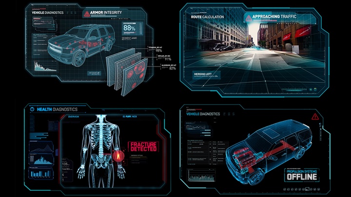
Look development concepts for the automotive interfaces in Captain America: The Winter Soldier. Courtesy of Perception.
Kirill: Would that be tied to safety concerns where an interface crash could lead to the car stalling on the highway, for example?
John: There are tremendous issues from the safety perspective. And a car has a very long product cycle both in its development and in its lifespan once it’s publicly available. I bring up a lot of these because we’re currently working with multiple automotive manufacturers and helping them with updating and conceptualizing where the automotive interface can go in the near to distant future.
Kirill: How far are they willing to push the envelope?
John: It depends on who you talk to, and I can’t get too specific as it’s highly confidential work. We’re working with multiple major manufacturers and doing everything from forecasting things that are 15-20 years down the line to things that will be commercially available in 2 to 3 years.
One common thing that we find is that everybody wants to be able to include as much functionality as well as aesthetic quality that feels at least as good or more advanced then what everybody uses on the daily basis. And those clients look for inspiration in feature film sci-fi futuristic interface. We now spend at least half of our time working with real technology clients who come to us to help consult, conceptualize, design and even fully execute interfaces and entire operating systems that bring some of the aesthetic qualities that you see in film interfaces and make them actually functional and usable, to make something that heightens the experience of the interaction. That particularly applies to areas where products have had interfaces that have been somewhat lacking or falling behind the industry standard.
Look development concepts for the automotive interfaces in Captain America: The Winter Soldier. Courtesy of Perception.
Kirill: Talking about developing real-world interfaces, do you see some kind of cross-pollination between the work you do for film interfaces and the traditional interfaces?
John: It’s really interesting. There’s certainly a lot that needs to be factored in when you’re working on a film interface or on a real interface. The notion of user experience for the real interface replaces it needing to tell a clear story to the viewer. But story telling is actually still a really powerful tool in a real-world interface, and it’s something that we use as part of our approach.
There are a lot of things that do carry over, and they carry over in both directions. We certainly take inspiration from our own film work in the stylistic execution and the aesthetic qualities of the interface. And when we’re working on film interfaces, we often take a lot of the grounded reality that we’re working on for the real stuff and bring that into film.
For instance, we worked on military and commercial grade flight simulator interface. I’m talking about one of those $15M pods on hydraulic legs that pilots use to log actual recorded flight hours towards certification. Our understanding of that system helps us make military heads-up display more functional and realistic in a film.
The directors of film love it when we present to them ideas that are fully thought out and really appear as if they function properly. When we present these concepts and ideas, we’re not saying “Here’s a bunch of boxes and windows all tinted blue and doesn’t it look cool.” We say “This menu up here performs this function, and this dial down here allows you to control this, and this timeline running across the bottom is tracking these things, and you’ll notice the upcoming points in the plot noted here and here while the past points are noted here.” And the directors love that realistic approach to the interfaces, and that’s something that solely has won us several of the pitches that we did for film interface against other studios.
Look development concepts for the automotive interfaces in Captain America: The Winter Soldier. Courtesy of Perception.
Kirill: Even though that as a viewer I’d only be able to see it if I hit the pause button and really look at each and every piece of the interface.
John: Absolutely. But when you’re making a film, those details are really important. When a film is being made, you’re not sitting back in a chair and munching on popcorn. You examine every single detailed nuance. And you never know that this film is going to stand the test of time and become something that people are watching 10 times because they fell in love with it and they know every single detail and nuance about it. That works on set and throughout the production of a film. That level of attention to detail is expected.
Kirill: You mentioned that your studio as a whole spends around half the time on real-world projects. What are your thoughts on smaller mobile screens taking over the interactions people have with their data and the Internet? Is it harder to design for smaller screens and shorter interactions?
John: Our site targets some of these real-world interface clients and tells our story. Part of our challenge there is that we can’t share much of our real-world interface concept work because it’s mostly for stuff that is not going to come out months or years in advance. But it gives a bit of a glimpse into what we do.
In regards to the smaller screens, I wouldn’t say that it’s harder or easier to work on a smaller screen. You just have to really respect that a phone is not a laptop and a tablet is not a phone. You have to work within the specific restraints and advantages that each of those device have to them.
Kirill: Going back to your film work, you mentioned Iron Man 2 as your big break. After that you did The Avengers and then the second installment of Captain America – all happening in the same Marvel universe. Do you aim for certain continuity in interfaces throughout that universe?
John: It depends. Sometimes the client will want to reference past interface or keep that sort of continuity, and sometimes they want to do a clean-slate approach. That really depends on the director and the storyteller in charge.
With the client such as Marvel that we’ve done so much work for there’s many more opportunities for that sense of continuity and continuation of a general aesthetic or theme throughout. That gets deeper into the branding, and that’s one of our favorite things – to have an opportunity to come into the project early enough to establish a sense of branding the interfaces for the entire film or even just for a specific set of characters.
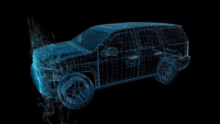
Design explorations for the automotive interfaces in Captain America: The Winter Soldier. Courtesy of Perception.
Kirill: What’s your elevator pitch? How do you tell people what you do?
John: It’s a very complicated thing to try and explain. I usually simplify it to we make computer screens that Iron Man interacts with and then we try to make these things work in real life for companies like Samsung, Space X or the automotive manufacturers.
Kirill: What do you think of the umbrella term of FUI where F stands for fake, futuristic, fantasy or fictitious?
John: We use a more general term which is future tech. It’s our way of forecasting technology trends of the future and bringing those to life.
Kirill: Looking into the technology of today, what would you like to see changing in how we interact with computers, screens or technology in general?
John: It’s hard for me to say what I would want it to be because it’s a very personal question. How would you like this stuff to help you to augment and improve your life, but also not to interfere with it? We’re already in a world where it’s really difficult to walk through a crowded train station because half the people are staring at their phones and aren’t even paying attention to where they’re walking. These things are very unpleasant about technology in the real world.
We talk about automotive interfaces and how people are spending so much time distracted in their vehicles that they’re literally killing each other on the road. There are a lot of weird negative things about technology and its existence. I almost think about a trend or a rebellion against technology as being one thing that could happen where it’s almost a new hippy movement that pushes away from technology and minimalizes it to the bare needed necessities to get by.
And on the other side I have this vision of the future where augmented reality is such a powerful thing that because you can augment anything digitally. Think about rather than buying a new shirt and a new pair of pants that are really cool, you would always be wearing a white shirt and pants, but you would download an application onto them so that anyone else you saw through their augmented reality lens would see whatever you had downloaded, purchased or designed yourself. And that would extend to everything in the world. Buildings would all begin to look like flat solid monoliths, but the architect would design a application for them that makes it appear to have a different facade or a different physical appearance when viewed through augmented reality. That notion of software being cheaper than the physical implementation of something would continue to take over and all of a sudden we’re living in this augmented landscape all around us.
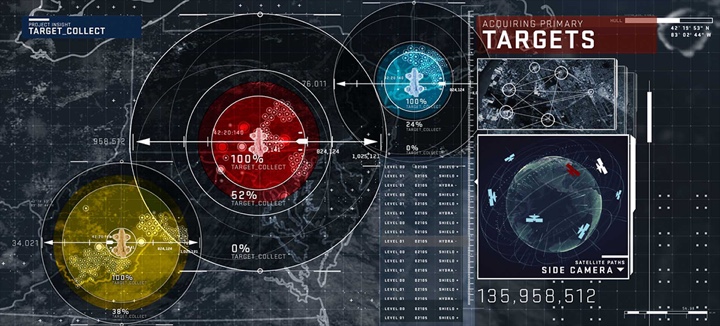
Screen graphics for Helicarrier interfaces in Captain America: The Winter Soldier. Courtesy of Perception.
Kirill: Wouldn’t that be a step towards the rather scary-sounding world depicted in The Matrix? The brain is fed all the signals and the world around you doesn’t necessarily even need to exist.
John: I’d say it’s a half-step. All of it is scary. Letting your car drive you around is scary, but already today there are cars that would do that in a minimal way. They will park themselves for you, or they will follow the road with adaptive cruise control. We’re giving more trust to this technology to handle the things, and as long as there’s an angle of convenience, we submit or surrender to it.
Kirill: What about the work environment? You mentioned the mouse and the keyboard as the boring things, at least for the movies, but they’ve proven very productive or, at least, they struck a very deep root in the last couple of decades. Would you want to change these interactions, taking them somewhere along the route of Tony Stark interacting with holograms gesturally?
John: I have a feeling that in certain instances, if it’s not broken, don’t fix it. You don’t want to change the organization of the letters on the keyboard just because maybe you’ve found something that can be more efficient – because then you lose that intuitive connection that we currently have based on our understanding of the keyboard.
You don’t change the position of the gas pedal and the break pedal in the car because you’ve decided that it’s more important that you use your right foot for breaking because your right foot has more sensitivity to it. You just don’t change those things without there being tremendous consideration and care being put into those decisions.
I think our current interfaces are relatively good. There are some positive things about touch screens, and there’s a lot of huge negative things about them. I do not like the lack of tactile feedback which, I think, is a really important thing. The precision and the control are also really important.

Screen graphics for Helicarrier interfaces in Captain America: The Winter Soldier. Courtesy of Perception.
The one area that I feel there’s a room for improvement is any sort of three-dimensional actions on a computer. You get into 3D modeling and working within 3D environments, and it still takes a lot of modifiers to make that work with the toolset that we have. And I’m not sure what the exact solution is for that. Is it a 3D mapped gesture controls? I don’t think gesture is a huge part of the future until gesture becomes hyper-sensitive to the point where you could make very subtle twitches with your fingers and your hands. Gesture is never going to work in the workplace environment for productivity if you’re waving your arms around. You’re going to break a sweat when you’re doing that, and you won’t be able to work for more than an hour at a time if you’re swinging your limbs around.
The stuff that I’m most interested in is where I see physical matter that is flexible in a way that a touchscreen interface sort of is. You can see SIGGRAPH presentations about tiny styrofoam particles that are moved through space with sound waves, and it allows the particles to cluster and form three-dimensional shapes on the fly. And then you had metal ball bearings and magnet fields where you can grab a ball bearing that is just floating in the air and move it around, and that movement would be recorded and translated to, say, a 3D camera move.
We’re still really far from it, but that’s the thing that is going to make a huge difference. Having physical tactile surfaces that give you the immediate sense of feedback but also morph or change shape or be flexible in a way that touch screens aren’t.
Kirill: There’s a lot of translucent or even fully transparent screens in the movies recently. It’s hard to judge them because we don’t have that technology available yet, but my impression is that it would very distracting to have the background peeking though into my working surface. What are your thoughts? Is it a movie thing only, or can it be applied to real world environments?
John: I think it’s cool and sexy and interesting, but I don’t see much advantage beyond certain things like augmented reality or heads-up displays. In film they’re really awesome because you can see through them. You can see an actor through the screen and that’s always a beautiful effect. And in the real world, if you don’t have control over your background, that’s bad. So the sweet spot would be augmented reality scenarios, like heads-up displays on car windshields.
Kirill: Winding down, how does it feel to watch the full movie that you’ve worked on in the theater? Can you detach from looking at your bits and get immersed in the story?
John: It always depends. It’s a product of what the process was like working on it. It’s always an emotional journey for us on these projects. Sometimes when we see them, you still feel like there is still one last thing you wanted to adjust or tweak. And sometimes it’s a really rewarding feeling.
Design explorations for the automotive interfaces in Captain America: The Winter Soldier. Courtesy of Perception.
And here I’d like to thank John LePore for agreeing to do the interview and talking with me about his craft. This is the first of two parts on the screen graphics / FUI work that Perception has been doing in the last few years – you can find the second part right here. And if you’re interested to read additional interviews about the wonderful world of screen graphics and user interfaces for film and TV, click here for more.
