The craft of screen graphics and movie user interfaces – interview with Jorge Almeida
Continuing the series of interviews with designers and artists that bring user interfaces and graphics to the big screens, today’s I’m honored to welcome Jorge Almeida. You have seen Jorge’s work on the seminal “Minority Report”, “Iron Man 2”, “Eagle Eye”, “The Dark Knight Rises”, “Mission Impossible: Ghost Protocol” and “Star Trek Into Darkness”. His latest production, “Tomorrowland”, is scheduled for release in May 2015. In this interview he talks about the evolution of digital tools in the last decade, designing interfaces that fit the story, striking the balance between visuals that compel the viewer and yet do not attract attention to themselves, the relentless pace of working on motion pictures, the lasting impact that “Minority Report” has had on the tech industry, his thoughts on screens in future offices and homes, and his recent transition away from the world of film UI.
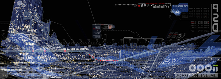
Eye scan interface from “Minority Report“. Courtesy of Jorge Almeida.
Kirill: Please tell us about yourself and your path so far.
Jorge: My name is Jorge Almeida, and I’ve worked as a user interfaces designer for the film industry for over 10 years. I’ve designed and/or animated UI for a number of feature films including “Minority Report,” “Iron Man 2,” and “Star Trek Into Darkness.” I recently finished work on the upcoming “Tomorrowland” and have since taken a UI Design position with Microsoft.
I originally started in Florida working in print. I spent years doing page layout and design for advertising, newspapers, and catalogues. I was also a computer colorist for a comic book company and wrote and illustrated my own comic book “Captain Cosmo and Phil, the bionic dwarf.” I later moved to Los Angeles and took a job with Black Box Digital, a small design and VFX house that used to operate in Santa Monica. Black Box worked on a variety of projects, but their bread and butter was film UI. They worked on films like “Armageddon” and “Enemy of the State.” They originally hired me to work on an online comic book project, but over time I started taking on more of the UI work. I loved movies, so I was happy to be involved in the industry.
I ended up spending 5 years with Black Box. I’ve since done UI work on other films including “Eagle Eye” (at Pacific Title), and “Iron Man 2” (at Prologue), before taking a lead designer position at OOOii. There, I served as lead UI designer and animator on “Mission Impossible: Ghost Protocol,” “The Dark Knight Rises,” and “Star Trek Into Darkness.” I’ve also gotten a few illustration jobs, one of which was doing the drawings for the end title sequence of “Sherlock Holmes.”
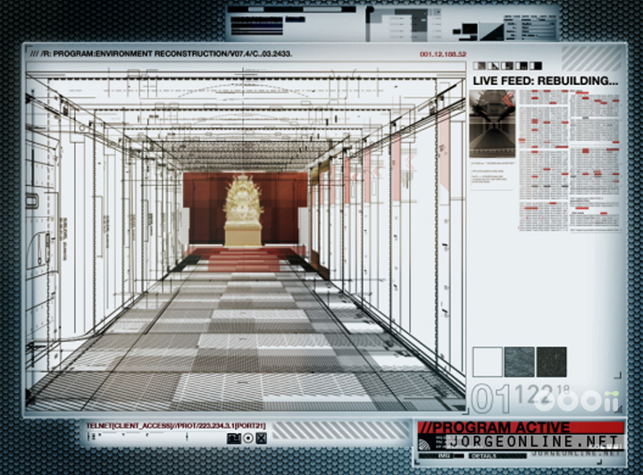
Kremlin hallway scan from “Mission Impossible: Ghost Protocol“. Courtesy of Jorge Almeida.
Kirill: As you transitioned from print design to doing movie interfaces, did it help that both operate on a single fixed canvas where you don’t need to worry how elements reflow and adapt to different screen sizes?
Jorge: I’d never really thought about that, but yes. You’re also pretty spoiled because it’s make-believe. We aren’t as restricted by specific style and font size requirements because our ultimate goal is to help tell the story. Unless required, I try not to get too caught up in minute details of accuracy and functionality. My goal is to make an interface that feels right. If the viewer understands what the UI is trying to communicate, without being distracted by the design, then I did my job.
To me, film UI is more about illustration. There’s a lot of design involved and a lot of thinking about how the UI works, but ultimately it’s about illustrating a story point and trying to do it in a way that the audience finds interesting. Also, I find that many of my design ideas are born out of an abstract concept that I am trying to illustrate.
For instance, one of our tasks with “Minority Report” was to digitally represent the raw stream of data that was pouring directly from the precogs’ minds. I focused on trying to make the date stream appear almost organic and alive. The data itself was essentially frame sequences and snapshots from the various precog visions, often repeated and overlapping, that are spread out horizontally along a timeline. However, with enough of these elements treated a certain way, the data did start to give the impression of something slightly fluid- especially when animated. This seemed especially fitting considering that the data was representing a murder. Numbers and bar graphs and digital readouts seemed too impersonal for such an event. For this reason, when designing the giant Precog screen, I thought of it as a sort of futuristic autopsy table.
Another example would be “Eagle Eye,” there are a few shots where I was trying to make the UI feel sort of like Frankenstein’s monster- with elements looking like they were ripped from other interfaces and cobbled together. For “Mission Impossible: Ghost Protocol” I was trying to give the UI an element of intimacy, like a doctor looking at X-rays. For the starship Vengeance in “Star Trek Into Darkness” I was trying to make it feel like the inside of a submarine. I’m often going for a feel, a sort of visual metaphor that fits the spirit of the movie. I didn’t get to think that way when I was working in print. Not that all print is like that, just that the type of work I was doing was more structured. I use my page layout experience more when I work on real-world films.
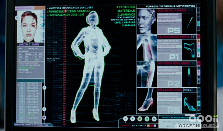
Body scan user interface, “Mr and Mrs Smith”. Courtesy of Jorge Almeida.
Kirill: Were you interested to follow the latest research and directions in the world of real software / hardware?
Jorge: I wouldn’t consider myself a tech junkie. Often times the technology was written into the script, so our job was to visualize the writer’s ideas. I would therefore do whatever research was required to do that accurately. I did a lot of real-world research for “The Dark Knight Rises,” for instance, because that was the style they were going for- but that’s not how I spend my free time. I spend more time looking at data visualization books, or any design books for that matter. With Black Box, as well as with OOOii, I was lucky that our offices were within walking distance of a Hennessy and Engels bookstore. They sell a great selection of art and design books.
Kirill: Where did your hours go when you were working on a typical production?
Jorge: It depends on what part of the production cycle I was involved with. During pre-production I would be creating a lot of design concepts for approval, so I spend most of my time generating designs, doing research and/or building animation elements. Once the production starts, it’s almost like a train that starts moving, and you’re trying to lay tracks in front of it as fast as you can. It’s not like post-production where you have some wiggle room with deadlines. During production your work must be ready when the camera rolls. No exceptions. You also need to be prepared to cope with schedule changes, and have the ability to work fast. It’s exhausting, but it’s also very creative and productive. There are also days where you spend half of your time making sure that things are polished and formatted correctly. You’re dealing with production notes, fine tuning animations for the sets. And then the other half is spent on continuing with concepts and designs. Production is the most intense for sure.
Animating can take much more time, patience, and planning than design. Since I do both design and animation, I can often get bogged down in the animation side of my work. Some days it felt like I did nothing but watch progress bars going from left to right. Still, I’ve come to love animating. I love visual storytelling and watching designs come to life can be very cool.
Kirill: You have a lot of VFX houses working on different shots, or even different parts of the same shot. How do you keep the communication and exchange flowing?
Jorge: It’s usually pretty straightforward. It will involve a phone call or two with somebody at the VFX house where we discuss the shots involved and how they would prefer the graphics be delivered. For monitor replacements, we normally provide a single frame sequence with a preview quicktime and/or whatever style frames or rough comps we might have shown the director for approval. For VFX shots like the Star Trek HUD, I will often render the key elements separately so that the compositor has maximum flexibility to dial in the look that the director wants. Ideally, there is not a lot of back and forth between us and the VFX house. Although we are collaborating in providing a service to the studio, the VFX houses are further down the pipeline. Therefore, I see it as our responsibility to provide good service to them. They’ll tell us how they’d like files and I see it as our job to provide the elements to their specifications.
HUD concept for “Minority Report“. Courtesy of Jorge Almeida.
Kirill: Going back to 1999 when you started doing film UI. What kind of hardware did you have back then?
Jorge: We were using Macs, but I don’t remember which models or the specs. There were only four of us when I started at Black Box: Kent Demaine and Will Robbins were the owners, Eric Berger was a generalist who would also tackle any technical issues, and me. Although we were small, we always seemed to have good equipment. I don’t remember any of us ever using render farms back then, though. I think we rendered locally or used somebody else’s machine to render. Kent animated the precog screen, and I remember him having to render certain shots as six 2k tiles for the compositors. That was a huge render for us at the time.
Kirill: And as you get better hardware over the years, it’s still never enough to keep up with the increasing demands on your output – resolution, complexity, number of shots.
Jorge: That’s part of what was frustrating. When we were working on earlier films, we would say that the hardware will catch up and eventually we wouldn’t have to spend so much time at work. The truth has been the opposite. I spent more time on the last “Star Trek” film then I did on any of my earlier films. Of course, it might also have something to do with the fact that I’m a workaholic.
Kirill: Do you find yourself borrowing or extending certain interaction elements from your previous productions?
Jorge: Sometimes I would repurpose old elements like blocks of text or window elements. Generic stuff. That happens more in the real-world films. When I’m doing something more creative like sci-fi, then I’ll come up with something new. Those jobs, although more work, are also the most fun.
Kirill: Was there anything that you wanted to take into your next movie but couldn’t because it was clearly a thing associated with that specific production?
Jorge: Not that I can think of.
Kirill: How have the tools evolved in the last decade? Are certain things easier to do during production or post-production these days?
Jorge: The software has definitely improved. I’ve worked almost exclusively with Adobe Illustrator, Photoshop, and After Effects for the past 13 years. That suite has improved tremendously, however I think Illustrator has fallen behind the other two in terms of UI design and functionality. I also have come to love Adobe Bridge as a tool for previewing and choosing concepts. I use it almost as my desktop now.
 If there was one issue I have with software, and computers in general, it’s that error messages are no more helpful now than they were 10 years ago. No matter how much I learn, I still feel just as helpless when things go wrong.
As far as things being easier, production has been made easier now that we don’t have to worry about frame rates and monitors flickering. However, I have noticed over the last few years that they play more graphics on devices like tablets and phones- which require different setups and headaches. On “The Dark Knight Rises” I designed and produced animations that played on phones, tablets, laptops, monitors, as well as the giant jumbotron at Pittsburgh Stadium.
Kirill: Was it any different for you on “Star Trek Into Darkness” which was a 3D production?
Jorge: Not really. On our side it was all 2D, and we were never asked to render anything specifically for 3d.
Kirill: There’s a lot of screens on “Star Trek”, and in particular on the bridge. Do you try to create a certain overall system of how different crew members control the ship?
Jorge: We received a seating chart so we knew who was sitting where and what there functions were. There was also a 360 degree radar monitor that played along the upper wall above the stations. Most of the stations were done on the first “Star Trek,” during which I wasn’t as involved in the UI for the bridge. I worked on a couple of the stations, and I created the animated widgets that you see floating on the giant radar, but most of my work for the first film was in the medical bay. In general, the production designer wanted to keep things pretty abstract with text being used minimally, so it was about trying to find a way to suggest the individual functions rather than spelling them out.
Kirill: And you don’t want to attract too much attention to those screens in the background.
Jorge: Right, and that’s especially the case with on-set UI. You want a certain level of activity so that the background feels active, but not too much that it draws attention to itself. It’s one area where film UI differs from reality, because most real-world computers are static. But in movies, especially action movies, the UI works better with a certain level of activity onscreen. It can be a tricky balance. For “Star Trek Into Darkness” we also had to create damaged versions of the animations which were much more active with plenty of red and blinking. Those obviously would have never worked during normal scenes, but with the shaking ship, moving camera, and actors running around they blend right into the background and add to the overall sense of panic.
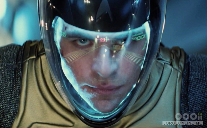
Spacejump HUD from “Star Trek Into Darkness“. Courtesy of Jorge Almeida.
Kirill: And then you have the sequence where Kirk and Khan fly through space from the Enterprise to the Vengeance. There the in-helmet UI took the central role.
Jorge: That was a fun sequence to work on. Not only was it a great-looking action sequence but the UI would provide the link between the ship and Kirk/Khan. There was the in-helmet UI, the viewscreen that Spock was monitoring, and a glass display that Bones was monitoring. Since it was all done in post, we were given an early edit of the sequence to design to. Many of the challenges involved getting the timing and positioning of elements right so that the flow of the sequence wasn’t disrupted.
With the helmet HUD, I tried to design the UI to compliment the actor’s face. I even added a brief facial scan at startup to suggest that the UI would customize itself to fit the character’s features. JJ had mentioned he wanted the UI to feel military, since it was in a pilot’s helmet. I started with a military HUD in terms of functionality, and then tried to streamline and remove elements until if felt right. Similar to not wanting the background screens to attract too much attention, you never want to cover the actors faces.
Kirill: You worked on Star Trek, Mission Impossible and The Dark Knight Rises, essentially getting into established franchises. Do you aim to maintain visual continuity from the previous installments?
Jorge: It depends first and foremost on what the director wants. On “The Dark Knight Rises” it was obviously the same director as the previous films, and he wanted to keep things real-world and generally consistent. Luckily for me, one of the sets was a remodeled Batcave- so I was asked to redesign that UI from scratch. As for “Mission Impossible: Ghost Protocol” there was a new director, and he was fine with letting me redesign the UI.
With “Star Trek Into Darkness” they re-used many of the background Enterprise animations from the previous film, so it was important that we keep things consistent. Since we created the UI for the first film, that wasn’t a problem.
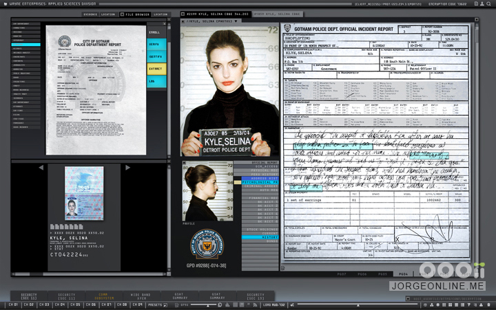
Batcave UI – Selina Kyle search in “The Dark Knight Rises“. Courtesy of Jorge Almeida.
Kirill: There’s a lot of people who are well-versed in every single little detail of the original “Star Trek” universe, including all the onboard computers and interfaces. Did you want to extend or enhance some of those older elements?
Jorge: I briefly brought up the subject of LCARS, and was told they wanted to take things in a different direction. I’m not exactly sure why, but our goal was to try to make everything unique to the world that J.J. Abrams was creating. Besides, LCARS wasn’t seen in the original series anyway so I would understand why they felt no obligation to replicate it.
Kirill: At which stage did you join “Minority Report”? Was it after the “think tank summit“?
Jorge: I believe so. We started during pre-production, and I remember looking through a brief that the production had put together based on that think tank. It detailed the world they wanted to create and featured some concept art of various sets and props. It was more about the physical tech, not the UI. Aside from what was seen in the film, there were also ideas like mini winged-drones owned by the various TV networks that would swarm around a crime scene like mosquitos. Anderton’s apartment was originally going to have UI that would appear anywhere on his walls using gestures. I also worked on a HUD for the police helmets.
As far as the precog screen, John Underkoffler created a booklet detailing the gestural language that would be used to interact with the UI. It was something like 20 pages, and it included photographs of the various hand positions and movements along with definitions for each. It was very cool.
Precog interface from “Minority Report“. Courtesy of Jorge Almeida.
Kirill: Were the compositing tools adequate for your designs?
Jorge: On that film Black Box only composited a few shots, for which they brought in a flame artist to do the work. Most of our work was composited by other companies like Asylum and ILM.
Kirill: Do you ever look back and wish to have the hardware and software from today on those movies?
Jorge: Yes, especially for the stability. It’s the system and software crashes that make me mental after a while. I’m pretty good at saving, but software didn’t always have auto save. Granted, part of the reason I used to get crashes is because I would use tons of layers. I like having the ability to mix and match layers and refine designs on the the fly, so I keep elements separate for maximum flexibility. That style has helped me in many ways, but it would also result in my files would get bogged down and crashing. I’ve had to force myself to work more efficiently over the years, but I still have a long way to go. Fortunately, my computer can handle much larger files now, so the technology seems to be meeting me halfway. Also, I can RAM preview most of the animations I work on now at full resolution, which makes proofing go much faster. That wasn’t always the case.
Kirill: What stays with you after wrapping up the production? If you look at your movies from 5 or 10 years ago, do the crazy hours fade away?
Jorge: Actually, the hours are what stay with me, but in a good way. When you work on a movie with a certain group of people, you develop a bond. The memories of doing the work are the shared experience that we talk about. Will Robbins also works at Microsoft now, and he and I were recently laughing about the old days at Black Box when you could walk around on certain nights and find each of us sleeping on the floor in our offices. People think seeing your work in a movie would be some grand moment, but for me it never is. It’s a weird feeling to spend a year of your life on something and then watch it fly by in a couple of hours. You work on a single shot, sometimes as short as 40 frames, and you watch it so many times that you forget it’s only two seconds on screen. I remember watching “Minority Report” for the first time, seeing one of my animations fly by, and thinking “there goes 3 weeks of my life.”
That being said, I’ve really come to appreciate working on film UI. Title sequence are seen as higher profile, and that’s what most motion graphics artists like to work on, but I’m personally not a big fan of splashy title sequences at the beginning of a movie. I find them to be a needless distraction that takes you out of the experience. Film UI, on the other hand, is actually part of the film and helps tell the story. I also enjoy being part of the production process and watching movies get made. On “The Dark Knight Rises” I was on the Batcave set watching Christian Bale in full Batman suit interacting with my work. That was surreal. I got more of a kick out of that experience than seeing those shots in the movie.
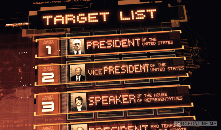
Project Guillotine interface from “Eagle Eye“. Courtesy of Jorge Almeida.
Kirill: And sometimes entire shots get cut based on whatever considerations the director and the producers had.
Jorge: Right. That sometimes stings. In general, I would say that, on average, at least 25% of my work ends up not being seen in a movie. Camera positions change, the script changes, monitors get repositioned, or the UI is hidden behind actors, lighting or props. Monitors also get replaced in post. It’s part of the process. That happens less with post-production because those are VFX shots that need to get paid for, so production is much more selective as to what they have you work on.
Kirill: And you have increasingly more people working on these big-budget productions. There were these efforts to create large libraries of digital elements that could be combined together with little need for additional technical human involvement, but that hasn’t really happened so far.
Jorge: Not that I know of. We tried to do something like that using flash, where a few animated pieces could be multiplied and reformatted to fit any screen size. The only problem was that the results were pretty boring.
Film UI is one of those things that people mostly notice when it’s done poorly. Bad UI just sticks out. My very favorite bad UI is for the film “Remo Williams: The Adventure Begins” (a movie which I happen to love). The UI in that film doesn’t even look like UI, it looks like some bad 70’s arcade game. Of course, now that’s become part of the film’s appeal to me.
Anyway, it’s been my experience that everything needs to be done pretty much from scratch in order to do your best work. It also makes the process more satisfying.
Kirill: Does it usually happen that you’re required to be on set for face-to-face time?
Jorge: Less now than before. Not only because connection speeds are faster, but because fewer productions are taking place in Los Angeles. Luckily, “Star Trek Into Darkness” did shoot in LA. Since we were involved all the way through post, I was around the production a lot. During pre-production I would meet regularly with production designer Scott Chambliss and director JJ Abrams to show them designs and animations.
Once production starts, the director is always on set and his time is very limited, so if I’m on set I might get a few minutes here or there to show our work. Most of the times it’s the graphics supervisor who will show our work for us and pass along any notes.
Stark Expo model scan and analysis from “Iron Man 2“. Courtesy of Jorge Almeida.
Kirill: How close does the post-production get to the release date?
Jorge: I think the latest I’ve worked on a film was six weeks prior to release. Something like that. It was for “Eagle Eye” and it was a stressful situation because the original lead designer got fired in the middle of post-production and we fell behind schedule, so I was asked to take the lead. We really had to work fast to get everything finished.
Kirill: Do you have any down time between your movies?
Jorge: There’s was always a month or two between production and post where I’d get to catch up on sleep and go home at a normal hour. However over the last few years I worked pretty much non-stop from one movie to the next, finishing one movie as I started the next with very little down time. During the last couple of projects I was starting to worry about my health. That’s when I knew I had to change careers.
Kirill: Do you have any objections to your work being labeled fantasy UIs or fictitious UIs? How do you introduce yourself to new people at a party?
Jorge: No objection at all. Fantasy UI seems the most appropriate, actually. When I would sit back and think about it, I was always amused at the fact that I worked on a soulless machine to create fake computer interfaces for a fake world where not even the actors themselves operated the UI. All of the animations were activated by somebody offscreen and timed to the actor’s movements. I couldn’t have been more separated from reality, so why not call it “fantasy?” Oddly enough, I always found the absurdity of the job to be part of its appeal.
As far as how I introduce myself to normal folk, I usually tell people that when they see somebody in a movie whose working on a computer, I’ll create what’s on the monitor. I will usually have to follow that up by referencing “Minority Report” or “Star Trek.”

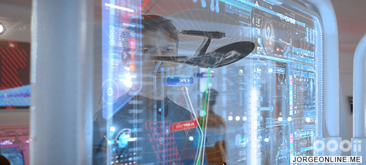
Glass panel on starship Interprise, “Star Trek Into Darkness“. Courtesy of Jorge Almeida.
Kirill: Were you surprised by the impact that “Minority Report” had and that it is still being felt today after a decade? I think this is the only movie that has left such a long-lasting impression on the general public outside the usual window of interest right after its release.
Jorge: Honestly, I wasn’t that aware of it. It’s probably because I’m not the most social person in the world, nor am I involved in any trade organizations or online forums, so I just never exposed myself to a lot of public feedback. I knew people remembered the movie, but I just figured it was because of the big names that were involved. Since coming to Microsoft I’ve received some flattering compliments for my work from other UI designers, so I guess I’m becoming more aware of its impact now.
That being said, we knew when we were working on it that it was a great opportunity for Black Box. I remember Kent saying to me, during preproduction, that movies like “Minority Report” wouldn’t come around often so I should enjoy it. He was right. On that film we had a lot of elements work in our favor. First, we had a script in which the function of the technology was featured in the story. We also benefitted from having a great production designer, Alex McDowell, who encouraged us to experiment. We also had a director who trusted us and let us do our thing. Spielberg would make story notes, like every director, but he generally gave us a lot of creative freedom. I even remember him saying during a critique “I don’t get it, but it looks cool.” He couldn’t have been nicer, which meant a lot to me considering he’d always been one of my heroes.
We also benefited greatly from the fact that the UI was featured mostly on transparent glass screens. Not only could we frame the UI around the actors, making the shots more interesting to look at, but it also allowed the actors to move more dynamically instead of being hunched over a screen. A lot of pieces fell into place on that film that made it a great showcase for our work.
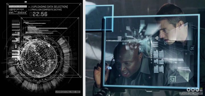
Left – Stark Expo model scan and analysis for “Iron Man 2“. Right – early precog interface concept for “Minority Report“. Courtesy of Jorge Almeida.
Kirill: Outside of the specific movie and its influence, would you like the technology to be more pervasive around us in both professional and personal settings? Should it explicitly present itself, or should it recede into the background?
Jorge: I’m not a fan of minimalism for the sake of minimalism. I appreciate the elegance of that approach, but the results can sometimes be pretty boring. Some of my favorite data visualizations are very dense and ornate. Hopefully dataviz will come to be seen more and more as an art form that is displayed not just for the information, but for it’s beauty. I think upcoming technology like transparent displays, holograms, etc. will require us to see UI this way. There will be no more monitor casings to block our view, and no frames to confine them. UI will become part of our living space, so I would imagine that people will eventually start thinking of UI the same way film designers do- as part of the bigger picture.
Kirill: It almost sounds like you’re doing interior design.
Jorge: That’s right. What you have on your computer screen, in terms of interior design, is no different than a plant on your desk or picture on the wall. I think eventually we’ll see UI as part of the overall look and style of the space in which it resides. It will be nice when we don’t have the current monitors to contend with. They are like mini cubicle walls.
Kirill: And you’re not only talking about office spaces of high-tech companies.
Jorge: Wherever. Ultimately, I think UI and dataviz could make future workspaces and homes appear much more colorful and exotic because we’ll prefer them that way. For example, what if in the future you had a digital representation of your family tree hanging like a picture on your wall, constantly updating with new information and events. You’ll spend more time looking at it than interacting with it, so of course you’ll want it to be beautiful.
Glass panel interface from “Star Trek Into Darkness“. Courtesy of Jorge Almeida.
Kirill: Do you feel that our office environment is stagnating in the last couple of decades? We might be having larger monitors with better resolution, but it’s still the same windows-icons-menus-pointer interaction with the same old mouse.
Jorge: Yeah, I guess. There must be a better way to do it, because my desktop is just as cluttered now as it was 20 years ago. The file-folder-pointer system was a great way to transition from the physical office space to the digital, but eventually a generation will come along that won’t need it. It’s hard for me to criticize real-world technology, though, coming from the film industry. It’s easy to think up ideas but much harder to execute them. It doesn’t just require a different approach to UI, but also users who have the energy and the need to try something new.
I’m a bit surprised that the multi-button mouse hasn’t taken off more amongst users. I would have thought we’d get to five-button mouse by now, or maybe even two of them simultaneously. What I find outdated is that I still keep one hand on the keyboard, trying to operate a device that was originally meant for two hands.
Kirill: Would you take it to the level of Tony Stark in “Iron Man” interacting with a holographic projection of blueprints and issuing voice commands?
Jorge: I hope so. What will be nice about gestural interfaces is how much healthier they will be to use. Regardless of whether or not we’ll be standing, just that fact that we’ll be able to lift our hands up off our desktops will take a lot of pressure off our wrists and improve circulation. Spending so many years in front of a computer has given me wrist pains, finger numbness, eye strain, headaches, back pain, etc. All from sitting on my butt all day with my hands resting on my desktop.
Kirill: How is your transition to the world of “real” products now that you’ve moved from doing film UI to work at Microsoft? And by real I mean the world of hardware limitations, conflicting user requirements and ever-present bugs.
Jorge: I’ve only been there a couple of months, so I haven’t yet been heavily involved in the product cycle. So far, I’m really enjoying it. There are some talented people here with a lot of passion. I think in the long run it will be more satisfying, knowing that I’m working on something that could directly affect the quality of people’s lives.
Kirill: Do you get to flex your artistic side at work, or do you leave that for your free time?
Jorge: I’ve gotten to do some storyboarding for Microsoft, and UI design/animation is an art in and of itself, so I’m lucky that I get paid to do something creative. As far as fine art, part of the reason for my move to Microsoft was to free up time that I can put into getting a fine art career off the ground. As much fun as film UI can be, it was so exhausting that there would be months where I wouldn’t have the time or the energy to even pick up a pencil. It was frustrating because I love to draw and to do so effectively requires daily practice.
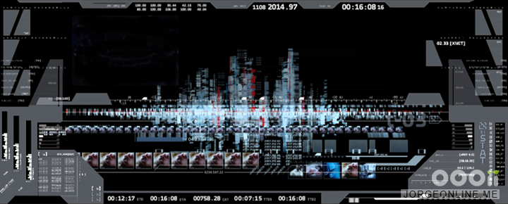
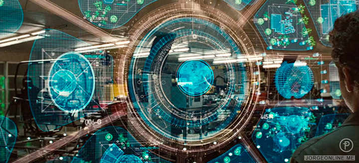
Radar screen on starship Vengeance, “Star Trek Into Darkness“. Courtesy of Jorge Almeida.
And here I’d like to thank Jorge Almeida for sharing his time to answer a few questions I’ve had about his craft. You can find more of Jorge’s work at his online portfolio.
