Human-computer interaction in “Prometheus”
As I was watching “Prometheus” again after the interview with Shaun Yue, paying closer attention to how human-computer interaction is presented in the various systems, a particular point that he made during the interview stood out:
When you look inside NASA control centers and spacecraft, the graphics do not appear very futuristic. Same if you go inside an air traffic control room and nuclear submarines – all of these very mission-critical settings. The graphics don’t become more sophisticated. If anything, they become simpler and more basic. You’re dealing with such important data that has to be processed.
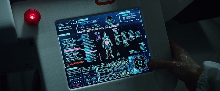
In one scene, Shaw hobbles over to the medipod to initiate a Caesarian to remove the trilobite from her body. She presses the red “Emergency” label on the screen (it’s not clear if this label is red before she touched it, and the earlier introduction of the equipment does not provide a clear view of the default presentation). In response, the automated voice says “Emergency procedure initiated, please verbally state the nature of your injury.” The first part is reinforcing the acknowledgment of the selection, and the second part guides Shaw to state the next command verbally. As Shaw says “I need Caesarian” the voice replies “Error, this medpod is calibrated for male patients only. It does not offer the procedure you have requested. Please seek medical assistance elsewhere.” She then initiates manual selection mode, making quick taps on the selector wheel and saying “Surgery. Abdominal. Penetrating injuries. Foreign body. Initiate.” which completes the selection phase and opens the pod.
Christopher Noessel over at the “Make It So” blog dissects this sequence:
Aside from the pointless “tension-building” wrong-gender plot point, there are still interface issues with this step. Why does she need to press the emergency button in the first place? The pod has a voice interface. Why can’t she just shout “Emergency!” or even better, “Help me!” Isn’t that more suited to an emergency situation? Why is a menu of procedures the default main screen? Shouldn’t it be a prompt to speak, and have the menu there for mute people or if silence is called for? And shouldn’t it provide a type-ahead control rather than a multi-facet selection list?
…
Why does Shaw need to speak in this stilted speech? In a panicked or medical emergency situation, proper computer syntax should be the last thing on a user’s mind. Let the patient shout the information however they need to, like “I’ve got an alien in my abdomen! I need it to be surgically removed now!”
I disagree. Natural language processing is a daunting task on its own. While false interpretation of voice commands is annoying when you dictate a memo, incorrectly interpreting a medical emergency from the words of a distressed patient can have quick and lethal implications. Particularly in a system clearly designed for a particular person – Peter Weyland.
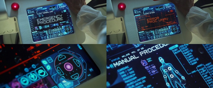
After the first voice-based interaction, as the system correctly recognizes an unsupported precisely-defined medical procedure, it does not presume to offer alternatives, or attempt to parse additional voice descriptions of Shaw’s situation. Instead, the manual selection interface offers an impressively quick way for Shaw to navigate the tree of available options and choose the specific supported procedure. And while the first impression is that Shaw is continuing to issue voice commands to navigate this menu, the second part of the sequence clearly shows her using the on-screen selector wheel – merely commenting her selections for the viewer’s sake.
The remarkable efficiency of this selection requires a certain degree of proficiency interacting with computer systems – which is implicitly expected from all passengers aboard this scientific expedition. The speed of this interaction is even more remarkable after watching the 3D re-release of “Jurassic Park” and its infamous “It’s a UNIX system! I know this!” scene, where it takes Lex 56 seconds to navigate the three-dimensional flyover rendering of the file system to locate the component that locks the laboratory doors.
While the sequence highlights the novelty of the interface, it also underscores the poor usability of the system even if you are familiar with it – with unnecessarily long transitions that follow each particular selection, and grotesquely zooming in on a very small part of the overall hierarchy.
It takes a more focused watching of “Prometheus” to see how pervasive computer screens are aboard the ship – on the bridge, in the science lab, in the airlock chamber and around the medipod. And yet the interaction is minimal. Actually, the only explicit interaction seems to be when Charlie turns on the projection cube and proceeds to swipe the hologram projections of cave paintings. The rest is relegated to pure visualization – such as the initial descent path of the ship, the DNA sequence matching or the diagnostic scan of Shaw’s abdomen inside the medipod. It’s as if the software is written to know what needs to be presented at any point in time without lengthy explicit instructions from the crew.
When you don’t have complex interaction patterns, you have fewer points of failure. While a crash in the DNA sequence matcher is a marginal waste of time, a crash in the descent tracker or the medipod is a matter of life and death. Removing interaction complexity or, in fact – removing the need for the explicit interaction once the intent is understood – is a key part in how the human-computer interaction is presented throughout “Prometheus”.
There are two systems worth noting for their uncommonly complex visualization layer. The first is the Holotable on the bridge, and the second is the Engineers’ spacecraft control room – the Orrery. Both are featured prominently throughout the movie, but yet both are displayed as low-risk systems.
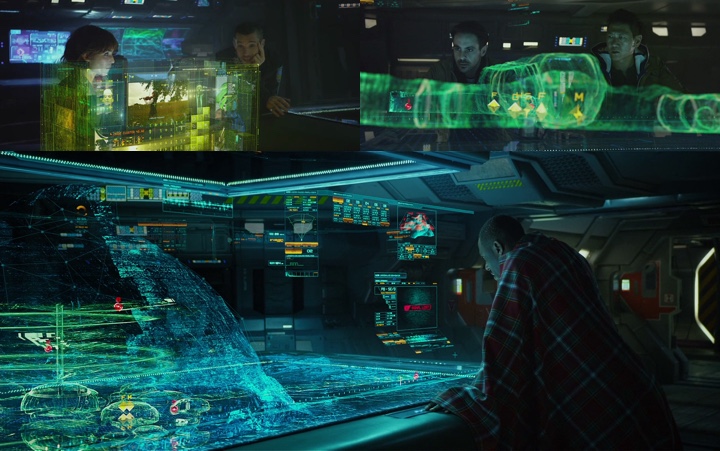
While the Holotable displays the visual structure of the dome as scanned by the laser “pups”, what happens if some part of that system crashes? Not much probably. The crew would miss some part of the scan, or see incorrect position of the probes, or miss the Engineers’ spacecraft. In fact, the sequence where Janek realizes that the underground structure is a spacecraft shows quite clearly that it was visible in the scan the entire time after David has opened its doors – even as he turned off his shoulder camera. If anything, failing to see the spacecraft in the rendering is a human failure.
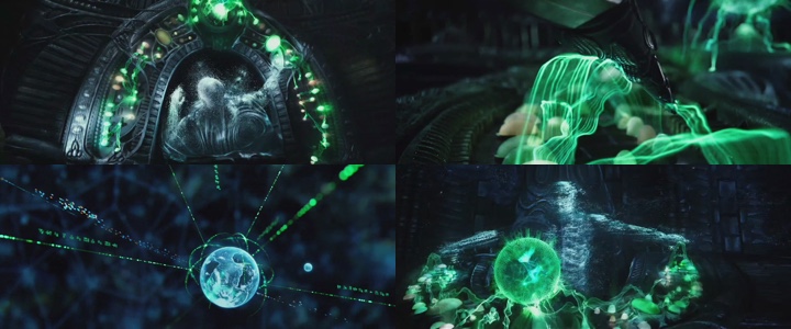
The Orrery itself is an interesting experimentation in visualizing planetary systems. However, it seems to purposefully stay as far away as possible from presenting the “quantum leap” interfaces that might be just within our reach if only we stop focusing on the next incremental improvements to the existing ways we interact with computers. If anything, the overhead shots of the deck Engineer, combined with booting the system by playing a flute portray this interaction as playing a musical instrument. If you’re interested in a deeper analysis of this navigational interface, click over to the “Make It So” blog.
Overall, the visual prominence of holographic stereo projections – mainly highlighted in the Holotable and the Orrery sequences – overshadows an interesting take on portraying human-computer interactions in movies. Computer screens are pervasive aboard the ship, and yet the amount of actual interaction required to accomplish the specific tasks is minimal.
Natural language voice input for a predefined set of tasks, predictive surfacing of relevant information, concise visual representation of salient data and simple touch-based interaction as the fallback for cases where incorrect interpretation of the user intent has life-threatening implications. These are some great ideas that deserve exploration in the real-world software.
