Physical and perceived view bounds
Some of your Android nine-patch assets may have transparent outer areas. For example, the buttons in Google Play Store have 4dip transparent outer area for the normal state. The assets for pressed and focused states then use that area for outer glows. What does this mean for aligning such controls with the rest of the UI?
If you place such a button in, say a vertical LinearLayout and set android:paddingRight on that container, you will get correct alignment for the physical content bounds, but not for the perceived content bounds. That transparent 4dip-space on the right side of the button will push it further inside the container, while the rest of the content (which does not have that extra space encoded in its asset) will be aligned on a different perceived vertical line.
Let’s take a look at the purchase dialog displayed on devices with larger form factor:
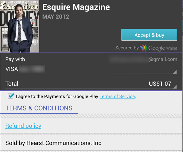
The “Accept & Buy” button is visually aligned with the “Secured by Google Wallet” text below it. But, the actual right edge of the button view is 4dips to the right of the right edge of that text view. Another option would be to set the right padding on that text view to 4dips as well. Sometimes, if you have such a button along the right edge of the container, you would need to set different paddings / margins on the content, depending on which side of the container it aligns to. And yes, the “Accept & buy” in pressed state shows the highlight halo that goes beyond the rest of the content that is aligned to the right edge of the screen. This, however, is a better compromise than having the button moved inwards when it’s in the normal state.

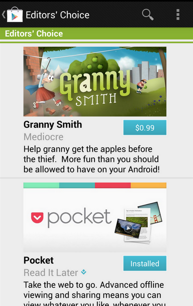
Sometimes you need to consider how view / background colors blend when you’re working on perceived alignment. Here’s how the app editorial cells looked like in the previous release of Google Play Store. It’s functional, and if you open hierarchy viewer to look at the physical bounds of promo image and the blue button below it, they are at the same right edge. But the outer transparent area encoded in the 9-patch asset (for outer glow of pressed / focused state) causes perceived misalignment.
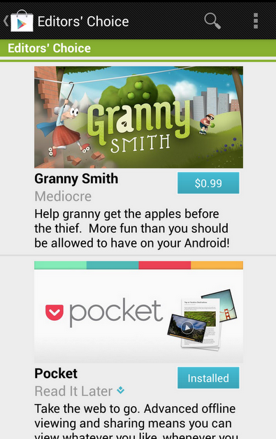
The next screen accounts for that transparent area by moving the button to the right. So now you have the right edge of the image aligning with the right visible edge of the button. But there’s still misalignment, and now it’s even more pronounced (aka the uncanny valley). In most cases the blue action button is displayed on dark grey background, and its outer white edge is quite visible there. But in this context we have very light gray fill, and the button’s outer white edge is almost unnoticeable:
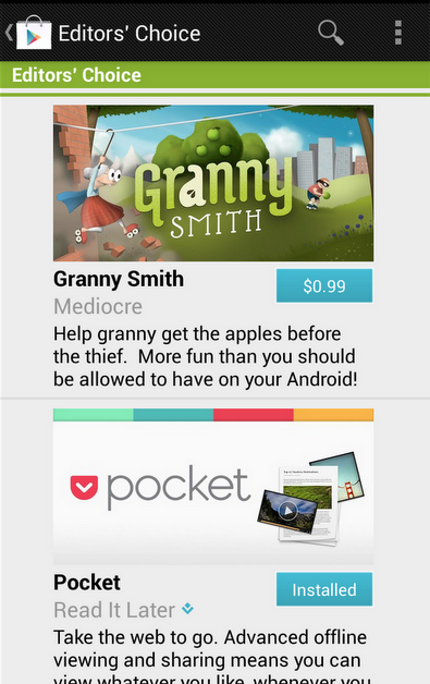
Our current solution is to nudge the button even further to the right, aligning the right edge of the promo image with the inner blue fill of the button, as shown here: