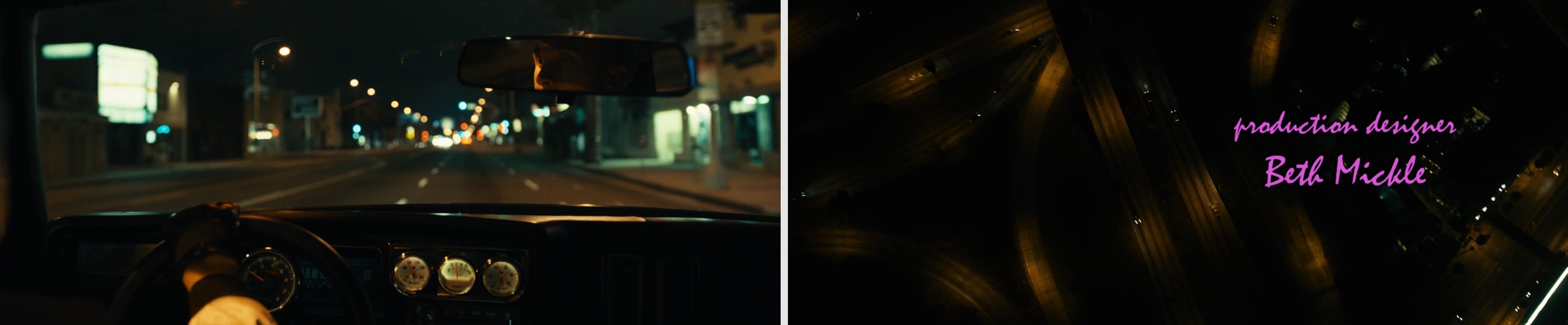
A man of a few words and emotions, slowly drawn into a deepening vortex of violence. “Drive” is a patiently woven tale of action, tension and darkness that revels in impeccably styled sets and meticulously raw drama. It is my absolute pleasure to interview the movie’s production designer Beth Mickle on how the movie came together, her most memorable sets and, how not, the story of the scorpion jacket.
Kirill: Let’s start with your background and how you got into the movie production design.
Beth: I started about ten years ago when I designed my first film when I was 21. I worked on several films with my brother when he was at film school at NYU back in 1999, and he had me working on a several student films helping out with sets, props and wardrobe. During the summer before my senior year at college a cinematographer friend of ours was planning to do a feature film; we worked together on a few films and he recommended me to be the designer. I did that – for no money – we just chipped in for the love and to get experience in feature films. That was called “Madness and Genius” with Tom Noonan, and it ended up going to the Toronto film festival, was up for Independent Spirit awards, played on the Sundance channel and did quite well for a little indie. We actually made the whole film for $18,000 (laughs).
 That was how it began for me, and I was extremely lucky that the director of that film had gone to NYU with Ryan Fleck and Anna Boden who directed “Half Nelson”. About two or three years after I had done that first film, Ryan and Anna called to see if I would be interested in doing “Half Nelson” which will forever be the film that really began my career.
Kirill: And then you went on to progressively larger productions?
Beth: I did very small indies for most of my career, actually. That was how I was recognized, I think. And then they started to be a little bit bigger in size over the last few years until “Drive” came up. Ryan and I had stayed in touch after “Half Nelson” and they were looking for a designer and he recommended me for “Drive”. That is how I ended up on “Drive” which was another incredibly fortunate moment in my career.
Kirill: How does in general the selection process work? Do you show the stills and pictures form your previous productions, or some kind of a motion highlight collection?
Beth: It’s a mix of things. It’s almost always previous work in past films that I’ve done and people have seen, and directors and producers respond to. If I do few period films, people can see my work in that area and it can lead to jobs in other period productions. And then when I go in to actually sit down with the director I’ll bring in two things.
The first is my portfolio that has hardcopy photos of all the main sets I’ve done, and I always include “before” and “after” photos. They show the locations before we started working on them, completely empty stages or sets in a warehouse, and then after we’ve done our job to rebuild or decorate from scratch. This shows the transformations and the possibilities.
And then the other thing I bring to the interview is a book of inspiration photos that I pull together after reading the script and imagining my vision for it. I pull hundreds of reference photos for the overall tone and color, and then I pull out the top five or six sets from the script and show reference images for each one so that the director can see the direction I’m imagining for the sets.
And so we sit and I go through them all and see if the things I’m envisioning are along the lines of what the director has in mind, and it goes from there.
Kirill: How was the process for “Drive” specifically?
Beth: It all happened extremely quickly, it was a really unusual case. They were just three weeks out from shooting and they needed a designer to come in and work very quickly. So I was sitting at home on a Friday night after finishing a job a couple of days before, and I had another potential job that was going to start in few weeks that I hadn’t officially signed onto yet. I got a call from my agent, and he said there was a film with Ryan Gosling looking for a designer to come on board ASAP.
The next day I had a Skype call with the director and the producers for an hour-long interview, and that night they called and said “You have the job. Can you be on a plane to LA tomorrow?”
Kirill: So you only had three weeks before the shooting started.
Beth: Normally you have around eight to ten weeks, but it all happened so quickly that we only had three weeks from when I landed to do all the prep. This was the shortest amount of prep that I’ve ever had on a feature film; even on the tiny indies you get at least four or five weeks. But that was one of the things that Nicolas [Winding Refn, director] really responded to, he really appreciated that I was able to work very quickly under pressure to get everything done. It was very demanding. We would work 16-18 hour prep days from the minute I landed up until we started shooting. We worked over our weekends, with no days off throughout prep – and even then we didn’t have a day off until about three weeks into the shoot (Laughs).
Kirill: As I was watching the movie I noticed that you had relatively very few sets, with each scene taking much longer than in a typical action movie. On one hand you have fewer sets, but on the other you have the camera spending much more time on each one. Does that require more attention for each set?
Beth: Absolutely, and that’s a great thing to point out. We didn’t have a high volume of sets, overall we had maybe 15 total sets that we really had to focus on. And you’re right – we spent so much time on each of these sets. Even at the end in Albert Brooks‘ home where we spend perhaps 20 seconds in the scene, the original script and shooting had us there for two or three really long scenes in this huge house of his.
There was such a small number of sets. In the film I’m doing now we have over 50 sets that we’re building and dressing. And to only have 15 or 20 made the short prep a lot more feasible.
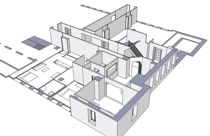
Sketch-up of driver/Irene’s apartments. Courtesy of Beth Mickle.
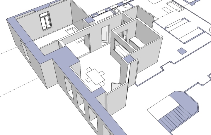
Sketch-up of Irene’s apartment. Courtesy of Beth Mickle.
Kirill: Did you have to spend much more time on each individual set because the camera ends up being there for minutes at a time?
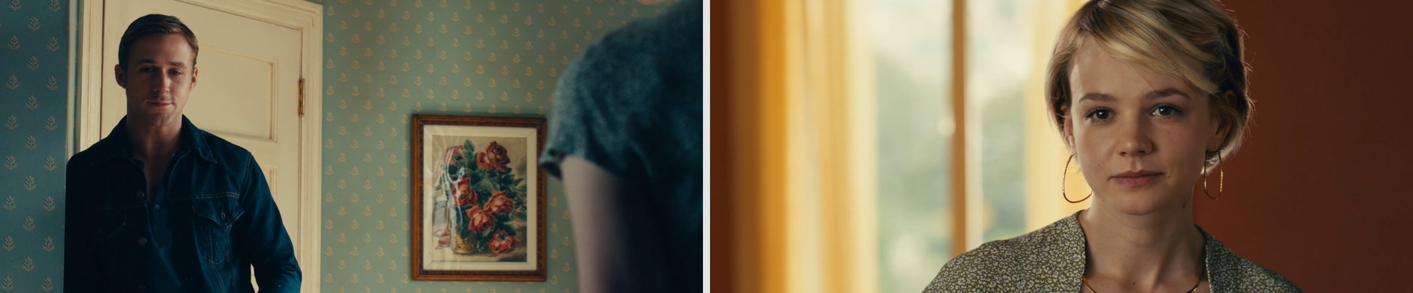
Beth: Yes, and we ended up with a lot of detail, especially on Carey Mulligan‘s apartment and Ryan Gosling’s apartment. Those were the ones with the most focus, and both the actors were really responsive and collaborative. Ryan had a bunch of ideas for his set, and if you look at it, there’s one wall that has this kind of old toile wallpaper. We aged it to look like it had been there for several years, and it was Ryan’s idea. He said that he wanted one wall in the apartment to have an old wallpaper that has been there forever, something that you can’t explain, something that doesn’t fit his character but it had formerly been somebody else’s apartment and he didn’t bother to change or paint.
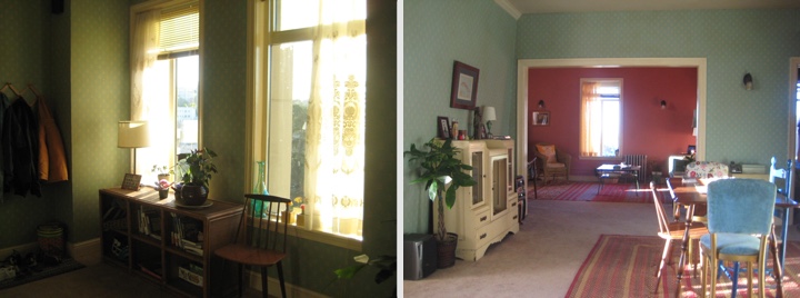
Carey / Irene apartment’s set. Courtesy of Beth Mickle.
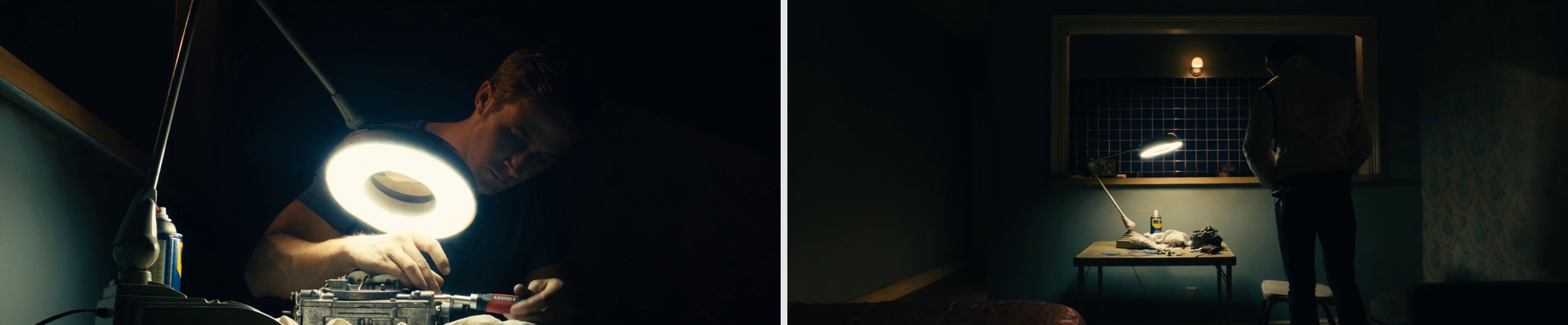
He liked the idea that when you move into these apartments as you hop around as a nomad, you always move into somebody else’s space, into the decisions that somebody else made before you. What kind of linoleum floor to put down? What kind of carpeting? What kind of wallpaper? He wanted to play with that idea which I really liked. He also wanted to have a car engine part sitting on his table, something he’s working on it. That’s his only hobby outside of driving and listening to music in his car, and Ryan wanted to show that passion.
Kirill: Does it happen a lot that you have these conversations with actors about what they would like to see around them?
Beth: It depends. Some actors really want to be involved, and some actors are happy to let you go at it and then step in on the day to see what it is. I would say half and half. Ryan is extremely involved, and he was on “Half Nelson” as well. Probably two or three main actors on each film would want to sit down and have a conversation about their sets, bring some ideas. And the other half of the main actors are so focused on their performance and their work with the director that when it comes down to the set details, they don’t address it too much.
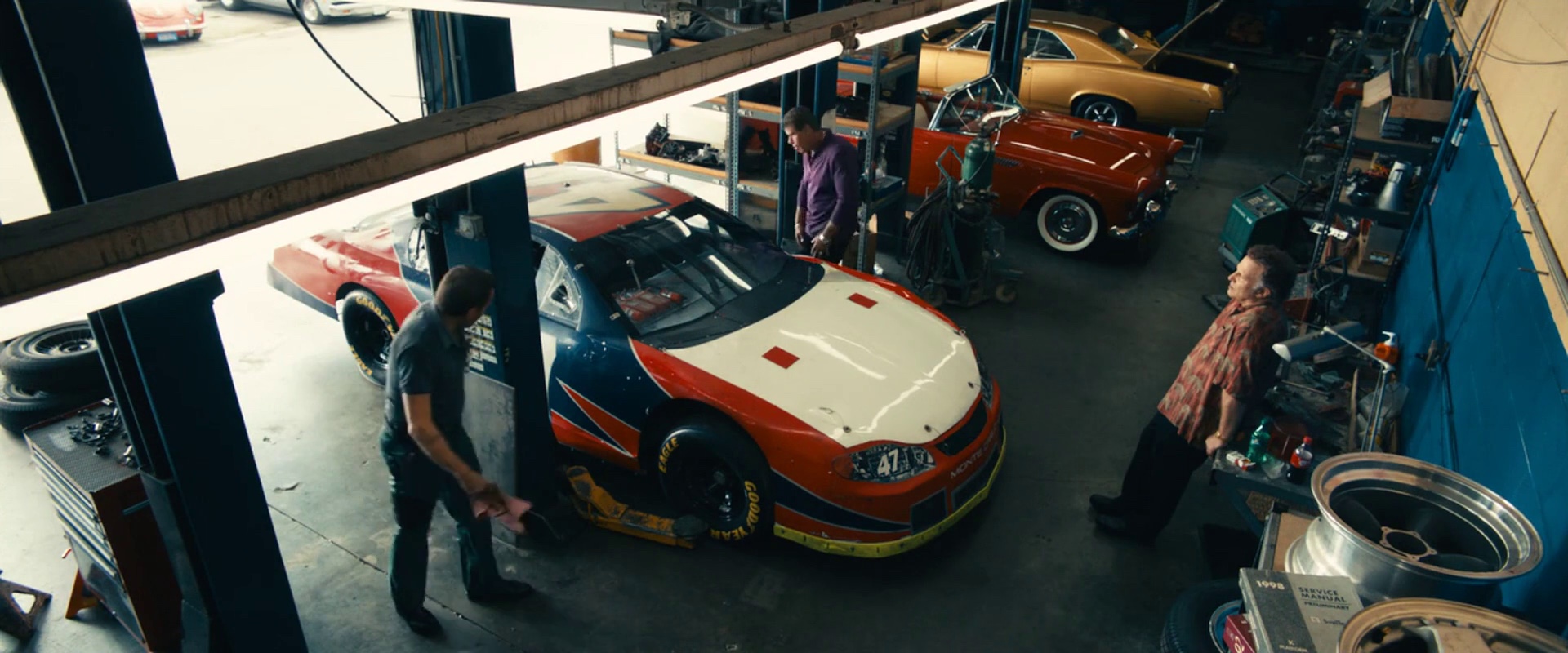
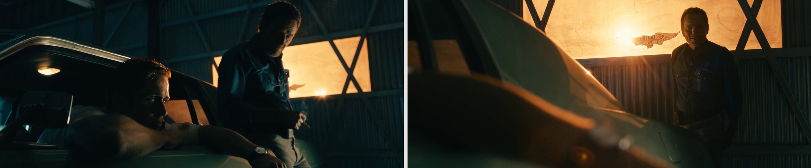
Kirill: Let’s talk about the car shop where Ryan’s character works. Did you use an existing location?
Beth: The space that we’ve used was the “Picture Caw Warehouse” company in LA which specializes in cars for films. They had one huge car bay out back that was empty and all white, with an office adjacent to it. We found that we wanted to shoot there, and we went in and did all the painting with rich blue tones, and did rich green tones for Bryan Cranston‘s office, and dressed everything from top to bottom. That was definitely another set with a lot of attention and a lot of details. We were there for days, and that was one of the sets that we dressed around the action – where Ryan would be working on the car, or where Ron Perlman would be walking around. We would pull the dressing around that in the background so you always see something behind them.
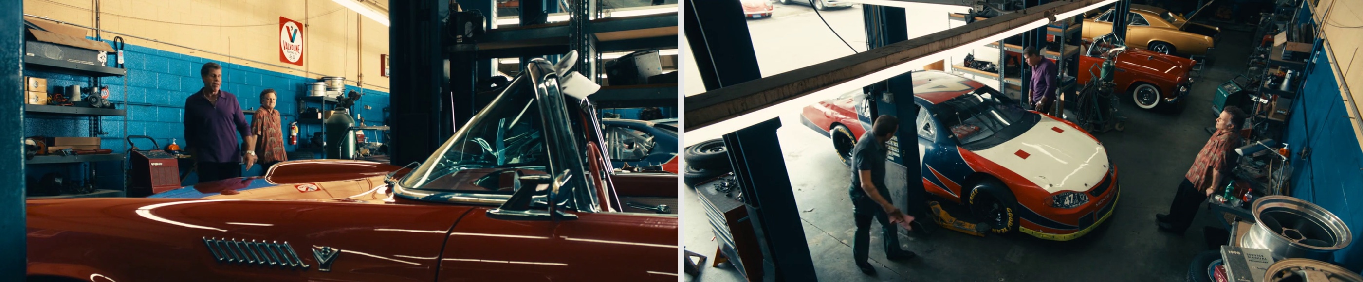
Bryan Cranston was really involved. He came up with a lot of ideas about what he would want to have in his office. We ended up doing a whole row of business cards lining the huge window in his office, little business cards tucked all along the frame of the window and piled up on the side of the wall. That was all from him.
Kirill: Did you do anything special with the cars?
Beth: It was so enjoyable. I went out to the vintage car lot and went through all of our options and picked the top 15 cars that we wanted to have in the background. Then we would bring them over and I would select 4 or 5 that would actually go into the car bays. We color coordinated it so that the right colors would end up there, with good rich reds, blues, greens as primaries, a few really sharp snazzy tones. Each day we would bring new cars and change them around to figure out what we want for each scene. I did learn a lot about cars, and a film that I’m doing now is a bigger action filled with lots of cars and car chases. It’s fun getting back into it.
Kirill: Apart from the pawn shop and the stunt chase, most of the outside scenes are just overhead shots of the night city streets. Was this due to production constraints?
Beth: Because we were a lower budget film in the eyes of the studio we didn’t do a lot of dressing outside. The director was great. He just said “it’s all the night time with naturally existing lights in LA and let’s not worry about adding light or signage.”
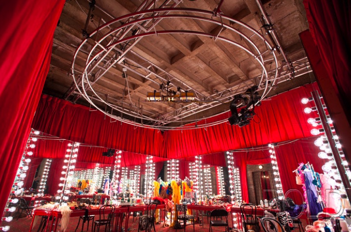
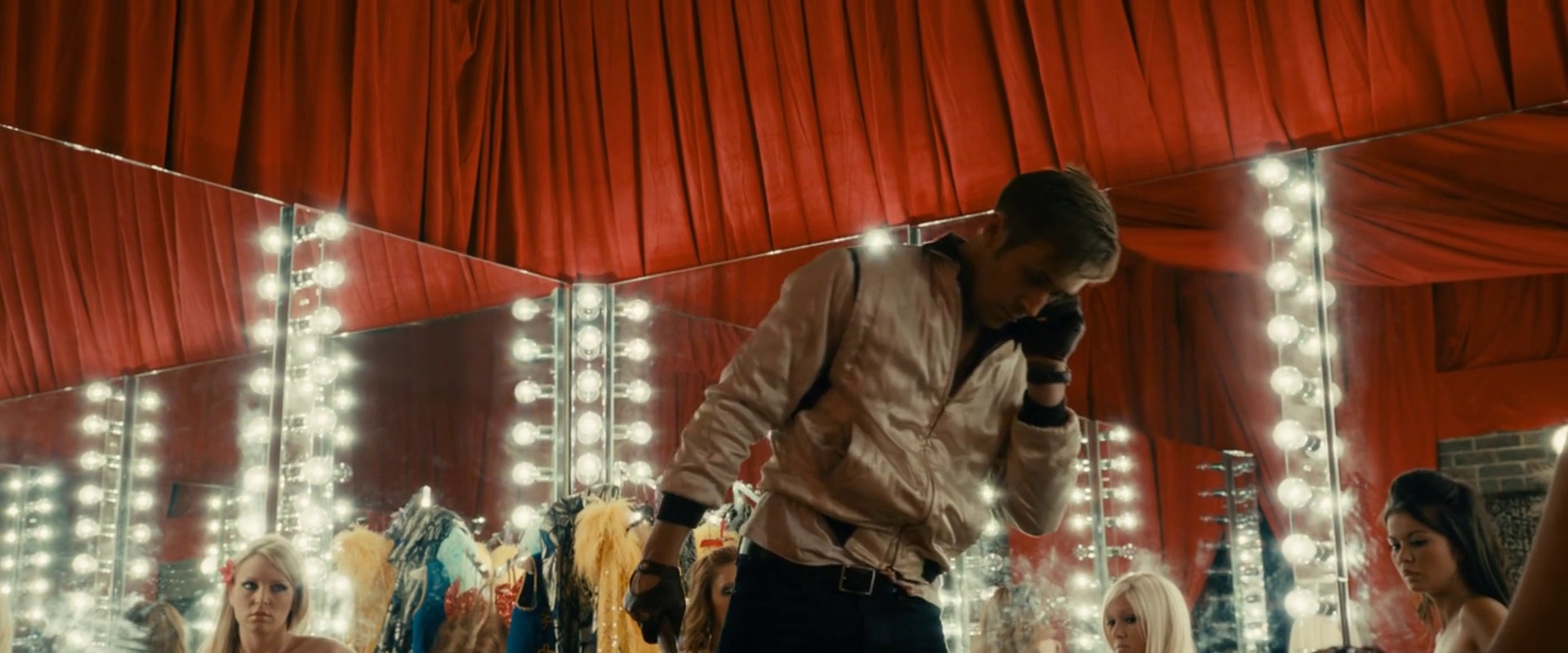
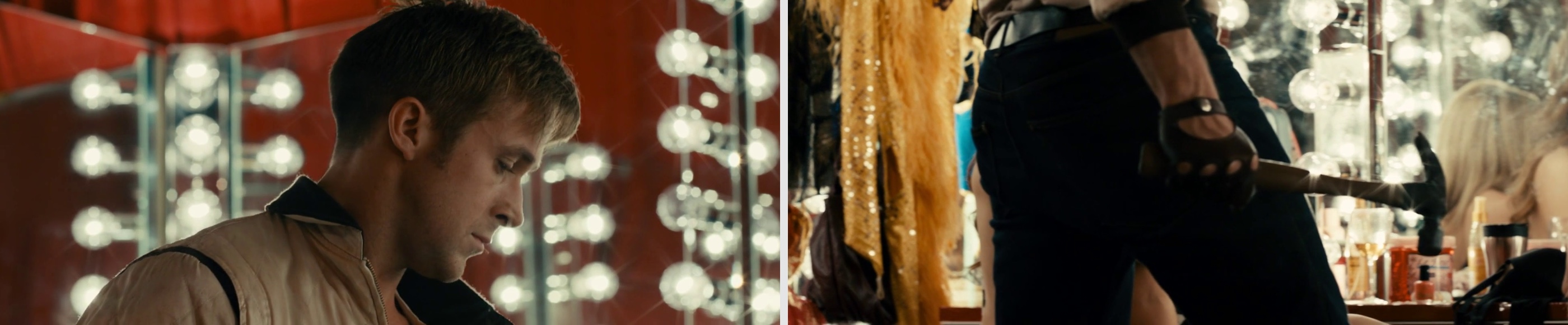
Another bigger interior set we dealt with was built right downstairs from where we built Ryan and Carey’s apartments. It was the strip club dressing room with the mirrors going around in a big circle, red drapery everywhere, ornate gorgeous red carpet on the floor. We did that from scratch, set it up on an empty warehouse floor. All through the prep the Nicolas [director] kept saying that he didn’t want to see the strippers on the stage, dancing around poles as you have seen them before. He wanted to go into a more interesting space, a place where we don’t usually go as an audience. And so we came up with the idea of a behind the scenes dressing room.
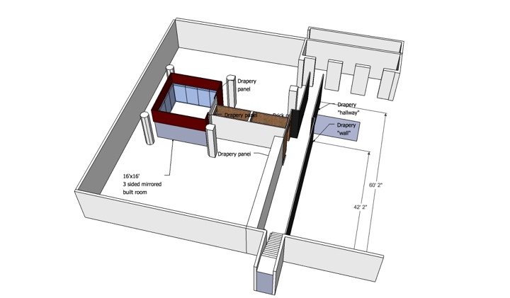
Sketch-up of strip club set. Courtesy of Beth Mickle.
Strip club dressing room set. Courtesy of Beth Mickle.
Kirill: It was this big splash of color
Beth: That was really exciting. Nicolas said “Do something, I like mirrors, I like red drapery. Play with it”, and we had no money to do it. We ended up finding a ton of mirrors. We built them onto moveable frames and I drew it up as this big circular rim of mirrors so they would all hit each other and reflect back and forth. We couldn’t afford a ceiling so we just had red drapery hanging all across the ceiling. We found this great carpet with swirling gold and jewel shapes on it, and we used that as the ground flooring. And finally our set decorator, Lisa Sessions found these beautiful dressing lacquered tables and it all came together. We added beauty bulbs around each of the mirrors and it all became this glittering mirrored set. To this day that’s probably my favorite set in the whole movie.
Kirill: Were you sad to tear it down once the shooting was complete?
Beth: Yes, it’s always sad to pull these sets apart as quickly as they came together.
Kirill: Even though you didn’t have a lot of external scenes in “Drive”, in general you have much less control over the external locations, especially for long shots.
Beth: Especially on smaller films. You’re part of the process when you’re picking the exterior, going out with the location manager looking to see what streets look the best, what streets have the best signage and the best layout. You’re involved with it, but on smaller films you don’t really have the budget to do a whole lot of changing there. Actually on the film I’m doing now we’re doing this Western street corner, painting the building facades, doing different signage throughout the decades everywhere, exterior lighting. It’s great when you have the resources to spread this far.
Kirill: Going back to the few outside night scenes in “Drive”, did you play with the lights to bring out certain specific areas?
Beth: That was mostly our cinematographer, Tom Sigel, and he did such a beautiful job with it. We did bring in a dozen sodium vapor street lights for the scene where Ron Perlman drowns in the ocean. We lined them along the Pacific Coast highway to provide more light for that scene.
Kirill: You already mentioned that the director wanted natural light. There were quite a few inside scenes happening in broad daylight where the outside light was let in in a very low, almost horizontally bounded pyramid. Did that affect the way you dressed up the interiors?
Beth: Not too much. We did have conversations with the cinematographer on what kind of light was he imagining to use – daylight, natural light, table lamps, standing lamps, overhead lighting. Once you know the layout of the set that definitely helps you to dress it and to think about the colors you’re going to use.
Kirill: What about the quality and spectrum of the light? Does it affect your choice of colors, textures and patterns for the set dressing?
Beth: That’s always a big thing when you’re choosing colors —you need to know what kind of lighting there will be in the room, to know which colors would work well and which won’t.
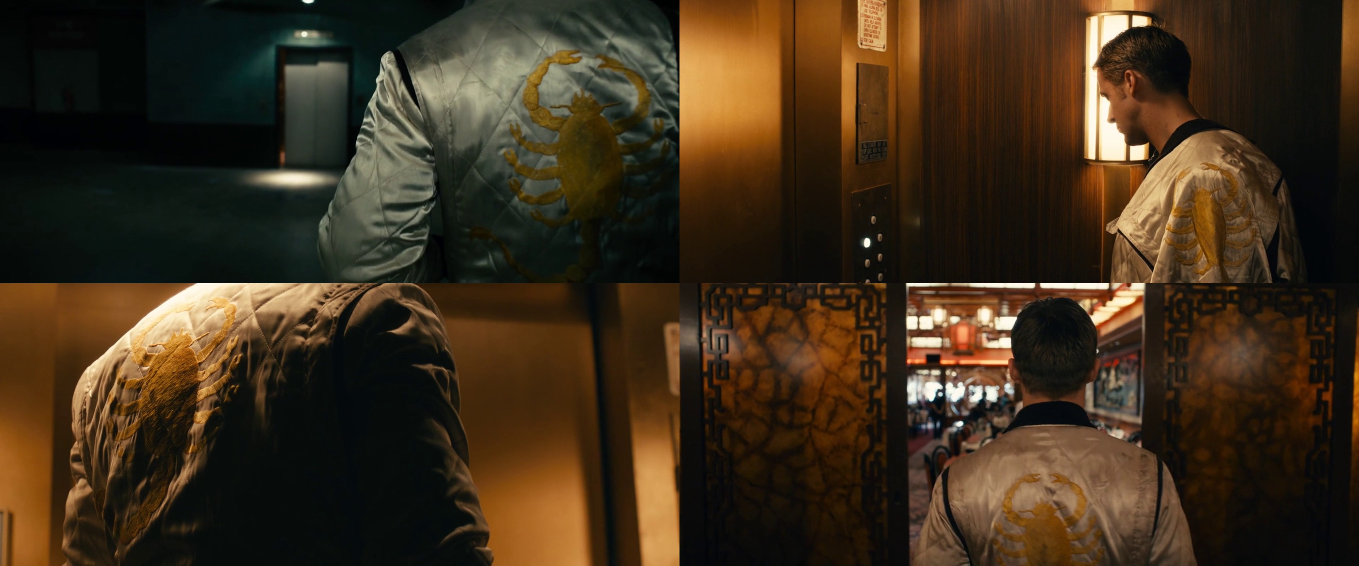
Kirill: Let’s talk about the scorpion jacket. What’s the story behind it?
Beth: None of us expected it to become such an iconic thing. It was just a fun byproduct of the film. I think that the idea came from Ryan [Gosling] and our director, but I’m not 100% certain. We knew that we wanted to have a scorpion on it, so we had the graphic designer Megan Greydanus work on the different scorpion symbols to put on the back of it. The costume designer Erin Benach worked on several different designs, tried everything – brown jackets, gray jackets, ivory jackets, aged ivory jackets with black trim, white trim. What color is the collar? What color is the cuff? We went through countless versions. We had camera tests on it, and finally we landed on the version that you see in the film. Erin did a fantastic job with it.
We wish we would have known what a recognizable item it would become. Ryan has one of the jackets, Nicolas has one of the jackets. We needed to have about six or eight of them by the end because it goes through different stages. It’s newer at first, and then it gets dirtier and then it gets bloody… then bloodier!
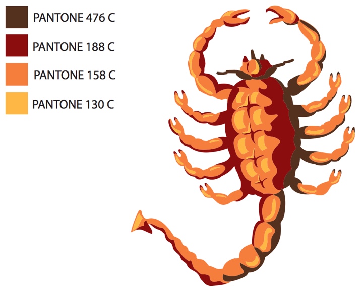
Scorpion illustration with Pantone legend. Courtesy of Beth Mickle.
Kirill: There are certain comparisons that have been drawn between “Drive” and film noir from 1940s – with low lighting throughout the movie, slanted camera angles and the overall pervasive atmosphere of doom for the main characters. Did you have any particular references?
Beth: We watched a few French films. “The Samurai” by Jean-Pierre Melville (1967) was one. We watched a few Jules Dassin‘s films, and Japanese Technicolor films. Nicolas really liked the colors in those. We watched “Irreversible” for some of the fight scenes to get sense of how he wanted the violence to go. The prep was so quick and we didn’t have a laundry list. Nicolas also wanted “Drive” to go in the theatrical direction of “Bronson”, so we kept that in mind.
Kirill: Let’s talk about Carey Mulligan’s character. Even though she essentially leads Ryan Gosling onto a doomed path, she is a very soft spoken, shy girl. Everything about her is very quiet – the fabrics, the wallpaper patterns, her hair style. Was this intentional?
Beth: Definitely. We went through lots of different options for her place. We knew we wanted her place to be a place where Ryan’s character would want to come to, a place that is warm and comfortable – versus his place which was very sparse and less inviting.
Carey / Irene apartment’s set. Courtesy of Beth Mickle.
Kirill: You mentioned that the strip club was your favorite set. Was there any other set that you particularly enjoyed?
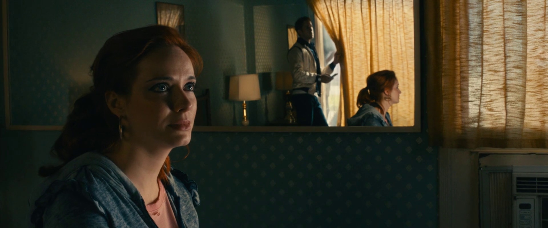
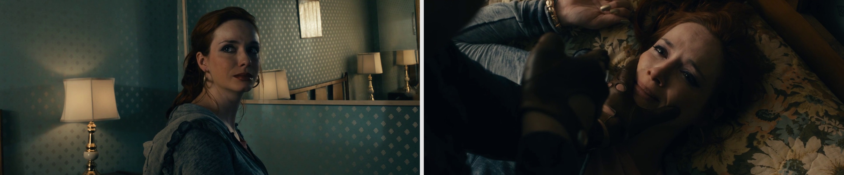
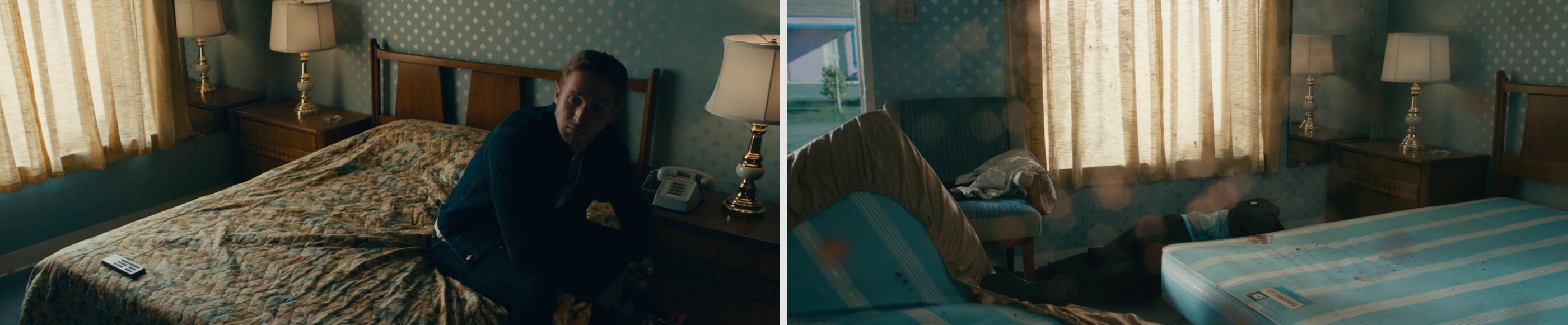
Beth: The motel room with Christina Hendricks. I was crazy about it. The location had pink walls and brown carpeting. We went in and did the pale blue wallpaper with little gold medallions all over it. And we found this beautiful bed spread with soft pink floral patterns and the same soft blue color in it, and some browns – it was a perfect complement to the wallpaper. we aged everything down to a slightly worn-in look and it ended up being this dynamite moment in the film. We added some large mirrors into the room for the DP [director of photography] to get some really interesting shots of Christina. We ended up spending so much time in that room even though it’s this tiny claustrophobic space.
Kirill: Did you build it from scratch?
Beth: No, it was an existing motel room. We couldn’t pull the walls out like you normally can, and we had a very few windows so you couldn’t even shoot through the windows. The director and the cinematographer were both really creative in figuring how to shoot it and make it work. Then we ended up having a lot of action in there where Ryan ends up killing the two perpetrators. Just to try and get all the choreography in that little room was pretty challenging.
Kirill: Did it end up destroying the set over and over again?
Beth: We got blood splatters everywhere and we had to replace a lot of wallpaper pieces stained with blood. Between setups we would CLEAN the carpet. The set was very simple but to me it was one of the more memorable sets on “Drive”. One of the reasons why I love working with Nicolas is that he’s OK with pushing the envelope visually. He’s OK with going into a heightened direction visually, taking a few risks to play with the visuals a bit more. Some directors prefer to play it safer, to have authentic interiors and not take too much attention away from the action, to have sets that are very straightforward. Nicolas really loved to turn up the volume on each of the sets, to turn up the volume on colors. Designing for him is really exciting because you get the opportunity to pick bolder metallic wallpaper patterns and put them up, to do a set with bright red everywhere, and wild mirrors everywhere. He just loves it and wants more of it.
Kirill: But on the other hand you don’t want to overdo it.
Beth: That’s the balance. You have to find it. There are some films that go overboard and the design is screaming for attention, it dominates the frame. You don’t want it to become that, unless that’s one of the goals of the film. There are certain movies where the director does want the visuals to dominate in some scenes, and you do want it to be a more visual experience. And Nicolas is really drawn to that. The film I just did with him in Thailand is very visually driven. He wanted it to be a wild sensory experience for his audience, and so it is actually much more heightened than “Drive” was. I’m really looking forward to seeing how it comes out; we took lots of risks in it and did lots of unusual things visually. I do agree that on some films you don’t want to go too far and to take away from the story. In “Drive” we just wanted to create this sort of fantasy version of LA where these two characters meet and fall in love. That was the idea that we based everything on – that it’s actually a beautiful love story between the two characters. It’s not a story about the pawn shop robbery, it’s a story of two people falling in love.
Kirill: Stepping away from “Drive” into a more general field of your craft, let’s talk about the technological progress in home entertainment. You started with smaller student and indie productions, and then moved into bigger films. About four years ago BluRay has won as the consumption format for the home entertainment systems, bringing a rather high level of details with it. Does this mean that you can’t “cut corners” anymore in your everyday work on the sets?
Beth: Absolutely. It’s one of the bigger challenges that we have to keep in mind these days as we’re doing the sets. They’re shooting digitally and the details are so much sharper. It’s a lot less forgiving. The aging on the walls has to be just right, the colors have to be just right, all the little visual details in the background and the dressing are no longer in soft focus in the distance. They are much more visible now, and that’s something that we do have to keep in mind. But on the other hand there’s this fantastic thing with digital that you have the ability to go back in post production and fix a lot of things. If you don’t like the color of something you can play with the colors in post. Or, for example, as we were bringing a lot of wallpaper pieces, if some of them don’t line up and you can see seams, you can fix this in digital post to make it go away. It has its pluses and minuses.
Kirill: What about shooting in stereo for 3D productions? Even if you haven’t done any of those, it seems to be increasingly prevalent these days.
Beth: It’s absolutely more and more prevalent. My boyfriend Russell Barnes has done three films that were shot in 3D format. I actually talk to him quite a bit about it. I’ve watched him work with it and one of the things that he’s much more aware of is that the 3D space has these visually different planes that you’re dealing with. With set dressing you end up creating different fields: the foreground, the middleground and the background. You want to make sure to have separation between them. Another important thing is the lights. The lighting for 3D is always interesting because you have to have a lot of lights to pick up all the details in the 3D format.
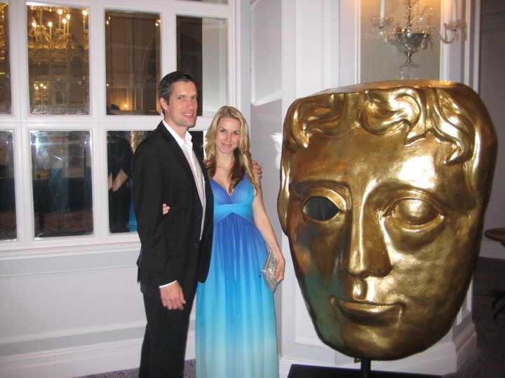
Beth Mickle and Russell Barnes at BAFTA 2010.
Kirill: Can you recommend a few productions that particularly impressed or inspired you?
Beth: One of my favorites is “Far From Heaven” with Julia Moore. It’s one of those films that has an absolutely stunning design, well thought out and beautiful choices everywhere in it. Another one of my favorites is “All The Real Girls” by David Gordon Green — it has very authentic, naturalistic sets, feels like a true documentary.
And here I’d like to thank Beth Mickle for this wonderful opportunity to learn about the design process of “Drive” and for sharing the additional materials.
