The production design of “The Artist” – conversation with Laurence Bennett
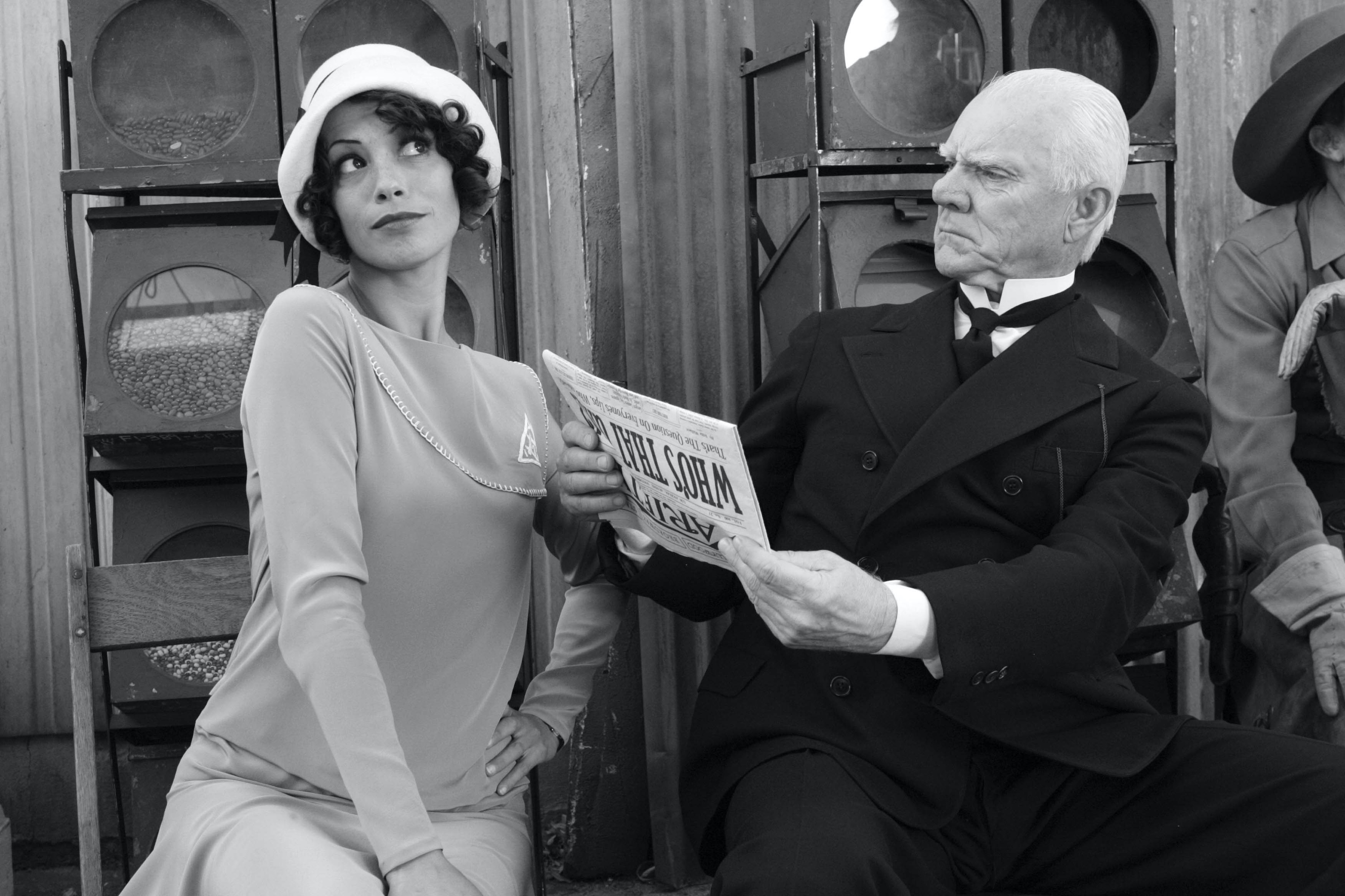
Distilling the art of film making to its purest form of visual storytelling, “The Artist” is a breathtaking masterpiece of cinematography. A story set in the glamorous days of early Hollywood, it effortlessly transports the viewer into the meticulously recreated world of silent black-and-white film. An authentic, warm and enchanting journey combined with a universal story of fame, pride, fortune and affection brings one of the most remarkable films in the recent history. The weeks leading to the Oscars awards ceremony are a very hectic time for Laurence Bennett, the production designer of the film, and it is a great honor to interview him about his work on “The Artist”.
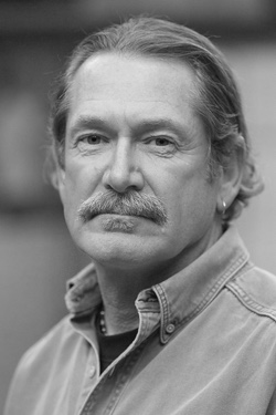
Laurence Bennett.
Photography by Jamie Trueblood.
Kirill: Let’s start with your background. You worked outside the movie industry for about ten years, and then moved to work on TV and movie productions.
Laurence: I started working in design when I was quite young. Between the school and college I worked in a small design firm. I studied in Los Angeles and in Japan, and after finishing college I moved to Ireland for ten years. I worked in theater and taught in the National College of Art. I was a painter and working in theater was really my introduction to show business. In the mid-seventies I had friends from Los Angeles who were getting into film business, and one summer I came back and worked with them doing miniature models for a big television special. That was my introduction to Hollywood, and interestingly, the production office we had on a small side street for “The Artist” was right across the street from the place where I worked 35 years earlier.
Kirill: In the last few years you worked on action thrillers such as “In the Valley of Elah”, “One Missed Call”, “Traitor” and “The Next Three Days”. How did you get to work on “The Artist”?
Laurence: It was sheer luck. One of my agents called me and connected me with the line producer who was assembling crew for Michel Hazanavicius [director]. We met, talked and hit it off, and I went to Los Angeles to meet Michel. The next morning we were out scouting together working on the picture.
Kirill: Did you have any hesitations joining such an unusual production?
Laurence: I embraced it whole-heartedly. I was very excited.
Kirill: Were you particularly connected to the 1920-30s era before you’ve started working on this film?
Laurence: I’d always been a fan of the movies of the era. My knowledge wasn’t as deep or as broad as it is now, because of all those months I’ve spent living and working in the period with Michel, Guillaume [Schiffman, cinematographer] and all my friends. There’s real magic in the pictures that came out of Hollywood in those early days. They were inventing the language of the cinema, and at the same time inventing the business of Hollywood. They seemed to have had a great time doing it, so I encouraged my crew to take on the same spirit of fun in approaching this project.
Kirill: Can you describe what happened during the pre-production stage, as you were working with Michel and Guillaume on the overall story and look, and the particular scenes?
Laurence: Michel arrived with the entire story boarded. His vision for the project was so complete and so whole. He had very specific ideas for most of the shots. The trick for me was trying to build the world around these shots that the characters would live in. We spent a good two and a half months in pre-production. We watched dozens and dozens and dozens of movies together. Michel introduced me to the works of F.W. Murnau, King Vidor, Fritz Lang and Josef von Sternberg. Also in Los Angeles there’s always an opportunity to see restorations of older works. Mark Bridges the costumer and I went to see the new restoration of “The Four Horsemen of the Apocalypse” [1921] which was Rudolph Valentino‘s big breakthrough film. And when you see good cinematography and design from the period that’s well restored and printed, the photography is so remarkably beautiful. Really exceptional stuff.
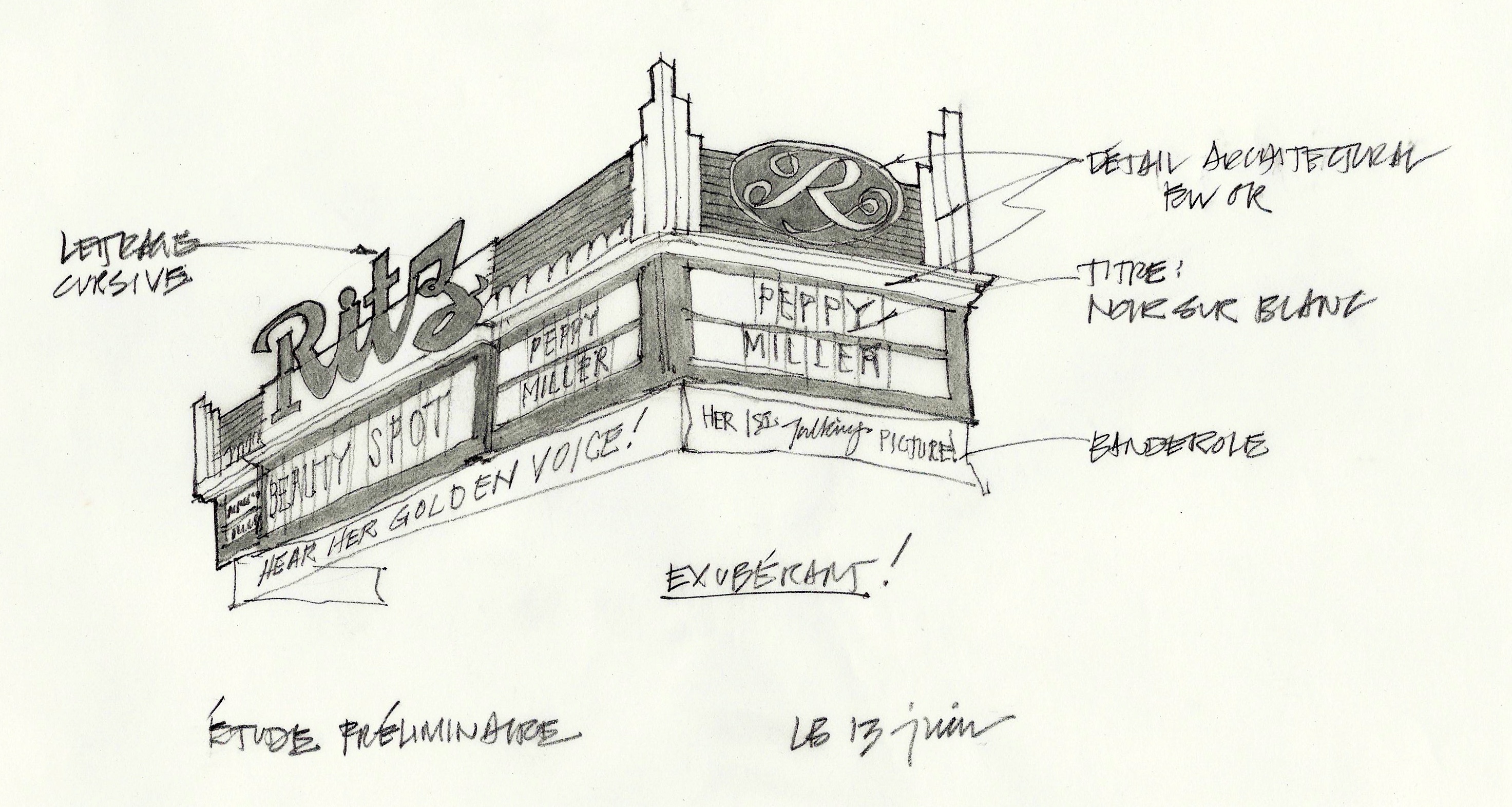
“Ritz” theatre marquee. Sketch by Laurence Bennett.
Kirill: Michel and Guillaume worked together before. How did you get into the rhythm of working with them?
Laurence: They are also very close friends. They were very welcoming to me into the process. It was great, the pre-production was absolutely delightful. It was time of shared exploration, kicking ideas around and finding things, seeing what would work.
Kirill: Were you aiming to limit your setups and techniques to what would be available to production designers and art directors of that time?
Laurence: Very much. There’s a directness and simplicity and real grace around the art direction of the time. I tried to mimic that. One thing was very important to us – the supremacy of the story. We were telling the story of George and Peppy and Jack the dog. Nothing was ever to upstage them, nothing was ever to get in the way, they were always center and clear in the story telling. I felt a real responsibility to make these living breathing environments that they operated in to never be a distraction, and to always support the believability of their situations.
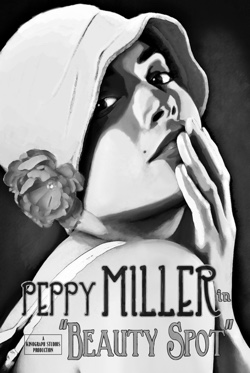
Artwork: Beauty Spot Poster.
Graphic designer – Martin Charles.
Kirill: Did you research the specific setup techniques of the era, along with the additional materials like fabrics?
Laurence: It’s all terribly important. Fortunately I had a team of very talented people, between my set decorator Bob Gould and the prop master Michelle Spears. They researched and put together many of these things to look at. Guillaume, Michel and I did extensive camera tests for materials, paint, pattern, make-up and costume. Testing in the various art departments went on right through the photography. Whenever we were putting together a palette of materials and textures and finishes for a particular set, we would test them in black-and-white.
Kirill: “The Artist” is your first production without color. Having such an important tool removed from your fingers, did you spend more time on contrast, textures and light to compensate for the lack of color?
Laurence: Certainly I focused a lot more on texture and pattern that I ever have before. Even the luster of finishes, the shine or the lack of shine. Without chroma cue for separating things within the frame you have to rely a lot more on rim light and contrast of light and shadow. I really found pattern and solids and different textures to be a great way to differentiate planes within a frame.
Kirill: Did you remove the color from the actual sets?
Laurence: I decided on an approach that was rather split. Because there’s so much film work within the film, with all the studio sets and the movies that we see in the movie, I decided to do all of those in black-and-white. The naturalistic sets within the story were rendered in naturalistic tones.
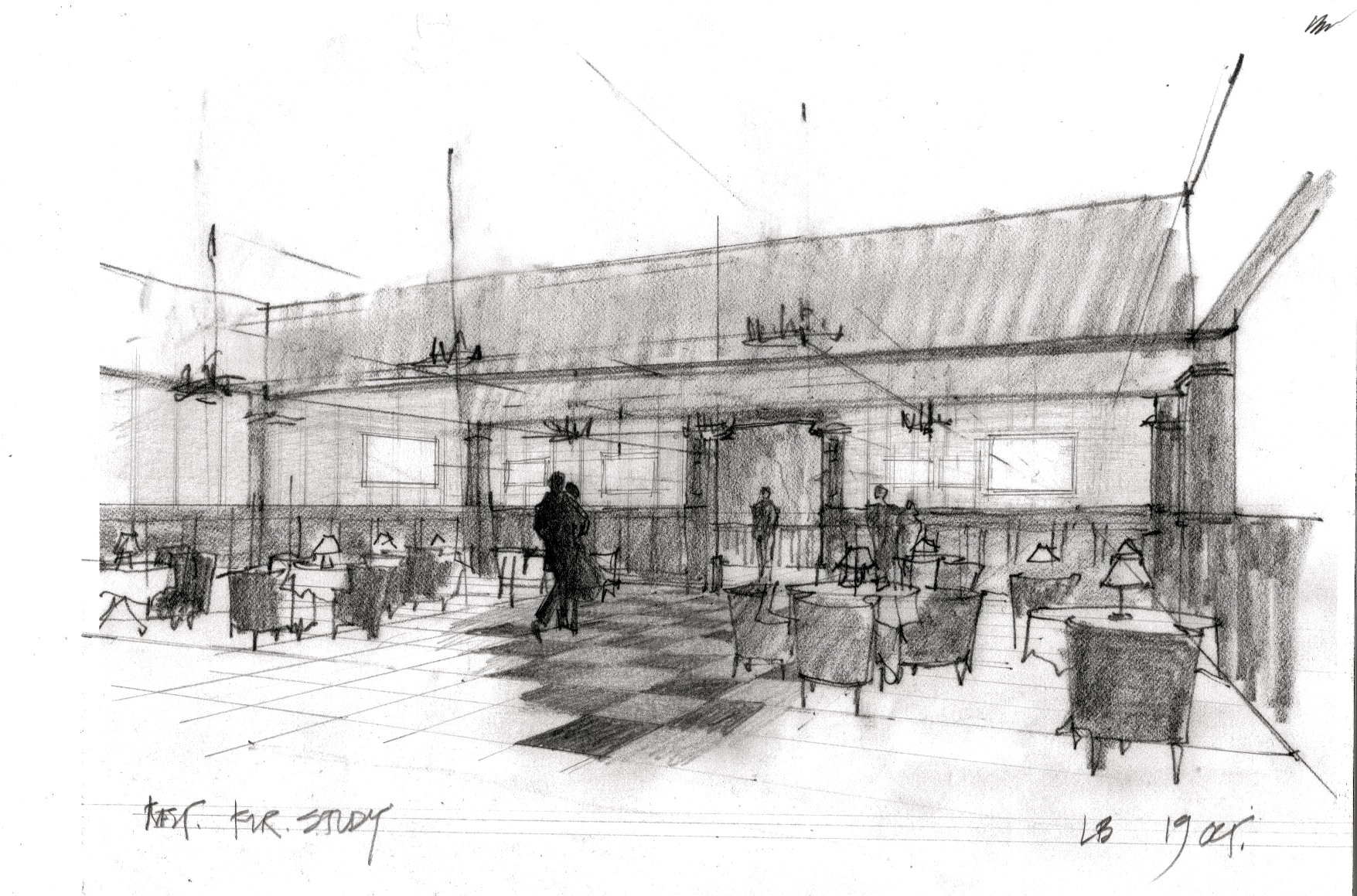
Restaurant set. Sketch by Laurence Bennett.
Kirill: And then you have another aspect of the era, shooting in the Academy ratio of 1.33:1, with much less horizontal space. How did that affect the preparation and setups when the audience sees less?
Laurence: You see different things. I’ve done 1.85:1, and most of my recent work has been 2.35:1. In 1.33:1 you see a lot of ceilings and floors, whereas you don’t in 2.35:1. So the composition would have a lot more above and below. It’s a different way of looking, a rather more awkward framing, and it’s difficult to adjust to. All of the location photographs, all of the sketches that I’ve prepared for Michel – everything was presented in 1.33:1 so that we would get used to that format.
I spent a lot more attention to the floors particularly. One of the things that was typical of the film sets of the time was that they seldom had ceilings. We had some ceiling pieces, elements and headers, but floors were a larger concern.
Kirill: Did you build your sets in the studio stages?
Laurence: It’s a big mixture. We had many many locations, all of the historic locations of the period – Peppy’s house, George’s mansion, the theaters. We did a lot of work on the back lots at Paramount – Los Angeles streets, the pawn shop, the tuxedo shop, George walking around, a little bit of the driving stuff, Peppy on the bus. Other driving stuff was done in an old Los Angeles neighborhood. The exteriors of the theaters were done at the Warner Bros back lot. And everything else was done on stage – George’s apartment after his fall, the screening room, the jungle, all of the little sets you see within the movies. We had a tremendous number of stage sets.
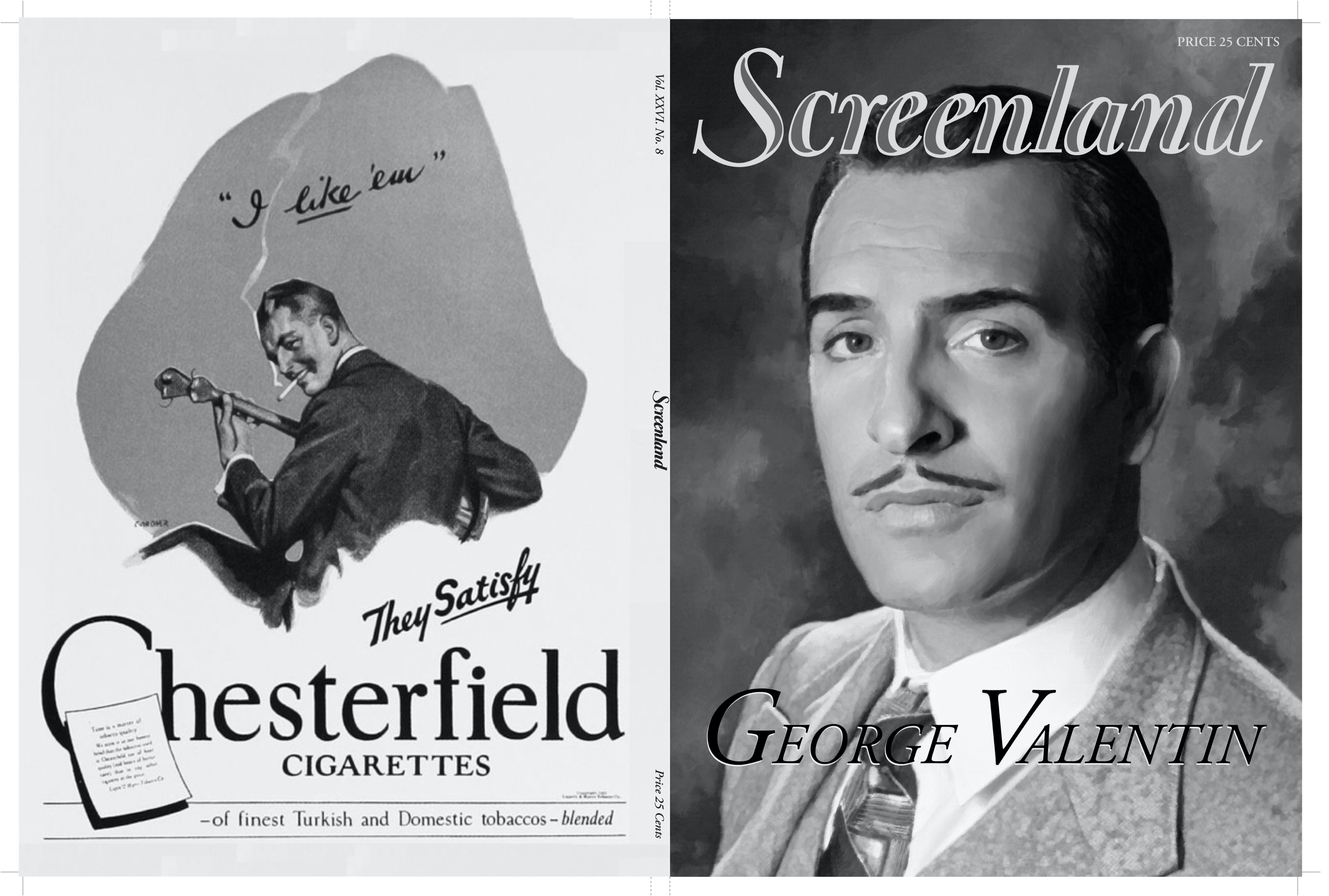
Magazine cover of “Screenland”. Graphic designer – Martin Charles.
Kirill: What happened to those sets? Are they gone, and was it hard to see them demolished?
Laurence: That’s what always happens. You hope that pieces would be recycled in other things. We used only painted backdrops outside the sets, and I tried whenever possible to use the oldest black-and-white ones. There are only very few still available, but there was one in particular that spoke to me. There’s a movie that Peppy does within the movie, “Guardian Angel”, and it has a North African, Moroccan feeling. The backing outside that set was from “Casablanca” [Humphrey Bogart, Ingrid Bergman, 1942]. And when I found that, it was a very rare and wonderful thing, like unrolling a holy relic. It was painted in black-and-white in the early 1940s. It was a real honor and thrill to be able to use it.
Kirill: You mentioned one of the historic location used for Peppy’s house. This is the old Mary Pickford residence. What is it used for these days?
Laurence: It’s a residence. A family owns it, and they recently did a major restoration. It’s in a beautiful shape. We looked at it and fell in love with it, and only then realized its provenance. When George wakes up from his convalescence in Peppy’s guest bedroom – that was Mary Pickford’s bedroom in the few years when she was seeing Douglas Fairbanks before they got married. It’s pretty remarkable.
Kirill: Was access to all the historic locations one of the main reasons to shoot in Los Angeles and not Europe?
Laurence: There was another reason. Michel and Thomas Langmann the producer had a very strong feeling about making the story in Hollywood because the story itself is about Hollywood – and I loved them for that.
Kirill: There was this odd piece floating around about a UK theater issuing refunds to people who didn’t know that it was supposed to be a silent film. On one hand, the story becomes more accessible when you remove the sound, but on the other hand, do you feel that the modern audience is ready to see such a movie?
Laurence: I think those stories are very exaggerated. It seems to have been one cinema in some place in the UK. I would hope that the picture opened up to a much broader audience the incredible strengths of a pure version of visual storytelling. Cinema is first and foremost a visual medium. I would hope that it’s exposed people to broaden their horizons a bit. The universality of the story by lack of dialog is quite incredible. I only realized it the other morning as I was doing a radio interview with a journalist in Bogota, Colombia, and there were journalists from Spanish-speaking world in four different countries asking questions. It was an incredibly emotional experience seeing people moved by the picture, hearing people’s questions and reactions from around the world.
Kirill: Even as the sets are in the background and the main focus is on the characters does not mean that you have less work to do.
Laurence: It’s a collaborative art form and I never worked on a production where both the cooperation and collaboration between various art departments was as strong and joyous as it was on this picture. Also, because of the uniqueness of the approach to storytelling I think it was much more essential that we worked in sync. This picture is nothing without what I think to be a good solid cinematography, design, costumes, make-up and hair. The casting is phenomenal, the extras casting – everything that was done by all the departments was so strong that it supported a very strong picture.
Kirill: The movie itself covers a roughly five year period, from 1927 to 1932, with the Great Depression striking right at the middle point. If you just watch the movies from the era, the glamour did not go away; in “The Artist” there’s a certain transition as George goes broke, with much less glamour surrounding him. How did you alter the visual language throughout the story?
Laurence: And then you notice as he’s pulled back to life by Peppy’s faith in him, the movie ends with a glorious, very high style finale, as he returns to a very glossy career. It was obviously by intent that the picture is taking a dark, slightly expressionist turn. His crisis was an opportunity to really darken the story and let the threat and his conflict be demonstrated visually in a different way.
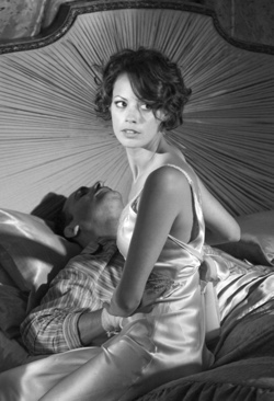
Still picture of one of Peppy’s 1931 movies. Photography by Peter Iovino.
Kirill: Do you notice any significant difference in the visual look of the movies from 1930s as they switched to sound?
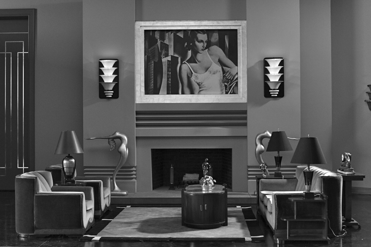
Laurence: Last week I was actually watching a few pictures from the very early 1930s. Cedric Gibbons, the production designer who is best known from that period, was responsible for not only changing the look of the Hollywood product, but also influenced interior design and product design around the world. He was responsible, more than anyone I can think of, for popularizing deco. He had been to the exposition in Paris in 1925, and he returned to Hollywood with this incredible enthusiasm for the modernism, the modern hope that its flair personified to him, and he began putting that into the scenery.
There’s one set that’s very influenced by Gibbons in “The Artist”. The set where Peppy is filming when she receives news of George’s accident when she reads the newspaper – it’s derived very directly from a set that Gibbons used both in “Our Dancing Daughters” and “Our Modern Maidens”.
Kirill: You mentioned the scene where Peppy is riding on the bus. There’s a few dozen other cars in the movie. Can you talk about the logistics of getting access to all these vehicles?
Laurence: They are real vehicles, and it’s tremendously difficult. The picture vehicle people worked long and hard to secure those cars and trucks and buses. There’s an amount of very common ones available in Hollywood, but for very special ones you need to go to the collectors. The bus was particularly hard to come by. We used the vehicles as is with no modifications, but the search for a couple of them was particularly prolonged and difficult.
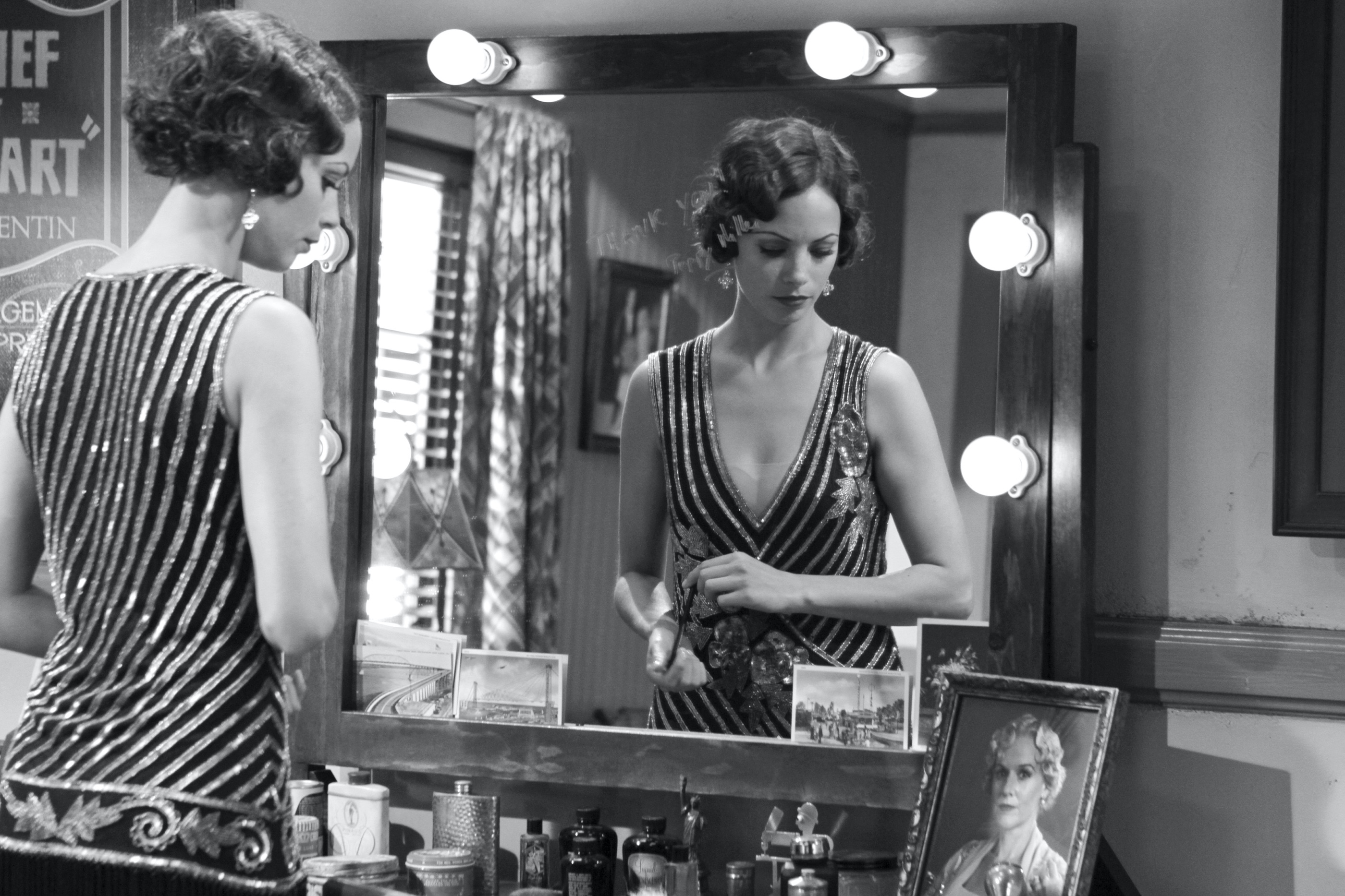
Kirill: Does that authenticity extend to the lower level of details of accessories such as microphones, hair brushes or light bulbs?
Laurence: We decided early on that we wanted to be true to the spirit of the period, rather than being slavish to detail. But certainly everything is quite authentic, requiring a little bit of looking and thinking. It also depends. The light bulbs, for example, are reproduction bulbs. But the sockets are from the period. We custom-made George’s table, but other items such as dressers and make-up tables were readily available.
Kirill: How much time and attention did you spend on the costume design? Was it a separate mini-production of its own?
Laurence: That was all Mark Bridges the costume designer who is a genius, and I think he has a lot of very deserved attention to this picture. There is a good bit of period wardrobes still available, but the problem is that it’s not in a very good condition. It falls apart as fabric deteriorates over time, so he built a lot of things. A lot of Peppy’s dresses, for example, were built from the styles of the time. He did a brilliant job saying a lot about the characters’ progressions through their arcs, but also helping bring them to the right amount of attention within the frame at any given time. Things like white colors on Peppy’s dresses and hats really bring attention to her face and focus her even in a crowd. Between lighting and costumes a lot was done that really highlights the characters.
Kirill: You’re recreating a very glamorous era in Hollywood’s history, but also an era that has the vast majority of its films well preserved (unlike the early movies that have been largely lost). Were you trying to avoid comparisons to any specific real-life actors, or was it a mixture of original storylines and homages?
Laurence: George Valentin begins as Douglas Fairbanks, morphs into John Gilbert and then becomes Fred Astaire. We were trying to be nimble in how we portrayed the characters and allowed them to grow a bit. There are obviously certain studios and stars and products from the time that were very much on our mind, but it was also important that we’re not too tied to any particular ones.
Kirill: Did you ever think about how the film would’ve been accepted had it been made back in the 1930s?
Laurence: I’d like to think that the story that Michel wrote is so strong, and Jean [Dujardin] and Berenice [Bejo] performances are so winning, that I think that it would charm audiences anywhere, anytime.
Kirill: There’s so much that has changed in the ways movies are made in the last 80 years. Without any specific reference to the current explorations of 3D shooting and projection, do you think there’s going to be a similar “nostalgic” movie made in 2100s about the modern movie making?
Laurence: We have no way of imagining. The technological changes and growth in the art and the crafts of cinema in the past 90 years – no one could have ever foreseen. There’s certainly some parallels in new technology now and what was going on with the conversion to sound, but who knows what sort of changes there’ll be. One thing I can say though is that good stories are always good stories. I am such a sucker for being told a story and being taken on a trip that when I watch a film form any country at any time and it’s good, the technology doesn’t really enter my appreciation of it.
Kirill: What was the role of visual effects in “The Artist”?
Laurence: There are several exterior scenes with an amount of CG augmentation and erasure. Philippe Aubry was the visual effects supervisor and he was with us through much of the shoot. He did a fantastic job in doing just the right amount and keeping the level of detail just perfect. He worked on a handful of very key scenes – the exteriors of the theaters, assembling the entire crowd within the cinemas for the big shots where we had around 200 people and needed 1200, the entrance to the studio. I built the gate and suggested to Philippe what we might put in the background, and he created it digitally.
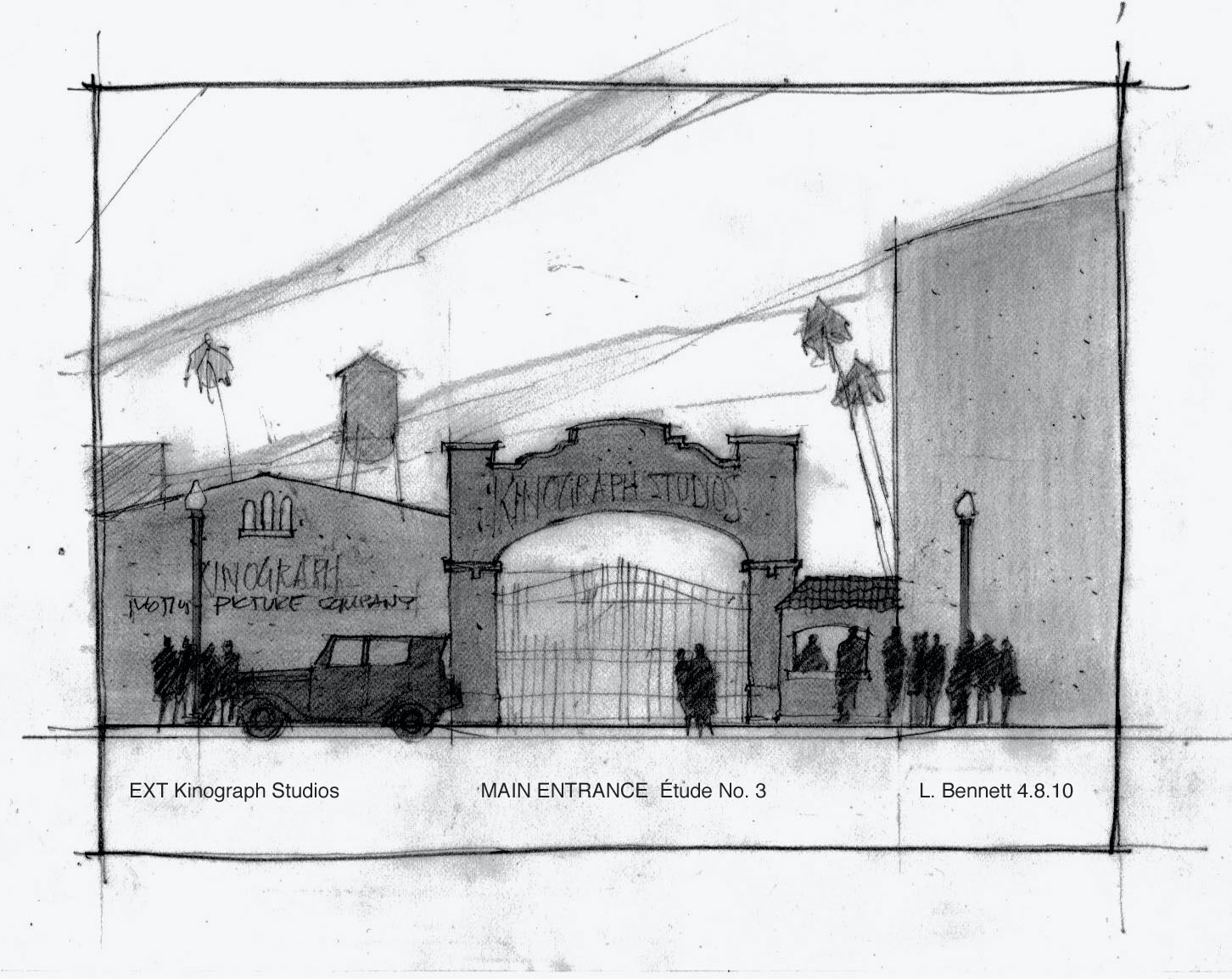
Exterior of Kinograph Studios, sketch by Laurence Bennett.
Kirill: What about the scene in the staircase as George and Peppy pass each other by as the studio moves to the sound productions?
Laurence: That’s a real beautiful historical building in downtown Los Angeles – the Bradbury Building, seen in many movies including “Blade Runner”.
Kirill: What’s next for you, besides the very hectic weeks leading to the Oscars? Do you think there’s a place for more productions of this type, or is it a one-off never to be repeated?
Laurence: I can’t really think much beyond that. Right now that’s keeping me pretty busy. I don’t think there’s going to be a big rush to make black-and-white silent movies [laughs]. What I hope is that there will be people willing to take chances to explore more off-mainstream approaches. I’ve been fortunate to have been involved in a couple of indies that really broke through, and when you’re working on something that could in fact be very special – but you’re not sure if anyone’s going to see it… Two pictures I’ve done – “Crash” and “The Artist” were different. When a small picture gets a chance to be seen so widely, and gets so much attention, it’s pretty remarkable the impact it can have.
And here I’d like to thank Laurence Bennett once again for his work on this extraordinary film, for graciously agreeing to answer my questions and for sharing the materials used in this interview.
