Android tips and tricks: pixel hunting
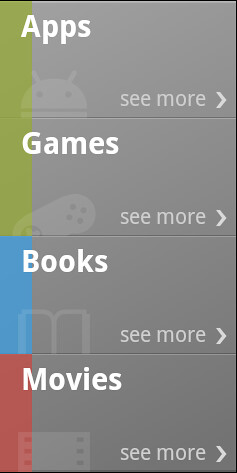
Continuing the series on the more interesting UI pieces of the new Android Market client, today i want to talk about one of the central elements of the landing page – media selector.

This element has a couple of characteristics that, left unattended, would have broken the intended visual appearance. First, note how the vertical gradient runs across all the cells, unifying them into a single UI element. Second, there are multiple overlapping translucent elements combined at different alpha levels and Z order.
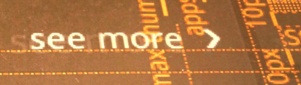
First, let’s take a look at the zoomed version of these overlapping elements:

The four elements are:
- Lighter gray thin strip going along the top edge of the cell
- Darker gray thin strip going along the bottom edge of the cell
- Thick color strip going along the left edge of the cell
- Media vertical watermark icon “peeking” from the bottom edge of the cell
If you trace the pixels along the bottom edge of each cell, you will note the overlap, where the pixels from the different elements are blended together creating a nice layered look. The cell layout is a RelativeLayout where each child view (including the text views for the media vertical text and the “see more”) is aligned to the relevant cell edges (with layout_alignParent* attributes). As child views are painted in the order in which they are defined in the layout – which means that the child defined last is painted last – this is the layout order:
- Thick color strip going along the left edge. The background of this child view is masked with 0xC0FFFFFF to hint at the underlying vertical gradient.
- Gray thin strips going along the top and bottom edges. These are translucent as well, achieving a nice highlighted look in the area where they overlap with the thick color strip. This allows changing the color coding of different media verticals without creating any extra assets.
- Media vertical watermark icon in the bottom left corner. It is positioned with negative layout_marginBottom to make it “peek” from the bottom edge. It is translucent as well, further contributing to the nice highlighted overlays along the bottom edge (especially in the colored area).
The order of these child views is important:

The left screenshot shows a different order of the child views. Here, the thick color strip is placed after the thin horizontal gray strips. If you study the cell dividers closely, you will see that this breaks the visual continuity of this bevel when it transitions into the colored area. Even though the translucency is the same, the combined effect is very different.
The right screenshot shows what happens when the light and dark grays of the thin horizontal strips are switched. Following the global lighting model that has the light source at the top of the screen, we now have a raised bevel instead of a lowered bevel. This draws too much attention to the separators that appear are very visible “bumps” on the surface of the unified selector element.
This screenshot highlights the importance of a single vertical gradient applied to the entire selector. Having a separate highlight in each cell adds too much noise and bumpiness to the visual surface. Instead, the entire selector has a background nine-patch with the slight vertical gradient. A final polishing touch is done in the code that populates the content of each cell – the top horizontal line of the top cell and the bottom horizontal line of the bottom cell are two pixels thick instead of one. This further establishes the selector as one visual element while still remaining consistent with the global lighting model. The implementation itself locates the specific child view by its ID using View.findViewById and then sets the height attribute of the getLayoutParams() result.
Stay tuned for more.
