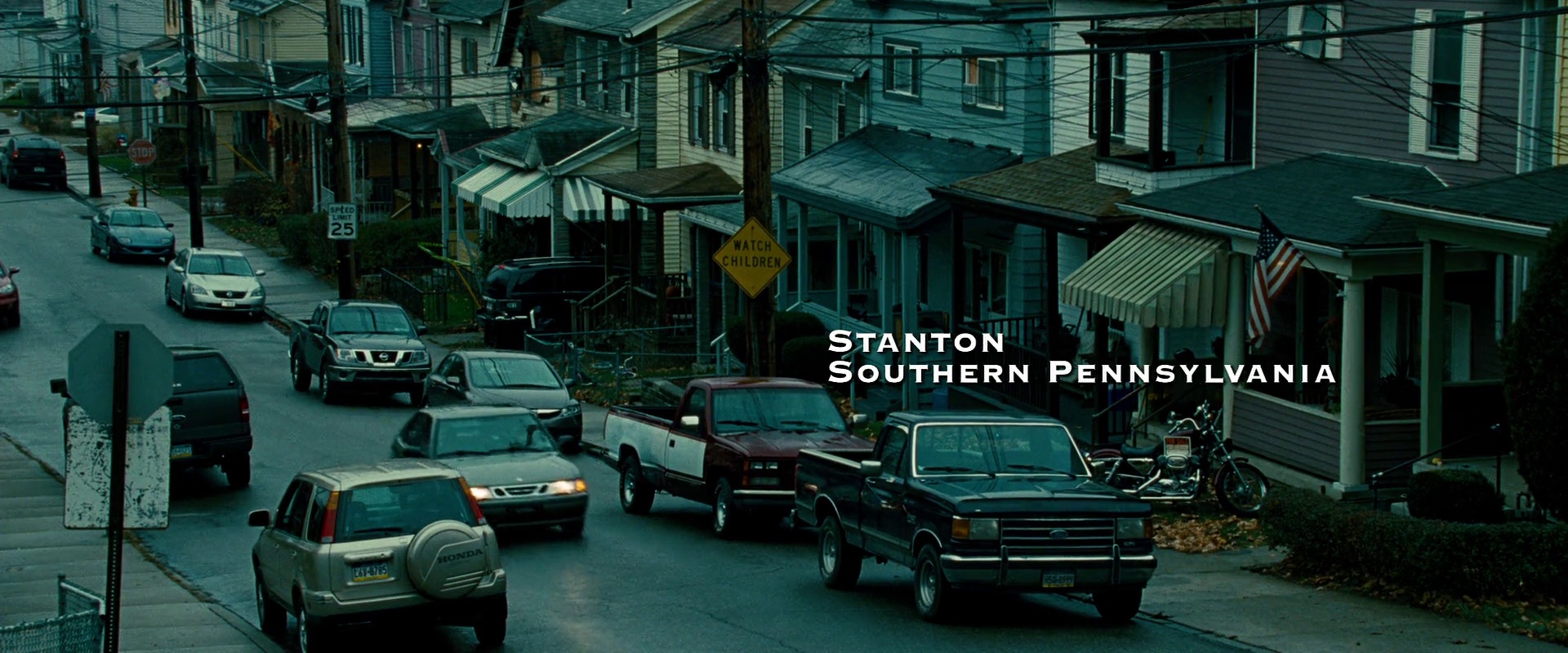
When i sat down to watch “Unstoppable“, the new movie by Tony Scott featuring Denzel Washington, Chris Pine and Rosario Dawson, i was immediately drawn into the heavy industrial visual atmosphere of the movie. The opening sequence delves into what looks like a blue collar neighbourhood, with dominating turquoise color and a few splashes of yellows and browns:
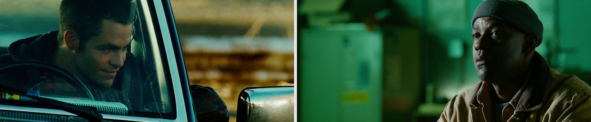
When the two leading characters are introduced, the color palette becomes a little richer with tinges of green, still remaining in the predominantly cool and desaturated band:
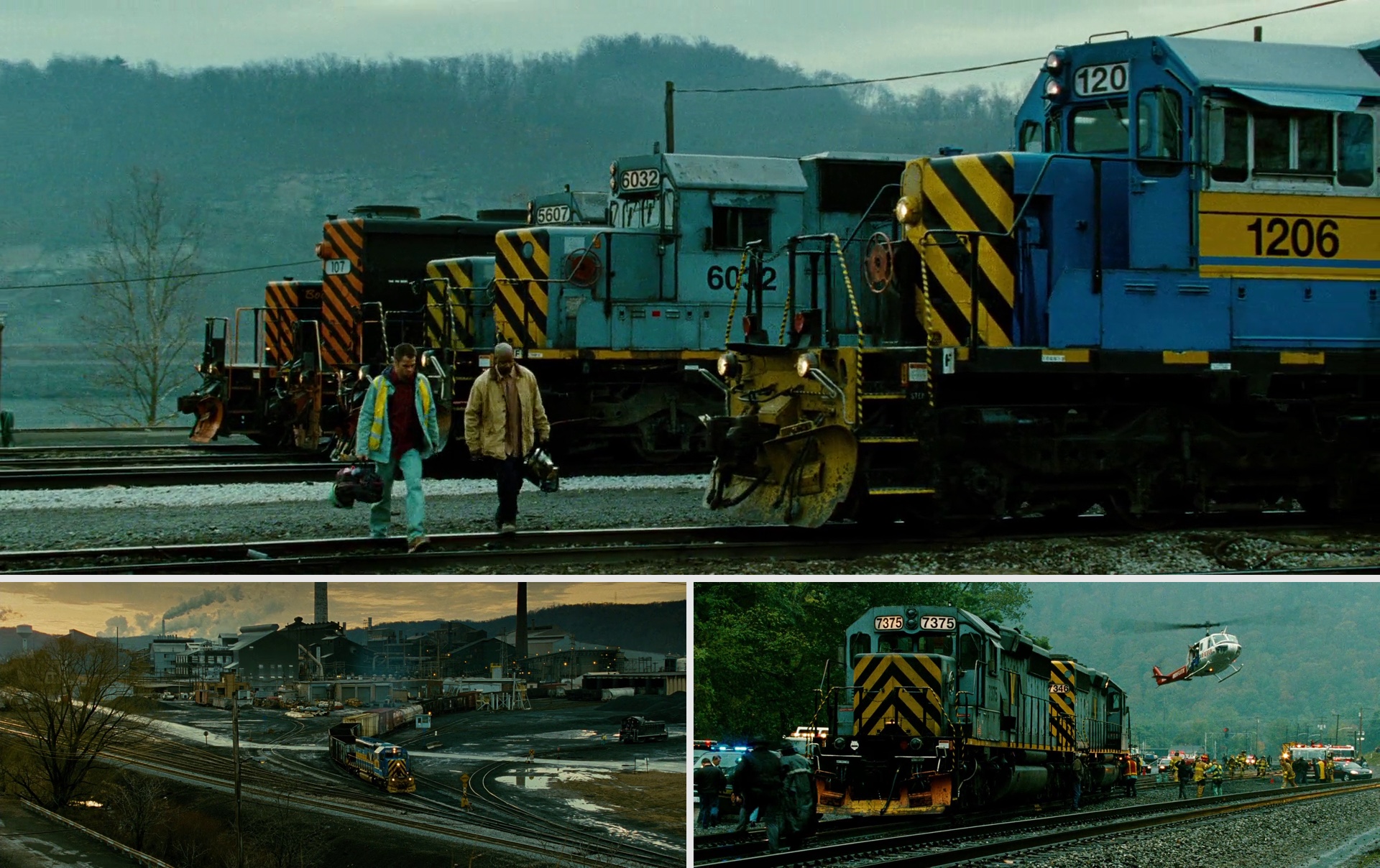
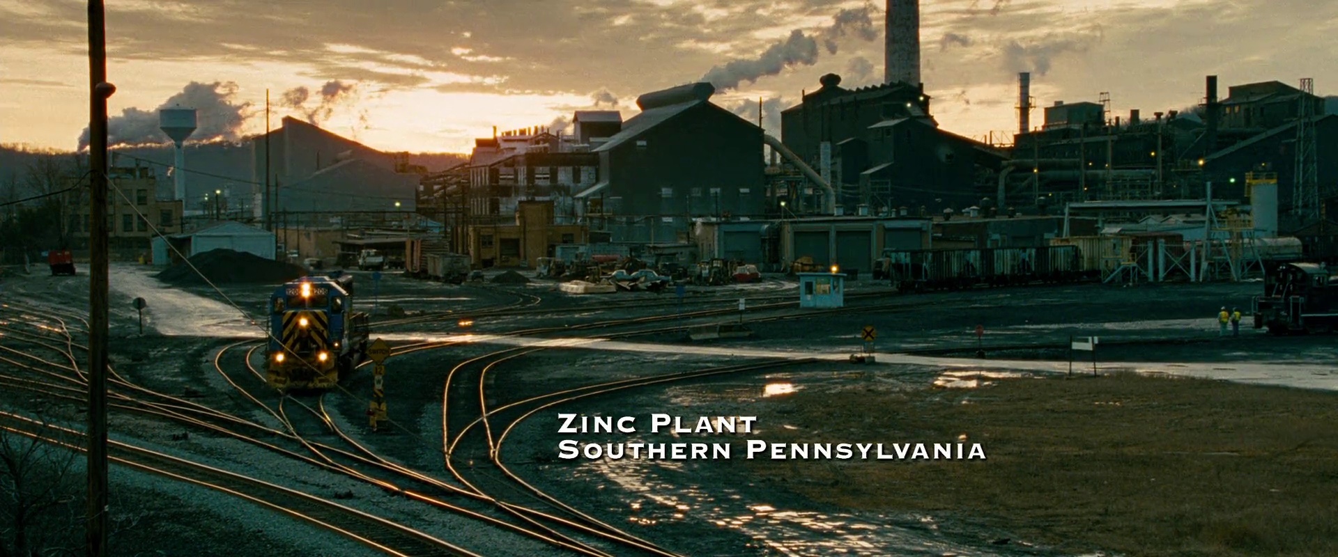
The vast majority of outside sequences feature railroads and trains – static at the beginning as shown in the next image. Note the color variation between the different models, balanced by the consistent pinstripe pattern that brings yellows and oranges into the scene saturated with blues, turquoises and greens of the trains and surrounding forest:
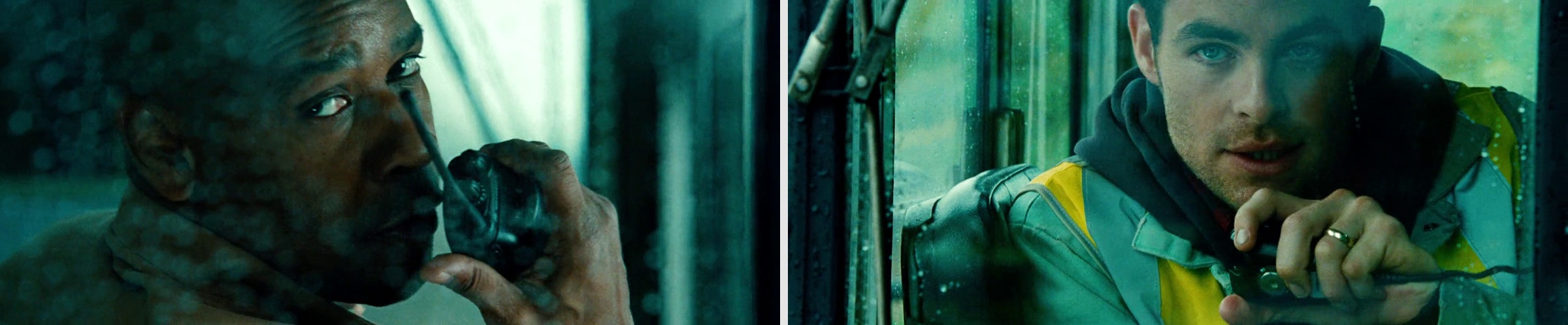
Once the characters get on the train, the camera switches between inside and outside shots, rarely placing the two together in the same frame. The outside shots are taken close to the cabin windows, with blurry rain drops creating attractive secondary textures that blend well with the carefully crafted interior design:
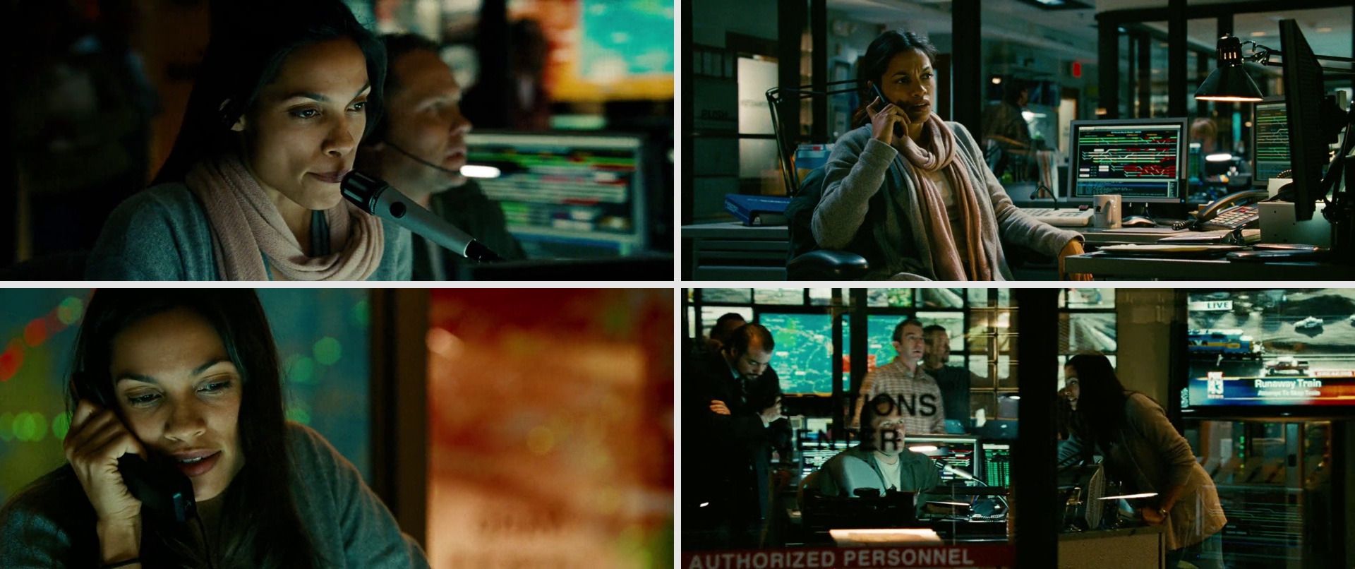
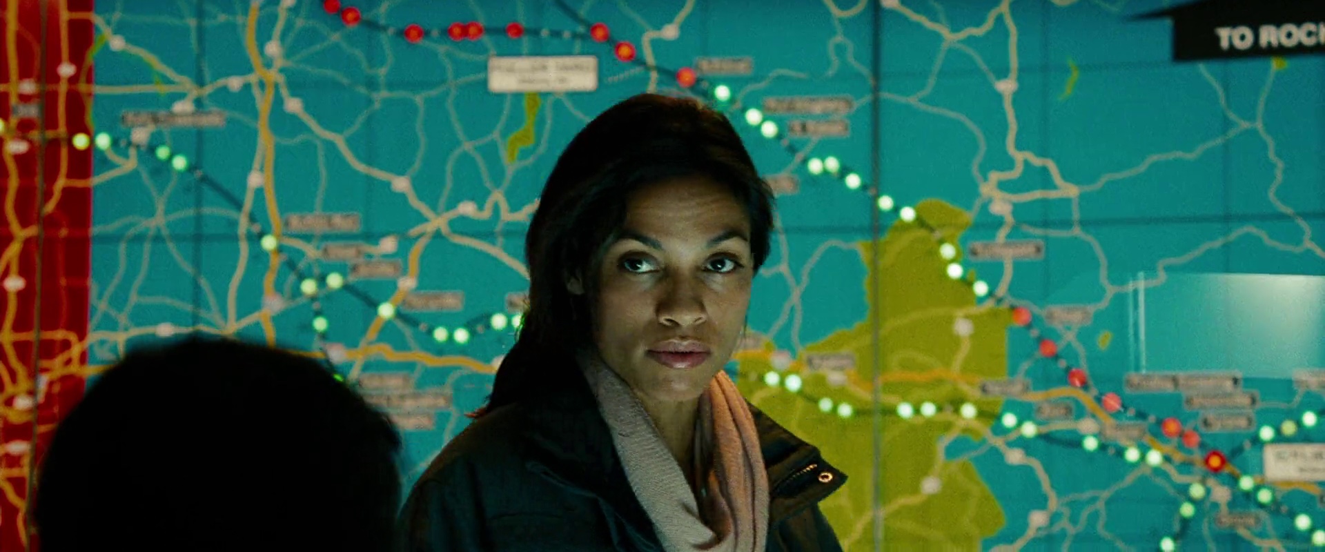
Once the train gets moving, it provides a fast changing dynamic scene. The third lead character played by Rosario Dawson is placed into a control room, leaving her to rely on radio communication and telemetry systems to collect information. Here is her character on the backdrop of an oversized route map. The map uses a variation of each primary color – red, blue and green, all shifted and desaturated to serve as a supporting visual element:
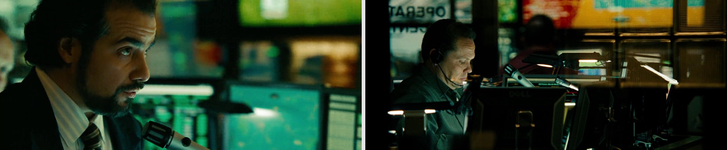
While most of the scenes in the control room are dominated by close-up shots of Rosario, the camera switches to the supporting characters to add some depth and variety. These characters are often filmed from a greater distance that highlights their secondary role and adds more perceived space to the location itself. Here, note the multitude of screens, each deriving from the main color palette of sand yellow, olive green, turquoise and brick red:
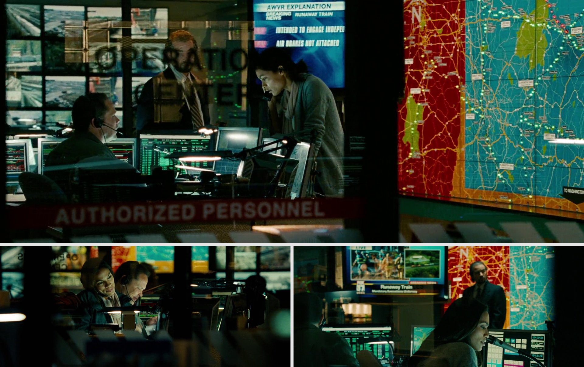
Extending the through-the-glass shots mentioned above, the camera moves quite freely around the control room, crossing boundaries of the rooms, open spaces and glass cubes. Not only this adds a lot of dynamism to this closed environment, it also places the viewer as an outside observer in a setting not accessible to general public. The next image illustrates this perfectly – the glass wall extends two thirds into the frame, adding an element of “observing with being noticed” – with the slightly blurred texts further highlighting the access restrictions:
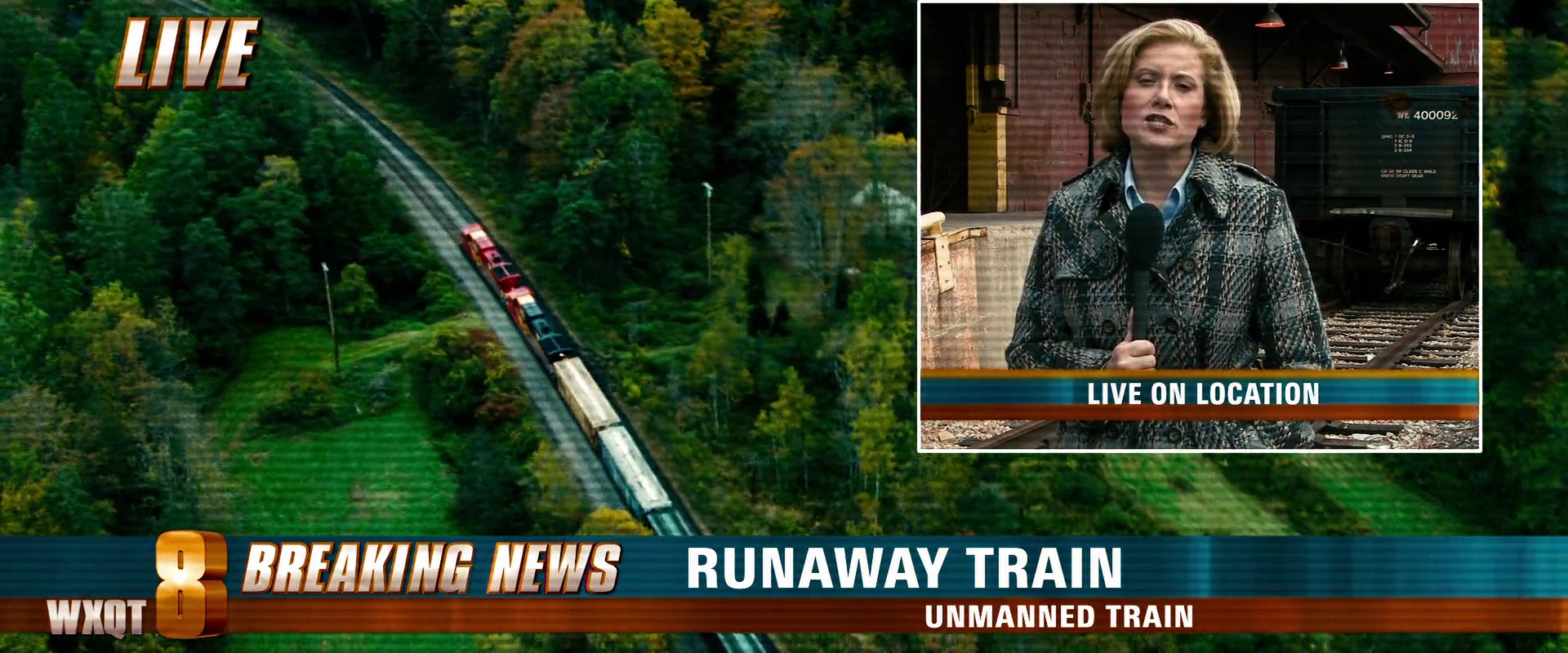
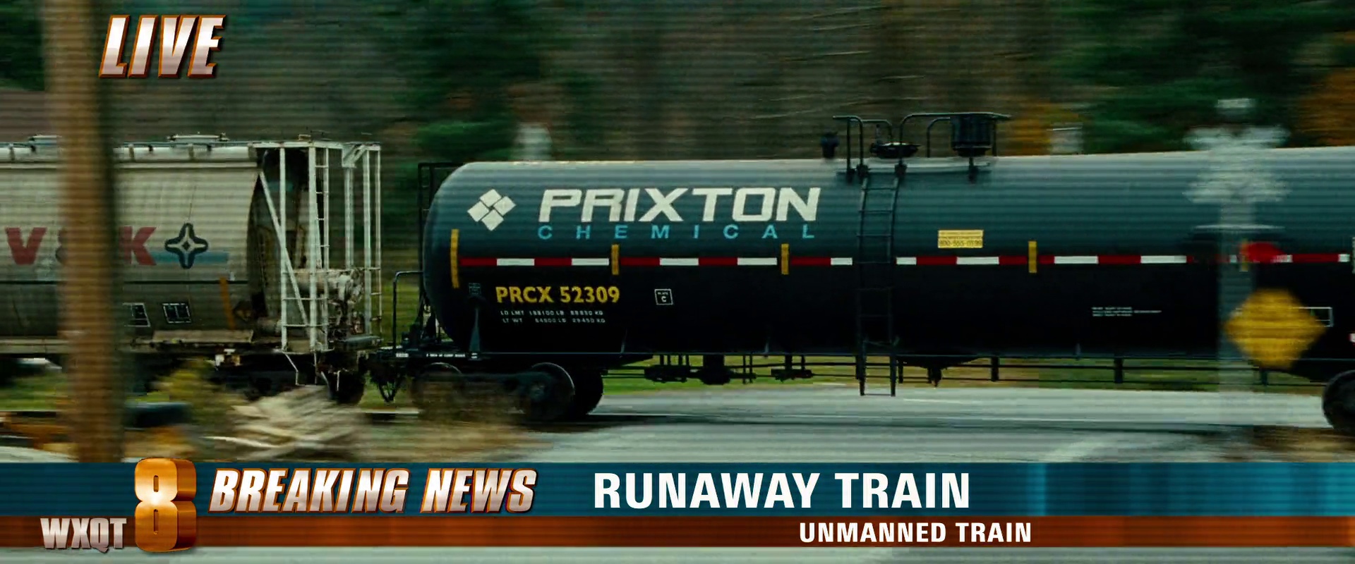
The tension around the runaway train is further reinforced by cutting to live TV feed from a local station. For an extra dramatic effect, this starts early on and is weaved into the interaction between three main characters. Most TV scenes are live-“shot” from the helicopters, adding large swaths of rich green forestry. This is balanced by the oranges, yellows and turquoises taken from the engine yard and control room monitors – further anchoring the cool color palette of the entire movie:
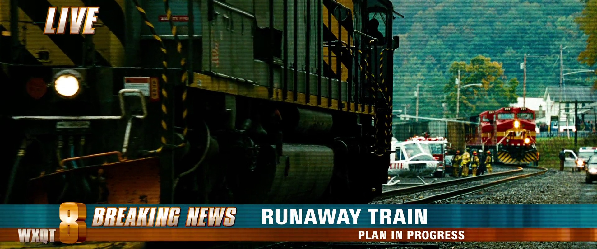
Some shots feature close ups of the locomotive. Bright oranges and reds of the exterior paint are supported by the emergency vehicles, patrol helicopters and police car flash lights. The next image shows a scene as filmed by the low-flying TV station helicopter. The camera is pointing forward, and rain drops add extra authenticity to the view, creating large blurred spots and causing nice refraction halos:
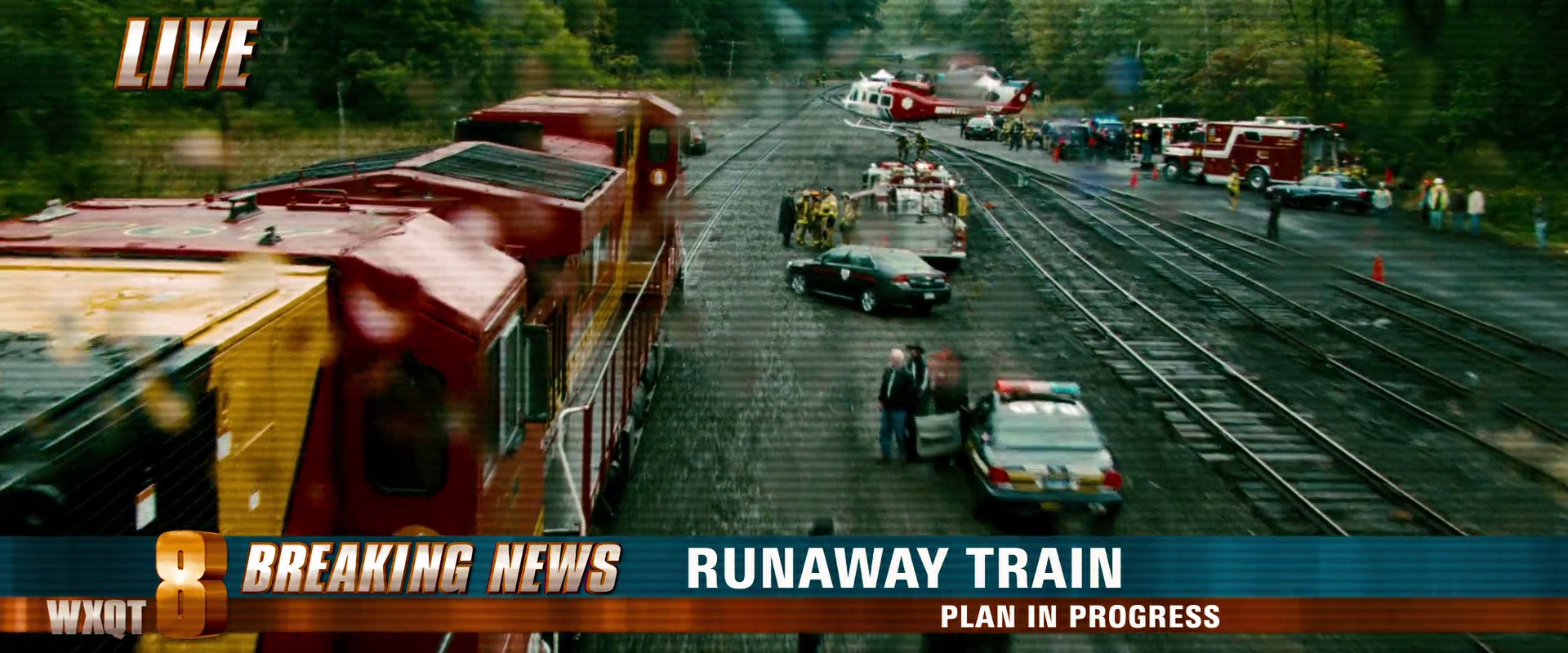
As the TV cameras follow the train along its winding path, the aerial shots are intertwined with stationary cameras – highlighting the opportunity that the ground crews had to mobilize the large vans. As before, such images frame the moving trains with lush forest scenery and standby emergency crews – note the red and yellows of the locomotive match the colors of the firefighter uniforms:
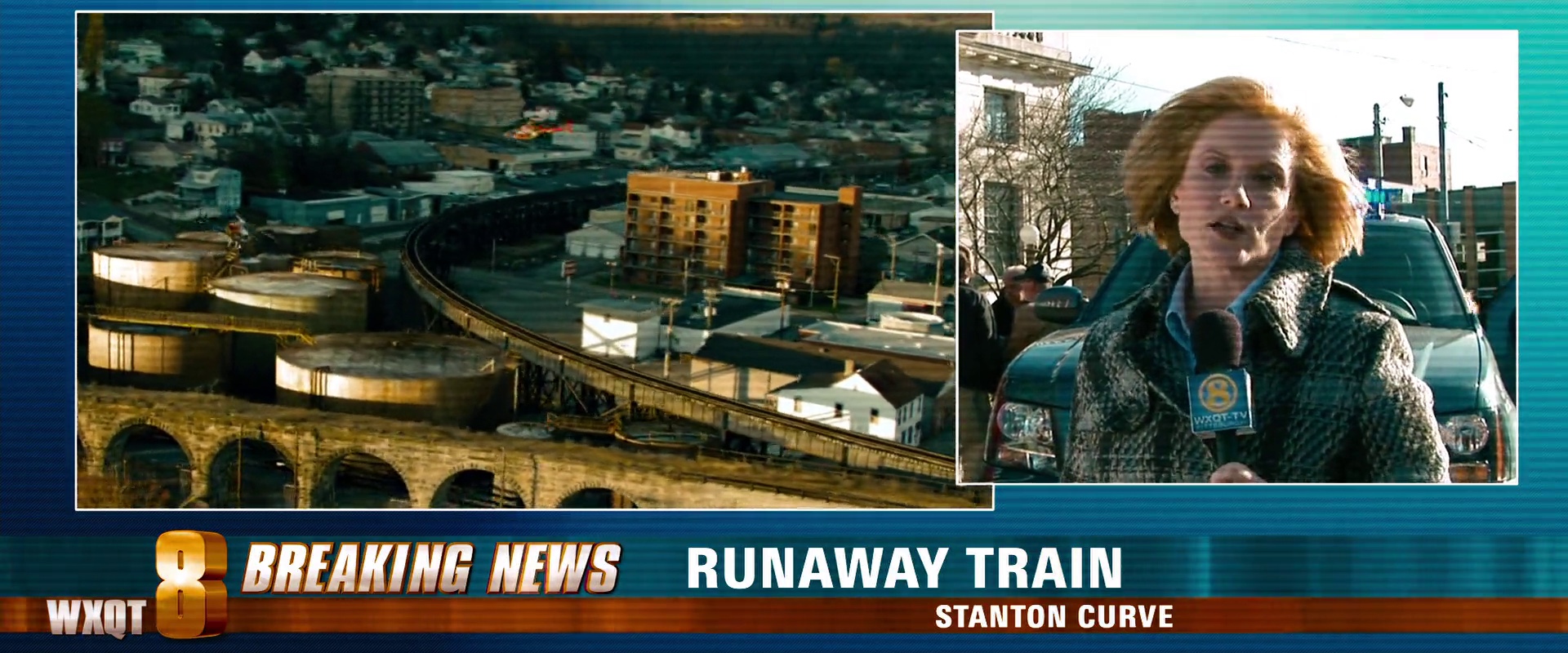
And yet one more example of a complex scene that combines two overlapping feeds. The oranges, yellows and turquoises of the TV station identity define the visuals of the feeds as well – note the sand yellow hair color of the reporter, combined with her light blue blouse and a glimpse of the roof flash lights on the police car behind her:
And this is, perhaps, my favorite shot:
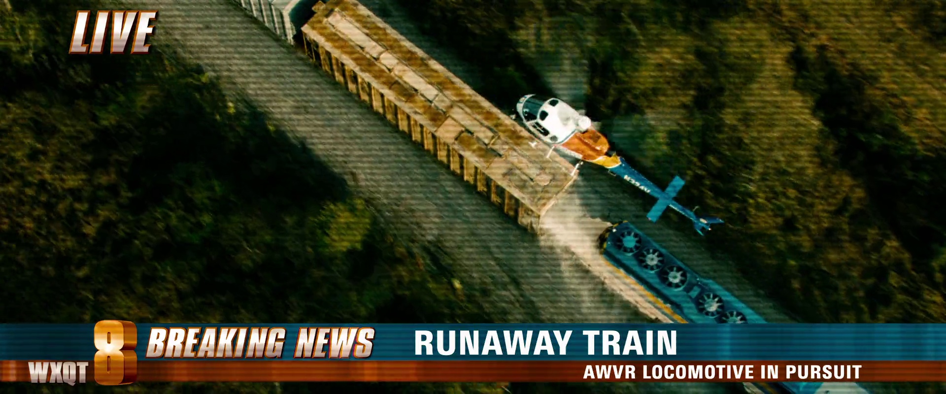
There are three main elements here, all “moving” in a perfect visual unison. The news strip at the bottom, the train cars and the hovering helicopter all use the same color transitions – deep turquoise on the right and yellow orange on the left. This is a very strong palette that serves as a major backbone for the entire movie.
It is my absolute delight that Drew Boughton, one of the key people responsible for the movie visuals has agreed to answer a few questions about his work on the movie and the industry in general.
 Kirill: Tell us a little bit about yourself.
Drew: My name is Drew Boughton. I am a Production Designer and live in Los Angeles with my wife Linda Boughton who is a Fine Art Painter.
Kirill: Production designer, art director, set director – all sound vaguely the same for people not closely involved with the industry. Can you explain the creative process behind the movie visuals?
Drew: Yes, a Production Designer is the key visual collaborator on the look of the movie working with the director prior to the involvement of the DP or Director of Photography. On “Unstoppable” the Production Designer was Chris Seagers. The Production designer is responsible for everything that is “seen” on camera. The selection of locations, colors and feel are all shepherded by the production designer in the prep process of the movie. The Director approves or makes changes as he or she sees fit.
The Art Director is the person who implements the design of the movie. This is done through directing and supervising the creation of drawings, the organizing of construction, paint and set decorating crews. This is generally speaking a “hands on” artistic job. I was one of three Art Directors on the film. Dawn Swiderski and Julian Ashby shared that title and responsibility with me.
Kirill: Looking at your career as an art director, you do roughly one movie a year over the last ten years. Would it be correct to say that your part starts long before the actual filming and ends long after the actors have moved on to their next movie?
Drew: My job starts 3-4 months before filming begins. And generally ends after all principal photography is done.
Kirill: The full crew page for “Unstoppable” lists well over a hundred creative artists in the art and visual effects departments – and you have even more for the upcoming “Pirates of the Carribean”. How do you make sure that the end product has a consistent look that supports the main storyline, and stays “out of the way” as much as possible?
Drew: There are a lot of people involved in managing that including the producers and the DOP (director of photography) who is principally in charge of capturing everything on film in a graceful and beautiful way that is consistent with the storyline etc. Of course the real person who guides all of this is the Director whose vision is being served by all the people around them.
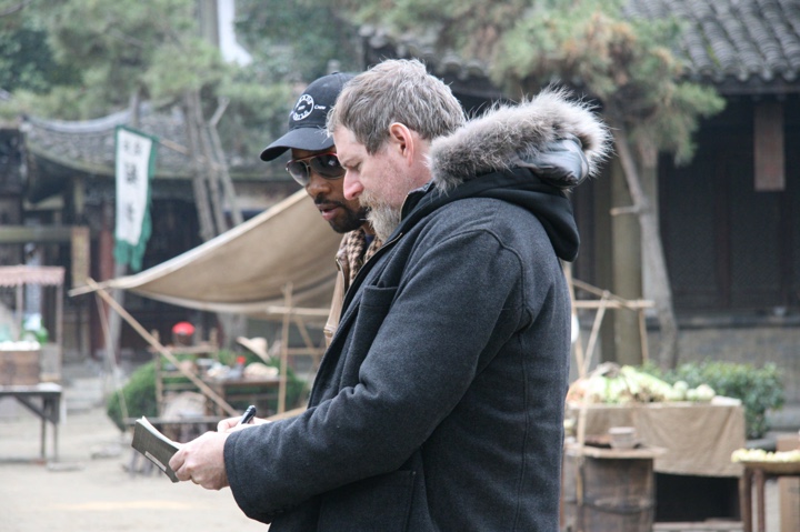
Drew and RZA on the set of the upcoming “The Man with the Iron Fists” movie that stars Russell Crowe, Lucy Liu and Pam Grier.
Kirill: What is your ideal level of movie director’s involvement with the art department? Do you prefer getting a high-level description of the visual mood and a cart blanche control over the entire set, or perhaps a closer collaboration throughout the various production stages?
Drew: The ideal level depends really on the Director. It is not so much a matter of preference. The thing is that an Art Department is a service based thing. We offer a specific service to the Director of a film. If that Director wants to be involved in reviewing every sketch or drawing the Art Department makes that is great with me. If the Director does not want to be “bothered” with seeing every drawing that is cool too. Although it can make for surprises on set which sometimes are a little uncomfortable. It just depends on the person.
Kirill: Most of the outside scenes in the movie feature heavily tinted turquoise palette. How much of this was done with lens filters, and how much was left to the post-production stage?
Drew: Tony Scott is widely respected (and emulated) in the Film industry for his unique photographic look. His films are considered masterpieces of cinematography and he has the experince to choose certain types of cameras and equipment with a desired look in mind before the film is ever produced. Most of the color comes from that knowledge of photography and a final “tweak” comes in post production digitally
Kirill: A lot of outside scenes were shot on rail yards and bridges. How much control over the production design of such scenes are you willing to cede to external parties?
Drew: We shot in existing locations primarilly which were stunning. So we have to give it for those cool places. The things we brought to the locations were all of our trains which were painted by us. We painted all the pricipal locomotives and train cars specifically to the instructions of Director Tony Scott and Production Designer Chris Seagers. As you watch the movie much of what you see is the trains themselves.
Kirill: The main control room (where Rosario Dawson spends the majority of the movie) is my favorite location. How much work goes into creating such a detailed indoors environment?
Drew: A tremendous amount went into that. That was a built set on stage in Pittsburgh. The giant illuminated map was created from scratch and animated to assist in telling the story.
Kirill: The transition from black-and-white movie to full color ones midway through the 20th century took a few good decades. Are we witnessing the beginning of a similarly lengthy and inexorable transition to productions that are not only augmented, but also predominantly produced in virtual CGI / VFX environments?
Drew: I don’t know of anyone on the planent who could honestly answer that question. The thing is do you want to watch a real Actor acting? If you do it will be hard to replace that person with a 3D model. As for the enviornments it is a bit of the same question: real actors in fake environments are “fake” to me personally so I tend not to like those movies.
Kirill: On a related note. The last two Oscar awards for art direction went to “Avatar” and “Alice in Wonderland” – both blurring the lines between real and imaginary worlds, fusing real actors and computer-generated characters in lush otherworldly environments generated on massive render farms. Do you see this as a passing fad that is “rewarding” the technical advancements, or a more steady trend away from traditional production and art design?
Drew: I think that both of those films are excellent and both feature traditional Production Design. The distinction is the implementation of the design. Sometimes is constructed in real space as the Avatar lab was and sometimes it is in 3D depending on the practical needs of the script.
I do not see any steady trend one way or the other. I see improvements in technology that film makers use to tell a story. To me it is more a question of what story the film maker wants to tell. If it is more films about future science fiction worlds than thats one answer. But sometimes a film maker wants to heave real drama based in real places as “Unstoppable” was. These were real trains with real stunts and very minor VFX augmentation. Which is why it is so gripping.
And here I would like to thank Drew Boughton once again for this wonderful opportunity, and his great work on the movie. I want to leave you with two more images. The one above is another shot from the TV feed – note how the train movement is conveyed by blurring the surrounding scenery while still keeping the cargo details in focus. And, if you haven’t noticed up until now, look at the translucent horizontal stripes applied on all TV scenes, helping to separate them from the rest of the sequences.
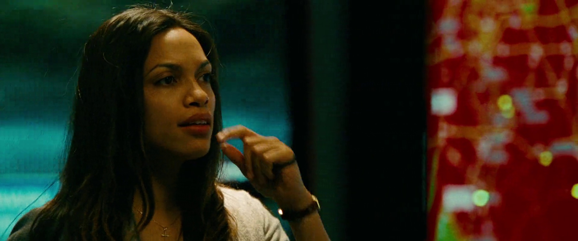
And here is the beautiful Rosario Dawson framed by the blurred wall monitor and muted steel blues and greens:
I hope you enjoy the movie visuals as much as I did.
