After seeing how the rules of physical world can be applied to animating colors, it’s time to talk about layout animation. If you’re a programmer, it’d be safe to say that you spend most of your waking hours in your favorite IDE – and if you’re not, you should :) Writing and modifying code in the editor part of IDE takes, quite likely, most of the time you spend in the IDE. A quite unfortunate characteristic of such an environment is that the UI around you is highly static. Of course, you see bunch of text messages being printed to different views, or search view being populated with the search results, or problems view showing new compile errors, or maybe you invoke a few configuration dialogs and check a couple of settings. All of these, however, do not change the layout of the views that you are seeing.
The rest of the world spends their time outside IDE, browsing their Twitter / Facebook / … streams, updating the Flickr / Picasa albums, downloading songs on iTunes, tuning into Pandora, making selections in the Netflix queues and what not. These activities are highly dynamic, and feature “information tiles” – data areas that display information on the status, pictures, songs, or movies that are relevant to the current view. While the amount of available items is certainly finite, it does not – and should not – fit on a single screen. Thus, activities such as searching, filtering and scrolling are quite common. Let’s take a look at one such activity.
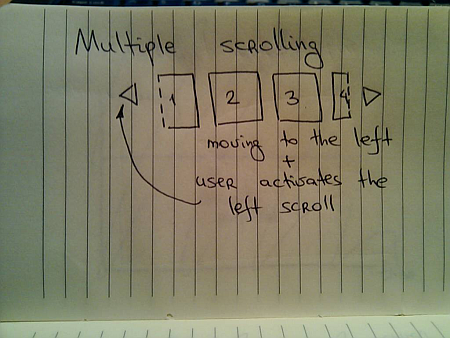
Suppose you have a scrollable widget that shows three pictures from your favorite Flickr stream in your blog footer:
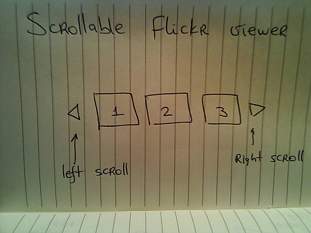
Here, the user can activate the left / right scroll buttons to view the next / previous batch of pictures – scrolling either one by one, or page by page. One option is to scroll immediately – as soon as the user activates the scroll button, the images just “jump” to the new locations:
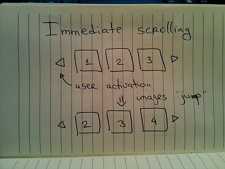
Simple to implement, but very user-unfriendly. You’re making the user remember the previous state of the application – where was each image displayed, and make the mental connection between old state, pressing the button and the new state. It would be fairly correct to say that immediate scroll is a persona non grata in the RIA world:
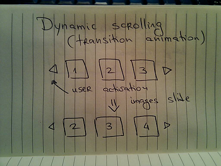
Now that you know that you want to slide the images, the next question is how to do it. Going back to the previous entries, a typical programmer’s solution is constant-speed scroll:
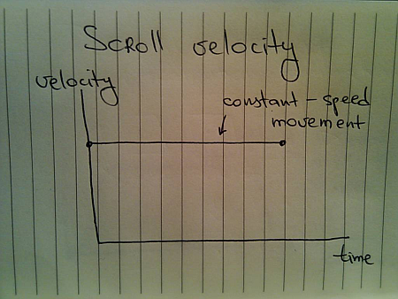
If you’ve followed this series so far, you know that this will not feel natural since it does not properly emulate movement of physical objects. How about emulating the movement of a man-driven vehicle:
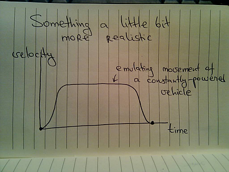
Here, we have a short acceleration phase, followed by the “cruising” scrolling, with the eventual deceleration as the scrolling stops. Is this the correct model? Not so much – the cruising of the physical vehicle happens because you’re constantly applying the matching pressure on the gas pedal (or let the cruise control do it for you).
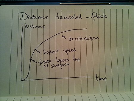
In this case, the user had a rather short interaction with the UI – clicking the button. The scrolling continues well beyond the point of the press end, and as such there is nothing that can “power” this constant-speed movement. A better physical model is that of the finger flick – a common UI idiom in touch-based devices such as smart phones or tablets:
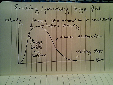
Here, you have very quick acceleration phase as the user starts moving the finger on the UI surface, followed by a slower acceleration attributed to the momentum left by the finger. Once the scrolling reaches its maximum speed, it decelerates – at a slower rate – until the scrolling stops.
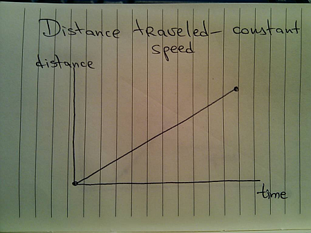
Let’s take a look at the distance graphs. Here’s the one for the constant-speed movement:
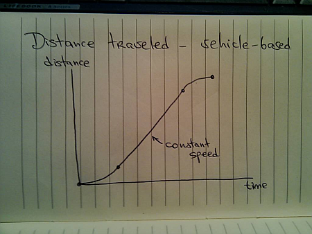
Here’s the one for the vehicle-emulating movement:
And finally, here’s the one for finger-flick model:
Now let’s take a look at what happens when the user initiates another interaction while you’re still processing (animating) the previous one. You cannot ignore such scenarios once you have animations in your UI – imagine if you wanted to go to page 200 of a book and had to turn the pages one by one. In the real world, you do not wait until the previous page has been completely turned in order to turn the next page.
The same exact principle applies to scrolling these information tiles. While you’re animating the previous scroll, the user must be able to initiate another scroll – in the same or the opposite direction. If you have read the previous entries, this directly relates to switching direction in the physical world.
Suppose you’re in the middle of the scrolling animation:
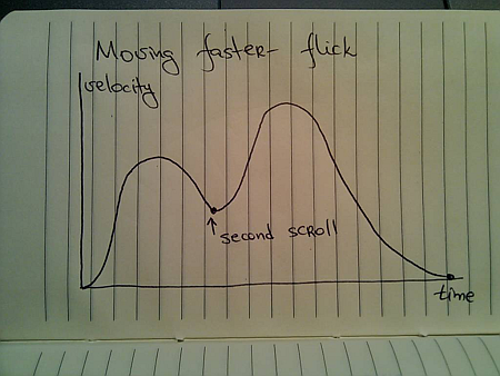
And the user presses the left scroll button once again. You do not want to wait until the current scroll is done. Rather, you need to take the current animation and make it scroll to the new position. Here, an interesting question arises – do you scroll faster?
For the specific scenario that is used here – scrolling the images – you have different options. You can maintain the same scrolling speed, or you can increase the scrolling speed in order to cover more “ground” in the same amount of time. Let’s take a look at some numbers.
- Suppose it takes 1000ms to make the full scroll.
- 800ms after the scroll has started, the user initiates another scroll in the same direction.
What are the options?
- Maintain the same scroll speed, effectively completing the overall scroll in 2000ms.
- Complete the overall scroll in the same time left for the first one – effectively completing the overall scroll in 1000ms.
- Combine the distance left for the first scroll and the full distance required for the second scroll, and complete the combined distance in 1000ms – effectively completing the overall scroll in 1800ms.
There is no best solution. There is only the best solution for the specific scenario. Given the specific scenario at hand – scrolling images, i’d say that option 1 can be ruled out immediately. If the user initiates multiple scrolls, those should be combined into faster scrolls. What about option 2? It’s certainly simpler than option 1, but can result is unsettlingly fast – or almost immediate – scrolls the closer the second scroll initiation gets to the completion of the first scroll. In our case, the second scroll initiation came 200ms before the first scroll was about to be completed. Now, you cover the remaining distance and the full distance for the second scroll in only 200ms. It is going to be fast, but it can get too fast.
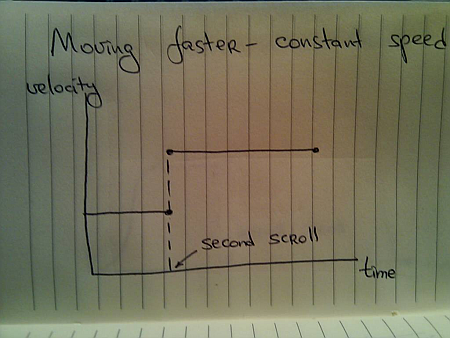
If we adopt the third option for this specific scenario, the velocity graph for the constant-speed scrolling looks like this:
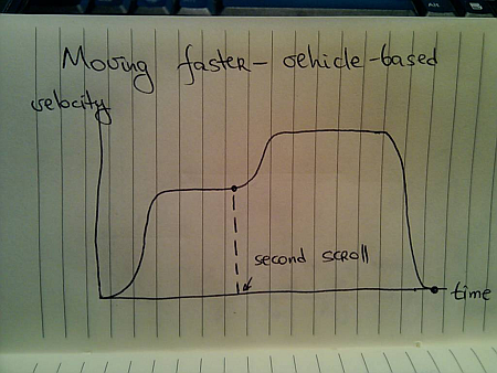
For the vehicle-based model it looks like this:
And for the finger flick based model it looks like this:
These two entries (on colors and scrolling) have shown just a glimpse of complexity brought about by adding dynamic behavior to your UIs. Is spending time on proper design and implementation of animations based on the real world justified, especially when the animations themselves are short? This is going to be the subject of the final part.
To be concluded tomorrow.
After seeing how the rules of the physical world constrain and shape movements of real objects, it’s time to turn to the pixels. State-aware UI controls that have become pervasive in the last decade are not pure eye candy. Changing the fill / border color of a button when you move the mouse cursor over it serves as the indication that the button is ready to be pressed. Consistent and subtle visual feedback of the control state plays significant role in enabling flowing and productive user experience, and color manipulation is one of the most important techniques.
Electron gun was one of my favorite technical terms in the eighties, and i remember being distinctly impressed by the fact that any visible color can be simulated with the right mix of red, green and blue phosphor cells. Somehow, mixing equal amounts of red, green and blue blobs of play-doh always left me with a brownish green bigger blob, but the pictures on the screen were certainly colored.
If you have a few hours to kill, color theory is a topic as endless as it gets. One of the basic terms in color theory is that of chromacity – which refers to the pure hue of the color. It is usually illustrated as a tilted horse shoe, with one of the sides representing the wavelengths of the visible spectrum (image courtesy of Wikimedia):

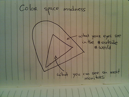
The problem is that average monitors (not only CRT, but LCD / plasmas as well) cannot reproduce the full visible spectrum. In color theory this is referred to as the color space – mathematical model that describes how colors can be represented by numbers. The sRGB color space is one of the most widely used for the consumer displays. Put simply, it is a triangle with red, green and blue points inside the chromacity graph (courtesy of Wikimedia):
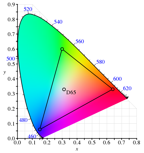
The ironic thing about this diagram is that it cannot be faithfully shown on a display that uses the sRGB color space – since it cannot reproduce any of the colors outside the inner triangle (color space in printing is an equally lengthy subject).
Now let’s see whether the constraints of the moving physical objects are relevant for animating color pixels on the screen.
Suppose you have a button. It is displayed with light blue inner fill. When the user moves the mouse over the button (rollover), you want to animate the inner fill to yellow, and when the user presses the button, you want to animate the inner fill to saturated orange. These three colors represent anchor points of a movement path inside the specific color space:
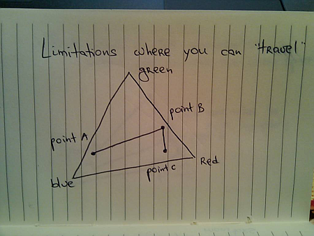
Imagine what happens when the user moves the mouse over the button, and presses it before the rollover animation has been completed. The direct analogy to the physical world is an object that was moving from point A to point B, and is now asked to turn to point C before reaching B. If the color animation reflects the momentum / inertia of the physical movement, the trajectory around point B may take the path outside the color space:
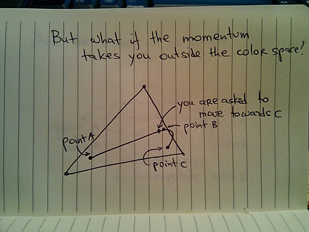
This is similar to physical world limitations – say, if point B is very close to a lake, and you don’t want to drive your new car into it. In this case you will need to clamp the interpolated color to lie inside the confines of the specific color space.
In the physical world, if you want to get from point A to point B, you would usually take the shortest route. This is not so simple if you’re interpolating colors. There’s a whole bunch of different color spaces (RGB, XYZ and HSV are just a few), and each one has its own “shortest” route that connects two colors:
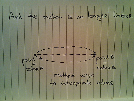
Chet’s entry from last summer has a short video and a small test application that shows the difference between interpolating colors in RGB and HSV color spaces.
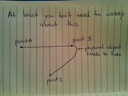
When you’re interpolating colors, the analogy to a moving physical object holds as far as the current direction, velocity and momentum. However, the moving “color object” does not have any volume – unlike the real physical objects. Thus, if it went from point A to point B (and stopped completely), and is now asked to either go back to A or go to point C, it does not need to turn – compare this to the case above when it was asked to turn to C while it was still moving towards B.
However, the rules of momentum still apply while the animation is still in progress. Suppose you’re painting your buttons with light blue color (point A) when they are inactive, and with yellow color (point B) when the mouse is over them. The user moves the mouse over one of the buttons and it starts animating – going from point A to point B. Now the user moves the mouse away from the button as it is still animating – and you want to go back to point A. If you want to follow the rules of physical movement, you cannot immediately go back from your current color back to the light blue. Rather, you need to follow the current momentum towards the yellow color, decelerate and only then go back to light blue.
Next, i’m going to talk about layout animations.
To be continued tomorrow.
After taking a deep dive into the intricacies of aligning text components, comboboxes, spinners and buttons in the latest 6.0dev drops of Substance look-and-feel, it’s time to talk about supporting different font settings.
As with precise micro-design, Karsten has pioneered the Swing work on matching the desktop font settings in his JGoodies Looks collection of look-and-feels. Along with the native font rasterizer (at least on Windows Vista and its Segoe UI 12 font), this is by far the most important part in creating an application that is visually consistent with the user desktop. Personally, i think that one of the biggest mistakes in Java 6 was staying with Tahoma 11 as the default font for the native Windows look-and-feel, followed closely by an equally baffling font choice in Nimbus.
After the JGoodies font policy layer has been adopted in Substance, it was extended to provide font policies for Mac, KDE and Gnome desktops. When you run a Substance-powered application under one of these (or Windows), it will query the desktop font settings, and adopt them for all the controls and title panes. While this may cause a form designed for Windows XP (Tahoma 11) to have controls overflowing the form bounds on Gnome (DejaVu Sans 13), it is a small price to pay – in my personal view.
Given the wide choice of fonts that Substance must support, the micro-design layer in Substance needs cannot use hard-coded pixel values for control insets, margins, gaps and strokes. This functionality has been present for quite some time, and now is extended to support the new alignment requirements.
Here is a screenshot of the relevant controls under the different Tahoma font sizes:

and the same controls with guider lines showing the alignment of perceived vertical bounds and text baselines:

If you’re interested to see what Substance 6.0dev can bring to your application, take it for a spin. You can also click the button below to launch a WebStart demo – switch to the “Alignment” tab and see the control alignment in action:

Last week i have written about improving the visuals of text components, comboboxes and spinners in the 6.0dev branch of Substance look-and-feel library. Today, it’s time to talk about the micro-design of these components – aligning perceived boundaries, text baseline and other visual elements of user input controls.
I have started looking into the precise micro-design around three years ago, with the main inspiration coming from JGoodies Looks library developed by Karsten Lentzsch. The micro-design looks at how the controls look like when they are placed next to each other – do they have the same perceived height, are the texts aligned on the same line etc. While these issues do not directly affect the business functionality of your application, they most certainly contribute to the overall polish and end user experience. Since then, the work in Substance has grown into complete support for resolution independence – scaling the entire visuals of all supported controls based on the current desktop font settings.
With the recent redesign of the visual appearance of user input controls in the next Substance release, there were two major changes that required revisiting the implementation:
- Uneditable comboboxes now have appearance identical to that of buttons. This means that the button visuals should now be micro-aligned with those of comboboxes and, by extension, with those of all text based controls.
- Editable text based controls have double borders. The outer border is lighter and blends with the container, and the inner border is darker, creating the inset look. The perceived vertical bounds of these controls is delineated by the inner border.
Let’s look at a few screenshots. All the screenshots in this entry will show the same collection of controls – text field, formatted text field, password field, spinner, editable combo, uneditable combo and a button. Here is how these controls look under the latest 6.0dev drop of Substance:

And here is the same application, with grid lines delineating the perceived bounds of the controls (red) and the text baseline (green):

Here, the perceived bounds and the texts are perfectly aligned. It’s important to note that the actual bounds of text fields as compared to that of button is different – the text field is two pixels higher than the button. However, since those two pixels are painted with a color much closer to the containing panel background, the perceived bounds of the text field is defined by the inner darker contour.
This visual alignment is consistent across all Substance skins. Here are the controls under Dust Coffee:


and Graphite:


Now let’s see how Substance 6.0dev fares against other core and active third-party look-and-feels – all under Windows Vista with the font settings specific to the relevant look-and-feel.
We’ll start with the default Metal / Ocean:

The guider lines highlight the problematic areas:

Button is one pixel taller than combos, and combos are quite a few pixels taller than text fields / spinners. Also, even though technically the bottom spinner button is aligned with the bottom edge of the spinner, the perceived alignment is off by one pixel (since the colors used on these two parts have inverted brightness). Finally, the dot characters of the password field appear to be 1-2 pixels too high.
Let’s look at the native Windows look-and-feel:

Apart from the archaic usage of Tahoma 11 (and not the platform Segoe UI 12), there are two visual problems. The top border of the spinner control is cut off (see UI guidelines for the correct visuals), and there are extra pixels around the corners of the uneditable comboboxes. Let’s look at the guider lines:

The text baselines are perfectly aligned, and the only issue is the one-pixel difference in the height of button and combo.
Let’s look at Nimbus – the new addition to 6u10+.

Before looking at the guider lines, notice how the bottom edge of the arrow button on the editable combobox does not visually align with the much lighter bottom edge of the control itself. The visual result is that the button looks much heavier, appearing to “hang” off the right side of the control. The same applies to the bottom edge of the spinner. Let’s now look at the guider lines:

Here, the controls heights are inconsistent. While the button has the same height as the text fields and spinners, the comboboxes are two pixels shorter. Also, the star characters on the password field appear to be 2-3 pixels too high.
Now let’s look at JGoodies Looks. First, the Plastic XP skin:

The guider lines show that everything is pixel-perfect:

Now let’s look at the Plastic skin:

Here, most of the texts appear to be too low, and this is confirmed by the guider lines:

Note how the button text baseline is one pixel higher than the rest.
Finally, let’s task a look at Synthetica. We’ll start with the Base skin:

Overlaying the guider lines:

Shows that the button is 2 pixels higher than the rest of the controls. However, everything else looks perfect, including the bounds and text baseline.
Next, the newly added Black Eye skin:

Let’s overlay the guider lines:

Here, we can see that the button is much taller than the rest of the controls, and the spinner is 2 pixels shorter than text fields and combos. Also, the star characters of the password field appear to be 3-4 pixels too high.
The last skin to analyze is the Orange Metallic:

And the guider lines:

Here, we can see that the buttons are taller than the combos, and the combos are taller than the text fields and spinners. Also, the star characters of the password field appear to be 3-4 pixels too high. Finally, the button font is bold, while the rest of the controls use plain font.
If you’re interested to see what Substance 6.0dev can bring to your application, take it for a spin. Stay tuned for the next entry which will talk about control alignment in Substance across different font sizes.
