Metric-driven design
One of my recent resolutions (not for 2014, but for mobile software in general in the last few months) was to evaluate designs of new apps and redesigns of existing apps from the position of trust. Trust in the designers and developers of those apps that they have good reasons to do what they do, even if it’s only one or two steps on the longer road towards their intended interaction model. But Twitter’s recent redesign of their main stream keeps on baffling me.Putting apart the (somewhat business-driven from what I gather) decision of “hiding” the mentions and DMs behind the action bar icons and adding the rather useless discover / activity tabs, I’m looking at the interaction model in the main (home) stream.
Twitter never got to the point of syncing the stream position across multiple devices signed into the same account. There is at least one third-party solution to do that, which requires third-party apps to use their SDK and users to use those apps. The developer of that third-party solution has repeatedly stated that in his opinion Twitter is not interested in discouraging casual users that check their streams every so often. If you start following random (mostly PR-maintained) celebrity streams, it’s easy to get lost in the Twitter sea, and when you check in every once in a while and see hundreds – if not thousands – of unread tweets, you might start feeling that you’re not keeping up.
As I’ve reached the aforementioned decision a few months ago, I’ve uninstalled all third-party Twitter apps I had on my phone, and switched to the official app. It does a rather decent job of remembering the stream position, as long as – from what I could see – I check the stream at least once every 24 hours. When I skip a day, the stream jumps to the top. It also seems to do that if the app refreshes the stream after I rotate the device, so some of this skipping can be attributed to bugs. But in general if I’m checking in twice a day and am careful not to rotate the device, the app remembers the last position as it loads the tweets above it.
In the last release Twitter repositioned the chrome around the main stream, adding discover / activity tabs above it and the “what’s happening” box below. While they encourage you to explore things beyond your main stream, it also looks like they’re aware that these two elements take valuable vertical space during the scrolling. And the current solution is to hide these two bars when you scroll down the stream.
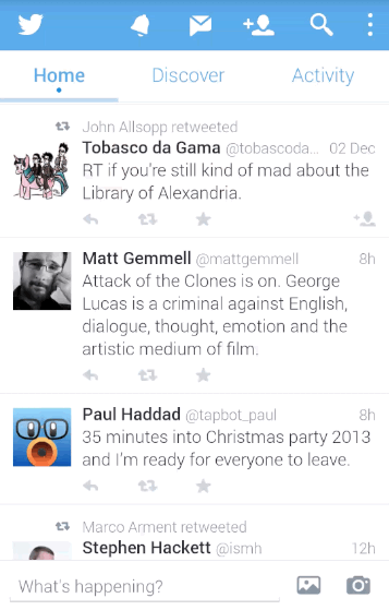
And here’s what baffles me the most. On one hand, the app remembers the stream position, which means that I need to move the content down to get to the newer tweets (as an aside, with “natural” scrolling I’m not even sure if this is scrolling up or scrolling down”). On the other hand, the app hides the top tabs / bottom row when I move the content up.
Is the main interaction mode with this stream is getting to the last unread tweet and then going up the stream to skim the unread tweets, as hinted by remembering the stream position? Or is it getting bumped to the top of the stream and scrolling a few tweets down just to sample the latest few entries in it, as hinted by hiding the two chrome rows and providing more space during the scrolling?
I don’t want to say what the app should or shouldn’t do in the stream (as pointed out by M.Saleh Esmaeili). It’s just that I can’t get what the designers intend the experience to be.
A few days ago The Verge has posted an article around metric-driven design in Twitter mobile apps, an for me personally the saddest part of this article is how much they focus on engagement metrics and how little the guy talks about informed design. Trying to squeeze every possible iota of “interaction” out of every single element on the screen – on its own – without talking about the bigger picture of what Twitter wants to be as a designed system. Experiments are fine, of course. But jacking up random numbers on your “engagement” spreadsheets and having those dictate your roadmap (if one can even exist in such a world) is kind of sad.
When every interaction is judged by how much it maximizes whatever particular internal metric your team is tracking, you may find yourself dead-set on locating the local maximum of an increasingly fractured experience, with no coherent high-level design, and no clear path that you’re taking to arrive to the next level. Or, as Billie Kent’s character in Boardwalk Empire says, “always on the move, going nowhere fast.”
